
Reference documentation and code samples for the Google Chat V1 API class Google::Apps::Card::V1::Card.
A card interface displayed in a Google Chat message or Google Workspace add-on.
Cards support a defined layout, interactive UI elements like buttons, and rich media like images. Use cards to present detailed information, gather information from users, and guide users to take a next step.
To learn how to build cards, see the following documentation:
- For Google Chat apps, see Design the components of a card or dialog .
- For Google Workspace add-ons, see Card-based interfaces .
Note: You can add up to 100 widgets per card. Any widgets beyond this limit are ignored. This limit applies to both card messages and dialogs in Google Chat apps, and to cards in Google Workspace add-ons.
Example: Card message for a Google Chat app
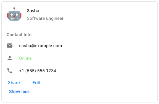
To create the sample card message in Google Chat, use the following JSON:
{
"cardsV2": [
{
"cardId": "unique-card-id",
"card": {
"header": {
"title": "Sasha",
"subtitle": "Software Engineer",
"imageUrl":
" https://developers.google.com/workspace/chat/images/quickstart-app-avatar.png"
;,
"imageType": "CIRCLE",
"imageAltText": "Avatar for Sasha"
},
"sections": [
{
"header": "Contact Info",
"collapsible": true,
"uncollapsibleWidgetsCount": 1,
"widgets": [
{
"decoratedText": {
"startIcon": {
"knownIcon": "EMAIL"
},
"text": "sasha@example.com"
}
},
{
"decoratedText": {
"startIcon": {
"knownIcon": "PERSON"
},
"text": "<font color="#80e27e">Online</font>"
}
},
{
"decoratedText": {
"startIcon": {
"knownIcon": "PHONE"
},
"text": "+1 (555) 555-1234"
}
},
{
"buttonList": {
"buttons": [
{
"text": "Share",
"onClick": {
"openLink": {
"url": " https://example.com/share"
;
}
}
},
{
"text": "Edit",
"onClick": {
"action": {
"function": "goToView",
"parameters": [
{
"key": "viewType",
"value": "EDIT"
}
]
}
}
}
]
}
}
]
}
]
}
}
]
}
Inherits
- Object
Extended By
- Google::Protobuf::MessageExts::ClassMethods
Includes
- Google::Protobuf::MessageExts
Methods
#card_actions
  def

 card_actions
 ()

 -
>
 ::
 Array
< ::
 Google
 ::
 Apps
 ::
 Card
 ::
 V1
 ::
 Card
 ::
 CardAction
>
- (::Array< ::Google::Apps::Card::V1::Card::CardAction
>) — The card's actions. Actions are added to the card's toolbar menu.
For example, the following JSON constructs a card action menu with
SettingsandSend Feedbackoptions:"card_actions": [ { "actionLabel": "Settings", "onClick": { "action": { "functionName": "goToView", "parameters": [ { "key": "viewType", "value": "SETTING" } ], "loadIndicator": "LoadIndicator.SPINNER" } } }, { "actionLabel": "Send Feedback", "onClick": { "openLink": { "url": "https://example.com/feedback" } } } ]
#card_actions=
  def

 card_actions=
 (
 value
 )

 -
>
 ::
 Array
< ::
 Google
 ::
 Apps
 ::
 Card
 ::
 V1
 ::
 Card
 ::
 CardAction
>
- value(::Array< ::Google::Apps::Card::V1::Card::CardAction
>) — The card's actions. Actions are added to the card's toolbar menu.
For example, the following JSON constructs a card action menu with
SettingsandSend Feedbackoptions:"card_actions": [ { "actionLabel": "Settings", "onClick": { "action": { "functionName": "goToView", "parameters": [ { "key": "viewType", "value": "SETTING" } ], "loadIndicator": "LoadIndicator.SPINNER" } } }, { "actionLabel": "Send Feedback", "onClick": { "openLink": { "url": "https://example.com/feedback" } } } ]
- (::Array< ::Google::Apps::Card::V1::Card::CardAction
>) — The card's actions. Actions are added to the card's toolbar menu.
For example, the following JSON constructs a card action menu with
SettingsandSend Feedbackoptions:"card_actions": [ { "actionLabel": "Settings", "onClick": { "action": { "functionName": "goToView", "parameters": [ { "key": "viewType", "value": "SETTING" } ], "loadIndicator": "LoadIndicator.SPINNER" } } }, { "actionLabel": "Send Feedback", "onClick": { "openLink": { "url": "https://example.com/feedback" } } } ]
#display_style
  def

 display_style
 ()

 -
>
 ::
 Google
 ::
 Apps
 ::
 Card
 ::
 V1
 ::
 Card
 ::
 DisplayStyle
- ( ::Google::Apps::Card::V1::Card::DisplayStyle
) — In Google Workspace add-ons, sets the display properties of the
peekCardHeader.
#display_style=
  def

 display_style=
 (
 value
 )

 -
>
 ::
 Google
 ::
 Apps
 ::
 Card
 ::
 V1
 ::
 Card
 ::
 DisplayStyle
- value( ::Google::Apps::Card::V1::Card::DisplayStyle
) — In Google Workspace add-ons, sets the display properties of the
peekCardHeader.
- ( ::Google::Apps::Card::V1::Card::DisplayStyle
) — In Google Workspace add-ons, sets the display properties of the
peekCardHeader.
#fixed_footer
  def

 fixed_footer
 ()

 -
>
 ::
 Google
 ::
 Apps
 ::
 Card
 ::
 V1
 ::
 Card
 ::
 CardFixedFooter
- ( ::Google::Apps::Card::V1::Card::CardFixedFooter
) — The fixed footer shown at the bottom of this card.
Setting
fixedFooterwithout specifying aprimaryButtonor asecondaryButtoncauses an error. For Chat apps, you can use fixed footers in dialogs , but not card messages .
#fixed_footer=
  def

 fixed_footer=
 (
 value
 )

 -
>
 ::
 Google
 ::
 Apps
 ::
 Card
 ::
 V1
 ::
 Card
 ::
 CardFixedFooter
- value( ::Google::Apps::Card::V1::Card::CardFixedFooter
) — The fixed footer shown at the bottom of this card.
Setting
fixedFooterwithout specifying aprimaryButtonor asecondaryButtoncauses an error. For Chat apps, you can use fixed footers in dialogs , but not card messages .
- ( ::Google::Apps::Card::V1::Card::CardFixedFooter
) — The fixed footer shown at the bottom of this card.
Setting
fixedFooterwithout specifying aprimaryButtonor asecondaryButtoncauses an error. For Chat apps, you can use fixed footers in dialogs , but not card messages .
#header
  def

 header
 ()

 -
>
 ::
 Google
 ::
 Apps
 ::
 Card
 ::
 V1
 ::
 Card
 ::
 CardHeader
- ( ::Google::Apps::Card::V1::Card::CardHeader ) — The header of the card. A header usually contains a leading image and a title. Headers always appear at the top of a card.
#header=
  def

 header=
 (
 value
 )

 -
>
 ::
 Google
 ::
 Apps
 ::
 Card
 ::
 V1
 ::
 Card
 ::
 CardHeader
- value( ::Google::Apps::Card::V1::Card::CardHeader ) — The header of the card. A header usually contains a leading image and a title. Headers always appear at the top of a card.
- ( ::Google::Apps::Card::V1::Card::CardHeader ) — The header of the card. A header usually contains a leading image and a title. Headers always appear at the top of a card.
#name
  def

 name
 ()

 -
>
 ::
 String
- (::String) — Name of the card. Used as a card identifier in card navigation.
#name=
  def

 name=
 (
 value
 )

 -
>
 ::
 String
- value(::String) — Name of the card. Used as a card identifier in card navigation.
- (::String) — Name of the card. Used as a card identifier in card navigation.
#peek_card_header
  def

 peek_card_header
 ()

 -
>
 ::
 Google
 ::
 Apps
 ::
 Card
 ::
 V1
 ::
 Card
 ::
 CardHeader
- ( ::Google::Apps::Card::V1::Card::CardHeader ) — When displaying contextual content, the peek card header acts as a placeholder so that the user can navigate forward between the homepage cards and the contextual cards.
#peek_card_header=
  def

 peek_card_header=
 (
 value
 )

 -
>
 ::
 Google
 ::
 Apps
 ::
 Card
 ::
 V1
 ::
 Card
 ::
 CardHeader
- value( ::Google::Apps::Card::V1::Card::CardHeader ) — When displaying contextual content, the peek card header acts as a placeholder so that the user can navigate forward between the homepage cards and the contextual cards.
- ( ::Google::Apps::Card::V1::Card::CardHeader ) — When displaying contextual content, the peek card header acts as a placeholder so that the user can navigate forward between the homepage cards and the contextual cards.
#section_divider_style
  def

 section_divider_style
 ()

 -
>
 ::
 Google
 ::
 Apps
 ::
 Card
 ::
 V1
 ::
 Card
 ::
 DividerStyle
- ( ::Google::Apps::Card::V1::Card::DividerStyle ) — The divider style between the header, sections and footer.
#section_divider_style=
  def

 section_divider_style=
 (
 value
 )

 -
>
 ::
 Google
 ::
 Apps
 ::
 Card
 ::
 V1
 ::
 Card
 ::
 DividerStyle
- value( ::Google::Apps::Card::V1::Card::DividerStyle ) — The divider style between the header, sections and footer.
- ( ::Google::Apps::Card::V1::Card::DividerStyle ) — The divider style between the header, sections and footer.
#sections
  def

 sections
 ()

 -
>
 ::
 Array
< ::
 Google
 ::
 Apps
 ::
 Card
 ::
 V1
 ::
 Card
 ::
 Section
>
- (::Array< ::Google::Apps::Card::V1::Card::Section >) — Contains a collection of widgets. Each section has its own, optional header. Sections are visually separated by a line divider. For an example in Google Chat apps, see Define a section of a card .
#sections=
  def

 sections=
 (
 value
 )

 -
>
 ::
 Array
< ::
 Google
 ::
 Apps
 ::
 Card
 ::
 V1
 ::
 Card
 ::
 Section
>
- value(::Array< ::Google::Apps::Card::V1::Card::Section >) — Contains a collection of widgets. Each section has its own, optional header. Sections are visually separated by a line divider. For an example in Google Chat apps, see Define a section of a card .
- (::Array< ::Google::Apps::Card::V1::Card::Section >) — Contains a collection of widgets. Each section has its own, optional header. Sections are visually separated by a line divider. For an example in Google Chat apps, see Define a section of a card .