Item logo image for Free Mobile Simulatore - Responsiveness testing

Free Mobile Simulatore - Responsiveness testing

Extension Tools 179 users
Item media 4 (screenshot) for Free Mobile Simulatore - Responsiveness testing
Item media 1 (screenshot) for Free Mobile Simulatore - Responsiveness testing
Item media 2 (screenshot) for Free Mobile Simulatore - Responsiveness testing
Item media 3 (screenshot) for Free Mobile Simulatore - Responsiveness testing
Item media 4 (screenshot) for Free Mobile Simulatore - Responsiveness testing

Overview

Simulate mobile, tab and pc to test responsive website for free.
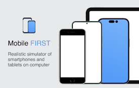
๐Ÿš€ Preview your website on real mobile and tablet devices — right from your desktop! Say goodbye to resizing your browser or juggling multiple devices. With Mobile Simulator – Responsiveness Testing, you can instantly see how your website looks and behaves across a wide range of smartphones and tablets — all within your Chrome browser. This powerful extension gives you a realistic, side-by-side view of popular mobile devices like iPhones, Samsung Galaxy, iPads, and more. Perfect for developers, designers, testers, or anyone building a mobile-friendly site. ๐Ÿ”ง Features you’ll love: ๐Ÿ“ฑ Multiple device models – iPhone, Android, iPad, and more ๐Ÿ”„ Portrait & landscape modes ๐ŸŽฏ Pixel-perfect simulations with accurate resolutions โšก One-click switching between devices ๐Ÿงช Instant live testing — no reloads, no fuss Whether you’re fixing a bug, refining a layout, or launching something new, this extension helps you spot issues fast and build better user experiences for every screen size. ๐ŸŒ Responsive design matters. Over 60% of users browse on mobile — if your site isn’t optimized, you’re losing visitors. ๐Ÿ”ฅ Start testing smarter. Install Mobile Simulator – Responsiveness Testing now and see your site through your users’ eyes.

Details

  • Version
    1.0
  • Updated
    June 21, 2025
  • Offered by
    luke
  • Size
    122KiB
  • Languages
    English
  • Developer
    Email
    lukemartindev482@gmail.com
  • Non-trader
    This developer has not identified itself as a trader. For consumers in the European Union, please note that consumer rights do not apply to contracts between you and this developer.

Privacy

The developer has disclosed that it will not collect or use your data. To learn more, see the developer’s privacy policy .

This developer declares that your data is

  • Not being sold to third parties, outside of the approved use cases
  • Not being used or transferred for purposes that are unrelated to the item's core functionality
  • Not being used or transferred to determine creditworthiness or for lending purposes

Related

Device Simulator & Tester

4.7

Test sites on multiple devices in one tab. Improve development, UI/UX, & QA with live previews.

Instant Mobile Preview - Side Panel View

0.0

View mobile versions of websites side-by-side in Chrome's side panel.

Mobile View: Test responsive designs fast

4.3

Test your responsive designs on multiple devices at once.

Mobile Simulator for Chrome

0.0

Switch any Chrome tab to mobile view with 38 device options in one click.

Discord Customizer

3.0

Discord customizer for profile picture, banner, and popout theme

Desktop - Mobile Responsive Testing Tool

4.6

All-in-one Chrome extension for SEO, UI/UX, responsive design, grammar, and security checks. Optimize websites with a single click.

Mobile View Tester: Responsive Web Design Tool

3.6

Mobile-first design validation. Quickly preview and optimize website performance across multiple device screen sizes.

Viewport Resizer: Ultimate Device Emulator & Website Testing Tool

4.2

Emulate devices, resize screens, and perfect your web design effortlessly with this cutting-edge testing and presentation tool.

Responsive Tester

3.2

Test responsive web designs or mobile pages and see if it is mobile friendly

Phone On Web | Android in browser

2.9

Using android phone in web browser without root, not need software download.

Phone Simulator — Mobile Emulator Tool

5.0

Mobile simulator in your browser ๐Ÿ“ฑ — preview responsive sites on 30+ devices

Mobile simulator - responsive testing tool

4.9

Smartphone and tablet simulator on computer with several models to test mobile responsive websites.

Device Simulator & Tester

4.7

Test sites on multiple devices in one tab. Improve development, UI/UX, & QA with live previews.

Instant Mobile Preview - Side Panel View

0.0

View mobile versions of websites side-by-side in Chrome's side panel.

Mobile View: Test responsive designs fast

4.3

Test your responsive designs on multiple devices at once.

Mobile Simulator for Chrome

0.0

Switch any Chrome tab to mobile view with 38 device options in one click.

Discord Customizer

3.0

Discord customizer for profile picture, banner, and popout theme

Desktop - Mobile Responsive Testing Tool

4.6

All-in-one Chrome extension for SEO, UI/UX, responsive design, grammar, and security checks. Optimize websites with a single click.

Mobile View Tester: Responsive Web Design Tool

3.6

Mobile-first design validation. Quickly preview and optimize website performance across multiple device screen sizes.

Viewport Resizer: Ultimate Device Emulator & Website Testing Tool

4.2

Emulate devices, resize screens, and perfect your web design effortlessly with this cutting-edge testing and presentation tool.

Google apps
Create a Mobile Website
View Site in Mobile | Classic
Share by: