Item logo image for Mobile View Switcher

Mobile View Switcher

Featured
3.4 (

117 ratings

)
Extension Tools 100,000 users
Item media 2 (screenshot) for Mobile View Switcher
Item media 3 (screenshot) for Mobile View Switcher
Item video thumbnail
Item media 2 (screenshot) for Mobile View Switcher
Item media 3 (screenshot) for Mobile View Switcher
Item video thumbnail
Item media 2 (screenshot) for Mobile View Switcher
Item video thumbnail
Item media 2 (screenshot) for Mobile View Switcher
Item media 3 (screenshot) for Mobile View Switcher

Overview

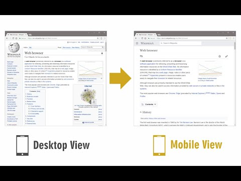
Switch to mobile view with one click via toolbar button.

Mobile View Switcher is a lite extension that let you switch a website to mobile view. Default mobile view is iPhone with iOS 15 but you can change it from the options page. Simply add a desired user-agent to change the mobile view to your desired one. There are many websites that offer user-agent strings for various devices. Simply copy and paste the desired one in the designated area in options page. Then reload any website to see the mobile view UI (while the addon is active). Toolbar button serves as ON|OFF switch to enable or disable the addon. Grey color for toolbar icon is when the addon is inactive and yellow color is for the active state. Simply click on the toolbar icon to switch states. To report bugs, please fill the bug report form in the addon's homepage (https://mybrowseraddon.com/mobile-view-switcher.html).

3.4 out of 5 117 ratings

Learn more about results and reviews.

Details

  • Version
    0.2.1
  • Updated
    February 24, 2025
  • Offered by
    Benni
  • Size
    35.21KiB
  • Languages
    English
  • Developer
    Email
    benni.es@yahoo.com
  • Non-trader
    This developer has not identified itself as a trader. For consumers in the European Union, please note that consumer rights do not apply to contracts between you and this developer.

Privacy

The developer has disclosed that it will not collect or use your data.

This developer declares that your data is

  • Not being sold to third parties, outside of the approved use cases
  • Not being used or transferred for purposes that are unrelated to the item's core functionality
  • Not being used or transferred to determine creditworthiness or for lending purposes

Support

For help with questions, suggestions, or problems, visit the developer's support site

Related

Responsive Tester

3.2

Test responsive web designs or mobile pages and see if it is mobile friendly

Page to Popup

3.9

See your desired website in the toolbar popup.

Viewport Resizer: Ultimate Device Emulator & Website Testing Tool

4.2

Emulate devices, resize screens, and perfect your web design effortlessly with this cutting-edge testing and presentation tool.

Automate Your Bing Searches

3.4

Automatically complete your Bing searches to earn Microsoft Rewards points.

Mobile simulator - responsive testing tool

4.9

Smartphone and tablet simulator on computer with several models to test mobile responsive websites.

Responsive Viewer

4.2

Show multiple screens once, Responsive design tester

Upload image from clipboard or URL

5.0

Upload images & files directly from a URL or the clipboard (ctrl+v), without needing to have them on your computer!

Temporary Mobile View

3.4

View current page in the mobile-friendly format by spoofing Android or iOS user-agent string on request header and JavaScript sides

Mobile View: Test responsive designs fast

4.4

Test your responsive designs on multiple devices at once.

U-Eyes: Mobile Device Simulator

4.5

Simulate mobile devices for responsive testing, mock-up and website preview, with screenshot and recording features

Mobile View Switcher

4.9

Switch user agent to simulate mobile (Android/iOS). Test mobile views, access content and save bandwidth.

Breeze: Website Management Tool

3.4

All-in-one tools for website migration project, operating website and SEO tools.

Responsive Tester

3.2

Test responsive web designs or mobile pages and see if it is mobile friendly

Page to Popup

3.9

See your desired website in the toolbar popup.

Viewport Resizer: Ultimate Device Emulator & Website Testing Tool

4.2

Emulate devices, resize screens, and perfect your web design effortlessly with this cutting-edge testing and presentation tool.

Automate Your Bing Searches

3.4

Automatically complete your Bing searches to earn Microsoft Rewards points.

Mobile simulator - responsive testing tool

4.9

Smartphone and tablet simulator on computer with several models to test mobile responsive websites.

Responsive Viewer

4.2

Show multiple screens once, Responsive design tester

Upload image from clipboard or URL

5.0

Upload images & files directly from a URL or the clipboard (ctrl+v), without needing to have them on your computer!

Temporary Mobile View

3.4

View current page in the mobile-friendly format by spoofing Android or iOS user-agent string on request header and JavaScript sides

Google apps
Create a Mobile Website
View Site in Mobile | Classic
Share by: