Item logo image for Pixefy - Responsive Design Checker

Pixefy - Responsive Design Checker

pixefy.io
Featured
4.7 (

29 ratings

)
Item media 5 (screenshot) for Pixefy - Responsive Design Checker
Item media 6 (screenshot) for Pixefy - Responsive Design Checker
Item video thumbnail
Item media 2 (screenshot) for Pixefy - Responsive Design Checker
Item media 3 (screenshot) for Pixefy - Responsive Design Checker
Item media 4 (screenshot) for Pixefy - Responsive Design Checker
Item media 5 (screenshot) for Pixefy - Responsive Design Checker
Item media 6 (screenshot) for Pixefy - Responsive Design Checker
Item video thumbnail
Item media 2 (screenshot) for Pixefy - Responsive Design Checker
Item video thumbnail
Item media 2 (screenshot) for Pixefy - Responsive Design Checker
Item media 3 (screenshot) for Pixefy - Responsive Design Checker
Item media 4 (screenshot) for Pixefy - Responsive Design Checker
Item media 5 (screenshot) for Pixefy - Responsive Design Checker
Item media 6 (screenshot) for Pixefy - Responsive Design Checker

Overview

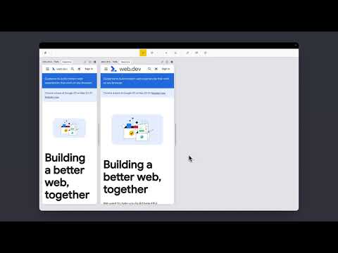
Preview and debug your website’s responsiveness across multiple devices in real-time, all inside one browser tab.

Pixefy helps you spot layout issues instantly and fine-tune designs with live editing tools – right as you build. It simplifies responsive testing by letting you preview, debug, and edit across multiple screen sizes in one place – no more switching tabs or resizing windows manually. 🚀 Key Features: âś… Live Responsive Previews – Test across multiple screen sizes side-by-side. Scroll, click, and interact on all screens simultaneously. âś… Custom Screens & Presets – Create and save your own breakpoints, or use popular device resolutions out of the box. âś… Screen Management – Rearrange, stack (horizontal/vertical), rotate, or zoom screens globally for a flexible workspace. âś… Inspect & X-Ray – Inspect styles, edit attributes live, and debug layouts with Visual Box Model, grids, and X-Ray overlays. âś… CSS Debugging Tools – View/edit computed styles, measure distances between elements, compare two elements, and track all changes in the Activity Tab. âś… Content Editing – Instantly replace text or images, and check word/character counts directly on the page. âś… Asset Downloads – Extract SVGs, PNGs, and other assets directly from Inspect Tool tabs. âś… Screenshots – Capture full pages, visible areas, or selected regions in one click. âś… User Agent Switching – Simulate different devices, browsers, or bots to see how your site adapts. âś… Accessibility Tools – Test AA/AAA contrast ratios, extract all colors, and preview vision impairments with blindness simulations. âś… Utilities – Live Dimension Widget (viewport width/height), copy any value or asset to clipboard, clear cache & refresh Pixefy. âś… Themes – Switch between light and dark mode instantly. Pixefy is regularly updated based on user feedback. Report issues or share ideas: www.pixefy.io/feedback See what’s new: www.pixefy.io/changelog

4.7 out of 5 29 ratings

Learn more about results and reviews.

Details

  • Version
    0.9.9 Open Beta
  • Updated
    October 10, 2025
  • Size
    827KiB
  • Languages
    English
  • Developer
    Pixefy
    Kauno g. 5 Vilnius 03214 LT
    Website
    Email
    info.pixefy@gmail.com
  • Non-trader
    This developer has not identified itself as a trader. For consumers in the European Union, please note that consumer rights do not apply to contracts between you and this developer.

Privacy

The developer has disclosed that it will not collect or use your data.

This developer declares that your data is

  • Not being sold to third parties, outside of the approved use cases
  • Not being used or transferred for purposes that are unrelated to the item's core functionality
  • Not being used or transferred to determine creditworthiness or for lending purposes

Support

Related

Mobile View: Test responsive designs fast

4.4

Test your responsive designs on multiple devices at once.

Responsive Tester

3.2

Test responsive web designs or mobile pages and see if it is mobile friendly

Website Responsiveness Checker

3.8

Optimize your website for all devices with website responsiveness checker

Tailwind responsive breakpoint display

4.6

Display screen dimensions and tailwind breakpoint prefix.

Responsive Viewer

5.0

View any webpage in different device dimensions with custom sizing

Responsive viewer For Chrome

3.9

View multiple screens simultaneously With Responsive viewer For Chrome

Responsive Website Testing Toolkit - Multiple Viewport Simulator

3.8

An essential tool to test the responsiveness of any website on multiple screens simultaneously

U-Eyes: Mobile Device Simulator

4.5

Simulate mobile devices for responsive testing, mock-up and website preview, with screenshot and recording features

Mobile simulator - responsive testing tool

4.9

Smartphone and tablet simulator on computer with several models to test mobile responsive websites.

Desktop - Mobile Responsive Testing Tool

4.6

All-in-one Chrome extension for SEO, UI/UX, responsive design, grammar, and security checks. Optimize websites with a single click.

Viewport Resizer: Ultimate Device Emulator & Website Testing Tool

4.2

Emulate devices, resize screens, and perfect your web design effortlessly with this cutting-edge testing and presentation tool.

Be Responsive

3.0

Be Responsive helps you to build smooth and responsive websites by rendering your website in both desktop and mobile view.

Mobile View: Test responsive designs fast

4.4

Test your responsive designs on multiple devices at once.

Responsive Tester

3.2

Test responsive web designs or mobile pages and see if it is mobile friendly

Website Responsiveness Checker

3.8

Optimize your website for all devices with website responsiveness checker

Tailwind responsive breakpoint display

4.6

Display screen dimensions and tailwind breakpoint prefix.

Responsive Viewer

5.0

View any webpage in different device dimensions with custom sizing

Responsive viewer For Chrome

3.9

View multiple screens simultaneously With Responsive viewer For Chrome

Responsive Website Testing Toolkit - Multiple Viewport Simulator

3.8

An essential tool to test the responsiveness of any website on multiple screens simultaneously

U-Eyes: Mobile Device Simulator

4.5

Simulate mobile devices for responsive testing, mock-up and website preview, with screenshot and recording features

Google apps
Create a Mobile Website
View Site in Mobile | Classic
Share by: