
You can add metrics that compare each row of your data to the total value of a column. You can also apply running calculations to the data in your charts.
Add comparison metrics to a chart
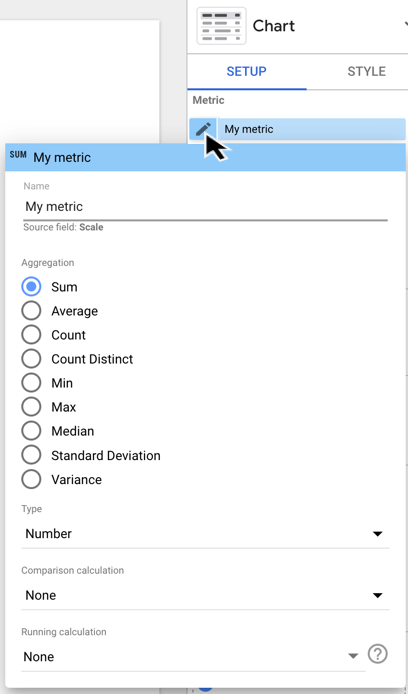
- Edit your report .
- Select a chart.
- In the Propertiespanel, select the SETUPtab.
- Choose a metric and click the edit option.
- Click the Comparison calculationmenu, and then select a comparison.
- To display the base value of the metric, change the Comparison calculationselection to None.
Compare to total
You can compare each row of data to the overall total for that field:
- Percent of totalshows the current row's value divided by the column total.
- Difference from totalshows the column total minus the current row's value.
- Percent difference from totalshows the column total minus the current row's value divided by the column total.
For each of these total comparisons, you can also select Ignore canvas filters in totalto compute the total value without applying viewer-applied filters, such as controls . Total rows still include filter properties .
Example
The following table shows the results of applying different "compare to total" options to the Order valuefield.This lets you evaluate each order's contribution to overall sales.
| Item | Quantity sold | Order value | Percent of total | Difference from total | Percent difference from total |
|---|---|---|---|---|---|
|
Pretty Bird Bird Seed
|
20 |
31.96 | 12.79% | -217.85 | -87.21% |
|
Healthy Dog Dog Food
|
16 | 79.96 | 32.01% | -169.85 | -67.99% |
|
Playful Puppy Toy
|
11 | 17.97 | 7.19% | -231.84 | -92.81% |
|
Parrot Perch
|
8 | 74.97 | 30.01% | -174.84 | -69.99% |
|
Happy Cat Catnip
|
4 | 14.97 | 5.99% | -234.84 | -94.01% |
|
Hungry Kitty Cat Food
|
3 | 29.98 | 12% | -219.83 | 88% |
|
Grand total
|
62 | 249.81 | 100% | 0 | 0% |
Compare to max
You can compare each row of data to the maximum value for that field:
- Percent of maxshows the current row's value divided by the maximum value.
- Difference from maxshows the current row's value minus the maximum value.
- Percent difference from maxshows the current row's value minus the maximum value divided by the maximum value.
Example
The following table shows the results of applying different "compare to max" options to the Order valuefield. This lets you see how each order compares to the maximum order.
| Hungry Kitty Cat Food | 3 | 29.98 | 37.49% | -49.98 | -62.51% |
|---|
Relative comparison
When your chart includes a comparison date range, you can apply the comparison function to either the base data or to the corresponding comparison date range.
For example, consider a time series chart that compares the current 28 days to the previous 28 days. The maximum value of Sessionsfor the current period was 1,947 on June 26. The maximum value of Sessionsfor the previous period was 1,571 on June 4.
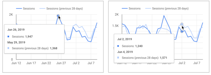
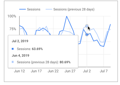
If you apply the Percent of maxfunction relative to base data, then every data point for the previous period will be divided by the maximum value of the current period (1,947). For the data point on June 4, the Percent of maxrelative to base data would be: 1571/1947 = 80.69%.
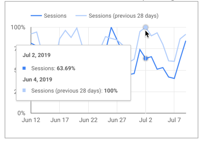
If you instead apply the Percent of maxfunction relative to corresponding data, then every data point for the previous period will be divided by the maximum value of the previous period (1,571). For the data point on June 4, the Percent of maxrelative to corresponding data would be: 1571/1571 = 100%.
Apply running calculations
Running calculations compute summary results across a collection of values. Running calculations return a value for each row of input, expressing that row's relation to the collection as a whole.
The following example shows the application of two running calculations to the Usersmetric:
- Running sum
- Running delta
Example
| Date | Source | Users | Running sum of users | Running delta of users |
|---|---|---|---|---|
|
May 7, 2018
|
1,400 | 1,400 | 1,400 | |
|
May 8, 2018
|
1,856 | 3,256 | 456 | |
|
May 9, 2018
|
1,748 | 5,004 | -108 | |
|
May 10, 2018
|
2,046 | 7,050 | 298 | |
|
May 11, 2018
|
1,497 | 8,547 | -549 | |
|
May 12, 2018
|
1,094 | 9,641 | -403 |
See a demonstration report here.
Looker Studio supports the following running calculations:
- Running sum
- Running average
- Running min
- Running max
- Running count
- Running delta
- Running percentage delta
To apply a running calculation
- Edit your report .
-
Select a chart. 3. In the Propertiespanel, select the SETUPtab.
-
Add a metric to chart, and then click the edit option.
-
Click the Running calculationmenu, and select a function.
-
To remove a running calculation, change the Running calculationoption to None.
To display the original metric and the metric comparison or running calculation in the same chart, add a second instance of the original metric by dragging it from the Available Fieldspanel. (You can't add a duplicate field using the metric or dimension picker.)
Differences between running calculations and calculated fields
Calculated fields work on the data in your charts on a row-by-row basis. Running calculations work across rows, making it easy to show complex data relationships without having to code custom SQL queries in your dataset. Such queries would be difficult if not impossible to replicate in a calculated field in your data source.
However, unlike with calculated fields, you can't edit the formulas of running calculations.
Limitations of comparison metrics
The Group others option is not compatible with comparison metrics. To use comparison metrics on a chart, disable the Group othersoption.