

Note:The Community Visualization feature is in Developer Preview. To learn more about upcoming features and improvements during this period, visit the Developer Preview page.
Data and style options for a community visualization are defined in a config
JSON. The data
configuration sets the number of dimensions and metrics that the
visualization supports. The style
configuration defines the style selectors that are
available in the properties panel.
Data configuration
The data
configuration defines the DIMENSION
and METRIC
elements that
Data Studio renders in the properties panel. Each element corresponds to dimension and
element fields that the user provides as inputs to the visualization.
The following shows a sample data element:
  {

 "id"
 :

 "twoDimensionsPlease"
 ,

 "label"
 :

 "Dimension Element Heading"
 ,

 "type"
 :

 "DIMENSION"
 ,

 "options"
 :

 {

 "min"
 :

 2
 ,

 "max"
 :

 2
 ,

 }
 }
The id
that you define in the data element is included in the information that
Data Studio responds with. The label
defines the text that users see above the
data section, and the type
defines whether it is a dimension or metric. The options
object defines the minimum and maximum number of fields that a user can add
to the data element.
In a DIMENSION
data element, the options
object supports an optional supportedTypes
key. If this key is defined, Data Studio constrains the type of dimension
fields that can be added to the element. The value of supportedTypes
is an
array that can contain any combination of "DEFAULT", "TIME", and "GEO".
A data section groups multiple data elements. Data Studio renders the label
as a heading for multiple data elements.
The following shows a sample data section:
  {

 "id"
 :

 "dimensionSection1"
 ,

 "label"
 :

 "Dimension Section Heading"
 ,

 "elements"
 :
 [

 // array of data elements

 ]
 }
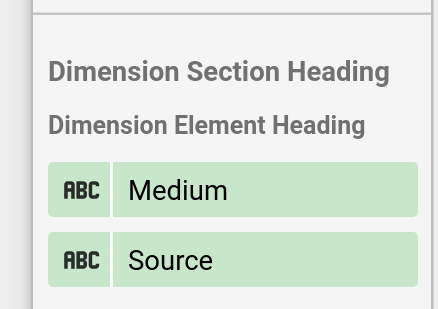
This image shows how Data Studio renders the data section and data element that were shown previously:
Style configuration
The style configuration defines the style selectors that are rendered in the properties panel.
The following shows a sample style element:
  {

 "id"
 :

 "linkOpacity"
 ,

 "label"
 :

 "Link opacity"
 ,

 "type"
 :

 "OPACITY"
 ,

 "defaultValue"
 :

 "0.2"
 }
The label
defines the text that users see as a tooltip, and the type
defines
the kind of style selector that Data Studio renders. Optionally, defaultValue
defines a default value for each style element.
Similarly to data elements, style elements are defined inside sections, which provide headings and logical groupings. To see the full list of available selectors, see the config reference .
The following shows a sample style section:
  {

 "id"
 :

 "styleGroup1"
 ,

 "label"
 :

 "Header for style group"
 ,

 "elements"
 :

 [

 // insert Style Elements here

 ]
 }
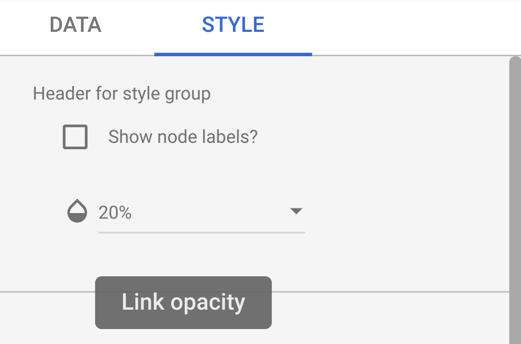
The following image shows an example of a style panel with an opacity
selector, with the tooltip "Link Opacity" corresponding to the label
in the
style element.
Interaction configuration
The interaction
configuration defines how chart interactions
work for a
community visualization. This configuration is optional.
Example:
 {
  "id": "onClick",
  "supportedActions": ["FILTER"]
}
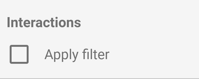
Only FILTER
is supported. If you configure interactions, a checkbox
shows up in the properties panel.
Features configuration
The features
configuration can turn on or off various features in your
community visualization. This section is optional. A list of features can be
found in the config reference
.
The following is an example of a features
configuration:
 "features": {
    "enableComparisonDateRange": true
  }
Example
To see an example of a visualization config, see the sample config .
Next steps
Once you have defined your config, write the visualization .