

Page Summary
-
Widgets are UI elements that provide structure, information, and actions within Google Workspace add-ons.
-
There are three main widget categories: structural, informational, and user interaction widgets, each with various specific widget types.
-
Cards, sections, and headers are structural widgets used to organize and contain other widgets, supporting navigation and layout functionalities.
-
Informational widgets like images, decorated text, and paragraphs present data to the user, supporting HTML formatting for enhanced visual representation.
-
User interaction widgets enable user input and actions, triggering responses like opening links, running functions, or displaying new content through elements like buttons, input fields, and selection inputs.
A widget is a UI element that provides one or more of the following:
- Structure for other widgetssuch as cards and sections,
- Information to the usersuch as text and images, or
- Affordances for actionsuch as buttons, text input fields, or checkboxes.
Sets of widgets added to card sections define the overall add-on UI. Widgets have the same appearance and function on both web and mobile devices. The reference documentation describes several methods for building widget sets.
Widget types
Add-on widgets are generally categorized into three groups: structural widgets, informational widgets, and user interaction widgets.
Structural widgets
Structural widgets provide containers and organization for the other widgets used in the UI.
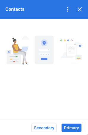
- Button set : A collection of one or more text or image buttons, grouped together in a horizontal row.
- Card : A single context card that contains one or more card sections. Define how users move between cards by configuring card navigation .
- Card header : The header for a given card. Card headers can have titles, subtitles, and an image. Card actions and universal actions appear in the card header if used.
- Card section : A collected group of widgets, divided from other card sections by a horizontal rule and optionally having a section header. Each card must have at least one card section. You can't add cards or card headers to a card section.

When you add a widget to one of the containers, you create and add a copy of that widget. If you change the widget after adding it, the change isn't reflected in the interface. Ensure the widget is complete before adding it. If you need to change a widget after adding it, rebuild the entire card section or card. See Construct cards for more details.
In addition to these basic structural widgets, in a Google Workspace add-on you can use the Card service to create structures that overlap the current card: fixed footers and peek cards :
Fixed footer
You can add a fixed row of buttons to the bottom of your card. This row doesn't move or scroll with the rest of the card content.
The following code excerpt shows how to define an example fixed footer and add it to a card:
  var

 fixedFooter

 =

 CardService
 .
 newFixedFooter
 ()

 .
 setPrimaryButton
 (

 CardService
 .
 newTextButton
 ()

 .
 setText
 (
 "Primary"
 )

 .
 setOpenLink
 (
 CardService
 .
 newOpenLink
 ()

 .
 setUrl
 (
 "https://www.google.com"
 )))

 .
 setSecondaryButton
 (

 CardService
 .
 newTextButton
 ()

 .
 setText
 (
 "Secondary"
 )

 .
 setOnClickAction
 (

 CardService
 .
 newAction
 ()

 .
 setFunctionName
 (

 "secondaryCallback"
 )));
 var

 card

 =

 CardService
 .
 newCardBuilder
 ()

 // (...)

 .
 setFixedFooter
 (
 fixedFooter
 )

 .
 build
 ();
Peek card
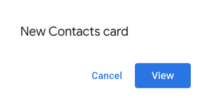
When new contextual content is triggered by a user action, such as opening a Gmail message, you can either display the new contextual content immediately (default behavior) or display a peek card notification at the bottom of the sidebar. If a user clicks Back to return to your homepage while a contextual trigger is active, a peek card appears to help users find the contextual content again.
To display a peek card when new contextual content is available, add .setDisplayStyle(CardService.DisplayStyle.PEEK)
to your CardBuilder
class.
A peek card only appears if a single card object is returned with your
contextual trigger; otherwise, the returned cards replace the current card.
To customize the peek card's header, add the .setPeekCardHeader
method with
a standard CardHeader
object when building your contextual card. By default, a Peek card header
contains only the name of your add-on.
Based on the Cats Google Workspace add-on quickstart , the following code notifies users about new contextual content with a Peek card and customizes the Peek card's header to display the selected Gmail message thread's subject.
  var

 peekHeader

 =

 CardService
 .
 newCardHeader
 ()

 .
 setTitle
 (
 'Contextual Cat'
 )

 .
 setImageUrl
 (
 'https://www.gstatic.com/images/
 icons/material/system/1x/pets_black_48dp.png'
 )

 .
 setSubtitle
 (
 text
 );
 .

 .

 .
 var

 card

 =

 CardService
 .
 newCardBuilder
 ()

 .
 setDisplayStyle
 (
 CardService
 .
 DisplayStyle
 .
 PEEK
 )

 .
 setPeekCardHeader
 (
 peekHeader
 );
Informational widgets
Informational widgets present information to the user.
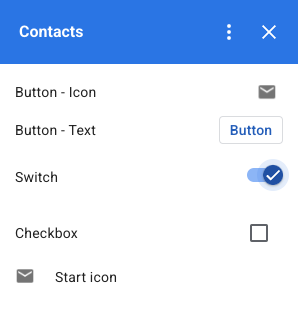
- Image : An image indicated by a hosted and publicly accessible URL.
- DecoratedText : A text content string that you can pair with other elements such as top and bottom labels, and an image or icon. DecoratedText widgets can also include a Button or Switch widget. Added switches can be toggles or checkboxes . The content text can use HTML formatting ; the top and bottom labels must use plain text.
- Text paragraph : A text paragraph, which can include HTML formatted elements.

User interaction widgets
User interaction widgets allow the add-on to respond to user actions. Configure these widgets with action responses to display different cards, open URLs, show notifications, compose draft emails, or run other Apps Script functions. See the Building Interactive Cards guide for details.
- Card action : A menu item placed in the add-on header bar menu. The header bar menu can also contain items defined as universal actions , which appear on every card the add-on defines.
- DateTime pickers : Widgets allow users to select a date, time, or both. See Date and time pickers for more information.
- Image button : A button that uses an image instead of text. Use one of several predefined icons or a publicly hosted image.
- Selection input : An input field that represents a collection of options. Selection input widgets present as checkboxes, radio buttons, or drop-down selection boxes.
- Switch : A toggle widget used with a DecoratedText widget. By default, these display as a toggle switch, but you can display them as a checkbox .
- Text button : A button with a text label. Specify a background color fill for text buttons (the default is transparent). You can also disable the button as needed.
- Text input : A text input field. The widget can have title text, hint text, and multiline text. The widget can trigger actions when the text value changes.
- Grid : A multi-column layout. Represent items with an image, title, subtitle, and customization options such as border and crop styles.


DecoratedText
checkboxes
You can define a DecoratedText
widget that has a checkbox attached, instead of a button or binary toggle
switch. Similar to toggle switches, the value of the checkbox is included in the action event object
passed to the Action
attached
to this DecoratedText
by the setOnClickAction
method.
The following code excerpt shows how to define a checkbox DecoratedText
widget to add to a card:
  var

 decoratedText

 =

 CardService
 .
 newDecoratedText
 ()

 // (...)

 .
 setSwitch
 (
 CardService
 .
 newSwitch
 ()

 .
 setFieldName
 (
 'form_input_switch_key'
 )

 .
 setValue
 (
 'switch_is_on'
 )

 .
 setControlType
 (

 CardService
 .
 SwitchControlType
 .
 CHECK_BOX
 ));
Date and time pickers
Define widgets that allow users to select a time, date, or both. Use setOnChangeAction
to assign a widget handler function to execute when the
value of the picker changes.
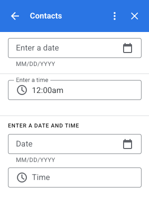
The following code excerpt shows how to define a date-only picker, a time-only picker, and a date-time picker to add to a card:
  var

 dateOnlyPicker

 =

 CardService
 .
 newDatePicker
 ()

 .
 setTitle
 (
 "Enter a date"
 )

 .
 setFieldName
 (
 "date_field"
 )

 // Set default value as May 24 2019. Either a

 // number or string is acceptable.

 .
 setValueInMsSinceEpoch
 (
 1558668600000
 )

 .
 setOnChangeAction
 (
 CardService
 .
 newAction
 ()

 .
 setFunctionName
 (
 "handleDateChange"
 ));
 var

 timeOnlyPicker

 =

 CardService
 .
 newTimePicker
 ()

 .
 setTitle
 (
 "Enter a time"
 )

 .
 setFieldName
 (
 "time_field"
 )

 // Set default value as 23:30.

 .
 setHours
 (
 23
 )

 .
 setMinutes
 (
 30
 )

 .
 setOnChangeAction
 (
 CardService
 .
 newAction
 ()

 .
 setFunctionName
 (
 "handleTimeChange"
 ));
 var

 dateTimePicker

 =

 CardService
 .
 newDateTimePicker
 ()

 .
 setTitle
 (
 "Enter a date and time"
 )

 .
 setFieldName
 (
 "date_time_field"
 )

 // Set default value as May 24 2019 03:30 AM UTC.

 // Either a number or string is acceptable.

 .
 setValueInMsSinceEpoch
 (
 1558668600000
 )

 // EDT time is 4 hours behind UTC.

 .
 setTimeZoneOffsetInMins
 (
 -
 4

 *

 60
 )

 .
 setOnChangeAction
 (
 CardService
 .
 newAction
 ()

 .
 setFunctionName
 (
 "handleDateTimeChange"
 ));
The following is an example of a date-time picker widget handler function. This
handler formats and logs a string representing the date-time chosen by the user
in a date-time picker widget with the ID myDateTimePickerWidgetID
:
  function

 handleDateTimeChange
 (
 event
 )

 {

 var

 dateTimeInput

 =

 event
 .
 commonEventObject
 .
 formInputs
 [
 "myDateTimePickerWidgetID"
 ];

 var

 msSinceEpoch

 =

 dateTimeInput
 .
 msSinceEpoch
 ;

 var

 hasDate

 =

 dateTimeInput
 .
 hasDate
 ;

 var

 hasTime

 =

 dateTimeInput
 .
 hadTime
 ;

 // The following requires you to configure the add-on to read user locale

 // and timezone.

 // See:

 // https://developers.google.com/workspace/add-ons/how-tos/access-user-locale

 var

 userTimezoneId

 =

 event
 .
 userTimezone
 .
 id
 ;

 // Format and log the date-time selected using the user's timezone.

 var

 formattedDateTime
 ;

 if

 (
 hasDate
 &&
 hasTime
 )

 {

 formattedDateTime

 =

 Utilities
 .
 formatDate
 (

 new

 Date
 (
 msSinceEpoch
 ),

 userTimezoneId
 ,

 "yyy/MM/dd hh:mm:ss"
 );

 }

 else

 if

 (
 hasDate
 )

 {

 formattedDateTime

 =

 Utilities
 .
 formatDate
 (

 new

 Date
 (
 msSinceEpoch
 ),

 userTimezoneId
 ,

 "yyy/MM/dd"
 )

 +

 ", Time unspecified"
 ;

 }

 else

 if

 (
 hasTime
 )

 {

 formattedDateTime

 =

 "Date unspecified, "

 +

 Utilities
 .
 formatDate
 (

 new

 Date
 (
 msSinceEpoch
 ),

 userTimezoneId
 ,

 "hh:mm a"
 );

 }

 if

 (
 formattedDateTime
 )

 {

 console
 .
 log
 (
 formattedDateTime
 );

 }
 }
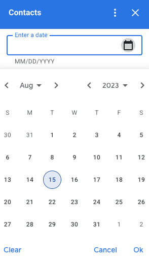
The following table shows examples of the picker selection UIs on desktop and mobile devices. When selected, the date picker opens a month-based calendar UI to allow the user to select a new date.
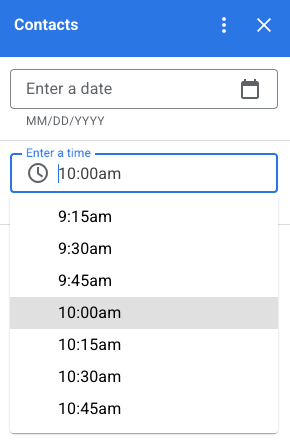
When the user selects the time picker on desktop devices, a drop-down menu opens with a list of times separated in 30 minute increments. The user can also type in a specific time. On mobile devices, selecting a time picker opens the built-in mobile "clock" time picker.
| Desktop | Mobile |
|---|---|
 |
 |
 |
 |
Grid
Display items in a multi-column layout with the grid widget. Each item can display an image, title, and subtitle. Use additional configuration options to set the positioning of text relative to the image in a grid item.
Configure a grid item with an identifier that's returned as a parameter to the action defined on the grid.

  var

 gridItem

 =

 CardService
 .
 newGridItem
 ()

 .
 setIdentifier
 (
 "item_001"
 )

 .
 setTitle
 (
 "Lucian R."
 )

 .
 setSubtitle
 (
 "Chief Information Officer"
 )

 .
 setImage
 (
 imageComponent
 );
 var

 cropStyle

 =

 CardService
 .
 newImageCropStyle
 ()

 .
 setImageCropType
 (
 CardService
 .
 ImageCropType
 .
 RECTANGLE_4_3
 );
 var

 imageComponent

 =

 CardService
 .
 newImageComponent
 ()

 .
 setImageUrl
 (
 "https://developers.google.com/workspace/
 images/cymbal/people/person1.jpeg"
 )

 .
 setCropStyle
 (
 cropStyle
 )
 var

 grid

 =

 CardService
 .
 newGrid
 ()

 .
 setTitle
 (
 "Recently viewed"
 )

 .
 addItem
 (
 gridItem
 )

 .
 setNumColumns
 (
 2
 )

 .
 setOnClickAction
 (
 CardService
 .
 newAction
 ()

 .
 setFunctionName
 (
 "handleGridItemClick"
 ));
Text formatting
Some text-based widgets support basic text HTML formatting. When setting the text content of these widgets, include the corresponding HTML tags.
The supported tags and their purpose are shown in the following table:
| Format | Example | Rendered result |
|---|---|---|
|
Bold
|
"This is <b>bold</b>."
|
This is bold . |
|
Italics
|
"This is <i>italics</i>."
|
This is italics . |
|
Underline
|
"This is <u>underline</u>."
|
This is underline . |
|
Strikethrough
|
"This is <s>strikethrough</s>."
|
This is |
|
Font color
|
"This is <font color=\"#FF0000\">red font</font>."
|
This is red font . |
|
Hyperlink
|
"This is a <a href=\"https://www.google.com\">hyperlink</a>."
|
This is a hyperlink . |
|
Time
|
"This is a time format: <time>2023-02-16 15:00</time>."
|
This is a time format: . |
|
Newline
|
"This is the first line. <br> This is a new line.
" |
This is the first line. This is a new line. |