Item logo image for Responsive Tester

Responsive Tester

https://test-responsive.freefinancetools.net/
Featured
3.2 (

85 ratings

)
Item media 1 (screenshot) for Responsive Tester
Item media 2 (screenshot) for Responsive Tester

Overview

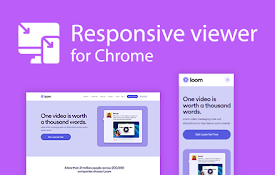
Test responsive web designs or mobile pages and see if it is mobile friendly

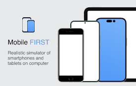
Test responsive web designs or mobile pages that detect specific user agents. Test multiple devices at the same time! The Mobile/Responsive Tester extension allows Developers to test their web pages against common mobile, phablet and tablet devices by emulating the user agent and screen resolution. Excellent for testing responsive web designs. Easily switch between portrait and landscape mode and test multiple mobile device's at the same time! To begin using the software, install our extension. Navigate to the webpage you wish to test for different resolution sizes. Click on our software extension icon, and then choose the resolution size.

3.2 out of 5 85 ratings

Learn more about results and reviews.

Details

  • Version
    3.0.0
  • Updated
    November 15, 2023
  • Size
    82.41KiB
  • Languages
    38 languages
  • Developer
    Website
    Email
    cedric.anguilar2020@gmail.com
  • Non-trader
    This developer has not identified itself as a trader. For consumers in the European Union, please note that consumer rights do not apply to contracts between you and this developer.

Privacy

The developer has disclosed that it will not collect or use your data.

This developer declares that your data is

  • Not being sold to third parties, outside of the approved use cases
  • Not being used or transferred for purposes that are unrelated to the item's core functionality
  • Not being used or transferred to determine creditworthiness or for lending purposes

Related

Page Ruler

3.9

Measure page elements size in pixel with an easy-to-use ruler.

Website Responsiveness Checker

3.8

Optimize your website for all devices with website responsiveness checker

Breeze: Website Management Tool

3.4

All-in-one tools for website migration project, operating website and SEO tools.

Window Resizer

4.3

Resize the browser window to emulate various screen resolutions.

Mobile simulator - responsive testing tool

4.9

Smartphone and tablet simulator on computer with several models to test mobile responsive websites.

Responsive Viewer

4.2

Show multiple screens once, Responsive design tester

Viewport Resizer: Ultimate Device Emulator & Website Testing Tool

4.2

Emulate devices, resize screens, and perfect your web design effortlessly with this cutting-edge testing and presentation tool.

Mobile View: Test responsive designs fast

4.4

Test your responsive designs on multiple devices at once.

Responsive Website Testing Toolkit - Multiple Viewport Simulator

3.8

An essential tool to test the responsiveness of any website on multiple screens simultaneously

CSS Peeper

4.3

Inspect website styles in seconds. Supercharge your workflow, and save hours of work.

Pixefy - Responsive Design Checker

4.7

Preview and debug your website’s responsiveness across multiple devices in real-time, all inside one browser tab.

Responsive viewer For Chrome

3.9

View multiple screens simultaneously With Responsive viewer For Chrome

Page Ruler

3.9

Measure page elements size in pixel with an easy-to-use ruler.

Website Responsiveness Checker

3.8

Optimize your website for all devices with website responsiveness checker

Breeze: Website Management Tool

3.4

All-in-one tools for website migration project, operating website and SEO tools.

Window Resizer

4.3

Resize the browser window to emulate various screen resolutions.

Mobile simulator - responsive testing tool

4.9

Smartphone and tablet simulator on computer with several models to test mobile responsive websites.

Responsive Viewer

4.2

Show multiple screens once, Responsive design tester

Viewport Resizer: Ultimate Device Emulator & Website Testing Tool

4.2

Emulate devices, resize screens, and perfect your web design effortlessly with this cutting-edge testing and presentation tool.

Mobile View: Test responsive designs fast

4.4

Test your responsive designs on multiple devices at once.

Google apps
Design a Mobile Site
View Site in Mobile | Classic
Share by: