[study(研究)] カテゴリの記事
全40件 (40件中 1-40件目)
1
-
背景画像を作成する(壁面)
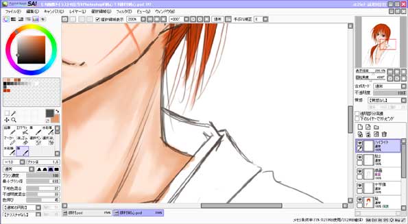
久しぶりに「研究&実験」です。昨日の記事の背景イラストは Photoshop6.0J と SAI を併用しています。SAIで描いている部分も多いですが、一部 Photoshop でパターンを作成し、テクスチャとして貼り付けている部分があります。■ 主な使用テクスチャ&パーツ ■ ←レンガっぽいもの ←岩のテクスチャ壁面に使ったのは左のようなレンガ画像。(実際の背景イラストに使ったのはこれよりもう少し丁寧に作りこんだものです)岩のテクスチャは、主に建物の角の石パーツに使用しています。(背景イラストに使ったレンガパーツを作るのにも使用しました。)■ 壁面を作る。 ■1、適当にSAIで塗ってみます。色ムラがあったほうがそれっぽく見えるので、エアブラシではなく筆ツールなどで塗ります。2、消しゴムツールで壁のはがれた部分を作ります。これもかなり適当で、キレイに消さず、がたがたした感じにしてみる。3、データをフォトショに移し、レンガのパーツをはめ込む。4、壁面とレンガのレイヤーをリンクしてから変形させる。※赤○部分をクリックするとリンクできます。5、データを再びSAIに戻し、レイヤのリンクを切り、レンガのレイヤーの位置を調整。ハイライトや影を入れてみる。6、またフォトショにデータを移し、壁とレンガのレイヤーを統合。そしてレイヤーコピーして、「カットアウトフィルタ」を適用。(設定数値や画像解像度により効果が違うので調整して下さい。)フィルタ効果をかけたレイヤーの不透明度をいじって元のレイヤが透けるように調整。簡単に説明するとこんな感じにしてました。この手順をもう少し細かく丁寧に作業して、ぼかしたりいろいろごまかしたりする、と。壁の厚さの表現って難しいですね。 ∩___∩ |\\ \\ / \\ \\ |\ \∩___∩ 彡、\ | ノ ヽ 厚さを表現!/ \ / ● ● | ( \ | ( _● ∩___∩ |\\ 彡、 |∪| |\\ \\ | \\/ __ ヽノ/ \\ \\ | \(___) |\ \∩___∩ ∪ | 彡、\ | ノ ヽ \ | /\/ \ / ● ● | !? \ | / ( \ | ( _●_) ミ \∪ |\\ 彡、 |∪| 、`\ | \\/ __ ヽノ /´> ) | (___) / (_/ ∪ | / \ | /\ \ \ | /\ ) ) \∪ \( \ \_) ●『研究&実験』へもどる●●『イラスト』へ●●『ぬりえ』へ●●『ゲーム』へ●
2007.07.11
コメント(12)
-
水の表現
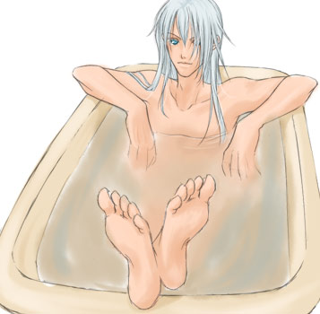
水の表現方法は?と尋ねられ…。思いっきり独学で適当にやっていたので、私のやり方はあまり正しくないかもしれませんよ?昨日の薔薇風呂に身を沈めるジャスパーに思いのほか素敵反応が返ってきて、とても嬉しいです。さてさて本題ですが、水の表現。色の無いものの表現ってのは難しいですね。昨日のは実際のところ水面に浮かせた薔薇の花弁でごまかしている部分が大きいです。 ←花びらを撤去するとこんな感じです。コツといえるようなたいしたものはありませんが、あえて言うならば水の縁に微かではありますがハイライトがきていることくらいでしょうか。白く縁取りすると、透明な何かがあるんだなと錯覚したりするようです。 ※浴槽との境目、キャラの胸のあたり等。ちなみに今回の使用ツールはSAIの筆ツールのみ。らくがきで終わらせるつもりだったので、はみ出しを気にせず筆ツールで塗装。どうも筆ツールではみ出しを気にせずざくざく塗ったほうが手塗りっぽい感じになって、自分的に好きな雰囲気になることが判明。レイヤー構成は、上から順に●ハイライト●線画●髪●目●バラ(主線があるほう)●バラ(ぼかしてあるほう)●湯●肌●バスタブとなっています。おそらく期間限定なデータダウンロードはこちらから。
2007.03.08
コメント(4)
-
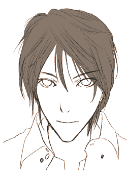
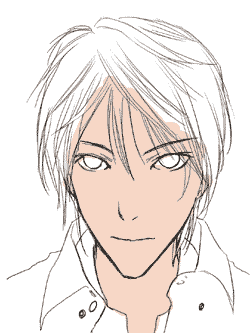
線画の加工をしてみる
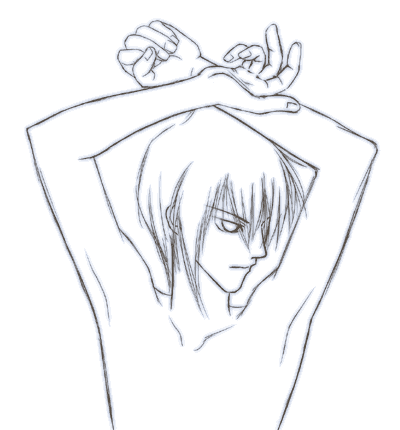
書く前から記事の内容が決まっているって楽でよいですね。今回は質問のあった線画加工の方法。つまり、左の画像のような加工なのですが…。やり方はいくつもあるのですが、今回記事にするのはその中でもかなり簡単と思われる方法です。なんだかイヤンなポーズですねorz斜め下を向いた顔と、腕と手を描く練習なんぞをしておりました。難しいナリ。□ レイヤースタイルを使用する その1 □まずはコレをダウンロードしてください。ダウンロードしたファイルはzip形式で圧縮されていますので、右クリック、『すべて展開』を選択し、展開します。Photoshopの、おそらく右上あたりに左図のようなカラー、色見本、スタイル、というウィンドウがあると思われますので、その『スタイル』という部分をクリックした後、赤○部分をクリック、『スタイルの読み込み』もしくは『スタイルの置き換え』を選択し、展開したASLファイルを読み込みます。あとは出てきたアイコンをクリック。ぼかし具合の調整をして、完成です。※ぼかし具合の調整についてスタイルを適用したレイヤーで右クリックすると、一番下あたりに『効果を拡大・縮小』というものがありますので、それを選択して微調整してください。□ レイヤースタイルを使用する その2 □上記のレイヤースタイルを自分で作る方法です。『レイヤー』→『レイヤースタイル』→『レイヤー効果』(ドロップシャドウ)を選択。左図のようなウィンドウが表示されます。ポイントは赤○部分。『距離』の数値をゼロにすることです。描画モードを『通常』不透明度を『50%』距離を『0px』あとは画質の『輪郭』を変更しています。『描画モード』の右側にある色のついている四角形をクリックして色を変更したりもできます。■おだ真紀にメールで問い質す■(匿名可)●『研究&実験』へもどる●●『イラスト』へ●●『ぬりえ』へ●●『ゲーム』へ●
2007.03.01
コメント(4)
-
『イラスト実験&研究』ページ更新。
『研究&実験』ページを更新しました。ずいぶんサボってたせいで、まるでページ大改装です。だいぶ追加しました。研究&実験テーマ:『イラストの練習・研究・実験。』イラストの練習していて思ったこと、偶然の産物なちょっとした発見、実験メモなどを書き綴るページです。初級編 - これからCGを始める方へ -イラストを描くために 線画の抽出方法、あと周辺機器のこと。 ペンタブもスキャナも無くたってパソコンで絵は描ける。レイヤーの話 これを知っているのと知らないのとでは大違い。ツールの話 Photoshopの便利なツールについて。『ショートカットキー』について。ラフ画から線画へ 線画が描かれるまでの工程線画を整える 『ペン入れ』みたいなもの。主線の色の話 主線の色の調節マスクの話 はみ出さないように塗る方法無料で使用できるソフト編 - お金をかけずにCGをやりたい方へ -スキャナもペンタブも無い場合 線画の抽出方法、あと周辺機器のこと。 ペンタブもスキャナも無くたってパソコンで絵は描ける。ペイントツール(ソフト)の話 無料お試し版ペイントツール『SAI』を使った感想無料で使えるペイントツール(ソフト)を手に入れる無料で使えるペイントツール(ソフト)を手に入れる・その2描き方研究 - おだ真紀的イラスト -● 描く手順 ●顔を描く● 主線 ●主線の色を変える● 塗る ●肌を塗る髪を塗る Photoshopバージョン髪を塗る2 SAIバージョン● レイヤー ●レイヤーの順序、別け方● 各パーツの描き方実験 ●ファーの描き方● 陰影 ●陰影のこと その1陰影のこと その2● 背景画像作成 & 最終的な画像加工 ●色調補正で色を変えるキャラの周りに光って浮かぶ文字キャラの周囲を白くぼかす キャラの周囲を白くぼかす・追記近未来風な壁の背景?フィルタ機能を使う背景(photoshop)● 修正 ●イラストの修正・ちょっとした手直し● オエビ(P-Bbs)関連 ●オエビ(お絵かきBBS)のことオエビで筆圧感知機能を追加オエビで塗り絵 線画をアップロードして使用する● 補足 ●ブラシのこと(Photoshop)GIFアニメ作成(Photoshop) つづき● ちょっとしたメモ ●キャラの年齢による描き方の差いろいろな角度で描いてみるちょっとこだわってみる唇の影ずいぶん書き散らしたなぁ…。●『研究&実験』へ●●『イラスト』へ●●『ぬりえ』へ●●『ゲーム』へ●
2007.02.25
コメント(2)
-
キャラの年齢による描き方の差
描き分けって難しい…orz最近ようやく少しだけできるようになってきたけれど、難しいです。顔を面長にすれば大人に、目ぇでっかく描けば子供なイメージに、となるはずなんだけど、バランス難しいナリ。以前は目でかく描く絵柄だったためか大人が描けなかったのだけど、今の絵柄に慣れたら今度は子供が描けないよ~!縦横比率の調整ムズカシス。●『研究&実験』へもどる●●『イラスト』へ●●『ぬりえ』へ●●『ゲーム』へ●
2007.02.25
コメント(2)
-
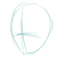
描く手順
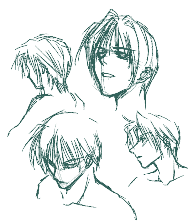
みなさんどんな手順で、どこから描き始めますか。おだ真紀は完全独学なので、もしかしたら自分変なことしてるかもしれない、と不安です。何か指摘くれ。ちなみにアタリの段階から全部SAIの画面上で行っています。紙に描くのは不得手です。1、アタリを入れる逆さになった卵型にアタリを入れています。ついでに顔の向きを決めるため、十字状に線を入れます。2、鼻を描く鼻の位置を決めて、描き入れます。最初に入れた十字の交わる辺りから線を引いています。3、目を描く目を描きます。大抵は鼻と線が繋がったほうの目から。今回の場合は右目。4、輪郭を描く顔の輪郭を描き入れます。アゴを描くのが最近とても楽しいです。5、口を描く唇の形を考えつつ、テキトーに描く。最初に描いた十字のタテ線を中心線として考慮。6、耳を描くだいたい目を描いたのと同じくらいの高さに耳を描くため、最初に描いた十字の横線を耳の上部分にしています。7、邪魔な線を消す最初に描いた十字が、そろそろ邪魔になってくるので消去します。8、前髪を描くこの時点でようやく別レイヤーを作成。髪のみ別レイヤーで描きます。9、頭部を描く頭蓋骨の形状を考慮しつつ、描く。髪型に惑わされないように気をつけてはいるけれど、逆立った髪のキャラは苦手です。とりあえずこんな感じで描いてたりするわけですが…。 ■おだ真紀にメールで問い質す■(匿名可)●『研究&実験』へもどる●●『イラスト』へ●●『ぬりえ』へ●
2007.02.22
コメント(6)
-
背景・文字を浮かせる
この文字加工、やたら簡単なのでよく使ってしまいます。よく見たら、かなりの頻度で使用していましたorz 左側2つはクリックすると大きなサイズで見ることができます。CGならではですね。こういう加工こそ得意とするところですから♪ちなみに使用ソフトはPhotoshop■1、文字列を入力する■まずは『ファイル』『新規作成』で、別パーツとして作成します。文字ツールを使ってとりあえず好きなフォントで好きな文字列を入力します。色も適当です。■2、文字列を変形させる■文字列を変形させます。画面上部に左図のようなアイコンがありますので、クリックしてみてください。クリックすると、左下図のような「ワープテキスト」ウィンドウがでてきます。スタイルを『円弧』に変え、また『カーブを+100%』にしておきます。 ■3、レイヤーをコピーする■2で作成した文字列のレイヤーをコピーし、180度回転させてます。2のレイヤーと3のレイヤーをきれいに並べてみます。これで文字の環ができました。■4、変形■文字のレイヤーを統合し、楕円というか、とにかく変形させてみます。これで完成。●『研究&実験』へもどる●
2007.02.20
コメント(4)
-
背景画像を作る
ド忘れ防止用にメモ。先日のイラストの背景作成手順。1、雲模様『フィルター』→『描画』→『雲模様1』※次の作業へ移る前に、作成した雲模様のレイヤーをコピーしておく。2、グラフィックペン『フィルター』→『スケッチ』→『グラフィックペン』※ストロークの方向は「縦」にしておく。3、ぼかし(ガウス)『フィルター』→『ぼかし』→『ぼかし(ガウス)』4、水彩画フィルタ『フィルター』→『アーティスティック』→『水彩画』※数値の上下動で様子がかなり変わるのでr、それは適宜調整。このあとこのレイヤーを色調補正して明度を上げてみたり。5、各種調整一番最初の『雲模様1』のレイヤーのコピーを一番上に移動。不透明度を調整して完成。●『研究&実験』へもどる●
2007.02.12
コメント(0)
-
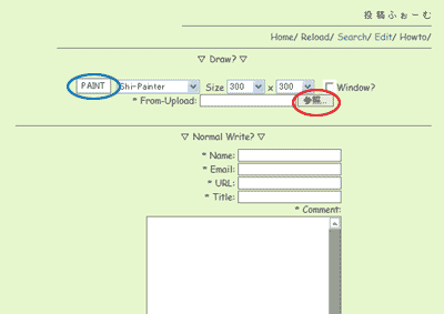
オエビで塗り絵。
オエビで塗り絵をする方法。(※アプレットはしぃペインター・プロ版)以前のバージョンのままでは使えなかったレイヤー機能を活かして塗り絵をば。新しいバージョンのしぃペインターをアップロードしてみて、すごくイイなと思いました。1、画像アップロードまずは画像のアップロード。たぶんおそらくどこのでもほとんど同じような機能があると思います。画像アップロード機能を探してみてください。Oebitさんのオエビは確か『Write(通常投稿)ボタン』から可能だったと思います。(記憶不確かでスミマセン。)ウチのオエビの場合は画面右上の『画像アップロード』を選択。アップロード画像から続きを描くのと、そのまま文章とアップロード画像のみ投稿するのを選択できる画面が出ます。そのまま文章とアップロード画像のみ投稿する方法しかないオエビの場合は、一旦投稿して、続きから再び編集することで続きから描けます。ウチのオエビでの場合は、アップロード画像からすぐ続きを描くため、左の画像の赤○から画像を選択し、青○をクリックしてみます。2、線画レイヤーとして使えるようにする画像アップロードされてすぐの、そのままの状態ではおそらく線画レイヤーとして使うことはできません。透けない白い紙の上に描いたような状態になっているので、いくら下にレイヤーを作って塗っても透けて見えないためです。かといって、線画のレイヤーの不透明度を下げただけでは、線画も薄くなって見えづらくなってしまいます。しかし、そこでその素敵機能ですよ。左図のレイヤーウィンドウ(左図右側)の線画レイヤーの上で右クリックすると、レイヤー関連の調整のためのウィンドウ(左図左側)が出てきます。『ノーマル』となっている部分を『乗算』に変えます。ただこれだけです。( *´∀`*)これで、下のレイヤーが透けるようになります。塗り絵楽しいです。●『研究&実験』へもどる●
2007.02.11
コメント(0)
-
ちょっとした小技・追記。
Photoshopのレイヤー効果と同じような効果をもたらすことは無料で使用できるソフトの場合には、可能か否か。とりあえずチャレンジしてみることにしますた。先日の『光彩(外側)』を使ったのと同じような、キャラの周りを白くぼかして浮かせる状態にしたい場合。(右画像参照。)これもSAIで表現可能なようでしたよ~。1、レイヤーを統合する。背景以外のキャラの部分を統合します。SAIでのレイヤー統合の方法は、「ctrl」キーと、「E」の同時押しです。すぐ下に配置されているレイヤーとくっつきます。一気に複数のレイヤーを統合することはできないようなので、地道に一枚づつ統合していきます。2、統合したレイヤーをコピーする。1で統合したレイヤーをコピーします。レイヤーを新規作成するアイコン(左図の点滅している赤○のところ)まで、レイヤーをドラッグすることでコピーができます。3、塗りつぶすコピーしたレイヤーの『透明部分保護』のチェックボックス(左図の緑○部分)にチェックを入れ、明るめの色で塗りつぶします。ついでに合成モードを『スクリーン』に変えておきます。(左図赤○をクリックし、選択。)『不透明度』も70%くらいにしてみたり。4、作成したレイヤーをコピーしまくるこのレイヤーを4~6枚ほどコピーし、1pixelずつ左右上下にずらしてみたりします。どうでしょうか。ここまででとりあえず似た感じにはできたと思うのですが。本当は4の段階でレイヤーにぼかし効果を入れたかったのですが、SAIにはそういった機能が無いようだったので断念。ごまかす感じでレイヤーをたくさんコピーしてずらすという案を採用しました。他のソフトでレイヤーにぼかしを入れられるようであれば、そのソフトも併用してみてもよいかもしれません。■おだ真紀にメールで問い質す■(匿名可)●『研究&実験』へもどる●今日は眠いのでこれでオワリ。コメントレスなどは後日します。ゴメンナサイ。
2007.02.02
コメント(4)
-
ちょっとした小技。
pink+nutsさんのコメントにあったし、そしてネタも無かったことですし、ちょうどいいのでちょっと記事にしてみました。背景色が濃くてキャラが埋もれてしまいそうなときについやってしまうこと。お手軽なので、よく左のように、キャラの周りを白っぽくしてみたりします。これでちょっとだけキャラが浮き立って見えるので、かなりお役立ち。大好きです。これは Photoshop のレイヤースタイル機能の一つです。今回使用したのは『レイヤー』 → 『レイヤースタイル』 → 『光彩(外側)』のみです。ちょっとまえに「レイヤースタイル」について軽く触れましたが、この機能をつかうとかなり面白い加工もできるようになるのではないかと思います。 左のようなウィンドウが表示されます。いろいろな加工が可能です。いやはや、楽しいですね。●『研究&実験』へもどる●■おだ真紀にメール送って問い質す■(匿名可)
2007.02.01
コメント(4)
-
すごいものをインストールしてしまった!!
オエビで筆圧感知できるなんて知りませんでしたーーーーー!!!キタ━━━ヽ(∀゚ )人(゚∀゚)人( ゚∀)人(∀゚ )人(゚∀゚)人( ゚∀)ノ━━━ !!! すごいです。興奮です…!まずはsketch studioさんのサイトに行って JTabletSetup v0.9.2 というファイルをダウンロード&インストール。その後、しぃペの使えるお絵描き画面を開き、キャンバス(絵描くところです)の右上(スクロールバーの上)に、[P] というボタンがあるのでそれをクリック。すると、「tablet.」というツールボックスがでてきます♪上下2段の妙なツールボックスですが、コイツを両方クリックしてONにしてやると…!オエビでもペンタブレットの筆圧感知機能が使えるのです!!!!ヒャッホウ!! ,r=''""゙゙゙li, _,、r=====、、,,_ ,r!' ...::;il! ,r!'゙゙´ `'ヾ;、, ..::::;r!'゙ ,i{゙‐'_,,_ :l}..::;r!゙ . ,r!'゙´ ´-ー‐‐==、;;;:.... :;l!:;r゙ ,rジ ` ̄''=;;:;il!::'li . ill゙ .... .:;ll:::: ゙li ..il' ' ' '‐‐===、;;;;;;;:.... .;;il!:: ,il! グッジョブ!!..ll `"゙''l{::: ,,;r'゙ ..'l! . . . . . . ::l}::;rll(, 'i, ' ' -=====‐ー《:::il::゙ヾ;、 ゙i、 ::li:il:: ゙'\ ゙li、 ..........,,ノ;i!:.... `' 、 ∧_∧ `'=、:::::;;、:、===''ジ゙'==-、、,,,__ `' ( ´Д`) GJ ` ̄''''===''"゙´  ̄`''ー'ー( )y━・~ ̄ くく,, ●『研究&実験』へもどる●
2007.01.27
コメント(0)
-
練習。
いろんな角度で顔を描くって、難しい…。特に下向きが苦手です。重要だってのは解っているのですがねぇ…。なかなか上手く描けません。(´・ω・`)●『研究&実験』へもどる●
2007.01.20
コメント(4)
-
顔を塗るときにさ。
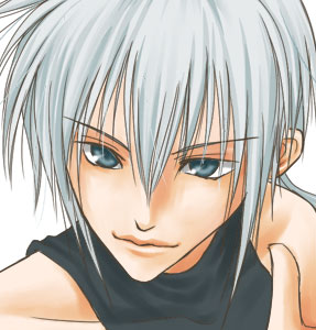
この左のイラストは肌を塗り終わる寸前の状態です。このあと仕上げ作業をするのですが、何が足らないと思いますか?画力が足らんという意見はどこかに置いといてください。答えは、顔に掛かる髪の毛(前髪)の影なのですが…。コレが無いと、おだ真紀的になんだかすごく描き足りない気分にさせてくれます。入れたところで、自己満足でしかないのでしょうけれど、なんとなく入れたいなぁ。そういいつつも、影を入れるにしても、この左イラストともまた違うわけです。この画像の場合、ぼかしつつ影を入れてみました。なんだかすっきりしない気がするんです。やっぱりすっきりくっきりはっきり影入れたい。まぁつまり、こうしたいわけなのですが。コレやるだけで画面がしまる感じがするのですよ。…気のせい?●『研究&実験』へもどる●
2007.01.17
コメント(0)
-

GIFアイコンをつくる。
データの片隅から発掘。 ← すごく小さなジャスパー君を発見しますた。何が入っているやら謎なCD-Rをかたっぱじから開けてみたりしてました。ちょっと前の本館サイトデータのバックアップらしきものから発掘。最近何度かGIFアニメアイコンなんぞを載っけていたりしますが、これらのアイコンを作るのは、それほど難しいことではありません。ドット絵を作成することさえできれば、簡単です。★まずはドット絵。★ドット絵っていうのはつまり、左図のようなもの。イラストとは違って色数少なめにすると良し。データも軽くなります。そのため、くっきりした線が描けるソフトが適しています。描くというより色を置いていくイメージです。線を滑らかにする機能が満載のSAIはドット絵には向いていないようですね。むしろWindows付属の『ペイント』とか、お絵かきBBSの鉛筆ツールなどが向いている感じです。 ※できればGIF形式を扱えるソフトを使うのが無難です。どのソフトを使用するときにも言えることですが、作業画面を思いっきり拡大しつつ作成しましょう。今回は上のドット絵のキャラをまばたきさせたいので、ドット絵データをコピーしてもう1枚、目を閉じた状態のドット絵も作成します。背景が透けて見えるようにするには、アニメの材料である2枚のドット絵の両方とも背景を透過処理する必要があります。使用ソフトによってやり方が違ったりするのでその辺は各自確認してください。★GIFアニメにする。★GIFアニメ作成ソフトを使いましょう。フリーソフトでもたくさんありますし、web上での操作でGIFアニメを作れるCGIもあるようです。↓GIFアニメ工房 (GIFアニメ作成CGI)■Photoshop編■5.5以降のバージョンのPhotoshopをお持ちの場合は、このソフトのみでgifアニメアイコンを作成することが可能です。ドット絵を作成する際は、鉛筆ツールが便利です。根気良く1マスずつ色を置いていきましょう。消しゴムツールも、アンチエイリアスのチェックをはずしておくなど、ちょっと設定をいじっておきましょう。(アンチエイリアスが有効になっていると自動的に境界をぼかされてしまうので。)必要枚数のドット絵のレイヤーを作成したら、ツールバーの一番下をクリックしてImageReadyを起動します。 →参照アニメーションウィンドウで『現在のフレームを複製』を選択。(赤○)レイヤーウィンドウで一番上のレイヤーの表示を非表示に切り替えます。緑の○の部分でマウス右クリックし、それぞれのコマの表示時間を決める。何度かテストしつつ調整。 …これ以上の説明がめんどくさくなったので、完成した画像の保存とか省略…。がんがって保存してください。●『研究&実験』へもどる●
2007.01.15
コメント(0)
-
最近拘っていること。
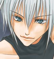
ここ最近のことですが、イラスト描くとき、妙に拘ってしまうパーツがあります。なんでだろう、唇。最近唇描くのが好きで、たまりません。ときどきやりすぎてキモい唇になったりもします。もっとかっこよくきれいなくちびる描きたいです。薄い唇が理想です。鎖骨描くのが好きなのは昔からのことですが、唇描くのが好きになるとは思ってもみませんでした。以前はもっと、こう、さらっと描いて塗っていた気がします。こんなかんじに。 →どうやらこういった細かいところで手を加えてしっかり塗ると、イラストが少しはがんばった感じに見えるような気がしますた。(研究発表。)今後もがんがろうと思います。線画の段階での形も右側の過去絵ではかなり省略されたものでまっすぐな形(しかも真ん中完全に途切れた線)にしていました。それでもかっこよく描ける人もいるし、そういう人はイイなーと思ったりするのですが、私には向いていなかったようで、ただのヘタレになってました。実際のところ、鉛筆描きやペン入れした白黒線画の段階だとこっちのほうが数段かっこよく見えるんですよね。現在の塗り方である左上図の塗り方する場合問題なのが、「線画が貧相になること」でしょうか。ほとんどを塗ったときの陰影で表現しようとするため主線を最小限にするのですが、ホント、塗る前はきわめて貧相です。 例→ ぬりえ線画というわけで、現在は(`・ω・´) ←コレを連想するような形w今は上唇の影塗るのも楽しいし、薄い下唇の影を塗るのも好きです。●この描き方・塗り方に至るまでの思考●1、もっと上手くなりたいと思った。たぶん2006年01月21日頃。おだ真紀はこの頃からイラスト練習を始めました。そっか、もう一年になるんだ…。自分が描きたいものとやっぱりなにか違うよなーと漠然に思ったりしました。2、上唇の影をいれてみた。とりあえず影だけ足してみました。少しだけ満足。でもなんかまだ違うなーとまだ違和感。3、影の形を変えてみた。影だけ現在の形にとても近くなりました。でもコレ、テラキモス。4、線画をいじってみた。思い切って線画のほうから形を変えてみた。現在の形にとても近い。そして現在に至る。もっとがんがろう。●『研究&実験』へもどる● ( ´∀`)σ)´Д`;)
2007.01.13
コメント(2)
-
今まで知らなかったナリ。
フォトショでGifアニメ作れたんですね。まったく知りませんでしたorz昨日の例の断線のせいで今日の午前中暇だったので、すっげぇ古いグラフィック系の本掘り出して読んでたんですよ。古いの何のって、『Photoshopの5.5がもうすぐ発売するぜ、イェァ!』というような内容。いつの時代だ…。そしたらその本、このことが載ってたの。どうやら5.5以降導入されたものらしいのですが、クリックしてみたんですよ。Photoshopのさ、ツールバーの一番下にあるやつ。なんだか便利そうです。今まで別のgifアニメ作成ソフト起動して作ってましたよ、アイコン。 おめでとう、自分! ひとつおりこうさんになったぞ! フォトショでgif画像いくつか作って、ソフト起動して、合成して…。ただPhotoshopでレイヤー分けしてこのボタン押せば、たちまちレイヤー1枚がgifアニメのコマ一つになるなんて…。知らなかったよ~~~~~!!!!!。・゚・(ノ∀`)・゚・。 ●『研究&実験』へもどる●メルフォからのコメントへの返信。アドレスが無かったので。↓ ↓ ↓某スレ住人さんですか?厨房のフリするのも厨房ですよ。とりあえず断る。( ゚ Д ゚ )9m
2007.01.09
コメント(2)
-
おもすれー!!超おもすれー!!
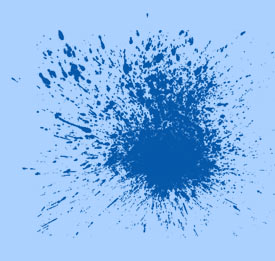
面白いフリーソフトないかなーと見ていたら。こんなの見っけた!!ヒャッホウ!!Photoshopで読み込んで使えるブラシ!『絵ブラシ(薔薇1)』ってなんだろう?『蝶ブラシ』ってなんだろう♪あまつさえ『くまさんブラシ』ってなんだろう~~~!!?たくさんあって、オラ、ワクワクしてきたぞ!!試しに1コだけダウンロードして使ってみた。←血飛沫ブラシ 1.00 ロゴマークの背景に。おもすれー!!!!●『研究&実験』へもどる●
2007.01.02
コメント(0)
-
実験、実験。無料でどこまでできるかな☆ミその2
無料と有料との壁とはいかなるものか。実験、実験、研究、研究~♪ごめん、正月だから昼間からへべれけで文章まとまんない。●ぬりえをやってみる●さてさて。続いて書いてしまいましたよ、この妙な企画。金のかかるソフトは一切使わず、ネットでダウンロードできるソフトのみでイラストを楽しもうという企画研究です。世の中たくさんのソフトがありますが、有料もあれば無料のものもあるわけです。大概有料ソフトのほうが性能いいにきまってますが、無料だって侮れません。実際色塗りには無料お試し版SAIを使用しています。無料お試し版ということで31日という使用期限がありますが、そのつどダウンロード(アップロード)すればほぼ無期限に使用できるようになっています。前回の記事で申しましたように、SAIは扱える保存形式が限られています。webで主に使う形式であるjpgがまず使えませんので、jpgをbmp、psd、tga形式に変換できるソフトを使って補います。※変換ソフトについては前回の記事参照。私はとりあえず試しに 疾風 -Tokikaze- 1.60 をダウンロードしてみました。起動がめっさ軽いです。快適です。軽さも単機能ソフトの利点です。昨日の記事でレタッチ機能について触れましたが、このソフトのトーンカーブ機能についてはあまり良くありませんでした。プレビュー見ながら微妙な調整ができるタイプではなかったようです。残念。でも、なんといってもpsd形式が使えます。psd形式大好きなので、ここは譲れません。ぶっちゃけpixiaでやるならjpgもpixiaだけでわざわざ変換しなくても開けるんだけれどさ。ペイントソフトとしてはSAIのほうが使いやすいとおだ真紀は思うわけですよ。どうしてもSAI使いたいから、しかたなく変換する手間をかけるわけです。■1、ぬりえ用の線画を用意する■まずは線画をパソコンに保存します。最近いろんなサイトで線画をぬりえ用に提供していたりしますね。たいていjpgかgifです。楽天でも『塗り絵しませんか?』というテーマがあったりします。他の人が描いたイラストを使用するのは著作権なども絡んでくるため、それぞれ線画を描いた方の指示があればそのとおりにルールを守り、使わせてもらいましょう。いまさらですがおだ真紀はマカーではないためマッキントッシュのことには触れないことにしておきます。マカーなら自分でソフトも探して自分で研究してください。なので、画像の保存方法は 画像の上でマウス右クリック → 名前をつけて画像を保存 です。■2、画像をjpg(もしくはgif)からSAIで使える形式に変換する■ダウンロードしてきた変換ソフトを起動します。(この記事で例として使用しているのは疾風 -Tokikaze- 1.60なため、gif形式には対応していません。gifも使う場合は他の変換ソフトをご使用ください。)とりあえず画像を保存したフォルダを開いて、ファイルをドラッグ。これで開けます。(左図参照。普通に『ファイル』→『ファイルを開く』でも構いません。)開いたら『ファイル』→『名前をつけて保存』を選択。bmp、psdのどちらかで保存。私はpsdが好きです。これで準備完了です。あとはSAIで塗ります。塗り方についてはここで説明するにはちょっと長い話なので省略。 →こちらを参照。■3、塗り終わった絵をweb公開する■塗り終えたものをweb公開するには、また保存形式をjpgやgif、pngにしてやらなければなりません。くれぐれもbmpでサイトに絵を載せないでほすぃ…。重すぎるよママン。とりあえずsai側でbmpかpsdで保存し、また変換ソフトでjpgなどに変換しなおします。疾風 -Tokikaze- 1.60の場合、『プレビューつきjpg保存』という機能があり、どこまで圧縮するとどんなふうに劣化するか見ながら調整することができます。(左図参照。)たしかPhotoshopにはあるけれど、Pixiaにはなかったと思う機能。あったかな?おだ真紀には見つけられませんでした。これはわりと重宝します。■おだ真紀にメールで問い質す■(匿名可)●『研究&実験』へもどる●
2007.01.01
コメント(4)
-
実験、実験。無料ソフトでどこまでできるかな☆ミ
あけましておめでとうございます。2007年ですね。今回は無料で手に入れることのできるソフトでどこまでお絵かき楽しめるかな、という実験企画です。なお、シリーズ化する可能性も有。とりあえず今回の記事はプロローグ的。前振り。今後は、『パソコンとネット環境さえあれば無料で手に入れられるソフトだけを使いお絵かきを楽しむ』をコンセプトにいろいろ実験していきたいとおもいます。ちなみに基本的な知識ですが、有料のソフトを『シェアソフト』、無料のソフトを『フリーソフト』といいます。●グラフィック系フリーソフト●グラフィックに関するソフトにもいろいろ種類があるわけですよ。シェアソフトならペインターなどのペイント系ソフト、Photoshopなどのレタッチソフトなど。イラストレーターなどのドローソフトもあったね。ほかにも単機能のソフトなら、保存形式を変換するためのソフト(コンバーター)や、たくさんの画像を管理するためのソフトなど。多岐にわたります。SAIやpixiaはペイント系にあたります。この分類はききかじりなので厳密に正しいかと言われればそこまでの自信はありません。あしからず。●金をかけずにチープにイラストを楽しむ●メインで塗装に使うソフトはSAIがおすすめです。 →SAIの配布サイトは こちら。SAIは製品化前の試作ソフトであるために無料配布されているソフトで、フリーソフトとはまた少し違いますが、とりあえず現在無料で使用できます。しかし、無料配布版ということで扱えるファイルの種類に制限が設けられていて、一般的にwebで使用される画像の保存形式であるjpg、gif、pngが扱えません。そこでファイル変換のできる他のフリーソフトを使用するわけです。SAIはbmp、psd、tgaは使用できるようなので、その形式に対応した変換(コンバーター)ソフトを探します。とりあえずYAHOOで検索してみましたが、かなりいろいろHITしましたよ。一部掲載してみます。G・こんばーちゃ♪ 1.52BMP,JPG,PNG,MAG,ICO,GIF,TIFが扱えます。エクスプローラーからドラッグ&ドロップだけで変換が完了。お手軽そうです。機能がシンプルな分、起動が軽いようです。そしてgifアニメが作れますよ。ヽ(*´Д`)ノ疾風 -Tokikaze- 1.60とにかく多様なファイルに対応しまくったソフト。なんと、50種類に対応しているらしく、psd(Photoshop形式)も使用可能。ただしgifは非対応。レタッチソフトとしても使えそうで、私がphotoshopでよくやるトーンカーブでの『色調補正』が可能っぽい。これとSAIがあれば、Photoshopなんて要らないかも。( ゚ Д ゚ )ドラッグ&ドロップ画像変換 3.01こちらもドラッグ&ドロップで簡単操作なソフト。bmp・jpg・png・eri・ico・mag・gifが変換可能です。jpg、png、eriは画像の質が設定可能らしいので、データの大きさ調整に便利かもしれません。おだ真紀的にはぶっちゃけ SAI と 疾風 -Tokikaze- 1.60 があればOKなんじゃなかろうかと思います。●『研究&実験』へもどる●●『ぬりえ』ページ●
2007.01.01
コメント(0)
-
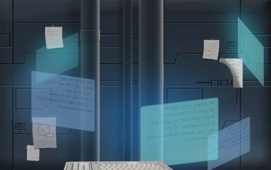
背景のこと。
おだ真紀はほとんど背景を描きません。ヘタレなのでキャラ描き終えた頃にはすでに息切れ状態で、そこまで手が回らない状態です。でも時には背景までがんばっちゃうことも。昨日のイラストは珍しく背景画像まで作っちゃったものです。↓キャラを非表示。背景のみにしてみる。↓ちなみにキーボードは以前使っていた古いパソコンのをデジカメで撮影し、はめ込んだもの。いちいち描いてなんていられんわ。こんなもん。めんどくさい。文明の利器ってすばらしい。便利です。ちなみにこの背景…●機械ちっくな壁●配管っぽいもの●ディスプレイっぽいもの●べたべた貼られたメモ紙で構成されています。※このイラストはPhotoshop6.0jを使用し、作成されています。■機械ちっくな壁■まずは新規作成。背景レイヤーを黒く塗りつぶしました。新しいレイヤーを作成し、こちらは灰色に塗りつぶし。さらに新しいレイヤーを上につくり、そのレイヤーに機械ちっくに線を描いていきます。色は黒にするとわかりやすいです。描き終えたら、ctrlキーを押しつつ線を描いたレイヤーをクリック。描かれた線が選択されますので、その線の形に灰色レイヤに消しゴムツールを適用。(deleteキーを押せば一発で消せます。)説明わかりにくいですね。つまり、左図のようにする、と言いたい。ここまでできたら、灰色のレイヤーにレイヤー効果。『レイヤー』→『レイヤースタイル』→『べベルとエンボス』これで完成。■配管っぽいもの■配管っぽいものはもっと簡単。使うのはグラデーションツール。(塗りつぶしツールを長押しするとでて来ます。)←左のような感じのグラデーションをかけます。いくつかこのレイヤーをコピー。自由変形(『編集』→『自由変形』)で横方向に縮小。縦はそのまま。(下の図1のように。)コピーしておいたグラデーションのレイヤーも同様に変形。それぞれ太さを変えておく。一部分、下の画像2のように小細工してみたりすると、よりいっそう配管っぽい雰囲気に。 1 2■ディスプレイっぽいもの■一番簡単。矩形選択ツールで長方形をつくり、好みの色で塗りつぶし。適当に文字を入れてから文字レイヤーと長方形のレイヤーを統合。最後に不透明度をいじって薄くして完成。適宜、変形ツールで変形させて使う。■べたべた貼られたメモ紙■これが楽しかった…。意味も無い図をちっちゃく描いてみたり…。セロテープで貼ってみたり。ムフフ。完成した絵では、つぶれたりしてほとんど見えていませんが。( ゚∀゚)アハハ八八ノヽノヽノヽノ \ / \/ \ アヒャ。背景作成にはPhotoshopが便利ですv●『研究&実験』へもどる●
2006.12.27
コメント(2)
-
陰影のこと。その2
↓過去絵↓服のしわって難しいですね。なかなか上手くいきません。最近時雨さんの塗りを参考にしつつ服のしわを練習していました。ちょっとは上手くなったのかな?左絵は自分専用のパソコンを購入し、パソコンでイラストを描き始めたころのものです。しわも含め、現在と描き方が変わっています。このころはまだ線画でしわを表現しようとしていました。現在は線を最小限にすることを考えながら、描いています。できるだけ陰影を色塗りで表現するようになりました。しわを描くときに重要なのはなんだろうと考えたとき、位置と方向かなぁと思いました。これがまた難しい。左絵のように線画の段階でしわを描いていても塗るときにその線画を訂正してばかりいたので、面倒になっていつしか線画にはしわを描き込まなくなりました。■しわの位置と方向■しわを入れる位置のほとんどは服の布地のふち付近と肘や肩など関節部分、身体の線が大きく曲がるところ・カーブするところに集中しています。先日の『ジャスパー』を例にすると、方向は左図の赤い矢印の方向。特に赤丸のあたりからは放射状に方向を決めてしわを描くようにしていたり。だいたい描き方はパターン化してきています。…とか言ってみたけれど。ごめん、ほんとはしわ描くとき何も考えてない。この記事さっきでっちあげたんだ。しわの方向なんてわかんねぇよ。テキトーなんだよ。( ゚∀゚)アハハ八八ノヽノヽノヽノ \ / \/ \ ●『研究&実験』へもどる●
2006.12.25
コメント(4)
-
陰影のこと。その1
今回は陰影のつけ方。おだ真紀の陰影のつけ方の基本にあるのは、高校の頃大学受験のために何枚も何枚も描いていた立方体、円柱、円錐etcのデッサン。あんなんでも役に立ったんだなぁとときおり感慨深く思います。でも、人物デッサンもしておけばよかった…。(´・ω・`) ショボン… 円柱を適当に塗ってみたものですが、左図を少しだけ不自然にしてみました。左図は円柱の左側を明るく、右を一番暗くしたものです。右図も左側が一番明るくなってはいますが、こちらは右端が一番暗いわけではありません。右端は少しだけ明るい色になっています。これは左からあたった光が床面などに当たって反射することを想定したもので、デッサンをする際の基本となります。また、人間の目にはコントラストの一番強い部分が出っ張って見えるようになっているそうです。なので、左図のようにしてしまうと、円柱の右端のコントラストが強くて、奥にあるはずの端が一番出っ張って手前にあるように見えて、不自然に見える、ということになるようです。違和感はおそらくそのせい。難しいね。陰影。●『研究&実験』へもどる●
2006.12.23
コメント(4)
-

ファーの描き方難しくない?
自分向いてないんだろうか。ファーとかついてる服が描きづらいです。上手く描けない、塗れないです。 (´・ω・`)(´・д・`) みんなはどうやって描いてるのさ…。今のところおだ真紀はこんなふうに描いているよ。まずは軽く線画を。あんまり線が目立たないように、線は多すぎないようにしてみる。一番暗い色の部分に使う色で下塗りしてみる。 使った色→■#CCC7B1少しだけ明るい色でハネた感じに色を置いてみる。 使った色→■#DCD8C4最後に、線画レイヤーより上のレイヤーに白っぽい色をまたハネた感じに色を置いてみる。 ※ちなみに使うツールはSAIの筆ツール。とりあえずこれでおしまい。もう少し丁寧に、なにかを描き足したら、もっとよくなるのかしら…?違うツールを使えばもう少しはよくなるのかしら…?●『研究&実験』へもどる●
2006.12.18
コメント(4)
-
オエビのこと
今日はオエビ(お絵かきBBS)のこと。慣れていない最初は難しいけれど、すっげぇ楽しいツールだと思うんですよ。私もまだまだオエビに慣れきっていないですが、描くのは楽しいです。■オエビのツール■※ちなみに使用したオエビはフリー配布のCGI。レンタルもいいけど、CGI自設置も ヽ(゚∀゚)ノ イイヨ!オエビの使用アプレットは『しぃペインター・プロ』です。一番上は『エンピツ』ツールです。アンチエイリアスの全くきかないくっきりはっきりな線が引けます。その下は『ペン』ツール。エンピツよりは滑らかな線が引けるので、私はよく線画を描く際に使用しています。さらに下。『水彩』ツール?かなりウッスラな線です。線画を描くときよりも塗るときに大活躍です。一番下。『エアブラシ』ツール。綺麗なグラデーションでぼかしたいときなどに使用。かなり便利。線を引くには不向き?■描いてみる■ペイントソフトを使って描いたのと遜色ないクオリティの絵もステキですが、お手軽にチョチョイと描いた感じの絵も結構好きです。最終的にどんなクオリティに仕上げたいのかによって描き方は全く変わってきます。今回はまず、お手軽にチョチョイと描く感じの描き方。 ラフを描く。エンピツツールでがしがしと描く。ペイントソフトを使うのとこの辺はまったく変わりません。というか、描く道具がオエビだろうと、ぶっちゃけほとんど描き方なんざ変わりません。テキトーにアタリをいれてみる。線画を描いてみる。このアプレットだとレイヤー関連が充実しているので、描画濃度もいじれます。ラフ画レイヤーを薄くして、主線を描き込みます。お手軽オエビ絵なので線画もエンピツツールで描いちゃいました。いつもはペンツールで描いています。線画がエンピツツールの線だと、いかにもオエビという感じのイラストになります。線はできるだけ細いほうが絵が上手く見えるようです。主線を描き終えたらラフ画レイヤーを削除。線画を描くレイヤーが複数になっている場合はレイヤーを統合したりする。色分けしてみる。異なる色のパーツはそれぞれ別レイヤーで塗る。色調補正できないから、おだ真紀が配色センス皆無であることがここで完全に露呈。あとは影をつけていきますが、私にはマスクが理解不能で使用不可能なので、使いません。(゚Д゚)それはすっぱりあきらめます。影を塗り終えたら、はみ出した部分を消しゴムツールでちまちま消して完成。陰影つけるときは、はみ出しを気にせずに塗ったほうが良いようです。●『研究&実験』へもどる●
2006.12.15
コメント(4)
-
色の調整をする
なんか眠いなー。イラスト描く元気ないので今回も『研究』~。『色の調整』です。私の色彩感覚がヘタレなせいなのですが、一発でいい色に塗ることができません。さすがは大学の「色彩学」でD判定食らったヘタレです。結局4年間あったのにも関わらず、色彩学の単位は取得しませんでした。 課題マンドクセ。('A`) まぁ、そんな状態なので、色に関しては最終的にマシになればいいや、と最後に補正することにしています。『トーンカーブ』で色調補正する 左絵が色調補正する前の、塗ったままの色。なんとなくうすっぺらい色使い。好みの問題ではありますが、私的にはいまいち好きではありませんでした。とりあえず影が青っぽくなるようにしてみました。ヽ(゚∀゚)ノ そのほうがお胸のテカりが目立つ感じだったから。髪もついでに色変えたのを掲載しましたが、実際は髪と肌は別で、レイヤー1枚づつ色を修正していきます。同じレイヤーにある色はまとめて色が変わってしまいますので、レイヤーは統合する前のほうがいいと思います。ちなみに色補正に使ったツールはPhotoshopの『トーンカーブ』です。(イメージ → 色調補正 → トーンカーブ)右上絵は左図のようにしました。(今回はRGB以外のレッド、グリーン、ブルーは一切いじってません。)SAIの色調補正ではここまでの細かな補正はできないので、いちいちデータ移動してフォトショで仕上げしてるんです…。さすがは写真修正のソフトです。便利です。仕事(写真屋)でもたまに使います。今日も写真を修整しました。本当はこれが本来の使い方なんだよね、とボンヤリ思いました。ちなみに、左下図のようにすると、右下絵のようになります。 ●『研究&実験』へもどる●■おだ真紀にメールで問い質す■(匿名可)
2006.12.01
コメント(2)
-
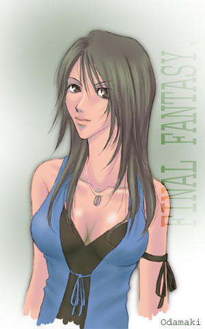
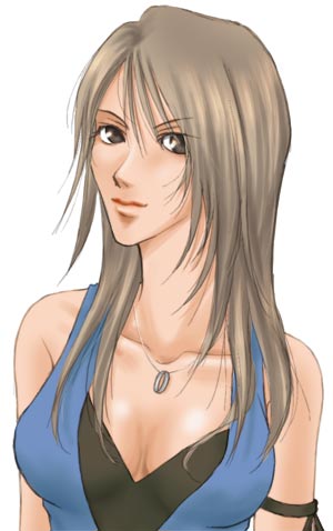
イラストを修正する
一度レイヤーも何もかも統合してしまってから修正箇所を発見してしまった場合の応急処置。作例は、やはり以前描いたもので、FF8リノア。 過去に描いた作品の修正をしたくなることってありませんか? 描いた当初は気に入っていたはずなのに、なんとなくどこかが気になり始め、不自然に思えてきたり。 なんだか顎のラインが妙に気になっていたので、ちょっと手直し。図1 図2 図3とりあえず、自分のヘタレ加減にひとしきりヘコんでみる。orzなんとか立ち直って修正してみようと覚悟してみる。失敗する可能性もあるので、保険のために元のレイヤーをコピーしておく。(最重要。)今回修正するのは主に顎のラインということで、まずは顎の辺りに肌色で修正したい通りのラインを引く。 色はのちほど直すので大体似た色ならどれでもいい。 (図1参照)スキマを埋め、主線の色をスポイトツールで拾い、主線を修正する。 微調整前なので主線が濃く目立って見えるが、これも後ほどぼかしツールなどでなじませる。 この時点ではあまり気にしないことにする。 (図2参照)スポイトツールで細かく色を拾いつつ、修正した場所の色をなじませる。 ぼかしツールも使用すればかなり誤魔化せる。 『alt』キーを使うとスポイトツールはとっても便利。 (図3参照)画像修正時は、やはりPhotoshopの方がおすすめです。●『研究&実験』へもどる●
2006.11.30
コメント(4)
-
髪の塗り方2
SAIを使い始めてから髪の塗り方がすこし変わりました。イイね!SAI!使うのはSAIの『鉛筆ツール』と『筆ツール』です。まずはやはりベタ塗りしました。次に『鉛筆ツール』を使って少しだけ濃い色をのせていきます。髪のスジに沿って、描き始めが細く、線の真ん中太く、描き終わり細く、となるように線状に塗っていきます。一通り線を置き終わったらベースの色よりちょっと明るめの色でまた線状に色を置いていきます。明るい色の次は一番影になる部分を塗ります。ここまではすべて『鉛筆ツール』使用です。影を入れ終えたら、ツールを『筆ツール』に変更。筆ツールを使って所々ぼかしていきます。選択色はベース色です。同じ『鉛筆ツール』でもSAIとPhotoshopでは全く違う描き味のツールのようですね。SAIの鉛筆ツールはフォトショの『ブラシツール』に近いと思います。ブラシツールよりも筆圧感知がすごいですが。あまりグラデーションがかからず、ちょっとシャープな線が引けます。フォトショの鉛筆ツールはおえかきBBSの鉛筆ツールのような感じなので、アンチエイリアスがまったく効いておらず、さらにもっとシャープな感じです。SAIの『筆ツール』は、フォトショの指先ツールとブラシツールを同時に使ったような感覚で、色を伸ばしつつ置いていくカンジです。 ↓筆ツールの線。↓上のパターンだと、よりいっそう水彩風。← 鉛筆ツールの線。 筆圧感知のおかげで、一筆でこんな線が引けます。●『研究&実験』へもどる●
2006.11.27
コメント(4)
-
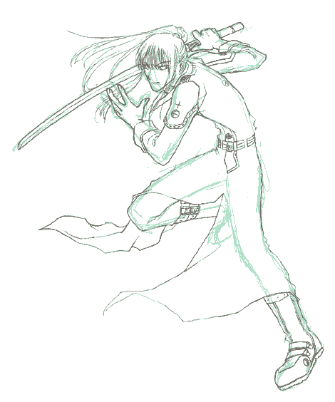
レイヤー順序のこと
皆さん、どんなふうにレイヤー別けしてどんな順番で重ねていらっしゃるんでしょう?常々気になってなりません。おそらく私の描き方がとことん独学&我流なので、ほかの方のやりかたが気になるのだと思います。ちなみに私の場合は…。先ほどupした剣心を例にすると、上から順にハイライト:目のあたりの光ってる部分です。細い髪の毛:小心者ゆえ髪と同じレイヤで描けませんアイライン:目の周りの主線を補強しています。線画:メインの主線レイヤーぼかした線画:主線レイヤをコピーしてぼかしたもの十字傷:小心者なので(ry髪:髪の毛のレイヤー着物:白いほう。着物その2:赤いほう。瞳:白目と瞳は別レイヤーで。白目:どうも塗り残しがあった模様。肌:塗った後色調補正かけてます。背景:適当背景。合計13枚のレイヤー使用。というような状態です。細い髪の毛や十字傷などは別レイヤーにする必要はあまり無いのですが、私が小心者なためこのような結果に。失敗するのが怖いんだもの。…説明めんどいな。SAIの保存データ、レイヤごとUPしてしまえ。ダウンロードはこちら。期間限定。レイヤー統合前・塗装済み完成品データ(縮小)です。解凍して見てね★※1.2メガほどありますのでご注意を。なお、保存形式はsai形式となっていますので、ペイントツールSAIをインストールしていないと開けません。同じ画像を保存するのでも、sai形式とpsd形式ではsai形式の方がデータ軽いんですね。今知りました。フォトショよりSAIのほうが効率いいのかしら?●『研究&実験』へもどる●■おだ真紀にメールで問い質す■(匿名可)
2006.11.23
コメント(2)
-
線画の線を整える
ラフ画の荒い線を整えてなんとか主線として使える段階まで持ってくるという作業がめんどくさくも重要な作業…。線が荒いままではどんなにきれいに塗装してもラフ画止まりです。主線を整えるというかパソコン上でペン入れ(?)してるヒトってみんなどうやってるんだろう…。もっと簡単でいい方法もあるはず…!私の場合、この『線を整える』という作業がとことん嫌いなため、駄目と判っていつつも、途中で塗り始めてしまったりして、結局塗り途中で線の修正の必要に迫られたりします。上の画像のように、線が何本も引いてあってきちんと整えられていないところを、修正してみます。 まずは作業しやすいように拡大。私には200~300%表示が一番作業しやすいです。(左上図は100%表示です。)作業しやすい環境が整ったら、足りない線を描き足してくっついていない線どうしを繋ぎます。(上中央図)線の薄いところ、細いところも線を足しておきます。描き足して線が全部つながったら、いらない線を消します。(右上図)…めんどくせぇ。●『研究&実験』へもどる●
2006.11.20
コメント(2)
-
イラストを描くために
これもすっげぇ基本ですが、とりあえず『研究&実験』コーナーを補完しておきたいのでこんな記事も書いておきます。周辺機器の話イラストをパソコンで描きたいと思ったとき、まず何をするかといえば線画を描くことです。紙に描いてスキャナで取り込む方法、ペンタブレットを使って画面を見ながら直接描いていく方法など、さまざまな方法があります。その辺は本当に人それぞれで、自分がやりたい方法、自分にできる方法でやればいいと思います。まず、どんな道具を持っていますか?ペンタブレットとスキャナ両方があればベターです。ですが、どちらか一方だけでも絵は描けますし、また…どちらも持っていなくても描こうと思えば描けます。(この記事の下のほう参照。) ●ペンタブ●(タブレット)ペン型の入力装置。画面を見ながらペンで描くようにして線を引いたり色を塗ったりできる。たいてい筆圧も感知してくれるので、線の強弱がつけやすい。ペンをひっくり返せば反対側の先端には消しゴム機能がついていたりする。●スキャナ●紙に描いた絵や写真などを取り込むための機器。平らなものなら何でも取り込める…?アナログで描いた線を活かしたいときにはコレ。スキャナで読み取って線画の抽出■Photoshop編■スキャナで絵を取り込む。webで公開するための絵なら解像度は低めでもいい。一緒に混じったゴミを消す。例:『イメージ』→『色調補正』→『明るさ・コントラスト』で消し飛ばす。チャンネルウィンドウを開き、(左図)「RGB」「レッド」「グリーン」「ブルー」どれでもいいので赤○部分までドラッグする。画面上のツールバー『選択範囲』『選択範囲を反転』を選択。新しいレイヤーを作り、「塗りつぶしツール」で塗りつぶせば線画の完成。■SAI編■ (→SAIについて)スキャナで絵を取り込んで保存。無料お試し版SAIでは「psd」「bmp」「tga」で保存された画像しか扱えないので注意。取り込んだ画像をSAIで開く。画面上のツールバーから『レイヤー』『線画をレイヤー化』を選択するだけで線画の完成。デジカメ&携帯カメラを使う!とことんリーズナブルな番外編です。携帯写メを使ってみる方法。スキャナもペンタブもない場合。(無料配布のフリーソフトなどを拾ってきて活用すれば十分描けると思います。 →検索してみる)携帯など、カメラで撮った画像を、とりあえずパソコンにとりこむ。画像処理ソフトで明るさ・コントラストなどの調整をしてみる。※携帯カメラ側の機能で、撮影するときに明るさをあらかじめ明るくしておける場合もあります。 そういった機能がある場合はどんどん活用!1→ 2→←31、携帯で撮影したままの画像2、明るさ・コントラストを調整した画像3、一度、カラーモードをグレースケールにした後、 再びRGBモードに戻した画像ペイント系のソフトで塗装する。下の画像はペンタブを使わずにマウスで塗ったものです。拡大しながら少しずつ塗るのなら、ペンタブ無くてもマウスでも十分可能です。今回ためしにやってみました。携帯カメラで撮影 ↓ ↓ ↓フリーの画像処理系&ペイント系ソフトをつかって線画抽出 ↓ ↓ ↓フリーソフト使ってマウスでぬりぬり塗装。「写メだから汚い」とか「スキャナが無い」とか「ペンタブ無い」とか言い訳する前になにかやってみるといいと思う。金など使わなくてもフリーソフトと少しの知恵を使えばこのくらいの芸当はできる。●『研究&実験』へもどる●
2006.11.18
コメント(4)
-
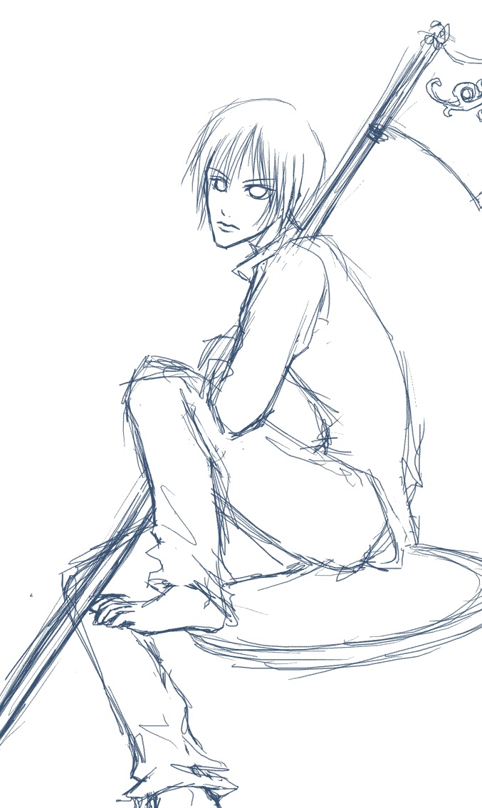
ラフ画から線画へ
めっさ基本ですが、とりあえず『研究&実験』コーナーを補完しておきたいのでこんな記事も書いておきます。イラストを描く基本は『線を引く事』だと思うのですが、デジタルで描くとなるとなかなかこれが難しい…。特にペンタブやマウスでの入力に慣れていない場合。線ががたがたしてしまったり、歪んでしまったり。できればまっすぐぴしっと線を引きたい…。きっと誰もが思うはず。左は先日の落書き(鎌もったやつ)のラフ画です。先日の記事の着彩画は、このラフ画にそのまま色をつけてしまったものなので、実際のところ、これが線画レイヤーになっています。左の絵をクリックすると原寸大サイズの線画が別窓で開きます。現段階ではラフ画なので線はかなりはちゃめちゃです。こんな状態の線を少しずつ描いては消し、描いては消しを繰り返し、整えていきます。ラフの段階では汚く見えてしまうくらいたくさん線を描いて、その中から正しいと思う線のみをのこして線画にします。では手順です。画像は左膝の部分です。 1、ラフ画のレイヤーの不透明度をいじって色を薄くする(左上図)ラフ画の色を薄くしておくことで、新たに描いた主線を見やすくします。2、新しいレイヤを作成し、主線を描いていく(上中央図)まずは作業しやすいように拡大。200~300%ほどに表示して作業することが多いです。私の場合、主線の色は黒ではなくいつも■#534741で描いています。3、ラフ画レイヤーを削除(上右図)これですっきり。あとはぶっちゃけ、どれだけ線のガタガタを隠せるかの問題~。よくやるのが、画像解像度をいじって画像を小さくする方法。1200pixelのを500pixelくらいに縮めれば、たいていの線はまっすぐに見えるようです。●『研究&実験』へもどる●
2006.11.17
コメント(4)
-

ペイントツール SAI
『SAI』を使ってみました。ここで言うSAIは製品化前のテスト版無料配布ソフトであり、シェアソフトでもフリーソフトでもない特殊な位置づけのソフトなのですが、時雨さんが絶賛しておられる事だし、ちょっと使ってみようか、と手をだしてみました。なにより無料で使えるところがすばらしい。(゚∀゚)使い心地もなかなかのものでした。製品版、結構売れるんじゃないかなぁと思います。筆ツールの伸びがかなり好みです。筆ツールすばらしい。ショートカットキーやレイヤなど、フォトショップと似ていたり対応されていたりしていたせいか、わりと扱いやすかったです。そしてPhotoshopで描いたものをレイヤーもそのままでSAIに持っていける。これはなんてイイ機能なのでしょう!Pixiaはレイヤー機能周辺が独特でフォトショに慣れすぎた私にはどうにも扱いづらかった…。ただ、これは無料お試し版なので完璧ではありません。普通の無料配布されているペイント系フリーソフトは無料なだけできちんと完成されたひとつの製品なのですが、このSAIは機能を確かめてもらうための一部機能制限つきな体験版であるがゆえに…JPEG、GIF、PNGなど、Webで主に使う形式での保存ができねぇ。なんてこった。保存機能関係に制限かかってる。('A`) 保存できないのもつらいが、読み込みすらできないこともつらい…。とりあえずpsd、bmp、tga形式は扱える模様。結局SAI単体だけでは使えず、Photoshopも起動しなければならん…。使い続けるには31日ごとに更新しなきゃいけないし…。(体験版だから?)描き上げてからの色調補正とか背景加工するときもSAIの機能では間に合わないし…。(これは私の配色センス等が激しくヘタレなせいですが…。)でも筆ツールのためなら Photoshop⇔SAI の幾度にもわたるデータ移動も気にしないことにします!実は絵を描くということに特化したペイント系ソフト、持っていなかったのですよ。フォトショは本来は画像加工のためのソフトですし…。今後はもしかしたら加工や最終的な保存などはPhotoshop、実際に描いたり塗ったりはSAIで、ということもあるかもしれません。●『研究&実験』へもどる●
2006.11.14
コメント(4)
-
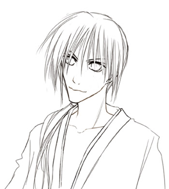
ようやく主線を描き終えたよ。
昨夜途中で投げ出してしまった神田さん。資料が無くて一向に作業が進まなかった…。神田のブーツってどういう仕組みになってるんですか!?コミックス(主に2巻)を片手に見つつ描いてましたが、足まできっちり描いてあるコマが少ない…!!( ゚∀゚)アハハ八八ノヽノヽノヽノ \ / \/ \ とりあえず描いては見たものの、間違っている気配がぷんぷんします。…曖昧なので、とりあえず上半身だけにしてみました。とりあえずラフに描いてみる。下描きです。ラフを描いておかないと、ただでさえむちゃくちゃなデッサンがさらに崩壊して大変なことに。中学生のころやっとそれに気づき、骨格のおかしい生き物にならないように面倒でもラフ画を描くようになりました。主線を描きこんでいきます。この作業が苦痛でなりません。先に描いたラフ画のレイヤーの不透明度をいじって色を薄くしておくと描きやすいです。ラフ画のレイヤーを削除。線画の完成。ようやくここからが楽しい塗り絵作業です。線が太くてくっきりで、これこそまさにぬりえ…。塗って遊びたいひとはご自由にどうぞ。サイトなどに掲載の際は、原画描いたやつの名前(おだ真紀)を記事のどこかに書いておいてください。●『研究&実験』へもどる●カピカピしていた鼻の下が悪化しました。…さきほど皮膚が破れて血がでました。
2006.11.12
コメント(2)
-

マスクの話
イラスト描く気分になれないので今日は『マスクの話』です。なぜ描く気になれないのかと言うと、風邪っぴきで咳が止まらんのです。苦しいのです。勘弁するのです。咳のしすぎで肋骨付近が痛くなってきました。さて、色塗りをしていて『はみ出したくないなぁ』と思うことありますよね。今回ははみ出さないように塗る方法です。実際のところ、パソコンで絵を描いた場合、はみ出した部分も最後に消してしまえば無問題なのですよ。でもやはりはみ出さずにきれいに塗りたいと思うのがヒトのココロですね~。ポスターカラーなどの絵の具でポスターなんぞを描くような授業を中学とかでやりますよね。それではみ出さないように『マスキング』しますよね。同じように、CGでもマスキングしてしまえば良いわけです。方法その1・レイヤーの透明部分を保護 (Photoshop)ちなみに現在はこの方法で塗っています。まずはパーツごとにレイヤーを別にして色をベタ塗りします。はみ出さないように塗り終えたら、左図の赤○部分をクリック。すると、レイヤの表示の部分に緑○のような錠前マークが表示されます。チェックマークが入っているのは『透明ピクセルをロック』の部分なので、これでそのレイヤーの何も描かれていない透明部分に何も描けなくなり、はみ出さなくなるという仕組みのようです。ちなみにその右のチェックボックスは『画像ピクセルをロック』、さらに右は『位置をロック』だそうです。●追記:SAIでのマスク●※ペイントツール『SAI』は製品化前のテスト版無料配布ソフトです。 シェアソフトでもフリーソフトでもありません。無料お試しソフトであるペイントツール『SAI』を使った場合も「透明部分を保護」ができます。方法その2・『選択範囲』機能を使う (Photoshop)もうひとつの簡単な方法です。塗りたい部分だけを選択範囲指定してしまえば指定されていない部分にはみ出すことはありません。選択範囲を指定する方法もいくつもあるのですが、今回はそのうちのいくつかを紹介。まずは『自動選択ツール』で選択する方法。とりあえずパーツごとに単色でベタ塗りします。それぞれのパーツは別の色で塗ります。塗り分けが済んだら、自動選択ツールでパーツを選択。選択したら「選択範囲」→「選択範囲を保存」を選択。保存した選択範囲はチャンネルとして保存されています。レイヤーウィンドウの「チャンネル」というタブをクリックしてチャンネルを選択範囲として読み込んでやれば何度でも同じ場所を簡単に選択できます。レイヤーの数をあまり増やしたくないヒトにお勧め。ほかのやり方としてもうひとつ。これはレイヤーの透明部分を保護してしまう方法とほとんど変わりません。パーツごとに違うレイヤーで塗りわけしておき、ctrlキーを押しながら塗りたいパーツのレイヤーをクリック。すると、そのレイヤーの描画部分のみが選択されます。効果も『透明部分を保護』とほぼ同じ。方法をひとつだけではなくいくつか知っていると、いろいろな局面で応用が利くようになって便利です。●オマケ●私は昔、『クイックマスク』という機能を使用して範囲を選択していました。ツールバーの『クイックマスク』をクリックするとなにやら画面が赤くなりますが、赤く表示されているのが『選択されていない範囲』です。ブラシツールなどで白く塗ってやると、その白い部分のみが選択されたということになります。選択したい部分を白く塗り終えてから『クイックマスク』の隣にある『画像描画モードで編集』ボタンをクリックしてみてください。白かった部分が選択されているはずです。選択されているのを確認したら、『選択範囲を保存』しておくと良いかもしれません。●『研究&実験』へもどる●
2006.11.10
コメント(2)
-
主線の色を変える
公言している通り、私は線画を描くのが苦手です。自分の線画を見ているのはあまりに心苦しいので、線画を描き上げるとすぐに着彩を始めてしまいます。でも基本が漫画絵のイラストを描くのに線画を描かないわけにはいきません。最終的には見えないくらいに主線を薄くしてしまうにしても、線が全く残っていないわけではないのです…。今回は主線の色についてです。----------------------------------------------------------------------------------------←左図は主線の色を黒(#000000)にした状態です。やけに線だけが浮いています。あまり好みではありません。ではこの線の色を薄くしてみた場合どうなるかと言いますと…。↓こうなります。↓なんだか主線が塗った色に負けてますね。↑これも好みからは離れています。色が薄すぎてしまうと主線の意味をまったくもって成しておらんがな。でもこの薄すぎる様態の線画にほんの少し加工するだけで丁度良くなるんですv←で、加工した状態がこちら。線画のレイヤーの『描画モード』を『乗算』に変えるだけ。←赤○部分をいじると描画モードを変えることができます。あとは余談ですが。線画も実は描いたままの状態ではありません。完成させる前にわずかではありますが、『ぼかし(ガウス)』フィルタをかけてぼかすようにしています。線はできるだけ目立たずやわらかく、が好きなのです。●『研究&実験』へもどる●
2006.11.05
コメント(2)
-

ツールの話
フォトショで絵を描くときによく使用するツールの話です。(※私のはWin版Photoshop6.0です)現在私はパソコンでしか絵を描いていません。紙に描いて、スキャナで取り込んで、線を整えて、色を塗る、なんて工程の多い作業が私にむいているわけがありません。Photoshopを使ってペンタブで直接描き込むのみです。ものぐさなもので、とことん簡略化が進んできています。あまり良くない傾向です。 さて、今回の『使用ツール』についてですが、Photoshopを起動した際、おそらく左側に縦長のウィンドウが表示されると思います。(左図参照)で、よく使うツールですが…■ラフ画を描くとき■ブラシツールを使用。ブラシサイズは小さいほうから数えて2番目か3番目くらいで、ちょっと太め。■線画を描くとき■同じくブラシツール。ラフ画の時よりも小さいサイズを使用。■色を塗るとき(ベタ塗りするとき)■同じくブラシツールを使用。■色を塗るとき(陰影をつけるとき)■エアブラシツールを使用。(サイズは主に13~19pixelくらいのやつ。)当たり前ですがこのあたりの使用頻度が一番高いです。あと便利なツールとして、スポイトツールやズーム(虫めがね)、移動、手のひらツールなどがありますが、これらはわざわざ選択しなくてもキーボードのショートカットキーでワンタッチで使えるので、使ったことがありません。スポイトツール → Altキーズーム → マウスの真ん中についてる、ぐるぐる回るやつ移動 → ctrlキー手のひら → スペースキーショートカットキーはいろいろ覚えておくと便利ですし、作業効率が格段にUPします。失敗したとき、一つ前の段階に戻るには、ctrlキーとZキーを同時に押せばいいし。ctrlキーとTキー同時だと自由変形だし。 ※ツールのいくつか(小さな三角がついているもの)は、一秒以上長押しすると面白いことがおこります。●自動選択ツール●クリックした場所の色に似た色の部分のみ選択してくれるツール。●矩形選択ツール●マウスをドラッグすることで○や□などの形に選択できる。shiftキーを押しながらだと、正方形や真円になる。これで選択してから「編集」「境界線を描く」にすれば選択した形を描ける。●ぼかしツール●部分的にぼかすためのツール。長押しすると逆にシャープにするツールや指先ツールが出てくる。指先ツールは、まるで絵の具を指先で、ぐにに、と伸ばしているかのようなカンジにできる。伸びる長さなどの細かい調節も可能なので、いろいろ遊んでみるのも楽しい。●ヒストリーブラシツール●一部だけを、あらかじめ登録しておいた時点にもどすのに使うツール。意外と便利。●スタンプツール●まるでスタンプを押すように、部分的に画像をコピーするツール。詳しくは専門のホームページで見てください。これに関しては私では説明しきれません。●グラデーションツール●塗りつぶしツールを長押しするとでてくる。その名の通り、グラデーションをかける際に使う。グラデーションがきれいに出せるのがCGの特性なので、これをうまく使いこなせるようになりたいものです。●鉛筆ツール●ブラシツールを長押しすると出てくる。やたらくっきりした線になる。gifアニメなどのドット絵描くときに使ってました。フォトショは楽しいおもちゃです。たまらん。 (*´Д`*)ハァハァ●『研究&実験』へもどる●
2006.11.04
コメント(0)
-
レイヤーの話
パソコンでイラストを描く際に重要な、レイヤーについてのお話です。以前のブログに載せていたものですが、そちらはすでに削除してしまったのでもう一度。もうすでにCG暦長いぜという方には何の役にも立たない記事ですが…。-------------------------------------------------------------------------『レイヤ』はそのままの意味だと『層』です。アナログで紙にイラストを描くときはペン入れをして、線画が消えないようにしてから色をつけたりしますが、デジタル絵の場合はどうするのかというと、線画を描く場所と色を載せる場所を別にするわけです。概念としては、ちょうど左図のように、上から『線画レイヤ』『着彩レイヤ』『背景レイヤ』というように重ねてあるといった感じです。セル画のように透明なシートのうえに描いているようなイメージをしていただけるとわかりやすいと思います。左図では3枚のレイヤで表現されていますが、実際には着彩レイヤも一枚のレイヤではなく、複数枚使用されていたりします。レイヤというのはとても便利なもの。肌、髪、服、アクセサリ類など、パーツごとに塗るレイヤを分けておけば、もし失敗してしまってもそのレイヤだけ直せばよいわけです。レイヤをわけて、ついでに色を塗るときにはみ出さないようにマスキングすることもできますね。そして、これは私の配色センスがどうしようもなくヘタレなせいもありますが、塗り終わったイラストもパーツごとにレイヤ別けしてあればそのパーツそれぞれで色を換えることができるのです~。これはすっごい便利!!だって…。 ↑このぬりえイラストだって元はこんなだったんですから。↑ 実際に塗った色より陰影を強く出したいときとかも、わざわざ塗りなおさなくてもちょこちょこっと小手先の画像処理だけでどうにでも補正できてしまうんです。色調補正とマスクについてはまた別の記事で書きますね。早く記事補完しておかなきゃ…。●『研究&実験』へもどる●
2006.11.03
コメント(0)
-
ぬりえ。 髪を塗る
肌の次は髪を塗っています。(肌を塗る工程はこちら)やはり最初はベタ塗り。つぎに大まかに陰影をつけてから、細かく線をひきまくる作業になります。ペジエ曲線を使って影を入れていく人もおられますが、私は使いこなせないので、一本一本、ぜんぶ自分で線を描いています。ひたすら、ちまちまと。 (;´Д`) 塗装色やブラシツールのサイズも途中で何度か変えてやると変化がでていい具合に見えます。↓こんなカンジに。↓●『研究&実験』へもどる●
2006.11.03
コメント(4)
-
ぬりえ。 肌を塗る
塗る順番として、なぜかいつも肌を最初に塗っています。ちなみにPhotoshopです。色は塗り終わってからでも変更できるので、まずテキトーに肌色っぽい色を使って『ブラシツール』でベタ塗りして、陰影をつけていきます。(使用した線画はこちら。)多少はみ出してもあとで消せるので気にせず、がしがしと。ちなみに陰影をつける際の使用ツールはたいてい『エアブラシツール』です。まぶた&目の周囲 → 鼻 → 唇 → 首 → 身体というような順番です。『指先ツール』などを使ってぼかすとなかなかいい具合になるので使ってみてください。↓こんなカンジに。↓●『研究&実験』へもどる●
2006.11.03
コメント(0)
全40件 (40件中 1-40件目)
1