
[Others] カテゴリの記事
全73件 (73件中 1-50件目)
-

BOBBI BROWN【C01 Camo】
2018年9月7日限定発売の2色。『CAMO LUXE COLLECTION』より『C01 Camo』カウンターでは2色の違いも分かったしシマーもチラチラと良かったのに私の暮らしの照明やシーンでは良さが全く引き出せない…これはかなりのレアケースですが完全にデパート照明マジックに魅せられてしまった。というわけで買うならどちらか一色で良さそう。■C01 Camo カモベースカラーはわずかーに白濁したチャコール(赤味グレイ)で、ピンクシマー。そのためダークカラーでもソフトな印象。強めな光で近くで見ればピンクシマーは分かりますが暗くなるとほぼシマーが隠れてしまいます。たくさん配合されているシマーは表面に出たがらないシャイなタイプ。テクスチャーは水っぽく濃淡が出やすいタイプで一度塗りは難しいです。乾きは普通からやや遅め。今回のベースコートはゲラン『ネイリストラバーズ』。トップコートなしでもウォータリーな見た目に。ボトルは膨らみのある四角柱でフロントにゴールド×ブラックで『BB』。キャップは円柱状でマットブラック、ブラシは丸筆で毛量はやや少なめコシはやわらかめ。おそらく2012年あたりのリニューアルのものと変わっていないと思いますが最近は平筆に慣れているので少し塗りにくさはあり。■サイズ:約w28×d28×h69mm[11ml]フランス製。
2018.10.20
コメント(1)
-

ORLY【50604 PAPARAZZI】
ラベンダーベースに、玉虫/レインボー系のシマー。ORLYのポリッシュは久々で前回は『FOWL PLAY』『NITE OWL』あたり。今回は2017年に発売された『COLOR AMP'D』のもので・完全乾燥まで8分・1週間耐久・ライト不要・発色が良い・最高峰のツヤ・除光液で簡単オフ…ということですが実際に全項目頷ける仕上がり。写真はトップコートなし。二度塗りで透け感ほぼなし。さて、この玉虫タイプに初めて出合ったのは2003年OPI『It's Summer for Sure』コレクション。・S34 Blue Monn Lagoon・S35 Crim-sun・S36 Sand-erella・S37 Coral Reef・S38 A Day At The Peach・S39 What's Dune?摩訶不思議な滑らかな虹色の輝きにネイルポリッシュでは今でも過去最高の衝撃を受けました。その後はDSシリーズとして展開したり、多くのブランドでも見られ、15年経過した今ではテクスチャーの一つとして定着。『Sand-erellaと一緒だ!』と懐かしくて買ったものの記憶が曖昧だったのか、経年劣化なのか色の違いは意外とあり。15年前はここまで薄くはなかった気がするけどなぁ…チップは3度塗り。表面にフロートするような玉虫感は色味が薄い『Sand-erella』の方が少し強め。(『PAPARAZZI』はパープルの色味が強いぶん弱まるのかも?)『Sand-erella』は下地が透けて見えるほどパープル味がかなり薄い(シアー)。比べてしまうと『PAPARAZZI』のパープル味が濃いので『Sand-erella』はブルーグレイに見えてしまうけど単体であればパープル系とジャッジできます。ラベンダー×レインボーが素敵な『PAPARAZZI』。ポリッシュとしても優れているので玉虫系デビューにはお勧めです。
2018.08.18
コメント(0)
-
SUSIE N.Y.【31 CLOUDY MONDAY】
スージー春の新色だったかな『31 クラウディマンデイ』はパールラメなしのグレイッシュモーヴ。9月になり落ちついた色を…という時にはこれと『32 インハールーム』がオススメ。アディクション『69 Park Avenue Princess』のダル系ファンなら好きかも。パークアヴェニュープリンセスはピンクより。クラウディマンデイはブルー/パープルより。今日はこのネイルの名前通りの憂鬱な月曜日(笑)ま、今週もひたむきにいきましょう。
2017.09.04
コメント(0)
-
YSL【22 BEIGE LEGER】
人気の『22 BEIGE LEGER』。やーーっと買いました。YSLでNo.1の人気色であり、多くのポリッシュのなかでも高評価の色。たしかにそうだなぁと感心しながらも、買うまでに期待感を煮詰め過ぎたようでぐっとくるほどでもなく。どうやら買うタイミングが遅かったようです。(色はとてもいいのですよ)パールラメなしのクリームタイプで、ちょっぴりくすんだベージュピンク。・少しのくすんだ色で白浮きしない・かといって指先が老け込むベージュではないと色の仕上がりの良さは見事です。また、・一度塗りでも二度塗りでも良さがあり・二度塗りだとほぼ透けないけれど、ウルッとしたウォータリーな仕上がり・チープな不透明さではないと質感もよく計算されています。上のマニキュアは加齢で凹凸のある爪でスジが入っているため見栄えが悪いですがそうでなければ、本来はもっともっといいマニキュアです。(マニキュアネタも爪が問題で厳しくなってきたな…)もちろん、肌の色によって合う合わないはありますが・着物でマニキュアを合わせたい(調和)・たまにはマニキュアをしたいけど自然な色がいい・オフィス、子供の学校行事といった個性は出さないときの色というときは、入手しやすく、品質の良いYSL『ベージュレジェ』は年齢を問わず勧めやすい1本だと感じました。ブラシは平筆で弧を描いたフィルバート型。ブラシの長さは約11mm、幅は約6mm。コシはやややわらかめ。毛量は普通からやや少なめですが、幅が広めなので華奢な爪の方だと大きいブラシだと思います。ボトルは四角柱。サイズは約w24×d24×h66mm。フランス製。キャップは艶のゴールド、フチがブラック、フロントにロゴ。ボトムはクリアガラスで、フロントに色番&色名にロゴ。キャップはダブルキャップで、引っ張り上げるとブラックの円柱型キャップ。同じではないけど、ニュアンスが近いもの。L.toR.SUSIE N.Y.32 IN HER ROOM、YSL 22 BEIGE LEGER、ettusais RS1 いちごオレ
2017.08.23
コメント(4)
-
NAIL HOLIC【OR250】
4月も下旬になり、一週間後にはGW。今月は仕事の担当者が変わって土日も少しやりとりしていたので常に仕事のことが頭の片隅にあるせいで、体は休めても気持ちの疲れが取れず。今週末は心置きなく休める!!という予定で、ブログでは書きたかったこと・エテュセのいちごオレの代替品・シュウウエムラのブラシはオススメ・ブラシクレンザーはやっぱりボビイ!・ボビイブラウンのファンデ気に入った・資生堂の香水、廃番多い…など、毎度気ままなつぶやきを記事にできればなぁと。さて、パステルスノーシリーズのオレンジ。まずベースのオレンジ色がパステル調ですが透け感/シアーよりで白浮きしません。そのため、明度の高い色でありながら肌に馴染みやすいです。私は黄味の強い肌なので合う色でした。ラメなしタイプだとパステルでも似合いそうなので、このラメなしがほしいくらい。ラメは大小2サイズで、ホワイトでマットカラー。大きい六角ラメは約0.5-0.8mm、小さいのは六角or四角or丸と判別できないのですが約0.2-0.4mmで大きいラメの半分くらいの大きさ。一度塗り(一番上のph)でもしっかりとした量のラメがまんべんなく広がり、刷毛の塗りムラは出てしまうもののあまり目立たず。液はややもったりめ。二度塗りすると。輝くラメに比べホワイトマットに見慣れていないせいか二度塗りではラメの量に少々違和感あり。一度塗りのラメ量、発色は二度塗りというバランスが好きかも。
2017.04.21
コメント(0)
-

NAIL HOLIC【PASTEL SNOW】
先月発売された新色で『パステルスノーシリーズ/全10色』から8色。パステルトーンにホワイトマットのラメ入り。背景を白にすると春っぽい♪左からGY050、WH051、PU150、OR250、YE550、GR750、PK850、BL950。選ばなかった2色は、・BE852:イエローとオレンジの中間色っぽいし、・PK851:PK850を選んだら別にいらないかなぁ…といった理由。ですが1本¥360+税で全10色でもシャネルやディオールなどの約1本分と考えるとそこはケチらずあと2本くらい買えばよかった(笑)チップはクリアのものに今回全て気持ち多めの二度塗り。爪に塗るより鮮やかめかも。『パステルスノー』とは言い得て妙で、雪が降る様子。ラメは大小2サイズで、ホワイトでマットカラー。大きい六角ラメは約0.5-0.8mm。小さいのは六角?四角?丸?と判別できないけれど約0.2-0.4mmで大きいラメの約半分ほどのサイズ。ホワイトラメ以外に、それぞれの色のラメも入っているように見えたけど、それはその部分にカラーが多めにのったためかも。近い色のチップを並べて。GY050、WH051OR250、YE550PU150、PK850GR750、BL950これからマニキュアをボチボチアップしたいと思いますがホワイトマットのラメが色のわりに個性的ですが春らしさ満開のポリッシュでキュート!
2017.03.14
コメント(0)
-
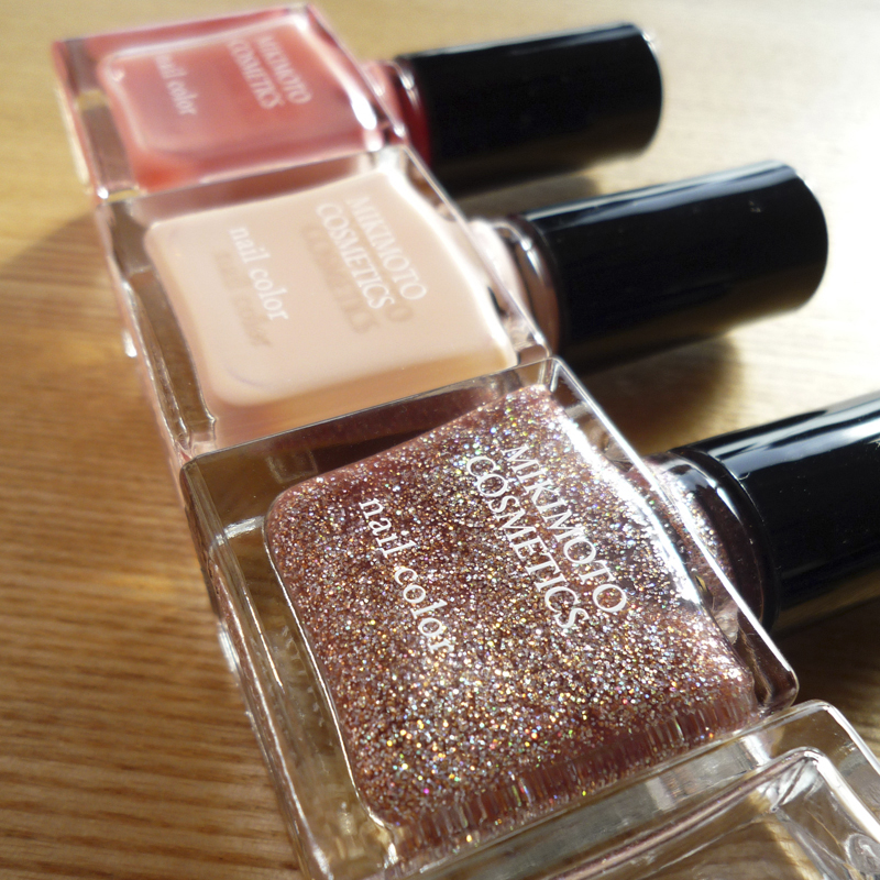
MIKIMOTO COSMETICS【INNOCENT ROSE】
今回のポリッシュは初めての『ミキモトコスメティックス』。あの真珠のミキモトです。去年秋に発売の『ローズペタルネイルキット¥5800』カラー3色にベース&トップが一つになったクリアコートの4本セット。10ml。日本製。『ジューシーローズ』『イノセントローズ』はグロッシータイプ。『ジュエルローズ』はグリッタータイプ。『指先にローズを咲かせるネイルキット』というコピーで箱の説明によれば■MCネイルカラー01/ジューシーローズ JUICY ROSEもぎたての果実のような優しい甘さのコーラルピンク。みずみずしいシアーな仕上がりで、大人の女性をほんのりスィートに魅せるカラーです。■MCネイルカラー02/イノセントローズ INNOCENT ROSE桜貝のような上品で清楚なピンクベージュ。清潔感のある肌なじみのよい仕上がりで、シーンを選ばないベーシック洗練カラーです。■MCネイルカラー03/ジュエルローズ JEWEL ROSEジュエリーの上質な煌めき感を表現した大人の女性にふさわしい上品ラメ。指先に華やかさと遊び心をプラスするカラーです。■MCベース&トップコート/ベース&トップコートネイルカラーの前後に塗ることで、凹凸をととのえて発色をよくし、美しい仕上がりを長持ちさせて自然なツヤを与えます。そして、今回塗った『02 イノセントローズ』。曇りの室内で、やや黄味不足に写っています。白味のあるピンクベージュに、微かなラベンダーパール。パール感は極々僅か、微弱なもので、人によっては気付かないレベル。実際、仕上がりはクリームタイプに見え、表面にパール感がフロートすることもほぼないです。ですが、この色を艶っぽく見せるのは出しゃばらないパール感があってこそ。一度塗りでは若干色ムラが出てしまうので(きれいに塗れたら一度塗りも良い)私は二度塗り以上が、きれいに仕上がります。ボトルで見るよりも、シアーで、それでいてやわらかなベージュピンクの発色もあり思っていたより白浮きはしません。こっちは天気の屋外。実際はこの色味。色といいシアー加減といい、ベーシックなマニキュアを好む方にはぴったり。ブラシは平筆。やわらかめ、毛量は普通。塗りやすいブラシ。乾きはやや早め。単体利用でも艶はいいですが、より美しさと持ちを求めるならやはりトップコートを。『ベース&トップコート』は、艶、厚み、持ち、乾きは普通。一般的によくある使用感で単品で販売されても購入はなさそうかなぁ。カラーの方は色次第で今後販売があれば買うかも。真珠パール入りとかあると面白そうですね。
2017.02.27
コメント(0)
-

ORBIS【シェルべージュ】
オルビスのネイルカラーを買いました。「かなり久しぶりな気がする…」と記事を掘り起こしたらどうやら前回は『2006年3月』らしい。10年経過。。。ポリッシュの数は増え(๑˃̵ᴗ˂̵)و シワも体重も増えました( ᵅั ᴈ ᵅั;)さて、購入したのは新色『シェルべージュ』と、『レディべージュ』の2色。今回塗ったのは『ジェルべージュ』でサイトによると 『肌にすっとなじみ美人度がアップするベージュ』ヌードピンク/べージュピンクをベースに、シルバーパール。時代も年齢も問わず女性が好みそうなこのピンクは通年利用できる色。黄味を帯びた色白な方にはマッチすると思います。曇りの日で色が少し暗いかも。爪先がボコボコしているのは二枚爪のせいで、薬指の中心の色が薄いのは老化で縦筋が入っているため。ネイル&ヘアのサプリで改善中ですが飲み忘れることが多いので効果は今のところ不明。状態の良い爪ならもっと良い仕上がりになるはずです。液はややとろみが強めですが塗りやすく、乾きは早め。ベースはゲランのネイルリフト、トップコートにセシェの場合ですが、持ちはあまりよくなくて、数日で爪先からパリパリと剥がれる結果に。もう1色の『レディべージュ』を塗るときは組合わせを変えてみます。
2016.07.11
コメント(0)
-

YSL【71 SAVAGE PINK】
4月下旬に急遽旦那の長期出張が決まり現地情報を調べたり準備に追われゴールデンウィーク返上でしたが先日送りだし、フゥゥゥ( ´Д`)と安堵し生活リズムも落ちつきました。ゆっくりマニキュアできるԅ( ˘ω˘ԅ) アップするタイミングが遅れて既に売切れとなってしまいましたがYSLの限定色『71 SAVAGE PINK』。サンドタイプのアンティークピンク系シルバー。ZOYAでいう『ピクシーダスト』のザラザラとした質感。サンドタイプでも、チカチカと輝くZOYAのピクシー『第一弾シリーズ』のようなもの、キラキラと華やかな『698 TOMOKO』のようなものもあり、YSL『71 SAVAGE PINK』はラメが多く力強い仕上りで『698 TOMOKO』の色違いのようですね。サンドタイプではないので、YSL『71 SAVAGE PINK』とはあまり関係ない色でしたが↑のボトルを見で思いだした色を引っ張りだしてみました。■OPI『R65 Rosy Reflection』ベースになる色味はよく似ていたので「R65 Rosy Reflectionのシマーをサンド調にしたらYSL『71 SAVAGE PINK』になっちゃうなぁ」という感じで、姉妹ほど似てないけれど、従姉妹くらいの距離感。■OPI『SR376 ULTA TWINKLED PINK』12年前に購入したものなので劣化もあるかもしれませんが『R65 Rosy Reflection』のピンク味を鮮やかに、シマーをより微細に、うっすらブルーの偏光を足した色。■OPI『SR AM2 Pink Caramel』『R65 Rosy Reflection』をべージュ系にし、シマーをより微細に少し和らげうっすらグリーンの偏光を足した色。
2016.05.18
コメント(0)
-

BURBERRY【303 OXBLOOD】
バーバリー、パールラメなしのクリームタイプのボルドー。マニキュアの写真では分かりにくいのですが、白を僅かに混ぜたようなまろやかさがあります。撮影したのは曇りの日。『OXBLOOD』と限定色『GOLD SNOW』も購入。キャップは限定はゴールド、通常はチタングレイ。サイズは約w23×d23×h69mm[8ml]ブラシは平筆。毛量はOPI並みですが、じ、軸が激太!ボトルの口もそれなりに大きめにはなっていますが軸が太すぎるためOPIやESSIEなどの感覚でいると出し入れする度に口に液がまとわりつきちょっとイラっとします。軸を2-3mm細く改良されるといいかも。液はサラサラしすぎず、もったりもせず塗りやすい粘度。スーっと均一に塗りやすく、乾きは普通からやや早め。手持ちの同系色と比べてみました。ネイル歴20年以上、色数800-1000本と増えましたがクリームタイプに目覚めたのが遅かったため「全く同じ!」という該当色はなし。でも、他のブランドにもありそうな色です。左から・BURBERRY【303 OXBLOOD】・CHANEL【18 ROUGE NOIR】・deborah lippmann【JUST WALK AWAY RENEE】・deborah lippmann【GIRL ON FIRE】一番暗い色は、CHANEL【18 ROUGE NOIR】一番青味よりの赤は、BURBERRY【303 OXBLOOD】一番赤味よりの赤は、deborah lippmann【GIRL ON FIRE】ちなみにシャネル『ROUGE NOIR』は暗過ぎ、もう少し赤味がほしいという方にはデボラ『JUST WALK AWAY RENEE』を。より赤味を求めるならデボラ『GIRL ON FIRE』といった感覚でこの3色は彩度が上がるような関係に見えました。チップに塗っていて「塗りやすいなぁ」と感じたのはシャネルで『OXBLOOD』が二度塗りで色の深みを増すのに対し、『ROUGE NOIR』は多め一度塗りで発色が完成といった仕上り。塗りやすさといい色の美しさといい、ファンが多いのも頷けます。最後はボトルで比較。
2016.03.05
コメント(0)
-

Sugar Doll【黒いトップコート】
11月も中旬。今年もあと一ヶ月半ですね。年末にむけて何かとセワしい時期になり毎年ピーピーヒーヒー言っていますが誕生日、クリスマス、正月とハッピーな行事があることで飴と鞭ですが好きな時期です。ネイルの方はダーク、ダル系カラーのベストシーズン。今回はシュガードールの『黒いトップコート』です。やや濁りのあるグレイッシュなクリアブラック。この日はとっても良い天気だったのでチャコールのように見え曇りだと黒味が増します。コンセプト&セールスコピーは『ネイルカラーのニュアンスチェンジが楽しめるトップコート』『あざやかなネイルカラーもしっとり大人色に変身!』ということなので、カラーポリッシュに重ねて魅力を感じる製品。トップコートですが、カラーポリッシュとして使用。一度&二度塗りでは中途半端で薄汚れたように見えお勧めしませんが三度塗り以上で色づいてくるとシャレたマニキュアになります。ベースコートに、黒いトップコートは四度塗り。薬指は中心に縦筋が入っているので、一番色ムラが出来ましたが健康で整った爪であれば(私の場合小指と人差し指)ツルンとした仕上りになります。ややもったりめの量で塗りましたが、エテュセ『ジェルカラコート』シリーズに比べると薄づき。パッケージに『超速乾タイプ』とありますがセシェと比べると乾きは少し遅め。艶も持ちは弱めから普通。「もしかしたら…面白いかも?」と重ねたのはZOYAの2012 SPRING『FLECK EFFECTS collection』の『582 MAISIE』。このホログラムトップコートは優れものでこれはグリーンに『583 OPAL』今回みたいに色合わせをちょっと外すと面白みがでてきますね。フレークホログラムは、販売中か不明ですがESSIE『Luxeffects』もオススメ。旬なアイテムであればホログラムではないけれどシャネルの『ルトップコートラメルージュヌワール』あたりも。ちなみに、持ってはいないけどアディクションにも『003 Black Leopard ブラックレパード』という黒いトップコートがあるようです。
2015.11.17
コメント(0)
-

Mpetit Japan【C355 Military Sweet+C358 Feminine】
顎関節症になり歯医者通いが始まりました。いままでと比べ口が開かず、例えばにぎり寿司がポイっと一口で食べれない具合。バクバク食べたいときは食欲と処理速度が追いつかずちょっとだけストレス。そのかわりなのか、病院帰りにプチプラネイルをバクバク買いました。そのなかで初めて買ったのが『Mpetit Japan』・C326 Bohemian Sweet・C354 Retro Yellow・C355 Military Sweet・C358 Feminine■C326 Bohemian Sweetべージュ系ピンクにシマー。まだ塗っていませんが無難そうな色で馴染むかなと。■C354 Retro Yellow ■C355 Military Sweetちょっとくすんだマイルド系のイエローとグリーン。パールラメなしのクリームタイプ。アディクションのグレイッシュさとTHREEのナチュラルさを足して割ったような色。アディクションほどクールではなく、THREEほどパステルじゃない、といった方が分かりやすいでしょうか。そんな印象の2色。■C358 Feminineクリアベースに、ゴールド、ホワイトのラメ。ゴールドラメが一番小さく微粒で、それにホワイトの四角と丸ともしかしたらランダムのラメ入り。この『C358 Feminine』はオススメ。店頭のサンプルのチップでもイエロー、グリーンなどに『C358 Feminine』を重ねてあったのを見て気に入り買ってしまったのですがグリーン『C355 Military Sweet』を二度塗り。フレンチで『C358 Feminine』そのまま線を増やしボーターにクリアベースでラメの広がり方がよく、境界線がボケてくれるのでポリッシュのブラシでラフに塗っただけでok(*˘︶˘*).。.:*♡ 乾きは遅めで、カラーのみだとキズが入るのでトップコートは必要。ちなみに『エムプティジャパン』というブランド/商品名だったので日本製と思い込んでいたら韓国製。なんだその紛らわしさはーー(´-ω-`)
2015.11.11
コメント(0)
-

GUERLAIN【NAILIFT LA BASE】
10月に入り10連休があり、結婚式が二組。普段とは違うリズム。あっという間に下旬になってしまいました。その間繰り返して塗っていたのが8月限定発売されたゲラン『ネイリフトラバーズ』。これはベースコートでOPIでいえば『ネイルエンビーオリジナル』と似た効果のアイテム。普通にベースコートとして使うのであればOPIでもゲランでも仕上りの差は分からず、ただ単色で済ませるなら艶が良く厚みが程よいゲランです!!色そのものは淡いミルキーなピンクで半透明。ベースコートによくあるタイプの色で塗るとクリアな仕上がり。液質はもったりととろみのあるタイプでブラシによく絡みたっぷりと付きます。瓶の口でしごく程度にもよりますがやや厚塗りになります。ブラシは太めで毛量は多め。平筆で毛先がカーブを描いた『フィルバート/Filbert』型。フィルバート型の長所は、・丸筆と平筆の両方の良さを持つ・動かし始めのカーブが描きやすい・筆をねじることでラインに強弱をつけやすい・フレンチなどのラインが描きやすい短所は・毛先に角がないので、エッジの表現や小さな塗りが難しい・ネイルブラシとしては馴染みがないため扱いにくいといった感覚です。ゲランのブラシは爪幅があり大きな爪の私には使いやすく親指以外の4本はブラシ一塗り/1ストロークでOK。逆にスマートな爪には幅が大きく塗りにくいかも。乾きは早く、5分くらい。爪先のコンディションが悪かったり曇ったりしてますが艶は強めで持ちがとてもいいですよ。一度塗りでもしっかりとコートし表面は整えられ二度塗りでより凹凸がならされて美しい仕上りに。ベースコートだけでも爪の手入れをしている清潔感のある厚み。ベースコートにしてはなかなか持ちがいいので「これでネイルできあがり♪」となっている10月です。前回のスック『蝶輝石』のベースコートはこのゲラン。ちなみにゲランのカラーポリッシュでオススメなのは『463 La Petite Robe Noire』季節も年代も問わないピンクで、60代の母も気に入っている色です。
2015.10.21
コメント(0)
-

SUQQU【EX-12 蝶輝石】
人によってはシルバーウィーク後半ですね。カレンダー通りの私は仕事はなく連休脳のまま週末になりました。こうしてのんびりしていられるのは今のうちで、例年通り年末にかけて仕事は増えそれに加えて旦那の仕事環境に劇的な変化がありこの動きで今後の生活が左右されるので何気に刺激的な秋冬です。「さて、どうなるのか…」と気にかけ心配つつも他人事のように客観視もしていたりと40代で体も思考も肉付けされた分、落ち着き構えられているようです。30代の自分だと…もがき暴れていたかな(笑)( つ•̀ω•́)つ・・:==≡≡Σ=͟͟͞͞(✡)`Д´)グヘッ!大正浪漫っぽいハイカラ色が多かったスックのネイルは現在は限定発売のみ。せめて人気色は残しておいてほしかった…というボヤキをカウンターでしつつ8月7日発売のネイルとアイシャドーを買いました。アイシャドーは定番/新色『20 香薔薇/KAORIBARA』・20 香薔薇/KAORIBARA・21 宵萩/YOIHAGI・EX-26夕蒼/YUUAOI(限定品)のなかで一番普通、無難な色合い。秋の枯れ感と温かみを感じるボルドー系は赤味が重すぎないので使いやすく人気のようです。BAさんによればイメージモデルの使用色はこのパレットで2色のみでのメイクだそうで。久しぶりのスックのアイシャドー、今回も安定の使用感。9月からアイシャドーはこれとクラランスがメインです。ネイルは2色発売で『EX-12 蝶輝石』はグレイッシュピンクパールで偏光タイプ。チラチラとピンク、ラベンダー、ゴールドの微粒ラメがモーブグレイ、オレンジパールといった秋の夕暮れ時の空を思わせる幻想的な表情に。スックの今回のどのアイシャドーパレットとも相性がいいようになっています。偏光感が強めなので一度塗りでも角度によってはほぼ透けない仕上り。二度塗りで透けません。塗り終えて似てるかなぁ…と思ったのが限定色ですがマジョリカマジョルカ『#12ちちんぷい』スックはピンク味でラメは微粒系のみと違いはあるけど従妹くらいの関係に思いました。珍しい色ではないけれど日本人の肌色と馴染む使いやすく少し遊び心のある色です。
2015.09.25
コメント(0)
-

Sugar Doll【48 ストロベリーモカ】
シュガードールのドルチェネイルカラー『48 ストロベリーモカ』。メーカーはヌードボンボンと同じエリザベス。秋にいいかなぁと買いました。ブラウン系ピンクにブルーの偏光シマー。ブルーが強いとモーブピンクに見えたり、黄味帯びたアンティークピンクだったりと変化の幅が大きい色です。一度塗りで少しの透け感、二度塗り以上でしっかりとした発色。今回は全て三度塗りで、モーブピンクの表情は撮れず。曇りになると青味が少し出てきますが普段の印象は、このボトルの色が近いです。乾きは普通から少し遅め、持ちはいい方かも。¥648で良い感じだったので新色の『53アーモンドミルク』を買うかも♪週末からシルバーウィーク。予定は一件だけですが、休暇に入る前のこの時間も好き╭( ・ㅂ・)و ̑̑
2015.09.16
コメント(0)
-

RIMMEL【909】
リンメルは5年ぶりのようで前回は『300』。今回はサンドタイプのライトブルー。店頭のサンプルのチップではシルバーにみえたけどそれは一度塗りだったためで、重ね塗りすると青味が増していき最終的にボトルの色に近づきました。マイルドなブルー系なので青系が苦手な人でも似合いそうな色。ライトブルーベースに、六角形の大小2種のホログラム入りっぽい。数年前は肉眼で見分けられたけど、だんだん見えなくなってきました(沈)ラメ粒に大小のメリハリが少し感じられ人魚を思わせる夏らしい色ですね。取り忘れたけど一度塗りなら青味がフロートしたパールに見え透け感もあり大人っぽい。一度塗りかこの二度塗りが好きです。この3-4度塗りになると、爽やかな色でもハードな感じになりますね。ブラシは、かなーーりコシがなく柔らかい。だから毛先両端の動きを制御するのがちょっとだけ難しい。またサンド調/速乾というのもあり、輪をかけてちょっとだけ難しい。そういえば夏休み始まっていましたね。今日は晴れ間が広がる夏らしい日です。
2015.07.18
コメント(0)
-

INTEGRATE【1 NUDE RED】
7月になり2015年も後半へ。昨日は七夕でしたが空は…雨でした。ネイルはクリアなワインレッド。両手を全て塗り終え二度塗りしようとすると一度塗りの最初の1本が既に乾いている…という超速乾性。なのですぐに重ね塗りできます。爪のコンディションが悪いですが一度塗り今回2-3度塗りまでは一気に仕上げたかなぁ。屋外5度塗りまですれば、この厚み。ただし、減りが激早い…5度塗りしたとしてもこの減り方はちょっと驚いた。減り具合も驚いたけど、気泡の入り具合もなかなかでこれだと目立たないけど角度や光によってはよくわかります。体温が高いと気泡が入りやすいので塗る時は注意してるけどインテグレートはやたらブクブクと入りました。点々と小さなものですが、結構な量。。。水色ポリッシュだったらアブクっぽいのか?色の仕上りは想像通り、速乾性はかなり驚かされました。OPI、ESSIEといったネイルブランドでもなかった気がします。大昔のクリア系というと『通常カラーよりも乾きが遅め』という認識でしたがこの頃のクリア&グロッシー系は逆に『早い』と逆転。エテュセのジェルカラーコートも早かったですが、インテグレートはそれ以上にミラクルスピードフィニッシュです。トップコートの『セシェヴィート』並みかそれ以上!!その超速乾は素晴らし過ぎるのですが大きな欠点が『ペローンと剥げやすい』こと。「チップかっ!」とつっこみたいほど、見事に。普段通りの生活でしたが爪先や両端から浮きはじめ何かの拍子にポロっと。貼付けたらもう一度使えそう(笑)まだ一回の使用なので断言はできないけど、次回はベースコートを塗ってみようと思います。(今回はこのポリッシュのみ使用)ヌードレッドより剥げないのは色は濃くなるけど、ZOYA『638 KATHERINE』。個人的にはこっちをオススメ&好き。インテグレートの製品は今回初でしたが一緒にリップライナー3色『50/PK750/BE350』は抜群に良い色でオススメ!!!またの機会にでも。
2015.07.08
コメント(0)
-

NailNailボリュームジェルカラーN【フレッシュローズ】
NAILHOLIC『BR360』と一緒に初めて買ったネイルネイルのボリュームジェルカラーN『フレッシュローズ』。・フレッシュローズ・サクラピュア・ロマンティックポピー・ハッピースイートピーの全4色、オレンジ系のロマンティックポピーも気になりつつも4色ではハッキリとした色で透明感があるだろうなぁとフレッシュローズ選択。エテュセのジェルカラーコートにもありそうなピンク系。ピンクが好きなのか恋しいのか補いたいのか…分析すると闇を覗き見しそうだからスルー(笑)蛍光灯だと青味が引き出され自然光だとこんな感じに。ボトルにそれぞれの花のイラストでフレッシュローズは『ローズ』。グロッシー系で浮かんだ好きなもの。・OPI『SR AL8 Sugar cookie pink』『F27 In the spot light pink』『2014 Sheer Tins』・ESSIE『545 Pink Glove Service』・CHINAGLAZE『70674 Love Letters』・CHANEL『445 Rose Gloss』・ZOYA『ZP639 PALOMA』『638 KATHERINE』『ZP640 FRIDA』・ANNA SUI『ANNA SUI 608』・JILL STUART『55 Floret Bud』・エテュセ『2 ブーゲンビリア』『RD1 苺シロップ』『RS2 ばらいろ』『PK4 花束ピンク』中でもアナスイのオレンジとZOYA3色は発色とクリアさがいつ振り返っても見事です。さて、色はやや青味よりのピンクにゴールドとレッドの微粒シマーラメ。3度塗りで凝視すれば分かる控えめなシマー。ジェルネイルが定着するに従ってネイルポリッシュも『ぷっくり』『ジェルのような』と謳ったものがトレンドというか主流になって久しいですね。でも実際のところ、そんなコンセプトのネイルポリッシュは3度塗り以上しないとソレっぽくはならないわけで。こちらのネイルもご多分に漏れず。私は自爪の色を健康的に整えてくれる一度塗りが気に入りました。『一度塗り』という点ではエテュセのジェルカラーコートのどの色よりも馴染みが良かったです。爪のコンディションが悪く表面がかさついてますが。二度塗。二度塗り以上になってくると些細な違いでですが黄味があるエテュセ『RS2ばらいろ』の方が指先に溶け込みます。三度塗り。この日は天気で、屋外撮影で見え方が変わります。この距離だとチラチラとシマーが分かります。人差し指や小指あたり。最近アップしたグロッシー系。エテュセ『ばらいろ』『イチゴシロップ』と。『ばらいろ』と比べると『フレッシュローズ』の方が青味系ですね。エテュセのバカンスネール『2 ブーゲンビリア』にも似てます。『フレッシュローズ』の方が色付きはやや淡めで青味より。この2色での比較だとエテュセは赤味よりに見えます。乾きは普通。表面のキズはエテュセ/ジェルカラーコートより入りやすいけどここはトップコートでカバーで♪10mlで¥900くらいだったのでエテュセ(9ml/¥950)っぽいポリッシュ。
2015.06.24
コメント(0)
-

番外編【黒猫ネイル】
アンアンの猫特集に刺激されてのネコネイル。アートはめちゃくちゃ久しぶり。私のキャラには可愛くなり過ぎました。もうちょっとマシに描けてる気がしたけど…アップで見るとラインはガビガビでしたね。「青いおめめがカワイイかも♪鼻はピンクかな。首輪も鈴もつけちゃって…」描きはじめたら思いのほか色数を使いました。ブラック…ZOYA387 RAVENブルー……JILL 38 BLUEBERRY BREATHレッド……JILL 109 LOVE SCANDALピンク……ちふれ 119 グレイ……エテュセ 6 わたげゴールド…ZOYA 662 MARIA LUISAシルバー…ZOYA 698 TOMOKOブルーは実験で混ぜ合わせたディオールのベースコートに、セフォラ013 HAVANA DREAMSと009 CARIBBEAN COCKTAIL。相性悪くムラムラで失敗。昨日今日でキットのブレスレットを2コ制作。久しぶりにそんな休日です。
2015.06.14
コメント(8)
-

NAIL HOLIC【BR360】
ヨドバシのネイルコーナーでズラズラーっと幅を利かせ、豊富な色展開だった『ネイルホリック』というブランド。「初めてみるなぁ…」とボトルを手に見れば製造発売元はコーセーで、フランス製。5ml。そして388円♪今年2月にスタートしたブランドのよう。5mlというのはエッシーミニボトルと同じで、少量でも個人的に程よく扱える量。エテュセのバカンスネールの2mlまでになると、液質もあるかもしれないけど粘度が高くドロドロになってしまうのが早くて。一般的なカラーは58色(うち2色はトップコート)、フローズンシュガーという表面がザラザラと砂のようなサンド調になるカラー6色、他にアート用の極細ブラシのものが4色。と、色数が多く数分眺めて選んだのがフローズンシュガー『BR360』色はテラコッタオレンジをベースに、シルバー、ピンク、ブルーもしくはミントの微粒ラメ入り。といってもピンクとブルー/ミントの色…撮れないというわけでして、メインの輝きはシルバーですね。一度塗りでは透け感は少しあるけど良い発色。私は濃さをだした二度塗りが好きです。写真は全てそう。光によって見え方に違いがある色もありますが、このBR360はどんな天候でも、どの蛍光灯タイプでもきれいに見えます。質感は、こんなザラザラとした凹凸。ブラシは平筆。質感はサラサラとしていて塗りやすいです。乾きもZOYAでもそうですが、このサンドタイプはかなりの速乾性。時間がないけどネイルしたい!という時はダントツでサンドタイプ、オススメです。サンド調といえば私はたしかZOYAの『ピクシーダスト』から使いはじめたかな。とても気に入っているのは【698 TOMOKO】【ZP658 GODIVA】 【675 STEVIE】 ポリッシュ抱え過ぎで普通は『使用2回目』という機会がなかなかこないのですがピクシーに関しては超速乾なので急いでいるときによく使います。フローズンシュガーの他の色も改めてチェックしつつ、どこかアディクションのような色が多いベーシックカラーも気になってきたネイルホリック。
2015.06.12
コメント(0)
-

雑誌2冊【ねこ+おまけネイル】
ねこ×anan。楽天でもAmazonでも売切れでコンビニへ。最後の一冊を買えました。人気みたいですね(ฅΦωΦ)ฅ そんなコンビニの棚でチラッと見えてしまったネイルボトルの写真の雑誌。手に取れば付録がネイルポリッシュ3色(๑˃́ꇴ˂̀๑)「おまけネイルが3本だと1200円くらい?」と思ったら780円♪想像より安いとこれまた嬉しい。初めて知った『Gina』という雑誌、どうも28歳あたりがターゲット。既に40代の私には過ぎ去り過ぎた年齢。シンプルなスタイルが好きでジーンズやパンツが多い私には年齢層はかけ離れているものの好みのスタイルで『ボーダー、チェック、ストライプ定番柄の着こなしはセレブに学べ』という記事はボーダー好きな私は内容も楽しめそう。さて、雑誌の表紙の写真と実物を並べて。『Gina』×『FRAY I.D』パステルな3色。ネイルポリッシュに惹かれて買ってしまったわけですが。残念ながら期待し過ぎたようで(´-ω-`)3色とも塗るのが一番難しい『クリーム』タイプ。粘度高め。マニキュアはいろいろと使って慣れているはずだけど一度塗りでは筋がザーザー入ってしまう。少量だとスジスジになるのでもったりめで3度塗り。乾きは普通からやや遅め。ストレスになるほどではないかも。3色の組合わせは素敵なのに、この塗りにくさはとても残念。量は10ml。中国製。撹拌玉はナシ。ブラシは平筆。一見普通っぽく見えるけれど、一般的なブラシより毛が太く、硬く、毛先が揃ってない。「ブラシを変えたらいいのか?」とエッシーの空きボトル/ミニに詰替。エッシー604/アイボリーパールが少し残っていたので色が混ざったけど塗りやすさはやや改善したかな。利き手じゃないと塗りが難しそうだから…ペディ用かな。薄めて使うべきか、面相筆などでライン、水玉模様などで使うか「マーブルなら!」とやってみたけど、液がもったり、手際も悪く、マーブルには向かないタイプだったようで結果ぐだぐだ(´-ω-`)このボコボコ、月面ネイルとでも言いましょうか。なんとか使ってあげたいけど、む、む、難し過ぎるーーーいい色なのになぁ。先週から仕事が詰まり気味で、法事2件で出かけたりと落ちつかない。。。今週末くらいは溜まってきた雑誌をゆっくり読みたい。さて休憩おわり。仕事だ、仕事だーー٩( 'ω' )و
2015.06.09
コメント(0)
-

Izavell【Nail Cologne/沈丁花】
1月の仕事が落ちついた、と思ったら風邪をひき10日経過。一週間前がピークで数日寝込みましたが、今は鼻水くらいに回復。今回はかなり味覚が鈍くなり「味が分からないと食事って楽しくない…」と歯ごたえとのどごしの良さで蒟蒻畑を食べてるせいか3キロ減量。というのは唯一のラッキー。そんな具合で素爪生活。爪はボロボロ折ってしまって、形を整える気力もないところお湯で落とせる気軽なアイテムを使ってみました。イザヴェルというメーカーで『ネイルコロン』というもの。フィルムタイプのマニキュア。子供向けのネイル商品と同じと思いますが、大人にはシーンが限られそう。・家事(特に食器洗い)をしない日に・今日だけ爪に艶がほしく・短時間で塗れて・落とすのが楽(お風呂入ったら勝手に落ちてる)という時かな。2種類あり『ジンチョウゲ』と『キンモクセイ』。ネイルコロンということで香りで選ぼうとしていましたが成分から違うようで『ジンチョウゲ』いきいき対策成分・唐辛子エキス/爪コンディショニング剤・ヒアルロン酸/保湿・セラミド(セレブロシド)/保湿『キンモクセイ』臭い対策成分・緑茶エキス/保湿・カミツレエキス/保湿・甘草エキス/保湿匂いは、しっかりとしています。香ってすぐに「沈丁花!」とは答えられないものの言われて匂えば「そうそうそう…」といった感じ。キンモクセイもジンチョウゲも好きな香りですが、昭和生まれの私にはトイレの傍に植樹というイメージ。一般的にローズ&ジャスミン、あたりで売り出しそうなところ渋い香りの選択ですね。『即乾10秒』というコピー、たしかに乾きますがちょっと表面がペタペタするので1-2分置き、一度水で流すと安心仕上げ。艶は、phのようにいい具合にでます。ブラシは、一般的なネイルブラシに比べると短い。けど、塗りやすい。ただ、このリップグロスのような長ーい形状。何度も出し入れし塗らなくてはいけないネイル用途にしては柄が長すぎ。スマートなデザインですが持ち歩く物ではないのでネイルボトル型だとよかったかな。色は、ちょっと白濁したマゼンタピンク。パールラメなし。チップに気持ち多めで塗るとL:ネイルコロンジンチョウゲ/R:何も塗っていないチップオフは、ぬるま湯で3-5分浸ける。ただ、普通にお風呂入っても落ちますし、洗い物とかしてると落ちてほしくないのに部分的に落ちます。水で手洗い程度では大丈夫ですが、ハンドソープを使うと少し落ちてしまう。うーん。なんだかマットネイルが流行り出していますが、「今日はツヤツヤにしたいなー」という日にこれを塗る、というのはありかな。覚えていたら実験します。
2015.02.08
コメント(0)
-

THREE【Nail Polish Basecoat+Topcoat】
ギリシャ戦、惜しいゲームでしたね。次のコロンビア戦に向けて、週末にでも験担ぎでブルーを塗ってみよう。さて、そのベースにも使おうとしているのがTHREE初のネイルアイテム。カラー全9色、ベースコート1色、トップコートが3色。コンセプトは…『THREE初のネイルコレクションは、青く透き通った空に浮かぶ、 小さな雲をさまざまな表情を切り取りました。 繊細な奥行きを感じさせるクラウディカラーは、 肌に自然と馴染むニュートラルな発色で軽やかなニュアンスを感じさせます。 それぞれの指先に生まれた色彩の雲に乗って、気分も高く弾ませて。』全色買いしてもいいほどの魅力はありましたが手持ちと重なるようだったので今回のコレクション/カラーポリッシュは見送りベースコートとトップコートの2本だけ。ベースコートは、1種類『CLOUDLESS MORNING』。『酸素透過性処方で圧迫感のないつけ心地』という説明の効果は分かりませんが爪を健やかに保つ処方はうれしいですね。色は、桜色。これが一番実物に近い色。4/17新発売のエテュセ『ネールガード』と比べると、ボトルではよく似た色。ついでにボトルのカラーリングも似てる…ですが、塗るとTHREEの方がシアー。カラーを塗らずベースコートだけという場合は、繊維がなく、白浮きしない、ムラになりにくい『THREE』の方がいいです。さて、トップコートは3種類。・『CLOUD CLEAR』・『01』・『02』購入したのはクリアの『CLOUD CLEAR』。こちらもベースコート同様に『酸素透過性処方』だそうで。乾きは早めで、仕上りは薄い仕上り。持ちは普通から良いレベル。ボトルは四角柱。量は7ml。一般的なものよりも少なめ。価格は¥1,800-。キャップは、ダブルキャップ。外キャップはグレイ。内キャップはブラック。ブラシは平筆、毛量はやや少なめ、毛先の長さはやや短め、コシはやわらかめ。クセがないので使いやすいタイプだと思います。ちなみに、ネイルリムーバーは今のところリキッドタイプはなく、『ボタニカルエッセンス ネイルポリッシュリムーバー/¥1,000-』というシートタイプのようで1枚入り×10包。液状と比べると高いなぁとは思うけど、一度は買ってみたいかも。
2014.06.20
コメント(0)
-

MARC JACOBS/ENAMORED【132 BLUE VELVET】
日曜毎に寝倒して、昨日は16時間寝てました。。。先月から私用でくたくた。でも痩せないんだなぁ。毎年コフレの季節はピョンピョンヾ( ゚Д゚)ノ゛飛び跳ねているはずですが今年はめぼしいものがあまりなく。好きなネイルポリッシュも燻って、気分は買いたいのに燃えるものがない…というわけで、今年は衣料にシフトして欲しかった手袋を買いました。レース模様の美しさはもちろんのこと、配置バランスがよく指先がほっそり華奢に見える。独り占めは勿体ないのでまた改めて紹介します。さて、マークのブルーベルベット。ベースになるブルーは真っ青ではなくてブルーにイエローのシマーが薄く張ったようなカラー。上手く撮影できませんでしたが(・へ・)ボトルではイエロー/ゴールド、マゼンタのマジョーラが見え隠れ。だけど爪に塗るとその表情は出ずフラットな発色。今回ポリッシュは3色買いましたが、マークは薄づきに『見える』仕上り。液を多めにとっても思ったより厚み感が出ないので、爪にペターっと薄いビニールが張り付いたような見え方。クリームやザクザクラメ系では違うかもしれませんがこの3色はそんな感覚。ちなみに剥げ方はパリパリと剥げ落ちていくタイプ(擦れて消えるタイプではない)。しかし、すっかり寒くなりましたね。体調を崩さないよう温かくお過ごしくださいヽ( ´ー`)ノ
2013.11.18
コメント(8)
-

MARC JACOBS/ENAMORED【140 PETRA】
年のせいかなぁ、新米の美味しさ、米は旨い、と素朴に思う秋。すくすく体重も増え、つ、ついに体重が60キロになりました(´ε`;)。。。20歳の頃、毎晩のように飲み歩いて一度同じ体重に増えましたが、社会人になってから仕事で揉まれ叩き込まれ48-50キロに戻り。30歳の頃じわっと52-55キロになり。結婚してまた太ったり激やせしたり、今年からじわりじわりと『二の腕が太くなって長袖がきつい…( ̄д ̄)エー』と言ってたら案の定Σ(゚д゚lll)ガーン年々太りやすく、痩せにくい身体になってきました。体型が嫌なのもあるけど、でっかい身体に合わせて服買うのって嫌ーーー年末には55キロになりました☆としれっとつぶやけるようになろう∠( ゚д゚)/と、恥じらいながらも公言するのでしたw有言実行というのはいかほどに( ´ー`)フゥー...さて、マークの2色目です。『PETRA』は、ダークブラウンベースにゴールドのシマー、それより微粒のシルバーとピンク(マゼンタ?)のシマー。拡大するとゴールドシマーというより、フレークっぽい不規則な形のゴールドが見えますね。やさしい日射しだと干しぶどうのような赤茶紫っぽい表情を見せますが基本的には燻されたような渋味とシマーさで指先に鉛のような重みがありますが、表面にスモーキーなニュアンスがあり、艶かしく女性的なダークカラー。ボトルの大きさはOPIと比べるとこんな感じ。ブラシは、左:マーク丸筆、右:OPI平筆。写し方が分かりにくいけど、OPIの方が毛量は多い。ボトルは平たい楕円形。内キャップはギザギザしてるので開閉しやすく握りやすい。>私の肌は黄味が強いのですが、指先は赤味を帯びておりその赤味とポリッシュのピンク味がマッチしたようで肌の色を明るく美しく見せてくれる色。二度塗り仕上げで透けずに発色。一度塗りでのムラも何処へやら。カラーだけだと艶不足で中途半端なので、トップコートを重ねた方が私は好きです。最近の掘り出しもの『The Lost Fingers』80-90年代のカバーをいろいろしててクネクネバブルな曲がまぁこんなアレンジって。カルチャークラブのカマカマ。ユルさがぴったり。ボンジョヴィの名曲は出だしで崩れそうになるけどクセになる♪なーま麦、なーま卵(空耳)ファンキーなあの曲も。
2013.10.20
コメント(2)
-

MARC JACOBS/ENAMORED【130 SALLY】
『マークジェイコブス』からメイクアイテムが登場。日本での取扱いは2015年?という噂で待ちきれずにいくつか取り寄せました。ネーミングから捻りがありネイルはHI-SHINE LACQUERとありますが『ENAMORED』夢中、惚れるといった意味のコピー。他のアイテムもこんな具合で・チーク/BOLDBLUSH『SHAMELESS』・リップ/LIP GEL『LOVEMARC』・リップクリーム/MOISTURE BALM『LIP LOCK』・ファンデーション/SUPER-CHARGED FOUNDATION『GENIUS GEL』などと、チャーミングなコピーがつけられています。なかでもファンデーションの『天才ジェル』という解釈でいいのか分かりませんがジーニアスなんてつけられたら試したくなるわけで。こちらはまた後日レポートします。さて、ネイルは全24色。今の気分で3色選びました。・130 Sally・132 Blue Velvet・140 Petra まず最初に塗ったのは『130 SALLY』。カラー三度塗りにトップコート。用紙に塗った時は、墨ベースにミントかグリーンシマーに見えていたのですが爪に塗ってみたところ、どうやらマジョーラ系。色が暗過ぎたのと、自分の目がバカになってるようで(老眼…)見極めが難しい。基本かなりのダークグリーンに、ブルーシマー。あれこれ書くよりは一見ということでボトルを。一色にシマーかなといった見え方ですが、裏から見ると分かりやすく青と緑の2色が登場!ちなみに、アメリカ製と思っていたら『MADE IN UK』とちょっと意外。ボトルデザインは、コロンとした丸みのある形状。艶のあるブラックのキャップにシルバーの帯、ダブルキャップ。大きさは約W50×H65×D20mm。量は13ml(シャネルと同じ量)。ブラシは丸筆、毛量は気持ち少なめ、コシは柔らかめ、長さは普通。液はサラサラ、筆がまだ使い慣れていないこともあり一度塗りをするとこうなった。光沢っぽく見えたりするライン&濃淡ですが、実は塗りむら!しかも人差し指(奥)は二枚爪でガタガタという。なんて塗りにくい…大丈夫なのかしらん?と思いながらの二度塗りでムラが少し解消。phではシマー、色味がよく写し出されていますが実際はここまで感じません。(黒とは言わないが緑黒、塩ワカメを黒くしたような色かなぁ)ここまでのシマー、またマジョーラ感を期待して購入するとアレレ?となりそうです。三度塗り&トップコート仕上げ。ここまで重ねれば完全に均一になり問題なし。セシェを使いましたが、やはり根元が縮んでしまいますね。乾きは、普通。他の色でまた違うかもしれませんが早くもないけど遅くもないかな。持ちは塗ったばかりなのでまだ分かりません。この色塗って思いだした色はMAC『Beyond Jealous』でそのシマー版がマークのこの色っぽいイメージ。ダークカラーにこだわりのある方には好まれるかも。爪の表面をいつもより丁寧に処理して塗ると良さそうです。
2013.10.11
コメント(2)
-

GUERLAIN【463 La Petite Robe Noire】
台風きてますね。数時間前ザザザーっと降り始めたので「これから降るのか」と思っていたら、今は曇り。災害が出ない台風であればいいですが。今日は模様替えで室内がえらいことになってまして。結婚記念日に合わせてテーブルを新調し今日届いたのですが、一人で組み立てられるサイズではなく開封して諦め広げてそのまま。段ボールまみれで洒落っ気のある雰囲気は微塵もなく。私らしい無邪気な現場といえばそうですが。しかし配達日をミスったwさて、ゲランのネイルポリッシュは今年5月に10色発売。7色くらいはレッド!コーラル!ローズ!ボルドー!とパンチのある色で「このあたりの色は必要な時に慎重に選ぼう」と一旦保留して一番使いやすく&選ばれそうな『463 La Petite Robe Noire』、そして評判の良いトップコート『Le Top Coat Gel』と購入しました。『463 La Petite Robe Noire』は、トープ/見え方によってはカッパー帯びたピンクベースになめらかなパール。パールの筋はカラー二度塗り後は少し目立ちますがトップコートを重ねれば表面が同じトーンで輝くような見え方になり気にならず。天気の良い屋外で撮影、ややメタリックに写っている気がしますが、実際にはここまでシャープに感じることはないです。強い光線に当たることでメタリックよりになっていたパール感(↑)が室内では落ち着きシルキーな質感に見えるようになります。OPI P02/Nomad's Dreamよりもシンプルな色味で(赤味が少ない)ROCOCO NAIL APPAREL『7219 STONE COLD KARMA LUXE』ほど紫/青味はない感じ。上記の2色も季節、年齢を問わず使えますが、ゲランのこの色が3色のなかでは一番日常使いでも、華やかな席でも、その場に適切な美感を持たせてくれる色かなぁ。『ル トップコート ジェル』ブラシは平筆、毛先が弧状のフィルバート型。思いだしたのはディオールのもの。珍しい形状なのでディオールでの使いはじめは「ちょっと隅の調整が難しいかもしれない…」と苦戦しましたが、力加減や、持ち方、を少し変えたら、そこそこ慣れました。なので、ゲランも同じだろうと思っていたら、それより少しまた難しい。ゲランは毛量が少し多め、長め、コシは同じくらいの柔らかさ。個人的に少し長め点が境界線を塗る時の調節が難しい、意思が伝わりにくい感覚です。今回ベースはESSIE『プロテインベースコート』を使い、カラーは二度塗り、トップコート一度塗りで仕上げましたが、持ちがとても良い!!欠けも、擦れて剥げるということもなく1週間はきれいな状態。カラー単体がいいのか、トップコートがいいのか、それとも両方の相性がいいのか分かりませんが持ちの良さを実感。他のブランドのカラーでゲランのトップコートを使って見極められるといいですが。速乾性はセシェよりは遅いですが、ストレスを感じずに乾きいい方です。テクスチャーは粘度やや高めのもったり系。流れることなく、糸を引くようなこともなく、塗りやすいです。厚みは一度塗りでも意外と盛れる感じで、モリモリとまではいいませんがリッチな感じの厚みに。二度塗り以上すればどんどん厚みを増せますが、私の思う『ゲラン』イメージなら、カラー二度塗り、トップ一度塗りが淑女っぽいかも。
2013.10.08
コメント(2)
-

Bobbi Brown【Roza】
連休中ですが、カレンダー通り。先月から長期戦の仕事でその束縛感であまりリラックスできません。スイッチの切替が下手なのか、仕事が趣味なのかも曖昧。Lilac Roseコレクションより限定色『ローザ』。グレイッシュペールピンク。パールラメなしのクリームタイプ。ボビイブラウンの色展開の特徴というと、スキンカラー/ブラウン系の充実でそんなブランドカラーにぴったりとくるネイルカラー。近い色は、■OPI『F16 Tickle My France-y』最初に発売されたロット/時点での色。(以降&現在は赤味が増したらしい。それはそれで買ってみたい…)ボビイの方が青味のあるピンク(赤味/オレンジ味がOPIほどない)といった感じ。ただ、OPIのF16は、2008年9月購入で経年変化もありそう。(OPIは平筆になったあたりから分離や色の変化が起きやすい気が…)■OPI『I48 Get Me To The Taj On Time』この色に赤味と灰色を少し足したらボビイの色。■ADDICTION『018 RSVP』ボビイより青味より(赤味低め)、OPII48に近い。チップのphが一番分かりやすいかも(ADDICTION撮り忘れた…)11mlと量は普通で、ブラシは丸筆で毛量はやや少なめだけど塗りにくさは今回感じず。年齢問わずいつでも使える万能色。
2013.05.01
コメント(6)
-

Elegance【19】
2月18日発売のエレガンス新色『19_あでやかでエレガントなパールローズ』“ローズ”という表現が使われると青味ピンクを思うのですが、この色はコーラルピンク(黄味)をベースにうっすらと表面にブルーパールがフロートした感じかなぁ。黄味と青味の両方を持ち合わせた色なのは確か。目新しさはないものの、春らしさを含んだピンクです。どちらかといえば色白さんに似合いそう。健康的な肌色だと、色が少しくすむかもしれない。しっかりとした発色で二度塗りで透けずに、ボトルのような色味。先日、目の前で売切れた…と項垂れていたバッグ。昨日入荷したと連絡があり、即突撃。次回まとめます。
2013.03.05
コメント(2)
-

SUQQU【EX-01 瑠璃珠/EX-02 桜珠】
スックの2013年春色は10周年記念でもあるらしい2色。・EX01 瑠璃珠/RURIDAMA・EX02 桜珠/SAKURADAMAチップの、特に『桜珠』は実際より青っぽく写ってまして。塗ったphの方が実際に近い色味。スラリとしたボトルに5mlで¥2,625-。SUQQU価格です、強気ですwまったりペースで新色発売なので買えています。(ちなみにOPI、ESSIEは15ml。CHANELは13ml。)マニキュアもくすみのある色は上手く選ばないと老けてしまいますが、この2色はブランドがターゲットとするマチュア世代が使用して老け込まない色。その匙加減がなるほど美味しい仕上がりになっています。■EX-01 瑠璃珠スモーキーなネイビーにシルバー、ブルー、ピンクの微粒パール。角度によって青味の燻し銀のようにも見えます。この2つの顔が、どちらもシックな雰囲気で素晴らしい。一度塗りだと薄墨のような慎み深さがあり、個人的には「この色が二度塗りで出ればいいのになぁ」と実は浅い色の方が好き。でも、濃淡が出てしまうので結局二度塗り仕上げ。とはいっても、日本の伝統色を思わせる静かなネイビー。マニキュアに難しい場合は、ぜひペディキュアで。「黒は強過ぎ」で「ボルドーはちょっと色気が増し過ぎ」というときにはこのネイビーが、控えめなインパクトでハッとする美しさ。オススメです。■EX-02 桜珠グレイッシュピンク、またはミルキーなモーヴにパール。「こんな春の影色もいいなぁ」とグレイッシュトーンのパステル。渋味はあるけどパール感があることで塗った時に華やかさと清潔感が保たれ、赤味が主張しすぎないので、爽やかな清楚感あり。調和を求められるシーンに使いやすい大人の色。今からだと卒業式、入学式のフォーマルなお母さんの爪にも良さそうですね。スタンダードにパールのネックレスともマッチする艶。こちらもオススメ!!
2013.02.19
コメント(0)
-

LANCOME【532 GINGER SWING】
12月になりました。この月は私の誕生日も含まれ、今年40(読み方としては『しぢゅー』って感じ)。先月50代半ばのクライアント/トモコさんと食事で「funnyちゃんいくつになったんだっけ?」と年齢の話になり、どうやら初めて出会った時のトモコさんは今の私くらいの年齢で、「トモコさんはこの歳であの大人っぽさだったんですねぇ。うはー私全然ガキ…」と焦りました。マズいぞ。何か取り残されている気分だ。だが、どうにもならないので(そういう諦めの良い点はたしかに不惑?)、私のぼんやりと理想とする年齢の重ね方をしている方、私の分まで任せたっ!さてさて、いつもの調子で。ランコムのクリスマスカラーより『ジンジャースイング』。サラサラとしたラメがフロートするような煌めき。今はもうオフしちゃったのですが、リムーバーで拭き取り中に微かに指先に残るシアーなラメがこれまた美しく。ラメ一粒、一粒の輝きがしっかりとしてるようです。同時期購入したディオールと似ていますがランコムの方が発色が良く、透け感が出ない仕上がり。色もディオールはゴールド/オレンジのラメが少し斑点っぽく見えるのに対してランコムは均一化された発色ではないかなぁと。華のあるゴールド系ではあるけれど、落ち着きがある色。私が理想としていた40もそうそうそれだw
2012.12.02
コメント(4)
-

LANCOME【575 FLIRTY RED】
クリスマスコフレで賑やかなコスメフロアですが、私の第一弾はランコムのホリデーカラーのネイルポリッシュ☆全3色から購入したのは下記2色。・532/ジンジャースイング・575/フラティレッドしっかりとした発色で、一度塗りでもこの濃さ。二度塗りで色が整いまして、セシェでウルウル仕上げ、と。今回の『575/フラティレッド』は、ワイン系の青味が実はあるボルドーレッド、シマータイプ。OPIのジャーマン・G18 Every month is Oktoberfest・G19 German-icure by OPIあたりの濃さとシマーが好みでレッド系を狙うのであれば、このランコム『フラティーレッド』なんていかがでしょう!重ねる回数/濃度で見え方が変わる不思議な色で、一度塗りの時点で色味が薄いと青味が出てワイン系よりで、二度塗りで重ねればゴールドシマーが強まることでブラウン系によりボルドーっぽく。このphだと分かりやすく、ボトルの色がピンクっぽい部分と、茜っぽい部分あり。今回、シャネルの『637/MALICE』も購入したのですが、なんと…仕上がりはほぼ同じ(二度塗り)。なんですが、ベースカラーが違い、光にかざすと(こちらは一度塗り)・ベースの色/シャネルが赤系、ランコムが青系(もしくはマゼンタ系)・表面の発色/シャネルはクリア、ランコムはスモーキー。・シマーの色/シャネルよりランコムの方がゴールドが強い。ここまですると色の違いは分かるけど、塗った状態では見分けがつきません。というわけで、どちらか1本あればいい色。ブラシは平筆、毛量は普通からやや多め、コシはやわらかめ。平筆の幅がワイドで爪の大きな私ですが小指で「ちょっと塗りにくい…」と感じたので、普通の爪幅、華奢な方だと扱いにくいかもしれません。それと、毛のまとまりが悪い。毛先はフラット型ではなく、弧を描いたフィルバート型のようだけど、ちょっと粗いかなぁと。下はシャネルのブラシ。スパッとまっすぐですね。乾きは早めで、サクサク塗っていくことができる。西日が当たると黄金色が強めに…この系統の色は肌を白く見せてくれるので塗ってて美人な気分になれるw
2012.11.06
コメント(4)
-

REVLON【430 WHIMSICAL】
デボラリップマン『グリッターインジエアー』が欲しいーーと叫び、日本代理店が出来たものの買うほどの購買力はなく、そのままになっているわけですが。レブロンから「パクリだよねぇ?」というほどのカラーが発売されました。レブロンのネイルは・F-034/Crystal Ball(80年代バブリーさ溢れる青味系ピンクパール)・F-27/Tangerine(山吹系オレンジをベースにゴールドのシマーパール)につづいて、今回の『430/ウィムジカル』で3本目。レブロンのネイルというと、以前から海外でも「デュープじゃない?」と評判w私も新色発表で色展開を見る度に「そんな気がする…」と思っていましたが、今回購入した『Whimsical』で「完全なパクリだ!」と確信できたので、他社の人気色をコピーしていたのは気のせいではなかったようです。ちなみにこんな感じで。・Deborah Lippmann『Bad Romance』→Revlon『Facets of Fuchsia』・Deborah Lippmann『Glitter in the Air』→Revlon『Whimsical』・Chanel『Graphite』→Revlon『Carbonite』・Chanel『Paradoxal』→Revlon『Perplex』・OPI『Gone Gonzo!』→Revlon『Blue Mosaic』ヒットしたカラーは次のシーズンには出してくるというwそんな、露骨なことをしてしまうレブロンなので独自のこだわりはなく人気のあるものを安く売ってしまえという感じで独創性はほぼゼロ。「同じ色でも我が社は安く提供できるんですよ…」と思ってるかは知らないが他社の1/3以下の価格で販売しているところは庶民の懐に優しい正義の味方。あと、限定色だったものを似て出してくれるのは買いそびれた者としては嬉しいけど、でもちょっと複雑。そういう思いがありながらも、以前から気になりつつも購入できなかったデボラリップマンの『グリッターインジエアー』を今回は安く!そして買い求めやすい環境にある!レブロン『Whimsical』で代打(`・ω・´)シャキーン色が淡いということは、レビューから分かっていましたがたしかにかなりのシアー。今回下地をエッシーの白系ベースを二度塗りし、それからカラーを5度塗りくらいして透けないかなというくらい。一度塗り。(地道なラメの乗り方もご覧ください)二度塗り。三度塗り。四度塗り+トップコート。ただし家事をして指紋がついたり、指も乾燥とダメージ。なので、上から数日後にしつこくトップコートで修正。ウル艶復活!曇りの日なので色味が分かりやすいかな。こんな感じで、ちょっとグレイっぽさがあります。あと、ラメがですね。ボトルで見るにはきれいなバランスなのですがブラシに取るには少ない量なので、なかなか六角グリッターがブラシに絡まず面積が広い爪ならグリッターがポツポツとのりますが、小さい小指なんて二度塗りでも1枚も乗らないという事態に。そんなわけで、見た目よく塗るためにもいつもより多めの回数を塗らないといけません。質感は、シアー&ミルキーなミントブルー系をベースに、六角グリッター(ピンク、ブルー)、小さめ六角/もしかしたら丸かもラメ(ピンク、シルバー)、四角ラメ(ブルー)、微粒ラメ(ホログラム系?)と、いろいろなサイズのグリッターが入ってます。数回重ねでは感じなかった微粒ラメが、厚く塗れば塗るほどしっかりと配合されていることが分かってきました。このphだと人差し指がなんとなくザラザラ入ってそうなのが分かりますかなぁ。発色は、明るい場所なら水色感はあるけれど、実際はブルーグレイといった感じなので、地味めな系統。パステルさを求めると「なんだか薄汚い…」という感覚になるかも。重ね塗りをしなくちゃならんし、乾きが早くはないこともあってどちらかといえば時間がかかるカラー。本家は違うのかもしれないけど、レブロンで満足してしまったwちなみに、WHIMSICALの意味は…と調べれば『気まぐれな、むら気な、変な、妙な、こっけいな』なるほど。
2012.09.19
コメント(4)
-

BOBBI BROWN【TWILIGHT】
オリンピックの日本人競技目白押しですね。女子サッカーを中心に追っているので決勝まで進んだことは嬉しい。画面からでも覇気は強く伝わってくるので頑張ってほしい!準決勝だったか男性アナウンサーが「サッカーの聖地ウェンブリーにナデシコの花が咲きました!」みたいな台詞。あの方の表現力、ステキ。感動と共に脳裏に緑の芝生いっぱいに撫子の花が咲く風景が浮かびましたよ。まだ優勝でもないのに、かなりの感動させられました。そんな、これから!というときに「黄昏/たそがれ」という名前のボビイブラウンのシマーネイルポリッシュ『トワイライト』。(塗ったのはちょっと前だけど、ちとタイミングが…汗)『ターコイズ』と同時発売の限定色。色は、レーズン系と思っていたけどきちんと二度塗りすると私が思っていたよりもレーズンのパープルは出てきません。レーズンに赤味と黒をかなり足した『烏羽色』というのが近いかな。影になるとこうして黒味帯びてくる。と思ったら、光にあたると表面がいぶし銀っぽく明るくなったりする…近い色はあるかなぁ、と軽くOPIで探してみたところ、この2色。・HL706 Have You Seen My Limo?・D01 Lincoln Park At Midnightちょっと脱線するけど、OPIが平筆になった頃からか分離や沈殿しがちなのね。真ん中のHL706もそのタイプで、白っぽいのが沈殿して振っても元通りならない。10年前の色は普通だったり。ん?で、こうしてみると近いといえない色でしたが。ボビイが一番ブラウンより。いや、グレイになるのか???色の比率は違うけどシマーの質感はHL706と同じ。ボビイのシマーは、ピンク/レッド、シルバー、グリーンあたりが分かる感じ。うーん、なんて表現すればいいのかいいのかな、この色。だけど今回のphはなかなか忠実に写っているので語るより見てもらった方が手っ取り早い色(´∀`*)ノシ気が早いけど、ボビイはクリスマス前にホリデーでもネイルが限定発売とのこと♪どんな色でしょうね。1-ESSIE_Ridge Filling BaseCoat2-BOBBI BROWN_Twilight3-BOBBI BROWN_Twilight4-SUSIE N.Y._Nail Volume Gloss Lavender 5-SUSIE N.Y._Nail Volume Gloss Lavender
2012.08.09
コメント(0)
-

SUSIE N.Y.【Nail Volume Gloss Lavender】
一日悲鳴を上げつづけてる今日。寝違えて首がめっちゃ痛く、こんなに痛いのは人生初。これまでなら声が出ても「いてっ」くらいな程度でしたが今回は「いたーーーーい!」と1オクターブ高い悲鳴になるほどの激痛。しかも、予期せぬ動きで痛みが走るのでたまらん。。。さて、マニキュア好きなら、絶対不可欠なのがトップコート!!私もいろいろ使っては完璧なものを探し求めているわけですが今のところリピートしているのがセシェヴィート。唯一の欠点は『縮む』こと。まぁ正確にボヤくのであれば…『液がもったりしがち』『合わせるものや状況でペロンと剥がれる』とかもあるけど、・デカボトルを買いマメに注ぎ足す、・それほどペロンと剥がれることがない、ということでその点はあまり気にならないんだけど『縮み』については、ちょっとだけ不満なのだ。で、今回のスージーさん。セシェと並びそうな製品な予感。。。6月30日に限定発売された『ネイルボリュームグロス』のラベンダーバージョン。通常品は使ったことがないけど、それに香りが足されただけなのかしら?セシェのもったりな厚み・艶・速乾性が10とするなら、スージーは8-9あたり。そして縮みについては、セシェが9なら、スージーは10と良い評価かも。香りについては、ラベンダーは好み☆香り付きのポリッシュは、アナスイ、ジルとかあるけれど、ラベンダーはさっぱりめで飽きにくいかも。ただ、ラベンダーといえば「ラベンダーだね」って感じだけど、「入浴剤っぽい?グリーン系??」といえばそんな感じ。塗ってる最中なんかは、梅酢のたくあんっぽい感じもしたwブラシは平筆。毛量は、普通。コシは普通からやや堅め。液は、ややもったり。セシェより粘度低め、エテュセより粘度高め。まだちょっと使い慣れてないようで、塗ってる時に思いがけず軸の上から液がドロォーっと垂れてくるのでちと焦る。【速乾性&硬化性】セシェ、エテュセに比べると乾きは若干遅めで、10-15分。硬化は、完全に乾いてしまえば同じレベル。【縮み】ベース→カラー二度塗り→表面が乾いたらトップコートを塗る、で、根元は0.2-0.5mmと、気持ち引っ張られる感じ。指先もうーーーっすら縮んだかもしれないけど、気にならない。【艶】塗った当日は最高にツヤピカで透明感もあり。(セシェと同じくらい)5-7日後でも曇ることなく。【厚み】セシェよりも厚みはないものの、量を多めに取って塗るか、二度塗り(またはそれ以上)すれば、それなりに厚く&好みの厚みに対応可能。エテュセよりも厚みは少し出しやすいかも。【ヒビ割れ】5-7日の経過で、全くなし。で、phで変化を見ると、まずは塗り立て。若干根元が縮んでいるけど許容範囲かと。そして、塗って5-7日経過。根元は爪の成長で開きができるものの、縮みはそれほどないかと。爪先も縮みがあるのかもしれないけど、擦れているのもあるかな。表面が曇ることもなく艶感はそのままで、ヒビ割れは一切なし。というわけで、スージーさん。まだ使いはじめだから断言はできないけど、なかなかいい感じです。ラベンダーの香りも好きなタイプだし、売切れる前に1本買い足してみようかな。
2012.07.24
コメント(0)
-

BOBBI BROWN【TURQUOISE】
ボビイブラウン『デザートトワイライト』コレクションより・ネイルポリッシュ『ターコイズ』・シマーネイルポリッシュ『トワイライト』の2色が7月13日、限定発売。『ターコイズ』は、ボトルも、マニキュアでも再現するのが難しい…陽に当たってるから色が飛んでるのもあるけど、これほど明るく白味はない。『トワイライト』のシマーさはこっちが分かりやすい。現在、ボビイにレギュラーでネイルアイテムはないし、限定でも発売回数が少ないので、『ターコイズ』については色の良さもあって人気がとてもあったようです。で、今回はその『ターコイズ』。原色系はいろんなブランドから出てくるようになりましたが、この『ターコイズ』は私がイメージするトルコ石/ターコイズの色。ほんのりくすみ、黄味がちょんっと入ってるところ。phは浅めに写ってて、実際はもっとしっかりとした濃さです。一度塗りでは、透け感がなかなかきれいなんだけど濃淡が出てしまうので今回もいつも通りに二度塗り仕上げ。しっかりとした発色で透けず、ムラなく、塗りやすいですね。テクスチャーは、やや粘度があるけど水っぽさもある塗りやすい質感。筆は丸筆、毛量は少なめ、コシはやや弱め。乾きは、普通からやや早め。それほどストレスない感じ。で、ボトルはリニューアルしてまして、過去のと並べるとこんな感じで。量が11mlと増え、キャップが四角柱から円柱に。ついでに手持ちのボビイネイル。持ちは、ベース&トップありなので単体では分からないですが、今回使用したトップコートは6/30に限定発売されたスージーニューヨーク『ネイルボリュームグロス/ラベンダー』。「どんなもんかなぁ…」と実験気分も兼ねて3度塗りしましたが、なんだかこれ、いいかもしれない。。。詳しいレポはまた後日しますが、セシェの次に好きかもしれない。ついにプチプラで納得のトップコート登場か?!人差し指と薬指のみZOYAのキラキラ重ね☆1-Butter London_Nail Foundation NAIL Flawless Basecoat2-BOBBI BROWN_TURQUOISE3-BOBBI BROWN_TURQUOISE4-ZOYA_#582_MAISIE5-SUSIE N.Y._Nail Volume Gloss6-SUSIE N.Y._Nail Volume Gloss7-SUSIE N.Y._Nail Volume Gloss
2012.07.20
コメント(2)
-

ESSIE & OPI【期待の新作!】
ネイル好きなわりに、ここ半年は鈍い反応で、OPIの春色NYCB、ミニーマウスも買わないままですが、やっと買う気スイッチが入った新色が登場しましたーーー!!まずは・・・ESSIE『Mirror Metallics』コレクション名通りメタリックで5色展開。・no place like chrome (シルバー)・blue rhapsody (ブルー)・nothing else metals (ライラック/ピンク)・penny talk (カッパー)・good as gold (ゴールド)シルバー系は、昔シャネルで出た『Silver』というのがかなりギラギラで『磨きあげたステンレス』という感じ。当時それほどパワーのあるメタリックはなかったので、「もしかしたらシリーズで出るかなぁ…」と淡い期待をしていたのですが音沙汰なく。そしてやっとメジャーなブランドからエッシーがリリースしてくれました(祝)爪をいつもより丁寧にピカピカに磨きこのカラーを塗れば、グリッターよりもインパクトのある輝きになることでしょう!名付けて…パワーメタルwwwブルー、ライラックは買う予定。つづきまして・・・OPI『M39_Black Spotted』どんなものかは画像検索してもらった方が早いのですが、(検索ワードは『OPI Black Spotted』で必ずOPIを忘れずに。じゃないと不気味よっ!)『Spotted/斑点、シミ』ということで、斑点模様ができるもの。クラックがヒビ割れで直線的だったのに対して、斑点は曲線での模様。使い方はクラックと同じ。ベースカラーを塗りその上からこのブラックスポッテッドを塗ると、あらまぁなんてことでしょう!と模様が出来る仕組み。ホラーっぽさは、気味悪さは今回の模様の方が強いけど、(見方によっては、魚・は虫類とかの模様に感じるのだ…寒)飽きにくいのは、スポッテッドの方じゃないかなぁと思います。今のところブラックのみだけど、クラックがそうだったように『White Spotted』『Gold Spotted』『Silver Spotted』『Red Spotted』.....なーんて次々とリリースされることでしょう。でも、ヴァンプな感じが好きなら、ブラックは絶対に買いですっ!!!ルビーベースに、ブラックスポッテッドなんて、吸血鬼っぽくてよ☆エメラルドにも似合いそう。早く発売されないかしらっ カモォォォ━━━━━(屮゚Д゚)屮━━━━━ン!!!!!!
2012.07.04
コメント(4)
-

EzFlow【Essential Oil Plus】
7月になった昨日、中学からの友達と会い「今日は人が多いねぇー」と思ったらバーゲンがスタートしたらしく、どこの店も今のところ30-50%offって感じ。レペットでパンプスを狙っているけど店頭では色違いしかなく、楽天で買うべきか悩みつつ結局手ぶらで帰りました。買い物ではないけど収穫だったのがボビイブラウンの13日発売の色を確認&納得できたこと。シマーのレーズンっぽいブラウンと、クリームのターコイズの2色。「私はレーズンっぽい方が好きかなぁ」と思っていたけどBAさんのマニキュアを見たらターコイズの方がカッコイイかも!鮮やか過ぎない色味なのでペンキっぽい感じにならず、白すぎることもなく子供っぽくもないかな…と。発売日が待ち遠しい。最近はサンダルになりペディキュアも目立つ季節。今は、ビビッドカラー5色に上からZOYAのフレークホログラムを重ねてて、ボビイでも「足かわいいー☆」と突っ込まれて嬉しいんだけど「浮腫んで恥ずかしいから見ないでっ」と後退りしましたがつい人の足先も目にしてしまいがちなので、せっかくならいい状態で。というわけで、乾燥しがちな人、爪を健やかにのばしたい人にはネイルオイル!普段からのケアもですが、ペディキュアが目立つ靴の時、うすくオイルを馴染ませ出かけると爪の周囲の皮膚がしっとりとして見栄えも良く。オイルで使用感も香りも好きなものでリピートできるものは、・ESSIE(ややこってり系の質感、アプリコットの香りだったかな?)・RMK(さらっとした質感でペンタイプ、ラベンダーの香り)・アディクション(さらっとライト系、ジュニパーベリーの香り)使用感は好きだけど匂いがちょっと好みと違うものは・OPI(オイルの浸透が良いが、瓜っぽい香り)・butter LONDON(扱いやすい質感、パイナップル×ココナッツの香りがちとクドい)・EZflow(こってりとした濃厚なオイルで好きだけど、マリン系の香りが苦手)で、EZflow『エッセンシャオイルプラス』色は、ベビーブルー。香りは、メロンっぽいフルーティーさ、もしくは瓜/キューカンバー系。個人的には、メロン/瓜系の香りは苦手だ(香水も)。テクスチャーは、トロミがあるこってり系。オイルのヌルっとした感じがあるものの重さはなく。列挙したなかで一番質感がマイルドなのはEzflow。指先の乾燥がひどいとき、冬場にはオススメかな。
2012.07.02
コメント(2)
-

GUERLAIN×PUCCI【01 PARADISIO】
6月は衣替えなわけですが、旦那の半袖シャツの準備をすっかり忘れてて週末買いに走りました。「シャツに、肌着に、、、とよし!」と任務を終え、向かう先は化粧品フロア。美容液、香水を買い、新作を試したりとふらふらし、最後にゲラン。もう売切れてるはずだから立ち寄るだけ♪と余裕たっぷりで「ネイルのオレンジはもう、ない、ですよね?」と笑顔で聞いたら「ございますーーー」と、とびきりの笑顔がかえってきまして。「ないと思ってきたけど、それは買わねばw」という流れになるわけで。ちなみにブルーの『02_RIVIERA』はやはり人気が高かったようで売切れてました。ゲランに定番ネイルポリッシュがないこともあって、限定2色を同時購入という人が多かったとか。まぁ、私も結果的にそうなりましたが。で、この色は、うっすらとだけどくすみと白味のあるコーラルレッドに、ほとんどわからないほどのパール。↑のphでは、赤味が強くなってるかも。もう少し白味がかったニュアンスです。最近発売された色では、・OPI『H61 Red Lights Ahead…Where?』・ettusais『#8 ハワイのハイビスカス』に近い。かなり近いw厳しくみれば些細な違いはあるものの、しょーじきなところ「あらぁーこれは同じだなぁ」です。目でも同じに見えるから、カメラでそれを引き出すのはますます難しい…そういうわけで若干ではあるけれど違いを言うならば…・一番くすみがあるのは『ゲラン』・一番白っぽいのは『エテュセ』・一番彩度が高いのは『OPI』という具合ですが、あと超微粒のパールがゲランだけ入ってるはず。(凝視してみるけど、見れば見るほど目が疲れ分からなくなっちゃうが…)ジルはボトルで見たら似てるけど、シアー度が全く違ってました。青系の02_RIVIERAは珍しさのある色だったけど、こっちの01_PARADISIOは、上記でもあるように最近の傾向からするとありがち/主流ともいえる色と質感。なので、色のレア度は低め。発色はこちらの色もとてもよく、多め上手に塗れれば一度塗りで透けない。でもきれいに仕上げるには二度塗りがオススメです。あと、最近気付いたんだけど、揮発しやすいのかもしれない。木製キャップだからかなぁ。なんだか減りが早いように感じるのだ。気のせいかなぁ。というわけで、・ゲランというブランド感が好きなら、ゲランがいいし。・色は好きだけど飽きちゃう可能性が大きいなら、エテュセ。・ガンガン使いたい、できれば安く手にしたいなら、OPIのレギュラーボトルを。
2012.06.04
コメント(6)
-

GUERLAIN×PUCCI【02 RIVIERA】
ゲランのネイルポリッシュは現在レギュラーアイテムではないけど、以前/5年以上前?はあったので、その時にちょっと使ってた記憶が。そしてこの夏、限定品として2色登場。・01 PARADISIO・02 RIVIERAパラディジオは、うっすらパール入りのビビッドオレンジ。『バカンスですーーー』というパンチのある色。リヴィエラは、パープルニュアンスのブルーシマー。「どっちもいいなぁ…」と迷ったけど、オレンジはちょこちょこと持っているのと、今季はいろんなブランド(OPI、CHANEL、JILL、DIOR)から出てることもあり、ゲランはブルーの『02 RIVIERA』を選びました。限定の上にプッチとのコラボ。同時発売の他のアイテム(粉ものやブラシ)では、プッチのブルー系の柄のケースなどがついてましたが、ネイルポリッシュはパッケージの内側がプッチ柄。よく分からない…というわけで解体。この流れる曲線は、ゲランのロゴなのかなぁ。ポリッシュのカラーと調和してますね。ボトルはシンプルな円柱型。キャップは木製っぽい。ブラシは…ピント合ってないけど、こんな感じの丸筆。毛量はやや多めで、コシがとてもやわらかーい。色は、こんな感じでチカチカとシマー入り。見る角度によってはシルバーシマーがメタリック調で艶めいてきます。ボトルでは「紫が強めになるブルー系かなぁ」と思っていたけど、たしかに紫ニュアンスは持ち合わせているものの、基本の青の発色が濃いのに明度を感じる鮮やかさ。光の三原色っぽい色。ヨーロッパの王室の妃が纏うイブニングドレスを思わせる。ロイヤルブルーまで青ではないけど、そうですねぇ…ウルトラマリンとイリスをミックスさせたような色?発色はとても良くて、多めの一度塗りで透けずボトルのまま表現に。シマーさもしっかりとしているので、薄く仕上げたい人なら一度塗り+トップコートという流れで大丈夫。今回はムラを極力出さないため二度塗り。講釈よりも塗ってみたphを。抜群に美しい!!高貴なブルーが好きな人は絶対買ってほしい。手持ちでの同系色と比較してみたけど、同じのはなさそう。ゲランと比較すると…(あらやだ、また綴り間違えてるしw)・OPI.HL705_Who are you wearing?(青味より)・CHANEL.483_Vendetta(赤味より)・VERSACE_V2005(赤味より)・OPI.R54JP_Russian Navy(青味、黄味より)・OPI.I47_Yoga-ta get this blue!(青味より)phでは塗ってないけど、エスティの『OL/Blue Dahlia』も青だけど…違うしなぁ。これだとゲランがちょっとザラっとした質感/シマーなのが分かるかも。乾きは、普通。早くはないけど、遅くもない。持ちはまだ分からないけど、今回セシェ重ねなので一週間は大丈夫なはず。しかし、こうして並べて見ると青系もいい色ですねぇ。1-Butter London/nail foundation flawless basecoat2-GUERLAIN_#02.RIVIERA3-GUERLAIN_#02.RIVIERA4-SECHE Top coat
2012.05.18
コメント(8)
-

Umberto Giannini【LOVE LETTER BLUE】
夕方から新婚ちゃんのお越しで深夜までホンワカと過ごし、今片付け完了♪この一週間くらいマニキュアは珍しくお休み中。なので、ちょっと指先に恥じらいを感じながらのサービスでしたw今日は素爪ですが、アップするのが間に合わずストックしているネイルネタを。Umberto Gianniniの【Party Loving Hair & Makeup Kit】より『Love Letter Blue』というほぼ黒に見える紺。パールラメなしのクリーム系。雲だった室内↑ではほとんどブラックな見え方。以前の写真↓では日光が強めに当たってることもあり青味が分かりやすかったな。とにかく濃厚で一度塗りで透けない、きっちりと爪の色を隠すパワー。液はなんとなくもったり。液を調整してるときは水っぽく感じつつも、塗り始めるとトロミがつくような感覚はちょっと珍しいテクスチャー。乾きは普通からやや遅め。ブラシがかなりソフトなので、少しの力でグニャっと広がるので繊細な力加減でブラシを動かさないといけない。キャップが太めな直径で、短めなので握りにくさはあり。発色がよいので、一度塗りで終わるつもりだったけど、ラインがガタガタだったので修正を兼ねての二度塗り。そしてESSIE『Shine of the times』で、重ね塗り、そしてドット。角度によって、オレンジレッド(カッパー?)、グリーンに見えるマジョーラ系。一面塗りは多めに塗ったらフレークラメで下地のカラーを覆い尽くす勢いでかなりギラギラとした輝きに。おぉー猛烈☆ベーシックな色だから、ネイルブランドでレギュラーカラーとしてあっても良さそう。1-Butter London_Nail Foundation NAIL Flawless Basecoat2-Umberto Giannini_Love Letter Blue3-Umberto Giannini_Love Letter Blue4-ESSIE_Shine of the Times5-Seche Vite
2012.04.14
コメント(0)
-

China Glaze【#70694_Tease】
めっちゃ、嵐な天気ですね。福岡は昨夜からゴォーーーっという音で外出するにはちょっと怖い感じ。明日は晴れるらしい。散髪行ってきます☆今回は、シアーなミルキーパールホワイトにブルーの偏光。ぱっと見た感じはよくあるタイプですけど、塗ってみるとシンプルなベースにブルーの偏光は珍しいタイプかも。って、phではブルーっぽさが出てないし。あれ?手持ちのポリッシュをザザーっと探ってみたところ、一番近かったのは、シャネル『51_OPALIN』。だけどベース部分がC.G.はホワイト、シャネルは濁りピンクなため、重ね塗りをしていくとシャネルが黄味が強いピンクになるので全く同じといった色ではないようですねぇ。他に近いかなぁーと手にしたけど、全く違ったものw・OPI LB2_Elle's Pearls by OPI (テクスチャーから違い微粒子があり、ピンクの偏光)・OPI H51_Pearl of Wisdom (上のLB2にシマーを追加したタイプなのでC.G.とは全く違う)・OPI R48_I'm a Princess, You're Not! (上のLB2をシアーにしたタイプ)・CANEL 335_Blanc Ceramic (ピュアなホワイトパールカラー。C.G.よりも不透明。)今回この色を選んだのは、外出前に時間がなかったため。クリーム、シマー系は2-3度塗らないときれいな発色にならないわけで、そんな時はグロッシーかシアー系に頼るのが確実。シアー系は自爪が透けて見えることもあり爪がきれいじゃないと難しいし、黄味があるポリッシュだと黄ばんだ爪に見えたりしてビミョーに色選びが難しいけど、『Tease』はそれがなく、きれいに見えるのでオススメ☆1-Butter London_Nail Foundation NAIL Flawless Basecoat2-China Glaze_#70694_Tease3-Seche Vite
2012.04.03
コメント(0)
-

ROCOCO NAIL APPAREL【#7219 STONE COLD KARMA LUXE】
3月。今年は例年よりも寒さが長引いてる感じですねぇ。福岡の桜は開花予想日が3月28日、満開が4月6日。今の寒さからは「月末には桜?」とピンとこないけど季節は流れているようで。ロココネイルアパレルより。モーヴ系ピンクに、艶っぽい見え方のシルバーパール。少しくすみ感があるかわいい色が好きな人にオススメ。このブランドのカラーものはこれが初めて。液はちょっと粘度高めで「どうかなぁ…」と思ったものの、塗ってみると結果オーライで均一にのばしやすいタイプ。phは定番の二度塗り仕上げ。だけどですね、一度塗りでもしっかり発色し濃淡が目立たなかったのだ。なかなかきれいに塗れたと思うのよ。ただこうなると「違う色も買ってごらんなさい」ってポリッシュの声が…幻聴?乾きは早めで、持ちもいい感じ。筆は平筆で毛量は多めで、やややわらかめな質感。四角のキャップ/ホルダー部分で平筆だときちんと向きを合わせてくれないと持ちにくいんだけど大仰なパッケージのわりに作りがやや適度で角度が悪く持ちにくい。価格は$16.5だけど総合的に判断すると半額かOPI/ESSIEくらいでいいんじゃないかなぁと思う。テンションあがるパッケージではあるがリピートするには過剰包装。でも、ときめいちゃうのも事実☆ネイル好きな友達にプレゼントするには、いい見た目と使用感なブランド。陽が翳ると、モーブっぽさもでてくる。1-ZOYA ANCHOR BASE COAT2-ROCOCO NAIL APPAREL_#7219 STONE COLD KARMA LUXE3-ROCOCO NAIL APPAREL_#7219 STONE COLD KARMA LUXE4-ZOYA ARMOR TOPCOAT/UV BLOCK
2012.03.01
コメント(0)
-

SEPHORA × KITTY【NIGHT SPARKLE】,ROCOCO NAIL APAREL【GOLD LEAF】
2月のはじまりですね。天気予報では雪、雪、と言われながらも降らなくて「降らないじゃないかぁ…」と子供のように空を見つめておりましたが、今夜は、、、雪が降りそうな雰囲気ヾ(*´∀`*)ノキャッキャセフォラ×キティ『NIGHT SPARKLE』。しっかりと黒味のある/透け感のないブラックベースに、イエローゴールド8割、レッド2割の感覚の微粒ラメ。ボトルで見ると、そのラメがべったりとしているので「爪に塗ると、ラメが強いかも?」と思わせるけれど塗って見るとおだやか。尖って転校してきたけど、実は性格かなり丸いんだね君゚(∀) ゚ エッ?…みたいな色「シンプルなブラックだけでは重くてちょっと苦手」という人には、黒はしっかりくっきりで、個性的なベールっぽいラメはいいかも。トップコート塗った仕上がりを見るとちょっと味付け海苔っぽい…w黒つながりで、シュウウエムラの『PA010』と比べてみるものの、ベースの黒さから全く違いました。浅い感じならシュウ、どっしりヘヴィならセフォラという感じですね。そしてその上からロココネイルアパレルの金箔を。[気に入ってるphなのでしつこく載せて申し訳ない( ̄ー ̄)b]塗り終えて「漆の重箱っぽいなぁ」と日本の伝統文化っぽさを味わいつつ旦那のコメントでは「豆っぽいね」と言われ、花豆を思い出したけど、そういえばお正月の黒豆って金箔かけたりしましたね。南天添えたり。まぁ何にせよ、和風になったようです。1-ZOYA_ANCHOR BASE COAT2-SEPHORA×KITTY_NIGHT SPARKLE3-SEPHORA×KITTY_NIGHT SPARKLE4-ROCOCO NAIL APAREL_GORD LEAF5-ZOYA_ARMOR TOP COAT/UV BLOCK
2012.02.01
コメント(2)
-

ORLY【FOWL PLAY_#48729】
2011年『a/w Birds of a Feather collection』より。ディープパープルベースに、シルバーのシマーラメ、レッド/イエロー/グリーンのフレークラメ入り。一度塗りでは色ムラが出来やすいけど、二度塗りで透けない仕上がりに。この色のポイントはなんと言っても『フレークラメ』。ホワイトオパールの游色効果(play of color)を思わせるような豊かな表情。先日購入したエッシーの『Shine of the times』と同じです。・・・ということは、ディープパープルにシマーラメのポリッシュがあれば、それにエッシーのそれを重ねればこの色になるかも??( ゚д゚)ウムトップコートを重ねることで、奥行き、立体感がでて美しいので厚めに仕上げることをオススメ。OPIの2009年のホリデーカラー『A08 Merry Midnight』と似てるなぁと思ったけど、実際は、ORLYの方がベースカラーの紫が黒味があり濃く、フレークラメのコントラストが強い仕上がりかな。フレークラメ、好きだ。
2012.01.24
コメント(2)
-

ROCOCO NAIL APPAREL【#7676 ROCOCO GOLD LEAF】
この純金に目がくらみ(ΦωΦ)フフフ…買いましたー(人´∀`).☆.。.:*・゚!クリアベースに、金箔☆『普通に金箔買って貼ればいい?』とも思う製品ではあるけど……見た目で気分盛り上げたいと思わないかー!(*´Д`)ハァハァ今回買ったのはそれとカラーポリッシュの計2本。パッケージもやけに気合い入ってます(´∀`*)ノシ■#7676 ROCOCO GOLD LEAF LACQUER $32.50(¥2,600-)使い心地は、まぁ書いたまま、見たままで…クリアに金箔w金箔の大きさは大小のコントラストが大きめ。ここのブランドはブラシが大きめなこともあり金箔も思ったより取りやすい。たぶん、星やハート型のラメより取りやすく、貼付けやすい気がする。匂いは、結構強め(+д+)同ブランドのカラーポリッシュとは匂いが違い、トップコートという位置づけらしいから成分も関係してるのかもね。今は手元にないけれど、Ezflowのトップコート『スピード フィニッシュ/UVトップコート』と似た匂い。鉛筆の芯の匂いをケミカルっぽくしたような感じかな。数日は感じるのでちょっと不快。思い出してみると、速乾性とか仕上がり具合もEzflowに似てるかも。ブラシは平筆。ただし、芯が太めで、毛量はやや多め、コシはやわらかめ。OPI、ESSIE、CHANELとは全く違い、ちょっと扱いにくいかも。乾きはなかなか早い( ^ω^ )ニコニコ乾燥すると金箔の上はマット調になるので、黄金の煌めきを出すのであれば、この上からトップコートがいいでしょう。繰り返しになるけど、一応これはトップコートでもあるが。ボトルは、膨張気味の四角柱(シャネルの口紅系)。キャップは、マットブラックのプラスチック製、ボディはクリアガラス。キャップの作りが OPIやESSIEなどと比べるとやや適当。というのも、こういう四角形のキャップは、私が“閉まった”と感じる位置と、ボディの四隅が合わなくてねじれた状態になって不格好なのだな。しかし、24金だけあって、偽りの無い金色(b´∀`)ネッ!2004年限定発売のジバンシイ『Gold Please!』も純金入りだったものの、あちらは色の中に10mg混入しているというものであって純粋に金を押し出したものではなかったけど、今回は『THE 純金』というもので言うこと無いっす。以前TINSであった純銀の『088/Miss Photogenic』よりも大粒でシンプル。■#7219 STONE COLD KARMA LUXE $16.5(¥1,320-)モーヴニュアンスのグレイッシュピンク、艶のように見えるパール。このブランドは初ということもあり『冒険せず使える色だ!』と無難路線で選びましたがネイルに慣れた20代後半以降の人には∠( ゚д゚)/オススメしたい色。匂いは、上記の純金とは違い一般的なポリッシュと同じような感じ。乾燥は早く、そのままでも適度な艶はある。ボトルの扱いにくさは多少あるものの、クオリティはいいんじゃないかなぁ。バカみたいにいろんなブランドのポリッシュを買っているのでがっつりこのブランドを追いかけることはできないけど、ひとまず『#7676 ROCOCO GOLD LEAF LACQUER』は納得で、オススメの1本!
2012.01.21
コメント(4)
-

2012年春色検討『DIOR + JILL STUART』
シャネルヴェルニ『539/JUNE』を受け取りに行ったときにディオール、ジルの新色もチェックしてきました。ジバンシイのグリーンポリッシュもチェックしようと思っていたのに浮かれてか、年のせいか忘れたwまずは、ディオール『ヴェルニガーデンパーティー』。バイオレットとグリーンがメインカラーっぽい春の限定色。#694 Forget Me Not ラメパールなしのマゼンタよりグレープ。 春らしさとしてほんのり明るさがありながら、気持ち濁りのある色。#504 Waterlily ほんのーりミルキー若草色ベースに、イエローグリーン?のシマーパール。 ほどほどの明るさ(白っぽすぎない)がよくいいかも。5色アイシャドウ『サンククルールガーデンエディション#441』のグリーン系も良くて数日考えたけど「待てよー」とドレッサーで探してたら5年前wのアルマーニの緑を発見。。。うーん、まだ使えそうだから我慢しました。一方、ジルのネイルは限定3色。#53 flower shower ミルキーなコーラルピンクに、ゴールドメインにレッド、グリーンのシマー。 下記2色よりもシマーラメがやや大きめ。#54 milky freesia ミルキーなバイオレットに、ブルー&ピンク(でパープルに見える)シマー。#55 floret bud ミルキーなチェリーピンクに、ピンク&ゴールド(?)のシマー。パープル『54 milky freesia』がかわいいぞ☆実際に予約引換券を見ると、#54は他2色よりも倍の番号だったので人気!(ちなみに#53.55の番号は同数)53 flower showerを見たときに「手持ちの色に似てるかも?」と店頭で思ったけど色を思い出せず帰宅して確認したところ『#42 Coral Drop』だったようだが…隅に塗ってみたけど、限定色の方がピンク味が強かった。私の記憶ってやはり曖昧ですwそんなディオール&ジルは、本日13日発売♪
2012.01.13
コメント(2)
-

ORLY【NITE OWL_#48725】
オーリーの2011A/W『Birds of a Feather』コレクションより。テーマ通り『鳥の羽』のイメージ。6色展開。・FOWL PLAY・LUCKY DUCK・NITE OWL・PEACHY PARROT・SEA GURL・SWEET PEACOCK選んだのは『NITE OWL』『FOWL PLAY』の2色で今回塗ったのは『NITE OWL』。ベースカラーはベージュトープ、シルバーのシマー。もしかするとゴールドも入ってるかもしれない(キラキラしてて見えにくい…)腕をのばしてネイルを見ても感じるラメ感。洗練されたくすみ系。シマータイプなので、ささやかに華やかな仕上がり。今回は、先日手にして「溺愛☆」と依怙贔屓している『ESSIE_SHINE OF THE TIMES』を先っちょに重ねてみましたが、ORLYのこの色とは合いませんでした(´ε`;)ベージュトープのせっかくの物静かさをぶち壊しといった感じですかね。シルバーシマーともケンカしてるようなので、いっそ全体に重ねた方が良かったのかもしれません。1-DIOR_BASE COAT2-ORLY_NITE OWL_#487253-ORLY_NITE OWL_#487254-ESSIE_SHINE OF THE TIMES5-SECHE VITEディープパープルベースにフレークラメの『FOWL PLAY』はいつになるか未定なものの後日レポを。しかし、正月ボケで仕事する気がしないなぁ…
2012.01.10
コメント(2)
-

COLOR CLUB【746_HUG ME】
ぬぁぁぁ仕事が忙しくなってまいりましたーヽ(´Д`;)ノアゥア...たぶんあと1週間から10日がピークっぽいようで。今日も仕事終えたのは先ほど2時半くらいだったかな。クライアントも忙しいようで、日に日にみんなヨボヨボwネイルレポがビミョーにズレつつありますが。11月末に塗ってたのがこれ。シアーなピーチピンクにゴールドのシマーパール。三度塗りでも透けるライトなタイプ。黄味が強めに帯びた肌であれば、指から爪先に自然なグラデーション。ゴールドのパールは色よりも控えめな見え方。phは、黄味が強くなってるかも。「マジョマジョトップコートを消費しよう計画」で、今回も使ってみたけれど、やっぱり硬さが弱いですねぇ。寝る前に塗り、乾かしたつもりだったけど…起きたら布団の跡ができてるではないかー。というわけで、翌日トップコートを更に重ね。跡の凹凸が激しかった薬指はうっすら残ってるけど、他は見事修復しましたよ☆さてと、これから風呂だ。先週ミカンを大量にいただき、冷凍ミカンに。湯船につかって食べるのが至福のひとときε-(´∀`*)ホッ1-DIOR BASE COAT2-COLOR CLUB_746_HUG ME3-COLOR CLUB_746_HUG ME4-COLOR CLUB_746_HUG ME5-MAJOLICA MAJORCA_Top Coat6-MAJOLICA MAJORCA_Top Coat
2011.12.07
コメント(2)
-

マジョリカマジョルカ【#12/ちちんぷい】
マジョリカマジョルカの限定色『#12ちちんぷい』。最近結婚式に出席したせいかブライダルっぽく見えちゃったりする色。色は、ほんのりとピンク味のあるプラチナパールベースに、シルバー、ピンク、グリーンなどに偏光するホログラム入り。角度によって輝き方、色味の表情が変わり、ホワイトラメ系のシンプルな発色、淡くカラフルなラメ感と楽しめます。可愛らしい色だけど、他のブランドでもありそうな色。ボトルで見るとこんな感じで、そこそこ実物に近い色味に写ったかな。ベースが淡くピンクがかったアイボリーにホログラムラメが七色に。でも塗ると、光や角度にもよるんだろうけどピンクっぽさは落ちついてしまうんだな。一緒に買った新製品のトップコート『グラスドロップジェルコート』。ころーんとしたフォルムにロゴ。速乾性はいまひとつ。(ヒビ割れするけど、まだエテュセの方が早い)厚み/ぷっくり度も思ったより出ない。もしかすると…と期待して買ってはみたけど。やはり今のところ、縮みはあるもののセシェが一番♪トップコートの旅はまだつづく。1-ESSIE_BASE COAT2-マジョリカマジョルカ_#12ちちんぷい3-マジョリカマジョルカ_#12ちちんぷい4-マジョリカマジョルカ_#12ちちんぷい5-マジョリカマジョルカ_グラスドロップジェルコート6-マジョリカマジョルカ_グラスドロップジェルコート
2011.11.02
コメント(6)
全73件 (73件中 1-50件目)
-
-

- 健康・美容にいいもの・いいこと
- これまで以上に、気をつけなくちゃい…
- (2024-07-27 06:15:03)
-
-
-

- 美容、美的生活
- ☆クリームボディソープ☆
- (2024-09-24 10:14:06)
-
-
-
- 香水
- Guerlain【Coconut Fizz】
- (2024-09-22 10:02:55)
-


