

All user data presented on this page is made up for example purposes.
Looker visualizations automatically determine which values to plot on a y-axis based on what field types are present in a query. For example, if an Explore that breaks down Users First Nameand Users Agefor the top 10 highest Orders Countis visualized as a column chart, the 10 dimension values for Users First Nameand Users Ageare automatically concatenated and separated by a dash (–) on the x-axis.
What if you want to separate Users Ageand Users First Nameso that Users Ageis plotted on the y-axis, and Users First Nameand Orders Countappear on the x-axis?
The two following solutions outline how to transform a dimension, such as Users Age, into a measure so that it can be visualized on the y-axis:
- Using a table calculation — Create a one-off solution directly from an Explore without developing LookML.
- Creating a measure — Develop LookML to be able to reuse an expression in future Explores without needing to create a table calculation.
Using a table calculation
A table calculation is the fastest and easiest way to plot a dimension on the y-axis. A calculation is typically plotted as a dimension if no measures are involved in the expression. You can make a table calculation behave as a measure by including a measure in the calculation's expression. The key is making sure the measure won't affect the value of the original dimension.
To use a table calculation to plot a measure on the y-axis, perform the following steps:
- If there is no measure in your Explore query, add any measure (such as a count), and then hide it from the visualization. If there is already a measure in your query that you want to include in the visualization, there's no need to hide it.
- Next, create a table calculation:
- For a numerical field, the calculation will be as follows:
${mydimension} + (0 * ${mymeasure}) - For a string field, the calculation will involve two logical functions,
if()andis_null(), instead:if(is_null(${mymeasure}),${string_dimension},${string_dimension})
- For a numerical field, the calculation will be as follows:
- Hide the original dimension — Users Agein this case — from the visualization, since the table calculation — Agemeasure — now represents the dimension's values in the visualization.

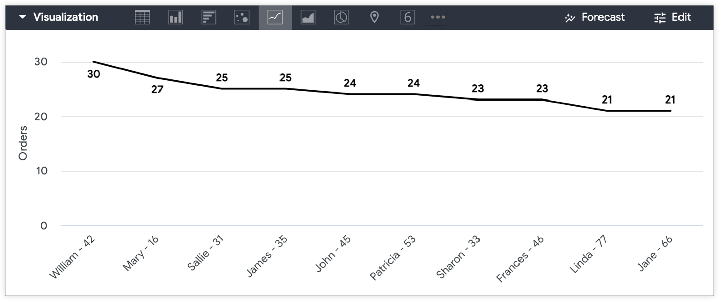
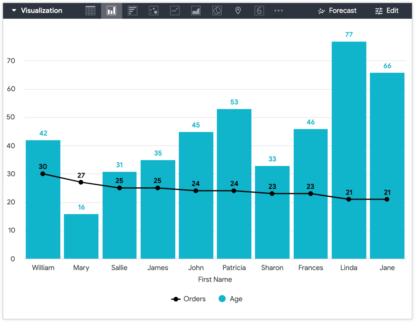
To distinguish between values in a visualization — in this example, the Agemeasure table calculation and Orders Countmeasures — you can use multiple vis types in a single chart.
For example, you can visualize Orders Countvalues as a line and Users Agevalues as a column to distinguish them once Users Ageis plotted on the y-axis.
Creating a measure in LookML
If you plan to plot a specific dimension on a y-axis again in the future, a more sustainable option is to create a sum
measure
or number
measure
in LookML that makes the dimension you want to plot into a measure. Instead of recreating the same table calculation in an Explore multiple times, you can add the field to a query from the field picker.
The measure will look similar to this:
measure: measure_for_age { ## replace with a new name
        description: "Use this age field for displaying age on the y-axis"
        type: number ## or sum
        sql: ${age} ;; ## replace with your dimension
    }
Adding a description
to the measure can help users understand the intended use of a field.
In this case, measure_for_age
is a number
type measure, since number
type measures do not perform any actual aggregation. This means Measure for Agewill display the same values as Users Agebecause it is a number
type measure that does not perform any aggregation.
Once you create the measure, include both the dimension and the new measure in the Explore query. For this example, include the dimensions Users First Nameand Users Age, and include the measures Orders Countand Users Measure for Age. Finally, hide the dimension that the measure is based on.
With the Users Agedimension hidden from the Explore visualization and custom visualization settings applied , the resulting Explore visualization displays the Users Measure for Ageon the y-axis and Users First Nameon the x-axis, and the Orders Countvalues as a line.
