
Reference documentation and code samples for the Google Apps Chat V1 Client class Card.
A card interface displayed in a Google Chat message or Google Workspace Add-on.
Cards support a defined layout, interactive UI elements like buttons, and rich media like images. Use cards to present detailed information, gather information from users, and guide users to take a next step. Card builder To learn how to build cards, see the following documentation:
- For Google Chat apps, see Design the components of a card or dialog .
- For Google Workspace Add-ons, see Card-based
interfaces
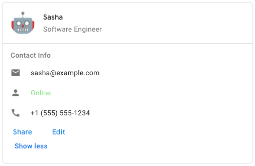
. Example: Card message for a Google Chat app
 To create the sample card message in Google Chat, use the following JSON:
 php { "cardsV2": [ { "cardId": "unique-card-id", "card": { "header": { "title": "Sasha", "subtitle": "Software Engineer", "imageUrl": "https://developers.google.com/workspace/chat/images/quickstart-app-avatar.png", "imageType": "CIRCLE", "imageAltText": "Avatar for Sasha" }, "sections": [ { "header": "Contact Info", "collapsible": true, "uncollapsibleWidgetsCount": 1, "widgets": [ { "decoratedText": { "startIcon": { "knownIcon": "EMAIL" }, "text": "sasha@example.com" } }, { "decoratedText": { "startIcon": { "knownIcon": "PERSON" }, "text": "<font color=\"#80e27e\">Online</font>" } }, { "decoratedText": { "startIcon": { "knownIcon": "PHONE" }, "text": "+1 (555) 555-1234" } }, { "buttonList": { "buttons": [ { "text": "Share", "onClick": { "openLink": { "url": "https://example.com/share" } } }, { "text": "Edit", "onClick": { "action": { "function": "goToView", "parameters": [ { "key": "viewType", "value": "EDIT" } ] } } } ] } } ] } ] } } ] }
Generated from protobuf message google.apps.card.v1.Card
Namespace
Google \ Apps \ Card \ V1Methods
__construct
Constructor.
data
array
Optional. Data for populating the Message object.
↳ header
Google\Apps\Card\V1\Card\CardHeader
The header of the card. A header usually contains a leading image and a title. Headers always appear at the top of a card.
↳ sections
array< Google\Apps\Card\V1\Card\Section
>
Contains a collection of widgets. Each section has its own, optional header. Sections are visually separated by a line divider. For an example in Google Chat apps, see Define a section of a card .
↳ section_divider_style
int
The divider style between sections.
↳ card_actions
array< Google\Apps\Card\V1\Card\CardAction
>
The card's actions. Actions are added to the card's toolbar menu. Google Workspace Add-ons
: For example, the following JSON constructs a card action menu with Settings
and Send Feedback
options: "card_actions": [ { "actionLabel": "Settings", "onClick": { "action": { "functionName": "goToView", "parameters": [ { "key": "viewType", "value": "SETTING" } ], "loadIndicator": "LoadIndicator.SPINNER" } } }, { "actionLabel": "Send Feedback", "onClick": { "openLink": { "url": "https://example.com/feedback" } } } ]
↳ name
↳ fixed_footer
Google\Apps\Card\V1\Card\CardFixedFooter
The fixed footer shown at the bottom of this card. Setting fixedFooter
without specifying a primaryButton
or a secondaryButton
causes an error. For Chat apps, you can use fixed footers in dialogs
, but not card messages
. Google Workspace Add-ons and Chat apps
:
↳ display_style
int
In Google Workspace Add-ons, sets the display properties of the peekCardHeader
. Google Workspace Add-ons
:
↳ peek_card_header
Google\Apps\Card\V1\Card\CardHeader
When displaying contextual content, the peek card header acts as a placeholder so that the user can navigate forward between the homepage cards and the contextual cards. Google Workspace Add-ons :
getHeader
The header of the card. A header usually contains a leading image and a title. Headers always appear at the top of a card.
hasHeader
clearHeader
setHeader
The header of the card. A header usually contains a leading image and a title. Headers always appear at the top of a card.
$this
getSections
Contains a collection of widgets. Each section has its own, optional header. Sections are visually separated by a line divider. For an example in Google Chat apps, see Define a section of a card .
setSections
Contains a collection of widgets. Each section has its own, optional header. Sections are visually separated by a line divider. For an example in Google Chat apps, see Define a section of a card .
$this
getSectionDividerStyle
The divider style between sections.
int
setSectionDividerStyle
The divider style between sections.
var
int
$this
getCardActions
The card's actions. Actions are added to the card's toolbar menu.
Google Workspace
Add-ons
:
For example, the following JSON constructs a card action menu with Settings
and Send Feedback
options:
 "card_actions": [
  {
    "actionLabel": "Settings",
    "onClick": {
      "action": {
        "functionName": "goToView",
        "parameters": [
          {
            "key": "viewType",
            "value": "SETTING"
         }
        ],
        "loadIndicator": "LoadIndicator.SPINNER"
      }
    }
  },
  {
    "actionLabel": "Send Feedback",
    "onClick": {
      "openLink": {
        "url": "https://example.com/feedback"
      }
    }
  }
]
setCardActions
The card's actions. Actions are added to the card's toolbar menu.
Google Workspace
Add-ons
:
For example, the following JSON constructs a card action menu with Settings
and Send Feedback
options:
 "card_actions": [
  {
    "actionLabel": "Settings",
    "onClick": {
      "action": {
        "functionName": "goToView",
        "parameters": [
          {
            "key": "viewType",
            "value": "SETTING"
         }
        ],
        "loadIndicator": "LoadIndicator.SPINNER"
      }
    }
  },
  {
    "actionLabel": "Send Feedback",
    "onClick": {
      "openLink": {
        "url": "https://example.com/feedback"
      }
    }
  }
]
$this
getName
Name of the card. Used as a card identifier in card navigation.
string
setName
Name of the card. Used as a card identifier in card navigation.
var
string
$this
getFixedFooter
The fixed footer shown at the bottom of this card.
Setting fixedFooter
without specifying a primaryButton
or a secondaryButton
causes an error. For Chat apps, you can use fixed footers
in dialogs
, but not card
messages
. Google Workspace Add-ons and Chat
apps
:
hasFixedFooter
clearFixedFooter
setFixedFooter
The fixed footer shown at the bottom of this card.
Setting fixedFooter
without specifying a primaryButton
or a secondaryButton
causes an error. For Chat apps, you can use fixed footers
in dialogs
, but not card
messages
. Google Workspace Add-ons and Chat
apps
:
$this
getDisplayStyle
In Google Workspace Add-ons, sets the display properties of the peekCardHeader
.
int
setDisplayStyle
In Google Workspace Add-ons, sets the display properties of the peekCardHeader
.
var
int
$this
getPeekCardHeader
When displaying contextual content, the peek card header acts as a placeholder so that the user can navigate forward between the homepage cards and the contextual cards.
hasPeekCardHeader
clearPeekCardHeader
setPeekCardHeader
When displaying contextual content, the peek card header acts as a placeholder so that the user can navigate forward between the homepage cards and the contextual cards.
$this