

Customizeable style properties

You can customize the colors, typography, spacing, borders, and corners of these Places UI kit components and non-UI kit features:
- Place Details component
- Place Search component
- Basic Place Autocomplete component
- Non-UI Kit Place Autocomplete widget
Places UI kit offers a design system approach to visual customization roughly based on Material Design (with some Google-Maps-specific modifications). See Material Design's reference for Color and Typography . By default, the style adheres to the Google Maps visual design language.
Use the Customization tool to visualize custom configurations in a Places UI Kit element. The Code tab provides configurations in HTML/CSS, Kotlin/XML, and Swift.
When instantiating a fragment, you can specify a theme that overrides any of the default style attributes. Any theme attributes that are not overridden use the default styles.
< style

 name
 =
 "CustomizedPlaceDetailsTheme"

 parent
 =
 "PlacesMaterialTheme"
>
< item

 name
 =
 "placesColorPrimary"
> @color
 /
 app_primary_color
< /
 item
>
< item

 name
 =
 "placesColorOnSurface"
> @color
 /
 app_color_on_surface
< /
 item
>
< item

 name
 =
 "placesColorOnSurfaceVariant"
> @color
 /
 app_color_on_surface
< /
 item
>

< item

 name
 =
 "placesTextAppearanceBodySmall"
> @style
 /
 app_text_appearence_small
< /
 item
>

< item

 name
 =
 "placesCornerRadius"
> 20
 dp
< /
 item
>
< /
 style
>
Customization tool
Use this tool to visualize custom configurations in a Places UI Kit element. The Code tab provides configurations in HTML/CSS, Kotlin/XML, and Swift.
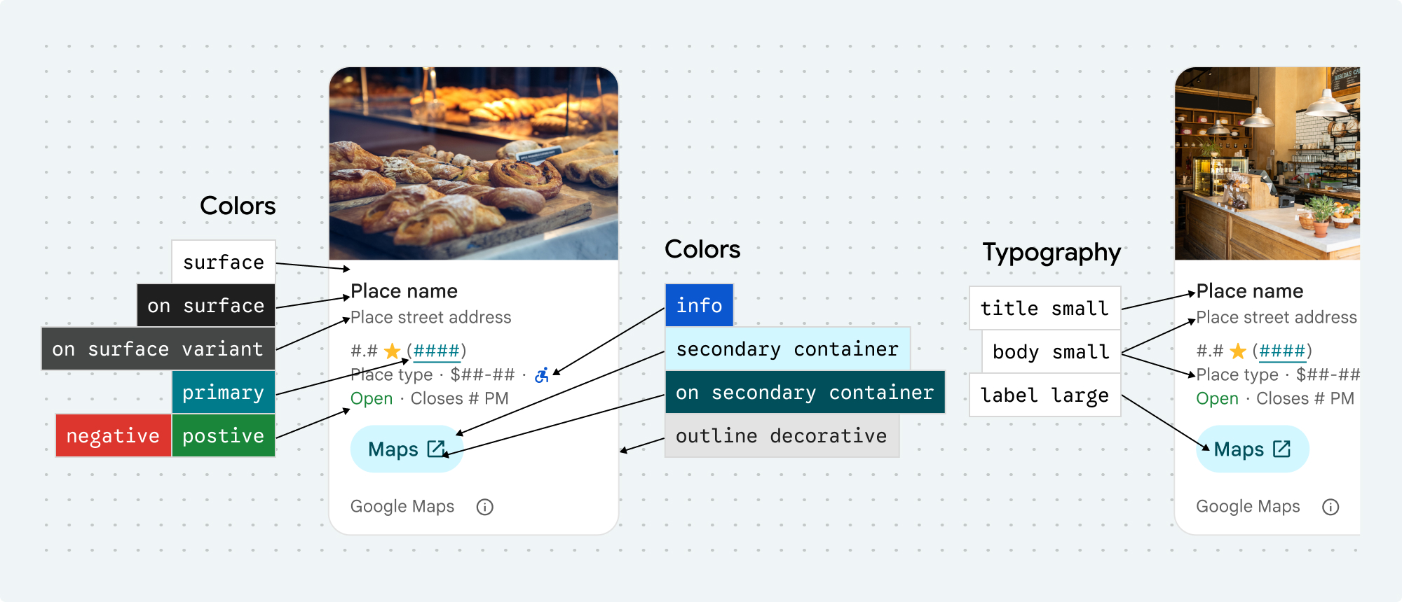
Style properties
You can customize the following styles:
placesColorSurface
placesColorOutlineDecorative
placesColorPrimary
placesColorOnSurface
placesColorOnSurfaceVariant
placesColorSecondaryContainer
placesColorOnSecondaryContainer
placesColorNeutralContainer
placesColorOnNeutralContainer
placesColorPositiveContainer
placesColorOnPositiveContainer
placesColorPositive
placesColorNegative
placesColorInfo
placesColorButtonBorder
placesTextAppearanceBodySmall
placesTextAppearanceBodyMedium
placesTextAppearanceLabelMedium
placesTextAppearanceLabelLarge
placesTextAppearanceHeadlineMedium
placesTextAppearanceDisplaySmall
placesTextAppearanceTitleSmall
placesSpacingExtraSmall
placesSpacingSmall
placesSpacingMedium
placesSpacingLarge
placesSpacingExtraLarge
placesSpacingTwoExtraLarge
placesBorderWidth
placesBorderWidthButton
placesCornerRadius
placesCornerRadiusButton
placesCornerRadiusThumbnail
placesCornerRadiusCollageOuter
placesCornerRadiusCard
placesCornerRadiusDialog
placesColorAttributionLightTheme
placesColorAttributionDarkTheme
Attribution colors

Google Maps' terms of service require you to use one of three brand colors for the Google Maps attribution. This attribution must be visible and accessible when customization changes have been made.
We offer 3 brand colors to choose from that can be independently set for light and dark themes:
- Light theme:
placesColorAttributionLightwith enum values for white, gray, and black. - Dark theme:
placesColorAttributionDarkwith enum valuesfor white, gray, and black.
Examples
This code sample shows how to create a theme that overrides the default style attributes. Any theme attributes that are not overridden use the default styles.< style name = "CustomizedPlaceDetailsTheme" parent = "PlacesMaterialTheme" > < item name = "placesColorPrimary" > @color / app_primary_color < / item > < item name = "placesColorOnSurface" > @color / app_color_on_surface < / item > < item name = "placesColorOnSurfaceVariant" > @color / app_color_on_surface < / item > < item name = "placesTextAppearanceBodySmall" > @style / app_text_appearence_small < / item > < item name = "placesCornerRadius" > 20 dp < / item > < / style >