
Delve into your data using the highly customizable and flexible free-form exploration technique. Free-form exploration lets you:
- Visualize data in a table or graph.
- Arrange and order the rows and columns of the table as you like.
- Compare multiple metrics side by side.
- Create nested rows to group the data.
- Refine the free-form exploration using segments and filters.
- Create segments and audiences from selected data.
Create a free-form exploration
- In Explore
, under Start a new exploration
, select the Free formtemplate. Note: The previous link opens to the last Analytics property you accessed. You must be signed in to a Google Account to open the property. You can change the property using the property selector.
- Under VISUALIZATION, choose how you want to display the data:
Table (default)
Donut chart
Line chart
Scatterplot
Bar chart
Geo map
Learn more about creating and editing explorations .
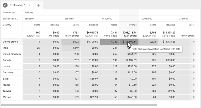
Example free-form exploration
The example below explores the relationship between Device Category and Screen Resolution by Country , measured by number of Users and Revenue . The table reveals that while the screen resolution for the majority of desktop users is 1366x768, the bulk of the revenue is generated by users on 1440x900 screens. You could create a segment from this data point and use that to further explore this audience's behavior.
You can also display the data using a number of different visualizations. The following example shows a line chart that compares the Mobile vs. Organic Traffic segments applied to the previous data table. You can choose different visualizations to get different insights about the people who visit your site or app.

Anomaly detection
With anomaly detection , you can identify outliers in your data using a line chart. This option is on by default in the Tab settings panel, and you can configure the detection model with these two settings:
- Training period (last days)refers to the number of days prior to the selected date range are used by the anomaly detection model to calculate the expected value of the metric displayed.
- For example, if your currently selected date range is the first 10 days of the month, and you set the training period to 7 days, the anomaly detection model will use the data from the 7 days prior to the beginning of the month.
- Sensitivitysets the probability threshold below which anomalous data will be reported. Sensitivity doesn't affect how the model "thinks": rather, it just specifies how data should be labeled. The probability of a point occurring at a particular value is predicted by the model and is not influenced by sensitivity.
- For example, a sensitivity of 5% means that any point occurring with a probability of less than 5% is considered anomalous. Therefore, a higher sensitivity model might result in reporting more data as outliers.
Once the Anomaly detection model is defined, Explorations applies a Bayesian state space-time series model to the training data to forecast the value of the metric displayed in the time series.
Finally, Explorations flags the datapoint as an anomaly using a statistical significance test with p-value thresholds based on the selected sensitivity.
Configure the free-form exploration
Set up the free form with these options:
Switch between chart types.