

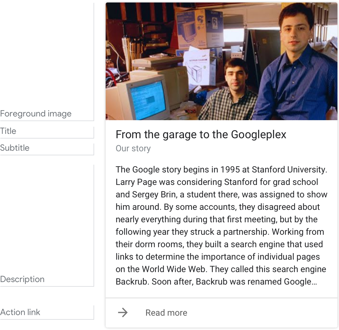
Basic card
Example
Here’s an example of what a basic card looks like when all required and optional fields are completed.
Requirements
This visual component currently supports customization .
- Max 1 foreground image.
- Width and height vary by screen. If the image's aspect ratio is different than the screen, the image is centered with bars along the top or sides.
- Image source is a URL. If an image link is broken, then a placeholder image is used instead.
- Customizable image shape (angled or rounded corners).
- Motion GIFs are allowed.
- Alt text is required for accessibility.
- Customizable image or color.
- Customizable font family and color.
- Max 1 line recommended.
- The card height collapses if no title is specified.
- Plain text. Fixed font and size.
- Max 1 line recommended.
- The card height collapses if no subtitle is specified.
(also called body or formatted text)
- PPlain text by default. Fixed font and size.
- Bolding, italics, and new lines available via a limited subset of markdown.
- Max 10 lines with an image. This is about 500 characters, depending on the screen. Additional characters will be cut off.
- Max 15 lines without an image. This is about 750 characters, depending on the screen. Additional characters will be cut off.
- 1 link can be specified at the end of a text-card.
- Links can lead directly to web pages or generate other visual components to advance the dialog. They can also be deep links to apps.
- Link title is required and cannot be misleading. This is checked during the approval process.
Guidance
Summarize information for the user
Do.
Summarize things like event details using a basic card. This allows users to scan it quickly for the information they want.
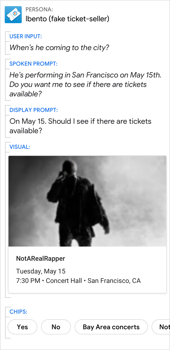
Don't.
It’s less efficient to present information like event details in the prompts.
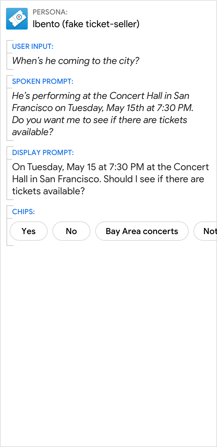
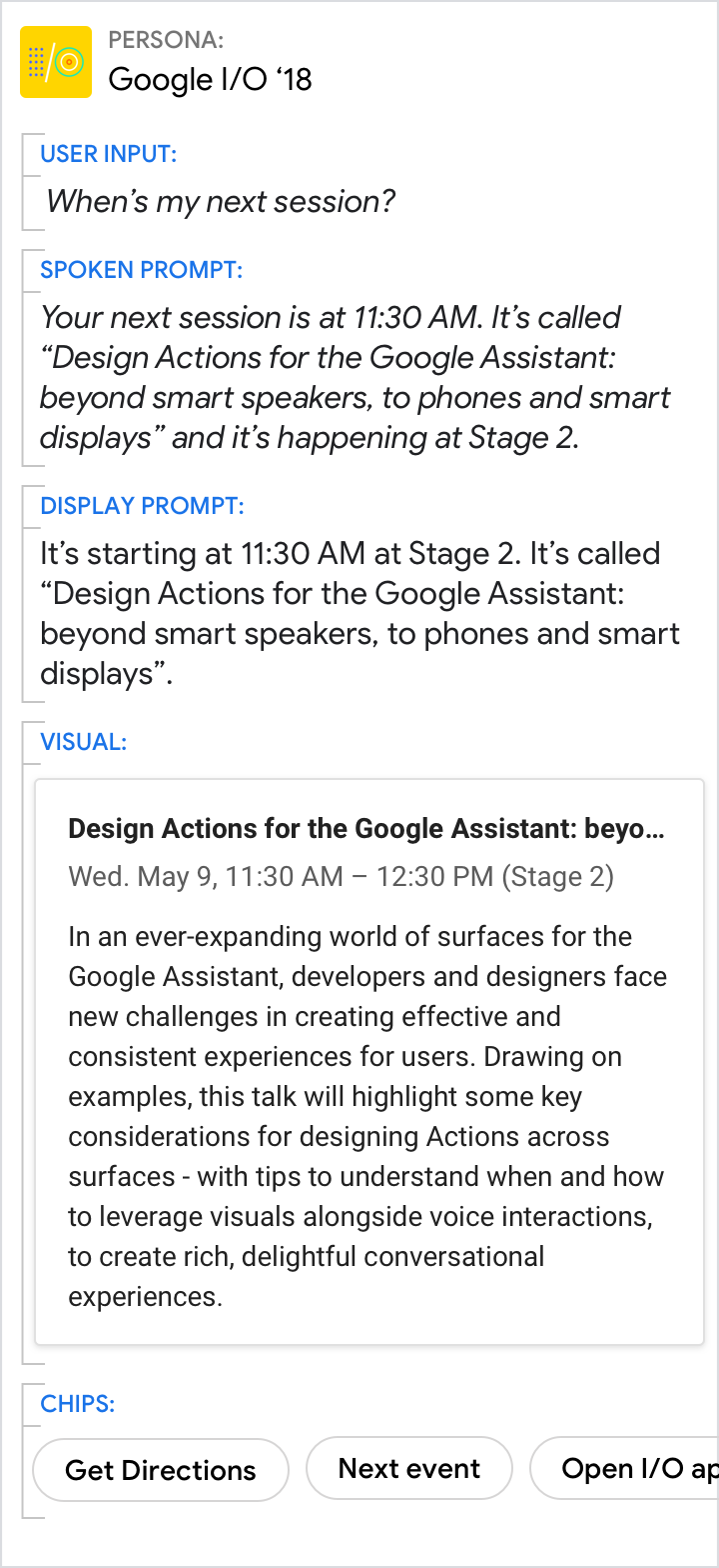
Give the short answer in the prompts and the related details in the card
Do.
Use the spoken and display prompts to give the specific answer to the user’s directed question (11:30 AM in this example). Use the visuals for related details.
Don't.
Avoid redundancy between the spoken prompt, display prompt, and visuals.
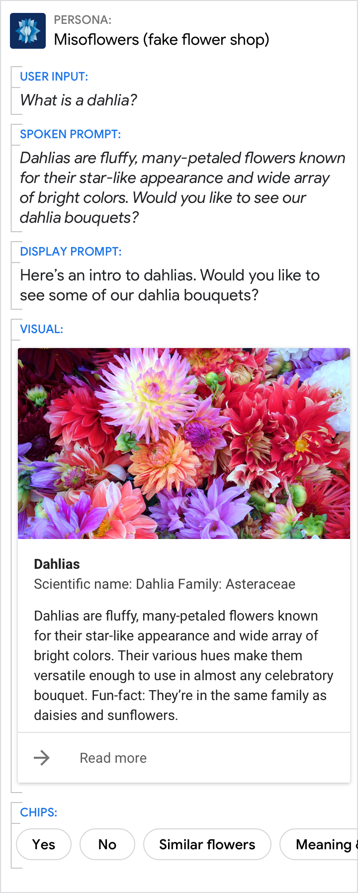
A picture is worth a thousand words
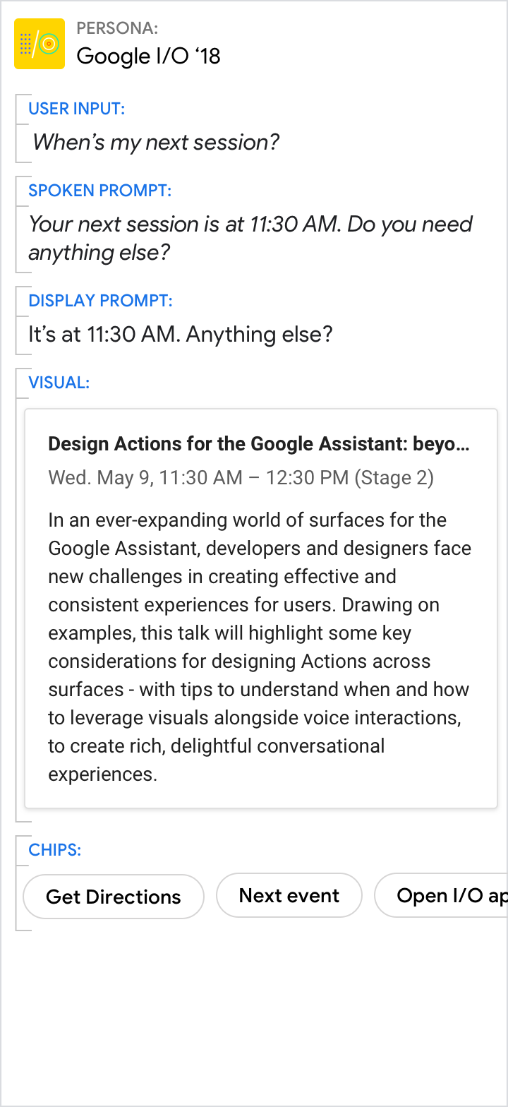
Do.
Sometimes an image is the best way to convey information to the user.
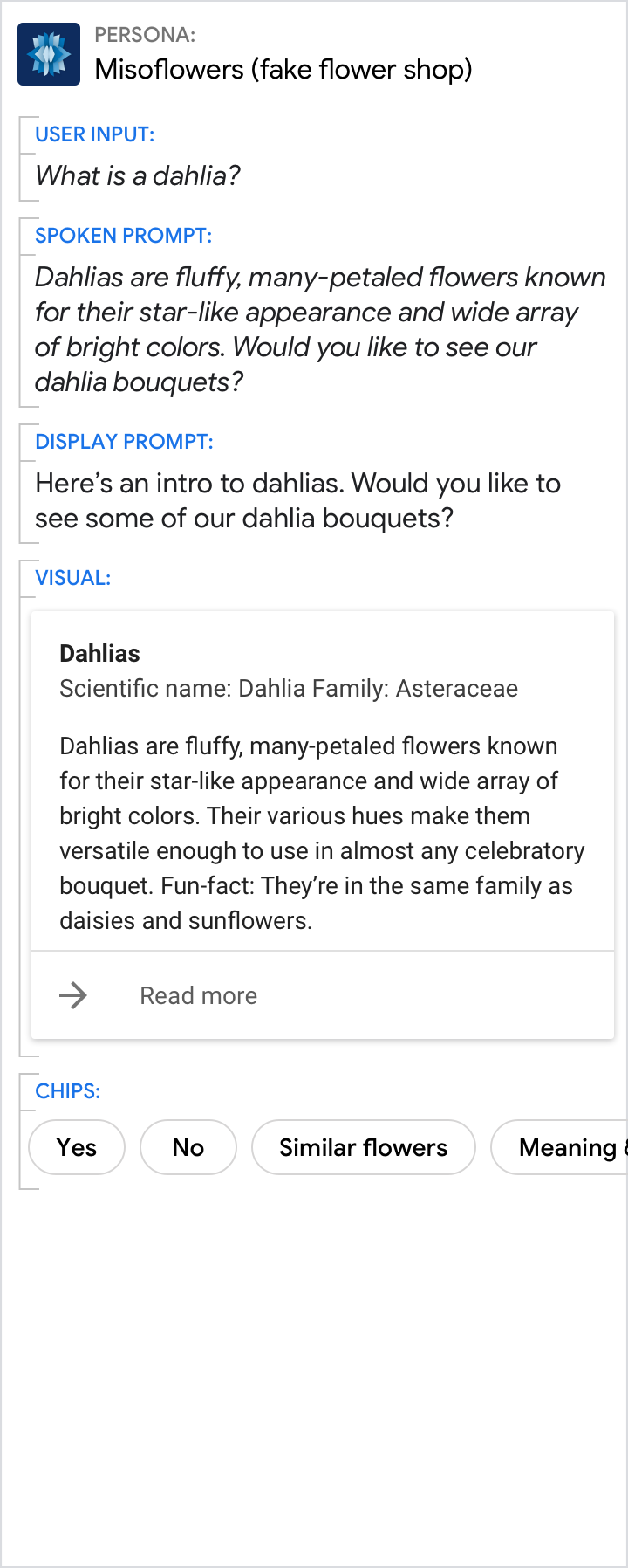
Don't.
Though the description is nice, a picture would have been better.