

There are many HTML customizations you can apply to a chat dialog.
HTML chat element options
The child element of the df-messenger
element can be either of:
-
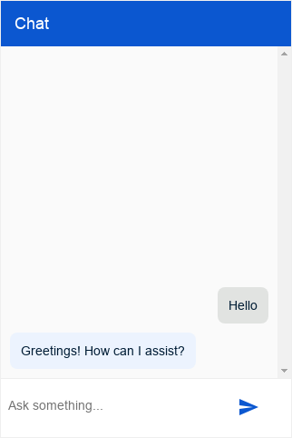
df-messenger-chat: agent dialog is always open -
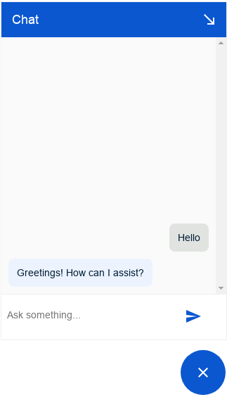
df-messenger-chat-bubble: agent dialog can be opened or closed with an open or close bubble button
HTML customizations for df-messenger
The df-messenger
HTML element has the following attributes:
| Attribute | Input policy | Value |
|---|---|---|
agent-id
|
Required | Agent ID associated with the Dialogflow CX agent. |
allow-feedback
|
Optional | Set to all
to allow end-users to provide feedback
on the agent's answers. |
language-code
|
Required | Default language code . |
project-id
|
Required | Project ID for the agent. |
location
|
Optional | The agent's region
. Default value is global
. |
intent
|
Optional | A custom event that will be invoked when the chat dialog is opened. You can use an event handler that will be called for this event and will produce the first agent message. |
oauth-client-id
|
Optional | Required for OAuth authentication
. Default value is null. If the value is not provided and Dialogflow CX Messenger unauthenticated access is enabled, unauthenticated users can interact with the agent. If the value is provided, the agent dialog will be overlaid with a "Request Authentication" (text can be controlled, see request-auth-text
notification, which requires the user to sign in before they can use the agent. |
storage-option
|
Optional | Specifies local storage for conversation messages. Use none
if messages shouldn't be stored. Using none
will clear all messages when the page is refreshed or reloaded. Defaults to sessionStorage
. |
session-ttl
|
Optional | Set to a duration in seconds to maintain session, must be strictly below 86400 (1d) and defaults to 1800 (30min). |
url-allowlist
|
Optional | Enables images being loaded from a comma separated list of URL prefixes. Image URLs used in HTML or Markdown responses must start with one of the listed prefixes. Use *
to allow all URLs. |
max-query-length
|
Optional | Defines the maximum length for a text query. If the value is negative, the length is unlimited. Defaults to 256. Additional documentation . |
HTML customizations for df-messenger-chat
The df-messenger-chat
HTML element has the following attributes:
| Attribute | Input policy | Value |
|---|---|---|
chat-title
|
Optional | The title of the chat box, shown above it. |
chat-subtitle
|
Optional | The subtitle of the chat box, shown above it, below the chat-title
|
chat-title-icon
|
Optional | The icon shown in the title of the chat box, shown above it, left of the chat-title
by default |
bot-writing-text
|
Optional | The text that is shown while the agent is writing |
bot-writing-image
|
Optional | The image that is shown while the agent is writing. Takes priority over bot-writing-text
. |
request-auth-text
|
Optional | The button text in case authentication is required. |
placeholder-text
|
Optional | Text to be shown in the input field while it's empty. Defaults to "Ask something…". |
bot-actor-image
|
Optional | Image source to use for the agent's actor image. Will be shown on each group of agent responses. |
user-actor-image
|
Optional | Image source to use for the user's actor image. Will be shown on each user message. |
HTML customizations for df-messenger-chat-bubble
The df-messenger-chat-bubble
HTML element has the same attributes as df-messenger-chat
and the following additional attributes:
| Attribute | Input policy | Value |
|---|---|---|
expanded
|
Optional | Boolean that determines whether the chat is initially open. If not set, the chat will remember its last state. |
chat-icon
|
Optional | The icon for the chat bubble. Must be a publicly available URI. |
chat-close-icon
|
Optional | The close icon for the chat bubble. Must be a publicly available URI. |
chat-collapse-icon
|
Optional | The icon for the collapse button in the title bar. Must be a publicly available URI. |
anchor
|
Optional | Defines where the chat dialog is placed relative to the open or close bubble. The value is two direction words ( top
, bottom
, left
, right
) delimited by -
. Default value is top-left
. The first direction defines the anchoring point, and the second direction defines the main expansion direction away from the bubble. For example: top-left
is placed on top of the bubble and expands to the left and upward (away from the bubble). |
chat-width
|
Optional | Defines the width of the chat window. Numerical values (in pixel). Defaults to 320px. |
chat-height
|
Optional | Defines the height of the chat window. Numerical values (in pixel). Defaults to 480px. |
allow-fullscreen
|
Optional | Defines if the chat window can open fullscreen. If set to always
, opens in fullscreen for all screen sizes. If set to small
, opens fullscreen for screen sizes below 500px, otherwise opens as a normal window. May override chat-width
, chat-height
and anchor
if set. |
minimized
|
Optional | Determines whether the chat is initially open in minimized form. Uses the same logic as anchor
. Will execute the initial intent
on load if specified. |