
The mobile SDK offers extensive customization capabilities, designed to empower you to incorporate brand requirements and create a unique and customized experience. This document provides a comprehensive overview of the available options in the mobile SDK to optimize consumer chat interactions.
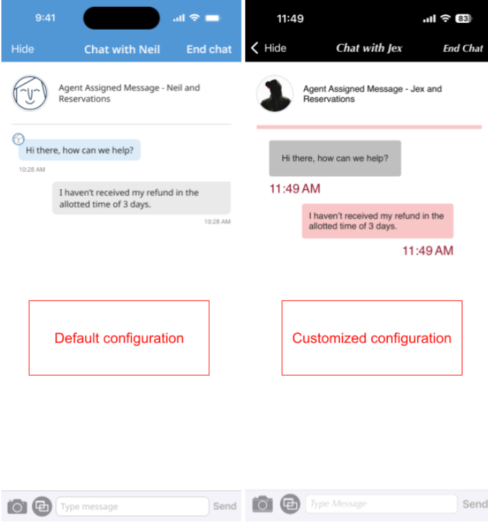
You can include as much or as little customization as you require to fit your business needs. Here is a side-by-side comparison of a default chat and a highly customized chat.
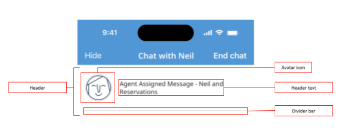
Header
-
Visibility
-
Avatar icon
-
Text
-
Font (size, style and color)
-
Divider color
-
Divider width
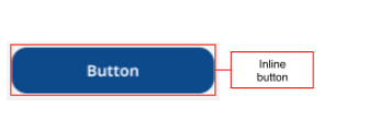
Inline button
-
Style
-
Alignment
-
Background color
-
Text color
-
Corner radius
-
Font (size, style and color)
-
Border color
-
Border Width
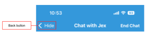
Back button
-
Visibility—of text only. The back arrow's visibility can't be customized.
-
Icon
-
Text color
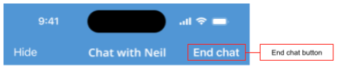
End button
-
Visibility
-
Font (size, style and color)
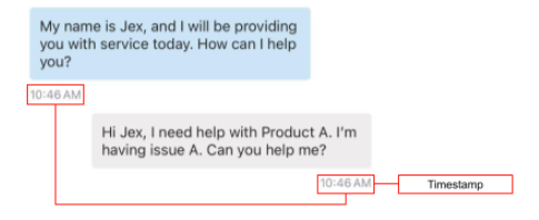
Timestamp
- Font (size, style and color)
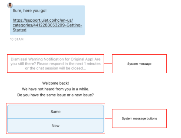
System message and buttons
-
Background Color
-
Corner Radius
-
Font (size, style and color)
-
Border color
-
Border width
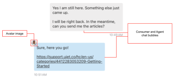
Consumer and agent message bubbles
-
Background color
-
Corner radius
-
Font (size, style and color)
-
Border color
-
Border width
-
Avatar
User input bar
-
Background color
-
Border color
-
Border width
-
Camera icon
-
Co-browse icon
-
Send button icon
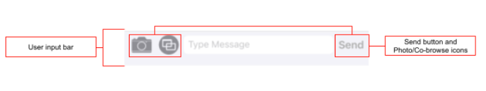
User input bar (text field)
-
Corner radius
-
Cursor color
-
Placeholder text
-
Font (size, style and color)
-
Border color
-
Border width
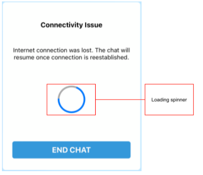
Loading spinner
- Custom animation