
Table charts provide direct views of your data. They can be formatted to illustrate elements of the data that you'd like to highlight.
Building a table chart
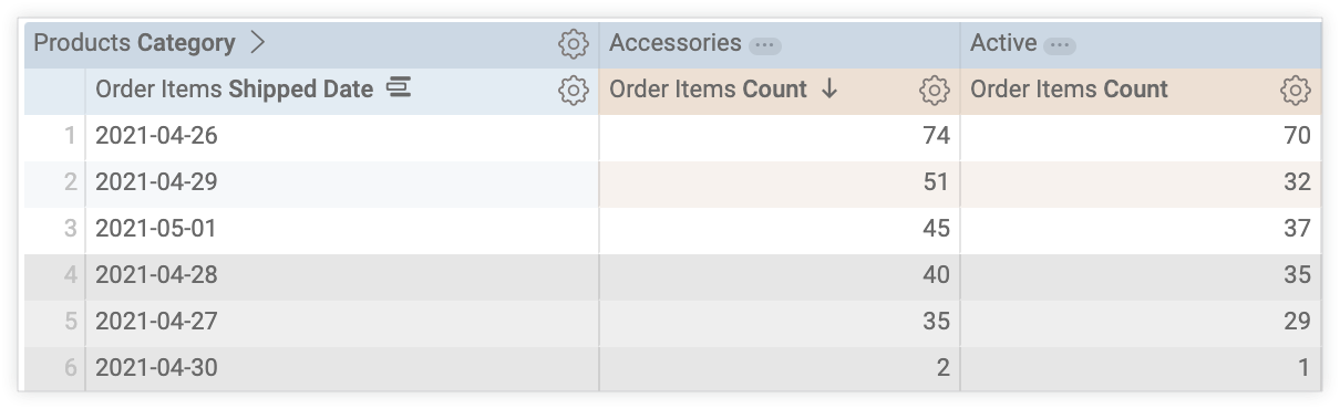
Table charts accept dimensions, measures, pivots, subtotals, table calculations, custom fields, and row or column totals. Table charts support up to 5,000 rows and up to 200 pivoted columns.
To use a table chart, run your query and select the table icon on the Visualizationbar.
To edit your table visualization, select Editin the upper right corner of the Visualizationbar.
The options listed next may be grayed out or hidden when incompatible with the composition of your table or if they conflict with other settings you have chosen.
Data bar options
Several options on the Databar can affect both your visualization and the data table.
Subtotals
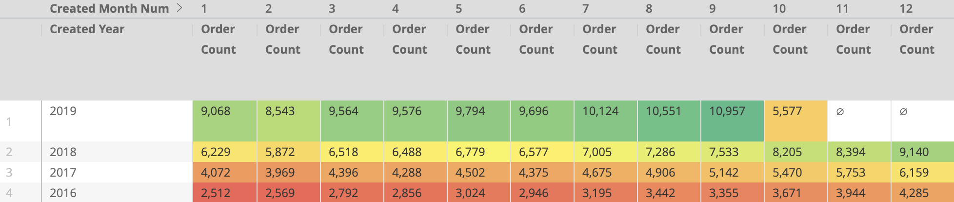
The option to add subtotals to your table visualization appears on the Databar when your data table contains at least two dimensions. Select the Subtotalscheckbox and press Run. Subtotals appear only in the table visualization. They do not appear in the data table.
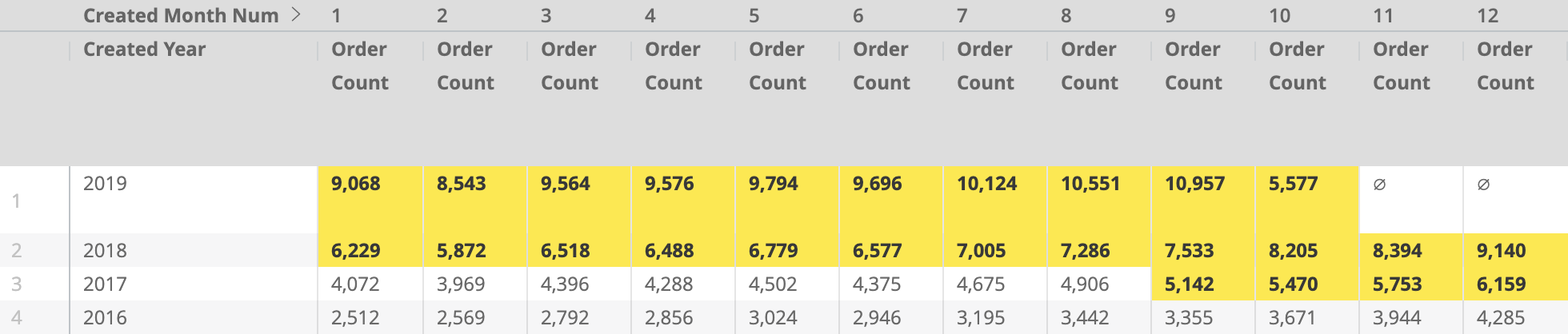
The following image shows a table visualization of Users State, Users City, Users Zip, and Orders Countwith subtotals enabled. In the visualization, the Orders Countfield shows the count for each zip code and the subtotals for each city and state. When a city contains multiple zip codes, the counts for all of the city's zip codes are added together to get the city's count. The state count is the sum of all the zip code counts in the state.

Subtotals are calculated for all dimensions other than the rightmost dimension. To change the dimensions that are subtotaled, reorder the positions of the dimensions in your data table.
There are some things to keep in mind about how subtotals work:
- If the same item appears in several categories, subtotals that count unique items might not add up as you expect. In those cases, Looker counts each item once rather than counting every duplicate appearance. Looker calculates column totals in the same way.
- Subtotals of table calculations
that perform aggregations, such as calculations using
percentileormean, might not add up as you expect. This is because table calculations calculate subtotals using the other subtotal values, not using the values in the data column. For example, if you have two User Countsubtotals of 30,500 and 24,312 and you have a table calculation such asmean(${users.count}), the table calculation will return 27,406 for both subtotal rows because it is performing the calculation(30500 + 24312)/2. - Subtotals are not available when you filter on a measure or when the Explore uses the
sql_always_havingparameter . - If your data table row limit cuts off your data table partway through a subtotal category, the entire category will be hidden from the table visualization.
- Sorting occurs within each subtotal category independently.
- The leftmost subtotal is always sorted. When you sort by multiple columns, subtotal columns are given precedence.
- If you change the order of your dimensions by dragging and dropping them in the Data section of the Explore, you may need to unselect and reselect the Subtotalscheckbox.
Subtotals can be collapsed or expanded in the table visualization. See the Collapse Subtotal section for more information.
Dialect support for subtotals
The ability to use subtotals depends on the database dialect that your Looker connection is using. In the latest release of Looker, the following dialects support subtotals:
Click here to display the table.
| Dialect | Supported? |
|---|---|
| Actian Avalanche | |
| Amazon Athena | |
| Amazon Aurora MySQL | |
| Amazon Redshift | |
| Amazon Redshift 2.1+ | |
| Amazon Redshift Serverless 2.1+ | |
| Apache Druid | |
| Apache Druid 0.13.x - 0.17.x | |
| Apache Druid 0.18+ | |
| Apache Hive 2.3+ | |
| Apache Hive 3.1.2+ | |
| Apache Spark 3+ | |
| ClickHouse | |
| Cloudera Impala 3.1+ | |
| Cloudera Impala 3.1+ with Native Driver | |
| Cloudera Impala with Native Driver | |
| DataVirtuality | |
| Databricks | |
| Denodo 7 | |
| Denodo 8 & 9 | |
| Dremio | |
| Dremio 11+ | |
| Exasol | |
| Google BigQuery Legacy SQL | |
| Google BigQuery Standard SQL | |
| Google Cloud AlloyDB for PostgreSQL | |
| Google Cloud PostgreSQL | |
| Google Cloud SQL | |
| Google Spanner | |
| Greenplum | |
| HyperSQL | |
| IBM Netezza | |
| MariaDB | |
| Microsoft Azure PostgreSQL | |
| Microsoft Azure SQL Database | |
| Microsoft Azure Synapse Analytics | |
| Microsoft SQL Server 2008+ | |
| Microsoft SQL Server 2012+ | |
| Microsoft SQL Server 2016 | |
| Microsoft SQL Server 2017+ | |
| MongoBI | |
| MySQL | |
| MySQL 8.0.12+ | |
| Oracle | |
| Oracle ADWC | |
| PostgreSQL 9.5+ | |
| PostgreSQL pre-9.5 | |
| PrestoDB | |
| PrestoSQL | |
| SAP HANA | |
| SAP HANA 2+ | |
| SingleStore | |
| SingleStore 7+ | |
| Snowflake | |
| Teradata | |
| Trino | |
| Vector | |
| Vertica |
There are some things to keep in mind about dialect support for subtotals:
- When you use MySQL, all subtotals must sort ascending.
- Pivots in MySQL and Snowflake will fail if you are using subtotals and the underlying result set contains more than 30,000 rows (regardless of any row limits you set in the data table).
- Using subtotals with BigQuery and Redshift may decrease query speeds compared to queries without subtotals.
Row Totals
If your chart contains pivots , you can add row totals to your chart by selecting the Row Totalscheckbox in the Databar. See the Exploring data in Looker documentation page for more information, including information on when totals aren't available and things to consider with totals .
The arrow to the right of the Row Totalscheckbox lets you toggle the placement of the totals column between the far right default placement and a placement further to the left, after dimensions and dimension table calculations.

Totals
You can add column totals for measures and table calculations by selecting Totalsin the Databar. See the Exploring data in Looker documentation page for more information, including information on when totals aren't available and things to consider with totals .

Column Limit
If your data table contains pivots , you can add a column limit to your chart by entering any number between 1 and 200 in the Column Limitbox. Dimensions, dimension table calculations, row total columns, and measure table calculations outside of pivots are not counted toward the column limit. Pivoted groups each count as one column toward the column limit. See the Filtering and limiting data documentation page for more information.

Row Limit
You can add a row limit to your chart by entering any number between 1 and 5,000 into the Row Limitbox on the Datatab. If your query exceeds the row limit you have set, you cannot sort row total or table calculation columns.

When you add a table chart to a dashboard , if the Row Limitis left blank, the dashboard imposes a limit of 1,000 rows to the table chart tile. To increase the row limit on a dashboard tile, enter a higher row limit up to 5,000, which is the maximum number of rows that can be presented.
Calculations
If you have the appropriate permissions, you can add table calculations to your chart by clicking the Add calculationbutton on the Datatab. See the Using table calculations documentation page for more information.

You can also use the Custom Fieldssection of the field picker .
Column menu options
When column menu options are accessed through a dashboard tile in view mode, changes to settings are not saved. To save changes to settings, enter edit mode on the dashboard, select Editin the tile's three-dot Tile actionsmenu , and change the settings in the edit window that appears.
Table charts have a three-dot Column Optionsicon at the upper right of each column, which appears when you hover over the column header.
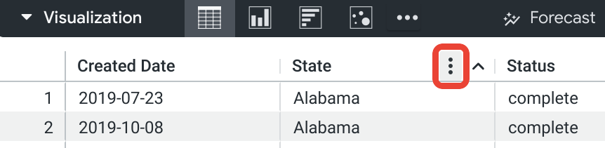
Selecting the Column Optionsicon reveals a column menu that provides options for freezing, copying, and resizing table columns as you view them.
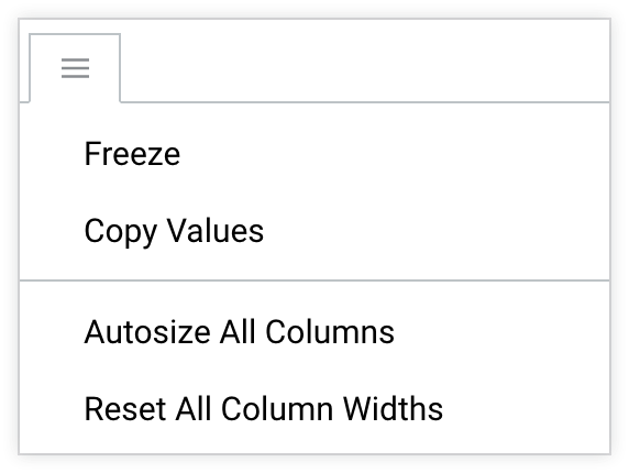
Freeze
Selecting the Freezeoption freezes a table column to the left side of the chart. The frozen column remains visible on the left side during horizontal scrolling. Multiple columns can be frozen. The first time you freeze a column, the row number column will also freeze, if it exists. When you unfreeze the last frozen column, the row number column will also unfreeze, if it exists.
When one or more columns are frozen, a vertical separator line appears between frozen and unfrozen columns.
To unfreeze a column, select the three-dot icon again and select Unfreeze.
Copy Values
Select Copy Valuesto copy the column header and all the values in the column, which you can then paste into a spreadsheet, text file, or Looker filter. You can also select a cell or a range of cells within the visualization and copy the contents using the keyboard shortcuts Command-C (Mac) or Ctrl+C (Windows).
Autosize All Columns
Selecting Autosize All Columnssizes the width of each column to fit its column heading name or its longest data value, whichever is wider.
Reset All Column Widths
Selecting Reset All Column Widthsresizes each column to its default width, which is the width that is set when Size Columns to Fit is turned on, or the width that is set by Autosize All Columns if sizing columns to fit makes columns too narrow.
Sorting columns
The default sort order is explained on the Exploring data in Looker documentation page.
You can sort columns in the table visualization by selecting column headers within the visualization. Each time you select a header, its column switches between ascending and descending sort order. A chevron appears in the column header to indicate that the chart is sorted by that column. The chevron points up to indicate an ascending sort and down to indicate a descending sort.
You can sort by multiple columns by holding down the Shift key and then selecting the column headers in the order you would like them sorted.
If subtotals are enabled, the leftmost subtotal is always sorted. Sorting occurs within each subtotal category independently.
If you reach a row limit , you will not be able to sort row totals or table calculations .
Manually moving and pinning columns
When columns are rearranged through a dashboard tile in view mode, changes to the column order are not saved. To save changes to column order, enter edit mode on the dashboard, select Editin the tile's three-dot menu , and move the columns in the edit window that appears.
Selecting and dragging column headers in the table visualization lets you move any column, including pivot groups and individual pivot columns, to any other location in the visualization. The order of the columns within the Datatable will not change.
While you are selecting and dragging a column, if you approach the left edge of the visualization, a pin icon will appear.
If you drop the column while the pin icon is present, the column will be pinned to the side of your visualization. The pinned column remains visible on the side during horizontal scrolling. Multiple columns can be pinned.
If you drag a column outside of the bounds of the visualization, an icon of a crossed-out eye will appear.
If you drop the column while the eye icon is present, the column will not move from its original position.
When you download a table with columns that have been rearranged, the columns will appear in their original order (the order in which they appear in the data table) even if the With visualization options applied setting is selected.
Manually resizing columns
To manually resize columns, select the right border of the column header and drag it left or right.
Manually resizing columns overrides Size Columns to Fit .
Plot menu options
Table Theme
The default theme for table visualizations is White. You can change the theme with the Table Themesetting.
You can choose table coloring options:
- Classic: The table appears as it does in the Data section, with blue dimensions, orange measures, and green table calculations.
- White: The table header is white, the data rows alternate between white and gray, and the text is black.
- Gray: The table header is gray, the data rows alternate between white and light gray, and the text is dark gray.
- Transparent: The table header is totally transparent, the data rows alternate between totally transparent and translucent gray, and the text adjusts itself in color. This can be useful when using a customized, embedded dashboard so that the tile background color shows through the visualization. On such a dashboard, the text color adapts to the background color, changing from black to white as needed. On the Explore page or in an embedded Look, the background is always white under the transparent visualization.
- Unstyled: The entire table is white, the data rows are separated by gray lines, and the text is black.
Show Row Numbers
You can toggle whether to show a row number at the beginning of each table row.
Show Row Numbersis disabled when you use subtotals in your table chart.
Show Totals
Show Totalstoggles whether to show column totals at the bottom of each table column.
Show Totalsis disabled when Totals are not added to your table chart.
Show Row Totals
Show Row Totalstoggles whether to show row totals at the beginning or end of each table row.
Show Row Totalsis disabled when Row Totals are not added to your pivoted table chart.
Transpose
The Transposeoption is available for visualizations that contain only one dimension. When Transposeis selected, the visualization's rows will switch to columns and the columns will switch to rows.
Limit Displayed Rows
You can show or hide rows in a visualization, based on their position in the results. For example, if your visualization displays a seven-day rolling average, you may want to hide the first six rows.
Click Limit Displayed Rowsto enable or disable this feature. When this feature is enabled, you can specify the following options:
- Hideor Show: Choose Hideto exclude certain rows from the visualization. Choose Showto display only a limited number of rows in the visualization.
- Firstor Last: Choose if the rows to hide or show are the first or last rows in the result set.
- Number: Specify the number of rows to hide or show.
In the Data section of the Look or Explore, excluded rows are shaded in a darker color.
This option is dependent on the row order. Changing the query's sort order or adding a row limit can change the rows that are shown or hidden in the visualization.
Pagination
For tables that contain 50 or more rows, you can enable pagination to display table rows in a series of pages at the bottom of the visualization.
To enable pagination, select the Paginate Rowscheckbox.
When pagination is enabled, you can use the Rows Per Pagesetting to specify the number of rows to display per page. You can select 50, 100, 250, 500, or 1,000 rows per page.
When pagination is enabled for a table visualization on a dashboard, you must enter dashboard edit mode to change the rows per page setting.
Series menu options
The series menu controls how your chart shows each data series .
In a table chart, each column is listed in the series menu for customization.
Truncate Text
When Truncate Textis turned on, the text that appears in data cells will be truncated and followed by ellipses. When it is turned off, text inside data cells wraps to subsequent lines.
To view the full version of truncated or wrapped text inside a data cell, double-click the interior of the cell; press Escape or click outside of the cell to return to the truncated or wrapped version.
The default setting for Truncate Textis on.
Truncate Column Names
When Truncate Column Namesis turned on, the text that appears in column headers will be truncated. When it is turned off, text inside column headers wraps to subsequent lines.
To view the full text of a truncated or wrapped column header, hover over the column header. A tooltip will appear with the full text of the column header.
The default setting for Truncate Column Namesis off.
Show Full Field Name
You can toggle whether to show the view name along with the field name for each column header. When Show Full Field Nameis off, generally only the field name shows; however, measures of type count
display only the view name instead.
Size Columns to Fit
Size Columns to Fitsizes the widths of all columns so that the table perfectly fits the width of the pane in which you are viewing it. When this option is toggled on, columns can still be manually re-sized, and the manually set widths will override the widths set by Size Columns to Fit. Widths set using the Size Columns to Fitoption are saved when you save your visualization as a Look or add it to a dashboard.
The default setting for Size Columns to Fitis on. However, if Size Columns to Fitresults in columns that are too narrow to be readable, Looker will automatically autosize all columns and will size each column based on its longest data value.
Minimum Column Width
Enter a number to set the minimum column width in pixels for every column in the table visualization. The default minimum column width is 100 pixels. This setting is useful, for example, if you have a table with a large number of columns and you want to create a PDF of the table visualization that does not cut off any table columns. In that case, you could reduce the minimum column width to ensure that all columns are included.
Customizations
The Customizationssection lets you customize each column, or series , in the table chart. Click the arrow next to a series to expand its options.
Label
You can create a custom label for the column that will appear in the visualization.
Width
You can set the width of the column by entering a number from 1 (narrowest) through 1,000 (widest). Widths set using the Widthfield are saved when you save your visualization as a Look or add it to a dashboard.
Format
The Formatoption appears for columns that contain numeric data. Using the drop-down menu, you can choose a predefined format or create a custom format for the values in that column. If you choose Customfrom the drop-down, use Excel-style formatting to create your custom format. Excel-style formatting is described on the Adding custom formatting to numeric fields documentation page.
Cell Text Layout

The formatting icons let you apply styling to the data cells for that column, including the following styles:
- Font style, size, and color
- Background fill color
- Bold, italic, or underline font formatting
- Horizontal alignment
These settings override any formatting options that are applied in the Row and header formatting options.
Customizing cell text layout is not available when the Cell Visualization option is set to on.
Column headers can be styled using the formatting menu .
Collapse Subtotal
The Collapse Subtotaloption appears for columns that have subtotals. Enabling this option will collapse all subtotals for that column. The subtotals will remain collapsed when you save your visualization as a Look or add it to a dashboard.
You can collapse subtotals on individual cells by selecting the arrow on the left side of the cell, but those changes are not saved.
Cell Visualization
The Cell Visualizationoption appears for columns that contain numeric data. When this option is turned on, horizontal bar visualizations appear in the column cells, representing the value of the data in each cell. The bar length is plotted from zero (in which case no bar appears) to the maximum data value.

A color palette appears when the Cell Visualizationoption is enabled. The default color palette for the bar visualizations comes from the color collection selected in the Collection menu option. Selecting the palette lets you select a different palette from the collection or create a custom palette by selecting the Customtab on the palette picker that appears. The bar colors reflect the data values from the minimum (left side of the palette) to the maximum (right side of the palette).
The Value Labelscheckbox also appears when the Cell Visualizationoption is enabled. This checkbox toggles the appearance of value labels for each data point on a chart. The value labels appear to the right of the bar visualizations for columns with only positive values or only negative values. For columns with both positive and negative values, value labels appear to the right of the bar visualizations for negative values and to the left of the bar visualizations for positive values. Value Labelsdefaults to on.
If a column is pivoted by another series, bar visualizations are plotted for that column in each pivot group; and the minimum and maximum values are shared across the pivoted columns. If a series is used to pivot columns, bar visualizations are not available for that series, even if it contains numeric data.
The Cell Visualizationoption defaults to onfor the first measure in the table visualization. For other columns with numeric data, it defaults to off.
Custom Tooltip
You can click the Custom Tooltipswitch to configure tooltips within the Explore visualization editor by using a combination of UI settings and an HTML editor that supports Liquid templating. Learn more about Custom Tooltips .
Formatting menu options
Color collection
Choosing a color collection from the Collectiondrop-down menu determines the palettes available for conditional formatting rules or cell visualizations .
A color collection lets you create themed visualizations and dashboards that look good together. You can see all the palettes in each of Looker's built-in color collections on the Color collections documentation page. Your Looker admin may also create a custom color collection for your organization.
The palettes for any cell visualizations and the Palettesection for each conditional formatting rule update with a palette from that collection.
Row and header formatting
Rowslet you set the font size for cell text between 1 and 99 points.
Headerlets you set the font size, text color, background fill color, and horizontal alignment for column headers. Header font size can range between 1 and 99 points.
Show Headers
Click the Show Headersswitch to show or hide table headers.
Borders
Click the Bordersswitch to show or hide table borders. You can also customize border settings, including border width in pixels, border color, and border style (solid, dotted, or dashed).
Cell Highlighting
Click the Cell Highlightingswitch to enable row and column highlighting when you hover over a cell in the table. You can also use the Highlight Colorcolor picker to select a custom color for cell highlighting.
Enable conditional formatting
You can apply conditional formatting to columns in a table visualization when subtotals are not present and the Cell Visualizationfeature is set to offfor those columns. Turn on Enable Conditional Formattingto define rules that color code your table, either on a scale or by specifying values that are of interest.
For example, you can color all values on a scale from red to yellow to green as the values scale from low to medium to high.
You could also format all values over 5,000 with a yellow cell background and bold text.
Defining formatting rules
You specify how to color code your visualization in the Rulessection.
When you first enable conditional formatting, there will be one rule, set to the default of color coding on a scale. Conditional formatting is supported on both numeric and non-numeric (string) fields, and rules can be applied to both dimensions and measures.

- To rearrange rules, click and hold on the icon with the three parallel lines and drag the rule up or down.
- To delete a rule, click the trash can icon in the top right corner of that rule section.
-
To add an additional rule, click Add Rule.
You can apply the rule to all numeric fields in the visualization, or apply the rule to one or more fields using the Apply tobox.
-
If you choose All numeric fields, the conditional formatting rule is applied to every value in all the numeric fields in the visualization. If you are color coding values on a scale, the scale will include all numeric values, even if the values in different columns are unrelated.
If you create multiple rules using All numeric fields, the rules higher on the list have precedence over rules lower on the list. To change the precedence of a rule, click on the three horizontal bars at the top left of that rule and drag the rule higher or lower in the list.
-
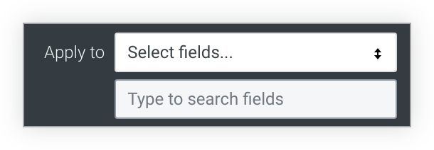
If you choose Select fields, Looker displays a box that lets you select the fields where you want to apply the rule. If you enter text in the box, Looker lists only the fields that include that text.
Select the field or fields to apply the rule. The conditional formatting will be applied only to the values in those fields.
If you create multiple rules on the same field, only the rule highest on the list applies to the visualization and the other rules are inactive. To move a rule higher or lower on the list, click on the three horizontal bars at the top left of that rule and drag the rule higher or lower in the list.
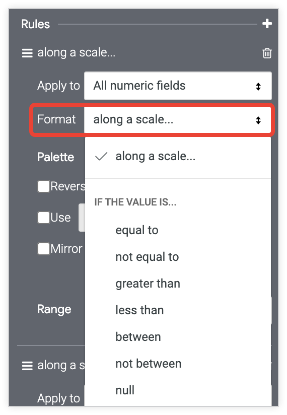
In the Formatbox, choose whether to color code values along a scale or based on a logical condition.
If you format based on a logical condition, when you enter a value in the Formatbox, do not use thousands separators.
Color coding on a scale
If you are color coding values on a scale, click the color palette. Color coding on a scale can be applied only to numeric fields.
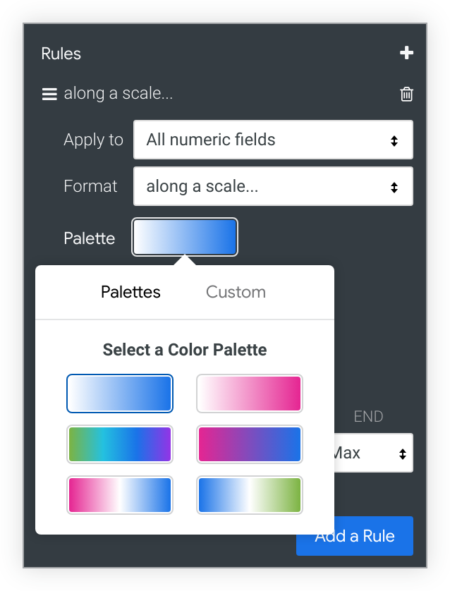
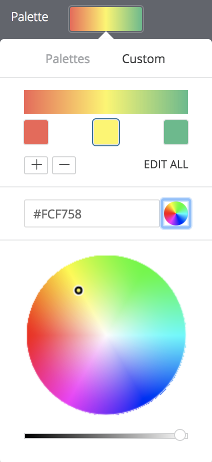
Choose an existing palette or create a custom palette by clicking on the Customtab of the palette picker:
- To add or remove colors from the scale, click the +or -buttons. You can have a maximum of 5 and a minimum of 2 colors on your scale.
- To edit all colors of the scale, click Edit Alland enter RGB hex strings
, such as
#2ca6cd, or CSS color names , such asmediumblue. - To choose a custom color for the highlighted part of your color scale, use the color wheel.
Use the following options to modify the color coding:
- Select Reverse colorsto apply the colors at the left end of the palette to values in the higher end of the data range and colors at the right end of the palette to values in the lower end of the data range.
- Select Use X color stepsto limit the number of colors used to the specified step value. When this option is not enabled, the data is colored on a gradient covering the entire palette spectrum. When this option is enabled, the data is then grouped and colored according to the number of color steps. For example, if you specify 5 color steps, the data is grouped into 5 equal buckets and the 5 colors applied, one color to each bucket of data. Valid color step numbers are from 2 to 100, inclusive.
- Select Mirror range around center valueto make equal color shifts on either side of the color palette. For example, on a scale from -100 to 0 to 100, values of -20 and a 20 will be the same color distance (10%) from the center color definition — 40% and 60% of the palette gradient respectively.
- Use the Rangefields to specify the values that determine the palette gradient start (0%), center (50%), and end (100%) colors. For the start and end colors, you can specify the minimum and maximum values in your data, specific numeric values, or percentile values. For the center value, you can specify the midpoint of the minimum and maximum data values, the data average, the data median, a specific numeric value, or a percentile value. For example, specifying start and end percentile values of 1% and 99% respectively, with a center value of 75%, causes the bottom half of the color gradient to apply to the lower 75% of your data values, and the upper half of the color gradient to apply to the top 25% of your data values.
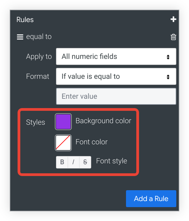
Color coding based on a logical condition
If you are color coding values based on a logical condition (in other words, using one of the Formatoptions beginning with If value is), choose the Background Color, Font Color, and Font Stylefor values that meet the condition. By default, the background color is set to the first color of the categorical palette you have chosen for your conditional formatting rule.
Include Totals
If conditional formatting is enabled, you can toggle whether totals are included in the color coding scheme.
Include Null Values as Zero
If conditional formatting is enabled, you can toggle whether null values should be represented as a zero.
Adding a table chart to dashboards
When you add a table chart to a dashboard , if the Row Limit is left blank, the dashboard imposes a limit of 1,000 rows to the table chart tile. To increase the row limit on a dashboard tile, enter a higher row limit up to 5,000, which is the maximum number of rows that can be presented.
Table charts with many rows that are added to a dashboard may look different when they are downloaded or scheduled in PDF format if the Expand tables to show all rowsoption is selected. See the downloading or scheduling documentation pages for more information.