[イラスト] カテゴリの記事
全84件 (84件中 1-50件目)
-
スマホで画像加工(1)~
皆様、お子さんの写真をブログに貼るときに、やはり防犯上などの考慮から顔に特定されないような加工をされてる方が多いですね。私も、半分はそうなんですが、もう半分は別の理由がありまして。うちのなすかとひょうすけは写真なしで4コマでネタにしてた時のイラストが残っておりまして。それで写真と組み合わせて外でのイベントを4コマにしていたわけです。まあ、こだわりといいますか。しかし、スマホは便利なもので写真を加工するための優秀なアプリがありますな。スタンプも多いし。ただ、やはりそこは自分のオリジナリティを出したい。以前PCで使っていたお面とか吹き出しとか集中線とかを使いたいなと。あと、写真を撮っている私が当然ファインダーの中にいないのが話の展開上こまる時に私の分身キャラクターを入れることができる。(水曜どうでしょうのひげディレクターのようにカメラファインダーの外からチャチャ入れているだけじゃ飽き足らず、ファインダーの中に映りこんでくるような。マイナーなたとえですが。大泉さんメジャーになってしまいましたが。)手前で、突っ込みを入れているしろくまが私(笑)。今回、スマホで加工した手順を備忘録として残しておこうかと。参考まで。(1)まず、元の写真。当然スマホで撮ったものだが、(さすがに大きすぎる(2400x3200px)のでここで表示するために小さく、そしてモザイクも入れてありますが、それはここではおいとくとして。)(2)ここで4コマ用(そのうち印刷できるように400dpiでA4に縦で2本収まる4コマとして設定した際の一コマ分の白紙のこれ※ 本当は枠線もない。ただそれだと真っ白で何もわからなくなるので、枠線だけつけてあります。これに写真を貼り付ける。使用したアプリはPicsArt - フォトスタジオ大きさを変えても、下絵として最初に読み込んだ白地で切り取ってくれるので便利。ま、その機能は、ほかのアプリでもあるけど、透過PNGや回転時に水平で引っかかるグリッド的な機能が気に入っています。保存形式がPNGでほかのアプリとやりとりする時に劣化しないのもいいです。写真は相変わらず枠線とモザイク入れてありますが、実作業の時は、入っていません。と、写真が横長の時はいいけど、こんな風に縦長の時は、どうしたもんか?さて…。長くなって来たので、一旦切ります。大泉洋出演!大人気の水曜どうでしょう DVDシリーズ【新品】 水曜どうでしょう DVD 第20弾 『原...価格:5,670円(税込、送料別)実は私、もと北海道人なのにリアルタイムのどうでしょうを見たことがない。ちょうど大阪とかにいた時期に放送したものが、人気になったようで、かく言う私も今ほぼリアルタイムで再放送(チバテレとかテレタマとかTOKYO MXとか)を見ております。うーん車の中で、ごちゃごちゃいっているのとか、そんなに惹かれないんですが、唯一すごいなと思ったのが、「対決列島」これは、北海道(HTBの前)を出発して鹿児島まで、行く先々で名物の甘いものを早食いしてその県の面積を取り合うという無理な企画。甘いもののチョイスもスケジュールもルールも、ひげのディレクターが勝手気ままにきめて、自分が勝ったら次の企画はカナダでカヌーに乗って川下りという自分の趣味満載の企画。そんな出来レースっぽい(そもそも北海道とったら終わりだろう?面積段違いなんだから)企画をがぜん面白くしたのが、ひげ側に加入させた安田君がみごとな天才っぷりを発揮して出来レース企画を完全にひっくり返してしまった。(でもこのDVD売ってないんだよねえ)大泉洋ばかりクローズアップされているけど、安田君はやはり天才だと思う。【楽天ブックスならいつでも送料無料】HK/変態仮面 ノーマル・パック [ 鈴木亮平 ]価格:3,812円(税込、送料込)この、変態仮面のラスボス役を好演(そうか?)しております。他にも結構いい演技を見せております。
Jun 13, 2015
コメント(0)
-
スマホで4コマを再開しよう(9)~スマホアプリとPCソフトのjpg変換の差異
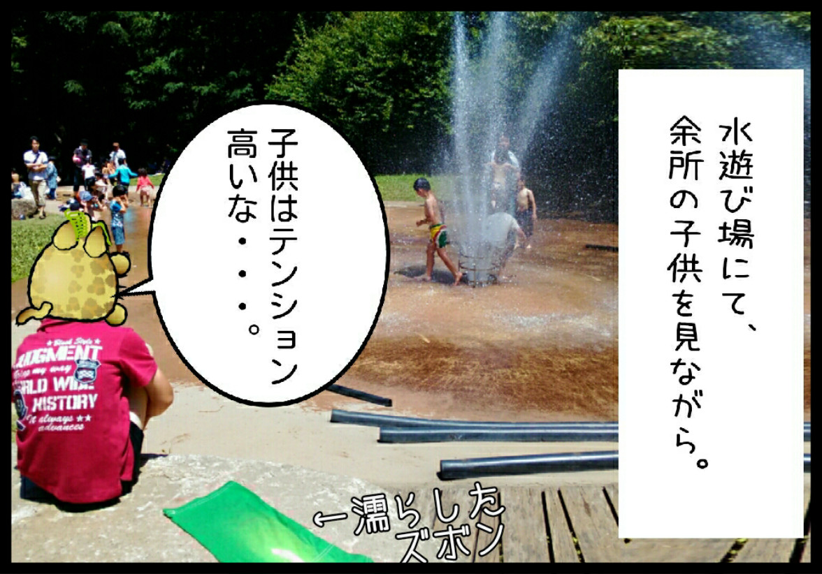
スマホで写真を加工してアップロードしようと四苦八苦。子供の写真はある程度の加工が信条なのだが、スマホ初心者なので、どうにも勝手がわからない。前回は画像の大きさが大きいままと、小さく縮小したものは、スマホ上では同じ大きさに表示されたとしても。もとの寸が大きい方がきれいということが分かった。画像ファイルの容量は、最近の通信環境だと、多少大きくても、以前ほどは嫌がられないとは思いますが、まあ、画面上差が出にくい(あるけど)ことにこだわって必要以上の巨大なファイルを貼るのはスマートじゃないなと。というわけで結局、以前と同じ385x269ででアップロードすることにする。ただ、スマホのアプリが、圧縮率と画像の綺麗さにおいて、PCと同程度なのかは、検証したいなと。というのも、どうもスマホアプリで圧縮したものは画像が粗いのに大きい気がする。やってみなくちゃわからない。科学大実験。まず、うちのひょうすけ君、水遊び場で遊んで転んで、ズボンを濡らしてしまい、熱い岩の上に貼り付けて乾かしている状態で一言。「子供はテンション高いなあ。」おいおい、君はいくつだい?(笑)という、実話に基づき、その時の写真から作ったのがひょうすけお面+台詞+枠線のこの一コマ漫画スマホのアプリで作業が終了したときはpngでした。さすがにこれは大きすぎて貼れないのでPC上でgimp2にてjpgに加工。品質は90と高めです。1176x822で254KB。実際にはこれではなくpngの方ですが、まあ、これがスタートの画質に比較的近いものだと考えてくだせえ。この大元のpng画像をまずスマホのアプリで縮小とjpg変換をしたのがこちら。385x269で93KB、圧縮の品質は2種しか選択できないがよい方を選んだ。次、おおもとのpng画像をPCで縮小とjpg変換をした上でgimp2にてjpgに加工。385x269で46KB、で品質は90と高め。どう見る?スマホの方は全体的にシャープさが失われてボケている。しかもファイルサイズはほぼ倍!!これはいかん。圧縮率が悪くファイルが大きいにもかかわらず、画像がぼけている。どうも、スマホのアプリは検証なしに使うとデカいわ悪いわということになりかねない。どうしたもんだ…。とりあえず、スマホのアプリをいろいろつかって試して更なる検証を続けます。※ 今回のスマホのアプリについては、特に名前をあげません。私の使い方がわるいだけで、どこかに眠っているパラメータがあるのかもしれないですし。ただ、そうであってもデフォルトでこうだということは(いや、実際はデフォルトよりも画質が良いとされるモードを探り出して用いているのではあるが)過信は禁物ではないかということで。ただjpgへのコンバートより、これは画像縮小の機能がいまいちなのではないかなという気がします。あくまでも、感覚的なものですがね。シンプルで可愛くてカッコイイ!おしゃれな男の子のためのハイセンスな水着3点セット。丁寧な縫...価格:4,536円(税込、送料別)夏空のようなスッキリとした青に、水平線のような白ボーダー♪カモメプリントはシックな可愛ら...価格:4,536円(税込、送料別)シックなブラウンの細ボーダーがお兄さんぽくてカッコいい!カーキ色のデニム風プリントとの組...価格:4,536円(税込、送料別)雨の日のきらいな女の子が、知り合いの雨好きな奴にそそのかされて、雨合羽の下にスクール水着を着ているから、どんなに濡れても怖くないもーん、という、趣味全開の漫画があったが(さて、わかるひといるかな。)濡れたらいけないと思うからこうなる。いっそ濡れてもよし、ただし水着みずぎしているのは抵抗がある。ということで、こういうのはどうかなと。濡れないうちは服のように装えるものということで。もちろん、着替えはいるのだが。これ以外にも、こちら「CDMストア」さんがそれっぽい品ぞろえが多いかなと。(キッズ&ベビーラッシュガードにあります。)さ、明日は準備を整えてまいりましょうか。
Jun 6, 2015
コメント(0)
-
スマホで4コマを再開しよう(7)検証
さて、では楽天のスマホアプリでアップロードしたものとPC版でアップしたものを比較してみようこちらスマホアプリ版で写真に直接、ひょうすけお面を貼り付けたもの。こちらがPC版の入力した4コマ風に改めたもの画質がずいぶんとPC版が悪い。(最初はアプリ版と思ったが、PC版の方がかなりぼけている)これは、PC版にせよ、容量上限に引っかかったため、別途画像を縮小したのがよくなかったようだ。結局、おなじファイルをアップしたら、PC版の方がいいのだが、圧縮したら元の木阿弥のようです。…ん。4コマ風はいつの間にか画像が左右反転している?なぜ?アプリでいじっているうちに反転したことに気が使なった?こういうとこともスマホの操作性の難しさだろうな。いつのまにか何かのボタンに触れてしまう。意図しないアップロードとか更新とかが起こりやすい。(実は、このページも写真貼っただけでプレビューを見ようとして誤って公開されて、あわてて入力している私だ。スマホでPC版をいじるとボタンやリンクが小さくて、誤操作しやすいことは、これだけでもよい証左であるな(笑))今後は、できるだけ画質が落ちない方法(個人的なこだわりとして、アップ直前の画像の画質は印刷品位というのがあるので)そのあたりはさらに検証していきたい。先日のハシビロコウハンコで気に入ってしまったはんこ屋さん「邪悪なハンコ屋 しにものぐるい」はんこやさん、安いハンコに押されて大変だろうけど、アイデア次第でこんな展開もあるのだなと感心した次第。変なハンコがいっぱいあって楽しいから、感心がある方はのぞいてみて(笑)大仏チラ見 認印価格:2,600円(税込、送料別)カピバラ 認印価格:2,600円(税込、送料別)スケキヨ 認印価格:2,600円(税込、送料別)ダンゴムシ 認印価格:2,600円(税込、送料別)つちのこ 認印価格:2,600円(税込、送料別)なんか、線とかを絞り込んで少ない面積で動物を表現するのって面白いな。ボンボヤージュ氏に通じるかも。【楽天ブックスならいつでも送料無料】ちびギャラ(ろくっ) [ ボンボヤージュ ]価格:864円(税込、送料込)ゴマブックス傾いて、どうすんのかなと思っていたが、独立してますね。ボン社SUZUさんと相変わらずつるんでます。
Jun 2, 2015
コメント(0)
-
スマホで4コマを再開しよう(6)~再構成してみる~
さて、先日の上野動物園遠足の写真を4コマまんがの形態に再構成してみました。差し替えようと思ったが、写真を加工してできたファイルの、形式的な問題でうまくいきませんでした。コンバートしてなんとか…あと、写真を4つ並べただけなので、オチてません(笑)。いやいや、まだまだ問題山積ですが、やっと、それらしくなってきました。【送料無料選択可!】動物たちの130年 上野動物園のあゆみ (単行本・ムック) / 小宮輝之/解説・監修 持丸依子/編集 中川成生/編集 小宮輝之/編集 飯野寿雄/編集協力上野動物園いいよね。ただ、園内がちょっと複雑で、移動しにくいかな、と。暑かったのもあるが、子供がへばりやすいな~(笑)
May 31, 2015
コメント(0)
-
スマホで4コマを再開しよう(4)~検証実験~
前回「スマホで4コマを再開しよう(3)~画像容量上限あがっているけど意味がないのでは~」で画像が小さく圧縮されてアップロードされていることの検証実験です。まず、以前描いた4コマ(790x1133)をPC上でアップしてみる。…プレビューでは、アップされた画像のままの寸で一瞬あらわれて、きゅっと枠にあわせて小さくなる。右クリック「新しいタブで画像を開く」であらわれたタブの画像は、クリックするとアップされた時の大きい寸で現れる。…よしよし、ここまでは昔のままだ。横幅が入らない以上致し方ない。おなじ画像を、スマホでアップしてみる。:(ここで下描き保存してスマホで再度編集をする):↑これはスマホから楽天アプリでアップロードしたもの。ぼろぼろです。要はスマホの画面に合わせたアップロード仕様なわけだが、見ている人はスマホだろうがPCだろうが配慮したわけではないわけで。実際、PCで上げた画像は以前と同様な見栄えなわけです。ということは、スマホの楽天アプリを使わずにPC用の画面からアップロードすればどうなる?これなら変わらない。劣化してない。というわけで、楽天アプリは入力に特化しているが貼り付けた画像の扱いとしてはあまり意味がないような気がする。分けるのは面倒くさいが、画像を貼るときはPC版を使うか、文字入力を済ませた後、一度下描き保存してPC画面の方に遷移して画像だけ貼るというのが最も画像を劣化させない方法かなと。楽天さん、楽天アプリの画像貼り付けの仕様は意味ないのでどうにかしてください。
May 26, 2015
コメント(0)
-
スマホで4コマを再開しよう(3)~画像容量上限あがっているけど意味がないのでは~
さて前回、アプリでの画像処理方法の模索を始めて、アップされた画像があまりにも劣化していることに気が付いた。(でアプリ検討が止まったわけですが)アプリのせいか?とも思ったのでこれを解消しないと画像処理もへったくれもないです。そして、以下のことに気が付いた。さらに前、楽天のアップロードできる画像の容量上限が変更になり、だいぶ余裕ができたことに触れた際(「いつのまにか画像容量が増えている…」)に、見過ごしていたことがあります。以下、【楽天ブログ】画像容量についてQ&A:画像の登録条件については下記の通りとなります。-------------------------■GIF、JPEG、PNG形式で保存されている画像■容量は1枚あたり500KBまで■容量は1日合計で2MBまで■容量の合計以内であれば登録枚数の制限はありません。■画像の縦横の大きさはそれぞれ2000ピクセルまで-------------------------上記の条件を満たしていない画像を登録したい場合は、お手持ちの画像ソフトで容量や保存形式の変更を行なってください。※※※ご注意くださいブログに掲載した表示画像のサイズは、特定のサイズを超えると自動的に変更になります。この特定のサイズはここに書いてある、縦横2000ピクセルと思うじゃないですか。しかし、その下に貼ってある、ご参考)ブログにのせた画像のサイズが勝手に変更されてしまうのリンク先に、Q:【楽天ブログ】ブログにのせた画像のサイズが勝手に変更されてしまうA:ブログた画像の横幅が以下のサイズを超えた場合には自動縮小され、テンプレートに最適なサイズで表示されるようになります。 【PCの場合】■メインの画像サイズ範囲・中央メイン型 :350ピクセル・右、左メイン型 :500ピクセル・メイン型 :650ピクセル・旧広場型 :650ピクセル■自由欄等、右サイドの画像サイズ範囲:130ピクセル【スマートフォンの場合】300ピクセル 以前は、画像のサイズによってブログのテンプレートが崩れたり横にスクロールしないとすべての画像を見ることができなかったりしましたが現在はブログのテンプレートに最適なサイズで表示されます。なんじゃこりゃ!!ぜんぜん2000じゃない!!なに?300って。しかも、以前の画像は、その場で圧縮していたものを見ていたので、アップロードした大きいものが影にあったのだが、これはアップロードの際に勝手に小さく寸を詰めている!!そしてこの圧縮の仕方がかなり劣化をさせている。楽天さん…他のところに合わせて画像容量を上げたようにみえて、これ改悪じゃないですか。こんなに小さく圧縮したら、上限あげても全く意味がないですよ。もう、再開したのに、早くもめげそうです。
May 26, 2015
コメント(0)
-
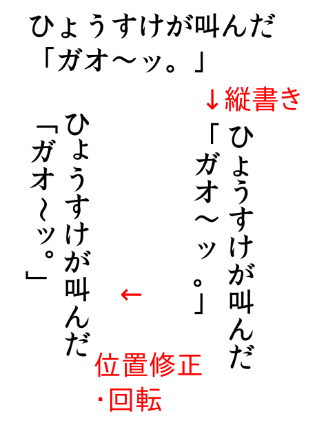
inkscapeで縦書き文字を打つ方法
inkscapeがイラストレーターに勝るとも劣らないベクター系ソフトウエアなのは疑いの余地がないのだが、これで漫画(私のinkscapeを使う上でのかなり大きなウエートを占める(笑))となると大変こまった欠点がある。それはinkscapeで縦書き文字を打つと拗音・撥音の位置、句読点の位置、長音波線などの位置と向きがうまく打てないというある意味「漫画」である以上致命的な弱点がある。もう、これが治らないなら、吹出しとか横文字のいわゆるアメコミ的な漫画にしなくてはならないかと思ってしまうほどの。しかし、どうも横文字の、左からスタートして右ページをめくる形態はどうにも乗りが悪い(私的に)。どうしても左から読みたくなってしまって吹き出しの時系列が逆転してしまい、どうにも読んでる時の気が乗らない。…みなさまどうです?これが、4コマ再開(せっかくマシンがおニューになったのに)のネックだったりするわけですよ。今日は結局抜本的な解決法が見いだせなかったけど、この間の紆余曲折をここに認めておいて、inkscapeで漫画を描く方の礎、というか試行錯誤に余計な手間を費やしたりするのを回避していただこうと、ここに記すものであるヨ。実は手間さえかければ、inkscapeには文字単位で位置を縦横自由に動かしたり、回転させたりする機能がある。ある。あるのではあるが、いちいち調節するのは大変面倒くさい。そこでsvgの中にその縦横移動量や回転量を文字ごとに記載した部分があるから、その部分にテキストのそれらうまく打てない文字に応じて縦横移動量・回転量を自動的に計算するエクセルシートを作って対応しようとしてみた。これは実際もう少しのところまで文字ごとの移動量・回転量のパラメータが出来たのだが、そこでさらなる困難が。長音のなかでも、明朝とか楷書っぽいフォントは明らかに縦に回転させただけでは不自然なものがあるのです。右利きの筆字は横棒の長音記号は筆の入りが句点のように左上が筆の先を向いた感じになる。これを時計回りに90°回転させて作った縦棒の長音記号らしきものは、右上に筆の先が向いた、不自然な感じになる。これは本来は縦棒でも左上に筆の先が向いた入りになるのが正しい。鏡像にしたら筆の入りが逆になるかと期待し、鏡像反転が文字ごとに出来ないか検討したが、かなり煩雑な手立てが必要になる。うおー負けへんでと思ってさらにいじる。文字単独なら胸像に出来るから、長音だけ別に打つかと…しかしさらに手間が増えるなあと、それでもやってみた。しかし、やってみるとこれが単なる鏡像だけで処理できる物ではないことが判明。横棒の長音記号は漢字の一のように右端が「止め」になるが、縦棒の長音記号は川の右端の縦棒のように「抜き」になる。これも単に横棒の長音記号を回転させたり、鏡像にしたりしても対応できない。そしてバラに打っているところで気がついたが、もはや結局一番の早道は位置の移動と回転はテキストをオブジェクトに変換して、文字ごとのグループを普通のオブジェクトの移動や回転の様に調節した方が早いし、長音は「川」や「ト」のような抜きのある縦棒で構成されたものを分解した方がいいということがわかった。※ といっても、漢字とひらがなで違うフォントをつかう漫画のフォントの場合は「川」はゴシック長音は明朝なんで、「ト」を使わざるをえないが、同じフォントでいい場合は「川」がらくかな。面倒くさいし、後でテキストを変更することも出来ないが、テキストの移動・回転がキーボードベースでちまちま打ち込んでいたことを考えるとマウスで移動量を刻みながら動かせて、感覚的にわかりやすいし、後で変更できない点も、オブジェクト化する前に、曲がった文字で雰囲気を読み取って、間違ってないか十分に確認してから行えば最小限で済むし、テキストはどこかに残しておけば、オブジェクト化したものが間違いでも打ち込みなおしは必要ないものと考えられる。とはいえ、縦書き対応してくれたらこんなことしなくてもいいのに。まあ、しばらくはこの手が私にとっては最善っぽいので、これで再開します。ご参考まで。
Oct 6, 2011
コメント(2)
-
4月になったから心機一転
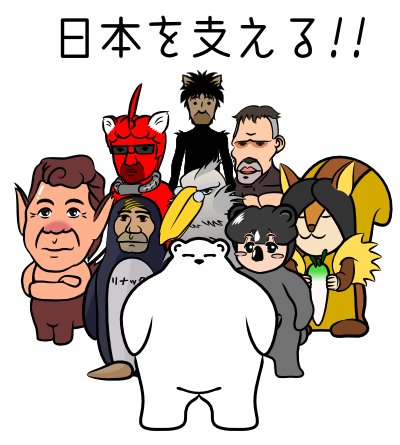
まあ、それは毎年言っているような気がしますが、私自身には震災の直接的な影響はあまりなかったものの、メンタルな面でのダメージは大きく、自粛というわけではなく書けなくなってました。あの瞬間までは少なくとも普通に暮らしていた人たちがいた。もし時間が巻戻せるなら…朝、目を覚ますと誰もいない。温かい家も、愛用の道具もなにもない。愛する家族もどこにもいない。そんな人がいっぱいいます。私もこれが夢ならと毎日思う。でも、これが現実なんだ。いま、私に出来ることはなんだろう。今回の震災は日本自体を傾かせるほどのものです。実際、東日本の製造業は地震の直接的な被害と停電のおかげで代替えのきかない機械の部品の生産が止まり、日本はおろか全世界でいろいろなものの生産が止まる有様。もちろん、原発の影響は東北はおろか日本全体の農産水産におよぶでしょう。日本は未曾有の大災害から長く厳しい、いつあけるかわからない厳冬に突入するでしょう。いま、そしてこれからずっと、私に出来ることはなんだろう。募金と献血と節電ぐらいしかできないが、それはそれとして。まずは、直接的な被害を免れた人ができること。それは「普段通りの仕事を、普段通りに実行できるように努力する。」なんではないかなと。私の会社は比較的生産拠点が分散しており、被害はうけたものの製品を作る力はまだかなりあります。日本のある特定分野ではありますが、ここを支える。その為に努力する。折も折り、大年度末。私は拙いながらも自分の仕事に専念していました。私の仕事場のメンバーはみんなプロフェッショナルで毎日頑張ってます。(東日本拠点で直接、地震に停電に直面している人もいます)頼もしい面々です。わたしもここで日本を支える。さあ、がんばっていこう。※ まだまだメンバーはいるんだけどとりあえず出来ている人だけ。どうも、りゅーじ先輩とか、メンバーの中でも数人はこのブログの存在を知っているのですが、誰が誰とかは深く追求しないでください。この画像は実在の人物・団体とは関係がありません。さあ、がんばろう。
Apr 3, 2011
コメント(2)
-
とにかく、inkscapeで何か描いてみよう。
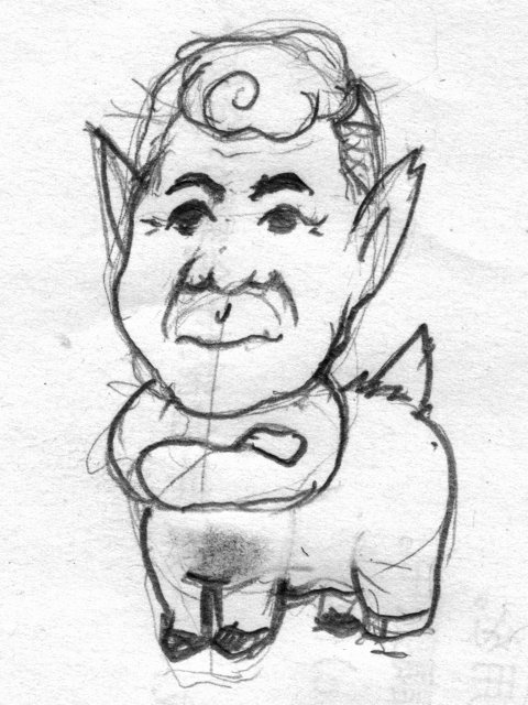
またあいてしまいましたよ。元旦に書く書くと言っておきながらもう半月。なかなかいそがしくて。まあ、そうは言っても仕方ない、少しずつでも何かを書こうかと。今日は、inkscapeについて。現在使っているxpに乗っているイラストレーターがもうウインドウズ7では動かないということから、フリーで使えるベクター系ソフトを探して行き着いたのがこのソフト。しかし、フリーというだけでなく、イラストレーターに勝るとも劣らない機能があります。ただ、なかなか、解説本とかがすくなくて、その機能を使いこなすには至っていないのが現状。そんなわけで、このソフトを使って実際にイラストを描くに際して、気がついたことを、備忘録として書いておこうかと。折も折り、うちの職場の先輩のこうたろう氏のキャラクターデザインがいきなり頭に沸き立ってきたので、そのキャラ作りを通して実地練習をやってみました。まず、イメージをその辺りにあった紙に、その辺りにあった鉛筆で描いてみました。年末の笑い飯のM-1のネタではないですが、ケンタウロスなわけで、下半身はトナカイです。名前は「こうたうろす」…うーたんでダメ出しでたからちょっとどきどき。しかも、適当な鉛筆についていた劣化した消しゴムでこすったら、みごとに画面が汚れて股間がまっくろに(笑)。つづいて電子化。スキャナーがある場合はスキャナーでしょうが、主線のあたりを取るだけなのだからそんなに解像度もいらないです。場合によっては携帯の写メでもいいかも。これを、inkscapeで開きます。だから、電子化の際の画像形式はinkscapeで読めればなんでもいいです。私は最近はpngが好み(gifみたいなものかと思ってましたが、フルカラーで圧縮が効き、しかも画像の劣化がないというフォーマットで、汎用性も結構あります。最近まで知りませんでした。)ですが、まあ、あたりだけなのでjpgでもOKです。ただし、inkscapeは結構いろんな形式の画像ファイルの読み込みやインポートに対応できますが、保存できるのはSVGでエクスポートはpngだけです。pngは無劣化なのですが、他の形式(jpgとかbmpとか)にするには他のグラフィックツールが必要です。(gimpがお勧めです。これもフリーウエアでフォトショップのような機能があります)まあ、それはおいといて、inkscape上で画像ファイルを開くかインポートして、下絵を表示させます。(このときリンク形式で開くと元の画像ファイルをリンクで表示させるのでsvgファイルが画像ファイルのように大きくなることがありませんが、リンク先を見失う、例えばsvgファイルだけコピーして、別の場所で開いたとか、元の画像ファイルごとSVGをコピーしたんだが、階層の名称が違うとかの場合は画像が表示されません。この場合、リンクで呼び出した画像を選択した状態で編集 → XMLエディタを開き、絶対パスで保存されている部分をファイル名だけにすると相対パスになるため、元の画像ファイルごとSVGをコピーした場合は階層の名称が異なっても相対パスは一致するのでちゃんと開きます。)レイヤーで下絵のあるレイヤーをロックして動かないようにして、その上位にもう一枚レイヤーを作成・選択状態にして、線画をそのレイヤーに描くようにします。鉛筆ツールを選択し線をぐりぐりなぞります。鉛筆ツールには「抜く」(三角 底辺→頂角)、「入る」(三角 頂角→底辺)、「入って抜く」(円/弧)の3つのパターン(それ以外に自分でつくったパターンを用いることも可)強弱をつけることができますが、たいがい「円/弧」で事足りますし、後で調節もできます。今回は何も考えないで「円/弧」で描きつづけました。次回、このパターンやパスを調整します。【送料無料】Inkscapeスーパーテクニック愛用してます。がいつまで立ってもこれ以外に解説書がでないというのもなんですな。【送料無料】徹底図解GIMP & Inkscapeのすべてgimpも使えますが、gimp単独ならこちらは結構出版されてます。gimpと併用する機会も多いので、こちらも手元にあると便利です。
Jan 18, 2011
コメント(0)
-
inkscapeが重い原因~実は濡れ衣?
※ すいません下書きから時間がたちすぎて、topに表示されず、さりとて、日付を変更する方法がわからないので再投稿いたします。2度見した方、ごめんなさい。*****************************以前inkscapeがイラストレーターに比べて重いという話をしたが、実はこれが半分ぐらい濡れ衣ではないかとの懸念が。というのも、inkscapeの保存形式のsvg形式というのが、人間が(がんばったら)理解できるような、テキストで記載されたデータなので、普通のデータの機械が即認識できるような言語での記載よりファイルが大きくなっているのだろうなと思っていました。しかし改めてファイルの大きさをみると、決してイラストレーターで作ったファイルより大きいわけではないような。たとえばこの「ひょうすけ102」(キャラクターは違う姿勢・アングルのものを作る度にそれだけを別ファイルで作成しており、そのキャラクターライブラリーから適当なものを選んで貼って作成しているんです)をブラシの属性などを全部削り落としてイラストレータ形式(.ai)で保存したら216KB、svg形式だと232KB。しかも、PCが内部でその情報を取り扱っている間も人間的な言語をエミュレートして演算しているわけもない。だとすると、何で重いのか。ひょうすけ102をinkscapeで開いて、XMLエディッタ(その画像をsvgで記載したもの?svg上で編集したら画像にも反映される?)と、当然svgなんだから人間が(がんばれば)読めるような記載が…、なんか妙なのがいる。他の比較的規則正しい記載に比べて「<i:pgf id="adobe_illustrator_pgf">」の部分は明らかに乱雑、ぐっちゃぐちゃだ。そしてこのぐっちゃぐちゃはどこかで見覚えがある。パソコン通信黎明期、メールで画像ファイル(といっても.magとかだが)をやり取りする際に用いられたishファイルに似ている(なつかしいねえ)。ということはこの部分はベクター(イラストレーター的)ではなく、ビットマップ(フォトショップ的)ななにかと考えられる。この部分をエディタで削っても画像には何の変化もないところを見ると、これはイラストレーター上でsvgを開くために仕込まれたイラストレータとの互換性を維持するための隠しコードのようなもの?もうひとつ、何かのはずみ(保存オプションで選べるのかも)でビットマップにオブジェクトが変換されたもの(貼りこまれたグラデーションが変換されていたのを確認)のようです。前者は削除してもかまわないようだし、後者は改めてinkscape上で作り直してやる方がよさそうだ。この部分を削る(XMLエディッタではタグ構造を把握しやすく、妙な部分はタグでくくられた一塊で削除が出来る)とファイルはたった47KBになってしまった。もちろんこのあとinkscape上で線の強弱などを付加するとファイルはまた大きくはなるのだが、あまり役にたっていない変なベクター(っぽい)データをぞろぞろ引き連れて演算しているのに比べて幾分早くなった気がする。もっとも、早くなったかどうかは、別要因としてubuntuをOSにしているマシンで動かしたからかもしれない(こっちの方が重要かも)。まあ、とにかく、inkscapeはいうほど遅くない点と、イラストレーターのファイルをsvgファイルにしてコンバートすると、inkscape上ではあまり使っていないようなコードがファイルを大きくしているという点は使われる方はご注意してくださいということで。徹底図解GIMP & InkscapeのすべてInkscapeスーパーテクニック
Oct 29, 2010
コメント(0)
-
イラストレーター→inkscapeコンバート
ジミーさんに掲載が滞っているとリアル世界でつっこまれた。うーん、inkscape修行中で、なんか成果が上がらないので腐っていたんですが、少しずつでも書きましょうか。何で腐っているかというと、実はinkscapeの決定的な弱点を見出したのです。それは重いこと。結構致命的です。なんせマシンパワーが脆弱なんで。でも、ウィンドウズ7ではわが動物舎の経済的な状況を鑑みるに、到底イラストレーターとフォトショップは買えない。もうgimpとinkscapeで行くしかないのだ。早いうちに対処法を検討しておこう。(ウブンツの方がホームグラウンドならぬホームOSなので早いかもしれないし)では進捗。一番てこずったひょうすけ君で。イラストレーターで作成してあったファイル。線は、基本的な抑揚とにじみ揺らぎのついたブラシパターン、ヒョウ柄はブラシの散布パターンでオリジナルはひとつしかなく、それほど重いものではないのだが、これをsvgで保存すると線ならアウトラインのでこぼこまで、柄ならそれぞれの、しかも毛羽立った毛羽の隅々までポイントを設定されてしまい、このままinkscapeで開くと重いのなんの。というわけで、イラストレーター上ですべてのブラシパターンを削除してしまう。線も抑揚なし、柄もなし。この状態でsvgで保存し、inkscapeで開く。微妙に色が異なる気がするが、まあ、この通り(同じなので画像は割愛)で、イラストレーターの時は基本的な抑揚とにじみ揺らぎのついたブラシパターンを設定していたのですが、これが問題。inkscapeにも似たような機能がある。が、ここで書くと話が散らかるので別の機会に詳細は書きますが、実際線の抑揚に関しては、抑揚パターン(イラストレーターのブラシパターンに相当)を作っておいて、それを今ある線に適応することができるのですが、・まとめて適応が出来ないとか、・適応したとたん、線のパスではなく、面をもったアウトラインになる(例えば、「線は黒、塗りはなし」条件で書いていた線のパスが、「アウトラインが黒、塗りがなし」という状態になり、いちいち、線と塗りを設定をしなおさなくてはならない)、といった不便な点があります。もっとも、抑揚パターンをその場で編集できる分だけ融通が利くし、山のように抑揚パターンを作らなくてもいい点はべんりかも知れない。で、抑揚をつけたのがこれ。他のキャラクターに加え、ひょうすけはヒョウ柄模様があるので、これは一つだけ毛羽にアンカーを設定した(これだけでも重くなる)ものを散布ブラシではなくタイルで配置。(ランダムにもできるので似た効果が得られる)そして、イラストレーターでは、その抑揚のブラシパターンににじみパターンもつけておいたのですが、線の長さによってパターンが詰まったり間延びしたりするのを防ぐ為、ブラシパターンの形状それぞれに、短いの中くらいの長いのものすごく長いのといろいろなバージョンを用意する必要があり、ものすごい大量のブラシパターンが必要になったりしたものですが、inkscapeは、にじみをフィルタでつけることが出来るので、抑揚パターンは長いの短いの考慮をする必要がありません。しかもフィルタは自分で作る事ができる(イラストレーターはパラメーターをいじる程度ですが、どのフィルタをこのパラメーターで実行したものを、更にもと画像に別のフィルタをかけて、乱数を発生させた画面を呼んで、その画面の濃淡で揺らぎを発生させて和をとるとか、何でも出来ます)ので、これも試行錯誤で以前のにじみと同じような効果を発生させるフィルタを作成し、この抑揚パターンのついたイラストにかけてやる。それがこれ。どうでしょう。結構再現できたと思うんですが。この詳細は、自分自身整理するために、別途書いてきます。今日はここまで。
Oct 14, 2010
コメント(2)
-
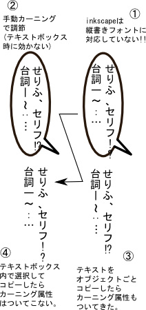
テキストの機能は?…縦書きに難あり
inkscapeをものにしようと悪戦苦闘。inkscapeとは直接関係ないけどHDDクラッシュの余波でフォントがなくなってしまった。クラフト墨とか教科書体ってデフォルトじゃなかったんだなあ。フォントをわざわざ買った覚えはないので、どこかのソフトについてきたんだろうけど、どのソフトなのか皆目見当が付かない。しかたない。というか、inkscape導入の思想(フリーで高機能)にならい、フォントもフリーものにしようか…。と思って、inkscapeのテキスト入力をいじり始めて気がついた。inkscapeにはテキスト入力の仕方に若干のインターフェース的な不備と縦書きへの未対応があります。まずインターフェース。簡潔すぎて字の大きさとか右寄せ左寄せとか行間とかはあるけど、カーニング(文字間つめ・あけ、ベースライン変化)が出来ない。これは結構致命的、一つ一つ文字ばらして、オブジェクトとしていじらなくてはならないのかと思ってたら、手動カーニングを解除という項目があるのでそういったものがいじれるようだ。しかし、どこをどうしたらカーニングなどをいじれるのか、メニューがどこにもない。調べてわかったが、これはかなり裏技。alt+カーソルキーで文字間、ベースラインの上下、そしてalt+Ctrl+「[」 or 「]」で回転も出来るのだ。※ ものの本にはalt+「[」 or 「]」になっているが、これでは動かない。Ctrlがいる。これはある意味便利かもしれない(が、もうちょっとわかりやすいところにおいてほしいな)喜び勇んで台詞(もともと、4コマ漫画を描こうとしているのだから台詞、そして縦書きのテキストは必須)を打ってみようとするとこんな有様。(1)(○は機種依存だった)のように、!?の半角を二つ並べて一文字扱いはイラストレータでも出来なかったが、-~…が横のままというのはどういうこと?調べてみると、現在の最新のinkscapeのバージョンにおいても日本語縦書きフォントがサポートされてないとのこと。svgがそもそもインターネットブラウザでそのまま閲覧できるような、Webページチックな画像フォーマットだからか?もしそうだとしたら、バージョンが進んで改良されるというのは望み薄なんだろうか。とにかく、日本語縦書きを扱えないDTPソフトはちょっと勘弁してほしい。はやく、改良してほしいもんです。(フリーとはいえ、あまりになんなんで…)まあ、量が知れているのなら、先ほどの手動カーニングで回転させたり、寄せたりしようとしたら今度は動かない。どうやらテキストボックス(っていうのか、テキスト入力の際にテキストが記入される範囲をドラッグして矩形にする場合?)の場合は手動カーニングは効かないような…。うーん、なんか半端だな。バグ?改めてテキストのスタートの位置をクリックするだけでテキストを入力し始めるとなんとか手動カーニングができる。回転させたり寄せたり。(2)の状態になった。しかし、いちいちこんなことするのも面倒。この向きの変わったテキストを保存しておいて貼れば使えるかなと、オブジェクトごとコピーするとその回転やら寄せた属性はちゃんと付いていく(3)が、テキストツールでテキストの所定の位置((4)の場合は全部を選択)するとその属性は付いていかないで、元通り。うーんこれはちょっと厄介。毎回、こんなカーニングせにゃならんのかいな。inkscape、やや暗雲。いまさら後にはひけないが。Inkscapeスーパーテクニックものの本。いい本です。愛用してます。
Sep 10, 2010
コメント(0)
-
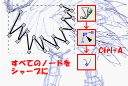
inkscapeで線を引く
むう、inkscape(イラストレーター的なフリーウエア)奥が深いぞ。ただ使っている人はともかく、解説しているページもgimp(フォトショップ的なフリーウエア)ほど多くない。自分なりな疑問や使い方は忘備録のように書いておこうかなと。ちゃんとした使い方とかはちゃんとした人がちゃんと書いているんで。私は私なりの(笑)※ちゃんとしたサイト Inkscape@JP前回、はジミーさんに主線を線の強弱なく描きいれたが、これだって素人の私には一苦労。イラストレーターとは使い方が微妙に異なる。1.まず、下絵の上にべつにレイヤーを作成して下絵は固定する。と簡単に言うけど、なれないとこれを探すのにも苦労する。イラストレーターはデフォルトなのに…。やり方は「レイヤー」→「レイヤー」でレイヤーのオプションウインドウをあけ、下絵レイヤー(最初からあるレイヤーに下絵をペーストしたもの)の目マーク(表示・非表示)の隣の鍵マークをクリックして鍵がかかった状態にする。そしてレイヤーのオプションウインドウツールボックス(左端の縦に長い、ツールのアイコンがいっぱいの、これもイラストレーターにはあるけど、微妙に違う。下の方のアイコンは画面が小さいと隠れて見えない点、注意。スポイトが見つからずずいぶん探したが、何のことはない下に隠れていた。)から「ベジェ曲線/直線を描く」(ロットリングかサインペンみたいなアイコンの)を選択。イラストレーターのときは最初からハンドルを引き出して曲線を表現するけど、ハンドルがいつも直線で角の両側に張り出した線の長さがいつも同じで、それだけで最初からうまく描きたい線を表現できるわけではないので後で微調整する。インクスケープはベジェパスを描く」同じことができる(別のモードもある)が、今回描こうとしているのは曲線-角-曲線の形状(ジミーさん羽とかそういう構成のものが多い)なので最初から全部角で描いてみる。ここから先がイラストレーターとちょっと違う。「ノードでパスを編集」モードにして、そのパスをつつくと、ノードを編集できるようになるが、そこで全選択(Ctrl+A)でノードすべてを選択状態にして、一気にノードの種類を変えることができるようになるのだ。このノードの種類という概念がイラストレータにはない。それぞれに引き出したハンドルでコントロールできるできるので別に必要ないかもしれないけど、一気にできるというのは意外と便利。全部を尖らせたり、全部を自動スムーズとか、対象にできるのだ。(もちろん選択したものだけ種類を変えることができる)さらにここからがイラストレーターと大きく違う。線をドラッグすると自然にカーブを調節できるのだ。イラストレーターでも線をドラッグできるが、なんだか意図しない形状に線が「吹っ飛ぶ」がinkscapeは結構自然なカーブになる。もちろん、完全に望む形にはならないからハンドルをちょっといじらないとならないが、かなり自然。しかも、前述のいろいろなノードの種類に設定した場合はその種類を生かしままカーブをドラッグで調節できるので作業がかなりしやすい。何言ってるんだかよくわからないが、一回試してみてほしい。この操作感はちょっとおもしろい。是非に。徹底図解GIMP & InkscapeのすべてInkscapeスーパーテクニック両方ともかっちまった。なかなか無いもんで。でも2冊はいらないかもしれない。gimpとセットの方は、最近電気屋にだまされて7を買わされて、イラストレータとフォトショップが使えない事態に陥っている、うちの親父にあげよう。CDもついてるし。
Sep 5, 2010
コメント(0)
-
Inkscapeを使ってみよう
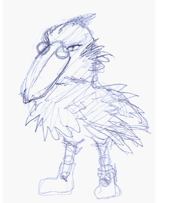
先日の外付けHDDクラッシュ、データ喪失事件を今だ引きずっているシロクマですが、このまま道に倒れて誰かの名を呼び続けていても、しかたないので、何か新しいことをはじめようかと。クラッシュの一件、XPが結構嫌いになっているものの今だXPを完全にきることが出来ない現状。しかし、XP環境で主に使っているソフトであるイラストレーター(勝手な通称イラレ)とフォトショップ(勝手な呼称フォトショ)が、次の7に切り替えた際にまた購入しなおさなくてはならない(誇ることでないけど、今現在、正規ユーザーなんですよ、でも両方とも8万ぐらいはしますんで…)点を鑑みて、しかもubuntuなら基本的にフォトショ的なGIMPと、イラレ的なInkscapeがフリーで利用できるといった事情も考えると、今後はこの2つのソフトを主に使っていくことになる(急には無理でも長い目で見れば)と思う今日この頃。しかし、重要かつ現実的な問題としてはこの二つのソフトのインターフェースに慣れるのに苦労するのはしかたないとして、この二つのソフトがフォトショとイラレに準ずるレベルの機能を有しているのかという点が、気がかりであります。実際、「GIMPの完成度は高い」との話は聞くけど、「Inkscapeの出来」についてはあまり話題にならないです。そして、比較的敷居の高い、ベクター系のグラフィックソフトが相対的に話題が少ないのはそうなんだが、とにかく絶対的に少なすぎます。まあ、とにかく使ってみよう、イラレを買えないとなるとベクター系という点では他にもう選択肢はなさそうだし…というわけで、おそるおそるつかってみたんですが、これが、なかなかなものなんですよ。特に最新バージョン。幸い、Inkscapeはxp環境でも動くバージョンもフリーであるため、本格移行まえに練習するには適してますし、そのバージョンもubuntuの最新版と同じ(ubuntu09.10だと前のバージョンだった)※ 窓の杜 - Inkscape…窓の杜にもあります。とりあえず、4コマ沖縄編は写真を実家からどの程度回収できるかがわからないので、帰省待ち(9月半ば)ですから、会社のことでも描こうかと思っていたんで、新キャラはinkscapeでつくろうかなと。----------------------------------------------------話は変わりますが、なんだか会社でこのブログの存在がばれて、見ている人がちらほら。勝手なキャラクター化がやりにくいです。今回は、「自分のキャラクターを出してくれ」といってきた、会社の先輩ジミーさんをモデルにinkscapeを試していこうかなと。ジミーさん下書き。ハシビロコウな感じ。目つきがするどいんで。主線を抑揚なくいれてみる。ちょっとハンドルの使い方に癖があるけど、ここまではさほどまごつかない。(ポイントやハンドルのショートカットが違う点ちょっとてこずるが)さてどうなるかな。徹底図解GIMP & Inkscapeのすべてまとめられちゃうのか。それぞれが、結構すごいソフトなのに…。Inkscapeスーパーテクニックこれ、買おうかな。
Aug 30, 2010
コメント(4)
-
朝目新聞様にリンクいただきました。
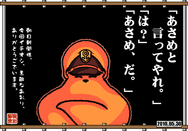
先週の「久しぶりにネタマンガを…北斗の拳×セーラームーン」に、「朝目新聞」さまの5/27アップ分にリンクをいただきました。以前にも2度ほどリンクいただきましたが、今回も多くの方が足を運んでいただいております。リンクされてから4日で1万5千アクセスも!!(普段のペースなら半年分、今までの総アクセスの実に1割です(笑))しかも、≪今回イチオシ≫と、もったいない扱いで、さらに「世紀末ムーンライト伝説 「北斗の月」」という、すばらしいサブタイトルまでいただきました。本当にありがとうございました。朝目新聞さんはほんと、ファンでございまして、身に余る光栄でございます。なお、「仲間はその二人なんだ(´∀`;」とのつっこみもいただきましたが、実は、もう一本ありまして、ええ、もう一人強力な仲間が登場します。近々、またアップいたしますので(笑) 追記:今回のイラスト、ネタがわかりにくいし、しかも古いし(笑)。
May 30, 2010
コメント(2)
-
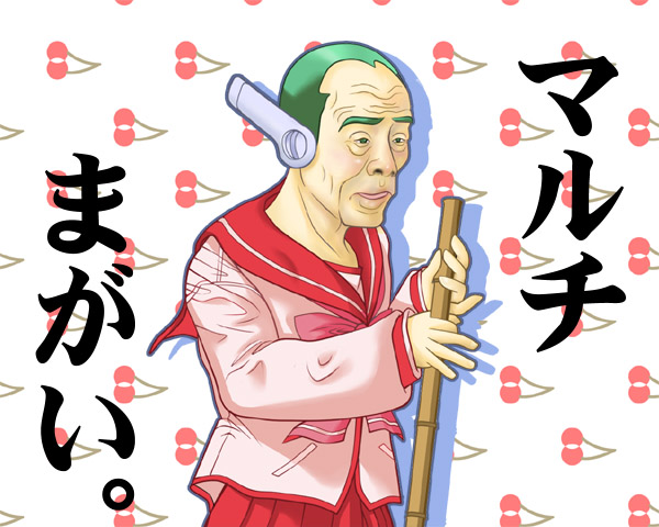
まだいる、マルチまがいさん。
あいかわらず、仕事に追われております。とほほ。また間を持たす為昔のイラストを貼ろうかと。今回は前々回のマルチまがいさんのつづきです。実は、マルチまがいさんはもう一人おりまして。ところで前回のマルチまがいさん、評判悪いです。(あたりまえか)ただのコスプレマニアのおっさんです。特に誰がモデルというわけでもないです。今回はもっと悪いかもしれませんね。で、このマルチまがいさんも当然モデルはいません。某政党のえらいひとでないです。怪しいネットワークビジネスとかとは関係はないですね。うん。 【中古】ライトノベル(文庫) To Heart マルチ、がんばりますっ! / 伊達将範
May 25, 2010
コメント(2)
-
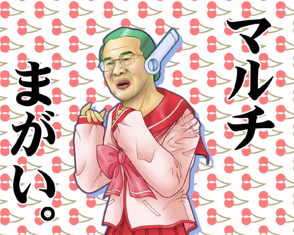
マルチまがいさん~その1
体調が崩れたままの上、次の旅行記の写真が足りず、描くものが多くて時間がかかります。ちょっと、昔に描いたイラストで間をもたそうかと。前々回の『動物舎~琉球物産記「ちんこすこう」』で普天間も雲の上の話とか言っていた方ではないですし、いや別にこれがどこの誰かとかどこかの与党の偉い人だとか、彼の推し進めるネットワークビジネスというのが、インターネットを使ったビジネスではないとか、Wikipediaのページに都合の悪い事書かれているので、どこかの誰かが国会内の端末からそれを削除したことがばれて、いまだに都合の悪いことが書かれているとかということではないです。バックもさくらんぼですね。某政党のマークではないですね。あと、この制服は某ゲームのマルチという女の子が着ている服に良く似ているけどちがうし、ましておっさんが着ているからマルチまがいであって、深い意味があるとかという事実もありません。コトブキヤ ToHeart マルチ ボディースーツver. 完成品フィギュア コトブキヤ版 (ToHeart ) 【フィギュア・美少女系】【ポイント倍付0401】トゥハートカードトゥハート マルチこれはマルチさん。ロボ子です。(違うよ、アンドロイドだよ。)地獄のマルチ商法ふーん、マルチってそんな風に呼ぶんだ。しらなかったよ。
May 13, 2010
コメント(4)
-

動物舎~GWはこんな感じ…
GWは本当にもう…ひょうすけがべとべとの目やにをだして目を赤くしていました。なすかが幼稚園で濃縮した風邪を持って帰ってきました。それぞれ医者に連れて行き対応したが、伝染力は衰えてなかったのか。まず風邪が家族に蔓延、さらに帰省先のシロクマ両親にも風邪がうつり、しろくま父は肺炎を起こす始末。(なんだかんだ言っても歳だから、心配)私はさらに結膜炎までうつり、熱は断続的に出て、激しく咳き込んで腰を痛め、声はまったくでなくなり、最後に通風(普段から薬を飲んでたが、風邪薬を飲んでる間やめてたのが災いしたのか。そもそもストレス性の面が強いので、咳と腰痛で寝れないせいかも)近年まれにみる、踏んだりけったりでした。神経痛、筋肉痛・関節痛(腰痛、肩こり、五十肩など)、手足のしびれ、眼精疲労エスファイトゴールド 90錠【第3類医薬品】[ビタミン剤]常備薬です。
May 10, 2010
コメント(10)
-

動物舎~琉球物産記「ちんこすこう」
GWにいろいろ(初日に風邪で38℃、ドーピングで落として温泉、動物園までいって、結膜炎、さらに腰を痛めて、最後に通風の発作)あって、ちょっと次の4コマがかけません。とほほ。というわけで、ちょっと再利用。先日描いたちんこすこうひょうすけバージョンはイラストレーターで描いたので、結構細密に作りこんでいたのです。今日は、それでちょっと一休みということで。本物はこちら。出生率No.1の沖縄県だから子宝ちんこすこう。結婚式の余興にも。子宝と安産”がテーマです。子宝ちんこすこうプレーン味 【珍品堂】子宝ちんすこう(糸満)出生率No.1の沖縄県だから子宝ちんこすこう。結婚式の余興にも。子宝と安産”がテーマです。子宝ちんこすこう掘りたて紅いも味 【珍品堂】子宝ちんすこう(糸満)子宝ちんこすこう(公式サイト)なんだかCMがYoutubeにて発見。それはそうと、例の鳩ぽっぽの腹案で燃え上がった徳之島にて、町長の「徳之島は長寿世界一が2人も出て、出生率も日本一。少子高齢化対策のモデルの島であり、地域力の残る島に基地は必要ない」(ソースは読売新聞)であれ?ちんこすこうのテーマ「子宝」のよりどころである、出生率トップは沖縄でないのかなと。こういうのは疑問に思ったらすぐすぐ調べてみたくなるのが私の性分なもので、調べてまいりましたよ。内閣府政策統括官(共生社会政策担当)のホームページの「平成21年版 少子化社会白書」から全体版 > 第1部 少子化対策の現状と課題 > 第1章 少子化の現状 > 第1節 近年の少子化の状況(1/3)これが統計の結果ですまず都道府県別では都道府県別合計特殊出生率(2007年) 合計特殊出生率 東 京 1.05(最低)大 阪 1.24 福 岡 1.34 佐 賀 1.51 長 崎 1.48 熊 本 1.54 大 分 1.47 宮 崎 1.59 鹿児島 1.54 沖 縄 1.75(最高)全国平均1.34 資料:厚生労働省「人口動態統計」 九州軒並み高いが、沖縄は図抜けていますねえ。で、一方の町長さんの発言はというと、市区町村別にみた合計特殊出生率の上位・下位10位 都道府県 市区町村 合計特殊出生率1 鹿児島県 大島郡 伊仙町 2.422 鹿児島県 大島郡 天城町 2.183 鹿児島県 大島郡 徳之島町 2.184 鹿児島県 大島郡 和泊町 2.155 岡山県 真庭市 2.1資料:厚生労働省「平成15年~平成19年人口動態保健所・市区町村別統計の概況」より抜粋統計の期間が違うが徳之島町は3位…ん?上の2つの町はどこかといえば、こちらも徳之島の町。おお、徳之島の3つの町で上位独占だ!確かに沖縄は子宝日本一の都道府県というのはあまり知られていないので、今回のちんこすこうの一件で初めて知ったのだが、さらに子宝の島というと徳之島だということをまたはじめて知った。今回の鳩ぽっぽの迷走で迷惑はこうむったけど、徳之島の知名度は上がったし、町長さりげなくアピールもしていてポイント高いぞ。話はちんこすこうから横道にそれるが(よこちん)民主・山岡氏「普天間、直接国民生活に影響ない」というのはどういうことなんだろうね。山岡氏は終盤国会の展望を説明する中で、「普天間の話や政治とカネの話は、直接国民の生活には影響していない。間接的にはあるかもしれないが、直接影響している大きな問題がたくさんある。地方に行くと、普天間というのは、何か雲の上の話だ」などと述べた。国民の生活に影響ない、雲の上の話か…。自分は雲の上で民草のために働いてやっているのだからという上から目線に思えますが。これに対し、伊敷郁子糸満市議が「普天間問題は私たちにとっては大きな問題だ。県民を冒涜(ぼうとく)している」と抗議。山岡氏はその場で「そう受け止められるなら、謝罪して撤回させていただく」と述べた。言われないとわからないし。そうもなにもそれ以外に受け止めようがないし。次回の選挙後は是非、国民の雲の下の目線で上を見上げる立場になっていただきたいですね。【仮装・かぶりもの・マスク・国民新党・民主党・政治家・内閣総理大臣】【送料無料100215】M2 ザ・民主党[鳩山くん・小沢くん・亀井くん3人組セット] 【マスク・かぶりもの】【05P26apr10】山岡さんを含め民主党の重鎮は他にもいるが、売れないか(笑)次回は北谷編にもどれるかな…。
May 7, 2010
コメント(2)
-

「へのこは生きている」っていきなり言われても…
まずはこの記事「鳩山首相「辺野古は生きている」 普天間移設問題で」ヤフーのトップではたしか「鳩山首相「辺野古は生きている」」までしか見えてなかった。悪意ない?だって「へのこ」だし。そりゃ、「へのこ」と「辺野古」は違うけど、なんかこのタイトルって「東スポ」(関西では「大スポ」)ちっくだな、と。かんぐりすぎ?私が下衆?私は、ママがらみの追求でハトさん壊れたかと思った。あと、キャスティングボードとか言って国政を国民の支持のほとんどない政党のいうままにされていいのか。東ハト オールレーズン 袋 14枚東ハト ポテコうましお味5P 袋 24g×5東ハト キャラメルコーン 24g×5個ハトといえば東ハト。あ、でも鳩といえば「鳩サブレ」なのにアフィリにない。通販してないんだ。そこに行かないと買えないというのはみやげ物を売る上で大切だね。
Dec 6, 2009
コメント(2)
-

古い同人の原稿2
さて、先日の続き、古い同人原稿を電子化しているしろくま。ホワッツマイケルとストリートファイター2を混ぜるという、ある意味危険なコラボです。ベガ役は原作ではやくざでしたが、その強面のやくざが家では猫をかわいがっているそのギャップを悪の総帥にやってもらおうと。やっと、マイケルが来ました。(笑)最近復刊して1巻分新たに描いたらしいホワッツマイケル。名作です。WHAT'S MICHAEL [ホワッツマイケル] (1-8巻 全巻)さて、私、これから北海道に帰りますので、しばらく音信普通です。では、行ってきます。
Aug 8, 2008
コメント(4)
-
動物舎観察日記~これはねぇ、もう、ど~しようもない。
(タイトルの誤字があったんで、なおすついでに、ちょっとニュアンスを変えてみました。)年をとったなあと感じる。こんなことはなかったし、その程度で一喜一憂する気にはならないのだが。そう思う。さるさん曰く、「てっぺんがうすい」って。(さるさんは身長が私より高いので私のあたまのてっぺんを覗き込める)活き締め うまづらはぎ(ハゲ)300g煮付け用なぜこの魚はハゲって呼ぶのだろう。うまづらは、まあわかるが(笑)
Feb 26, 2008
コメント(9)
-

キリ番企画経過と募集
しまった、次のキリ番が接近中だ。前のができてないのに(笑)まず、前の56789番の途中経過を。さあ、後藤さんが出てきました。さて、これはキャラはパトレーバーですが、更にもうひとパロディしてます。構図とストーリーは別の漫画なんですが、元の漫画は何で、どのシーンでしょう。(ヒント:次のシーンがキャラ多すぎ)てなわけで、これをクイズにしてもよかったんですが、知っている人しか当たらないとちょっとハンデがあるので、キリ番イラストリクエスト受け企画は60000Hitに最も近い楽天メンバーです。もちろんただの巡回者とかいますんで、ちゃんとリクエストを指定していただかないと、次へ次へとまわりますんで。では。前回好評のネコ桶じゃなくてネコ鍋。うちもなすかに入ってもらってムービーを撮りたいもんです。ねこ鍋ねこ鍋(DVD) ◆20%OFF!
Dec 10, 2007
コメント(2)
-

55555Hit御礼イラスト!
さて先日55555Hitを踏んだ方にはイラスト描きましょう企画でめでたくもニアピンの(55555Hitは楽天外の方で名乗り出た人がいない)アケミ4554さんの「となりのトトロのトトロの名シーンを しろくまくんで書いて欲しい」というリクエストに答えまして、バス停のシーンを。ん~微妙。ちょっと言い訳。まず、Gペンで描くつもりだったけど、しろくまとなると、イラストレーター主体であること。そしてセルワークは比較的イラストエーターでも得意であること。ということで描き出して気がつく。このシーンに限らず、アニメはセルと背景のガッシュか何かで描かれた部分があるということ。しまった。テクスチャーが違いすぎる。背景は水彩で描かないと。しかし、イラストレーターでどこまでやれるか、パターンによりどこまで省略できるかを試してみたくもなる。というわけで、実は背景は拾い葉っぱが1種、雑草っぽいのが1種を散布ブラシにしてます。もうちょっとパターンがあったほうがとも思ったのですが善哉。あと、元ネタのはなし。このシーンは映画ではサツキが眠ってしまったメイを背負っているとなりにトトロがいるのですが、資料を探していて気がついたのですが、当時の映画のパンフレットにはトトロ以外は一人しかいないのです。しかも、サツキとメイを足して2で割ったようなどちらでもない女の子が。※ 画像とそれを紹介した記事がyutaさんのブログこころが生ずる『場』にあります。それにしても、よくパンフをまだお持ちでした。参考にさせていただきましたありがとうございます。そのパンフには今とはイメージの異なる赤く太い明朝で、ややおどろおどろしく「となりのトトロ」とかいてあります。うーんウルトラQのようだ。あと、キャッチコピーは「このへんないきものは まだ日本にいるのです。たぶん。」というのがあって、実はお父さんの声の糸井重里氏のもの。(糸井重里がコピーライターだと知らない人はいないとは思うけど念のため」それをもじりました。説明がましいけど、さるさんは私しろくまより大きいです。(笑)というようなわけでアケミさんへ。55555Hitありがとうございました。皆様もありがとうございました。今後ともご贔屓に。一番上が映画のワンシーン、真ん中の一つが昔の女の子が一人しかいないバージョンです。
Oct 22, 2007
コメント(8)
-

キリ番企画~踏み人募集中。
うーん、うちの近所の方々のブログで相次いでキリ番が発生。私も、ちょっとやってみたくなったんで、急遽キリ番企画。もうすぐ55555Hitが来ます。楽天の方で踏んだ人にパンプキンヘッドさんみたいにリクエストCGを描きます。踏んだ方は自己申告お願いするっす。話し変わりますけど、パンプキンヘッドさんの記念CGを描くにあたって、いつものイラストレーターでのイラストだと時間がかかるので、ここ10年ぐらいつかってなかったGペンでイラストを描くと、旨くかけないながらもソリッド画材+フォトショップの面白みを再認識。特にGペンの描いてる感がす・て・き。(笑)Gペンいいね。しばらくGペンにもどろかな、なんて今日この頃です。55555HitもGペンで描く。ペンになれなくちゃ。うお、紙に引っ掛かる。日光 Gペン3本入りタチカワ Gペン3本入りゼブラ Gペン3本入り昔は日光使ってたけど、たまたまゼブラを買ったのが10年ぐらい前かな。つかわないでほってあったのを発掘。インクも製図用が手付かずだったので、腐ってない。あとは、紙だな。母ちゃん、かみ。
Oct 15, 2007
コメント(9)
-

耳鳥斎の地獄絵とPiNMeN
結構よく見ている番組に「美の巨人たち」というのがあります。純然たる美術番組もいいけど、結構着眼点や構成が面白くて気に言ってます。(寸劇がしょうもないけど、それも一回りして程よい肩の力の抜けっぷりです)そのなかで、先々週ぐらいの放送の耳鳥斎(松屋平三郎)「別世界巻」がなかなか気にかかる。曰く、地獄絵なのですが、その技巧はどちらかというと漫画に近く、日本の漫画の原型の鳥獣戯画の影響を受け継いでいるとも、近代の漫画の概念を確立したとも言われる岡本一平(岡本太郎の父親)に影響を与えたともいわれるほどの人物で、当時は江戸の写楽に並び称されたとも。※ この耳鳥斎の作品は大阪市立図書館がWeb上で公開してます。→浪華画壇の異才・耳鳥斎の世界あと、 七海(ななみ)さんのHP蜻蛉屋akitu-yaで耳鳥斎の『かつらかさね』についての解説がなされています。蜻蛉屋akitu-yaさんは擬人化の蔵で鳥獣戯画など日本の古典の擬人化されたキャラクターについても解説されておられます。興味深いものも多いので関心のある方はご覧ください。しかし、近世、現代においてはその作品はあまり取り上げられることもなく、この「別世界巻」も大学の倉庫に眠っていたものを持ってきたものでTV初公開。さて、その内容ですが、漫画の流れを汲んでいるような人だから恐ろしげな地獄絵図ではなく、なんかのんきにデフォルメされた亡者が泣いてるのか笑っているのかうつろなのかよくわからない表情で鬼の攻めを受けている。うーん、なんか見たことがあるそうだ、PiNMeNだ。ご存じない方へ説明するほど私もよく知らないがCS放送「アニマックス」で放映しているのを見て、ちょっと気に入っている3DCGアニメーションで改めて調べると「デジタルコンテンツGP2000 銀の翼賞 受賞(2000年4月)というような記事もある。なんでも貧乏な星からやってきたエイリアンが「地球人」に騙されてなんだか劣悪な環境でアルバイトをしているらしいです。(…今調べて、はじめてそんな設定があるとはじめて知りました。設定なんかまったく知らなくても、なんか妙な雰囲気はわかるんで機会があったらごらんいただけたら、と。)たとえば、いきなり登場したら10人のそのPiNMeN達(もう既に複数形か)が三角に並んでじーっとしている。いきなり現れた大きな玉になぎ倒される。(ボーリングのピンのバイト?)しばらくすると、ぼろぼろに怪我をして包帯まみれになったPiNMeNが現れる。またなぎ倒される。最後には自らの不遇とこの境遇に涙し怒りに震えるのだが、ベルが鳴るとまた三角に並ぶ。(今考えると、これは始業のベルか)そんな不条理な立場でいつ終わるともわからない仕事=地獄の責め苦、もしかして、「別世界巻」はPiNMeNにも影響を与えているのでは。 2話ぐらいずつ収録。これは体裁が違うけど全部入ってるんかな。中古だけどね。こちらはrework、新しく作った方です。 ぬいぐるみとか、キーホルダーとかもあるのか。…微妙だなあ。本は「作者自身が書き下ろした、悲喜こもごもファンタジー小説。」だそうです。【楽天VIDEO 会員は無料】 PiNMeNリワーク ダイジェスト映像 1分バージョンこんなのもある。まあ、CS見れる人はとりあえずみてみてください。
Oct 13, 2007
コメント(7)
-

10万Hit&お誕生日おめでとう to パンプキンヘッド0899さんへ
いやー10万-3Hitを踏んだので私もおめでとうCGを描くといってたのに、ずいぶんかかる。最近のイラストレーターでのイラストは再利用(拡大縮小でも絵が乱れない)が使いやすいのだが、ぱっと描くのはやはり紙と鉛筆だね。ということで10年ぶりくらいでGペンでイラストを描いてフォトショで彩色をしてみました。タイミングが遅れたせいで誕生日まで一緒にお祝いしてしまいました。すまんこってす。久しぶりで筆致が荒れている&デッサンが乱れているのはご愛嬌ということにしてください。では、あらためて。パンプキンヘッド0899さん、10万Hit&お誕生日おめでとうございます。まあ、カボチャ頭といえば、季節ネタでもあるので、ハロウィンのカボチャ的なイメージで描いてみました。名づけてパンプたん。→パンプキンの第2ラグナ駅パンプキンヘッド0899さんはいろいろな困難を乗り越えて、今プロの絵師への道を歩み始めました。みんな、パンプキンヘッド0899さんを応援しよう!
Oct 8, 2007
コメント(6)
-
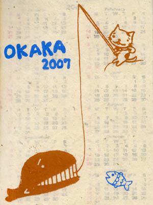
OKAKAの旅
店頭でであったキャラクターのレポート。 よく行く、民芸品というか民族系グッズを扱っているお店「チャイハネ」の店先、2007年のスケジュール帳なので半額になっている手作りの冊子に目が留まった。 なんか間の抜けたネコのイラストが実に私の感性にびびっと来た。 表紙には「OKAKA 2007」の文字。 ひっくり返すと裏には 「NEPALESE HANDMADE PAPER」 「DESIGNED BY AMINA」 とある。 中表紙のイラストをちょっと紹介著作権に触れるので、このくらい(宣伝してるんだから勘弁してネ) にしておきますが、ページの端々にこのネコの抜けた感じのイラストが描かれています。 紙は手漉きといえば聞こえはいいがぼろぼろで、印刷は木版とはんこを組み合わせたと思われる100%手作り。日本人の感覚では商品としての品質を満たしていないような気もするが、その何ものにもとらわれない素朴な感じがいいし、すべて手作りなので手間は相当なものだ。 きっと現地の方が一つ一つつくったのだと思うと感慨深いものがあります。 で、このそれぞれの表記の由来ですが、調べても殆どわからないながら、断片的な情報をつなぎ合わせて見るとこんな感じと思われる。 「AMINA」はチャハネのブランドというかコンセプトデザインとか輸入とかユニットのようなもののように思われます。 (ソースはこちら、 アミナコレクション会社案内アミナコレクション会社案内 私たちの正倉院(社歴) ではOKAKAは? これについての記載もチャイハネのオンラインショップで発見。 横浜中華街大曼荼羅商店『チャイハネ』 - Cayhane Online Shop 「オカカの旅 第2弾!」とあるから、このネコがOKAKAなんだろうな。私が買ったものとは図柄が違うのでスケジュール帳のようなものとカレンダーみたいなものがあるようです。 で、このカレンダーの2006年版を購入した方のブログが少々。 キャラクター|まくまクマのグルメ開拓 まくまクマさん、どうもしろくまです。 中華街・健康診断 - マダムDooの日記 - 楽天ブログ(Blog) マダムDooさんは今年のバージョンですね。 と、このくらいしか見当たらない。 うーん、あまり注目されてないのか。 よし、がんばって応援しよう。 とりあえず、この抜けっぷりが気に入ったしろくまでした。 脱力系の猫というと猫村さんが連想されます。
Feb 26, 2007
コメント(0)
-
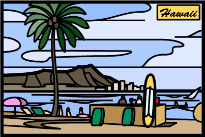
ハワイのおもひで(7)~番外編イラスト
今日は時間がない。でも毎日書いているものを書かないのはどうも(既に一日遅れてしまった)というわけで、過去イラストを貼っておくナリ。実際には登る事の出来なかったダイアモンドヘッド、ステンドグラス風イラストレーター仕上げで。また描きたくなったな。ハワイはいろんなものがあった。風景も印象的だったし、産物も造型もみんな魅力的なものだった。創作心が刺激されたものです。先日アロハタワーの絵柄のアロハシャツがあったんで有名な定番建物だったんだといっていましたが、アロハシャツって絵柄がいろいろなので結構いろんなものがデザインされているのかも。ダイアモンドヘッドのも当然あるわな。お、かわいい。
Jan 15, 2007
コメント(0)
-

ぼてじん作っちまえ+いぬてんも作っちゃえ
ぼてじんを作ってみたのだが、テーマをTVではなく手作りにしてみた。でも、3DCGって手作りという感じでは無いなあということで改めてTVテーマのところに戻ってきました。更にいぬてんも作ってみました。どうかな。ワン ワン ワン ワン ワン ワン ワン ワン ワン
Jan 7, 2007
コメント(0)
-

やっと追いついたけどデミトリ過去絵(2)
やっと、実日付と書き込み日付が一致しました。(今日2回目の書き込み、一回目は「過去絵デミトリ」ここ2週ほど修羅場だったから~といいつつまだ緩やかな修羅場は継続中。追いついたけど過去絵でして…これは夏に描いたものです。蚊に刺されたくない吸血鬼が蚊取り線香を炊いているという絵づらが描きたかったんでこんなことに。いや、まああいかわらず抜けた主人公がすきなもんで。
Dec 14, 2006
コメント(0)
-

過去絵デミトリ
昨日の真夜中帰ってきて、今朝もそうそうに仕事に出たんで、また書き込みが置いてかれている。また、過去絵だ。ネタはいっぱいあるのだが。貴族のたしなみどうも、私はかっこつけてるキャラを抜けさせるのが好きで。ヴァンパイアの帝王、デミトリもデミちゃん呼ばわりでしかもパンツ一丁、更にすね毛むき出し。これもフォトショ3で描いていたころ。1600万色に慣れようと模索していた感じが出ている。それまで16色のドッターだったんで、なかなか染み付いてくせが抜けず、解像度とかの概念になじめなかったなあ。
Dec 12, 2006
コメント(2)
-

過去絵リンリン
出張中のひぐまはまだまだ家に帰れない。とはいえ、日記が実時間から引き離されるのはなんかいやだ。というわけで、またまたまた過去絵だ。レイレイの袖の中のグッズをリンリンもお手入れ中です。普段出番がないけど。おふだになって操っているので。フィギュアでお茶を濁そうかと思ったが、ない。そりゃそうだ、普段おふだから。が、レイレイに比べ扱いが…
Dec 11, 2006
コメント(0)
-

過去絵モリガン姉御その4
今日は午後から出張にでます。相変わらず、使いまわしです。夜遊び三昧仕事と称して夜はお城を抜け出す姉御。モリガン姉御を描いたのはこれが最後の一枚。もっとも描いたのはもっとも古く、フォトショの3(2だったかも)あたりで描いたもので、マックの時代でした。このころはドット絵からフルカラー環境に突然移行して(まだ世はフルカラー全盛ではなく、16から256への過渡期ぐらい)戸惑っていたころです。なつかしいなあ。もう10年以上は間違いなく前です。この一連の過去絵モリガンシリーズで指摘があったんですが、いつのまにかヴァンパイアも懐かしいの領域なのだなと愕然してしまいました。時のたつのは早いものです。
Dec 9, 2006
コメント(2)
-

過去絵モリガン姉御その3
どちらかといえばイラストなのでこちのテーマに来ました。お初です。さて、今週来週と修羅場で土曜も日曜も無いひぐまでありますが、よく見たらその余波で、更新の日にちがどんどん置いてかれている。朝方描いた「調子に乗って連発、過去絵モリガン」も12/9(土)に書いたのに木曜日になっている。どうせ、月火と更新が出来ないんだから、追いついとかないと。過去絵です。HPの方にありますが、ブログでは初登場だと思うんで、ご勘弁。モリガン姉御3発目やや時期をはずしてますが、ハロウィンねたです。子供が「お菓子をくれなきゃいたずらするぞ(Trick or treat)」といって仮装してねりあるくのが本来のハロウィンだが、「お菓子はいらないからいたずらして」といいながら自分も行く気になっているモリガン姉御。まあ、サキュバス(夢魔)だしね。ほらこんな扱いだ。
Dec 8, 2006
コメント(0)
-

調子に乗って連発、過去絵モリガン
なぜか今日も明日も仕事のひぐまです。(泣)というわけで、今日も古い絵ですが…。体操服ですが、デミちゃんに年齢がきついと(300歳以上だからね)指摘されるモリガン姉御。このあと、デミちゃんはニンニクコンボでぼこぼこに。おまけやはりモリガンはいっぱいあるな。フェリシアは無いのに。こちらリリス。その趣味の方向け。さて仕事行くか。
Dec 7, 2006
コメント(1)
-
山藤章二とナンシー関について…チャンポン
今日もこの時間12:40からの書き込み開始。昼休みしかかけん。やれやれだな。また同じ話に終始するのか…。山藤章二についてあらためて、Web上で情報を収集していたら、こんな方が。やぶいぬ日記の本物とパチモン:ナンシー関vsナンシー小関・10番勝負話題自体は山藤章二は引用されるだけです。ナンシー関氏と、どうみても氏を意識した(言葉選んでるな、俺。もっと不遜でもいいと思うが。笑)画風のナンシー小関とを比較して、かなり小関氏に対して批判的な日記をお書きになっています。ナンシー関にについてもいまさら説明の必要もないが消しゴム版画で実に味のある似顔絵を作成された方で、私もこの方のイラストはかなり嗜好にあう。一方、亡くなられたナンシー関氏のオマージュといって、同じような傾向の消しゴム版画(じゃなくてフォトショのレタッチではとの指摘もある?)をナンシー関さんのスピリッツを未来に伝えたいという使命感といって偽物としてスタンプ画を作っておられるそうな。個人的には長州小力的なまがい物っぽいところを前面に打ち出したペンネームからして、まあ、そういう意図なんだろうなとは思う。この日記の作者の方は関氏と小関氏の両方の作品(同じ対象者をモチーフにしたもの)を並べて小関氏批判を繰り返している。まあ、気に食わないのはわかるし、いいたいことは一つ一つごもっとも。私もそう思うけど、まあ、自分が批判がましい事を言っているときにははたから見るとこういう風に見えるのだなという妙な「落ち着かなさ」も感じた。あと、小関氏がナンシー再認識という点では少なくとも関氏に再び関心が向いた点においては小関氏とやぶいぬ日記の作者のBushdog氏には謝意を表すものではあります。こう書くとBushdog氏はいっしょにするなと激怒されるでしょうが、少なくとも小関氏がいなければBushdogだってこの日記をかかれることもなく、私も見る機会がなかったという点ではまちがいなので。まあ、私も小関氏の狙い通り関氏を思い出したということで、関氏の著作を買って見たいと思う。(小関氏のは買わないけどね。)またまた続く。しかも山藤章二氏の話が少なすぎ。ここからが本質なのに。
Dec 1, 2006
コメント(2)
-
googlemapはどうするのか?KFCの巨大広告
コネタです。ちょっと古いねたなのでもうご存知の方も多いでしょうが、米ケンタッキー・フライド・チキン(KFC)が巨大なカーネル・サンダースの絵の広告を作成しました。ソースはいっぱいあるけど、とりあえずこれ、「KFCが宇宙人に広告、砂漠に巨大なカーネル・サンダース」なんでも新ブランド戦略の一環(カーネルおじさんのマークが若い時の写真を元に作り直された)で7875平方メートルの大きさの看板。(写真はこちら)曰く、「世界で初めて宇宙から見ることができる広告」になるそうな。それはまあニュースとしてあったのは知っている。しかしここで疑問。この手の衛星写真(航空写真)といえばgooglemap。人口密集地や名所でなければ解像度は知れているし、更新の頻度も少ないけど、googlemapに広告が載るとしたらgoogleは広告料を取るのか?それとも、モザイクでも入れるのか?そういえば、日本でもイネの種類で絵を描いているところがあったがこれはgooglemapで見えるのだろうか。仔細はこちら「青森県田舎館村HP」今年は風神雷神で、稲の色を3色から4色に増やしてパワーアップしたらしいです。googlemapでは…残念、見えないどっちかが大きいのかわからないけど、こっちだって村の広告なんだから、世界初は狙える。7875平方メートルということは、仮に短辺と長辺が1:1.414だとしたら75x105、田んぼアート(というのだそうな)は、…別のソースだけど、1万5000平方メートル!!勝った。KFCの社長は「NASA(米航空宇宙局)の宇宙飛行士であろうと火星生物からのシグナルであろうと、宇宙空間の生命体からきょう連絡があれば、オリジナルレシピチキンをお送りします」といっているそうな。田舎館町町長様へ、火星から連絡が着たら、オリジナルブレンド米(この田んぼで取れたやつ)を送ってあげましょう。
Nov 27, 2006
コメント(0)
-

飲スピレーション自作してみよう…チャンポン(2)
さて、30000HITが何度も出たり、出なかったり、カウンターが減ったり戻ったりといっているうちにおいたかれた感のあるネタではありますが、以前に話題にしたJTのRoots飲スピレーションのCM、立方体が空間に散らばっていて、それを視点を変えていくにつれ特定の絵になるというやつ。詳しくはこちら。JT ルーツ 飲スピレーションのPLAY! 飲スピレーション2これが自作できないかなという話題でした。詳細はその時の日記を見るよろし。(飲スピレーション自作してみよう…チャンポン)久しぶりのshadeが上手く使えずてこずってしまいました。では、やっと出来たひぐまroots、ご覧ください。とぅ~るるるる~るるるるるるる、と口ずさみながら見てください。
Nov 25, 2006
コメント(2)
-
漫画とか雑誌とかについて一考察…チャンポン
鎌倉旅行記は一回休み。ちょっと他の方のネタに合わせた日記をば。(まとまりないなあ、まあ「チャンポン」ってくらいなんでごたまぜです)よく私が行くブログに実に私のリビドーを刺激して止まない、魅力的なキャラを描く方が居られます。(パンプキンヘッド0899さんのブログ「パンプキンのオモチャ箱」)そのなかで艶っぽいのはみなさん好きなか?という問いかけがあって、そこで書き込みをしているうちに長文になるほど盛り上がってしまった(笑)というわけで私の日記でも急遽取り上げてみようかと。私的には艶っぽいいらすと、いやぶっちゃけ楽天の規約範疇ではあるがエッチイイラストがすきかという問いに関しては「オフコース(笑)、大好きだ。(大笑)」と答える。ただ、その方ははいろいろなものが描ける方なので特にそればかりというのはもったいない気もする。一発見て喜べるという点ではエッチいイラストの威力は絶大だが、作品としての体裁、特にじっくり読ませるストーリーものや長ものはいろんなファクターがいるだろうな、と。私の自論ですが、たとえば雑誌の構成も、また作品単品で見ても刺身の盛り合わせみたいなもので、如何に大トロが旨くても皿に大トロしか乗ってないんじゃ、しつこすぎ。大トロ(看板)も赤身(スポコン)も貝(通好み)も光り物(べたギャグもの)も卵(おこさまむけ)もカッパ(気分を変えて4コマ)もツマ(軽いイラスト)もわさび(辛口読み物・柱の情報)も菊の花や緑の葉を切った飾り(おまけ?プレゼント?)も上がり(読者投稿)も(もちろんどれが安ものだといっているわけでなくたとえであり、すべてが欠けざる重要なファクターであり、ないと体裁が整わない。イラストがツマというのは軽んじているわけではない。念のため)すべてが必要で、すべてが旨く組み合わさってはじめて全体としての体裁が決まるのではないかと。長くなりましたが、作品としてもリビドー炸裂おねーさん、色っぽい奥さん、はつらつ娘さん、ろり系お譲ちゃん…ちがうちがう、もっと範疇広げて、熱血少年、めがね君、バカ、乱暴もの、渋い中年、薀蓄爺さん、肝っ玉母さん、超悪者、いい男などなどがバランスよく入っているのがよろしいのでは。なんて、自分が実践できないのではありますが。軽くイラストをのっけとこ。私は折角かっこいいキャラクターをどうしようもない状態にして描くのが好きで、このキャラバンパイヤというゲームの主人公、吸血鬼でかっこつけてるから、こういう状態にしたら面白かろうと描いてみたもの。吸血鬼のくせに蚊に刺されて蚊取り線香。主人公なのにパンツ一丁。
Jun 15, 2006
コメント(6)
-
クロスステッチのようなイラストとは…チャンポン (3)
ずいぶんほっといたら、別の技とかの蓄積もされたので、若干自分の中で時代遅れな感じ。どこまでやったっけ。(これまでの経過はクロスステッチのようなイラストとは…チャンポン (1)・(2)参照)前回はフォトショップはインデックスで減色すると塗られている色の面積にはぜんぜん考慮してくれないので、自分でパレットを選択することで適切な色を中心に減色できる。ただしまだまだ、色が多い。これで40色。これをまず地面の同心円状(そうなるように色を拾ったからまあ、単色で、比較的色相の同じようなものが色が並んでいる)これを間にある色をそれを挟む色でタイリングしていく。タイリングはまだ旨い技が見当たらない。タイルパターンのパレットとかペン先があればいいのだが(昔のツールにはあった。今はタイリング自体が用いられることがないんでそんなツールは無い。)仕方ないのでタイルを別のファイルで作ってそこからタイルを拾ってタイルパターンで塗りつぶす事にする。ここから色を拾いながら中間色で塗りつぶし、塗りつぶされた色を画面上から消していく。これを繰り返して少しずつ色をタイルに置き換えていき、あと少ししかない色(線のジャギーに使用されている色とか)を同系統、または同輝度の色と置き換えて減らしていく。(輝度の低いところと高いところは人間の目はその色相の違いをあまり見分けることが出来ない)そうこうしてなんとか16色まで減色したのがこれ。16色(パレット上は黒を必ず入れなくてはならないからか、17色になっているけど、使用色は16色)どうだろうか。アップで見るとこう。アップで見るとタイリング。色相と輝度が近いと遠めにはわからない。もう少し手間を省けるといいんだが。つぎはもっとクロスステッチに実際に使えるような素材で実践してみる。(つづく)
Jun 11, 2006
コメント(8)
-

今日は走るぞ、なすねこ…チャンポン
そろそろ、gifでやるのはきつくなってきたけどしつこく。今日のなすねこは、走る、落ちる、ずれる。綺麗に落ちました。トムとジェリー風に。んー結構しんどい。朝早くから作りこんでしまった。寝よ。
Jun 9, 2006
コメント(20)
-
今日のなすねこだ、チャンポン
説明も早々に、今日のなすねこ。向きは初期の向きに、あと、ヅラの浮き上がりも矯正。ただ、アニメの枚数が増えたのでgifにしてはサイズが大きいのが難点。むむむ。ここまでやるとフラッシュかな。となると元絵はイラストレーターで加工したほうがいいかも。まあ、gifはあんまり凝っちゃいけないかな。
Jun 8, 2006
コメント(4)
-

クロスステッチのようなイラストとは…チャンポン (2)
クロスステッチのようなイラストから昔のPCの風4000色中16色640x480をフルカラーからコンバートしようと四苦八苦。フォトショップの減色では思ったようなパレットにならず32色で既に意図しない色情報の劣化が。(詳細は「クロスステッチのようなイラストとは…チャンポン(1)」参照ください)結局フォトショップの減色はピクセルの数にはあまり左右されないようだ。となればやはり自分でパレットを作るしかない。手順は前回と同じ、「イメージ」→「モード」→「インデックスカラー」で「使用中の色に合わせて割り付ける」、で画像に劣化が出ないぎりぎり少ない色数にする。今回は64色。プレビューのボックスをクリックすると、その減色状態と、元の絵を見れる。一度でもプレビューをかけるとパレットがキャッシュに残るのか、プレビューのチェックをはずして、「使用中の色に合わせて割り付ける」を「カスタム」に変更する。すると256食分あるパレットが出現する。64色分しかないので残りは真っ黒が割り当てられている。このパレットを元に減色をしているのだから、このパレットをいじれば意図する減色が得られるはずだ。この特定のパレットをクリックするとその色を変更できるし、画面上から色を取得することもできる。ここから減らすより自分で作ったほうが早い場合(今回は自分で最初から取得したほうがいいかも。両方試したが、一から取得したほうが早かった。)場合は「使用中の色に合わせて割り付ける」で「その他」表示色2色ぐらいにすると、殆ど画面上から色をとるのに便利。こんな感じで肌、髪、シャツ、ブルマ、地面、主線とそのアンチジャギーのために濃淡をあわせて取得する。これを何度かプレビューで元絵とのギャップが納得できる程度に収まるまで試行錯誤する。なおこのパレットは呼び出したり保存したりもできる。この40色の取得したパレットで減色をするとこうなる。40色で結構再現できているとおもうが、当初の目的である16色まではまだまだ倍以上の色を使用している。もちろん16色でなければならない理由は今どこにもない。メモリもHDDも大きいしCPUも高速だ。ただ当時は16色で出来たはずであり、その苦心惨憺した上でパレットを減らした工夫が画面に現れていて、当時のCGの雰囲気とでもいうものに一役買っていたのではないかと思う。となると、やはりできるだけそこまで減色してみたい。まだまだ続く。(クロスステッチはいつになることやら。)
Jun 3, 2006
コメント(1)
-

ハバネロたん?なんだ?
先日に引き続きハバネロの種やら苗やら実やらを楽天で見ていたが、スナックやソースに混じりこんなのが出てくる。なんじゃこりゃ。一応種はついているが…統一されているキャラクターがある。困った時にはWikiPedia。「ハバネロたんとは、香辛料のひとつであるハバネロおよびそれを素材としたスナック菓子『暴君ハバネロ』を元に擬人化されたキャラクター。」暴君のあの凶悪な面構えでなくていわゆる「萌え」とか「ぷに」とかいっている系統のようだが。「ネット画家であるシガタケによってデザインされ、赤い目に赤い髪、赤いワンピースを身につけ、頭頂部にヘタ(アホ毛?)を持つ少女として描かれる。」アホ毛のへたか。なす娘みたいだなあ(藤原カムイ先生作)「アマチュアレベルで創作されたキャラクターでありながらインターネット上で徐々に火がつき、個人サイトやコンピュータ雑誌などに取り上げられるようになってゆく。」楽天で売られているのはそこから派生した同人ゲームとその音楽集だが、元のイラストやフィギュアの方は確かにどこぞの雑誌の表紙になって店頭に並んでいるのは見たことがある。ああ、これかあ。残念ながらそちら楽天市場には無いみたいなので写真は貼れないが。こちらがデザインのシガタケ氏のHP。「画展」4コマがかわいい。(いかんいかん、こういう道からは足を洗わないと(笑))でも最初食べた時は次の日のトイレではこういう状態になる。出口が痛い。
Jun 1, 2006
コメント(19)
-
クロスステッチ風の画像加工について…チャンポン(2)
前回は、クロスステッチの技術を全く知らずに、いきなりそれを模してもダメでしたという有様でした。やはりもう少し勉強しないと。なにより、クロスステッチはクロスで設計図も「X」が打たれているけど、できあがりをみるとマスの大半が糸で埋まっている。背景の白い部分を気にする必要もない。と考えるとCGの効果としてのモザイク(モザイク画ではなく)、あるいは初期CGのいわゆる「ドット絵」と考えることもできるのでは?話は変わるが、私がCGを始めたのはまだ4000色中16色、640x480(だったかな)ドットの制限付だった。今のCGの環境から見るとすさまじく低いスペックだが、私には逆にそのスペックが魅力的だった。無論、当時は未来である今のような1600万色メモリー許す限りの広大なキャンバスという状況を知っているわけではない。当時は画面上で色を使えることに感銘を受けていた、その技術の進歩に酔っていた。とはいえ、4000色中16色、640x480というのは一つ一つ色を人間が管理していっても何とかなる、極端な話、いざとなったらすべてのドットを手で打っていけばいいのだ。そしてどんな上手い人でも、どんなツールを持っている人でもそのスペックで勝負しなくてはならない。その限られたスペック内でなら、少々時間を描けさえすれば私でも描けるのではないか。そうして、私はCGを描くようになった。案の定、腕力勝負で手間を大量に投入した技法をとるようになった。当時のCGは前述の通り16色しかない。でも、特定の色に集中(大抵肌色)させ、かつパターンでじわじわと色を入れ替えていくことで驚くほど滑らかなグラデーションを作り上げた。私もその限られたスペックで如何にすべらかな肌を作る事に腐心した。(モチーフは大抵肌の露出度の高い女性キャラであったが)話を戻すと、このクロスステッチの配色を設計することは、当時の粗く使用色数の少ない(16って事はないだろうが)環境でCGを描いていたころに似ているような気がする。ぜんぜん既存のステッチの技法を知らないままだが、そういった観点からクロスステッチの配色設計をしてみようかと思う。うーん、どこまでできるかな。今日は前フリだけ。失礼。
May 29, 2006
コメント(6)
-

クロスステッチ風の画像加工について…チャンポン
クロスステッチ作るぞ~!と宣言されたすちゃらかニョボさんのページをみて、以前に写真を手軽に加工してクロスステッチ風の画像を作れないものか試行した事を思い出した。まずは元絵。これをクロスステッチ風にするにはと考える。作業はフォトショップ。まずパターンで「X」をつくり画面いっぱいに貼り付ける。ところが「X」が密着しすぎて、「◇」のパターンが目に付く。失敗。ついで「X」をパターンの領域より少し小さくする。(クロスステッチは確かXの糸の出ている穴は上下左右共有していて様な気もしたが…それなら前者の描き方が正解だが、見栄えの問題)それを別レイヤーでパターン塗りつぶし。「X」以外は白、「X」は抜きになるように加工して、元画像の上に被せる。元画像はクロスステッチの繰り返しパターンの大きさでモザイクをかける。ここで抜けている「X」の部分だけしか色が透過しないとひどく画面が白いので全体的に透明度を上げる。意外と簡単には出来たが、クロスステッチではなくなってしまった気もする。(プリント・カウントクロスステッチってやつかも)ドンマイ。
May 28, 2006
コメント(4)
-

アスパラマンをしっているか?…チャンポン(5)
しつこくしつこくしつこくしつこくアスパラマンネタ。ついに最後です。(ここまで登場のアスパラマンは「アスパラマンをしっているか?…チャンポン(1)・(2)・(3)・(4)」を参照ください。説明なし。まずは見てください。江口寿史先生。なんじゃ、こりゃ!!意味深に下品な気が…。白いワニが出て以来、どうも単発イラストで一発ウケをとる芸風になったような気がする…。連載ちゃんと描いて欲しいな。というわけで、引っ張りまくったアスパラマンネタは今回で終了です。次回より平常運行。
May 27, 2006
コメント(4)
-

アスパラマンをしっているか?…チャンポン(4)
しつこくしつこくアスパラマンネタ。あと2枚です。(ここまで登場のアスパラマンは「アスパラマンをしっているか?…チャンポン(1)・(2)・(3)」を参照ください。今日は紅一点。池田理代子先生。花を背負ってるよ、キラキラしてるよ、バラ咥えているよ~。最近はチマキャラでもベルバラを描いているとはいえ、よくもまあこんなキッツイ題材に挑んでもらえたものだ。※ 説明までもないが池田理代子先生は「ベルサイユのばら」「オルフェウスの窓」「女帝エカテリーナ」の作者。
May 26, 2006
コメント(11)
-
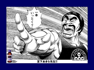
アスパラマンをしっているか?…チャンポン(3)
今日は(も)アスパラマンネタ。小出しにしてます。(だって全部一気に出すときっつ過ぎるんだもん)(ここまで登場のアスパラマンは「アスパラマンをしっているか?…チャンポン(1)・(2)」を参照ください。「わしが男塾塾長、江田島平八である。」って感じですか。あなたそんだけ元気があふれかえっているならアスパラドリンクいらんでしょう(笑)アスパラがらみ。以前マイクロトマトの画像をお借りした(アフィリもしたって)「京野菜 錦 川政」さんのサイトより。左は普通のアスパラ、右はミニアスパラ。なんかここは小さい野菜がすきだなあ。「京野菜 錦 川政」さんのサイトはこちら。妙な野菜が多いです。
May 25, 2006
コメント(22)
全84件 (84件中 1-50件目)