
[模型] カテゴリの記事
全65件 (65件中 1-50件目)
-

競作、VF-1!
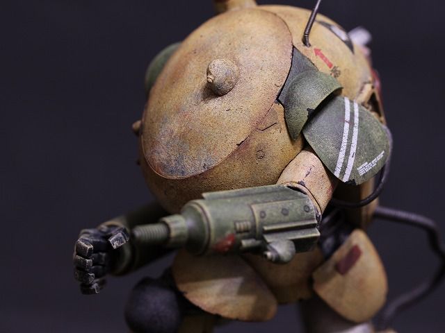
.凄い時代になったものです。 大型モデルのVF-1Sが複数リリースされるとは・・・。・バンダイ 1/48 DX超合金 VF-1J バルキリー(一条輝機) ファイター時の全長が約300mm。 完全変形トイのバルキリーとしては決定版でしょう。 バリエーション展開も順調。 オプションパーツもぬかりなし。 ロイのVF-1Sか、マックスのVF-1Jが欲しいなぁ。 画像は魂ウェブから拝借しました。・Max Factory 1/20 PLAMAX MF-25 minimum factory VF-1 スーパー/ストライク ガウォーク バルキリー 全長約570mm。(ファイターは約713mm) これを見てしまうと、バンダイのバルキリーは大型モデルとは言えなくなってしまいます。 なんせ、この大きさですから。 MAX渡辺さん、良い笑顔をされています。 ABS製とは言えこのサイズのプラモデルでは可動は難しかったのか、固定モデルとなっています。 固定モデルとしてガウォーク形態をチョイスしたところは「ウマい!」と思いました。 初めにファイター形態を出してしまうとバルキリーらしさが薄れてしまうし、「せめて脚だけでも変形してくれたらなぁ。」と誰もが思ってしまったと思います。 しかし、ガウォークを先に見せられると「ファイターも良いよね!」となります。 特にストライク・ファイター・バルキリーは格好イイです。 これを作り込んだら楽しそうだなぁ。 にしてもデカ過ぎます。 画像はグッドスマイルカンパニーから拝借しました。・アシェット週刊 超時空要塞マクロスVF-1Sバルキリーをつくる 1/24だからバンダイのちょうど二倍の大きさで、全長約600mm。 ダイキャスト製で強度はありそうだけど変形機構は無し。 その代わりに電飾や電動ギミックが盛り込まれています。 問題は販売元がアシェットと言う事。 過去のアシェットの航空機モデルの作例を見ると、組み立ては大変そうだし、サポート体制に問題があるし、延長号としてスーパーパーツが準備されている事が見え見えだよねぇ。 画像はレッサーかずさんから拝借しました。 この三商品の棲み分けはこんな感じかな? 変形を楽しみたい人→バンダイ ヤル気とスキルがある人→マックスファクトリー アシェットの怖さを知らない人→アシェット 僕は? バンダイかな。 1/48のバルキリーとレギオスを並べてみたいです。
2019/12/07
コメント(2)
-
バンダイ 1/5000 スターデストロイヤー・その4
6jiroさんからスターデストロイヤーのライティングモデルに付属しているLEDユニットを格安で譲って頂きました。 これって、12発全て同じ色なのかと思っていたら、白色と青色の二色なんですね。 早速組み込んでみました。 流石は純正パーツ。 光ファイバーを使用していないにもかかわらず、あらゆる穴がしっかり光っています。 当然ながらブリッジも光っています! 光量は落ちるものの、艦首方向の横メカにも光が届いていますね。 エンジンは全てに火が入り、光量も増したため全速航行状態に。 ブリッジが光ると印象が大きく変わりますね。 とは言ってもブリッジに関しては裏話がありまして。 実は純正のLEDユニットを使用してもブリッジは光らなかったのです。 で、よくよく見てみたら、ブリッジは穴が塞がっていました。 ブリッジを分解して裏から穴の位置を確認して、ピンバイスで開口しました。 横メカの庇が歪んでいたし、僕のスターデストロイヤーは「ハズレ」だったようです。 6jiroさんからLEDユニットと共にファルコンも送られてきました。 シンプルに塗装してEP5のワンシーンの再現です。 EP4ではスターデストロイヤーは圧倒的な存在だったにも関わらず、EP5では衝突してしまったり、貼り付いたファルコンに気が付かなかったりと、木偶の坊的な扱いが残念でした。 パネル塗装を再現しようとして失敗したのがコレ。 エナメルで塗装すればやり直しが出来ただろうけど。 ブロッケードランナーの塗装はソコソコ上手くいったかな。 こんな小さい物、まともに塗装できませんよ。 とは言え、スターデストロイヤーのオマケとしては欠かせないアイテムであり、「バンダイさん、分かってるね~。」と言ったところです。 純正のLEDユニットを搭載して、本来の姿を得る事が出来ました。 6jiroさん、ありがとうございました!
2019/11/02
コメント(4)
-
バンダイ 1/5000 スターデストロイヤー・その3
.内部にクリスマスツリー用の連結しているLEDを詰め込んで完成としました。 LEDの固定ポイントは純正のポイントをそのまま利用しました。 内部はお見せ出来るような状況ではないので割愛します。 電池ボックスを内蔵にしたため、ブリッジの収まりがちょっと悪くなってしまいました。 窓の穴の数は純正のままなので、物足りないですね。 ファイバーを使用していないため、穴があっても光っていないところもあります。 中央のノズルは真後ろから見ると光っているのですが、斜めからでは光が分かりません。 巡航中で出力を抑えているという設定にしておきましょうか。 横メカの所は隙間から光漏れしちゃってますね。 艦首方向の横メカも光が届いていません。 あれ? ブリッジも光ってないなぁ。 ダスト・シュートは上手く光っていました。 下面のドックの光量が弱いかな。 エンジン・ノズルのスリットはチャレンジするべきだったか。 6jiroさんの作例を見なければ気にならなかったのに。 取り付けたLEDの先端が凹レンズ状になっていて光があまり拡散しないために光が届かない部分が出来てしまったようです。 失敗だったなぁ。 元々のディテールが半端ないお陰で、お気楽に試作した割には満足のいく仕上がりとなりました。 無論、電飾に関しては全く満足していません。 気が向いたら電飾をやり直すかも?
2019/10/24
コメント(4)
-
バンダイ 1/5000 スターデストロイヤー・その2
.一先ず塗装が終了しました。 マスキングが適当でしたからパネル塗装も適当です。 プロップに似せるのではなく、オリジナルのスターデストロイヤーと言う事で。 パネルを各種グレー系(11、13、60、307)で塗装。 プロップでは使われていないと思われる赤系(81)やブルー系(115)の色もお遊びで使っています。 本当はヴェネター級のような赤いストライプをビシッと入れようと思ったのですが、怖じ気付いてしまいました。 センターの赤いパネルはその名残です。 そのままではパネルのコントラストが強すぎるため、再び白サフを軽く吹いてコントラストを下げています。 空気感を出すためにコントラストを下げる事はありますが、宇宙空間で色は霞むのでしょうか。 全長が1.6kmもあるとは言え、本当はクッキリ見えるのかな? スミ入れも単調にならないように、タミヤのスミ入れ塗料のブラックやグレイ、ダークグレイ、ブラウンをランダムに使用しています。 美しいシルエットですね。 ブリッジ後部の猫背な感じが好きです。 残念なのはこの部分。 船体上部の端が歪んでいて、横メカの庇が平行になっていません。 個体差かな。
2019/10/23
コメント(4)
-
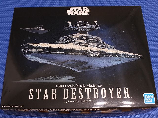
バンダイ 1/5000 スターデストロイヤー・その1
スターデストロイヤーの通常版です。 方々で紹介されているから今更な感はありますが、ランナーの写真から。 組み立て前のパーツの接写写真を撮り忘れたのが悔やまれるくらいに細かいディテールが施されています。 プロップを徹底研究されただけあり、そこかしこに見覚えのあるパーツが確認出来ます。 もっと大きなスケールで商品化されていたら、これらのディテールは別パーツになっていたのでしょうか。 作ってみたいけど、恐ろしいですね。 通常版には電飾関連のパーツは入っていないのだろうと思っていたら、遮光用(導光用?)のパーツやシールも含まれていました。 船体の補強も兼ねているようだから、あった方が良さそうです。 それに、なぜかミレニアム・ファルコンとブロッケード・ランナーがこのランナーに含まれています。 素材の性質の問題か、この二隻はディテールがやや甘いんですよね。 スターデストロイヤー本体と同じランナーの方がより細かいディテールで作れたのでは? パーツ点数は少ないし、合わせ目処理もないから組み立てはチョー簡単。 サクッと組み立てて、先ずは黒サフで真っ黒に。 311を吹いて・・・と言うのはウソ。 離れた所から缶の白サフを軽く吹いただけです。 手抜きだけど意外に良い感じ。 これ完成でも良いかなぁと思ったのですが、6jiroさんの作例を見てしまうとパネル塗装をしてみたくなりました。 こちらはSTAR WARS IDENTITIESで撮影したスターデストロイヤー。 真っ白な船体だと思っていたら、パネルの塗り分けがうっすらと確認出来ます。 そして無数のスジ彫りも。 バンダイ製はこのスジ彫りが一部省略されていますが、2m以上もあるプロップのスジ彫りを30cmの模型に完全再現してもね。 プロップのパネルを再現するテクニックもやる気もないので、適応にマスキング。 スジ彫りが少ない分、パネルは少なめですし大きめになります。 って言うか、これ以上のマスキングは僕にはムリです。 下面のマスキングが少ないのは、挫折したから。 どうせ、完成したら下面はあまり見ないしね。
2019/10/21
コメント(4)
-
嬉し恥ずかし。
ホビコムの月例コンテストに作品を応募したところ、なんとSGプラウラーが入賞しました! やった!! 達人の作品がひしめく中、僕の作品に目をとめてくれた審査員の方に感謝申し上げます。 実は立て膝S.A.F.S.も一緒に応募していて、自分としてはS.A.F.S.の方が作り込めたし塗装も思い通りにいったと思っていたんだけどなぁ。 分からないものです。 ブログで自分の作品をアップするという行為は認証欲求の一つであり、応募なんて行為は認証欲求の極みですね。 その欲求が満たされた今、僕の顔はニヤけております。
2019/08/26
コメント(6)
-
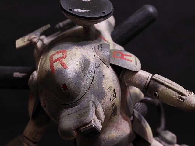
Wave シーピッグ・その3
シーピッグが完成しました。 前回、色調の補正をホワイト寄りにするかグレー寄りにするか悩んだわけですが、最終的にはどちらかに寄せるのではなく、ホワイトの領域には緑っぽいホワイト(ダックエッググリーン)をグレーの領域には緑っぽいグレー(RLM02グレー)をドライブラシすることによって色調を整えました。 そんなわけで、緑っぽい機体になるかと思ったら写真では茶色っぽく見えますね。 ホワイトバランスの問題かな。 ベースの船体側もホワイトとグレーの組み合わせのため、基本的にはホワイトとグレーしかない作品となりましたが、それぞれの色調が違うため単調にならずに済んだかな。 赤い差し色をもっと入れたいところでしたがグッとこらえました。 元々、赤いデカールが多かったしね。 横山先生の作品は艶ありで仕上げられているようなのですが、半光沢のトップコートを吹いたら作品が軽く見えてしまったのでつや消し仕上げにしました。 今回の主役は実はベースの方でして、シーピッグ本体よりも力が入っています。 ベースの方に力を注いだため、シーピッグのディテールアップは一部に留まっています。 塗装については、辺縁対比の効果が最初は良い感じで出せていたのに、塗装を重ねる内に薄れてしまった事は反省点です。 下地の313を残す範囲が狭かったのが原因で、この点は次回注意したいと思います。 ホワイトとグレーの明暗比を調整する方法として、それぞれを濃く薄くするのではなく違う系統の色を上乗せするというのは新しい試みでしたが、情報量を増やすことも出来るし一石二鳥でした。 SGプラウラーのハッチやショルダーアーマーの縁の部分。 ここの辺縁対比効果は、今見返すと良い味が出ていたんですよね。 同系色の場合は下地に濃い色あるいは薄い色を使用すれば良いのでやりやすいのですが、今回のような場合はどんな色を使用すれば良かったのか。 隣り合う色同士によって異なるのだろうと思うのですが、専門家に聞いてみたい所です。 実は僕は高校時代は美術部だったのですが、そんな事を教えてくれるような部活ではなかったからなぁ。
2019/08/24
コメント(2)
-
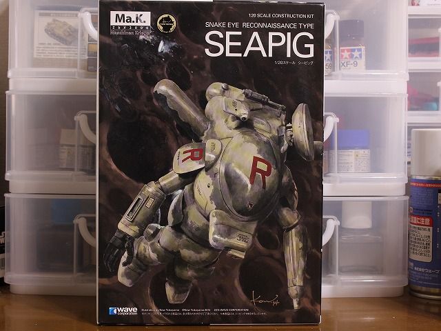
Wave シーピッグ・その2
シーピッグ(SEAPIG)とはイルカ(海豚)のことかと思いきや、イルカはDolphinであってSeapigではないんですよね。 では、Seapigは? これがシーピッグ。 ナマコの一種だそうです。 画像は珍獣図鑑から拝借しました。 可愛い?気持ち悪い? こう言うのが好きな人にはたまらないのしょうが、僕にはちょっと・・・。 この機体がなぜシーピッグと名付けられたのか。 ネットで検索すると横山先生が間違えたのではないかという記事があったけど、本当のところはどうなんでしょ? 背中のレドームがシーピッグの突起物に似ているから? 我が家のナマコは只今こんな感じ。 今回は色を重ねて色合いを探る事はせずに初めからモネ風の虹色に。 今回はホワイト/グレー迷彩にしようと思っているので、まずは311(グレーFS36622)で叩いて白いけど白くない感じに。 ファルコン用に買った311ですが、ちょっと時間が経って濃度が濃くなっていました。 本来は濃いままだと扱いにくいのですが、叩き塗りするとテクスチャーが付きやすいと言うメリットもありますね。 辺縁対比の効果を狙って、グレーを置く予定の部分に313(イエローFS33531)を。 カラーモジュレーションセット ジャーマングレーのハイライト2を先の313がギリギリ隠れないように上乗せ。 更にハイライト2の上にハイライト1を上乗せ。 ん・・・、考えていた感じとなんか違うなぁ。 ハイライト1と311のコントラストが強すぎたか。 明暗比が下がるように調整してみようと思います。 どっちに寄せるのが正解なのか。 ホワイト寄り?グレー寄り?
2019/08/11
コメント(2)
-
Wave シーピッグ・その1
.ベースはシーピッグのために作った物だったから、タイトルは「シーピッグ・その4」でも良かったかも。 さて、宇宙遊泳中すなわち無重力下で人間はどんな姿勢になるのか。 宇宙ステーション内の写真や船外活動中の写真を見ると、各関節は力が抜けて伸ばすでもなく曲げるでもない中立のポジションにあるように見えます。 よって、こんな感じになるのかな。 そう言えば、横山先生の箱絵のシーピッグもこんな姿勢ですね。 これが正解だったとしても、躍動感がなくて模型のポージングとしてはイマイチ面白くない。 特別出演頂いたこちらの機体は、シーピッグを犠牲にして以前製作したスネークボールです。 現在の僕の作風とは大分違いますね。 僕の頭の中にある無重力下の姿勢はこんな感じ。 膝は片方を屈曲させ、もう片方を伸展。 足首は両方とも伸展させて遊泳感を出してみました。 足首を伸展させた方が遊泳しているように感じるのはガンダムなどのアニメの影響かな。 無重力下で船内の通路や格納庫内を移動している時って、こんな姿勢で描かれているような気がします。 右腕はファイアボールからの借り物です。 S.A.F.S.の足首はあまり伸展させる事が出来ないので、前作の立て膝S.A.F.S.の経験を活かして伸展できるように加工しました。 シーピッグその物のディテールアップは一部分に留めています。 十分にゴテゴテしていますからね。 そんなワケで仮組み。 お~、浮いた浮いた! 腕で支えているのではなく、宙に浮いてバーに掴まっている様に見えますね。 上手くいった。 お花畑下地の前処置としてオキサイドレッド・サーフェイサーの上からホワイト・サーフェイサーを軽く吹いてあります。 船体で試してみたブラック・サーフェイサーの上に軽くホワイト・サーフェイサーを吹いたときとは大分印象が違いますね。 ピンク色っぽくなって、豚っぽくなった? ここからホワイト/グレー迷彩を施す予定です。
2019/07/31
コメント(2)
-
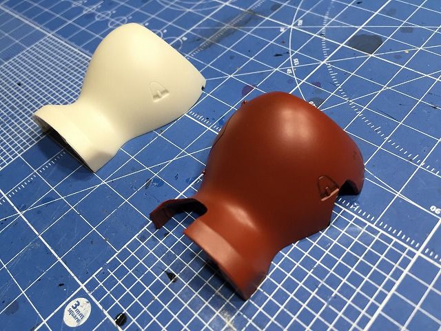
ベース完成
.メインの仕上げに合わせて微調整する可能性はありますが、取り敢えずベースが完成しました。 そう言えばメインの機体について言及していませんでしたが、以前から後ろに写っていたからお分かりですよね。 Waveのシーピッグです。 船体部分はお花畑下地の上から、11(ガルグレー)を叩き、311(グレーFS36622)で整えました。 裏側は下地の80(コバルトブルー)と122(RLM82ライドグリーン)のみにして明度を下げて、11(ガルグレー)を叩きました。 メカ部分は敢えてお花畑下地は行わずに、115(RLM65ライトブルー)を下地に308(グレーFS36375)と13(ニュートラルグレー)を叩く事によって印象を変えています。 裏側のメカの一部は下地に108(キャラクターレッド)と19(サンディブラウン)を使用しています。 船体に無粋な真鍮線を突き立てたのはこのため。 これはシーピッグを浮かせるための支柱ですが、支柱を隠すために腕の中を通す事にしました。 支柱は中指の部分から腕の中へ。 なんか、痛そう・・・。
2019/07/28
コメント(2)
-
ベース
.宇宙遊泳感を出すためのベース製作に取り掛かりました。 シチュエーションとして当初は月面っぽい地面を作って支柱で浮かせるという方法を考えたのですが、ジャンクパーツの消費もしたかったので宇宙船の外壁に取り付いていると言う設定にしてみようと思います。 宇宙船の艦首?砲台?センサー? ランナーを眺めてビビッと来たパーツをノリに任せて組み上げたので、これがどんな機能を持った部分なのか自分でもよく分かりません。 ファルコンのパーツ解析をしている方々がこれを見ると、無意識のうちに何のパーツを使用しているか考え始めてしまうかも知れませんね。 ファルコンでは使用しないパーツを選んだつもりなのですが、重要なパーツを使ってしまっていたらどうしよう・・・。 いつもの六角ベースに穴を開けて、穴の奥に固定する事によって空間の一部を切り取ったように見えたら良いなと思うのですが、果たして完成時にはどんな感じになる事やら。 ブラック・サーフェイサーをしっかり吹いた後に、ホワイト・サーフェイサーを軽く吹いた状態です。 こうするとSWメカっぽく見えるかな? ホワイト・サーフェイサーを吹いたのは、いつもの塗装法をベースが明るい状態からスタートするとどんな感じになるのか試してみたかったからです。 ところで。 このような多彩な色を下地に塗ってから本塗装をする事を「虹色下地」と言うそうですね。 最近知ったのですが、MAX渡辺氏がかなり以前から提唱されていたようで、エアブラシで斑点状に各種の色を乗せるのが原法なのかな? ハッキリとは覚えていないのですが、叩き塗りを始めた頃にネットで偶然に虹色下地の画像を目にして真似てみようと思ったのが始まりでした。 僕のは虹色と言うよりはお花畑のように見えますがね。 お花畑下地からライトグレー系の船体にする予定です。
2019/07/19
コメント(2)
-
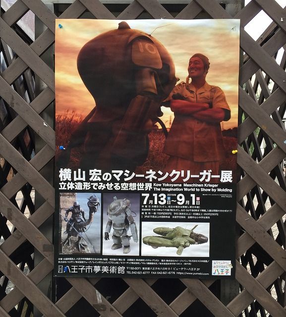
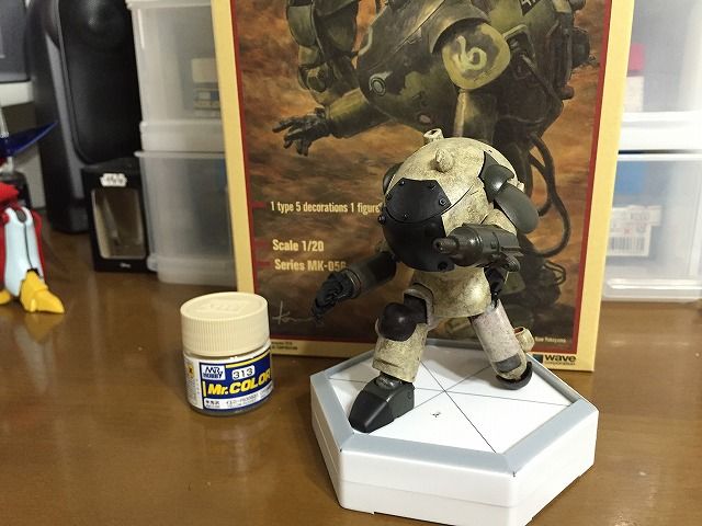
横山宏のマシーネンクリーガー展
八王子で開催されているマシーネンクリーガー展に行ってきました。 八王子の商店街のあちらこちらにはこの様なポスターが貼られていました。 一般の方々には「何だコレ?」でしょうね。 会場はこちら。 八王子市夢美術館です。 美術館と言うよりはギャラリーって感じですかね。 幸いなことに僕が行った時間帯は来館者は程良い数でユックリと見る事が出来ました。 どれもこれも子供の頃に憧れた作品ばかり。 もの凄い数の作品が展示されていて圧倒されました。 S.A.F.S.のオリジナルモデル。 これをHJ誌で初めて見た時は衝撃だったなぁ。 あ、そうそう。 この展覧会は撮影可と言う事で、皆さんバシバシ写真を撮っていました。 知っていれば一眼レフを持っていったのに・・・。 ホルニッセのオリジナルモデル。 ランディングギアとか繊細な構成なのに、ちゃんと現存しているなんて凄いですね。 その昔、このキットを買ったハズなんだけど、どこへ行ってしまったのかな。 ファイアボールSGはやっぱり格好イイなぁ。 Waveさん、これを新規金型で出して下さい! フェスティバルの告知ポスター。 このフェスティバルに行った!行った! 懐かしい~。 物凄い存在感のクレーテ。 次はパックレーテ行こうかな。 でも宇宙遊泳感をテーマにした物も作ってみたいし。 シーピッグは偵察型だけど左手兄弟の一員ではないんだよね。 この機体の質感はどうやったら出せるのか。 どれもこれも素晴らしいです。 実弾仕様かぁ。 これも良いですね。 横山先生のこの様な世界観も素敵です。 横山先生の仕事部屋だそうです。 こんな部屋で埋もれて死ねたら本望か。 無性に模型製作に没頭したくなるような展示会でしたねぇ。 テクニックが高度で真似は出来ないけど、インスピレーションは頂きました。 会場を出る時に、横の部屋に見覚えのあるお顔が・・・。 横山宏先生だ! サインを頂きに特攻を掛けたかったのですが、マナーとして我慢しました。 8/12のギャラリートークがあるらしいです。 行きたい!
2019/07/15
コメント(2)
-
Wave S.A.F.S.・その3
立て膝のS.A.F.S.が完成しました! 固定ポーズとしたため、各関節にはエポキシパテでカバーを作成。 ハルレッドやフラットブラックで所々に汚れや剥がれを追加。 デカールを貼り、つや消しトップコートを吹いた後にカラーモジュレーションセットのダークイエロー(ハイライト2)をドライブラシして落ち着かせました。 ベースは100均で見付けた芝生シートを使用。 戦場にしては綺麗すぎたかな? S.A.F.S.は胴体が前に飛び出ている上に足が短いから、股関節を90°曲げても膝は胴体よりも前に来ません。 そこが可愛く感じます。 これまでの作品では腕を下ろしていて脇の下は見えないので、ディテールアップはしていませんでした。 今回は腕を前に出して脇の下が丸見えになるため、ディテールアップしています。 次回作でもこの部分はディテールアップしてみようかな。 等身大の兵器だから本当は見上げるようなカメラアングルはそぐわないけど、この作品の特徴が現れているアングルです。 足が短いから立て膝になっても背の高さが余り変わらないなぁ。 グレー部分を追加するために製作した追加装甲ですが、ハッチの先端部分の塗装が思いの外に上手くいったため追加装甲を付ける事は止めました。 でも、勿体ないため両面テープで付け外しが出来る様にしています。 なにしろ、このボルトはクレーテから拝借したパーツですから・・・。 立て膝三人衆。 今回はポージングも塗装も納得の仕上がりで、お気に入りの一つになりました。
2019/06/29
コメント(2)
-
Wave S.A.F.S.・その2
.今回のS.A.F.S.は前回のSGプラウラーとは違って塗装のイメージが固まっているため筆の進みが早いです。 問題は頭の中のイメージをキャンバスに描き出せるかどうか。 前回の最後の写真はカラー配置確認のためにオキサイドレッドサーフェイサーの上にカラーモジュレーションセットのダークイエロー(シャドー)と カラーモジュレーションセットのオリーブドラブ(シャドー)を叩いただけの状態でした。 MSVのザクやグフの茶色は白っぽい茶色のため、313(イエロー FS33531)で叩いて方向修正。 茶色と言いながらイエローを選択したのは店先で見て近い色だと思ったから。 ホントの指定カラーは何色なんでしょうか。 イエローの反対色であるブルーを115(RLM65 ライトブルー)と72(ミディアムブルー)を追加して面を複雑に。 更に7(ブラウン)を軽く追加して濃淡を強調。 再度313を叩いて色を整えました。 色々やった割には一枚目の写真と大差ないなんて言わないで下さいね。 iPhone6のカメラだと細かい差が描写されないんですよねぇ、と言い訳してみる。 緑色の部分はカラーモジュレーションセットのオリーブドラブ(シャドー)の上に122(RLM82 ライトグリーン)を叩いています。 カラーモジュレーションセットのダークイエロー(ハイライト2とシャドー)を各所にドライブラシしてコントラストを付けました。 やっぱりイエローと名の付くカラーを使用しているため「茶色と緑色の機体」というよりも「黄色と緑色の機体」になってしまいました。 当初のイメージであった「MSVのザクやグフ」とは違う雰囲気になりましたが、考えていたイメージとのズレはあまりないのでまぁイイか。 後は細かい仕上げに入ります。
2019/06/27
コメント(0)
-
Wave S.A.F.S.・その1
.あぁ、忙しい。 仕事があると言う事は良い事なのだが、忙しすぎるのも困りもの。 一ヶ月先になってしまう事も、待ち時間が長くなってしまう事も俺のせいじゃないよ。 仕方ないでしょ。 あ~、忙しい。 さて、タイトルは「S.A.F.S.・その1」としましたが、立て膝の続きです。 左腕と右大腿を前に出すため、胴体の干渉する部分をザックリとカット。 手足を下ろした時にカットした部分を埋めるような機構を考えようと思ったのですが、固定ポーズにする事で機構を考えなくても良い事にしました。 このポーズのままならカットした部分は気にならないでしょ? S.A.F.S.は地上専用機なのでMSVのザクやグフをモチーフに塗装。 胴体の茶色の部分が広すぎてどうもシックリ来ません。 ザクやグフの胸のグレーの部分がアクセントになっていると思い、グレーを追加する事に。 塗装でグレーを追加するのは面白くないので、追加装甲としてグレーを追加。 もっと広範囲に覆うような追加装甲を取り付けている作例を見掛けますが、あそこまで覆ってしまうとザクやグフの胸から離れてしまうので小振りにしました。 それでも想像以上にアクセントが強く、むしろザクやグフのイメージから更に離れてしまいましたね。 ちょっとダサい?
2019/06/20
コメント(2)
-
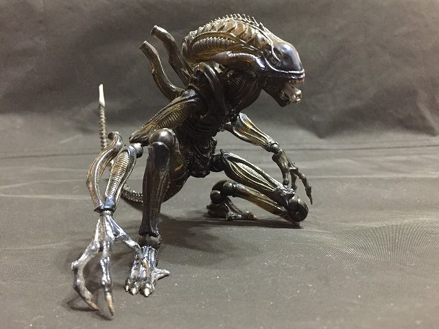
立て膝
・ロボット系の模型を作っていると憧れると言うか、取らせたくなるポーズの一つが立て膝。 関節を目一杯曲げる必要があるので、実際には困難なポーズです。 要素は以下の5つ。(右脚を前に出す場合) ①右脚の大腿を抱え込むように股関節を90°以上曲げる。 ②右脚の膝関節を90°以上曲げる。 ③左脚の膝関節を180°近く曲げる。 ④左脚の踵に尻を乗せる。 ⑤左爪先を曲げる。 リボルテック・シリーズは巧みな関節機構やデフォルメから立て膝が容易に行えるフィギュアですが、特にこの「エイリアン・ウォーリアー」は細身な体型と二重関節も相まってクラウチング・スタートも出来てしまいます。 マジンガーZやガンダムのような往年のロボット・デザインではこれらの動きをこなす事は不可能なワケですが、最近のメカニック・デザイナーが上手い処理を追加してくれたお陰で大分動けるようになってきましたね。 一番の問題は股関節であって、腰周りにアーマー・プレート処理を施した事によって大腿の抱え込みまでとはいかぬまでも股関節を90°近く曲げられるようになりました。 因みにMG ザクはノーマルタイプであれば立て膝が可能なのですが、このMS-06Rは下腿のデザインの関係で膝関節を十分に曲げる事が出来ず立て膝が出来ません。 股関節の可動性に優れたデザインであったのがオーラバトラー。 このビルバインは難なく立て膝が出来ます。 変形機構の関係で逆膝も可能なため、ガウォーク形態を取る事も出来ます。 劇中ではこんな形態は出てきませんが・・・。 とまぁ、ここまで立て膝についてダラダラと書く原因となったのがコイツら。 マシーネンクリーガーのスーツはこの膝をちょっと曲げてダラッと立っている様子が魅力でもあるのですが、皆して同じポーズを取っていると面白みがありません。 フル可動モデルとされていますが、実際には可動範囲が狭いためこうなってしまいます。 そこで、こんな事にチャレンジしています。 S.A.F.S.にアクションポーズを取らせる事は出来るのか。 もともと膝間接が二重関節になっているため、干渉する部分を徹底的に削る事によって各関節が90°以上曲げる事が出来ます。 問題は胴体前面の装甲をどうするかです。 アーマー・プレート処理は出来ないしなぁ。
2019/06/03
コメント(2)
-
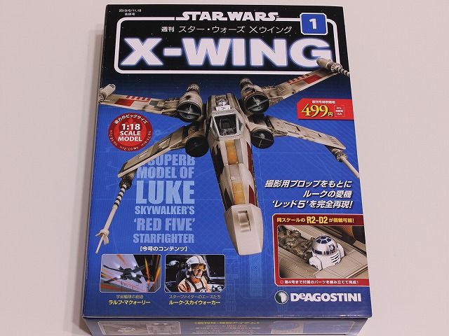
デアゴスティーニ 週刊スター・ウォーズ Xウィング 第1号
遂に来ました! アシェットのT-800に続いて、デアゴスティーニのXウィングの試験販売が開始となりました。 ターミネーターとスター・ウォーズ。 SF映画の二大対決ですね。 まずはマガジンから。 「撮影用プロップを限りなく忠実に再現した1/18スケールモデル」と書かれているので、ミレニアム・ファルコンのようなスタジオ・スケールではないと言う事? 100号で完結するそうです。 コンテンツは3つのようです。 ・宇宙艦隊の創造 ・スターファイターのエースたち ・組み立てガイド STEP BY STEP ファルコンでスター・ウォーズの世界については語り尽くしてしまっただろうから、このXウィングで100号もネタを持たせるのは大変でしょうね。 僕らが知りたい事は「プロップの世界」なんだけどなぁ。 デアゴは分かっていないね。 レーザー・キャノン砲とR2-D2は第4号までの組み立てで完成するそうです。 パーツです。 ・レーザー・キャノン砲 砲身1 ・レーザー・キャノン砲 接続パーツ ・レーザー・キャノン砲 砲身2 ・レーザー・キャノン砲 筐体(外) ・コクピット・キャノピー(後) ・コクピット・キャノピー(前) ・R2-D2 頭部 ・R2-D2 LEDマウント ・R2-D2 接点付きLED ・R2-D2 ホログラムプロジェクター(ABC) ・R2-D2 パネル(前) ・R2-D2 右脚(外) パーツの組み立てはここまで。 Xウィングのキャノピーって青っぽいグレーだと思っていたのですが、デアゴのパーツは茶色です。 本当の色は? レーザー・キャノン砲の方針は金属製のパイプでした。 そのため塗装の食い付きは悪いようです。 組み立てでちょっと引っ掻いたら、ウェザリングが剥げて白くなってしまいました。 取扱注意です。 付録の原寸大ブループリントです。 サイズ比較のためにiPhoneを上に置いてみました。 ファルコンも大きいですが、コイツも相当大きいです。 置き場がありません。 この手の分冊模型って、どうしてこんな巨大なアイテムばかりなのでしょうか。 もう少し小さければ手が出しやすいのに。
2019/05/29
コメント(4)
-

アシェット THE TERMINATOR T-800をつくる vol.01
レッサーかずさんのところで兵庫県でアシェット「ターミネーター T-800をつくる」の試験販売が開始されたとの情報を見て群馬県と埼玉県の本屋を覗いたところ、埼玉県で発見したので買ってきました。 創刊号は特別価格で299円で、2号以降は1799円だそうです。 ページを一枚ずつめくっていきましょう。 恒例の特典は三つ。 ①エンドスケルトン キーリング ②ドライバーセット ③1:2スケール プラズマライフル ・高さ:100cm ・素材:高品質ダイキャストおよびABS製パーツ ・ディスプレイベースから「ターミネーター」のメインBGMが響く! ・遠隔操作でアゴが動く ・両眼が怪しくLED発光 ・関節が自由に動かせる ・サウンドエフェクトを搭載 ・赤&青の証明が光る! 右下に小さく「全120号で完結します。」と書いてあるけどホントか? 絶対に延長するよね。 マガジンコンテンツ ・ターミネーター・ユニバース ・T-800 エンドスケルトン 組み立てガイド ・SFムービー傑作選 ・現実世界のサイエンス ターミネーターのネタだけでは120号も持たせられないか。 続いてパーツを。 創刊号は常に印象的なパーツが当てられますね。 クルマだとバンパーとか、ボンネットとか。 そう考えると、ファルコンの創刊号のパーツってイマイチだったような・・・。 顔面のパーツはメッキが施されていますが、マガジンの表紙にあるようなツルツルな表面ではなく、ちょっとザラついています。 この点に不満を感じる人はいるのではないでしょうか。 組み立てはここまで。 眼が動かせます。 仮組みするとこんな感じ。 ヘッドだけでも完成させたいと思ってしまいます。 しかし、第2号は「上アゴと右腕を組み立てる」、第3号は「右腕と右人差し指を組み立てる」。 アシェットが上から順番に組み立てをさせるワケがありません。 ターミネーター好きには堪らないアイテムだと思います。 僕も映画自体は好きだけど、全高100cmにもなるコイツを家に置いておきたいかというとそこまでではないかな。 と言う事で、僕は第2号以降はパスします。 そうそう。 今までの写真だとサイズ感が伝わらないと思うので。 500円玉と共に。 1/2スケールってもっと大きいと思ったけど意外に小さい?
2019/05/24
コメント(2)
-
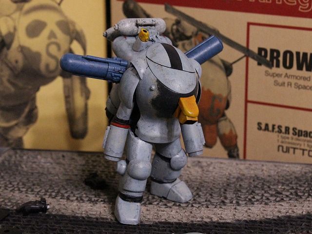
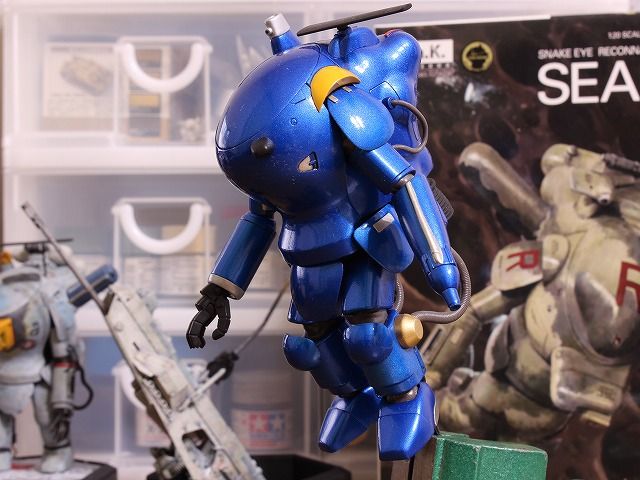
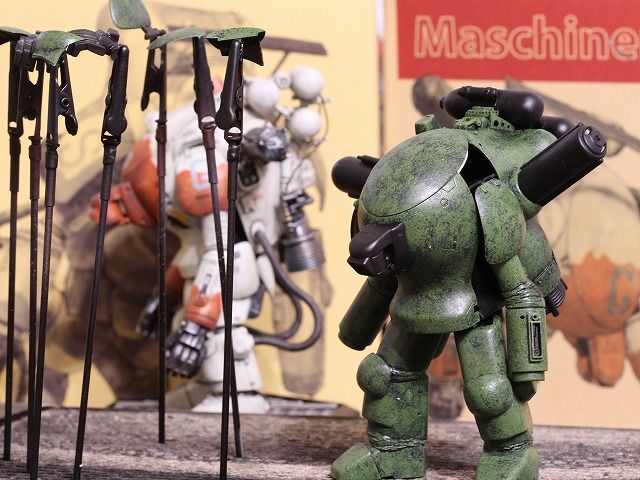
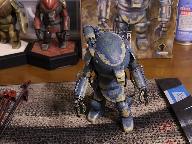
SGプラウラー・その4
.筆が進まないSGプラウラーですが、なんとか完成しました(完成した事にしたと言った方が正確か)。 前回の続きで、エリントシーカーの特徴的な円盤状レドームのイメージを落とし込むためにハッチに黒帯を追加する事に。 黒帯と共にレドームの輪郭をイメージしたラインを書き込んだところ、野球帽を被っているようになってしまったためボツ。 輪郭ラインを廃止して、黒帯に角度を付けたスタイルに変更。 これ以上はイメージが膨らまなかったので仕上げに入る事にしました。 レドームや増装タンクにワンポイント塗装を追加。 デカールを貼った上からウェザリングしたり削ったりして完成です。 今回のベースは宇宙船の外壁をイメージしてみました。 F-4ファントム+エリントシーカーの雰囲気は出たかな? IRシーカーの付け根のジャーマングレーでは縁辺対比効果を入れたのに対し、ハッチの黒帯は塗装をナイフやシンナーで剥がす手法を取ってみました。 縁辺対比効果の方が深みが出て良いようです。 ライティングを強めにしてコントラストを過度に効かせると宇宙空間ぽくなる? プラウラー兄弟。 バーニア周りにフェアリングが付くと速そうに見えますね。 僕はゴチャゴチャ・メカ剥き出しの方が好みかな。→SWメカの影響か。 左手四兄弟。 今回は足首を短くして低重心化したため、他の兄弟と比べるとズングリした感じが出せました。 完成してしまうと同じに見えるけど、他の三兄弟とは違い今回のSGプラウラーは日東製がベースになっています。 日東製は作りにくいから嫌いです。 Waveから新規にファイアボールSGを出してくれないかなぁと思っていたら、スーパーボール発売のアナウンスが! SGとはちょっと違うけど非常に楽しみです! あの時、スーパーボールではなくスネークボールを選択していて良かったぁ。
2019/05/22
コメント(2)
-

SGプラウラー・その3
.6jiroさんのF-4 ファントムの作例からイメージを頂き、307と308の二色迷彩に方針転換。 それと同時に偵察機である事から「マクロス 愛・おぼえていますか」に登場したエリントシーカーのスパイスも盛り込む事にしました。 全体に307を叩いた後に、縁辺対比の下準備のために各部のエッジにニュートラルグレーを塗りました。 また、エリントシーカーの機首のカラーリングを参考にIRシーカーをイエローに。 この写真を振り返ってみて、この位の濃淡差を初めから狙った方が良かったと思ってしまいました。 と言う事で、エッジに308を乗せたところでイメージ通りにならず。 307と308の濃淡差が思ったより少なく、縁辺対比のニュートラルグレーがシミのようで全体にボンヤリしてしまいました。 そもそもニュートラルグレーが余計だったか? エッジが退色しているように見えなくもないけどね。 この先の修正イメージが沸かなかったため、この段階でしばらく作業が停止してしまいました。 完成イメージを膨らませるために、決定している細部の塗装を施してみました。 エポキシパテで製作してあった関節カバーをフラットブラックで塗装。 F-4にもエリントシーカーにも赤いラインがワンポイントとして入れられているので、前腕に赤を入れてみました。 関節にブラックが入った事によってシャキッとしましたね。 307の部分を濃くしてみようとミディアムブルーをドライブラシしてみたけどこれはやり過ぎだったので、この後にガルグレーでトーンダウンさせています。 もう少しブラックを足そうと言う事でIRシーカーの付け根周囲にジャーマングレーを追加。 やっぱり黒系と黄色系は相性が良いですよね。 縁辺対比のためにジャーマングレーの下地にはダークイエローを入れたのですが、ここは上手くいったようです。 レドームはエリントシーカーのFASTパックからイメージを頂きミディアムブルーとしました。 ジャーマングレーをドカンと入れた事によって黒-黄コントラストに目が行き、エッジのボンヤリは気にならなくなりました。 うん。 何とかイメージが纏まりました。
2019/04/20
コメント(2)
-
SGプラウラー・その2
.筆が進みません。 プラウラーの箱絵のようなドクロ・カラーは好みではなく、オリジナルのカラーリングにしようと思ったものの発想力の欠如でイメージが膨らまず。 取り敢えず黒サーフェイサーの上から122を乗せてスタート。 緑の反対色である赤(108)で縁取りしてシルエットを強調。 この方向性で良いかなぁ、でも宇宙専用機の雰囲気ではないなぁ。 宇宙専用機らしく11で白系に変更。 赤い縁取りを残したら、ドギツくなってしまいました。 311でリセット。 宇宙専用機なんだから、やっぱり白系がイイのかなぁ。
2019/04/05
コメント(2)
-
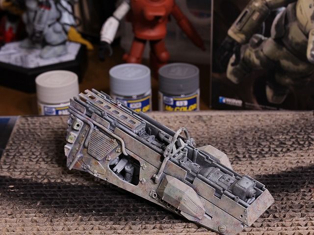
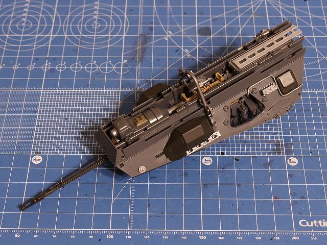
SGプラウラー・その1
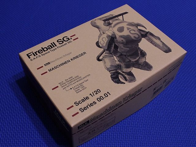
・Wave ファイアーボールSG 「スネークアイの生産配備の遅れをカバーすべく生産された暫定改良型」と言う設定だそうです。 日東製のファイアーボールにWave製のパーツ(胴体・エクサイマーレーザー砲・右手首・足首など)が追加されたキットで、胴体はスネークアイに似ていますが若干異なります。 これが発売された当時はさぞかし盛り上がった事だろうなぁ。・日東 プラウラー ファイアーボールにラクーンとプラウラーのランナーが追加されていて、なかなか贅沢なキットですね。 嬉しい事に余剰パーツとしてハッチが手に入るんです。 ランナーと共に撮影するのを忘れてしまいましたが、両キット共にこれらのスプリング類が入っています。 ファイアーボールSGと日東製プラウラー。 どちらも貴重なキットですが、プラウラーについてはWave製が出てしまったので僕の中では価値がだだ下がりしてしまいました。 SGはそのまま製作するつもりだったのですが、プラウラーを活かすためにSGプラウラーとして製作する事にしました。 SGプラウラーはハセガワから1/35が出ていますね。 プラウラーとSGではボディ形状が異なるため、レドームや増装タンクの取り付けに難渋しました。 おまけに、シーカーの造形が悪くて裏側が丸見えだし。 これは設計ミス? なので、Wave製のシーカーの一部を複製して穴埋めしました。 今回もジャンクパーツであれこれやってみたけど、フェアリングの防弾板はSGの流麗なボディラインをスポイルしてしまったか? ディテールアップはもうちょっと加える予定です。 このディテールアップを考える時間が何とも楽しい。 これに対して隙間埋めは大変で楽しくないです。 バーニアなど難しいところは細い半丸棒を貼り付けて誤魔化しています。
2019/03/17
コメント(4)
-
Wave S.A.F.S.R SPACE TYPE プラウラー・その2
前回に思い通りにならなかったグレーFS36622(311)のドライブラシでしたが、ガルグレー(11)とRLM65ライトブルー(115)で整えました。 当初の狙いとはちょっと違う感じになりましたが、後ろで背を向けているファイアボールとは違う趣きの白になりました。 オレンジの差し色はブラウン(7)をベースに叩いて、ゴールド(9)とハルレッド(XF-9)のドライブラシでコントラストを付けました。 ゴールドのアクセントが良い効果を出しているのですが、写真では伝わらないかも知れません。 マスキングは切り込みを入れたポストイットで簡易的に行う事によって境目が程良くラフになるようにしています。 軽くウェザリングして、ステッカーを貼って、特徴的な長尺アンテナを取り付けて完成です。 この機体はこのゴテゴテした背中が魅力ですね。 タンクを1個増やしてゴテゴテ・マシマシにしています。 差し色は箱絵に沿ってオレンジにしました。 ブラウンなのにオレンジに見えるところが何とも不思議。 この配色でブルーやグリーンも試してみたいところです。 ベースは宇宙基地の床をイメージしてみました。 「週刊サンダーバード秘密基地 第2号」に入っていた壁面トラスフレームをバラして使用しました。 ベースの機体であるファイアボールと共に。 ファイアボールを製作したのは約2年前。 僕の塗装技術は進歩したのだろうか。 左手三兄弟。 ん~、やっぱり色々考えながら塗装した事もあってか、ラクーンが一番納得の出来かなぁ。 ただ今思うと、ダイソーで買った草は邪魔でしたね。 さて、次の「左手」は・・・。
2019/02/01
コメント(2)
-
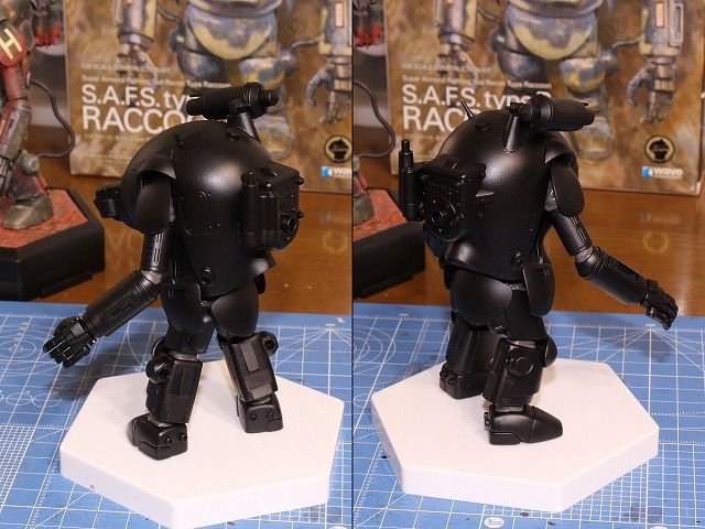
Wave S.A.F.S.R SPACE TYPE プラウラー・その1
マイブーム「左手祭り」の3機目、プラウラーです。 ファイアボールの偵察型ですね。 このプラウラーは新製品ですがWaveとしては当初から計画されていたようで、ラプーンのランナーにはプラウラーの名前が付いている物が含まれていました。 そのためファイアボールのパーツが余剰パーツになったり、ファイアボールにも使われないラプーンのパーツも入っていたりします。 今回はディテールアップ・パーツとして、これらのパーツも使用しました。 プラウラーは元々燃料タンクが2つに増やされていますが、ファイアボールのタンクも使用して3つへ増加。 特徴的なレドームは左側だけディテールアップしてみました。 その他にも例によって背部を中心にジャンクパーツを散りばめましたが、ファルコンと違って好きなようにジャンクパーツを取り付けられるのって楽しい~。 「茶色っぽい白」を目指して、下地はサンディブラウンからスタート。 続いてコバルトブルーとキャラクターレッドを乗せました。 この状態では宇宙専用機には見えませんね。 続いて311でドライブラシ。 サンディブラウンが透けるようにドライブラシをしていたハズなのに気付いたら茶色っぽさは何処へやら。 おかしいなぁ。
2019/01/26
コメント(2)
-
叩き塗り
.以前に6jiroさんからリクエストのあった件です。 叩き塗りで使用している筆はこちら。 精雲堂のドライブラシセットです。 パッケージの物は新品で、下の物は使用後です。 ご覧の通り、一作品塗装するだけでダメになってしまいます。 筆に塗料を少量付けて、親指の所で余計な塗料を落としてから筆をパーツに叩きつけて色を乗せていきます。 叩き具合によって下地の色の残し具合(透かし具合)や凸凹感(テクスチャー)を調整します。 凸凹が出来たところにドライブラシをかけるとこんな感じ。 下地によって赤っぽい青とか、黄色っぽい青になります。 オキサイドレッドサーフェイサーを初めに吹いておくと、パーツの溝や凹みに叩き塗り残しができるので錆っぽく見えますね。 この塗装法の最大の長所は筆ムラを全く気にしないで良い所です。 僕は筆塗りが大の苦手なんです。 でも、この塗装法をやる様になってから筆塗りが楽しくなりました。 最大の欠点はクルマやバイク、飛行機のような綺麗な仕上がりを要求されるモデルには使用できない事ですね。 よって僕はその手のモデルは作れません。
2018/10/18
コメント(2)
-
Wave S.A.F.S. type R ラクーン・その4
.ラクーンが完成しました。 今回は縁辺対比と言う効果を取り入れた塗装に挑戦してみました。 いつもの叩き塗りにこの効果がプラスされたことによって塗装面の情報量が増して良い感じになったと思います。 前回のラプーンと同様に背部を中心にジャンクパーツなどでディテールアップしました。 横山宏先生の世界観を損なっていないと良いのですが・・・。 今回の一番のお気に入りはこの部分。 増設したセンサー類や追加したボルトのゴツゴツ感とヒロイックなトリコロールカラー(白じゃなくて黄色だけど)がマッチしてくれました。 本当は赤をもっと入れたかったけど、偵察機なのでここはグッとこらえました。 偵察機としては既に派手過ぎだけどね。 「物陰に隠れて索敵行動」と言うシチュエーションにしたかったのですが、ベースのサイズの関係から中途半端な植物しか置く事が出来ませんでした。 偵察機の新旧対比。 ラクーンはS.A.F.S.がベースになっているだけあって、割とシャープな印象ですね。 仮組みの時点ではラプーンの方が好みでしたが、完成してみるとラクーンの方が格好良くて気に入りました。 次は偵察機つながりでシーピッグか。 でも、シーピッグって左手がないんだよなぁ。 いい加減、ファルコンも再開しないと・・・。
2018/10/16
コメント(2)
-
Wave S.A.F.S. type R ラクーン・その3
真っ黄っ黄ぃだった部分を落ち着かせるため、差し色の部分だけにスミ入れ塗料 (ブラック)でウォッシング。 肉眼ではかなり落ち着いた印象になったのだけれど、写真では変化が伝わらないかも。 デカール張り。 ハッチの魚の骨は白色とベージュ色が用意されていて、ここでは白色を選択しました。 ただし、このままでは真っ白すぎますので・・・。 ダークイエローでドライブラシして色調を差し色に揃えました。 他のデカールも空気感を出すためにドライブラシしました。 後はハゲチョロを入れて完成かな。
2018/10/11
コメント(2)
-
Wave S.A.F.S. type R ラクーン・その2
ラクーンの箱絵です。 ブルー系のボディにイエロー系の差し色がされています。 このブルーに近付けなかった・・・と言う話は横に置いといて。 この機体も反対色が用いられていますね。 同様にスバルのラリーカーもブルーのボディにイエローの六連星があしらわれています・・・と言う話もどーでも良くて。 このブルーとイエローの境目に注目。 ブルー側は色が濃く、イエロー側は薄くなっています。 これは縁辺対比と言う現象を故意に起こしているものと思われます。 隣り合う色の影響を受けて、境界部分が一方はより暗く一方はより明るく見えると言う現象ですね。 この技法を真似てみたいと思います。 ミディアムブルーにブラックグレーやクリアーレッドを混ぜてトーンダウンしたものを差し色する部分に塗装。 イエローの下地としてガルグレーを叩き塗り。 このままでも良くね? 差し色をイエローからグレーに方針転換する衝動に駆られつつ・・・。 Mr.カラーの「カラーモジュレーションセット・ダークイエロー」のDYハイライト2を叩き塗り。 さらにDYハイライト1を境界から遠い所に追加。 何も気にしないで見ると分からない程度だけど、意識してみると縁辺対比の効果が出ているでしょ? もっと派手に濃淡差を出すべきなのか、この程度で良いのか。 これからの課題です。 ただ、こうして組み上げてみるとイエローが派手すぎたようです。 ダークイエローだから茶色系のイエローのハズだけど真っ黄色に見えますね。 やはりグレーに方針転換するべきだったか。
2018/10/10
コメント(2)
-
Wave S.A.F.S. type R ラクーン・その1
.ラプーンで予告した通り「左手祭り」の第二弾としてラクーンに取り掛かりました。 ラプターとラプーンでは途中経過の記録を残さなかったために自分でもどんなメニューであの色合いを出したのか記憶が曖昧になってしまいましたので、今回は逐一記録してみました。 素組みに黒サフを吹いた状態。 ラクーンはS.A.F.S.の偵察型ですから、ラプーンと比較すると旧型ってことです。 そのためかラプーンよりもスッキリした感があります。 ディテールアップした状態。 毎度の事ながらキットではコード類が省略されています。 頭部のセンサーポッド、肘関節、足首にコードを追加しました。 その他は旧型感を損なわない程度にと考えながら、ジャンクパーツや鉄道模型のディテールアップパーツなどを取り付けてみました。 やっている最中は結構付けた様に感じたけど、こうしてみると少なかったな。 オキサイドレッドサーフェイサーをランダムに。 実家で使っている急須がこんな色をしていたっけな。 ジャーマングレイでトーンダウン。 パープルっぽくしたミディアムブル-を叩き塗り。 箱絵のブルーを目指したけど全く違う色合いになってしまいました。 そもそもミディアムブルーをベースにした事が間違いか。 方向性を探るためにダークイエロー・コバルトブルー・キャラクターレッド・クリアーレッドを軽く叩き塗り。 方向性を探るどころか迷走気味。 状況を整えるためにミディアムブルーでドライブラシ。 仮組みして再確認してみましたが、箱絵のイメージから大分離れたブルーになってしまいました。 でもまぁ、コレはコレで悪くないからこのまま進めていきます。
2018/10/04
コメント(2)
-
マジか!
.「第58回全日本模型ホビーショー」でWaveから下記のモデルが発売予定であるとの発表があったそうです。・ノイスポッター・クラッフェンフォーゲル・プラウラー 画像はWaveから拝借しました。 プラウラーについては8月にHP上で発表があったので知っていましたが、ノイスポッターとクラッフェンフォーゲルについては驚きですね。 一部の金型が失われているため再販不能と言われていたけど、遂に新規金型で復活ですよ。 嬉しいやら悲しいやら。 ノイスポッターとプラウラーのNITTO製未組み立てキットを所有している僕としては複雑な気分です。 クラッフェンフォーゲルは所有していないので朗報ですけどね。 クラッフェンフォーゲルはヤフオクで高額取引されていたけど、今後はどうなるのでしょうか。 NITTO製とWave製では価値が違うか?
2018/10/01
コメント(2)
-
デアゴスティーニ 週刊サンダーバード秘密基地 第2号
サンダーバード秘密基地の第2号です。 仕事帰りでちょっと遅めに本屋に行ったところラスト1冊でした。 倉庫には在庫はあったのかな? 創刊号は見当たらなかったから、結構人気なようですね。 マガジンです。 第2号にして早くも読み応えがありません。 こんな調子で110号まで持つのかなぁ。 「週刊 サンダーバード2号 & 救助メカ」でネタを使い果たしたか? 部品は多めです。 特別付録の「国際救助隊機密ガイド」です。 国際救助隊の設定や隊員リスト、サンダーバード1号~4号の解説、エピソード紹介などで構成されています。 立ち読みできない物の画像をアップして良いのか迷ったので、表紙だけ紹介しておきます。 サンダーバード・マニアな方々にとっては目新しい内容はないと思いますし。 今回の組み立ては、前回と違って一手間必要でした。 トレーシー・ヴィラ(プール横の建物)内部の照明の取り付けを行います。 パーツの内側にはLEDが填まりそうな溝があるのですが・・・。 マガジンではこの様にLEDが外に飛び出るように取り付ける指示になっています。 しかし、これではヴィラの二階パーツに取り付ける事が出来ません。 LEDが溝に填まるようにすると二階パーツに取り付ける事が出来る様になるし、一階と二階を組み合わせる時に配線の取り回しが可能になります。 このミスプリは全国展開する時には修正されるのかな? サンダーバード1号は前回の2号に続き塗装もマーキングも綺麗で良く出来ています。 主翼は開閉しますが、バリのために噛み合わせが悪かったので軽く擦り合わせをする必要がありました。 全長は約5cmです。 「国際救助隊 機密ガイド」によると1号は全長35m、2号は全長76mですから、サイズ感は全く合っていませんね。 巻末に載っていた「今後の完成予定パーツ」によると。 創刊号~第5号で「トレーシー・ヴィラ、TB1号、TB2号が完成!」。 第6号~第10号で「TB2号コンテナ格納庫が建設中!」。 第11号~第15号で「TB1号機体格納庫が建設開始!」。 となっています。 この書き方だと、第10号でTB2号コンテナ格納庫が完成するというわけではないか。 TB2号コンテナ格納庫のパーツを揃えた頃には山肌や他の施設などの不要パーツが山積みになってしまうのでしょうね。 危険だ・・・。
2018/09/26
コメント(4)
-
デアゴスティーニ 週刊サンダーバード秘密基地 創刊号・その2
.サンダーバード2号の大きさやコンテナについての話題が出たので。 全長7cm、全幅5cmです。 全長が10cmあれば満足度がかなり違ったと思うのですが、島の大きさとの兼ね合いでこのサイズになったのでしょうね。 機体の裏側はジェットノズルなどが再現されています。 機体前後のポッチが二つ並んでいる部分にマグネットが入っています。 コンテナの裏にはローラーが装備されているのでコロガシ走行が可能です。 これは発進シークエンスを再現するためだと思われます。 コンテナのロックは、コンテナの突起部分を機体側の凹に押し付けるだけです。 コンテナの中身はこんな事になっています。 内部の床や側壁が再現されていないため、内部にメカを収納することは不可能だと思われます。 仮に収納できたとしても、引っ掛かって出てこなくなりそうです。 ミサイル格納庫のハッチが開くようになっていますが、搭乗シークエンスではこのハッチにスロープが接続されるようです。 実際は別のハッチがあるんですよね? 第2号にはサンダーバード1号が付属するのですが、購入するかどうするか悩みます。 こんな小っちゃいサンダーバード2号でも490円だから納得できますが、次号からは1990円ですからね。
2018/09/13
コメント(2)
-
デアゴスティーニ 週刊サンダーバード秘密基地 創刊号
レッサーかずさんから情報のあったデアゴスティーニの新作です。 群馬で試験販売されるというので買ってきました~。 マガジンです。 マガジンの前半は秘密基地の全貌の紹介です。 内部まで再現されているそうです。 作り込む人は山肌や樹木をリアルにしたり、内部のディテールアップや施設の造設をされるのでしょうねぇ。 キリがなさそう・・・。 後半は「ビルドアップガイド」、「柿沼秀樹のTBガイド」、「ジェリー・アンダーソンの功績」です。 創刊号なので例によってパーツはブリスター・パッケージに収められています。 瞬間接着剤付きです。 これはありがたい。 組立自体はあっという間に終了。 組み立て作業は「TB2号隔壁の組み立て」、「プールガーデンフロアの組み立て」、「TB2号の組み立て」です。 気になっていたメカの大きさですが、ご覧の通り全長7cmと小振りです。 ギミック用のマグネットがボディ底面とメインノズル内に仕込まれているので、冷蔵庫などに貼り付ける事が出来ます。 言うまでもなくコンテナは着脱可能で、ミサイル格納庫のハッチも開閉できます。 ミサイル格納庫のハッチって、搭乗口も兼ねてますか? コンテナは前後のハッチを開閉可能です。 今回の隔壁とTB2号を並べるとこんな感じ。 2号の格納庫とカタパルトだけ欲しいですけど、そんな訳には行きませんよね。 第2号はTB1号が付属します。 それと、特別付録として全16ページの「国際救助隊機密ガイド」が入っているとのこと。 デアゴさん、気合いが入っていますね!
2018/09/11
コメント(6)
-

Wave製 S.A.F.S. Mk.III Type R ラプーン
前回製作したラプターの偵察型のラプーンです。 サーフェイサーを吹いた状態で止まっていた物を仕上げました。 ラプターにセンサーを追加装備した機体ですが、更に市販のディテールアップパーツを追加してみました。 偵察型という事で左手はマニピュレーターを選択。 武器の左手よりもこっちの方が好みだなぁ。 カラーリングはボックスアートを参考にしたのですが、どうしても「ケチャップを塗った肉詰めピーマン」にしか見えない・・・。 左手つながりで次回はラクーンかな。 遂にプラウラーの発売も決まったし、僕の中では「左手祭り」が続きそうです。
2018/09/05
コメント(2)
-
WAVE製 S.A.F.S. Mk.Ⅲ ラプター
。ファルコンの製作にちょっと疲れを感じてきたところだし、積んであるキットを減らすために脱線しました。 こう言うのを「積み滅ぼし」と言うそうですね。 足首の配線部分をちょっと弄っただけですので、基本的に素組みです。 しかし、各関節の短縮やカバー付け工作はやはりやっておくべきだったと少し後悔。 最後の写真はヤフオクでよく見掛けるガンプラ出品写真の真似をしてみました。 このデータは箱裏に書かれているデータなのですが、Land Speedは65km/hrだそうです。 この短足で? 中の人は大変だ・・・。 今まではWAVEの六角ベースをそのまま使用していましたが、それではあまりにも寂しいので足元にも拘ってみました。 ラプターは砂地を、スネークボールは鉄板をイメージしてみました。 このベースにしても先程のデータ表記にしても、ちょっとした一手間がクオリティ・アップに繋がりますね。
2018/06/01
コメント(2)
-
目を疑う光景
。ファルコンのプロップで使用されたキットを探しに、今まで訪れた事のなかったブックオフに行ってきました。 プラモデルの棚には「何故だ!」と声を上げたくなる程に飛行機の模型ばかり。 飛行機模型の収集家が大量に持ち込んだのかな? ミリタリー関連はホントに数個しかありませんでした。 プロップで使用されたキットを見付ける事は出来ませんでしたが、驚愕の掘り出し物がありました。 目を疑うとは正にこの事。 マシーネンクリーガー関連の模型がズラリ。 大人買いしてしまいたいところでしたが懐にそんな余裕はなく、厳選してこの二つをゲットしてきました。 ゲットしたのは、ノイスポッターとラプターです。 ノイスポッターですよ、ノイスポッター! シュリンクは剥がされていましたが、中袋は未開封状態のノイスポッターがしれっと置いてありました!! 新品同様のノイスポッターに巡り会うなんて思ってもみませんでした。 僕が手に入れてしまっても良いのか、もっと必要としている人に買って貰った方が良いのではないのか。 ちょっと悩みましたが、買っちゃいました。 勿論、このノイスポッターは作らずに永久保存決定です。 作ってナンボのプラモデルを作らずに保存するのって、普通の人にしてみたら意味不明な行為ですよね。
2017/11/10
コメント(2)
-
スネークボール・その2
スネークボールが完成しました。 このカラーは意外だったでしょ?と書きたかったのですが、6jiroさんにキャンディ塗装をするのではないかと勘付かれてしまいました。 「オネーチャンのお尻」写真+シルバー立ち上げで艶あり塗装をする事は分かってしまいますよね。 でもキャンディ塗装ではなく、ここは僕らしくスバルのWRブルーマイカによるメタリック塗装で行く事にしました。 WRブルーマイカの色そのものを出すために、カー用品店で売っているSOFT99・ボデーペンの「02C」を使用しました。 ツヤ出しに使用したクリアもSOFT99・ボデーペンです。 黒サフ→シルバー→WRブルーマイカ→クリアーの順番で吹きました。 クリアーはSOFT99の指示に従ってWRブルーマイカを吹いた2~5分後に吹きましたが、このタイミングでクリアーを吹くのは緊張しますね。 本当はクリアーが完全乾燥した後にコンパウンドで磨かなければならないのですが、我慢できず完成としてしまいました。 ボディ・サイドには「555」あるいは「六連星」を描きたかったのですが、クルマの様な広い平面がないため断念。 その代わりに肩にキャメルイエローのワンポイントを入れました。 ゴールド・ホイールをイメージして靴をゴールドにするかどうするか迷ったのですが、陸上選手みたいになってしまいそうなので止めにして、膝の丸いパーツをゴールドにしました。 あとは、各所にチタンシルバーを散りばめてみました。 カーモデルのようなツヤのある綺麗な機体にしたかったので、ウェザリングは一切やりませんでした。 背中の曲線とメタリック塗装が狙い通りハマってくれました。 S.A.F.S.三兄弟。 それぞれアプローチを変えてみましたが、このデザインには何でも受け入れてしまう懐の深さがありますね。 次はちゃんとシーピッグを作りたいと思うのですが、スネークアイの再販はあるのでしょうか。
2017/07/13
コメント(2)
-
スネークボール・その1
今回のイメージソースはこれです。 写真はAmazonから拝借しました。 どうですか、この曲線美! ツンっと盛り上がった膨らみ。 その膨らみが作り出す光と影。 周囲の明かりをあたかも自らの光のように見せる艶めかしい艶。 一発でやられました・・・。 この作例はラプターですが、ラプターは通販やオークションでは高値になっています。 似たような曲線を持つスネークアイも同様で、定価では手に入りません。 そこで模型店でずーっと売れ残っていたシーピッグに目を付けた訳ですが、これとて本来は高価取引商品です。 今まで誰にも買われずに残っていてくれて、ありがとね。 シーピッグは2014年7月に発売されたそうなので今更僕が書く必要はないと思いますが、キットの内容をちょっと紹介。 このキットはS.A.F.S.とスネークアイのランナーにプラウラーとシーピッグ用のランナーが追加された構成になっています。 よって、このキットからスネークアイを組む事も出来ます。 コンパチって訳にはいきませんがね。 僕にとっては不要な中の人の生首がなぜか三種類入っています。これはサービスなの? 前回も紹介した写真ですが。 左のスネークボールは、2004年にマックスファクトリーで販売されていた物。 右のスーパーボールは、2011年にポストホビーで限定販売された物だそうです。 僕がプラモデルから離れていた間にこんな魅力的な物が発売されていたのですね~。 完全に世間の潮流に乗り遅れていますが、再現してみようと思います。 この二つの機体を再現するには、スネークアイのハッチをS.A.F.S.のハッチと交換すれば良いのだろうと簡単に考えていたら、そんな単純ではありませんでした。 スネークボールは背部右側のアンテナがS.A.F.S.型のシーカーになっていますが、この付け根はスネークアイのままでは薄すぎて取り付け出来ません。左腕はスネークアイ型です。 スーパーボールはスネークアイ型のアンテナですが、左腕がラプター型になっています。 ラプター型の左腕の入手は不可能だしスクラッチも面倒臭いので、スネークボールを作る事にしました。 スネークボールにするためのパーツです。 S.A.F.S.のハッチはメーカーに部品請求しましたが、コストが意外と掛かってしまったので複製すれば良かったと後悔しました。 真ん中のトウモロコシの粒みたいのは、左胸の乳首です。スネークアイには乳首がないんですね。 シーカーの基部はパテ盛りで厚くして、シーカーはS.A.F.S.の物を複製しました。 今回はシルバー立ち上げです。 今日はここまで。
2017/07/12
コメント(4)
-
マシーネンクリーガーの新入り
前回紹介した新入りです。 マシーネンクリーガーに詳しい人はスネークアイであると直ぐに分かると思います。 詳しくない人にとっては、僕がこれまでに製作した物とは全く違う機体と思うかも知れません。 何を隠そう、尻隠そう。 僕もそう思っていました。 この機体って、S.F.3.D ORIGINAL時代にはなかったですよね?あったのかな? スネークアイはS.A.F.Sの改良型であるそうな。 ナルホド、そう言われてみると胴体や四肢は共通なようです。 S.A.F.Sのデザインに感銘を受けた僕にとってはスネークアイのハッチのデザインはイマイチ馴染めないでいました。 で、S.A.F.Sなどを製作するに当たってマシーネンクリーガーのことをネットで調べていたら、こんな機体がある事を知りました。 スネークボールと言うそうです。 写真は丸猫堂から拝借しました。 ちなみに、こんな機体もありました。 スーパーボールと言うそうです。 写真はMILITARY BLOGから拝借しました。 やっぱ、ツルツル頭の方が格好イイよなぁ。 この頭と背中の曲線の組み合わせがたまりません! スネークボールかスーパーボールを作りたいと思って、プラモデル屋からコレ引き取ってきました。 シーピッグです。 マシーネンクリーガーに詳しくない人には更に訳の分からない話になっていますよね。 これはスネークアイの長距離戦闘偵察型だそうです。 詳しい人からは「勿体ないからそのままシーピッグを作りなさい!」と怒られそうな気がしますが、これをベースにします。 シーピッグのパーツは保管しておいて、将来的にスネークアイが手には入ったらシーピッグ作りますので許して下さい。
2017/07/11
コメント(2)
-
比較
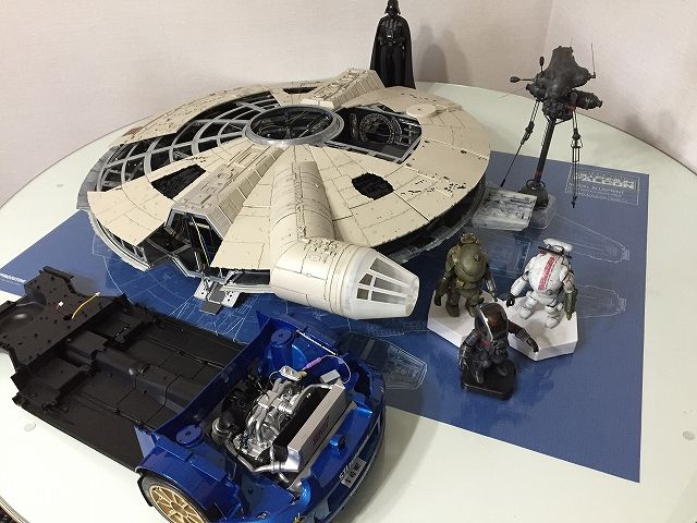
pipipi1014 さん、これでファルコンの大きさが伝わりましたか? 今はインプと良い勝負ですが、ファルコンに機種が付くと相当大きくなります。 デアゴからの情報では、全長808mm、全幅596mm、全高192mmになるそうです。 インプが全長551mm、全幅221mm、全高173mmですから、ファルコンの方が大きいですね。 重量については金属の塊であるインプの方が上になると思いますが、内装の作り込み次第ではファルコンも重くなりそうです。 こんな大きい物を相手にしていると、マシーネンクリーガーのサイズが心地イイんですよ~。 そして、こんな大きい物はこれ以上置けません!
2017/07/07
コメント(12)
-
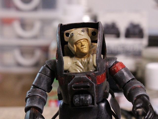
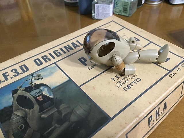
NITTO製 P.K.A・その4
P.K.Aが完成しました。 中の人は前回紹介した物と同じく「1/16ワールドフィギュアシリーズ 現用アメリカ陸軍歩兵」ですが、諸事情によりもう一つの頭と交換しました。 また、諸事情によりキャノピー越しで失礼させて頂きます。 キャノピーのヒンジ周りのパーツがなくなっていた事も理由の一つですが・・・。 腕の事を考えて中の人を変更しましたが、こうして全体像を見ると腰から下のバランスも変ですね。 胴が短いし、股関節の幅も広いです。 中の人が見えてしまうから、骨格を想像してしまうんですよね。 足首に装甲板があるのですが、このパーツも紛失していました。 また、頭部に装着するペリスコープのようなパーツも紛失していました。 こうして見ると、肩幅の件はあるとしても、AFS系列のスーツよりも視界は良好で閉所恐怖症にならずに済むし、現実的なデザインかも知れません。 同じ偵察部隊という事で、ノイスポッターと一緒に記念撮影。 改めてノイスポッターって大きいのだなぁと実感します。 こんなのが街中をフラフラ浮いていたら怖いですね。 さて、P.K.Aをご存じの方ならば前胸部に装着されている変なパーツが気になっているハズ。 ここには本来は楕円形のダクトが付くのですが、このパーツも紛失。 その当時の僕はP.K.Aは完成させられないとサジを投げてしまって、パーツ管理が雑になっていたようです。 ツルツルボディではつまらないので、P.K.Aの元ネタであるヒューズのパーツを移植しようと思ったのもののヒューズを見付ける事が出来ず。 代わりにアパッチのローター周りのパーツと照準装置を移植しました。 そして、ついついイタズラ心に火が付いて・・・。 ゴッド・バード、チェ~~~ンジ! これでホルニッセに乗らなくても飛べるようになりました。 中の人が仰向けだよ! なんて突っ込みはご遠慮下さい。
2017/07/01
コメント(4)
-
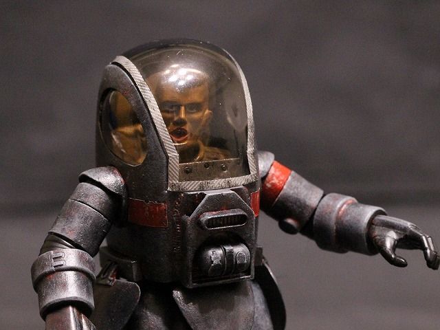
NITTO製 P.K.A・その3
。P.K.Aの中の人で気になる事。 これはP.K.Aに限った話ではなく、パワードスーツ系全般に言える事なんですが。 「パイロットの腕はどうなってるの?」 って事です。 パイロットの肩からスーツの肩までの距離があるため、このままだとパイロットの肘がスーツの肩に来てしまいます。 この問題に真っ向から勝負してデザインされたのが「闘士ゴーディアン」。 画像はYouTubeにアップされていた物から拝借しました。 ゴーディアンとは、マトリョーシカよろしくパイロットがロボットの中に、そのロボットがさらに大きなロボットの中にと言った具合に、計3機のロボットが重なるように合体する昔のロボットアニメです。 オープニングの透視図を見れば分かるように、パイロットが1機目に乗り込むと、パイロットの肘は1機目のロボットの肩に、そして手首はロボットの肘に来るようになります。 次に1機目が2機目に合体すると、1機目の肘は2機目の肩に来るので、パイロットの手首は2機目の肩に来ます。 ついでに言うと、パイロットの膝は1機目の股関節に来ます。 さぁ、この状態でロボットが動くとどうなるか。 人間の関節はボールジョイントではないですからね、骨折間違いなしです。 子供ながらにその操縦システムに疑問を、いや、恐怖を感じた事を覚えています。 話を元に戻すと、P.K.Aもこんな感じですよね。 パイロットに対してP.K.Aのボディの幅が広すぎるようです。 そのため、合わせ目を削ってボディの横幅を詰める工作をされている作例を見掛けましたが、それではキャノピーが使用不能になってしまうので、パイロット側で問題解決を図る事にしました。 S.A.F.Sの追加装備でも使用したタミヤの「1/16ワールドフィギュアシリーズ 現用アメリカ陸軍歩兵」の上半身を突っ込んでみました。 1/20のP.K.Aに対してちょっとオーバースケールと言う事になりますが、頭が大きくなりパイロットの肩幅が広がるため、純正のパイロットよりはマシになりました。 それでもスーツの肩がまだ離れていますね。 肩関節の軸を見ると、矢印の部分にストッパーがあって関節の球体部分が少し浮くようになっています。 そうしないと、肩関節周囲のデザインの関係上、腕を真下に下ろせないためですね。 これを削って球体部分がボディーに密着するようにしました。 上腕の可動範囲が狭くなって脇を締める事が出来なくなってしまいますが、肩から腕に掛けての違和感が少しは改善されたのではないかと思います。
2017/06/30
コメント(2)
-
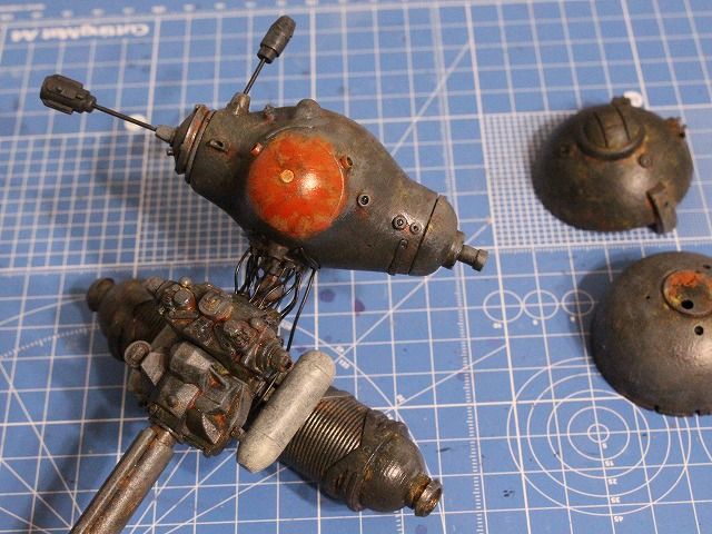
NITTO製 P.K.A・その2
。P.K.Aの続きです。 前回の最後の写真。 あれは一見するとブラウンを塗ったように見えたかも知れませんが違います。 ノイスポッターの眼の部分のように下地を赤にしようと思ってキャラクターレッドを塗ったところでした。 しかし、黒サフの上からレッドを乗せてもブラウンにしか見えませんね。 レッドの発色を良くするために、下地を311でやり直し。 コレを見て、次回作は冬季迷彩仕様にトライしたくなりました。 改めてキャラクターレッドを乗せてみると、綺麗に発色してくれました。 オリンピック選手団仕様? もちろん、この後に下半身も赤くしました。 ノイスポッターと同じ偵察部隊にしようと思ったので、迷わずに初めからジャーマングレーを乗せていきます。 下地の赤の残し具合が難しいです。 シン・ゴジラ仕様? あ~、毎度の事ながらやり過ぎました。学習能力なし・・・。 グレーのグラデーションを模索しているうちに下地の赤が殆ど分からなくなってしまいました。 この手前くらいがちょうど良かったか。 ノイスポッターと同様に赤い識別帯を塗り、左肩というか上腕部分に赤の差し色を入れました。 言い忘れましたが、キャノピーのフチはハセガワのシルバーカーボンフィニッシュです。 中の人を乗せると雰囲気が変わりますね。 しかし、S.A.F.Sと違って中の人が見えてしまうばかりに気になる事が・・・。
2017/06/28
コメント(2)
-
NITTO製 P.K.A・その1
ノイスポッターの次はコレ、P.K.Aです。 実家の押し入れから発掘された物のうちの一つです。 例によって仮組み状態で放置していました。 マスキングテープで固定している部分はまだ良いのですが、セロハンテープで固定している部分は最悪です。 テープが全く剥がれませんでした。 でもまぁ、塗装してしまえば誤魔化せるので製作をスタートしました。 組み立てて黒サフを吹きました。 と、簡単に書きましたが、ここに辿り着くまでがまぁ大変。 その当時の自分が仮組みで放置した理由が分かりました。 あらゆるパーツに対して合わせ目消しをしなければならないし、パーツの合いも悪いし。 時間が掛かったのは余計な工作を追加したせいもあるんですけどね。 それについては追い追い。 いつものように色を重ねていきます。 S.A.F.Sと違って中の人も作らなければならないし、まだまだ時間が掛かりそうです。
2017/06/21
コメント(2)
-

NITTO製 ノイスポッター・その3
ノイスポッターが完成しました。 どうですか、このデザイン。 原作者の横山宏先生のセンスって、ホント素晴らしいですよね。 これが絶版キットであるという事が残念でなりません。 バンダイのディスプレイスタンドを使用して躍動的な感じに。 やはり付属のスタンドでスッと立っている方が似合いますね。 次は何を作ろうか。
2017/06/14
コメント(4)
-
NITTO製 ノイスポッター・その2
ノイスポッターの製作を続けています。 つくづく「筆塗りって手軽でイイわ~」と再認識している今日この頃です。 エアブラシを使わなければならないファルコン製作が億劫になりそうで心配です。 って言うか、もうなってます・・・。 さてさて、目玉です。 ここも迷走しました。 この部分はクリアパーツになっていて、センサーとしてボディとは違う質感を出すために裏からブラックで塗装していました。 表面がツルツルして質感の違いは出たのですが、その代わりに統一感がないためシックリしませんでした。 ノイスポッターってその形状から可愛くもあり不気味でもあるので、「血走った不気味な目玉」にしてみようと試みましたが見事に失敗。 結局はボディ色の延長で落ち着きました。 下地の赤がうっすら見えて、不気味というか感染したアテロームに穴が開いたような感じになりました。 目玉の周りのモールドが甘い部分やメンテナンスハッチの角にディテールアップパーツを追加。 窒素タンクは色味を変えてアクセントになるようにしました。 棒(サポートユニット)や球(分析記憶ユニット)を接続するとノイスポッターらしくて良いのですが、自立が難しくなります。 専用のスタンドが付属していますが、倒れそうで怖いです。 球の中に鉛を詰めて重心を下げてみましたがやはり不安定。 何かスタンドを準備する必要がありそうです。
2017/06/07
コメント(4)
-
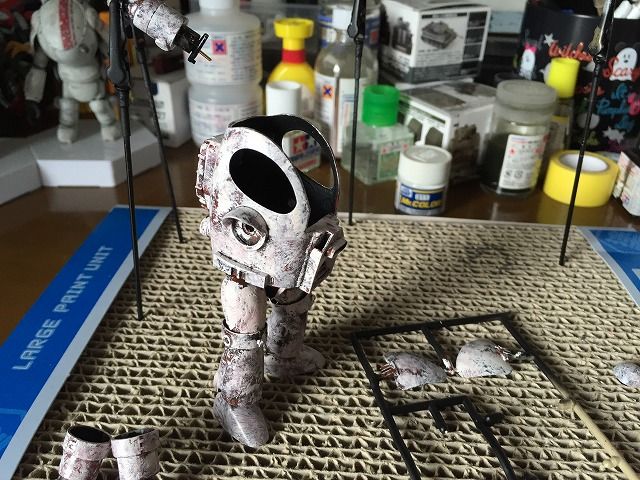
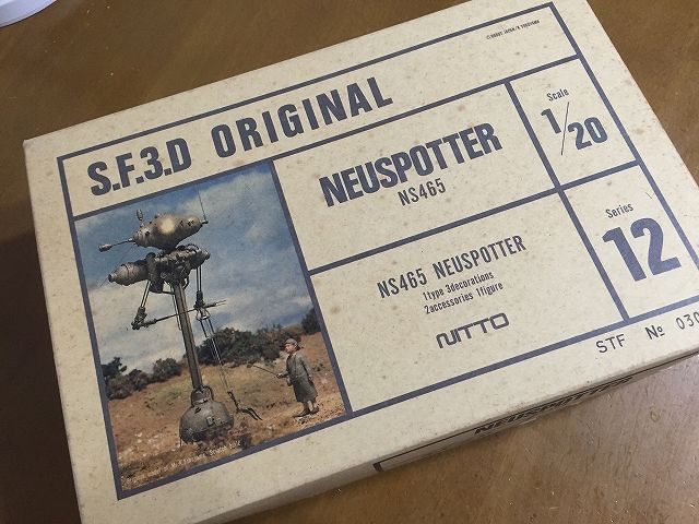
NITTO製 ノイスポッター・その1
既に何回か紹介しているので「その1」とするのは今更な感じはしますが、正式にノイスポッターの製作を開始しました。 このキットの難関のひとつ。 AT-ATの首(反重力ユニット)の合わせ目消しです。 蛇腹部分は何とかなりましたが、両端のドーム部分にある物凄く細い凸モールドを残す事は不可能です。 ちょっとヤスリ掛けしただけで消えてしまいました。 これは仕方ないですね。 塗装については、前作のS.A.F.S達と同じようにカラーをバシバシ重ねていきます。 まずは変な組み合わせで面白い効果が出る事を期待して、黒サフの上にブラウンとミディアムブルーをランダムに重ねてみました。 が、この組み合わせはイマイチでした。 S.A.F.Sでイイ感じだったのでダークイエローを重ねてみましたが、偵察機であるノイスポッターには合わないと思い取り止め。 偵察機らしくオリーブドラブを重ねて迷彩柄に。 色の配置がなっていないために汚らしくなってしまって大失敗! 慌てて、ジャーマングレーで方向修正。 前のオリーブドラブが効き過ぎて、ジャーマングレーが立たなくて苦労しました。 やっぱり偵察機なんだし、初めからグレー系にしておけば良かった。 軸をボールジョイントに交換して、首を傾げたような感じにしています。 ちょっと角度が変わるだけで表情が出ますね。 ボールジョイントが丸見えで格好悪かったので、目隠しを兼ねて配線でディテールアップしてみました。 このキットにはムギ球(懐かしい~!)が付属していて目玉が光るようになっているのですが、付属していた物は割れて使えなくなっていました。 そこで、LEDを仕込むついでに横に並んでいるセンサーも光ファイバーで光るようにしました。 光漏れが酷いな・・・。 イメージ通りに行かずに苦戦してます。 今日はここまで。
2017/06/03
コメント(4)
-

最近のトピック
1.バンダイ製 PERFECT GRADE 1/72 ミレニアム・ファルコン 遂に来た!って感じ。 「1.7mサイズの撮影用モデル」と言う文言が目に入って最初は誤解して驚いてしまいましたが、1/72だからデアゴよりも小さいですね。 内部にも拘っていそうだし、デアゴよりも完成度が高い事は間違いなさそうだし楽しみです。 買いませんけどね。 ファルコンを二機も駐機させる余裕はありません。 出来は良さそうなのに、この写真の塗装は迫力がないですね。 スケール感を感じられないのは何故だろう? 綺麗に作りすぎているからかな。2.タミヤ製 1/20 グランプリコレクションシリーズ No.53 タイレル P34 1977 モナコGP ホビコムでアントマンさんが紹介されていたキットを購入しました。 この中にロストパーツが含まれているらしいです。 そもそも、ファルコンのプロップ制作時には沢山の市販キットのパーツが使われていて、このタミヤのタイレルもその内の一つだそうです。 機体上面のディテールアップはまだまだ先ですが、デアゴ・ファルコン・ユーザーに買い占められてしまう前に買っておきました。3.アシェット・インプのステアリング問題。 KAZevo4さんから頂いた情報です。 これはアシェット・インプのフロント・サスペンションです。 ストラットのトップにフェンダーにハマる凸モールドがあります。 これはレガシィの時に使用していたダンパーです。 右側がProva製、左側がTEIN製です。 Provaのサスは峠や高速を走る時に最高でした。 TEIN製は正立ダンパー、Prova製は倒立ダンパーのため見た目が違いますが、基本的にはインプと同じ形式のサスペンション・レイアウトです。 TEIN製を見ると分かりやすいのですが、実車の場合はストラット・マウントとダンパーはベアリングを介して結合しているので、フェンダーと結合する部分はクルクル回ります。 しかし、アシェットの場合はこのストラットマウントが存在しないため、フェンダーに固定するとタイヤが動かなくなってしまいます。 ステアリングとタイヤが連動することが売りの一つだったのに・・・。 トップの凸モールドを削ったり、固定のネジを緩めたりすればタイヤは動くようになるかも知れませんが、ネジに負担が掛かりそうで怖いですね。 ステアリング機構のギアが噛んでくれなかったので僕の場合はステアリングと前輪の連動は諦めていましたが、前輪の向きが変えられないなんてトミカと変わらないじゃないか! 更に言えば、サスペンションは車体を押すと沈み込む事になっていますが、タイロッドの可動軸が垂直方向ではなく水平方向なので、サスペンションを無理に沈み込ませると破損する可能性があります。 ハコスカで物議を醸していましたが、インプも危ないかなぁ。 同じアシェットでも航空機シリーズはギミック満載で楽しそうで羨ましいです。
2017/06/01
コメント(2)
-
無知であることは罪である。
昨日のブログで紹介したように、現在はNITTO製のノイスポッターに浮気中です。 マシーネンクリーガー好きの方にとっては常識ですが知らない方々のために説明しておくと、このプラモデルは金型が失われてしまったため、新規に金型を製作しない限りは市販されることのない貴重な絶版キットなんです。 そのため、オークションでは高値で取り引きされています。 なんてもっともらしく書いてますが、長い間模型界から離れていた僕にとってそんな事になっていたとは知る由もなく、実家から埃を被った状態で出てきたコイツを見て、「ジャンクパーツにちょうど良いな。」などという恐ろしい事を考えたのでした。 知らないって怖い事ですね。 この写真は散逸していたパーツを回収して、仮組み状態で止まっていたパーツを点検しているところです。 パーツの確認に当たって必要となる組み立て説明図は紛失していたので、yangminさんにお願いをして組み立て説明図の画像データを送って頂きました。 yangminさん、改めてありがとうございました。 さてさて。 プレミアが付くキットを作る事自体が勿体ない!って話もあるのですが、売り物にもならないような状態で置いておくのも勿体ないので作ってしまいます! 若干の紛失パーツがあるのですが、このキットの特徴の一つである金属パーツは幸いな事に全て揃っていました。 それにしても、このAT-ATの首の合わせ目には(*_*) マイッタ!!
2017/05/30
コメント(5)
-
NITTO製 S.A.F.S
WAVE製ではなくNITTO製のS.A.F.Sです。 以前、箱だけ紹介したことがありましたが、中身はこんな事になっていました。 仮組みのためのセロハンテープが変色・変質してプラから剥がれなくなっていました。 幸いなことに、パーツの欠品はありませんでした。 WAVE製はこのNITTO製をそのまま再販しているのかと思っていたのですが違うんですね。 パーツ割りや細部のデザインが異なっています。 一番目に付くのが胴体のパーツ割りです。 NITTO製は胴体が左右にパーツ割りされていますが、WAVE製は前後(更に背中側は左右に分割)にパーツ割りされていました。 WAVE製はパーツ割りが目立たなくなるように工夫されています。 そのお陰で、オープン・シェルを再現できるようにもなっていますね。 NITTO製は合わせ目が真ん中に来る上に、合いが物凄く悪いです。 このままでは可哀想なので、数十年ぶりに製作を再開します。 後ハメ加工を行い、パーツの表裏を黒サフで黒染めし、ベースの最下層はブラウンで。 火星用の迷彩を作るとしたらこんな感じ? 続いてダークイエロー。 砂漠迷彩仕様みたいですね。 陰になるところに補色であるブルーを追加して絵画的に。 フェルメール仕様? この段階で上手く仕上げることが出来れば、グリーンを使わなくてもグリーンに見せることが出来るんだろうけど、僕には無理です。 4種類のオリーブドラブを使用して仕上げ。 これはMr.カラーの「カラーモジュレーションセット」を使用しました。 同じオリーブドラブでも、トーンが異なる4種類のオリーブドラブがセットになっているので、グラデーションを作る際に助かります。 以上の塗装は全て、太めのドライブラシ用筆でバシバシ叩くようにして色を塗ると言うよりは乗せるようにしています。 そうすることによって、塗装面が適度に荒れてテクスチャを作ったようになります。 また、ベタ塗りではないため上の色の隙間から下の色が見えて情報量が増えるので、表情が豊かになります。 と言う目論見なのですが、どうかな? と言うことで完成。 オリーブドラブを基調としたことで、アメリカ陸軍の歩兵をイメージしてポーチやザックを取り付けてみました。 使用したのは、タミヤの「1/16ワールドフィギュアシリーズ 現用アメリカ陸軍歩兵」のパーツです。 1/20のSAFSに対して1/16だからオーバースケールになるかと思いましたが、ピッタリでした。 もう少し大きくても良いくらいですが、これらは「中の人」用の装備ですからこんなもんでしょ。 左腕はM16をイメージしてパーカライジング風にしてみました。 SAFSの二連発となりましたが、改めてプラモデル作りの楽しさを噛みしめました。 筆塗りの楽しさも再認識しました。 ここで宣言します。 あと三つ作りたいプラモデルがあるので、しばらくファルコンの製作はお休みします!GSIクレオス Mr.カラー特色セット CS581 カラーモジュレーションセット オリーブドラブ VERSION1/16 ワールドフィギュアシリーズ 現用アメリカ陸軍歩兵 (デザートユニフォーム)【36308】 【税込】 タミヤ [タミヤ ゲンヨウDユニフォーム]【返品種別B】【RCP】
2017/05/24
コメント(4)
全65件 (65件中 1-50件目)
-
-
- 道の駅めぐり
- 熊本 【道の駅 小国】梅干 かぼす果汁
- (2024-08-29 08:28:12)
-
-
-
- バイクのメンテ&カスタム
- スマホシェイド工作 Ver2
- (2024-09-03 12:19:35)
-
-
-

- ☆★バイク★☆
- ヤマハ VOX リヤブレーキクリーニ…
- (2024-09-20 07:18:08)
-


