
[OPI] カテゴリの記事
全47件 (47件中 1-47件目)
1
-
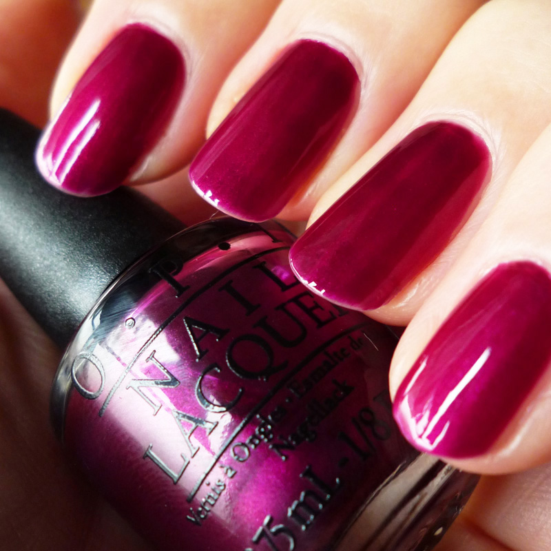
OPI【F02 Kiss Me Or Elf!】
OPIの『Kiss Me Or Elf!』ダークフューシャ、シマータイプ。2014年ホリデーカラーでミニボトルのセットに入っていて自身では選ばない色。ヴァイオレットのような青味の紫、ワインのような赤味の紫は好きだけど、ピンク味でネオンっぽさを感じると、なんだか気持ちが不安的になるため(笑)用紙にのせると落ち着きのある色マニキュアになると、さ、ざわざわするーけれども、周囲からは「目を惹く」とかで好評でした。5月から仕事の忙しさで気力が萎えていたこと、梅しごとでちょいちょい指先を使う作業が多かったのでネイルはほぼお休み中でした。ペディキュアはサンダルを履く季節になってシャネルのカーキマジョーラ系『531 PERIDOT』で、こちらはしっくり。新色は買っていないけれど、塗り待ちポリッシュが溜まってきたので梅干が完成したらマニキュア本格的に復活させたいです。
2017.07.25
コメント(0)
-

OPI【N52 Humidi-Tea】
OPIの2016SSの『New Orleans Collection』は寒暖色のバランス良い内容。このなかから画像検索し似合うかなぁ…と選んだ『N52 Humidi-Tea/ヒュミディティ』。でしたが私には肌を浅黒く見せ、似合わない色でした。長いことマニキュアしてるのに、端くれでもデザイン屋なのに、未だに色選びに失敗するのって…(´-ω-`)色はほーんのちょっとだけくすんだピーチピンクをベースにレッドorオレンジのシマー、それよりも微粒のグリーン、シルバーのシマー、それにピンクの偏光がかかっていることもあり表情豊か。そのためで『くすんだピーチピンク』という表現をしているものの、phでは『テラコッタピンク』っぽい見え方がほとんどになってしまいましたがどれが正解とは言い切れない複雑でもある色です。これだとテラコッタよりですね。日中は春夏らしい陽気なピンク。たとえば浜辺などでメインに過ごす時間帯が日中であれば、マニキュアでもペディでも映える色。ただ、夕方以降の暗さになると黄ぐすみしてしまい肌色を悪く見せやすいです。ベースの色にあるくすみがもう少しなければいい色です。レッドorオレンジのシマーは凝視して爪の角度を変えれば見えてきます。あまり役立ちませんが、比較してみた色はOPI JAPAN10周年で発売された『AM1 Pink a Peach』。(リンク先は2010年で当時よりピンクがより黄味よりに劣化してました…)↓この黒背景のものが、一番肉眼で見た時の印象に近いです。『N52 Humidi-Tea』がちょっとくすんだピーチピンクに対して『AM1 Pink a Peach』はくすみのないピーチピンクです。シマーはシルバー/ピンク/グリーンで粒のサイズが3色とも同じ。(レッドorオレンジのシマーはなし)↓N52 Humidi-Tea↓AM1 Pink a Peach今日は一段とまとまりのない記事になってスミマセン。自分でも読みにくい(´-ω-`)次回はYSL【71 SAVAGE PINK】(*˘︶˘*).。.:*♡
2016.04.12
コメント(0)
-

OPI【COLOR PAINTS】
保留のつもりが忘却の彼方へ消え去ろうとしているのは日常の出来事でさえ多々あり困ったものですが思いだした今日はOPI『カラーペインツ』のことを(๑•̀ㅂ•́)و✧ESSIEのシルクウォーターも寝かせたままなのでいつかそのうち…以前塗った記事が去年8月、今回は当時撮影したボトル&チップ。ミニセットになかった3色はレギュラーボトルで購入しました。チップはたしか二度塗り。ボトルで見ると青/P25は万年筆のブルーブラックのような濃さ。どれも透明感がありながらも発色の良い色です。ただのコピー用紙だと少し分かりにくいのですが下に水玉模様の用紙を敷くと透明感が伝わるかなぁ。もう少し暖かくなったら本格的に使いだしたいところです◖ฺ|´⌣`*|◗·˳♪⁎˚♫
2016.02.24
コメント(0)
-

OPI【NT221 SAMOAN SAND】
ネイルエンビーの色付きタイプ4色のうちの3色目は『NT221 SAMOAN SAND』。通常のカラーポリッシュ『P61 SAMOAN SAND』で人気のある色。なのでエンビータイプとしても採用されたのでしょうか。オレンジよりの健康的なスキンカラー。パールラメなし。チップだときれいなのに…爪の表面のコンディションが悪いのもありムラになりやすく塗るのが難しい。これは二度塗り。トップのphは一度塗りでシアーに仕上げるのが私には最善策のよう。二度塗りでは塗りムラがでて納得できずMpetit Japanのグリッター『58 feminine』を重ねて気休め。このポリッシュは品名に『Japan』と表記しつつ韓国製(´-ω-`)?ですがこのグリッターはTINS『085 Miss Grace』『033 The Spicy Pinheel』あたりが好きな方ならオススメです( ・ิϖ・ิ)っ
2015.11.09
コメント(0)
-

OPI【NT223 PINK TO ENVY】
ネイルエンビーの色付きタイプ『PINK TO ENVY』。二枚爪、おそらく老化で縦筋が入りはじめた私の爪でのレポは製品の魅力を下げてる気もしますが(汗)クリアピンクでほぼ透明。そのため色ムラはないけれど、自爪の色と状態をダイレクトに見せてしまうのでいつもよりも恥ずかしい。。。色付きシリーズでは、見たままではありますが一番色付かない色。うっすらとしたピンク味だから発色もやはりそのままで。ネイルエンビー『オリジナル』と迷われている場合は、仕上りの色はほぼ同じ、見分けがつかないので『ボトルの見た目の色で決める』というゆるい選択で良さそう。爪を磨くにも薄くもあるので、それもできず。サプリを飲みはじめてみようかなぁと思っています。
2015.10.27
コメント(0)
-

OPI【L28 Staying Neutral】
夏は暑いぃ、冬は寒いぃ、と動かない私ですが過ごしやすい季節になったこともあり外出が増えています。今週は友人に誘われて演劇を観にいきアイデアをそのまま形にできなくても行動する前から諦めてはいけないなぁ…と刺激を受け頭に浮かぶことをいつもより少し意識して過ごした気がします。明日は写真展&トークショーに行きます。さて今回のマニキュアは一ヶ月前になりますが、インフィニットシャインを試すならネイルを塗る時間がないお盆休み中かな♪と初めて使いました。OPIは『カラーポリッシュ』の他に、ジェルタイプの『Gel Color』が登場、そして『INFINITE SHINE Gel effects lacquer system』という速乾+艶感のあるカラーポリッシュの進化系も発売。『INFINITE SHINE』は・専用ベースコート『PRIME/プライム』と・専用トップコート『GLOSS/グロス』が必要になりますが、これまでの『カラーポリッシュ』と同様のステップでマニキュアができます。『Gel Color』より導入しやすかったので1色購入しデビューしました。『PRIME/プライム』はベースコートで使用感は普通。クリアな仕上り。『LACQUER/ラッカー』は、現在48色と豊富に。『L28 Staying Neutral』は、トープもしくはモーブよりアッシュ。刷毛のラインが入りやすかったものの使い心地はカラーポリッシュと同じ、乾きは早め。『GLOSS/グロス』は、ダイヤモンドパウダー、プラチナパウダーを配合したトップコート。ダイヤにプラチナってよく分からないけどなんだか凄そう(笑)質感はさらっと水っぽいため、ブラシは平筆で毛量は多いですがあまり付着しません。幅のある爪の私には、いつもより多めの量がポイントでした。乾きは、OPIの歴代トップコートのなかでは一番の速乾性。セシェには並びませんが、OPIの進化を実感。仕上げた直後は「思っていたより普通…」と期待し過ぎたと少々残念に思いました。が、このアイテムを評価するのは数日経過してから。しっかしと硬化し表面のキズが入りにくいようで艶感が持続。どのくらい持つのか10-12日間様子をみたところ爪の状態が悪いので爪先の欠けはあったものの、艶は曇ることなく色のくすみもなく最終日まで持続。3つのステップで仕上がっているので、このトップコートだけが秀逸とは断言できませんがそれにしても持ちはたいへん良い製品!!…となると、色展開はまだクリームタイプのみですが、パールラメ系も出てくるようになればカラーポリッシュから『INFINITE SHINE』に移行?リムーバーは『エクスパートタッチラッカーリムーバー』を推奨していますが、私はZOYAのリムーバーでオフ。特に問題なく。OPIは、この3つのシステムをセットとして売り出していますが、通常のカラーポリッシュにもトップ&ベースが使えるか今後実験。
2015.09.12
コメント(0)
-

秋の赤色探し
クラシックな赤のオススメを…とコメントをいただいて探してみました。「好きなタイプだからいろいろあるかなぁԅ( ˘ω˘ԅ) ♪」と思っていたけど該当したのは5色で意外と少ない結果に拍子抜け。・OPI F05『In A Holidaze』2014・OPI F64『First Date At The Golden Gate』2013・OPI V14『Red Like Roses』2007・OPI W15『I Don't Do Dishes!』2006・Deborah Lippmann『GIRL ON FIRE』■OPI F05『In A Holidaze』2014 秋色度★この中では一番直近発売の色。また、一番シアー、青味のある赤。個人的に『秋は黄味』『冬は青味』という感覚があるのでこの色は冬よりの秋色かな。■OPI F64『First Date At The Golden Gate』2013 ★★★2013年のコレクションなのでまだ購入可能な色。今回紹介するなかで個人的に一番『秋らしい赤』。春夏ではなく冬でもない。くすみのある赤でパールラメなしのクリームタイプ。購入当時のレポでも書いていた通り『黒ではなく茶色のような渋味のある赤でレトロっぽく温かみのある色。季節でいうなら『秋冬の赤」と答えられそうな色。』スモーキーさで好みが分かれるかもしれないけど、この加減は素晴らしい。■OPI V14『Red Like Roses』2007 ★★明るさと深みの加減、赤味と青味のバランスが良い色。なめらかな艶のあるパール調。秋の愁いはないけれど、紅葉の鮮やかさを思わせるような色。■OPI W15『I Don't Do Dishes!』2006 ★★V14と、かなーーり似た色。W15の方がほんの少し青味より。どちらも発売から年月が経ち入手困難な色ですが極めてベーシックカラーなので、シャネル、ディオール、サンローランでありそう。■Deborah Lippmann『GIRL ON FIRE』★★OPI F05『In A Holidaze』を少しだけブラウンよりにした赤。ややシアー系でパールラメなし。色は良いけど、ちょっとムラになりやすい。秋が深まるにつれ、ネイルカラーをほんの少しの赤の違いで楽しむのもよさそうですね。
2015.09.01
コメント(0)
-

OPI【NT220 HAWAIIAN ORCHID】
夜になると草むらから秋の虫の声が聞こえてくるなぁ…と思えばもう28日。8月はお盆の帰省疲れ&夏バテで寝込みいろいろとアタマの痛い毎日でいつもの気楽さが消滅。考え過ぎてもしゃーない、と普段の感覚にスイッチ切替ヽ(•̀ω•́ )ゝ✧。OPIのネイルエンビー『NT220 HAWAIIAN ORCHID』。色は、グレイッシュモーブ系ピンク。パールラメなしのクリームタイプ。『グレイッシュモーブ系ピンク』という表現だといい感じで、アディクションやMACあたりにありそうですが、見た目の印象ではやや古くさい、野暮ったさがあります。10年前であれば『モード』だったかもしれないけど、2015年の『モード』ではない色。ほんの少しの色加減でしょうが、オススメするには難しく惜しい。ネイルエンビーは自爪に直接塗るのでベース/トップコートを塗る手間が減ります。一度塗りでは少し透けるもののしっかりと発色。撮り忘れましたが私は一度塗りの色味が良かったのでハワイアンオーキッドについては今後は重ね塗りしない予定です。二度塗りで透けない仕上り。モーブの青味が増し、質感が悪い意味でペンキっぽくなります。艶がないわけではないけど、もう少し艶のある仕上りだと良いのかなぁと。写真は二度か三度塗り。このくらいの陽射しだとグレイのくすみが目立ちませんがそうでないシーンでは指先が、ふ、老けてしまう…しかも、加齢、ストレス、食生活の乱れもあり、縦筋が入る爪。。。この色&質感はそれを目立たせてしまうようです。縦筋が入ると指先の見た目年齢も老けますね。爪先の表面の荒れもヤスリで整えたいところですが、爪が薄く対処できず悪循環。ネイルエンビーカラータイプの効果を本気で知ろうとするなら最低でも一ヶ月は持続&繰り返さないと分からないでしょうね。乾きは早めで硬化も強く、一週間くらいで4-5度塗りした結果、爪先は表面の状態が悪いので一部剥げ落ちたもののそうでない所の定着はよく、細かいキズはかなり入りにくく、その点は高評価。残りの3色の色がマッチすればいいなぁ。
2015.08.28
コメント(2)
-

OPI【NAIL ENVY 2015】
弱い爪をサポートする『ネイルエンビー』。いろんなブランドを使いだしてからはペースが落ちているものの一番よくリピートしているベースコートはこれかも。そんなネイルエンビーから、色付きタイプが新登場♪・NT220 HAWAIIAN ORCHID(A06)・NT221 SAMOAN SAND(P61)・NT222 BUBBLE BATH(S86)・NT223 PINK TO ENVY『PINK TO ENVY』以外の3色は同名の既存色/カラーポリッシュがあり()内はその品番。いずれも人気色かつベーシック/ナチュラルカラーで、それらをネイルエンビーバージョンとして発売したようです。色は一枚上と下が一番近めといいたいとこですが、黄色強め。これは中の2本のピンク味が飛んでべージュっぽくなってるかも。■NT220 HAWAIIAN ORCHID4色のなかで一番色づくのがこれ。ほんのりモーブ系ピンク。パールラメなし。私が持っていたカラーポリッシュは『HAWAIIAN ORCHID/A06』のみ。今回のエンビーと並べるとこんな色調。A06の購入が2007年5月と退色してるかもしれないので断言はできませんが、同じ品名でも色は全く同じではありません。ネイルエンビーの『HAWAIIAN ORCHID』はパールラメなしのクリームタイプですが、カラーポリッシュの『A06』はピンク/ラベンダー系の偏光タイプ。この点は明らかに違います。海外製品にありがちな色に対する感覚が大雑把。よく言えば執着しない、フリーダム(笑)私の写真の色合わせも同じ…とにかくNAIL ENVY HAWAIIAN ORCHID ≠ A06 HAWAIIAN ORCHIDA06とは違っても、色そのものはとても良く流行に左右されない落ちついたくすみのあるピンクです。■NT221 SAMOAN SANDこれもネイルポリッシュP61で人気のある定番色。オレンジよりの健康的なスキンカラー。パールラメなし。べージュ系はピンク系よりも慎重に選ばないと指先が老けた印象になるのでベーシックな色ですが実際に色を合わせて購入がオススメです。色は上のphが近いです。下はちょっと赤味不足。■NT222 BUBBLE BATHネイルポリッシュS86として人気のある定番色。マイルドなシアーピンク。パールラメなし。『NT221 SAMOAN SAND』よりもほんの少しだけ透明度が高め。phより青味よりでもう少しだけグレイのくすみあり。■NT223 PINK TO ENVY4色のうちこれのみクリアタイプ。パールラメなし。少しにごりのあるクリアピンクの仕上りはほぼ無色。チップは厚め二度塗りですが色は感じません。表面の艶の有無がその違いといったところでしょうか。発色を期待すると外すので、それならエンビーではなくOPIのカラーペインツ、ESSIEのシルクウォーターがいいかも。一気にポリッシュが増え並べたものを目にするだけで気持ちが上がります。
2015.08.06
コメント(2)
-

OPI【COLOR PAINTS mini】
久々にドーンとポリッシュを買いました。OPI『COLOR PAINTS』とESSIE『SILK WATERCOLOR』。どちらのコレクションもメインカラーは透明度がありながらも発色のよいパールラメなしタイプ。ネイル界をリードしてきたブランドが同時にぶつけてきたグロッシー系。ファンを裏切ることなく、それぞれのキャラクターをもった色展開に。今回は、OPIでミニセットだけで塗りました。・P19 Silver Canvas ・P20 Primarily Yellow・P21 Chromatic Orange・P22 Pen & Pink ・P24 Purple Perspective ・P26 Turquoise Aestheticベースに『P19 Silver Canvas』というシルバーを二度塗り。「これだけでもいい銀色だねぇ」と気にって数日過ごしたためアートするまでに爪が伸びてしまった(笑)一度塗りで若干の透け感はあるもののしっかりと色がのり、二度塗りで金属的な鋭い輝きが強くでます。屋外で8月の陽射しともなるとこの力強さ。ちなみに、シャネルに『SILVER』という色がありましたがそれが好みの方は好きかも。いつか比較してみたいと思います。さて、ミニボトルの残りの5色は、グロッシータイプ。このイエロー『P20 Primarily Yellow』でも分かりますが濃厚。まず親指で透明度と色の混ざり具合を確認。塗る量にもよりますが、水彩絵の具のように色が重なれば混色もできるみたいです。たとえば、枠で囲んだところはイエロー+ピンクで、オレンジ系。イエロー+ブルーで、グリーン系。アートじゃなくても、単色塗りで色を重ねて自分好みに仕上げるというのも楽しめそう。今のところアイデアが浮かばないので私はそういう使い方が増えるかなぁ。
2015.08.04
コメント(0)
-

OPI【F10 Red Fingers & Mistletoes】
ネイルネタが激減していたのは素爪で過ごすことが多かったわけで。相変わらず爪のコンディションが悪いことと(手入れする余裕もなく…)年末年始の仕事に家事にピーピーなっていたというのもあり。新年会があり「爪も塗らねばなぁ」と気合いも込めての色選びOPI『F10 Red Fingers & Mistletoes』は2014年秋冬、ん、ホリデーカラーだったかのミニセットより。ボルドーほど渋くはないレッドにマゼンタ、ゴールドのマジョーラっぽいラメ。ベースはシロップっぽいレッドで一度塗りでは量によっては少し透け、二度塗りでこのようにしっかり発色。トップコートはセシェ使いで根元が引っ張られてます。こうしてみると、ラメはフレーク系なのかも。ところで、クリスマスコフレは今回は不作で。ファンデーションを買いにいった時に合わせてもらったシュウウエムラ『アイ ニード シュウ トリオ』と資生堂『スパークリング パーティー パレット』くらいだったかな買ったのは。そして今は春の新色になってますが「うーん…春もピンとこない」と燻っていたところ2chのネイルスレでデボラリップマンがセールと話題でサイトへ行くと70%OFFくらいに。早く気付いていたらブログで散財仲間を募ったのですが今回は間に合わず。前から「デボラ買う買うー♪」と騒ぎながら買えていなかったし、クリスマスコフレは不発だったからここで爆破!と本能のまま注文し本日ドサっと届きました。ここまで塊で攻められると、ネイル熱が少しは復活しそうな気もしてきましたよ。ミニボトルが多め。このサイズじゃないとネイル所有数が。。。リップマンらしいゴロゴログリッターラメ。オフの面倒臭さと、爪への負担から極力ゴロゴロラメ系は避けていましたがリップマンといえばこのタイプを使わないと!セレブコレクションからの5色セット。単品の他にトップ/ベースコートも数種類。のんびりレポできればいいなぁ。
2015.01.15
コメント(0)
-

掃除機OPI Edition【エルゴラピード10周年記念モデル APOPI】
掃除機『エレクトロラックス/エルゴラピード スティック型』の不具合があり修理に出していたのが戻ってきました。たいへん丁寧なサポートで「これからもここのメーカーは安心して選べる♪」なんて思い新製品を見たら、なーーんとOPIとコラボしたカラーが2色発売されていました。・プリンセスルールズ!/APOPI1・アップ フロント& パーソナル/APOPI2R44 Princess Rule!(ピンク)/B33 Up Front & Personal(ゴールド)『R44 Princess Rule!』は2006年のPrincess Charming Collection Spring、『B33 Up Front & Personal』は2005年のBrights collection Summerから。2005年というと…シカゴコレクションの頃。約10年前にもなるわけで。ひやぁ。ちなみにこの2色は『OPI & Dell Laptops』でも使われたカラー。OPI、他にも家電とコラボしてたような。修理が戻ってきて掃除機は復活したけど、もし買い替えだったら『アップ フロント& パーソナル』を選んでいただろうなぁ。ほんの少しだけど…複雑な心境w ٩꒰・ัε・ั ꒱۶
2014.10.06
コメント(2)
-

OPI【2014 Sheer Tins】
今年の春に発売された『シアーティンツコレクション』やっとのアップで、マニキュアしたのは未だに1色のみですが透明感と発色の良さは満足です。発想的にはありそうなのに、どうしてこれまでシリーズでなかったのか不思議。・S01 I'm Never Amberrassed/イエロー・S02 Be Magentale With Me/ピンク・S03 Don't Violet Me Down/パープル・S04 I Can Teal You Like Me/ブルーと、バランスのよい4色展開。シールドが可愛くてそのままですが、キャップは白色。OPIでは初?今回はこんなタグ付き。ポップで愉しげ。■S01 I'm Never Amberrassed■S02 Be Magentale With Me■S03 Don't Violet Me Down■S04 I Can Teal You Like Me粘度は高め。セシェの「ちょっと粘度高くなってきたかなぁ」と似ています。もったりとしてブラシには線香花火の玉のようにボテっと絡みます。艶はとてもいいです。一度塗りで「まぁ、ツヤツヤ♪」と感心していましたがボトルを改めてみると『TOP COAT』…というわけで、トップコートは不要です。乾きは普通。セシェよりは遅いですが、それほどストレスはないかなぁという待ち時間。カラー2度塗りめなら、10-15分したら重ね塗り可能。3度目以降は20-30分してからの方が安心。硬化は、ちょっと弱め。擦れの傷に弱い印象。グラデーションを作る場合は、粘度が高い/モリモリになるので段差と厚みがよりでやすい。さて、一番最初に塗ったのは『Don't Violet Me Down』パープルという色の濃さもありますが4色のなかでは『I Can Teal You Like Me/ブルー』と並び良い発色。【一度塗り】甘みのあるピンクパープルで、透け感がありつつ爪色を若々しく整えたような発色。パープルではあるけれど、紫すぎない。そんな発色と透明感のある仕上りは魅力的だけど液のもったりさがあるため若干塗りむら/濃淡が出やすいので私の場合は難しい。この日は爪も指のコンディションも悪く、より悪い仕上りに見えます。【二度塗り】パープル感が増すものの、透け感はまだしっかりある。一度塗りであった塗りむらも二度塗りでなんとか修復できるように。【三度塗り】パープル感は増すものの、一度塗りから二度塗りになった時ほどの変化は感じにくい。二度塗りで均一に塗れたなら三度塗りの必要性はなさそう。【四/五度塗りくらいしたかな…記憶曖昧】重ねただけパープル感は増すけれど、これ以上は飽和状態な気も。クリーム/シマータイプなどのように、重ね塗りでボトルの色/見え方になることはこのシリーズはなく。自爪は完全ではないけれどほぼ透けない。ここまでくるとかなり厚みがでて、うるうる度もしっかり。つぎに、チップで。各色グラデーションを5度塗りまで。タグの印刷色は実際の発色になかなか忠実。背景色をかえて感覚良く塗れば、グラデーションに5度塗りは必要ないかなぁ。手間がかかるし、厚みでキズが入りやすくなるし。というわけで今回は単色塗りでしたが、このくらいシアーだから違う色を掛け合わせ新しい色を生み出すことも可能。それでグラデーション、ドットとかもいいだろうなぁと。
2014.08.08
コメント(4)
-

OPI【Beach Sandies】
OPIブラジルコレクションの陽気な3色。・XNL513 I’m Brazil Nuts Over You/レッド・XNL514 What’s a Little Rain Forest?/ブルー・XNL515 You’re So Flippy Floppy/イエローOPIのサンド調は今回初めて使いますが、ZOYAよりラメが小さいのでザラザラとした質感も控えめ。見た目、質感はZOYAの方が好き。『XNL513 I’m Brazil Nuts Over You』は、たぶんピンクのピグメント入りで(液がピンクでシルバーピグメントがピンクに見える…という可能性もありますが)ピンクっぽい浅めのレッド。『XNL514 What’s a Little Rain Forest?』は、そのブルータイプ。『XNL515 You’re So Flippy Floppy』は、そのイエロータイプ。と質感、ラメの構成は同じ。今回のミニボトルで気付いたのですが、OPIはミニボトルも平筆に変わっていました!これまで小さいし、短いし、毛量少ない…と塗りにくかったのがすっかり改善。本数が増え過ぎた私には今後はミニサイズにすべきか(;´∀`)
2014.05.20
コメント(0)
-

OPI【A59 Next Stop...The Bikini Zone】
2014『OPI Brazil Collection』より、A59【Next Stop...The Bikini Zone】。ブラジルというと2016年のリオデジャネイロオリンピックに、来月6月からはFIFAワールドカップ開催と注目を集めていますね。ネイルポリッシュメーカーではOPIが時事ネタに一番敏感に反応しているので2020年の東京オリンピックには『OPI Tokyo Collection』とストレートに打つけてヾ(*´∀`*)ノ♪きっと今では思いもよらぬニュータイプの質感が開発されてたり。その頃には48。。。成長の見込みは今とかわりなさそうだけどこうしてのんびりブログができる暮らしだといいな。さて、ブラジルコレクションは2種類ミニセットで購入しました。レギュラーカラーからの4色セット『DC A16 Copacababies Mimi Pack』・A59 Next Stop...The Bikini Zone・A64 AmazON...AmazOFF・A66 Where Did Suzi’s Man-go?・A68 Kiss Me I’m Brazilianミニボトルのみで展開の4色セット『DC A17 Beach Sandies Mimi Pack』は質感が全てリキッドサンドタイプ。・XNL512 Samba-dy Loves Purple・XNL513 I’m Brazil Nuts Over You・XNL514 What’s a Little Rain Forest?・XNL515 You’re So Flippy Floppyで、今回は『A59 Next Stop...The Bikini Zone』。ほんのりとマジョーラ系、2つの表情がある色です。メインとしてはラベンダーグレイですが、べージュグレイにも。上のphだと、薬指(手前から2本目)が分かりやすく小指側がラベンダー(ピンク味)で、中指側がべージュ(黄味)っぽくなっています。ただし基本的にここまでべージュ感が見えてこないので、このべージュグレイを求めて色選びされると肩透かしを食らうので注意。シャリっとしたフローズンな煌めき/メタリック感が実際より弱く出ていますが、色味としてはこんな感じです。15-20年くらいマニキュアを趣味にしていると、さすがに同じような色も巡ってくるようになります。YSL #148 Astral Pinkや、Ezflowとかが近い感覚。OPIでは2002年の『Victorian Holiday Collection/Winter』。10年以上前なのでうろ覚えですが、このコレクションで衝撃的だったのがシアーでイリデッセント/偏光色だったこと。偏光色はあったかもしれませんが、液質が水っぽくシアーなものが当時はまだ珍しかった記憶。そのコレクションの2色(SR 2L2Merryberry Mauve、SR 2L3 Sugarplum Yum)と他1色(Z21The Color To Watch)が『A59 Next Stop...The Bikini Zone』に近いかなと思った4色ですが、、、私のデジカメだと、色の違いが無駄にはっきり出てしまったので違うデジカメ、場所で撮り直すと肉眼に近くなりました。この2色が似てるかも?と思ったけど…(;゚д゚)ェ…違いました。。。過去の記憶の脆さの露呈。昔話のついでに、翌年の2003年には『Its Summer For Shore Collection/Summer』という玉虫色/オーロラが発売されて大ヒット。それがDesigner Seriesとして継承され、今も新色が定期的に発売されているのかな?OPIは、5月19日に2つのコレクションが発売。『Muppets Most Wanted collection』・G75 Muppets World Tour・G76 Miss Piggy’s Big Number・G77 I Love Applause・G78 Let’s Do Anything We Want!・G79 Kermit Me to Speak・G80 Gaining Mole-mentum・G81 Int’l Crime Caper・G82 Chillin’ Like a Villain2011年に『The Muppets collection』があり、マペッツとしては第二弾。『G79 Kermit Me to Speak』は、今回の『A59 Next Stop...The Bikini Zone』と近い色っぽいかも。(A59の霜っぽさを除いたツルンとしたのがG79になりそう)『Spotlight on Glitter collection』こちらはザクザク、カラフル、コンフィティ系グリッター。・G35 Blush Hour・G36 Chasing Rainbows・G37 Desperately Seeking Sequins・G38 I Reached My Gold!・G39 Rose of Light・G40 You Pink Too Much┌( ゚Д゚)ノ 新色出過ぎで追いつけない。
2014.05.11
コメント(0)
-

OPI【F64 First Date at the Golden Gate】
数年悩んでいた家具が増税前という追い風?で先週末到着。新アイテムに嬉しさがある反面、小物が散乱し片付けが億劫。3月中には整理する、という作業ができました。昨日は久々に化粧品新作巡りを。しかしながら販売時期としては中途半端だったようで新色限定は売切、気になってた色は好みじゃなかったり次回の新作発売はもうちょっと先とタイミングが悪く。結局シャネルのチークで春っぽいオレンジ『76FRIVOLE』を買いました。新色は収穫無しでしたが、春を連れ帰った気分。さて、OPI新作はブラジルコレクションが出ていますが、今回(といっても塗ってたのは12月…)は2013年サンフランシスココレクションより。『ゴールデンゲートブリッジで盛り上がる初デートでつけたい鮮やかなルビー』ということですが、私が思うルビーは←この色よりもう少し赤味よりのイメージ。そのため塗った色を見ても「うーん、ルビー?」と感じるわけですが、実際はこんな赤味が強い色。マルーンよりも少し青味よりかな。購入前は、正統派レッド、明るく濃さ強い赤かなと思っていましたが、黒ではなく茶色のような渋味のある赤でレトロっぽく温かみのある色。季節でいうなら『秋冬の赤」と答えられそうな色。3月も1/3過ぎちゃって。あらぁ。
2014.03.10
コメント(4)
-

OPI【D07 Golden Eye】
OPI『007 Sky Fall Collection』より『D07/Golden Eye』。ギランギランのほんのり爽やかさのあるゴールド。フレーク状のゴールドラメをベースに、ピンク/グリーンの偏光ラメ入り。だんだんと目も老化しているのか、小さな色を識別するのが難しいのでもしかしたら配合や色が違うかもしれないので多少のミスはお許しください…蛍光灯の青味の光源だと黄緑を微かに感じるゴールドで、夕陽のような暖色の光を浴びるとオレンジ系のゴールドに。ボトルで見ると「ザックザクだなぁー」というラメですが、一度塗りでは、ラメとラメの間隔/隙間があるので下地の色が透けます。今回は三度塗りでやっと透けない仕上がりに。指全部に塗ったら、珍しく(初めてかも?)なんだか恥ずかしくなる強烈な色。人前でいつもより指をまるめてしまったwきれいな色ですよ。なんだろなぁ、今の自分の感覚とズレがあるのかも。撮影し忘れたけど、お正月に『D08 The Spy Who Loved Me』というこちらも爽やか系でレッドにゴールドシマーというのを塗ってましたが健康的な色気がある色でなかなかオススメです。この色の時も「なんだか恥ずかしい…」と感じてた。007シリーズの色出しは何かあるのかなぁ?あと2色塗り待ちがあるけど…果たしてどうでしょう、私。
2013.01.25
コメント(0)
-

OPI【G21/Nein ! Nein ! Nein ! OK Fine !】
OPI秋冬の新色『G21/Nein ! Nein ! Nein ! OK Fine !』。チャコールに、グリーンまたはブルーを少し混ぜたような色。クリームタイプで、こちらもG16同様に不透明系。一度塗りの最中の一瞬は透明感があり、「もしかしてグロッシーっぽい?」と期待させますが、二度塗りで不透明になります。塗りにくさはあるものの、多めの量二度塗りでカバーできました。黒が色褪せたような色。グレイ(無彩色系)というには色気があります。光源によって、黄味を感じればカーキ系の黒、青味を感じれば深緑っぽい黒。ボトルで見るとフラットな色味ですが画一的なクリーム系にしては表情豊かです。↑は室内で撮影。ただ、私にとってこの色は気分が落ちつかないので何か心理的に合わないのかなぁと漠然とですが感じてます。屋外で撮影、空と雲が写った♪そうだなぁ…グレイタイプならモーヴよりのアディクションの『009/CODE GRAY』の方が馴染むし、みずみずしさがあるので好き。1_DIOR BASE COAT2_OPI_G21 Nein ! Nein ! Nein ! OK Fine !3_OPI_G21 Nein ! Nein ! Nein ! OK Fine !4_SECHE VITE
2012.10.29
コメント(4)
-

OPI【G16 Don't Pretzel My Buttons】
くすんだライトべージュ。ライトタン。クリームタイプ。水分を感じるようなグロッシーさはなく、不透明で無機質な発色。↑は屋外で撮影。自身の質感の好みもあるけど私はスキンカラーの場合、グロッシー系だと透明感と艶で許容範囲が広がるけど、クリーム系の色はかなりビンゴな色でないとダメらしい。私が使うと色が合っていないファンデーションのような感覚。ブログのphで見ると悪くないけどリアルだと浮いている…チップに塗った時は特に感じなかったけど、実際に爪に塗ると「なんだこりゃ?」というくらい異常に塗りにくく驚いた。(ベースコートはディオールで、相性が悪かったのかもなぁ)一度塗りでは下地を溶かすようなムラができ、二度塗りでも濃淡が出来てしまい…三度塗りでなんとか均一になるものの、厚みがでてヘン。。。液の凹凸も出やすいので、いつもより丁寧に爪の表面を整えての使用が○。↓は室内で夜に撮影。こんな色が似合うとカッコイイんだけどなぁ(´・ω・`)1_DIOR Basecoat2_OPI G16 Don't Pretzel My Buttons3_OPI G16 Don't Pretzel My Buttons4_OPI G16 Don't Pretzel My Buttons5_Ettuais Gel Topcpat N6_Ettuais Gel Topcpat N
2012.10.13
コメント(4)
-

OPI【2012 Germany Collection】
ジャーマン・コレクションより購入したのは4色。ミニセットの4色(↑)と・G16 Don't Pretzel My Buttons・G21 Nein ! Nein ! Nein ! OK Fine ! ・G23 Suzi & The 7 Dusseldorfs・G24 Unfor-greta-bly Blue先日レポした2色(↓)・G18 Every month is Oktoberfest・G19 German-icure by OPI■G18 Every month is Oktoberfestディープなバイオレットシマー。暗い色ではあるけれど、色味が認識できる彩度のある色。微粒パールは均一な輝きになるタイプ。塗りむらも出来にくく扱いやすい。■G19 German-icure by OPIディープなボルドーシマー。バーガンディーほどの青味はないかなぁ。こちらもG18と同じ微粒パール系で、塗りやすさも同じ。それほどこの系統の色にこだわりがなければ・紫系が好みなら→G18・赤系が好みなら→G19つづきまして、ミニでの4色。購入した色だけ見ると陽気さはなくて、そうだなぁ…ドイツの堅実さにスポット当てた印象。この色合いで眠っていた記憶が出てきて、ちょっと脱線。ドイツ映画『メトロポリス/1927年(昭和元年!)作』。この映画について書くと長くなるけど…観たのは10年くらい前かなぁ。サイレント&モノクロ作品で、この映画にアールゾイドというバンドが上映と同時に演奏というスタイル、いくら最新の音響設備でも生音源に勝るものはないわけで、作品の映像と思想からくるアバンギャルドさに、聴覚と振動から突き刺ささってくる臨場感。できることならもう一度体験したい傑作。あぁぁ、芸術の秋だし、そういう衝撃を受けたい。■G16 Don't Pretzel My Buttons(↓)くすんだライトべージュ。ライトタン。クリームタイプ。水分を感じるようなグロッシーさはなく、不透明な無機質な発色。『白茶』という色をもう少し暗くした感じ。個人的には難しい色だー。今、塗ったので明日撮影してアップします。■G21 Nein ! Nein ! Nein ! OK Fine !(↑) チャコールに、グリーンまたはブルーを少し混ぜたような色。クリームタイプで、こちらもG16同様に不透明系。『羊羹色』というのに近いのかな。■G23 Suzi & The 7 Dusseldorfs(↓)バイオレットシマー。ペディキュアに使いましたが、二度塗りでも明るさと意外にも透明感あり。チップのphよりも甘めで浅い感じ。個人的には色は好きだけど、G18やG19といった濃いタイプの方が落ちつく。■G24 Unfor-greta-bly Blue(↑)藍色系のシマー。『紺藍』に近いかな。鮮やかさはあるけど影のあるブルー。なので夏のブルーではなくて、たしかに今の時季だなぁ…と納得させられたり。背景をグレイ/ブラックの2パターンで♪しかし、色合わせがきちんと出来てなくてスミマセン。夕方の陽射しが強くなってきまして…左から2、3番目のシマーさが、右2色のシマーだけどほんのり曇った感じ…伝わるかなぁ(*´ω`*)
2012.10.12
コメント(0)
-

OPI【Every month is Oktoberfest,German-icure by OPI】
Germany Collectionより。・G18 Every month is Oktoberfest・G19 German-icure by OPI購入した全6色を一気にレポするパワーがなかったのでまずは今回のコレクションで気に入った2色から!写真の撮り方にも問題がありボトルじゃ違いが分かりませんが、肉眼でもパッと見は違いが然程ないこちらの2色。塗って光を当てるとそれぞれバイオレット系、ボルドー系と違いが出てきます。明度、彩度、シマーの雰囲気も近いこともあり交互に塗っても違和感のない組み合わせになりました。目新しさはないかもしれないけど、秋らしさのあるカラー。色の詳細は、後日まとめて書きます(´∀`*)ノシ【ボヤキ】今回の記事を書いて保存しようとしたところ『わいせつ、もしくは公序良俗に反すると判断された表現が含まれています』と、エラー。何のことか分からず「はぁ?( ̄Д ̄ )」と首を傾げていたけど『ジャーマン・コレクション』という言葉を中黒[・]なしで入力したことで『マン・コ』が禁句だと理解した。意外とセンシティブなのねw
2012.10.10
コメント(4)
-

OPI【H64_Wooden Shoe Like to Know?】
先週は早かったー!何が忙しいというわけでもなかったけど気付けば週末でした。今週末には6月になるけで、は、はやい…2012オランダコレクションより。このコレクションからはミニサイズの4本と、レギュラーサイズでこの『H64_wooden shoe like to know?』を買いました。以前のページでちょこちょこレポしてるので内容がかぶっちゃいますが、ココアのような白味のニュアンスのある赤味系ブラウンに、ゴールド/レッド/グリーンのシマー。ぱっと見た感じでは、クリームタイプといっていいほどシマーは控えめ。光の当たり方によっては、↓のボトルのようにゴールドメインのシマーがチラっと見えます。梅雨に入るとマニキュアではクドいかな(梅雨明けしてからはイイ☆)。ペディキュアならオシャレさんっぽい色かも。1-Butter London_Nail Foundation NAIL Flawless Basecoat2-OPI_H64_wooden shoe like to know?3-OPI_H64_wooden shoe like to know?4-Seche Vite
2012.05.28
コメント(2)
-

OPI 2012 Spring【Holland Collection】
2012年S/Sオランダコレクションより。4色のミニサイズセットと、H64『Wooden Shoe Like to Know?』を購入。ネイルポリッシュは、どうも6-700本になっている気がしまして、「さすがに増えすぎたなぁ…ペースを落とさねば」という気持ちも半分あるのですが(もう半分は「買いまっせー」精神です。えぇ。)どんどん追いかけるブランドが多くなっているので、ミニサイズで満たされるものはそれで対応しようという流れになってます。ミニサイズはブラシが小さいので使いにくいけれど、可愛さ満点☆▼H64_wooden shoe like to know?ココアのような白味のニュアンスのある赤味系ブラウンに、ゴールド/レッド/グリーンのシマー。この色は好きな色だったのでセットとは別にレギュラーサイズで購入。ぱっと見た感じは、クリームタイプといっていいほどシマーはとても控えめな輝き方。phはちょっと濃くなりすぎてるかも。▼H58 I Have Herring Problemブルーグレイに、ゴールド/シルバーなどの微粒ラメ。ミニセットの中では渋さがある色。光の当たり具合によってはグレー色が強くでますがその場合表面に微粒ラメのゴールド/シルバーが艶のような表情を見せるので暗い色ですが沈むことはありません。そのバランスがとてもユニークな色。▼H59 Kiss Me On My Tulipsほんのり白味のニュアンスがあるマゼンタピンク。パールラメなしのクリームタイプ。『H61 Red Lights Ahead…Where?』の赤と同じ明度&彩度感。くっきりとした発色、ビビッドカラー。プラスチックを塗装したような質感。ややキッチュな系統ですが、高彩度なピンクが好きな方にはツボな一色かも。▼H60 Pedal Faster Suzi!ライラックピンクベースに、シルバー/ピンク/グリーンなどの微粒ラメ。ラメの輝きは光沢を放つようなタイプではなく、やや砂のようなザラッとした質感を思わせるサラサラ/ザラザラとした粒での輝きといった具合。4色のなかではやや肌の色を選ぶ色。▼H61 Red Lights Ahead…Where?ほんのり白味のニュアンスがあるレッド、パール/ラメなしのクリームタイプ。どちらかといえば黄味よりの赤、とはいっても朱赤ほどの黄味の強さはなし。いろんな赤がありますが、こちらは積み木を思わせるような子供っぽい系統。セクシー、エロティックな感じではなく、健康的、健全、明朗といった雰囲気の赤。女性っぽさを打ち出したファッションよりも、レトロ系(70年代)に馴染むかなぁ。
2012.04.11
コメント(2)
-

OPI【Gel Color by OPI】
地震が起きたようで。みなさま気をつけて。他のネイルブランドやメイクアイテムにウハウハしてたのでOPIはオランダコレクションもチェックしてないというのに、ついにジェルの発売ですとーっエッ(゚Д゚≡゚Д゚)マジ?!カラー30色。それにベース&トップコートの2本。ベーシックカラー『ALPINE SNOW』『BLACK ONYX』『KYOTO PEARL』や、人気色もいろいろとエントリーし『PASSION』『PRINCESS RULE!』『COSMO-NOTE TONIGHT HONEY!』など、スタートとしてはバランスのよい色展開に感じましたよ。さて、私はブログでも公開してる通りもっぱらポリッシュ派。ジェルはいろんな人の爪を見て、独特なウルっと感と発色の良さに羨ましく思いながらも、自分でやる/サロンで施術としても、いろんな点で『面倒』に感じることがあり未開拓。しかし、大好きで信頼しているOPIからのリリースとなると色選びしやすいし挑戦してみようかなぁ…という芽が出てきました。ジェルは『長持ちさせたい』『定番の色がある』という人にはいいと思うけど、気分やシーンでコロコロ変えたい、最小限の道具で手軽に楽しみたい、そして私の場合『色好きで色を収集したい』という場合はポリッシュ街道をひたすら進んでいる方がおサイフにやさしいのだが。まいったなぁ(ヾノ・ω・`)動画は、OPIジェルカラーの紹介、カラーリングとオフ。
2012.03.14
コメント(4)
-

OPI【2011_The Muppets/Holiday】
OPIのホリデーは流行のマルチラメ/グリッターで展開してきましたね。「わぁーいラメラメー★」とはしゃぎながらも、ビンボー街道突っ走り中で大人しくミニセットを購入。この4色をシンプルに表現すれば、ブラウンゴールド、シルバー、レッド、マルチグリッター。今季のOPIは、カラフルなラメが売り。■C07_designer…de better! [ph一番上のシルバー]シルバーラメベースに、カッパー、ピンクの微粒ラメ。ラメサイズはどれも同じで、量はシルバー7、カッパー2、ピンク1といった感覚。太陽光の下ではシルバーにカッパーの微細を感じ、蛍光灯の下ではカッパーよりもピンクの微細を感じます。“C08_warm & fozzie”とラメタイプは同じですが、ひねりを感じるのはこちら!■C08_warm & fozzie [ph上のカッパー、ph下]ブラウンゴールド、ピンク、グリーンの微粒ラメがミックス。ラメの輝きは均一サイズでザラザラとした見え方。秋に発売された“S19_rally pretty pink”と同じ質感。あのオレンジピンクをブラウンよりにした雰囲気。「前にも似た雰囲気があった気がする…」と探したところ、2009年ホリデーの“A04/shim-merry chic”。今回は砂のような粒子で構成されているのに対して、A04はよりなめらかな粒子で、フレーラメ入りでラメの強弱がはっきりとしています。ちなみに、近くで見るとブラウンゴールドであまり魅力的に感じないのですが、手を離して見たときの色は、摩訶不思議な色合い。フォギーな発色に感じ、表面にピンクのベールがかかったようになり肌に黄味がある日本人の肌には馴染みやいのではないかと思います。また、モカ系ベージュのような洋服が多い人にもとてもオススメ。■C05_wacka wackaややローズよりレッドに、レッド/ピンクのシマー。色としてはよくあるタイプ。均一は発色が美しく、色白の方にはかなり肌との相性が良さそうな印象。ph下の右端の色だけど、明るめに写ってます。■C10_excure moi! [ph上センター]ベリー系シロップのようなピンクのクリアベースに、ゴールド、シルバー、レッド、ピンク、グリーンといったマルチカラー(角度によって色が変化するホログラムではありません)の、六角形ラメと、微粒ラメの2種類入り。OPIでここまでカラフルにラメが盛り込まれたものは初!!数年前から数色のラメがミックスされたものが出てきていましたが、遂にここまで賑やかな色彩となりましたね。これから他のブランドからも同じようなタイプが発売されると思うけど、個人的にはシャネルがどんなエッセンスを加えリリースしてくるか楽しみ☆
2011.12.29
コメント(0)
-

捜索続編【OPI_W43_Skinny Dip 'n in Lake Michg'n】
『OPI W43を探せっ!』というわけで比較していますが、今回はネイルチップに塗った編です。自爪に塗ろうとしてましたが「同じものでいろんな条件で撮った方がいいっぽいかもー」ということで。前日の真夜中。職人になったつもりで塗る。でも顔がにやけちゃうんだな。「うはー、やっぱりこの色いいわぁー」とかでね。クリアチップの長さは約22mm。ベース&トップコートなしで、三度塗り。自分の爪よりも長いので、量の調節が最初は難しかったー。↑これらは、蛍光灯の下で撮影。各色の色味の違いが分かりやすいかも。で、翌日。天気は晴れ。前回に1色『OPI_A51/Canberra't Without You』追加して6色で比べます。左より。・OPI W43_Skinny Dip 'n in Lake Michg'n・ZOYA 399_Diem・DIOR 211_Sweet Almond・CHANEL 201_Sahara Beige・ZOYA 371_Parker・OPI A51_Canberra't Without You↓フラッシュなし↓フラッシュありOPI/W43に近い2色を並べる。背景を変えると色が変わっちゃってますが…背景グレイは全体的に黄味かぶりし、赤味が強くなってます。ラメが分かりやすいように近づけて。W43と399Diemのラメ感、配合量はよく似てます。DIORはそれよりもやや多めな感覚。↓このPHはそこそこリアルに近めな色。ZOYA 371_Parkerは、他のよりラメというかパールでつるんっとした感じ。OPI A51はラメが他のものと違い、ピンク、シルバー、グリーンの微粒ラメもあるもののメインは千切ったようなラメ/スノーフレークです。白っぽさはあるものの、可愛い色ですよ。角度をかえて。背景をかえてみます。↑のOPI_A51はラメのフレーク感が分かりやすいかなぁ。しかし、背景グレイは色の調整不足でごめんなさい。ちなみに、phをクリックし『フォト蔵』へ飛び800×800の拡大サイズでも確認できます。というわけで...OPI『W43_Skinny Dip 'n in Lake Michg'n』とZOYA『399_Diem』は姉妹ほど遠くなく、ほぼ双子といっていいほどの色です。個人的には、W43の代わりとしてリピートできる感覚。たまにはこうして遊ぶのも楽しいもんですな。ぽちさん、きっかけをありがとう♪
2011.11.07
コメント(14)
-

捜索編【OPI_W43_Skinny Dip 'n in Lake Michg'n】
OPI2005年CHICAGO Collectionの『W43_Skinny Dip 'n in Lake Michg'n』は当時かなりヒットした人気色。色は、オレンジ味のベージュベースに、シルバー、グリーン、ピンクの微粒ラメ。この色がきっかけで他のブランドからも似た色が発売された記憶があります。残念ながらこの色は既に廃盤になっており、似た色をお探しの方から質問をいただいたので「せっかくだから探してみよう♪」と手持ちからピックアップできたのは4色。(シャネルとディオールは廃盤かもしれません)OPI/W43に近かったものから書くと…■ZOYA_399 DIEM [2007.5]■DIOR_211 Sweet Almond [2007.10]■CHANEL_201 SAHARA BEIGE [2010.10]■ZOYA_371 PARKER [2006.1]カッコ内の数字は、購入年月。OPI_W43は2005年8月。保管は、直射日光が当たらない状態(引出しなど)にしているもののある程度の年数が経過しているので本来の色とは若干違う場合もあるかも。どうしても色味が上手く撮れなくて解説でカバーするようにしてみます。結論から言うと『OPI/W43』と『ZOYA/399/DIEM』は9割くらい同じ。色味として OPIの方がきもーーーち赤め。ラメの種類は同じ、配合具合も同じっぽい。↓黄味が強めにでてるかも(実際はもうちょっとオレンジピンクっぽい)↓こっちはピンクすぎだ…(´ヘ`;)でもシャネルの黄味が強いのは分かるかな。各色のアップ。斜めからだとラメが分かりやすいかなぁ。同じことだけど倒してみるwOPI/W43と各色の比較。↓ZOYA/399/DIEMと。かなり近いと思う!☆。.:*:・'゜ヽ( ´ー`)ノ↓ZOYA/371/PARKERと。色の系統は似てるけど、ラメというよりもパール系。ちなみに前回塗ったときはこれ。↓DIOR/211/SWEET ALMONDと。ZOYA399の次に近いのがこれ。OPIより若干色味が濃いめ、ラメの量が若干多め。↓CHANEL/201/SAHARA BEIGEOPIより黄味が強い。ラメ感は同じ、配合量もほぼ同じ。というわけで。一番近い『ZOYA/399/DIEM』と今一度比べる。『ZOYA/371/PARKER』も並べてみます。ここで以前の解説の訂正。『ややグレイッシュなベージュピンクにシルバーのシマーパール、 実際に塗ると、やわらかで温かみのあるシアーなベージュピンクに。 パールの輝きはphの小指で分かるけどシマーで奥の方に輝きを感じる程度で、 ぱっと見た感じではクリームタイプ。』と書いていましたが、今回改めて観察したところシルバーのシマーではなく『ゴールド』です。この文章を参考にされた方、ごめんなさい(m´・ω・`)m ZOYA同士の比較をすると( ゚∀゚)ノ色としては、399/DIEMより371/PARKERの方が気持ちローズ(ピンクっぽい)感じ。テクスチャーは、ラメとパールタイプの違い。399のラメをすり潰しゴールドパールをちょい足しして、ピンクよりにしたら371という感じかなぁ。感覚の問題なので難しいけれど、・OPI/W43の色味が好みであれば371もオススメです。・OPI/W43のラメ感を求めるのなら371は不要といった具合でしょうか。今回はひとまず、ボトルでの比較。後日、ZOYA/399/DIEMとOPI/W43を塗ってレポします(´∀`*)ノシ♪なんだか楽しい。
2011.11.05
コメント(6)
-

OPI【E55_RED SHATTER+T31_My Address is "Hollywood"】
曇りの日は、色がきれいに写るー♪今回は2011A/Wの『T31_My Address is "Hollywood"』をベースにその上から未だに研究中な レッドシャッター『E55_RED SHATTER』を。毎回どんなクラックが入るか楽しみなシャッター系ですが、量多めで根元からジグザグにのせていったら、これまた違う柄に。しかしレッドシャッターって、生々しくて『肉』っぽい……白ベースにレッドシャッター塗ったりすると『霜降り肉アート』かっ?気分によって赤い爪だと血が流れてるようなイメージに感じるんだけど、このアートだとますますそんな感じwちなみに今年のOPIピンクリボン『E58_Pink of Hearts』はピンクシャッター。たしかシマー系でレッドよりは使いやすいかも。ついでにゴールドシャッター[E60]もあるけど、使いこなす自信がないのと、ちょっと飽きてきたのでスルーします。私はどうもインパクトが強いものってワクワクするけど長続きしないみたい。(バレンタイン時期?のラメ入りポリッシュも上手くのせられない+オフが面倒で冬眠中)1_OPI_NAIL ENVY2_OPI_T31_My Address is "Hollywood"3_OPI_T31_My Address is "Hollywood"4_OPI_E55_RED SHATTER5-SECHE VITE
2011.10.17
コメント(2)
-

OPI_V14【Red Like Roses】
2007年のバレンタインカラーより。黄味よりのレッド、スカーレット。と・て・も、鮮やかっ!くっきりした色なので、肌の色を問わず使える赤。肌が白く見え、目を惹く色。じっくりと観察すると角度によって底に赤色がありその上にシアーな黄色のベールがかかったような感覚。それに厚み仕上がりになるセシェを重ねているので一般的なものよりも色に奥行きがある。強い太陽光線の下では↑のphのようにシマーな流れが見えるけど普段は↓のような見え方(@室内)。前に使ったのはいつだ?と検索したらこんな感じ。ちなみに似た色は『W15_I don't do dishes!』という色。Red Like Rosesよりも黄味がなく、ピンクっぽい感じ。左手はRed Like Roses、右手はI don't do dishes!としたけど、ぱっと見は同じ。好きなのは…今回のRed Like Roses♪1-OPI_Nail envy treatment2-OPI_V14_Red Like Roses3-OPI_V14_Red Like Roses4-Seche vite赤い爪を見てたらちょっとクリスマスを思い出したんだけど。今年のコフレでこれは欲しいと思った第一号はアルマーニ!『Madre Perla Face and Eye Palette』↑は限定の限定になるデコ仕様。3000個限定っぽい。日本ではどうもデコ仕様でないバージョンが10/28限定発売。・マドレペルラ フェイス アンド アイ パレット/¥7,875-・マドレペルラ アイ パレット/¥7,875-でも、キラキラパウダーまだあるしなぁ…悩む。
2011.09.29
コメント(0)
-

OPI【新色でカモフラ】
「この色なら迷彩できそうかも?」とOPIの秋冬新色を買って思ったことを実際にやってみた。前回のオリーブが爪先から落ちてきたので、それをベースに3色で描く。先まで塗ったのにセシェで縮んでしまったが。「上手にできたー♪」と自画自賛中で調子のって今回のポイントのまとめ。ピンク系とかでやっても良さそう♪
2011.09.23
コメント(11)
-

OPI【Touring America Collection/2011】
OPIの2011年A/W12色から選んだのは、前回の『T34_Uh-oh Roll Down the Window』とミニサイズ4色セット。試し塗りの段階だけど感じたことは今回のコレクションは普段以上に重ね塗りをすることで色味がぐっと出て、ダーク系は重ねることで遠目で見ると黒くなりがちだけど、今回のは色が保たれながら暗くなるって印象。■T24_A-taupe the Space Needleカーキよりトープ。クリームタイプ。ここ数年いろんなブランドから出ているトープ&カーキ系。この系統が好きな方にはたまらない色なはず。phではカフェオレベージュっぽく見えるけど、実際はもっと暗め。■T26_French Quarter for Your Thoughtsライトグレイ。クリームタイプ。寒色系なのに、それほどクールな感じがしない不思議な色。オススメするにはちと難しい色。■T28_Honk If You Love OPIグレープ。クリームタイプ。軽くのばすと赤味があり、二度塗りで紫色がグググっと深まる。濃くても「紫色を塗っている」と認識しやすい発色。■T31_My Address is "Hollywood"明度はあるものの気持ちくすんだ黄味よりピンクに、ピンクシマー。輝きはほとんど感じず、強い光線があたりじっと見れば分かる程度。ぱっと見た感じではクリームタイプ。■T34_Uh-oh Roll Down the Window 黄味よりオリーブ。クリームタイプ。手持ちの近い色では・ESSIE_731/SEW PSYCHED(青味よりシルバーパール)・ZOYA_544/GEMMA(青味よりブルーシマー、やや明度高め)これらよりも、OPIの方が泥臭いアーミーカラー。天気のいい時に撮ったので、全体的に色が明るめになってます。しかし、いつものことながら塗るのが追いつかないw
2011.09.22
コメント(4)
-

OPI【T34_Uh-oh Roll Down the Window】
OPIの2011秋色のテーマは『Touring America Collection』。『T34_Uh-oh Roll Down the Window』とミニサイズセット(これはまた後日レポ)を購入。狩りが控えめなのは、ホリデーカラーに情熱という名の予算を注ぎ込むためw曇りの日に撮ったから色が少し濃いめに出てるかなぁ。黄味よりオリーブ。 数年前からちょこちょこ出てきてるこの系統。手持ちは少なく、これらにあと撮り忘れたシュウウエムラくらい。きちんと並べて撮った↑は色が飛び気味。左からESSIE731/SEW PSYCHED、ZOYA544/GEMMA、OPI_T34/Uh-oh Roll Down the Windowこの3色のなかで黄味が一番強く、泥臭い色。他の2色はパール入りに対して、OPIはクリームタイプ。二度塗りで透けない仕上がり。一度ではムラができやすいかも。最近カモフラに心酔している私としては「これで爪の先までアーミーよ♪」という色味。うーんいいです。今回もネットで買ったけど、色が混ざってないのか分離したのかシェイクしまくってもこんな状態w交換が面倒だったのと「塗ったらマーブルチックでいいかも♪」という発想で塗ったけどマーブルにはならなかったのでした。1-ESSIE_Ridge filling base coat2-OPI_T34_Uh-oh Roll Down the Window3-OPI_T34_Uh-oh Roll Down the Window4-SECHE VITE【番外編:カーキつながりネタ】10年以上前になるシュウウエムラのアイシャドウ。当時とても良くして頂いたBAさんに提案されたもの。「この人にずっとアドバイスしてもらう!」と思うほど知識と提案、そして人柄が花マルな方で。品質は落ちてるはずだけどトラブル感じるまで使いたい。他の化粧品はある程度の年数で処分できるけど、シュウウエムラのアイシャドウだけはできないんだなぁ。シュウさん亡くなって、韓国製になって単色は1色しか買ってない。で、昨日新作ファンデを見に行きホットピンクのネイルカラーを購入。
2011.09.21
コメント(0)
-

OPI【2011 Holiday “MUPPETS”】
買い物行く予定だったけど昼まで寝てしまい、トイレへ行きまた寝て起きたら3時前(つд⊂)ゴシゴシ( ´゚д゚`)アチャー本日予定変更でヽ(´ー`)ノマターリさて、見つけましたよーOPIの2011年ホリデーのテーマは『Muppets Collection』。アメリカコレクションにはちょっと惹かれなかったけど、ホリデーカラーはキラキラしてまーす♪って最近グリッター系は爪が弱っているからあまり使えないけど、この煌めき!常に欲してるのだwこのphからだと、買いたいなぁと思うのは上段右の2色と、下は全部wwwまぁ、これから化粧品のコフレも出てくるのでおサイフ事情と合わせつつなので買う色は減ると思うけど。で、色だけじゃなくてマペット絡ませてるところがキュート♪
2011.09.18
コメント(2)
-

Elegance【12_gris perle】+OPI【E62_Silver Shatter】
エレガンス『12_gris perle』からシルバーシャッター重ね。下地がナチュラルカラーなのでコントラストはおだやか。クラック系ポリッシュはなかなかいい使い方が思い浮かばず、出番は先が剥げたりしたときの修復用となっている…OPIからピンクとゴールドのクラックも発売されたけど悩む。使いこなす自信がない(ヾノ・ω・`)1-OPI_Nail envy treatment2-Elegance_12_gris perle3-Elegance_12_gris perle4-Seche vite5-OPI_E62_Silver Shatter6-Seche vite
2011.09.15
コメント(6)
-

OPI【Red & Black shatter+Rally pretty pink】
グレープ、カシスっぽい赤紫帯びたローズピンク系。それにイエロー/グリーンゴールドの微粒ラメ。液がとてもサラサラしてて塗りやすいタイプ。一度塗りでもいい塩梅に発色。肌の色が黄味&赤味帯びた人ならこの色はとても馴染みやすい色。ペディキュアも地味派手なタイプが好むならオススメ♪で、それに重ねてみたのがレッド&ブラックのシャッター2色。『S19_Rally pretty pink』とレッドシャッターはセットになってて、いろんなブログでその組み合わせを見て自分もそうするのは面白くないしなーと先っちょにレッドを塗ってみたら…「爪から血でてるぅぅぅーーーヽ(´Д`;)ノアゥア...」というわけで、残りはブラックシャッターを塗ったのでした。そしたらこれはこれで「なんだかなぁ…“ゴッドハンド洋一”っぽいーヽ(´Д`;)ノアゥア...」まぁ、離してみるとシノワズリっぽい雰囲気にも見えるかなぁ。レッドなかなか難しいかも…1-ESSIE_Ridge filling base coat2-OPI_S19_Rally pretty pink3-OPI_S19_Rally pretty pink4-OPI_E55_Red shatter5-OPI_E53_Black Shatter6-Seche vite
2011.06.21
コメント(4)
-

OPI【Red+White+Silver shatter】
シャッターシリーズ到着!とりあえず前回のシャネルの上からホワイト&シルバーをー♪相変わらず乾きは早い。■E54_White Shatterブラック同様な質感。ブラックシャッターより繊維が裂けるようなクラック。あと、色がそうだから仕方ないのかもしれないけど盛った部分は『水溶き片栗粉をのばし、乾燥させてみました』な感じもする。トップコートを塗って艶を出したら違ってくるかも。薬指はきれいなヒビ割れがでたけど、小指はいまひとつ。■E62_Silver Shatter下地の色がシルバー/玉虫系なので、ホワイトシャッターよりもコントラストがより地味。質感は、さらさらと流れるような微粒ラメ入り。海水浴で、水で溶いた砂を身体に流したときに見るような質感。・S19_Rally pretty pink ・E55_Red Shatter・S18_Spark de triomphe ・E54_White Shatter・E62_Silver Shatter ・E54_White Shatter ・E55_Red Shatterそのうち他の色もレポします( ゚∀゚)ノ
2011.06.20
コメント(7)
-

OPI【F27_In the spot light pink】
2011年春色のソフトシェードコレクション『Femme de Cirque/ファム ドゥ シルク』。“シルク”という発音から“絹”と思っていたら、そうではなくて“サーカス”。フランス語で『サーカスの女』という意味。こうして気付けば『あぁぁ、シルク・ドゥ・ソレイユのシルクっ!』と合点がいった。相変わらず鈍い……(ヾノ・ω・`)今回の色は『F27_In the spot light pink』。ほんのりと青味よりのシアーピンク。パール/ラメなしの、クリーム&グロス系。数年前からじわじわと展開している『色味』と『透明感』が両立したタイプ。私が思うところでは、ESSIEの『545/Pink Glove Service』でクリアさとほんのりピンク(ほとんど発色しない控えめな色)がヒット。その後、CHANELなども出し始め、透明感がありながらもしっかりとした発色という方向に流れANNA SUIの608で「ここまできたかー!」と感心していたら、大御所OPIからもテキサスコレクションでドーンヽ(´∀`ヽ)と発表され、そして今回のソフトシェードコレクションで、シフォンのようなやわらかな色でも発色するものが登場。ネイルポリッシュ業界も流行をくり返しているように見せつつも進化してるのね。今回は、多めの二度塗り。テクスチャーはやや水っぽく塗りやすい。しかし、色の濃淡が出やすいので(気にならないといえば気にならないけど)パールタイプよりも注意して、厚みが均一になるように塗るのがきれい仕上げのコツ。・・・と言いながらも、できなかったw上↑は太陽光の下で、phでは透明度がきもーち強め。下↓は蛍光灯で、こっちはこっちで白味がきもち強め。実際に目で見た感覚は、両方を足して割ったような色づきかな。後日、シャネルのほんのりとピンクに色づいたクリアベースにホログラムラメ入りの『237/ペピート』を二度塗りし、エッシー『596/スターターワイフ』でフレンチ仕上げ。うーん、組み合わせが悪かったのかもしれないけど、この色はシンプル仕上げの方が良いのかも。清楚系(←ここ重要)シアー白ピンクが好きなら、このナチュラルな感じの【F27_In the spot light pink】はヒットなはず。ぜひ試してみてヾ(*´∀`*)ノ1-OPI_Nail Envy Maintenance2-OPI_Nail Envy Maintenance3-OPI_F27_In the spot light pink4-OPI_F27_In the spot light pink5-Seche vite6-Chanel_237/Pepite7-Chanel_237/Pepite8-Essie_596/Starter White9-Seche vite
2011.06.02
コメント(7)
-

OPI【F01_Shanghai Shimmer】
OPIのベスト5に入ると思う『F01_Shanghai Shimmer』店頭のポップには『人気!』とあるはず。購入したのは、2003年9月26日。コンディションは全く問題なし。(最近リリースされるものは分離しやすいのに 昔のものはなりにくいのは何か成分が変わってきた?)久しぶりに塗ったけど、やっぱりいい色!日本人の指先&好みに似合う甘めのローズピンク。それにグリーン/イエローの偏光。二度塗りで透けないけど、パールの重さがない色。パールのスジは若干でるけど、強めではない。発表されてから随分と経つのに、いろんな流行があるなかいつ使っても色味やパール感に古くささがない。これからも永遠に愛される一色でしょう。この色は、ボトルで見るよりも青味が出ずそれどころか温かみのあるピンクになる不思議な色。偏光の効果もあると思うけど。下は、シルバーラメ入りのトップコート重ね。(セシェがきれたので最近はもっぱらinm仕上げ)本当に美しく女性的な基本色なのでオススメ。これからマニキュアを始めようと色選びに迷ってる人にも。新社会人、新生活始まった人がんばれー♪1-Ezflow/natural nail treatment2-OPI/F01_Shanghai Shimmer3-OPI/F01_Shanghai Shimmer4-INM/Northern Lights Hologram Top Coat [silver]
2011.04.06
コメント(4)
-

OPI【B62/Give Me the Moon! + I46/Moon over Mumbai】
『MOON/月』と名がつくポリッシュ2色。■I46/Moon over Mumbai2008年春あたり発売の色。クリーミーなライトグレイ(グレイニュアンスのミルクといった方が近い?)に、微粒のシルバーパール。パールはほとんど色味にとけ込んでいるのでクリーム系、もしくはグロッシー系といった色。三度塗りでも透け感のあるみずみずしさ。クールトーンで白っぽいのが好きな人にはたまらん色( ̄ー ̄)bただし、色むらができやすく塗るのが難しい。小指は三度塗りでもムラが修正できず。ちなみにアディクションの『006/Moon Walk』もクールなグレイ系だけどOPIと比べると、白味が弱く青味が強く透け感がない発色。■B62/Give Me the Moon!2007年春あたり発売の『Night Brights』より。ブルーグレイをベースに、ブルーパールのシマー系。やわらかな印象なので、エッシーから出てそうな印象。ちなみに、他のMOONには玉虫発祥シリーズのうちの1色『S34/Blue Moon Lagoon』というのも。MOON系は、やはりブルー、グレイ系なんですねぇ。最近月を眺める余裕がないので今夜あたり窓から見てみよう( ゚?゚)ホゥ●☆1-Ezflow_natural base treatment2-OPI_I46/Moon over Mumbai ×33-OPI_B62_Give Me the Moon! ×34-Seche top coat
2011.03.10
コメント(4)
-

OPI【B08_Sparkle-icious】
どうしてもやってしまう最近のマイブーム(ってビミョーに死語?)『除光液で落とす前の“必殺ブラックシャッター重ね”』前回のジルが、こんなことになってしまいました。天使のような子が、悪魔に豹変。しかも今回は調子のってグリッターも塗ったからもう何がなんだかなーw子持ち昆布の佃煮みたいになっちゃったよ。ところで、OPIのクラックタイプ。【OPI Pirates of the Caribbean Collection】としてシルバータイプがでるらしい。個人的には、ブラックよりもシルバーの方が使いやすいかなぁ。ブラックは、まだ色の組み合わせが上手くいかなくてねぇ。ついでにゴールドも出してほしいところ。1-Ezflow/natural nail treatment2-Jill Stuart/49_Petal Shower3-Jill Stuart/49_Petal Shower4-Jill Stuart/49_Petal Shower5-Seche/topcoat6-OPI/E53_Black Shatter7-OPI/B08_Sparkle-icious8-Seche/topcoat
2011.02.24
コメント(4)
-

OPI【K07_Teenage Dream】
OPIケイティコレクション2色づかい。【K08_The One That Got Away】に【K07_Teenage Dream】を斜め重ね。とても淡いクリアピンクをベースに、シルバーホログラムの六角形&微粒シルバーラメ【K07_Teenage Dream】。ベースに塗ったルピー/K08_The One That Got Awayが強いのでシルバーグリッターを使ったように見えるかもしれませんがクリアピンクが控えめながらも主張しているのでうーっすらとシルバーの表面がピンクがかっています。些細な点だけど、シルバーグリッターを塗るよりもまとまりのある仕上がりになっているんじゃないかなぁと。1-Ezflow/natural nail treatment2-OPI/K08_The One That Got Away3-OPI/K08_The One That Got Away4-Seche /top coat5-OPI/K07_Teenage Dream
2011.02.18
コメント(0)
-

OPI【K08_The One That Got Away】
ケイティシリーズより。マゼンタピンク/パープル感のあるルビー、クラレット系。二度塗りで透けない仕上がり。ピンクのシマーラメは、クリスマスのオーナメントを思わせるような質感。平日にこの色を塗ってる人を見ると「お、派手な色楽しんでるねぇー(´∀`*)ウフフ」という印象。赤/紅系よりも冴えがある艶やかさでインパクトが強い気がしますねぇ。白髪を紫色に染めたおばぁちゃん、絶対似合うのでオススメしたーい(人´∀`).☆.。.:*・゚今日はバレンタイン。日本では多くの女子がドキドキ、男子もワクワクしているのでしょう。特に学生さんとか。楽しいだろうなぁ。私は中学2年の時の友達4人でやった悪ふざけを思い出します。。。『クセのある男子をピックアップして、それぞれクジで決めた人に渡す。』という、今思えば誰にメリットあるんじゃ、それって全員罰ゲームやないかみたいなwwwで、そのターゲットとなった4人の男子は・勉強ができスポーツもできる、でもナルシストな子(*´ω`*)・臆病で女子からの嫌われ者(´ж`;)・男臭いけどシャイ、体育部長をするような真面目な子(´゚ω゚`)・印象がなかったのか忘れた(w)私が当てたのは『男臭いけどシャイ、体育部長をするような真面目な子。』【うーさん】と呼ばれていた男子。当日の放課後。各人変な緊張感。「どうしてこんなことしようとしたんだろ(゚∀゚≡゚∀゚)」「だれだよ、こんなの言い出したの」とか思いながら。「(*´Д`*)う、うーさんっ、これあげるー(ダッシュで逃げる自分)」だったと思う。たぶん。だって恥ずかし過ぎて記憶がないんだもんw・:*:・(*´∀`*)・:*:・好きでもないのに渡すけど、いい性格の男子だったのでいざというシーンになって変な気持ちになってたはず。その後の話は、ホワイトデーに覚えていたら書きます。あ、すごい展開はないので期待せずに。さてさて、現在主婦となった私。旦那の持ち帰るチョコがある?ない?と楽しみとなっている日(/ω・\)チラッ明日は…旦那に渡すというかカプリコを一緒に食べようと思います。脱線したけど、バレンタインっぽい色でもあるルビー色ネイル。爪に塗った色の方が実際の印象に近いものの、陰になったり照明の色によっては下のボトルのような黄味が強めに出ることも~ヘ(´ー`*)↑表記ミスってます…1-Ezflow/natural nail treatment2-OPI/K08_The One That Got Away3-OPI/K08_The One That Got Away4-Seche /top coat
2011.02.14
コメント(0)
-

OPI【Katy Perry+E53/Black Shatter】
ケイティペリー4色とブラックシャッター。ケイティはちょっとクールな色展開。ブラックシャッターはOPI初のクラック系で昨日のブログ通りこれまでにないユニークな模様が楽しいヽ(´∀`ヽ)■K07_Teenage Dreamとても淡いクリアピンクをベースに、シルバーホログラムの六角形ラメ、それに粒子ではなく繊維っぽい微粒シルバーラメ。よく似てるのが【TINS_009/The Pink Sapphire】【Teenage Dream】の方が微粒シルバーラメの輝きが弱めなものものすごーくこだわらなければ、どっちか1本持ってたらいい感じ( ̄ー ̄)bグッ!■K08_The One That Got Awayボトルで見ると、ボルドー!という色味ですが実際はマゼンタピンク/パープル感のあるルビー、クラレット系。ワインのような赤や茶といったニュアンスはなく青味の赤。パンチのある色だけど色の”雰囲気”に透け感があり(実際は透けない)濃い色でも重くならず、ピンクシマーが入っていることで可愛い。微粒のラメはシャーベットっぽいシャリ感。他のラメと合わせても良さそう。゚+.(・∀・)゚+.゚イイ!!(↑表記ミスしてた…K08_The One That Got Awayデス)■K09_Not Like The Moviesボトルのphではサイバーなゴールド/グリーンっぽくなってますが、実際に塗るとシアー&シマーなグレイッシュカーキをベースにボトルでは感じ取れなかったピンクの偏光。でケイティ4色の中で一番面白い色ヽ(・∀・ )ノ 近い色では2002年のOPIホリデーカラーにシアーで偏光系が流行りその中の【SR2L3_Sugarplum Yum】にシアーさと色味の系統が近いです。ですが、この微粒のラメ/シマー感は今時。■K10_Last Friday Nightクリアブルーをベースに、ブルー/グリーンがメインに輝くセロファン系ホログラムの六角形ラメと微粒ラメ。【K07_Teenage Dream】のラメと一見同じように見えるもののこちらはセロファンタイプなので透明感が高く、空や山が湖面に映りキラキラ輝いているようなイメージ。濁りのない透明感の高いブルーで一番ケイティっぽい色だと思った。彼女のチャームポイントの瞳からそう感じるようですね(゚Д゚)ノ ァィ各色塗った感じ。その上に、クラックタイプ【E53/Black Shatter】を強弱をつけて塗るとこんな具合。このphだとさずがに水彩絵の具の黒が乾いてカピカピになった見え方wきれいなクラックはこちらで。
2011.02.12
コメント(8)
-

OPI【B10/Take the stage+B04/Glow up already!】
「アギレラの歌もいいけど、久々のシェール観たいっ!」と思いながらも予定が落ちつかず映画【バーレスク】まだ観に行ってません。“シカゴ”もでしたが歌&ダンス系の作品はスクリーンが絶対いいので今週末あたりには行きたいと予定です。ネイルだけでもとりあえず2010年ホリデー“バーレスクコレクション”よりまずは、“B10/Take the stage”。オレンジよりカッパー、シマータイプ。明るさがあり、鮮やかさもある華やかなカッパー。紅葉を思わせる色でありながらも“B09_Rising star”同様に、夏から冬に長期間しっくりと合わせられる色。B09が肌に馴染みすぎる、肌がくすむという場合はこの色なら似合うのではないかと。そして、ダンサー気分でグリッター“B04/Glow up already!”でボーターを足し無意味にパワーアップですw人差し指と中指は、ラメを盛ったので他よりボッテリ。グリーンアップルを感じる爽やかなゴールド、グリッタータイプ。ラメの色は、ゴールド、シルバー、ピンク/パープル、レッド/オレンジ、ブルー、グリーンといったとても賑やかな色合い。遠目でみるとゴールドグリッターですがそれでも「何かチラチラ色を感じる」という見え方。ちょっと小腹空いたから、リンゴたべてきます。1-butter LONDON/nail foundation2-OPI/B10/Take the stage3-OPI/B10/Take the stage4-Seche/top coat5-OPI/B04/Glow up already!6-MAC/Overlacquer
2011.01.11
コメント(0)
-

OPI【BURLESQUE 2010 Holiday】
burlesque3 posted by (C)design_kOPIの2010年ホリデーカラー12色から選んだのは5色。・B04_Glow up already!・B08_Sparkle-icious・B09_Rising star・B10_Take the stage・B14_Tease-y dose it!今回のポイントは、グリッター(6色)がマルチタイプ。「どれも魅力的だなぁ」と感じながらも「全色買うには使いこなす自信がない…」と眩みまして厳選。もう少し早く発売されていたら、ハロウィンネイルにもいい色展開。▼B04_Glow up already!グリーンアップルチックな爽やか系。もう1色のグリッターよりまばゆい。▼B08_Sparkle-iciousマルディグラカラー/紫緑金っぽいカラフル系。グリッターの中では一番ごちゃごちゃした賑やかな感じ。▼B09_Rising starオレンジゴールド。B10とラメの質感は同じで色味が違う。▼B10_Take the stage赤味の強い明るいカッパー。B09とどちらに絞ろうとしながらもきれいな色で結局両方とも。▼B14_Tease-y dose it!チャコールレーズンにピンクラメ。もしかするとシャネルの“509/PARADOXAL”の彩度をちょっと鮮やかにパールをラメ粒子にしたらこの色っぽい気がします。映画『バーレスク』の方も、アギレラ×シェールと見応え&聞き応えがあるからチェックしたい♪burlesque4 posted by (C)design_k
2010.11.11
コメント(2)
-

OPI【Z21/The Color To Watch】
OPI【2010/SWISS COLLECTION】より。このシリーズから買ったのは2色で、これと青緑系の“Z22/Cuckoo for this Color”。ややくすんだラベンダーをベースに、ブルー/ピンクの偏光。超微粒なラメもブルーとピンク。シアーなタイプで三度塗りで透けない仕上がり。グレイッシュ系だけど、澄んだ色味。澄んでいるけれど、発色はいい、とボトルからの想像とちょっと違った仕上がり。ノーザンライツシルバー(チカチカしてるのはコレ)を重ねているのでより輝きを増した見た目になっています。そろそろOPI/ホリデーカラーが発売。マルチカラーのグリッタータイプに注目してますが、使いこなせるかなぁというのもあり、ただいま厳選中。1-Seche/base coat2-OPI/Z21/The Color To Watch3-OPI/Z21/The Color To Watch4-INM/Northern Lights Silver Hologram Top Coat
2010.10.25
コメント(0)
-

OPI【SRBH1/pink of hearts 2010】
恒例のOPIピンクリボン限定色。2010年はパール&微粒ラメ入りのベビーピンク。かーなーりシルバーっぽい発光が強いタイプ。パールのスジは入らず二度塗りで透けない仕上がり。かわいい色だけど、「今どきっぽい色?」と聞かれたら「違うかなぁ…( ´Д`)/」という感覚で、日本人の黄味肌にはちょっと違う気もするし。色はいいんだけどね。「どこかで見たことあるなぁ…」と感じながらも今のところ思い出せず。とりあえずOPIで親戚っぽいのと比較すると“SR376/Ulta Twinkled Pink”よりミルキーなピンク、黄味のくすみと偏光ブルーを除いた発色。“R65/Rosy Reflection”よりシルバーラメの発色+量控えめ、マイルドなベビーピンク。“R44/Princess Rule!”にベビーピンクの色味を足してしっかりと発色させた感じ。、、、書いてて何をどう説明したいのか分からなくなった(苦笑)「“R44 Princess Rule!”がしっかり発色したらいいなーε-(´∀`*)」という人には嬉しい色かもしれません。次回はエッシーの秋色を予定。シャネルのカーキ3色も気になるけどお財布がキビシイのでシャネル同様の渋いエッシーのミニ4本セットを購入したわけですがバランスのいい内容でニコニコしてるとこです。1-Dior/base coat2-OPI/SR BH1/Pink of hearts 20103-OPI/SR BH1/Pink of hearts 20104-Dior/top coat
2010.10.05
コメント(0)
全47件 (47件中 1-47件目)
1


