
[ettusais] カテゴリの記事
全21件 (21件中 1-21件目)
1
-
番外編ettusais【いちごオレ、おかわりできます。RS1】
エテュセの廃番『RS1 いちごオレ』に近い色探し第二弾!であり最終回。つまり、結論から申し上げるとコメントをいただいた方のお勧め通り『RIMMEL 808』がビンゴ!教えていただきありがとうございましたエテュセ、リンメル。色もシマーもよく似ています。今回比べた4色シャネル、エテュセ、リンメル、スウィーツスウィーツ。チップ右側が黒いのは裏面に書いた色名が透けたため。一度塗り二度塗り ■ettusais RS1 いちごオレ【廃番】グレイッシュローズをベースに、微粒のピンク(メイン)、ゴールド?シルバー?あたりも入っているシマー。落ちついた温もりのあるシックな色。それでいてシアーな発色で重ね塗りでも重くならず、うるっとした仕上がり。■CHANEL 521 ROSE CACHE【廃番】5年以上の経過で多少の経年劣化はあるかも。『いちごオレ』に比べるとオレンジよりのピンク。シアー&シマーはほぼ同じ。■RIMMEL 808一番似ている色ボトルでもチップでも違いが分からない。テクスチャーも似て粘度も低め。エテュセは平筆で毛量があり、リンメルは丸筆で毛量はやや少なめ。『いちごオレ』が入手できないとお困りの方にはオススメ。厳しく判定しても90%以上は納得できるはず!■SWEETS SWEETS 06二番目によく似ている色で『いちごオレ』の青味をほんの少し引いた暖色より。・『いちごオレ』の青味がちょっと苦手。・『ローズカシェ』のピンク感は好きだけど、黄味/黄ぐすみが似合わなかった。という人にはいいかも。ピンクシマーは『いちごオレ』と同じ。シアー感は若干こちらが不透明。………と書いてみたものの、エテュセ+リンメル+スウィーツスウィーツの3色は感覚によっては『同じ』といっても問題ないかも。似てるかなぁと一緒に買ってみた番外編。『SWEETS SWEETS 52』『RIMMEL 813(はチップ塗り忘れ)』■SWEETS SWEETS 52パールラメなしのクリームタイプ。『いちごオレ』のシマーを抜き、青味を増したタイプ。アディクション『069 Park Avenue Princess』あたりのダル系モーヴピンク好きな方におすすめ。■RIMMEL 813好みの色だったので購入。パールラメなしのクリームタイプ。やや浅めのグレイッシュピンク。すっきり解決ーーー話題は変わりますが、毎年この時期はELLE DECORから植物特集号が発売。ハイドロで20鉢ほど植物と暮らしている私には憧れの詰まった楽しみな号。5月6日発売。 しかもボダムのダブルウォールグラスのおまけ版も!¥1,980-(右は通常版)。不注意で一年に一個割ってしまうのですが 熱くても持て、氷が入っても水滴がつかないので気に入ってるグラス。↓『スカル/200ml』2個セットで¥2,500~3,000-……2冊注文してしまう。で、それをみていた流れて見つけたの『mini』という雑誌。 6月1日発売の2017年7月号¥780-は、X-girl特製のネイル(3ml)豪華10本セット! 1 チェリーレッド 2 パッションオレンジ 3 コーラルピンク 4 グレープ 5 ラベンダー 6 スモーキーブルー 7 ピスタチオ 8 マカロンイエロー 9 ピュアホワイト、 10 ぷっくりツヤありのジェルネイル風トップコートネイルポリッシュがおまけな雑誌は以前買ったけどイマイチだったので今回もどうかなぁとは思うけれどもエテュセのバカンスネールは今年も発売されないようなので気晴らしに予約。
2017.05.03
コメント(2)
-
番外編 ettusais【いちごオレ、おかわり。RS1】
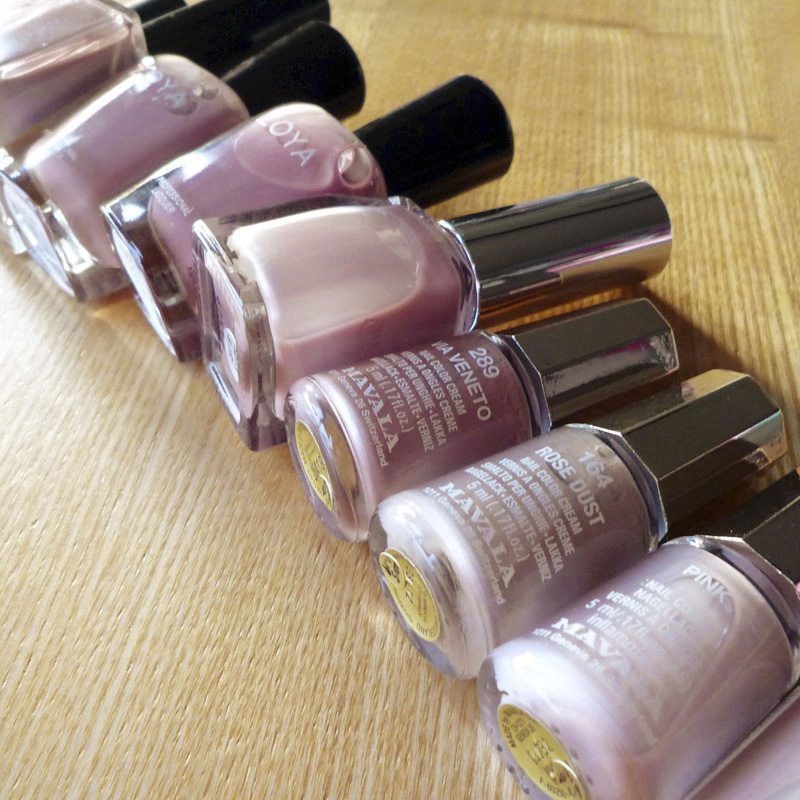
エテュセの人気限定色『RS1 いちごオレ』の話題になりどうやら廃番/販売終了したかもかも?ということで手持ちで入手可能の『いちごオレもどき』を探してみました。結論からいうと該当するものはなく「エテュセさん…おかわりしたいですっ!」と願うばかりです。『いちごオレ』はジェルカラーコートの限定色、このシリーズのなかで一番好きな色!!グレイッシュローズをベースに、微粒のピンク(メイン)、ゴールド?シルバー?あたりも入っているシマー。落ちついた温もりのあるシックな色なのです。それでいてシアーな発色なので重ね塗りしても重くならず、うるっとした仕上がり。そこもまたいい塩梅なのです。思い当たる色を取出してみましたが、ありそうでない………■deborah lippmann『Sweet life』グレイッシュモーヴ。パールラメなし。エテュセと全く違いましたが、おすすめな色。■ADDICTION『069 Park Avenue Princess』グレイッシュモーヴ。パールラメなし。デボラの色を濃く暗くしたのがこれ。というわけで、こちらもエテュセと全く違いますが、やはりおすすめな色。■ZOYA『706 RUE』グレイッシュモーヴ。パールラメなし。上記2色と近い色だが、そのなかではベージュより。よって、同じくこちらもエテュセと全く違いますが、おすすめ!■ZOYA『707 BRIGITTE』赤味よりのモーヴ。パールラメなし。上記3色と同系色、エテュセに比べると不透明度が高い。■MAVALA『289 VIA VENETO』このなかではボトルを並べると一番近い色(だけど少し黄味より)。ただ、エテュセのシマー感が色の内側に溶け込んでいるような見え方に対し、マヴァラはシマーというよりパール感でそれが表面に出るタイプ。そして不透明度もエテュセよりやや高め。■CHANEL『521 ROSE CACHE』当時似ていると感じたシャネル『521 ROSE CACHE』。これは廃番、というかヴェルニそのものがリニューアルしそのなかで『504 ORGANDI』が『521 ROSE CACHE』に近いという情報もあり。比較もありますが、人気色のようなのでいつか入手の予定。『いちごオレ』待ってまーす。
2017.03.11
コメント(5)
-

ettusais【PK2 さくら】
2016年1月に限定発売の『PK2 さくら』。名前通りの淡い桜の花びらのような淡いピンクは、パールラメなしでシアーなタイプ。『PKシリーズ』はこれが4色め。・PK1 桜貝ピンク・PK2 さくら(限定色)・PK3 マーメイドピンク(限定色)・PK4 花束ピンク(限定色)定番色『PK1 桜貝ピンク』をほんの少し白く、明度を上げたのが『PK2 さくら』な印象。一度塗りでは、若干『PK1 桜貝ピンク』の方がピンク味があるかな?と僅かな差。二度塗りで、『PK1 桜貝ピンク』の方がピンク味を増し差がでます。しかしまぁ、色にこだわらなければほぼ同じに感じるかも。私のイメージは可愛らしさは『PK1 桜貝ピンク』大人っぽいのはピンク味ひかえめ『PK2 さくら』。ジェルカラーコートで比較した4色・PK1 桜貝ピンク・PK2 さくら(一番白味ピンク)・PK4 花束ピンク(一番黄味ピンク)・RS2 ばらいろ(一番シアー)ちなみに、私が好き&馴染む色から・RS1 『いちごオレ』・RS2 『ばらいろ』 ・RD1 『苺シロップ』 ・PK2 さくら ・BE3 『ミルクティー』 ・BE2 『ココアクリーム』 ・BE1 シアーべージュ ・PK1 桜貝ピンク ・PK3 『マーメイドピンク』 ・PK4 『花束ピンク』 次の新色はいつかな(๑˃̵ᴗ˂̵)و
2016.06.02
コメント(3)
-

ettusais【クイックケアコート】
2016年5月12日発売のエテュセ『クイックケアコート』『素爪でいるより、爪にいい。リムーバー不要!素爪ケアつや出し美容液』というコピーだけでは、ポリッシュ?美容液?何なの?と首を傾げていましたが、平たーく言うと『手入れが簡単で自然な仕上がりで日持ちしないマニキュア』使い方は、素爪に塗ります。数日で表面の艶がなくなってきたら重ね塗り。落ち方が斑になった場合はリムーバーで落とします。というわけで、最終的にはリムーバーは必要(笑)液は淡いクリアピンクで、パールラメはなし。とろみはなく、水っぽい質感です。塗りやすく、ほぼ塗りムラはなし。乾きはやや早め2-3分で触れても大丈夫です。無香料で、マニキュア系の薬剤の匂いはありますが一般的な物に比べればやや穏やか。仕上がりは、色づきはほとんどなくクリア。表面は磨かず塗りましたが清潔感のある仕上がりではないかと思います。厚みは、液の水っぽさから推測できる通りでません。多めに液を取っても乾燥すると蒸発もあり薄くなります。残念なのはキズが入りやすいこと。日常の些細な摩擦や衝撃で簡単にコートが削られてしまいますがクリアなのでそのキズ加減は凝視しなければ分からず、一日or二日に一度重ね塗りすれば、補修&維持はできます。『薄膜ヴェールで保護、欠け、割れ、二枚爪、乾燥を防ぐ』といった効果については気持ち程度で、それらのケアをするならネイルオイルやクリームでのケア、マニキュアならOPIのネイルエンビーがオススメかなぁと。(ネイルエンビーはエテュセほどキズ、擦れはないです)マニキュアのベースコートとしては、一般的なベースコートと同じ感覚です。便利なような中途半端なようなアイテムですが、私のケースでは、急な打合せで出かける直前に素爪なことに気付き「(資料説明時に)指先見られちゃうなぁ…( ・ὢ・ )」とちょっと意識したのでこれを一度塗り、作業時間は5分以内で完了で助かった!ということから踏まえますと、、、・その場凌ぎで急にネイルケアをしなくてはならない・だけどカラー塗るシーンではない・なんとか取り繕え、あとでネイルを落とすのは面倒(もしくはあとでカラーリングする)といったシーンには良いかもしれません。私は、うーん、リピートはないかも(´-ω-`)ところで、エテュセといえば春は『バカンスネール』なのに2016年は発売なし。その代わりなのか6月9日『ネールクレヨンセット』『ネールカラー(マット)』が限定発売。
2016.05.31
コメント(0)
-

ettusais【5 パンジー】
今週も何かと荒れた日々。ピークは『銀行印無くしたーーーと焦った事件』でした。無事に見つかりましたが、それまで立ち寄った先々に電話、警察の落とし物サイトまで見て「銀行印無くすなんて馬鹿過ぎる‥…うぉーーなんなのこの6月はっ!!!」と凹んだり逆切れしたり安堵したりと。白髪がますます増える。。。そんなときのマニキュア。ベースコートを塗り「さてカラーを…」というところでこの出来事だったので2日間ベースコートで過ごしたら爪先が剥げてしまってそれに気付かずカラーを塗ったので少々ゴワゴワになっています。人差し指の指先が分かりやすいかも。これは下地の状態が悪いのであって、ポリッシュの質に問題はありません。↑は曇りの日の屋外。↓は曇りの日の室内で。色はライラックにラベンダーシマー。シマーさはかなり微細で、塗ってしまうとクリームタイプといっても分からないほど。ですが、このシマーがあることでのっぺりとした見え方にならないようです。バカンスネール12色のなかではほんの少しですが艶が弱めでマットより。今回はディオールのトップコートで仕上げ。今日は出張なので寝なくちゃ。
2015.06.27
コメント(0)
-

ettusais【BE3 ミルクティ】
雨の土曜日。来週からは6月と思うと梅雨も近いなぁと。ミルキーなべージュブラウン。パールラメなし。スキンカラーで地味すぎない落ちついた色です。4-6度塗りになると透けずしっかりと、ミルクティ色。持っているジェルカラーコートで同じ『BE』タイプになる『BE2ココアクリーム』と比べると…ココアクリームは名前通りのココアな赤味があります。どちらもナチュラル系が好きなら好みかも。
2015.05.30
コメント(0)
-

ettusais【RD1 苺シロップ】
今回はエテュセの『RD1 苺シロップ』。ジェルカラーシリーズは、量多めで重ね塗りしても透けます。上のは6-7度塗りだったかなぁ。色が濃くなるとよくあるガーベラの色みたい。葛湯のようなとろみを感じるレッドでシアー系。パールラメなし。クリアタイプですがこれは一度塗りでも色付きが分かります。二度塗りでしっかり赤味が出て蛍光ペンの赤を薄めたような色に。三度塗りではより赤に深みが出ながらも透明感は保っています。紹介してきたジェルカラーコートのなかではポップで健康的な色。これはたしか4-5度塗り。これにセシェがけするともっとウルウルなんでしょうねぇ。
2015.05.22
コメント(0)
-

ettusais【RS1 いちごオレ】
エテュセの『ジェルカラーコート』シリーズがひたすら続き中。バカンスネールにデボラ、ジル、ちふれと待機中。一週間に一色として5-6-7-8月で夏色を塗るとすれば…出番があるのはたった15-18色!!マニキュアで月日の流れを考えるとすぐに秋になりそう。グレイッシュローズをベースカラーに微粒のピンク(メイン)、ゴールド?シルバー?あたりも入っているシマー。落ちついた、ぬくもりのある、シックな色。一度塗りでは、うっすらとピンク味帯びるので、爪色をナチュラルに整えたいなら一度で。二度塗りでは、爪の色(赤味)がまだ透けて重なることもありボトルで見るよりもべージュよりのスモーキーピンクに。三度塗りになると、ほぼ下地が透けなくなることで、ボトルの色/青味よりのスモーキーピンクに。シマーさは何度塗りでも20-30cmの距離で自分では分かる程度で遠目ではパール/ラメのないクリームタイプといった見え方です。あまり派手な色ができない方にもいいかも。塗ったのは一ヶ月前でどれが何度塗りか忘れてしまったけど。はっきりと言えることは年間を通して使えるカラー。私が買ったジェルカラーコート6色のなかでは一番好きかも。シャネル『521 ROSE CACHE』と似ているということで陽射しが違うけど、たしかに似てますね。シャネルもエテュセも10代の女性にはちょっと大人し過ぎるので、20代、できれば半ば以降の方ならぜひ試してほしい色です。
2015.05.20
コメント(4)
-

ettusais【RS2 ばらいろ】
ゴールデンウィーク中はエテュセの『RS2ばらいろ』でした。初日は一塗りで終え、2日目に上からまた一塗り。3日目にまた一塗り…3-4日目に家事の最中に人差指の先が剥げてしまったけどこの方法だと剥がれにくく一週間は持ち、強い衝撃を与えない限りヒビ割れもなし。日に日に色付き、厚みは増し、艶が更新され見た目はよく、縮みも少なく。そうか…ジェルカラーコートは一日一塗りだといいのか(⌯¤̴̶̷̀ω¤̴̶̷́)✧と今更ですが気付きました。一度塗り『RS2 ばらいろ』は赤味ピンクでグロッシータイプ。パールラメなし。一度塗りでうっすらとピンク味が足され厚みはないけど艶があり二度塗りで血色のよいピンクになり厚みはないものの表面はフラットに三度塗りでピンク味はマニキュアと分かる発色になり、厚みも出てきて。以降はこんな感じで液はトロンとした液で塗りやすくムラもできないので淡くても良ければ一度塗りでもいいですね。前の『花束ピンク』と比べると『PK4 花束ピンク』はミルキー。『RS2 ばらいろ』はクリア。使いやすいのは『ばらいろ』かなぁԅ( ˘ω˘ԅ)
2015.05.18
コメント(0)
-

ettusais【PK4 花束ピンク】
連休前ですねぇ。予定が入っているのは1日だけ。あとはゴロゴロしてるか気が向けば外出か…とユルユル。バカンスネールで浮かれていたら『ジェルカラーコート』から新色。『PK4 花束ピンク』コーラル系のピンクでシアータイプ。パールラメはなし。春の今の温かみのある花束を連想させるウォームピンク。黄味よりなのでボトルで見た感じはほっこり可愛いのですが爪に塗るとちょっと気難しさがありますね。これは一度塗りなんですが、ヘアワックスを使ったので艶が落ち、爪先も擦れ落ち気味。シアータイプで黄味ピンクとなると一度塗りだと黄ばんだ爪にピンクを塗っているように見えるんですよね。そして二度塗り。いい天気に撮ったこともあり、うるつやぶりが…む、無駄に最強になってる。実際はこんなにウルウルしてないし、色はシアーではあるけれどもう少し不透明より。『必要以上に写真写りが良いネイル』になってます。感覚的にはこれが近いかなぁ…2-3度塗りで感じる色味は『甚三紅 じんざもみ』『コーラルレッド』のような黄味なピンク。ジェルカラーコートの『ばらいろ』と並べる。ボトルでみるとどちらも可愛いなぁというピンク。『花束ピンク』は乳白っぽいピンクなのが分かります?青味のある『ばらいろ』の方が塗った時に素直にピンクに染まるので使いやすい、お勧めなのは『ばらいろ』になっちゃうかなぁ。『花束ピンク』は一度塗りでは本来の良さが出てこないので二度塗り以上でしっかりとピンクの色味を出すのがオススメ♪
2015.04.27
コメント(2)
-

ettusais【8 スイートピー】
バカンスネールの『スイートピー』は私が思い描くスイートピーの色。庭先に咲くのはもう少し先の花ですかね。ペールピンクでシアータイプ。パール/ラメなし。一度塗りで淡く色付き、二度塗りでも透けます。phは二度塗りだったかな。全体的に色が少し浅いかも?バカンスネールはミニボトルだから減りがやはり早いですね。マニキュア一回で容量の1-2割は消費かな。少量なこともあってどんどん粘度が高くなるのでサクサクと使わないと。そういった点ではバカンス的なまったり感がないポリッシュ(笑)
2015.04.18
コメント(0)
-

ettusais【2015 Vacance Nail “FLOWERS”】
お待たせ中?のエテュセ2015年バカンスネール12色。1から6は、春のトレンドカラー。7から12は、夏のトレンドカラー。サイズはいつものミニサイズ約φ17×h54mm[2ml]で日本製。背景かえてチップはサイズを揃えられず、上下で違います。透明感はこれが分かりやすいかなぁ…では、各色のレポ。『1』『2』『3』『4』■1 わすれな草マイルドなシアンでクリームタイプ。パール/ラメなし。多めに取れば一度塗りで透けません。実際の忘れな草の花びらの色よりは濃くて青味が強いかな。『ディープスカイブルー』や『ドジャーブルー』あたりです。■2 ブーゲンビリアストロベリーピンク。パールラメなしで発色と透明感を併せ持ったグロッシータイプ。グロッシー系にしてはほんのりミルキーがかっています。『ブーゲンビリア』をシアーに、水で薄めたような色。■3 マーガレットクリームがかったオフホワイトでクリームタイプ。パール/ラメなし。ボトルで見るよりも塗ると黄味が出てきます。ありそうで意外となかったユニークなカラー。12色のなかでは塗りムラができやすい。『アイボリー』のようなうっすらと黄味がかった温かみのあるホワイト。■4 花粉オレンジ味のあるサフランイエローでクリームタイプ。パール/ラメなし。コクのあるイエロー。『マリーゴールド』『ガーベラ』と比べると若干色が沈みます。『サフランイエロー』と『ゴールデンイエロー』あたりが近いかな。『マリーゴールド』はちょっとオレンジが強い。『5』『6』『7』『8』■5 パンジーライラックにラベンダーシマー。シマーさはかなり微細で、塗ってしまうとクリームタイプといっても分からないほど。12色のなかではほんの少しですが艶が弱めでマットより。『モーブ』をちょっぴりマイルドにした感じ。光にあたると『ラベンダーモーブ』『クロッカス』あたりかな。■6 わたげグレイッシュホワイトでクリームタイプ。パール/ラメなし。青味、赤味、黄味などに特に偏らない白味のあるグレイ。シャネル、ディオールあたりから発売されると人気がでそうなカラー。■7 葉っぱ黄味のある若葉のようなやわらかなグリーン。クリームタイプ。パール/ラメなし。チップではマイルドで明るさがありますが、爪に塗ると肌色との相性もありますが少し渋味が出てきます。■8 スイートピーペールピンクでシアータイプ。パール/ラメなし。一度塗りで淡く白味ピンクに色付き、二度塗りでも透けます。チップでは私が思い描くスイートピーの花びら通りの色。これは塗りやすく一度塗りでもきれいな仕上り。コツは多めに取り、いつもより少しブラシを浮かすように動かす。『9』『10』『11』『12』■9 マリーゴールドマイルドなオレンジでクリームタイプ。パール/ラメなし。シャーベットにあるようなキャロットオレンジ。『花粉』『ガーベラ』と同じ彩度、質感。■10 ガーベラマイルドなコーラルオレンジでクリームタイプ。パール/ラメなし。ビビッドすぎないポップなカラー。■11 ハイビスカスレッドピンクのシロップにレッドグリッター。ベースカラーは『ブーゲンビリア』と同じようなグロッシーさ。ハイビスカスの方が彩度が強いです。■12 あさがおブルーのシロップに、ブルーグリッター。『ハイビスカス』と同じ液質、グリッターサイズで、色違い。ちなみに、オレンジ3兄弟。これに『1.わすれな草』『7.葉っぱ』でペディキュアにしたらいい色合いでした。2015年のバカンスネールは私には使いやすい組み合わせかも?
2015.04.06
コメント(4)
-

ettusais【PK3 マーメイドピンク】
週末には花見でも…と思っていましたが雨雨雨…この時季になるとネイルは桜のシールを貼ってみたりと楽しんでいましたが時間に追われて四季を愛でる心のゆとりがございません。。。(๑•̆૩•̆)今はエテュセの『マーメイドピンク』。春を意識したわけではなく、最近届いたから塗ってみましたが。こうして客観的に見ると春らしさがありますね。曇りの日。『淡く儚いキレイな指先に』が商品のコピー。色はボトルではミルキーなモーヴピンクに見えますが爪に塗るとそれほどの発色はなく一度塗り、うっすらと白味のあるクリアに穏やかなパールシマー。二度塗り、微かにピンク味を帯びてきますがそれでも白味がメイン。三度塗り、よりピンクが出てきますがそれでも控えめでピンクニュアンスのパールホワイトといった感じです。シマーは、シルバーメインにピンク、グリーン/ブルーも入っていますがメインはシルバーに感じます。重ね塗りすることでシマーさは強くなってきますが、ギラっと鋭いパール調ではなく、サラサラと微粒でエレガントな煌めきです。ボトルのような透けないモーヴピンクと思われて購入されるとちょっと印象が違うかも?場所を変えて。たしか二度塗り。これはウルっとしてるのでおそらく三度塗り。一日一度塗りで、3日間重ねていくとその都度艶が補われますがそのままだと4日目には表面に細かなキズがつくせいかくすんできますね。最終的にはセシェで仕上げるといいかも。
2015.04.04
コメント(0)
-

ettusais【BE2 ココアクリーム】
3月末締切の仕事なのに全くアイデアが浮かばず「そのうちデザインの神が降臨するさー」と余裕でいたけど何も起こらず…ヒーヒー言いながら仕上げ、無事4月になりました。気付けば桜の時期ですが福岡では雨/曇りで週末まで持つかなぁ。。。そんな状況でバカンスネールのチップは待機中。。。※奥2色はバカンスネールではありません。つなぎに『BE2 ココアクリーム』を。上(↑)のphは曇りの日で、下(↓)以降は昼白色の下で撮るとこのような色。光によってオレンジっぽくも見える色です。『大人べージュでスラッと長く!』がコピー。名前の通りココアのような赤味のブラウンをミルキーに薄めたカラーにピンク、グリーン、イエローなどで構成されたピグメントはゴールドシマーに見えます。一度塗りでは透け感がありつつもほんのりと色付きナチュラルなヌードカラーな印象。塗りやすく色の濃淡も出来にくいので好みであれば一度塗り仕上げも有りです。二度塗りでココアの赤味が増し均一なトーンになり、ここでもまだシアーさがあります。ピグメントの輝きは光の加減などによって変わりますが間近で見ればよく分かりますが、パールラメとしてより艶として感じる見え方。三度塗りでほぼ透けませんがグロッシーさがあるので重さはありません。個人的には三度塗りが透明感、ナチュラルさ、清潔感のバランスが良く好み。さきほどTINS到着!迷って『801 Sugar Milkshake』『803 Lemon Syruped Bouquet』の2色に。イエローは想像よりほんのり酸味というか青味があるタイプ。4色のうちこの2色はシアー系という表記だったけど思っていたよりしっかりとした発色。楽しみが増えましたが、どれから塗ろう……(ヾノ・∀・`)
2015.04.01
コメント(4)
-

ettusais【2014 Vacance Nailで研究中】
ネイルアートを久々に研究中。何年も単色塗り、せいぜい指で色を変えるくらいのマニキュア生活でしたがせっかくのエテュセでいろんな色があるので、なんとかならぬかと。『3.くらげ』は、なんとなく分かってはいたのですが単色で塗るのは難しい色でした。塗り終えた感想は「子供の頃の『ぞうさんの色』だなー」です。でまぁ、その色だけで過ごすのが腑に落ちなかったことから今日も一人をいいことに晩ご飯も食べずに娯楽研究が始まったのでした。まだ改善点はあるけれど、他の色を合わせたら『ぞうさんの色』がよく見えてきました。しかし夜の写真は無駄に年齢がでてる…ここまで老けてないと思うけどこれもまた事実か。図案と肌年齢のギャップの方が問題。゚(゚´Д`゚)゚。
2014.06.05
コメント(2)
-

ettusais【11.海ガメ】
4月半ばからエテュセのバカンスネールを皮切りにOPI、ZOYA、TINSの新色が続々と到着。「えーーーと、どれから塗ろう…」と迷いつつも嬉しいのですが、半年くらいネイルから遠退いていたせいか塗ったり、撮影することが億劫にもなって。リズムが崩れるとこうなっちゃうのかなぁ。まず選んだのは『海ガメ』。マイルドなグリーンにゴールドシマー。この色は、塗りやすいです。一度塗りでは少しムラになるけれど、二度塗りだときれいに仕上ります。ベースコートはエテュセの新発売のファイバー入りのもの。『海ガメ』の後日、OPIのカラーもこのベースコートで塗りましたが欠け、擦れ、ヒビ割れといった欠点がないようなので、なかなかいいかも。グリーンカラー繋がりで。一目惚れしたiPhoneケースを手にしたことから、初代から追いかけ続けていたインフォバーとお別れ。連休にiPhoneに機種変したけどMac使いなのに格闘中…GWにしたことは・帰省(しかも2回…)・Mac改造(4年目にしてHD死亡)・小石原の陶器市へ。『小石原ポタリー』がきっかけで、いつか小石原へ行きたいと思っていたのと連休中は20%OFFということもあり出かけました。買い物中はかなり出費した気分でいましたが、帰宅して整理してみると14点で¥22,000-くらいだったので大満足。いろんな窯を巡りましたが、買い物したところは『原彦窯』は小石原ポタリーのグループに参加している窯。『マルダイ窯』藁葺きの古民家で、中はモダン。『高取焼』今回の買い物で一番高かった↓ご飯茶碗¥4,500-(から20%OFF)こちらも藁葺きの古民家ですが室内も歴史のある風格でした。今日は既に通常運転、のはずなのにホリデー感が抜けていません。
2014.05.08
コメント(4)
-

ettusais【Nail Guard】
エテュセの4/17発売『ネールガード』。ファイバー入りのベースコート、ハードナー、コンシーラー。ここ数年気に入っているベースコートはバターロンドンですが、ちょっと新しいものを使いたい時期でもあり購入。色は、ピンク味帯びた乳白色で、パール/ラメはなし。ファイバー、繊維入りですが、ボトルからはその質感は分かりません。液質は、少しトロっとしており一度塗りでは均一に塗りやすいですが、二度塗りだと少し濃淡が出やすくなります。発色は、塗っている最中はその白味がそこそこでてきますが、乾くと少し透明感が出ます。一度塗りでは、やや白味がありながらもクリアに近く、二度塗りになると、透け感はありながらも白味が分かる発色です。こちらはどちらも一度塗りですが、表面に繊維がでてくるのでこのままで過ごすには見栄えはあまり良くはないかなぁと。ちなみに、二度塗りだと繊維は目立ちにくくなりますが色味があまりよくないので(肌の相性もあるかもしれませんが、健康的な肌、爪色には見えない)このアイテムはカラーを塗ることを前提として使うのがいいようです。乾燥は、普通からやや早め。5分くらいで重ね塗りが出来るので個人的にストレスない時間です。その後バカンスネールを二度塗りし数日経過しましたがマニキュアの持ちはいいかも。ところで。既に注文中で楽しみにしているOPIの新色『OPI Sheer Tints Collection』その名の通りシアーな仕上り、私の表現でいう『グロッシー系』の登場。重ね塗りすることで、ウルウルで艶々なネイルに。ここ数年このタイプが好きなので早く到着しないかと。S01 I'm Never AmberrassedS02 Be Magentale With MeS03 Don't Violet Me DownS04 I Can Teal You Like Meミニボトルのセットもあるので、こちらを選ぶのもいいですね。グロッシーファンとしてはレギュラーサイズを注文。5月には入荷のようです。
2014.04.23
コメント(0)
-

ettusais【2014 Vacance Nail】
2年ぶりに購入したエテュセ『バカンスネール』2014年のコンセプトは『Under The Sea』海中の色彩がテーマ。左から…1.深海2.あぶく3.クラゲ4.ムラサキ貝5.イソギンチャク6.タツノオトシゴ7.カクレクマノミ8.珊瑚9.チョウチョウウオ10.アオヒトデ11.海ガメ12.マンボウネット注文で、この12色と新発売の『ネールガード/ベースコート』がセットで¥4,136-。カラーは1本¥259-、ベースコートは¥1026-。計算が合わないなぁと思ったら、セットを購入すると2円ですが高くなるようで(あらま)まずは『1』『2』『3』『4』■1.深海 [シマー] ウルトラマリンに、ピンク、ブルーメインのシマー。若々しい夏らしさのあるブルー系。『海ガメ』ほどシマーが色に影響しません。■2.あぶく [ラメ] シルバーに、レインボーの輝き。海底から水面へ泡が立ち上っていく様子を凝縮したようなカラー。マンボウよりも粗いラメ。■3.クラゲ [クリーム] ミルキーなブルーグレイ。パール/ラメなしのクリームタイプ。個人的にはクラゲ/ゼリーフィッシュなので、この色でゼリーっぽい発色(グロッシー系)だとイメージがぴったりだったな。■4.ムラサキ貝 [クリーム] ミルキーなライラックピンク。パール/ラメなしのクリームタイプ。つづいて『5』『6』『7』『8』■5.イソギンチャク [シマー] 赤紫味よりのマゼンタピンクに、ピンク、シルバー、メインのシマー。といってもそれほどシマーは目立たないかも。■6.タツノオトシゴ [クリア&ラメ] クリアなストロベリーレッドベースに、ピンクラメ。ラメの大きさは今回のシリーズのなかでは一番大きい。■7.カクレクマノミ [クリア&ラメ] クリアなオレンジベースに、オレンジもしくはゴールドラメ。『6.タツノオトシゴ』と同じラメ感。■8.珊瑚 [クリーム] ベビーピンク。『珊瑚』という名前からコーラルピンクを思い浮かべそうですがこれはそれほど強いオレンジ/レッドさはありません。ただ、phは実際より淡く薄くなっているのでこのくらいのピンクを少し明るくした感じ。最後に『9』『10』『11』『12』■9.チョウチョウウオ [クリーム] ライムイエローほど青味は強くないですが、クールな印象のあるマイルドなイエロー。パール/ラメなし。■10.アオヒトデ [クリーム] アクアグリーン。パール/ラメなしのクリームタイプ。『9.チョウチョウウオ』の黄色と相性の良いグリーン。■11.海ガメ [シマー] マイルドなグリーンにゴールドシマー。緑色の絵の具に少し白を混ぜたようなまろやかさ。それにゴールドシマーという黄味(黄金色)感が入っているためシンプルなグリーンではありません。■12.マンボウ [パール] べージュグレイ系パール。シルバーでもほんのりと温かみを感じます。マンボウのゆったりとした泳ぎに合っている色。一ヶ月ぶりにマニキュアして「あーーやっぱり塗らなくちゃ♪」と。今週末からは連休が始まるし、徐々にいつもの調子に戻ってきたかな?ベースコートもいい感じなのでまた後日。
2014.04.21
コメント(2)
-

ettusais【夏の終わりに水風船】
盆休み中の夏祭り、浴衣に水風船を持ってる日本の夏の子供の姿を見て「そういう柄もいいなぁ…」とイメージ。今回のベースカラーは縦割りで近似色『バハマのサンドビーチ』『ハワイのハイビスカス』で2色使用。といっても自己満レベルの色の違いなのでw 分かりやすくすると、この部分が『バハマのサンドビーチ』☆その上からラメ『マイアミのネオン』を天の川っぽい感じのカーブで塗る。ホワイト『パラオのミルキーウェイ』でドットを。パレットに広げたホワイトを少し乾くまで待ち、ねっとり糸を引くようになったら爪楊枝のようなもので糸を引きそのまま爪の上にランダムに。きちんと乾かないうちに、トップコートを塗ったら色が流れたー。しかしまぁ、遠目で見れば問題なく出来上がり。そういえば、こういうお菓子あるなぁ…と調べたら『雪の宿』っていう名前の砂糖がのっかった煎餅。この煎餅色でアートもいいかもっ♪1-RIMMEL_Treatment Hardener2-ettusais_#7 バハマのサンドビーチ3-ettusais_#8 ハワイのハイビスカス4-ettusais_#9 マイアミのネオン5-ettusais_#3 パラオのミルキーウェイ6-ADDICTION_Top Coat7-ADDICTION_Top Coat8-ADDICTION_Top Coat
2012.08.19
コメント(4)
-

ettusais【Gel top coat N + Vacance Nail 2012】
エテュセの毎年恒例の『バカンスネール』。プチプラということもあり気持ちが大きくなり大人買いしたわけですが、一気にずらーーっと色を揃えてしまうと、色好きとしては至福の時だけど「あぁぁ、何から塗ろう…」と贅沢な悩みもつきものでして。ひとまずぱっと目に入りカワイイ!と思った赤をベースに塗りました。#8『ハワイのハイビスカス』はコーラルレッドにパール/ラメなしのクリームタイプ。かわいらしさのあるキュートなレッド。OPI/2012オランダコレクションのH61に近い色。こちらの方が若干黄味が強め。他にもポツポツと色をのせたけど、仕上がりイメージができないままで、最終的に何をしたかったのか分からないものになっちゃったw↓は、ボトルの持ち位置が悪くてシールのバカンスネールの文字の『バカ』だけ見えててスミマセン。1-ESSIE_Protein Base Coat2-ettusais_#8 ハワイのハイビスカス3-ettusais_#8 ハワイのハイビスカス5-ettusais_#5 リオデジャネイロのカーニバル6_ettusais_#6 セイシェルの夕暮れ7_ettusais_#7 バハマのサンドビーチ8_ettusais_#9 マイアミのネオン9_ettusais_トップコートさて。エテュセのジェルトップコートについて。テクスチャーは、ややトロミあり。セシェに比べると、水っぽいので均一に、薄めには塗りやすい。液の色は、こんな感じでやや白濁。ブラシは、平筆。【速乾性&硬化性】これまで同様、もしくは若干早い?セシェと比較してもストレスのないスピード!塗ってから3時間後、うつ伏せ寝で枕の下に手を入れ適度に圧をかけたけど問題なし!【縮み】ベース→カラー二度塗り→表面が乾いたらトップコートを塗る、という一般的な流れで風呂上がりの夜に塗った場合。3時間後には最大1mmの縮み。翌朝も若干縮んでいた。縮み部分は、根元のみ(これはセシェも同様)。【艶】塗った当日は最高にツヤピカで透明感もあり。(セシェと同じくらい)数日後は気持ーち透明度が落ちる。(セシェはそれはない)しかし、旧タイプのエテュセのものと比較すると改善されてる。5-7日後、指によってはヒビ割れで曇るという感じ。【厚み】旧タイプとあまり変化がない。セシェよりも厚みはないものの、量を多めに取って塗るか、二度塗り(またはそれ以上)すれば、それなりに厚く&好みの厚みに対応可能。【ヒビ割れ】・ベースコート一度塗り(エッシー)・カラー二度塗り(シュウウエムラ)・トップコート一度塗りという条件で、いわゆる主婦的な家事&仕事はMacでデスクワークという環境で、約10日後はこんな感じに(途中経過のphは取り忘れてましたー)普段は5-7日くらいでオフするので、ここまで持たすことはないけど。塗ってから3-5日は気になることなく、以降だんだんヒビ割れが入ってきました。一度ヒビが入ると急速に広がっていく感じ。ちなみに掲載してるのは左手で、利き手の右手の方がよりヒビ割れが強く入ってました。【持続性】一般的なものよりはいいと思う。ヒビ割れするものの、欠けたり、擦れて落ちるということはなかったので定着はなかなか強そうな印象です。というわけで。このトップコートを使ったのは、一番最初のエテュセのカラー/レッドと、このシュウの2回だけなので、データとしては全然不足ですが。まぁ旧タイプと比較すると、ヒビ割れの問題は完璧ではないものの改善してると思いました。1週間くらいで塗り替える、というパターンであれば買ってもいいと思います。私自身も、これならリピートしてもいいかなぁと。(今はセシェのデカボトルに、他いろいろあるので、早々にリピートはできないけど)【なんとなくのまとめ】・5-7日くらいで塗り替えるならエテュセでもいい。・現時点で一番オススメはセシェ(90点)、次点はエテュセ(75-80点)。
2012.05.15
コメント(6)
-

ettusais【2012 Vacance Nail】
4月恒例のネイルポリッシュといえば…エテュセ『バカンスネール』☆前回買ったのは…2010年で、去年は買い忘れかスルーか覚えてないけど。今回はネットで、12色+トップコート、おまけ(トート)のセットものを注文。色展開はこんな感じ。このphが一番発色近いかなぁ。1_プーケットの夕日 [P]2_バリ島の大自然 [P]3_パラオのミルキーウェイ4_モルディブの青空5_リオデジャネイロのカーニバル6_セイシェルの夕暮れ7_バハマのサンドビーチ8_ハワイのハイビスカス9_マイアミのネオン [G]10_ゴールドコーストの海岸 [G]11_ドバイの砂漠 [P]12_ジャマイカのカフェタイム [P] [P/パールタイプ]、[G/グリッタータイプ]、他はクリームタイプ。2009年の色展開を鮮やかにした内容って感覚かな。「なーんか色数が少ない気がする…」と思ってたんだけど、過去記事貼付けてたら、15色から12色に減ったようですね。#1.2.3.4#5.6.7.8#9.10.11.12では、色レポ。1_プーケットの夕日ピーチピンクベースに、ピンクの偏光パール。12色のなかでは唯一のスキンカラー。偏光であるものの、黄味の強さがあるのでぱっと見は『肌色』という感覚。2_バリ島の大自然ミルキーなミントグリーンにシルバーパール。肌色を選ぶグリーンですが、くすみがなく明るい発色。3_パラオのミルキーウェイ純白。パール/ラメなしのクリームタイプ。一度塗りで透け感のないカバー力。アートが得意な方なら、他の色とこの色を上手く活用できそうですね。鮮やかな色彩でクリームタイプが好きな方ならこの『3』から『8』まではおすすめ。4_モルディブの青空シアン。パール/ラメなしのクリームタイプ。こちらも一度塗りで透け感のない発色の良さ。5_リオデジャネイロのカーニバルイエロー。パール/ラメなしのクリームタイプ。純粋な黄色でクセなし。6_セイシェルの夕暮れオレンジ。パール/ラメなしのクリームタイプ。こちらもイエロー同様にいわゆる純粋なオレンジ。7_バハマのサンドビーチマゼンタ。パール/ラメなしのクリームタイプ。OPI/2012オランダコレクションのH59に近い色。こちらの方が若干青味控えめ。8_ハワイのハイビスカスコーラルレッド。パール/ラメなしのクリームタイプ。かわいらしさのあるキュートなレッド。OPI/2012オランダコレクションのH61に近い色。こちらの方が若干黄味が強め。個人的にこの色は肌を白くみせてくれる予感。9_マイアミのネオンクリアピンクベースに、ホログラムの微粒サイズと六角形の2種類のラメ入り。ザラッとした感じに見えるけど、塗ると意外と凹凸のないグリッター。10_ゴールドコーストの海岸クリアイエローベースに、ホログラムの微粒サイズと六角形の2種類のラメ入り。『9』と同じテクスチャーのグリッタータイプ。ただし、こちらの方が六角ラメが多め。11_ドバイの砂漠うっすらとカーキニュアンスのあるアンティークゴールド。パールタイプ。夏にギラっとしたゴールド系を塗りたい方には『11』『12』をオススメ。12_ジャマイカのカフェタイムブロンズゴールド。パールタイプ。色白なら肌をより白く、日焼け肌ならよりセクシーに見せてくれそうな色。というわけで。今回は複雑な色味ではないので見た感じのままな印象で素直に色選びしても間違いはなさそう(なかでもビビッドカラー系はまぁ想像するような色だと思われます)試し塗りしたものでは、上の背景黒のものが一番近いですが他の背景も。そして、もう一つの楽しみであり期待だったのは…リニューアルした『トップコートN』なのだっ☆この青いボトルでは3回めのリニューアルになるのかな?セシェと比較すると乾きの早さ、縮みは同じ。艶、厚み、固さはやや劣る。(厚みはちょっと面倒だけど重ね塗りをすれば解決)液の質感がセシェよりさらっとしているので、扱いやすい!というわけで、なかなか良いのだけど使っていくうちに判明した完全にダメな点でリピートにつながらなかった理由が『仕上げた数日後にはヒビ割れが入る』こと。「これさえなければー」と残念に思っていたわけですが、やーーーっと改善してくれたらしいので、今回は期待も込めてこのセットを購入したわけです。とりあえず今回は、色のレポだけで。トップコートについては何度か繰り返してきっちりレポします。最近のマニキュアは単色か、重ねて仕上げて終わり…となってますけど、バカンスネイルを買ってしまうと一気に色数を手にするから過去を振り返るとちょこちょこ頑張ってる自分w・しましまフレンチ・トラぷりん・ポップなラスタカラー2012年版でも頑張れるのかしらん…(だんだん面倒くさがりになってる)
2012.04.25
コメント(4)
全21件 (21件中 1-21件目)
1


