

A treemap shows your data organized into dimension hierarchies. For example, you can use a treemap to show the average annual sales of each item in a product category, broken down by its subcategory and its place in the product hierarchy.

Treemaps in Looker Studio
Data in a treemap is displayed in "branches" (also called "nodes"). Each branch can have zero or more sub-branches, and one parent branch (except for the root, which has no parents). Each branch is displayed as a rectangle, sized and colored according to the values in your data. Sizes and colors are valued relative to all other branches in the graph.
Treemaps are a good hypothesis-generation tool because they can help expose the relative importance of, and the relationship between, different entities.
Treemap examples
The following treemap displays the number of items sold by an online pet store. The branch labels come from the Departmentand Itemdimensions.
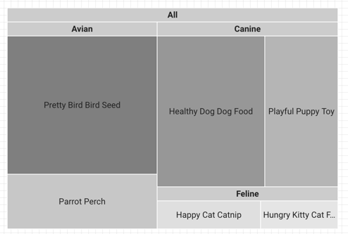
Here's how the underlying data for this chart is organized:
Add the chart
Add a new chart or select an existing chart. Then, use the Propertiespanel to configure the chart's Setuptab and Styletab properties to set up the chart data and style the chart, respectively.
Set up the chart data
The options in the Setuptab of the Propertiespanel determine how the chart's data is organized and displayed.
Data source
A data source provides the connection between the component and the underlying dataset.
- To change the chart's data source, click the current data source name.
- To view or edit the data source, click the
 Edit data sourceicon. (You must have at least Viewer permission
to see this icon.)
Edit data sourceicon. (You must have at least Viewer permission
to see this icon.) - Click Blend datato see data from multiple data sources in the same chart. Learn more about data blending .
Dimension
Dimensions are data categories. Dimension values (the data that is contained by the dimension) are names, descriptions, or other characteristics of a category.
Drill down
This option appears on charts that support it.
Drilling down gives viewers a way to reveal additional levels of detail within a chart. When you turn on the Drill downswitch, each dimension that you add becomes another level of detail that you can drill into. Learn more about chart drill down .
Levels to show
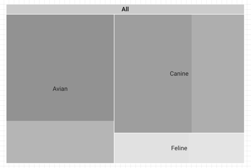
The Levels to showoption determines the granularity of the chart. For example, the sample chart in the Treemap examples section on this page has Levels to showset to 2, causing it to show two levels of detail ( Departmentand Item).
Setting Levels to showto 1causes the chart to display only one level of detail ( Department):
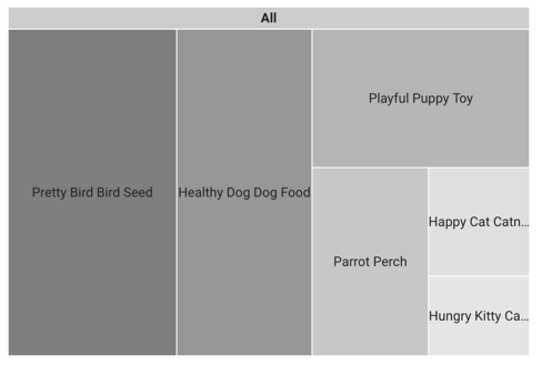
What's the difference between drill down and levels to show?
Drill downlets you focus on a specific level of detail, while Levels to showcontrols how many levels of detail appear in the treemap. For example, here's the result of drilling down into a chart. Note that it now displays only one level of detail, but that level is now the Itemdimension level.
See an example of a treemap with drill down turned on (the report is in English only).
Metric
This option displays the metric data broken down according to the selected dimension. For example, a chart that shows annual sales data could be broken down by a Sales Regiondimension to show sales by region or by an Employee IDdimension to show sales by sales associate.
Optional metrics
You can add optional metrics by turning on the Optional metricsswitch and selecting metrics from the Add metricfield selector. You can also click metrics from the fields list on the Datapanel and place them in the Optional metricsselector.
Metric sliders
Turn on the Metric slidersswitch to add a metric slider to your chart.
Fields
The Fieldsoptions let you choose how to color the treemap. Select Metricor Dimensionto color the treemap by either the metric or the dimension fields that are set. By default, treemap charts are colored by Metric. The Fieldssetting determines the available options in the Color bysetting in the Styletab.
You can optionally choose another metric for the Secondary labelsetting to display that metric's corresponding metric values in the treemap chart.
Filter
Filters restrict the data that is displayed in the component by including or excluding the values that you specify. Learn more about the filter property .
Filter options include the following:
- Filter name:Click an existing filter to edit it. Mouse over the filter name and click Xto delete it.
- Add filter:Click this option to create a new filter for the chart.
Date range dimension
This option appears if your data source has a valid date dimension.
The date range dimension is used as the basis for limiting the date range of the chart. For example, this is the dimension that is used if you set a date range property for the chart or if a viewer of the report uses a date range control to limit the timeframe.
Default date range filter
The default date range filter lets you set a timeframe for an individual chart.
Default date range filter options include the following:
- Auto:Uses the default date range, which is determined by the chart's data source.
- Custom:Lets you use the calendar widget to select a custom date range for the chart.
Learn more about working with dates and time .
Total rows
Treemaps can display from 5 to 5,000 rows of data.
Group others
Turn on the Group othersswitch to aggregate the results that are outside of the specified Number of serieslimit into a series that will have the label Others. When enabled, Group otherslets you compare other series against the context of the remaining results.
Chart interactions
When the Cross-filteringoption is enabled on a chart, that chart acts like a filter control. You can filter the report by clicking or brushing your mouse across the chart. Learn more about cross-filtering .
Style the chart
The options in the Styletab control the overall presentation and appearance of the chart.
Chart title
Turn on the Show titleswitch to add a title to your chart. Looker Studio can automatically generate a title, or you can create a custom title for the chart. You can also customize the title's styling and placement.
Autogenerate
This option is enabled by default. When Autogenerateis enabled, Looker Studio generates a title that is based on the chart type and the fields that are used in the chart. The autogenerated title will be updated if you change the chart type or make changes to the fields that are used in the chart.
To add a custom title to your chart, enter it into the Titlefield. This will turn off the Autogeneratesetting.
Title options
When the Show titlesetting is enabled, you can use the following title options:
- Title:Provides a text field where report editors can enter a custom title for the chart.
- Font family:Sets the font type for the title text.
- Font size:Sets the font size for the title text.
- Font color:Sets the font color for the title text.
- Font styling options:Applies bold, italic, or underline styling to the title text.
- Top:Positions the chart title at the top of the chart.
- Bottom:Positions the chart title at the bottom of the chart.
- Left:Aligns the chart title to the left side of the chart.
- Center:Centers the chart title horizontally.
- Right:Aligns the chart title to the right side of the chart.
Treemap
These options control the appearance of the treemap:
- Show branch header:Shows or hides the parent branches.
- Branch header color:Sets the color of the branch header. This setting appears when Show branch headeris enabled.
- Show scale: When enabled, displays the value scale for branch color colors. This setting appears when Gradientis the selected Color byoption .
- Border radius:Sets the border radius of the branches. The higher the value, the more rounded the edges of the branches will appear.
Color By
These options control how your data is colored:
- Single color:When this option is selected, the data series is displayed in shades of a single color. Otherwise, the chart is displayed in multiple colors, according to your report theme . You can set specific colors by using the color picker.
- Dimension values:This option colors each dimension value in the chart with the color that is specified in the Manage dimension value colorsmap. The Dimension colorssetting ensures that your data uses color consistently, regardless of the position of that data in the chart. This option appears only when Dimensionis selected in the Fieldssetting
of the Setuptab.
- Enable multi-tone:When this setting is enabled, branches are displayed in varying shades of the colors that are set in the Manage dimension value colorsmap, according to the branch dimension value. This option appears when Dimension valuesis selected.
- Gradient:This option colors each branch in multiple shades of the Max color valuesetting, with the option to display the coordinating value scale . Additionally, you can customize the colors that are set for Mid color valueand Min color value. The Gradientoption appears only when Metricis selected in the Fieldssetting of the Setuptab.
Label
These options set the font style, font size, font color, and value format for the text in the chart:
- Font family:Sets the font type of the legend font.
- Font size:Sets the size of the legend font.
- Font color:Sets the color of the legend font.
- Show data labels as:Sets the data that are displayed in the branch labels. The options that are selectable depend on the type of field, if any, that is set for the Secondary labelsetting
in the Setuptab. The data label options include the following:
- None:Displays branches with no data labels.
- Dimension only:Displays the dimension values in each branch.
- Dimension and metric (value):Displays the dimension and metric values in each branch.
- Dimension and metric (percent):Displays the dimension value and the percentage of the metric value against the total of metric values in the chart.
Legend
These options determine the placement and appearance of the chart legend:
- Display legend:When enabled, displays the chart legend.
- Position:Sets the position of the legend.
- Alignment:Sets the alignment of the legend relative to the selected position.
-
Align legend with grid:Sets the alignment of the legend with the position of the grid, instead of aligning with the title.
-
Max lines:Sets the number of lines that are used by the legend. If the number of series requires more lines, overflow items can be displayed by clicking the <and >arrows.
-
Font family:Sets the font type of the legend font.
-
Font size:Sets the size of the legend font.
-
Font color:Sets the color of the legend font.
Background and border
These options control the appearance of the chart background container:
- Background:Sets the chart background color.
- Opacity:Sets the chart opacity. 100% opacity completely hides objects behind the chart. 0% opacity makes the chart invisible.
- Border color:Sets the chart border color.
- Border radius:Adds rounded borders to the chart background. When the radius is 0, the background shape has 90° corners. A border radius of 100° produces a circular shape.
- Border weight:Sets the chart border line thickness.
- Border style:Sets the chart border line style.
- Add border shadow:Adds a shadow to the chart's lower and right borders.
Chart header
The chart header lets viewers perform various actions on the chart, such as exporting the data, drilling up or down, or sorting the chart. Chart header options include the following:
- Chart header:Controls where the chart header appears on the chart. The Chart headeroptions include the following:
- Do not show:The header options never appear. Note that report viewers can always access the options by right-clicking the chart.
- Always show:The header options always appear.
- Show on hover (default):Three vertical dots appear when you hold the pointer over the chart header. Click these to access the header options.
- Header font color:Sets the color of the chart header options.
Reset to report theme
Click Reset to report themeto reset the chart settings to the report theme settings.