

You can set the font and background colors to be used in your charts based on the data. For example, you can highlight an entire table row font color to green if the value for a field called Campaignis "Summer Sale"; or you can set a scorecard chart background to red if the value for a field called Clicksis less than 100.
Single color conditional formatting
Single color conditional formatting lets you apply a specific font color and background color to your data. Single color conditions can include the following:
- Dimensions
- Metrics
- Multiple conditions using AND/OR logic
You can use single color formatting in the following types of charts:
Use single color formatting on a table chart
To apply single color formatting to a table chart, follow these steps:
-
Select a table chart.
-
In the Propertiespanel, open the STYLEtab.
-
In the Conditional formattingsection, click + Add formattingto open the Create rulesmenu.
-
In the Color typesection, select Single color.
-
In the Format rulessection, use the Select a fieldmenu to choose a field for comparison. Depending on your chart configuration, the options can include the following field types:
- Dimension: Compare to a dimension value.
- Metric:Compare to a metric value.
- Select any field:Compare to any value in the chart (see the Select any field section on this page for more information).
-
From the Select a conditionmenu, select a comparison condition. For example, you can choose an option like Contains, Equal to, or Empty.
-
In the Input valuefield, enter a value.
For metrics, you can enter a literal value or specify another metric in the chart. For example, "Summer Sale" or Forecasted Sales. -
Choose the colors in the Color and stylesection to apply when the format rules are met.
-
Click Save.
Use single color formatting on a pivot table chart
To apply single color formatting to a pivot table chart, follow these steps:
- Edit your report .
- Select a pivot table chart.
- In the Propertiespanel, open the STYLEtab.
- In the Conditional formattingsection, click + Add formattingto open the Create rulesmenu.
- In the Color typesection, select Single color.
- In the Format rulessection, choose one of the following comparison options:
- Metric: Compare to a metric value.
- Row: Compare to a row dimension value.
- Column: Compare to a column dimension value.
- Any: Compare to any value in the chart (see the Select any field section on this page for more information).
- Select a comparison condition from the Select a conditionmenu. For example, you can choose an option like Contains, Equal to, or Empty.
- Enter a value in the Input valuefield.
For metrics, you enter a literal value or specify another metric in the chart. For example, "Summer Sale" or Forecasted Sales. - Optionally, click the Apply when collapsedcheckbox in the Format rulessection to apply the formatting to pivot tables that are collapsed . Conditional formatting will apply to the visible row when a collapsed value meets the applied conditions.
- Choose the colors in the Color and stylesection to apply when the format rules are met.
- Click Save.
Use single color formatting on a scorecard or bar chart
You can highlight values in scorecard and bar charts based on specific conditions. To apply single color formatting to a scorecard or bar chart, follow these steps:
- Edit your report .
- Select a scorecard chart.
- In the Propertiespanel, open the STYLEtab.
- In the Conditional formattingsection, click + Add formattingto open the Create rulesmenu.
- In the Color typesection, select Single color.
- In the Format rulessection, the Valuesoption is selected and can't be changed. The Valuesoption automatically uses the current scorecard metric as the basis of the formatting rule.
- Choose a comparison condition from the Select a conditionmenu. For example, you can choose an option like Contains, Equal to, or Empty.
- Enter a value in the Input valuefield.
- Choose the colors in the Color and stylesection to apply when the format rules are met.
- Click Save.
Select any field
The Select any fieldoption in the Format rulessection lets you define a single color format rule based on any field in the chart.
To use the Select any fieldoption, click Select any fieldfrom the comparison options in the Format rulessection.
Color scale conditional formatting
Color scale conditions let you evaluate a single metric against its percentage or absolute numeric value.
You can use color scale formatting on the following types of charts:
Use color scale formatting on a table chart or pivot table chart
To use color scale formatting on a table or pivot table chart, follow these steps:
- Edit your report .
- Select a table chart or pivot table chart.
- In the Propertiespanel, open the STYLEtab.
- In the Conditional formattingsection, click + Add formattingto open the Create rulesmenu.
- In the Color typesection, select Color scale.
- In the Format based onsection, choose a field in the Select a fieldmenu. You can select only a single metric as the basis for a color scale.
- In the Color and stylesection, select a part of the chart to format.
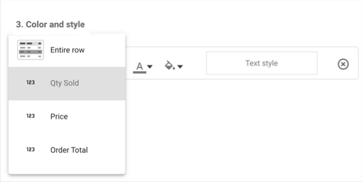
- For table charts, you can format individual fields or the entire row.
- For pivot table charts, you can format only one of the metrics in the chart.
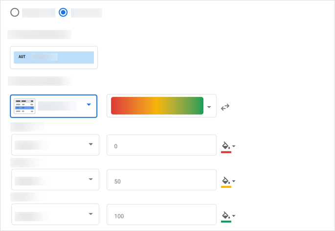
- Select a color gradient
. Click the
 Reverse color scalearrow button to change the direction of the gradient.
 - For each data Point, enter a value into the Input valuefield, and click the Background colorbutton to customize the background color for each data point.
- Click Save.
Use color scale formatting on a scorecard or bar chart
To use color scale formatting o a scorecard or bar chart, follow these steps:
- Edit your report .
- Select a scorecard chart.
- In the Propertiespanel, open the STYLEtab.
- In the Conditional formattingsection, click + Add formattingto open the Create rulesmenu.
- In the Color typesection, select Color scale.
- In the Format rulessection, the Valuesoption is selected and can't be changed. The Valuesoption automatically uses the current scorecard metric as the basis of the formatting rule.
- In the Color and stylesection, choose a color gradient
. Click the Reverse color scalearrow buttonto change the direction of the gradient.
- For each Point,enter a value into the Input valuefield and click the Background colorbutton to customize the background color.
- Click Save.
Compound format rules
Conditional formatting rules can include multiple conditions using AND
or OR
logic.
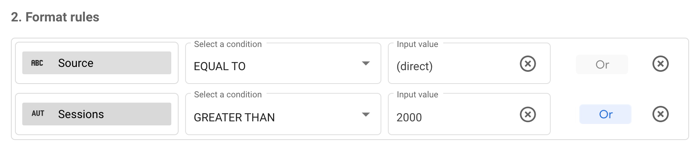
In the following example, a table chart will format rows that match the condition when the value for a dimension called Sourceis EQUAL TOto "(direct)", or when the value for a dimension called Sessionsis GREATER THAN2000.
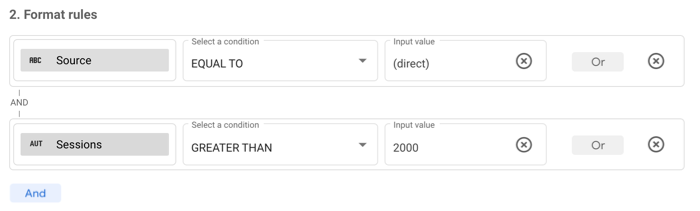
In this example, a table chart will format rows that match the condition when the value for a dimension called Sourceis EQUAL TO"(direct)" ANDwhen the value for a dimension called Sessionsis GREATER THAN2000. Both conditions must be met to be formatted.
Format rule order
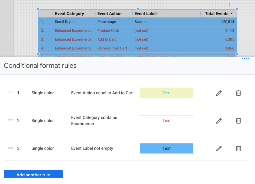
The order in which you specify format rules can be important. Multiple rules in a chart are evaluated in sequential order, and the last set of true conditions found is the rule that is applied. For example, there are three rules in a table:
- Rule 1 sets both a font color and a background color.
- Rule 2 sets a font color.
- Rule 3 sets a background color.
When all three rules are true, the font color from Rule 2 and the background color from Rule 3 are applied. Rule 1 will be ignored.
You can reorder rules by clicking the rule in the Conditional format rulesmenu and then dragging and dropping the rule into position.
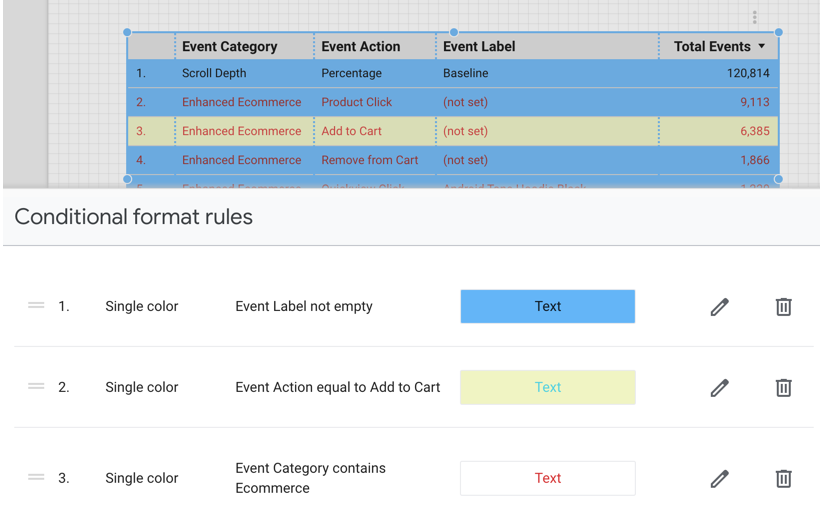
When Rule 3 from the previous example is moved to the first rule position, its background color setting is carried through the rule hierarchy and is applied to the table.
What you can format
You can apply conditional formatting to the following portions of your charts:
Format the entire row
The Entire rowoption applies the colors that you select to every row in the table that matches the condition.
Format a specific field
To format a specific field in a table, select that field from the menu.
For scorecards, or for tables that use the Select any field format rule, this option appears as Cells, and it is the only option available.
Format drill-down dimensions and optional metrics
You can apply formatting rules to drill-down dimensions and optional metrics. The formatting rules will only take effect when those fields are selected in the chart.
How to select colors
You can use single colors or a color scale to format your charts.
Single colors
Use the color pickers to select the font color and background color to the values specified for each condition. An example of how the colors will appear in the chart is displayed next to the color selection in the Create rulesmenu.
Color scale
Data points determine the minimum, middle, and maximum values of your color scale. By default, a new color scale defines three data points that are based on percentages, with preset colors (red, yellow, green). You can base the scale on absolute numbers and select different colors for each data point.
You can have a maximum of five data points and a minimum of two data points.
- To add more data points, hover your cursor over an existing data point, and click Add
 .
. - To remove a data point, hover your cursor over an existing data point, and click Delete
 .
.
Use preset colors based on your current theme
Click the down arrow on a color scale preview to choose a new preset color scale. These preset scales are based on your report theme, which lets you keep your report visually consistent. The last two color scales are optimized specifically for visually impaired users.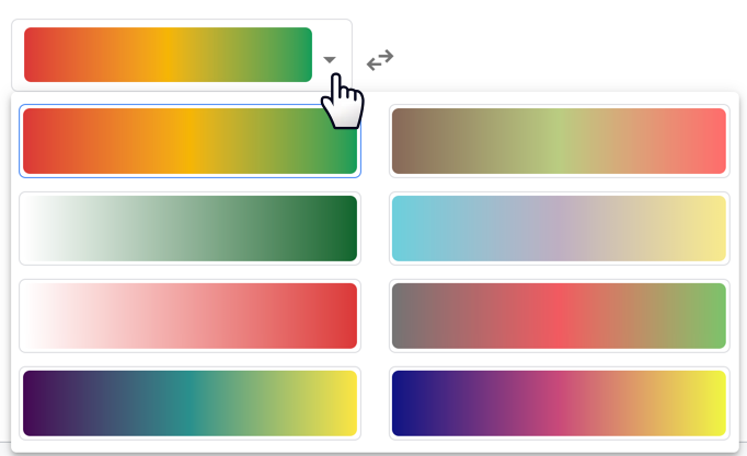
Reverse the color scale
To swap the order of the minimum and maximum colors, click the Reverse color scalearrow button![]() .
.
Format rules, percentages, and decimal precision
When building rules that compare numbers, use the actual value in the data, rather than the value that is displayed in charts. For example, to build a format rule that selects values greater than 51.2%, use the decimal value: Bounce rate >.512
Similarly, numbers that are displayed in your charts may be rounded up or down. Include as many digits as necessary in your rule to properly match the underlying data. For example, a rule such as Bounce rate =.512
wouldn't apply if the actual value was.5119, even though that number appears as.512 when rounded to three decimal places. You can adjust metric decimal precision in the STYLEtab of the chart's Propertiespanel.
Edit and delete conditional formatting rules
- Edit your report .
- Select the chart with the rule that you want to edit.
- In the Propertiespanel, open the STYLEtab.
- In the Conditional formattingsection, click Edit
 to open the Conditional format rulesmenu.
 - Click Editor Deletefor the rule that you want to change .
Copy conditional formatting rules
There are two methods for copying conditional formatting rules.
To copy conditional formatting rules from one existing chart to another existing chart, follow these steps:
- Copy a chart with conditional formatting applied
- From the report menu toolbar, open the Editmenu.
- Click the Paste specialoption.
- Click the Paste style onlyoption.
To create a new chart with the same conditional formatting rules as an existing chart, copy and paste the existing chart.
Limits of conditional formatting
Conditional formatting has the following limits:
- Single color conditional formatting is available only for table charts, pivot table charts, scorecard charts, bar charts, and query result variables.
- Color scale conditional formatting is available only for table charts, scorecard charts, bar charts, and query result variables.
- Conditional formatting isn't available for combo charts.
- Conditional formatting rules don't apply to subtotals or grand totals.
- Dimension-based compound conditions in pivot table charts must use the same field in each
ORcondition. - Format rules can only use fields that are selected in the chart.
- You can apply up to 20 format rules per chart.
- Switching between chart visualization types (for example, switching from a table chart to a scorecard chart, or a pivot table chart to a table chart) may require you to update conditional formatting rules, depending on the type of chart and the fields that are used in the rule.