2020年05月の記事
全48件 (48件中 1-48件目)
1
-

◆【楽天モバイル】「Galaxy A7」を注文しました:楽天モバイルの楽天市場店で購入すればよかったのに、失敗です:特別定額給付金で支払います:パソコンのクロームブラウザでは、申し込みページの表示に「履歴」の削除が必要でした
特別定額給付金が振り込まれたので、楽天モバイルで「Galaxy A7」を注文し、楽天モバイルのRakuten UN-LIMITプランに申し込みました。プラン料金は、1年間無料だそうです。データ通信が無制限というのが魅力です。公園の散歩でも、ベンチでの休憩時に動画を楽しめそうです。楽天エリア外で5GBを使い切っても、低速度で無制限なので、radikoとかは聴き続けることができそうです。今後、もっと魅力的な端末が同じくらいの負担で購入できるようになる可能性もありますが、「Galaxy A7」くらいのスペックであればとりあえずいいかな、と思いました。ファーウェイのスマホもコスパはよさそうですが、新しい機種はグーグルのアプリストアが利用できないので、アマゾンのキンドルのタブレットのような不便さがあるので選択肢には入りません。次は、AQUOSやArrowsがお買い得になるのかもしれませんが、先のことはわかりません。Galaxy A7+Rakuten UN-LIMITプランセット(事務手数料3300円込)【15000円相当のポイント還元】価格:22000円(税込、送料無料) (2020/5/31時点)楽天で購入色は3種類のようです。↑楽天市場店で購入すればよかったと思います。キャンペーンのポイント特典については、購入店が限られるので、要注意でした。「楽天モバイル(Web・店舗)、楽天モバイル楽天市場店以外で購入した場合、楽天モバイルスマホ専門店(5/2以降の購入)、楽天スーパーDEALでの購入は特典対象外となります」ふつうにキャンペーンサイトから購入手続きに進めば問題ないと思いますが、楽天ポイント的には、楽天モバイルの楽天市場店で購入するのがよさそうです。というか、そうしないといけません。私は、楽天モバイル(Web)で購入してしまったので、楽天ポイントとしては、失敗してしまいました。つまり、今回のキャンペーンでの端末購入場所としては、「楽天モバイル(Web・店舗)」と「楽天モバイルの楽天市場店」の2通りがあり、私は前者で購入してしまいました。似ていますが、楽天ポイント的には大きな違いがありました。「楽天モバイルの楽天市場店」で購入すれば、普通に楽天ポイントが付くので、実質、数十円の負担で購入できたはずです。情報の重要性を再認識しました。残念。なお、楽天モバイルのプラン変更の場合は、キャンペーンにエントリーすれば、別のポイント体系になるようです。エントリーして楽天モバイル(ドコモ回線・au回線)から「Rakuten UN-LIMIT」にプラン変更いただき、Galaxy A7ご購入で18,699円相当のポイントを還元いたします。最初、楽天モバイル(Web)購入申し込みページにアクセスする際に、Windows 10とWindows 8のクロームブラウザではエラーが出ました。この時点で、楽天モバイルと楽天モバイルの楽天市場店の違いに気づいて楽天市場店で購入すればよかったのに、と後悔しています。パソコンのクロームブラウザでは、楽天モバイルの申し込み段階のページが表示されなかったので、「アクセスが集中しているの?」と思ったのですが、いつまでたってもエラー表示が出て、アクセスできませんでした。パソコンのEdgeブラウザやiPhoneのクロームブラウザではアクセスできたので、パソコンのクロームブラウザの問題であることがわかりました。結局、クロームブラウザの「履歴」を削除したら、アクセスすることができました。でも、1ページ表示するごとに履歴の削除が必要だったりしたのは、嫌な感じでした。→ この現象は、楽天モバイル(Web)の場合であって、楽天モバイル楽天市場店で購入すれば何の問題もなかったことに、後で気づきました。IEブラウザでアクセスすると、「IEブラウザは非対応です」と明確に表示されたので、楽天モバイルの申し込みページの作り込み方には何か仕様上の特徴があるようです。恐らく、モバイル端末経由での申し込みを想定しているのでしょう。でも、間口を狭めてどうしようというのでしょうか。さて、注文時の「Galaxy A7」の端末代金が税込み18700円で、15000ポイントの還元があるというので、よくわからない機種ですが、注文しました。購入理由は、「価格」と「還元ポイント」のバランスです。さらに、現在は、オンライン契約であれば、「3300ポイント+3000ポイント」の還元があるようなので、「支払22000円-ポイント21300」で、実質700円ほどの負担になりそうです。楽天カードでの支払いにしたので、そのポイント分も考慮するともう少し負担は少なくなります。もし、楽天市場店で購入して、ポイント倍率の高い人であれば、実質プラスになるのかもしれません。楽天のキャンペーンのポイントには期限があるようなので、還元されたらすぐに使う予定です。6月初めに届くような表示がありましたが、どうやら、購入時の表示よりも端末とSIMの到着には時間がかかるようです。では、なぜすぐ届くような表示を出しているのか意味がわかりません。システム上の仕様なのでしょうか。申し込み確認メールも届いていませんが、サイトでは、「申込番号」が発行されていましたが、「準備中」となっています。→【申し込み時の希望通り、6月1日に届きました】「いつ届くのかわかりません」の表示を見た気がするのですが、予定通り、申し込みの翌々日に届きました。「Galaxy A7」は、有機EL画面で、イヤホンでドルビーアトモス対応のようなので、スマホ拡大鏡と合わせて使うと面白いかもしれません。アマゾン・プライム・ビデオは、アンドロイド端末向けに5.1ch音声を配信しているので、試してみたいと思います。グーグルの最近のサービスにも触れられるので、仕事にも役立てることができそうです。アンドロイド端末は、アンドロイド4.4の端末以来なので、楽しみです。本当に欲しいのは、「iPhone XR」とかですが、1000円弱で新品のアンドロイドスマホが手に入るので我慢します。Windows 10との連携機能もアンドロイド端末の方が充実しています。↓スペックの詳細がまとまったページがありました↓Galaxy A7のGPUは、「Mali-G71 GPU」シリーズのエントリーモデルのようです。↓8コアのCPUは、サムスン製です。「アッパーミッドレンジ」ということだそうです。↓楽天市場以外の有名ストアの利用でも楽天ポイントが貯まります。---------------------------------------------------------------------------------------------------------------------------------------↓実効再生産数を計算できるWebアプリがあります。↓倍加時間についてです。---------------------------------------------------------------------------------------------------------------------------------------------------【ダッシュボード「COVID-19 Transition Graphs」を試作】中国本土以外の地域への感染が拡大しているため、国別、地域別の感染者数の推移を簡単に確認できるダッシュボードを試作しています。随時、ページを追加しています。グラフのデータは、右上部分の操作でダウンロードすることができます。アメリカの「地域別の変数」を前処理して、「州別」での推移をグラフ化できるようにしました。また、州コードのフィールドを作成してコロプレス地図も作成しています。楽天ブログでは「iframe」タグが使えないので、Bloggerのページから利用できるようにしています。無料で利用できる、グーグルの「データポータル」のダッシュボードです。データさえあれば、簡単に作成できます。「国」別、「地域」別に日ごとの感染者数の推移を見ることができます。↓ダッシュボードの試作です。下記リンクのページから利用できます。ジョンズ・ホプキンス大学の「JHU CSSE」の「Covid19 Daily Reports」のデータを利用しています。 EdgeブラウザやIEブラウザなど、Chromeブラウザ以外での利用の場合はうまく表示されないことがあるようです。↓上記のダッシュボードのデータの出所のサイトです。マップがメインのダッシュボードです-----------------------------------------------------------------------------------------↓WHOのサイトでも、感染者数、地域などの「Situation Report」が日々更新されています。関心がある場合は、一日に一度見るといいのではないかと思います。↓日本のインフルエンザの「定点当たり報告数」をグラフ化できるダッシュボードを試作。都道府県別にグラフ化可能です。------------------------------------------------------ 新型コロナウイルス(2019-novel coronavirus)対策もインフルエンザ対策と同じで、手洗い、うがい、マスク着用(咳エチケット)、免疫力アップなどが対策になるようです。【3/6再入荷】【お一人様3個まで】LEC レック 除菌の【激落ちくん】320ml 除菌 激落ち キッチン アルカリ電解水 配合 アルコールスプレー 除菌スプレー【RCP】【S-659】【キャッシュレス 還元 対象店】価格:260円(税別、送料別)(2020/3/7時点)楽天で購入----------------------------------------------------------------------------★おすすめの記事 ◆How Windows Sonic looks like.:Windows Sonic for Headphonesの音声と2chステレオ音声の比較:7.1.2chテストトーンの比較で明らかになった違い:一目で違いがわかりました----------------------------------------------------------------------------------------------------------
2020.05.30
コメント(0)
-
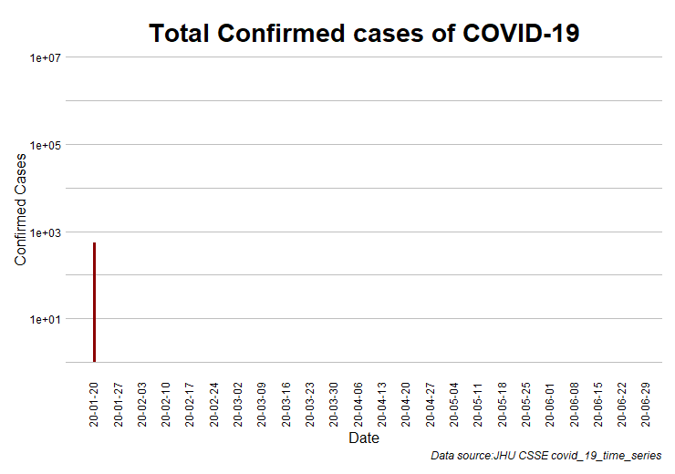
◆【新型コロナ】世界の感染確認者数、死亡者数の推移のアニメーショングラフです:対数軸にしたら、わかりやすくなりました
久しぶりに、感染確認者数と死亡者数の推移のアニメーショングラフを更新しました。R言語でグラフ作成をしていますが、ggplot2は細かな設定が可能です。y軸を対数軸にして、x軸も見やすく整理しました。新型コロナウイルスの感染は、急速に拡大することがよくわかります。第1波の急拡大が中国、第2波の急拡大が欧米というようなことが、対数軸グラフからわかります。感染者の多くが、軽症や無症状であることが、感染を拡大させているようです。すぐに重症化して、致死率が高い感染症の方が死者数は少ないのかもしれません。↓世界の感染確認者数は600万人に近づいてきています。y軸を対数軸にし、x軸も見やすくしました。↓世界の死亡者数の累計です。---------------------------------------------------------------------------------------------------------------------------------------↓実効再生産数を計算できるWebアプリがあります。↓倍加時間についてです。---------------------------------------------------------------------------------------------------------------------------------------------------【ダッシュボード「COVID-19 Transition Graphs」を試作】中国本土以外の地域への感染が拡大しているため、国別、地域別の感染者数の推移を簡単に確認できるダッシュボードを試作しています。随時、ページを追加しています。グラフのデータは、右上部分の操作でダウンロードすることができます。アメリカの「地域別の変数」を前処理して、「州別」での推移をグラフ化できるようにしました。また、州コードのフィールドを作成してコロプレス地図も作成しています。楽天ブログでは「iframe」タグが使えないので、Bloggerのページから利用できるようにしています。無料で利用できる、グーグルの「データポータル」のダッシュボードです。データさえあれば、簡単に作成できます。「国」別、「地域」別に日ごとの感染者数の推移を見ることができます。↓ダッシュボードの試作です。下記リンクのページから利用できます。ジョンズ・ホプキンス大学の「JHU CSSE」の「Covid19 Daily Reports」のデータを利用しています。 EdgeブラウザやIEブラウザなど、Chromeブラウザ以外での利用の場合はうまく表示されないことがあるようです。↓上記のダッシュボードのデータの出所のサイトです。マップがメインのダッシュボードです-----------------------------------------------------------------------------------------↓WHOのサイトでも、感染者数、地域などの「Situation Report」が日々更新されています。関心がある場合は、一日に一度見るといいのではないかと思います。↓日本のインフルエンザの「定点当たり報告数」をグラフ化できるダッシュボードを試作。都道府県別にグラフ化可能です。------------------------------------------------------ 新型コロナウイルス(2019-novel coronavirus)対策もインフルエンザ対策と同じで、手洗い、うがい、マスク着用(咳エチケット)、免疫力アップなどが対策になるようです。【3/6再入荷】【お一人様3個まで】LEC レック 除菌の【激落ちくん】320ml 除菌 激落ち キッチン アルカリ電解水 配合 アルコールスプレー 除菌スプレー【RCP】【S-659】【キャッシュレス 還元 対象店】価格:260円(税別、送料別)(2020/3/7時点)楽天で購入----------------------------------------------------------------------------★おすすめの記事 ◆How Windows Sonic looks like.:Windows Sonic for Headphonesの音声と2chステレオ音声の比較:7.1.2chテストトーンの比較で明らかになった違い:一目で違いがわかりました----------------------------------------------------------------------------------------------------------
2020.05.30
コメント(0)
-

◆【新型コロナ】ECDCのデータを利用して、実効再生産数・Rtを計算するR言語のコードの例の改訂版です:ダッシュボード用のデータを用意することができます
ECDCのデータを利用して、国ごとの実効再生産数・Rtを計算するR言語のコードの改訂版です。R言語のコードで、前処理、計算したデータをcsvファイルに保存し、グーグルのスプレッドシートにインポートして、そのスプレッドシートをグーグルのデータポータル・ダッシュボードのデータソースにしています。計算した実効再生産数・RtをECDCのデータを利用したダッシュボードでグラフ化しています。プルダウンメニューで国を選んで、グラフを表示させることができます。下記のRコードで用いている「EpiEstim」のパッケージは、「Improved inference of time-varying reproduction numbers during infectious disease outbreaks」という論文に基づいています。このパッケージでは、実効再生産数・Rtを日々の感染確認者数のデータと発症間隔のパラメータから計算しています。↓「EpiEstim」パッケージでは、発症間隔の分布の情報と日々の感染者のデータから実効再生産数・Rtを計算する仕組みになっています。ベイジアンの手法が用いられています。なお、ジョンズ・ホプキンス大学のデータを利用したダッシュボードにも同じ計算方法での実効再生産数・Rtのページを追加していますが、ECDC版のデータと少し異なるので、実効再生産数・Rtの値も異なっています。------------------------------------------------------------------------------------【改訂版:Rコードの例】ECDCのデータでは、スペインの最新の日付のデータが欠損しています。データの日付がそろっていないと、ダッシュボード的に不便なので、最新の日付のスペインの「ゼロ」データを1行追加しています。この場合、「today」の日付を利用しているので、スペイン以外の国のデータとの整合性の関係上、下記のコードでのデータの読み込みは、日本時間の午前中に行う必要があるようです。夕方になると、スペイン以外の国のデータで「today」の日付のものが入ってくるようです。そうなると、やはりスペインのデータは一日分欠損状態になってしまいます。なお、スペインの実効再生産数の計算にとってはよくないことなので、ECDCでデータ版のダッシュボードの実効再生産数ではスペインを選択できないようにしました。代わりにスペインの実効再生産数・Rt(1日前までのデータでの計算結果)のページを追加しました。・Rtの計算結果のデータに年月日の列を追加しています。計算対象の国は、感染確認者数のデータのある日数が「70日以上」の国にしています。・感染確認者数のデータの「df_DC」の処理の部分は、「df_ECDC」のデータを利用すればいいので、この部分を除けばもっとコードの行数を減らすことができます。・発病間隔のパラメータを平均4.8、標準偏差2.3にしています【修正】EpiEstimの推定のところで、「df_ECDCtemp2$cases」が文字列になっていたので、エラーになっていました。as.numeric(df_ECDCtemp2$cases)と応急処置しました。以前は、スペインの1行をスプレッドシートで作成したものを、csvファイルにして、読み込んで、本体と結合していました。改訂版のコードでは、コード上でスペインの1行を作成するようにしたので、変数のデータ型の問題が生じたようです。→次の処理を加えて、データ型の問題を解消しました。一度、csvファイルに書き出し、読み込むとデータ型の問題が解消しました。read.csv()によってデータ型が変換されます。自動変換が合っている場合は、列ごとにデータ型を指定するよりも簡単なようです。今回のエラーとは関係がありませんが、「,stringsAsFactors = FALSE」の意味がよくわかります。従って、「as.numeric(df_ECDCtemp2$cases)」の処理は不要になっています。「write.csv(df_Spain,"df_Spain_temp.csv",fileEncoding = "UTF8")df_Spain <- read.csv("df_Spain_temp.csv",stringsAsFactors = FALSE)df_Spain <- df_Spain[,c(2:12)]」------------------------------------------------------library(EpiEstim)df_ECDC <- NULLdf_Spain <- NULLdf_ECDC <-read.csv("https://opendata.ecdc.europa.eu/covid19/casedistribution/csv", na.strings = "", fileEncoding = "UTF-8-BOM",stringsAsFactors = FALSE)#ECDCの最新データは日付が1日前のものになるので、1日前の日付のスペインのデータを自動追加できるように、日付から、月と日の数字を取り出して利用します。 yestd <- today() - 1 mnum <- month(yestd) dnum <- day(yestd)#6月19日:人口データが更新されていました。変数名を"popData2019"に更新。#スペインの人口も更新しました。df_Spain <- t(c(paste0(dnum,"/0",mnum,"/2020"),dnum,mnum,"2020","0","0","Spain","ES","ESP","46937060","Europe"))colnames(df_Spain) <- c("dateRep","day","month","year","cases","deaths","countriesAndTerritories","geoId","countryterritoryCode","popData2019","continentExp")write.csv(df_Spain,"df_Spain_temp.csv",fileEncoding = "UTF8")df_Spain <- read.csv("df_Spain_temp.csv",stringsAsFactors = FALSE)df_Spain <- df_Spain[,c(2:12)]df_ECDC <- rbind(df_ECDC,df_Spain)colnames(df_ECDC) <- c("dateRep","day","month","year","cases","deaths","countriesAndTerritories","geoId","ISO code","popData2019","continentExp")df_ECDC$Date <- as.Date(df_ECDC$dateRep,format="%d/%m/%Y")geo_list <- unique(df_ECDC$countriesAndTerritories)df_ECDCtemp <- NULLdf_ECDCtemp1 <- NULLdf_ECDCtemp2 <- NULL temp_R <- NULL temp_Rt <- NULL temp_date <- NULL temp_Date1 <- NULL temp_Case <- NULL temp_DC <- NULL df_DC <- NULL df_Rt <- NULL temp_notcal <- NULL Numa <- NULL Numb <- NULL Numc <- NULL df_notcal <- NULLdf_ECDCtemp <- df_ECDCfor (i in seq_along(geo_list)) { df_ECDCtemp1 <- subset(df_ECDCtemp,df_ECDCtemp$countriesAndTerritories==geo_list[i]) df_ECDCtemp2 <- subset(df_ECDCtemp1,df_ECDCtemp1$cases >= 0) if (length(df_ECDCtemp2$cases) >= 70) {rt_parametric_si <- estimate_R(as.numeric(df_ECDCtemp2$cases),method = "parametric_si",config = make_config(list(mean_si = 4.8,std_si = 2.3))) temp_R <- rt_parametric_si$R temp_Rt <- mutate(temp_R,countriesAndTerritories=geo_list[i]) Numa <- nrow(rt_parametric_si$R) temp_date <- as.data.frame(df_ECDCtemp1$Date) Numb <- nrow(temp_date) Numc <- Numb-Numa temp_date <- temp_date[-c(1:Numc),] temp_Rt <- mutate(temp_Rt,Days=seq(from=1,to=nrow(rt_parametric_si$R), by=1)) temp_Rt <- mutate(temp_Rt,Date=temp_date) temp_Date1 <- matrix(rt_parametric_si$dates,ncol=1) colnames(temp_Date1) <- "Days" temp_Case <- matrix(rt_parametric_si$I,ncol=1) colnames(temp_Case) <- "Cases" temp_DC <- cbind(temp_Date1,temp_Case) temp_DC <- as.data.frame(temp_DC) temp_DC <- mutate(temp_DC,countriesAndTerritories=geo_list[i]) df_DC <- rbind(df_DC,temp_DC) df_Rt <- rbind(df_Rt,temp_Rt)} else {temp_notcal <- as.data.frame(geo_list[i]) temp_notcal <- mutate(temp_notcal,Under70days=nrow(df_ECDCtemp1)) colnames(temp_notcal) <- c("countriesAndTerritories","Under70days") df_notcal <- rbind(df_notcal,temp_notcal) }}write.csv(df_Rt,paste0("Covid19datasetRt",mnum,dnum,".csv"),fileEncoding = "UTF8")write.csv(df_DC,paste0("Covid19datasetDC",mnum,dnum,".csv"),fileEncoding = "UTF8")#Rtを計算した国の数を確認します。170の国・地域の実効再生産数・Rtを計算していました。geo_list <- unique(df_Rt$countriesAndTerritories)length(geo_list)---------------------------------------------------------------------------------------------------------------------------------------------------------------------------------------------------------------------------↓実効再生産数を計算できるWebアプリがあります。↓倍加時間についてです。---------------------------------------------------------------------------------------------------------------------------------------------------【ダッシュボード「COVID-19 Transition Graphs」を試作】中国本土以外の地域への感染が拡大しているため、国別、地域別の感染者数の推移を簡単に確認できるダッシュボードを試作しています。随時、ページを追加しています。グラフのデータは、右上部分の操作でダウンロードすることができます。アメリカの「地域別の変数」を前処理して、「州別」での推移をグラフ化できるようにしました。また、州コードのフィールドを作成してコロプレス地図も作成しています。楽天ブログでは「iframe」タグが使えないので、Bloggerのページから利用できるようにしています。無料で利用できる、グーグルの「データポータル」のダッシュボードです。データさえあれば、簡単に作成できます。「国」別、「地域」別に日ごとの感染者数の推移を見ることができます。↓ダッシュボードの試作です。下記リンクのページから利用できます。ジョンズ・ホプキンス大学の「JHU CSSE」の「Covid19 Daily Reports」のデータを利用しています。 EdgeブラウザやIEブラウザなど、Chromeブラウザ以外での利用の場合はうまく表示されないことがあるようです。↓上記のダッシュボードのデータの出所のサイトです。マップがメインのダッシュボードです-----------------------------------------------------------------------------------------↓WHOのサイトでも、感染者数、地域などの「Situation Report」が日々更新されています。関心がある場合は、一日に一度見るといいのではないかと思います。↓日本のインフルエンザの「定点当たり報告数」をグラフ化できるダッシュボードを試作。都道府県別にグラフ化可能です。------------------------------------------------------ 新型コロナウイルス(2019-novel coronavirus)対策もインフルエンザ対策と同じで、手洗い、うがい、マスク着用(咳エチケット)、免疫力アップなどが対策になるようです。【3/6再入荷】【お一人様3個まで】LEC レック 除菌の【激落ちくん】320ml 除菌 激落ち キッチン アルカリ電解水 配合 アルコールスプレー 除菌スプレー【RCP】【S-659】【キャッシュレス 還元 対象店】価格:260円(税別、送料別)(2020/3/7時点)楽天で購入----------------------------------------------------------------------------★おすすめの記事 ◆How Windows Sonic looks like.:Windows Sonic for Headphonesの音声と2chステレオ音声の比較:7.1.2chテストトーンの比較で明らかになった違い:一目で違いがわかりました----------------------------------------------------------------------------------------------------------
2020.05.30
コメント(0)
-
◆【新型コロナ】オンライン申請をしていた、特別定額給付金が振り込まれました
5月2日にオンライン申請をしていた「特別定額給付金」がやっと振り込まれました。オンライン申請をしてから4週間弱が過ぎていました。申請内容には間違いがなかったようで、自治体から問い合わせなどはありませんでした。早い時期にオンライン申請をしていたので、郵送申請の場合より遅くなるということはなかったようです。オンライン申請といっても、メールで申請書を送るようなものだったようで、郵送申請の受付が始まってからオンライン申請をしていたら、振り込みは郵送申請と同じか、あるいは遅くなっていたのかもしれません。このような業務は、人手をかけずにIT化によって自動的に処理できるようにして、自治体が感染対策などに人的資源を振り向けられるようになってほしいと思います。---------------------------------------------------------------------------------------------------------------------------------------↓実効再生産数を計算できるWebアプリがあります。↓倍加時間についてです。---------------------------------------------------------------------------------------------------------------------------------------------------【ダッシュボード「COVID-19 Transition Graphs」を試作】中国本土以外の地域への感染が拡大しているため、国別、地域別の感染者数の推移を簡単に確認できるダッシュボードを試作しています。随時、ページを追加しています。グラフのデータは、右上部分の操作でダウンロードすることができます。アメリカの「地域別の変数」を前処理して、「州別」での推移をグラフ化できるようにしました。また、州コードのフィールドを作成してコロプレス地図も作成しています。楽天ブログでは「iframe」タグが使えないので、Bloggerのページから利用できるようにしています。無料で利用できる、グーグルの「データポータル」のダッシュボードです。データさえあれば、簡単に作成できます。「国」別、「地域」別に日ごとの感染者数の推移を見ることができます。↓ダッシュボードの試作です。下記リンクのページから利用できます。ジョンズ・ホプキンス大学の「JHU CSSE」の「Covid19 Daily Reports」のデータを利用しています。 EdgeブラウザやIEブラウザなど、Chromeブラウザ以外での利用の場合はうまく表示されないことがあるようです。↓上記のダッシュボードのデータの出所のサイトです。マップがメインのダッシュボードです-----------------------------------------------------------------------------------------↓WHOのサイトでも、感染者数、地域などの「Situation Report」が日々更新されています。関心がある場合は、一日に一度見るといいのではないかと思います。↓日本のインフルエンザの「定点当たり報告数」をグラフ化できるダッシュボードを試作。都道府県別にグラフ化可能です。------------------------------------------------------ 新型コロナウイルス(2019-novel coronavirus)対策もインフルエンザ対策と同じで、手洗い、うがい、マスク着用(咳エチケット)、免疫力アップなどが対策になるようです。【3/6再入荷】【お一人様3個まで】LEC レック 除菌の【激落ちくん】320ml 除菌 激落ち キッチン アルカリ電解水 配合 アルコールスプレー 除菌スプレー【RCP】【S-659】【キャッシュレス 還元 対象店】価格:260円(税別、送料別)(2020/3/7時点)楽天で購入----------------------------------------------------------------------------★おすすめの記事 ◆How Windows Sonic looks like.:Windows Sonic for Headphonesの音声と2chステレオ音声の比較:7.1.2chテストトーンの比較で明らかになった違い:一目で違いがわかりました----------------------------------------------------------------------------------------------------------
2020.05.29
コメント(0)
-
◆【新型コロナ】第2波対策は「幅広い検査と隔離」「医療体制拡充」の戦略で対応してほしいと思います
緊急事態宣言期間中は、外出自粛、休業要請、ステイホームで、人と人との接触機会が減って、感染者がほかの人に感染させることが減っていたわけですが、自粛が緩和されると、感染者が増える可能性があります。感染者が増えたからといって、再び、厳しい外出自粛、休業要請の対策をとると、経済社会活動に多大な打撃を与えてしまいます。「幅広い検査の実施と隔離」「医療体制拡充」の対策によって、経済社会活動と感染拡大抑制の両立を目指してもらいたいと思います。ブラジルなど、中南米では感染拡大が続いています。北米、東欧、南アジアやアフリカでも感染が拡大中です。先日、ブラジルからの帰国者が無症状感染者だったことがわかり、検疫が重要であることが再確認されています。そもそも、2月は中国から、3月は欧米から感染者の入国、帰国があったということなので、日本の外からの流入の阻止は重要な課題のようです。世界で感染拡大が続いている以上、「インバウンド需要」は、当面望めないようです。せめて、国内だけは、外出自粛などは最小限にとどめてもらいたいと思います。↓ジョンズ・ホプキンス大学のデータを利用したダッシュボードにも実効再生産数・Rtのページを追加しました。国別に表示させることができます。---------------------------------------------------------------------------------------------------------------------------------------↓実効再生産数を計算できるWebアプリがあります。↓倍加時間についてです。---------------------------------------------------------------------------------------------------------------------------------------------------【ダッシュボード「COVID-19 Transition Graphs」を試作】中国本土以外の地域への感染が拡大しているため、国別、地域別の感染者数の推移を簡単に確認できるダッシュボードを試作しています。随時、ページを追加しています。グラフのデータは、右上部分の操作でダウンロードすることができます。アメリカの「地域別の変数」を前処理して、「州別」での推移をグラフ化できるようにしました。また、州コードのフィールドを作成してコロプレス地図も作成しています。楽天ブログでは「iframe」タグが使えないので、Bloggerのページから利用できるようにしています。無料で利用できる、グーグルの「データポータル」のダッシュボードです。データさえあれば、簡単に作成できます。「国」別、「地域」別に日ごとの感染者数の推移を見ることができます。↓ダッシュボードの試作です。下記リンクのページから利用できます。ジョンズ・ホプキンス大学の「JHU CSSE」の「Covid19 Daily Reports」のデータを利用しています。 EdgeブラウザやIEブラウザなど、Chromeブラウザ以外での利用の場合はうまく表示されないことがあるようです。↓上記のダッシュボードのデータの出所のサイトです。マップがメインのダッシュボードです-----------------------------------------------------------------------------------------↓WHOのサイトでも、感染者数、地域などの「Situation Report」が日々更新されています。関心がある場合は、一日に一度見るといいのではないかと思います。↓日本のインフルエンザの「定点当たり報告数」をグラフ化できるダッシュボードを試作。都道府県別にグラフ化可能です。------------------------------------------------------ 新型コロナウイルス(2019-novel coronavirus)対策もインフルエンザ対策と同じで、手洗い、うがい、マスク着用(咳エチケット)、免疫力アップなどが対策になるようです。【3/6再入荷】【お一人様3個まで】LEC レック 除菌の【激落ちくん】320ml 除菌 激落ち キッチン アルカリ電解水 配合 アルコールスプレー 除菌スプレー【RCP】【S-659】【キャッシュレス 還元 対象店】価格:260円(税別、送料別)(2020/3/7時点)楽天で購入----------------------------------------------------------------------------★おすすめの記事 ◆How Windows Sonic looks like.:Windows Sonic for Headphonesの音声と2chステレオ音声の比較:7.1.2chテストトーンの比較で明らかになった違い:一目で違いがわかりました----------------------------------------------------------------------------------------------------------
2020.05.28
コメント(0)
-
◆【新型iPhone SE】性能と価格のバランスが良いのは「iPhone SE 2」「iPad Air 3」?:Antutuベンチマークスコアのデータから:スコア以外の性能も含めた総合力では「iPhone XR」が魅力的?:データのスクレイピングとグラフ作成のRのコードも
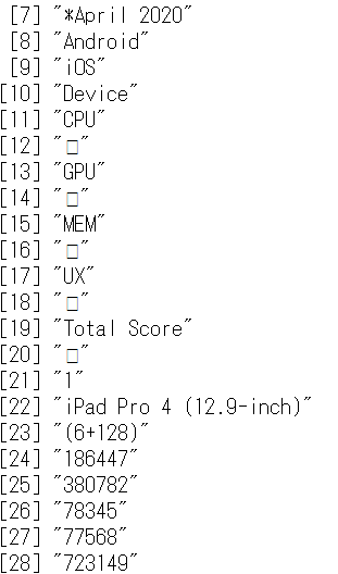
iOS(iPad OS)機器のAntutuベンチマークスコアのデータ(2020年4月)を、R言語でスクレイピングして、グラフを作成してみました。↓R言語で、「read_html()」とすると、下記のように、デバイスとスコアのリストが得られたので、for i 文を使って、26種類のデバイスのデータを抜き出して整理しました。以前は、テーブルで読み込めましたが、javascriptが利用されるようになって、一手間かかるようになりました。iPadでは、「iPad Air 3」のコスパが高いようですが、iPhoneでは、約5万円からの「iPhone SE 2」のコスパが最高のようです。ベンチマークスコアの上では、「iPad Air 3」と「iPhone SE 2」は「ミドルクラス」の位置にあるようです。「iPhone SE 2」は、顔認証ではなく、指紋認証なので、「マスク時代」には「iPhone SE 2」の方が便利そうです。「Total Score」は「CPU」のスコアと比例的な関係です。「GPU」スコアは、iPad Proの新しいモデル(3または4)が圧倒的に高くなっています。iPad Proは、スコアの上では、第3世代と第4世代の違いは大きくないようです。「UX」スコアは、「Total Score」とは違った傾向が見られ、「iPhone」が健闘しているようです。iPad 6とiPad7との違いはあまり大きくないので、価格が安い場合は、iPad 6を選ぶということもありかもしれません。でも、iPad 6では、アップルTVが1年間無料にならないはずです。その分の価格差まではないかもしれません。ところで、「Liquid Retina HD display」を備えたiPhone XRは、「Dolby Vision HDR」と「Dolby Atmos(using Dolby Digital Plus / JOC)」に対応している、最も低価格なiOS端末のようです。ディスプレイや音響などの性能も含めて考えると、「Liquid Retina HD display」iPhone XRの総合力は高いようです。なお、「iPad Air 3」は、「Dolby Vision HDR」対応ですが、「Dolby Atmos(using Dolby Digital Plus / JOC)」には対応していません。もしも、「iPad Air 4」が「Dolby Vision HDR」と「Dolby Atmos(using Dolby Digital Plus / JOC)」の両方に対応してきて、価格が変わらなければ、かなり魅力的な端末になると思います。もっとも、Netflixやアマゾン・プライム・ビデオなど主要な配信サービスは「Dolby Atmos」音声をiOS端末向けには配信していないので、今のところ、「Dolby Atmos」音声については、「Apple TV+」の動画にしか期待できません。↓楽天市場以外の有名ストアの利用でも楽天ポイントが貯まります。楽天市場で「iPhone」を検索する楽天市場でiPadを検索する-------------------------------------------------------------【データのスクレイピングとグラフ作成のRのコード】url <- "https://www.antutu.com/en/ranking/ios1.htm"df_tabl <- as.data.frame(read_html(url))df_data <- df_tabl[c(21:228),]df_data <- as.data.frame(df_data)i<- NULLj=1k=8df_antutu <- NULLdf_data1 <- NULLdf_data2 <- NULLfor(i in seq(1, 26, by = 1)){ df_data1 <- t(as.data.frame(df_data[j:k,])) df_antutu <- rbind(df_antutu, df_data1) j = j+8 k = k+8}colnames(df_antutu) <- c("Rank","Device","Device2","CPU","GPU","MEM","UX","Total_Score")df_antutu <- as.data.frame(df_antutu)df_antutu1 <- df_antutu[,1:8]write.csv(df_antutu1,"df_antutu.csv")df_antutu2 <- read.csv("df_antutu.csv",stringsAsFactors = FALSE)ggplot(df_antutu2,aes(x=Total_Score,y=CPU,label = Device)) + geom_point()+stat_smooth(method = "lm", se = FALSE, colour = "black", size = 1) + geom_text_repel()ggplot(df_antutu2,aes(x=Total_Score,y=GPU,label = Device)) + geom_point()+stat_smooth(method = "lm", se = FALSE, colour = "black", size = 1) + geom_text_repel()ggplot(df_antutu2,aes(x=Total_Score,y=MEM,label = Device)) + geom_point()+stat_smooth(method = "lm", se = FALSE, colour = "black", size = 1) + geom_text_repel()ggplot(df_antutu2,aes(x=Total_Score,y=UX,label = Device)) + geom_point()+stat_smooth(method = "lm", se = FALSE, colour = "black", size = 1) + geom_text_repel()ggplot(df_antutu2,aes(x=MEM,y=UX,label = Device)) + geom_point()+stat_smooth(method = "lm", se = FALSE, colour = "black", size = 1) + geom_text_repel()ggplot(df_antutu2,aes(x=MEM,y=GPU,label = Device)) + geom_point()+stat_smooth(method = "lm", se = FALSE, colour = "black", size = 1) + geom_text_repel()ggplot(df_antutu2,aes(x=GPU,y=UX,label = Device)) + geom_point()+stat_smooth(method = "lm", se = FALSE, colour = "black", size = 1) + geom_text_repel()ggplot(df_antutu2,aes(x=reorder(Device, Total_Score), y=Total_Score)) + geom_bar(stat="identity", fill='#0072B2') + coord_flip()+labs(x="Device",y=" Score",title="Total_Score",caption="Data source:Antutu benchmark" )ggplot(df_antutu2,aes(x=reorder(Device, UX), y=UX)) + geom_bar(stat="identity", fill='steelblue') + coord_flip()+labs(x="Device",y=" Score",title="UX",caption="Data source:Antutu benchmark" )ggplot(df_antutu2,aes(x=reorder(Device, MEM), y=MEM)) + geom_bar(stat="identity", fill='#009E73') + coord_flip()+labs(x="Device",y=" Score",title="MEM",caption="Data source:Antutu benchmark" )ggplot(df_antutu2,aes(x=reorder(Device, GPU), y=GPU)) + geom_bar(stat="identity", fill='#56B4E9') + coord_flip()+labs(x="Device",y=" Score",title="GPU",caption="Data source:Antutu benchmark" )ggplot(df_antutu2,aes(x=reorder(Device, CPU), y=CPU)) + geom_bar(stat="identity", fill='#E69F00') + coord_flip()+labs(x="Devices",y=" Score",title="CPU",caption="Data source:Antutu benchmark" )---------------------------------------------------------------------------------------------------------------------------------------↓実効再生産数を計算できるWebアプリがあります。↓倍加時間についてです。---------------------------------------------------------------------------------------------------------------------------------------------------【ダッシュボード「COVID-19 Transition Graphs」を試作】中国本土以外の地域への感染が拡大しているため、国別、地域別の感染者数の推移を簡単に確認できるダッシュボードを試作しています。随時、ページを追加しています。グラフのデータは、右上部分の操作でダウンロードすることができます。アメリカの「地域別の変数」を前処理して、「州別」での推移をグラフ化できるようにしました。また、州コードのフィールドを作成してコロプレス地図も作成しています。楽天ブログでは「iframe」タグが使えないので、Bloggerのページから利用できるようにしています。無料で利用できる、グーグルの「データポータル」のダッシュボードです。データさえあれば、簡単に作成できます。「国」別、「地域」別に日ごとの感染者数の推移を見ることができます。↓ダッシュボードの試作です。下記リンクのページから利用できます。ジョンズ・ホプキンス大学の「JHU CSSE」の「Covid19 Daily Reports」のデータを利用しています。 EdgeブラウザやIEブラウザなど、Chromeブラウザ以外での利用の場合はうまく表示されないことがあるようです。↓上記のダッシュボードのデータの出所のサイトです。マップがメインのダッシュボードです-----------------------------------------------------------------------------------------↓WHOのサイトでも、感染者数、地域などの「Situation Report」が日々更新されています。関心がある場合は、一日に一度見るといいのではないかと思います。↓日本のインフルエンザの「定点当たり報告数」をグラフ化できるダッシュボードを試作。都道府県別にグラフ化可能です。------------------------------------------------------ 新型コロナウイルス(2019-novel coronavirus)対策もインフルエンザ対策と同じで、手洗い、うがい、マスク着用(咳エチケット)、免疫力アップなどが対策になるようです。【3/6再入荷】【お一人様3個まで】LEC レック 除菌の【激落ちくん】320ml 除菌 激落ち キッチン アルカリ電解水 配合 アルコールスプレー 除菌スプレー【RCP】【S-659】【キャッシュレス 還元 対象店】価格:260円(税別、送料別)(2020/3/7時点)楽天で購入----------------------------------------------------------------------------★おすすめの記事 ◆How Windows Sonic looks like.:Windows Sonic for Headphonesの音声と2chステレオ音声の比較:7.1.2chテストトーンの比較で明らかになった違い:一目で違いがわかりました----------------------------------------------------------------------------------------------------------
2020.05.27
コメント(0)
-
◆聴き逃したラジオ番組を録音、保存しておきたい時は「どがらじ」が便利です
ステイホームで、家にいる時間が長くなり、ラジオを聴く機会が増えた人もいるかもしれません。聴き逃したラジオ番組は、1週間以内であれば、radikoで聴くことができます。便利になりました。1週間以内の番組を聴くだけでなく、高速録音ができるのが、どがらじの「らじれこ」アプリです。久しぶりに、どがらじのサイトを見たらスマホ版もありました。今度、インストールしてみようと思います。今回は、パソコンにインストールしてあった「どがらじ」で、「聴き逃した」というよりも、放送後にその存在を知った「ステイホーム」特番のラジオ番組を高速録音しました。ラジオ局を選び、番組表から過去の番組を選ぶだけで、高速録音ができます。録音に要する時間が短くて済むのでとても便利です。環境によっては、1時間番組を約1分で録音することができるようです。録音した番組は、ライブラリからiCloudにMP3形式でコピーして、iPhoneで手軽に聴くことができます。radikoのタイムフリーを利用して、パソコンで録音することもできますが、その場合は、実時間が必要になります。長時間の番組を録音する場合は不便です。高速録音ができるので、出かける前に過去の番組を録音し、iCloudにコピーすればスマホで手軽に持ち出すことができます。スマホにダウンロードしておけば、電波の届かないところでも聴くことができます。↓手軽にラジオ録音ができます。予約録音だけでなく、過去の番組を高速録音することができるので便利です。 ↓関連記事です-------------------------------------------------------------↓おすすめの記事--------------------------------------------------------------------------------------------------------------------------------------楽天市場で「マスク」を検索する------------------------------------------------------------------------------------------↓実効再生産数を計算できるWebアプリがあります。↓倍加時間についてです。---------------------------------------------------------------------------------------------------------------------------------------------------【ダッシュボード「COVID-19 Transition Graphs」を試作】中国本土以外の地域への感染が拡大しているため、国別、地域別の感染者数の推移を簡単に確認できるダッシュボードを試作しています。随時、ページを追加しています。グラフのデータは、右上部分の操作でダウンロードすることができます。アメリカの「地域別の変数」を前処理して、「州別」での推移をグラフ化できるようにしました。また、州コードのフィールドを作成してコロプレス地図も作成しています。楽天ブログでは「iframe」タグが使えないので、Bloggerのページから利用できるようにしています。無料で利用できる、グーグルの「データポータル」のダッシュボードです。データさえあれば、簡単に作成できます。「国」別、「地域」別に日ごとの感染者数の推移を見ることができます。↓ダッシュボードの試作です。下記リンクのページから利用できます。ジョンズ・ホプキンス大学の「JHU CSSE」の「Covid19 Daily Reports」のデータを利用しています。 EdgeブラウザやIEブラウザなど、Chromeブラウザ以外での利用の場合はうまく表示されないことがあるようです。↓上記のダッシュボードのデータの出所のサイトです。マップがメインのダッシュボードです-----------------------------------------------------------------------------------------↓WHOのサイトでも、感染者数、地域などの「Situation Report」が日々更新されています。関心がある場合は、一日に一度見るといいのではないかと思います。↓日本のインフルエンザの「定点当たり報告数」をグラフ化できるダッシュボードを試作。都道府県別にグラフ化可能です。----------------------------------------------------------------------------★おすすめの記事 ◆How Windows Sonic looks like.:Windows Sonic for Headphonesの音声と2chステレオ音声の比較:7.1.2chテストトーンの比較で明らかになった違い:一目で違いがわかりました----------------------------------------------------------------------------------------------------------
2020.05.26
コメント(0)
-
◆【新型コロナ】富士総合火力演習もいいですが、自衛隊の防疫部隊には、第2波の爆発的感染拡大時に活躍してほしいと思います
感染症であっても、ウイルス兵器による攻撃であっても、感染拡大が起きれば、ウイルスに感染した患者が多数発生します。富士総合火力演習で、離島防衛の演習をするのもいいですが、現実に生じている、国民の生命を脅かす緊急事態に対して、自衛隊の防疫部隊(陸上自衛隊衛生科)は何の役にも立たないのでしょうか。もちろん、自衛隊は、何もしていないわけではなく、クルーズ船での対応や検疫、搬送、教育支援、軽症者隔離施設の手伝いなどを行ったりしています。しかし、補助的な業務ばかりで、フルに活動をしているようには思えません。この秋に第2波が来ると、爆発的な感染拡大が生じるかもしれません。爆発的な感染拡大が起きてしまえば、利用可能な資源を総動員する必要があると思います。外国からの侵略に備えて、能力を温存しておく、といったことを言っている場合ではなくなる事態になると思われます。野戦病院の設営、PCR検査センターの運営、感染者の搬送など、自衛隊の防疫部隊にもできることはたくさんあるのではないかと思います。国民の生命を脅かす緊急事態に対して、自衛隊には最前線でフルに活躍してもらいたいと思います。もちろん、自衛隊が活躍する必要がないことが一番いいことですが。---------------------------------------------------------------------------------------------------------------------------------------↓実効再生産数を計算できるWebアプリがあります。↓倍加時間についてです。---------------------------------------------------------------------------------------------------------------------------------------------------【ダッシュボード「COVID-19 Transition Graphs」を試作】中国本土以外の地域への感染が拡大しているため、国別、地域別の感染者数の推移を簡単に確認できるダッシュボードを試作しています。随時、ページを追加しています。グラフのデータは、右上部分の操作でダウンロードすることができます。アメリカの「地域別の変数」を前処理して、「州別」での推移をグラフ化できるようにしました。また、州コードのフィールドを作成してコロプレス地図も作成しています。楽天ブログでは「iframe」タグが使えないので、Bloggerのページから利用できるようにしています。無料で利用できる、グーグルの「データポータル」のダッシュボードです。データさえあれば、簡単に作成できます。「国」別、「地域」別に日ごとの感染者数の推移を見ることができます。↓ダッシュボードの試作です。下記リンクのページから利用できます。ジョンズ・ホプキンス大学の「JHU CSSE」の「Covid19 Daily Reports」のデータを利用しています。 EdgeブラウザやIEブラウザなど、Chromeブラウザ以外での利用の場合はうまく表示されないことがあるようです。↓上記のダッシュボードのデータの出所のサイトです。マップがメインのダッシュボードです-----------------------------------------------------------------------------------------↓WHOのサイトでも、感染者数、地域などの「Situation Report」が日々更新されています。関心がある場合は、一日に一度見るといいのではないかと思います。↓日本のインフルエンザの「定点当たり報告数」をグラフ化できるダッシュボードを試作。都道府県別にグラフ化可能です。------------------------------------------------------ 新型コロナウイルス(2019-novel coronavirus)対策もインフルエンザ対策と同じで、手洗い、うがい、マスク着用(咳エチケット)、免疫力アップなどが対策になるようです。【3/6再入荷】【お一人様3個まで】LEC レック 除菌の【激落ちくん】320ml 除菌 激落ち キッチン アルカリ電解水 配合 アルコールスプレー 除菌スプレー【RCP】【S-659】【キャッシュレス 還元 対象店】価格:260円(税別、送料別)(2020/3/7時点)楽天で購入----------------------------------------------------------------------------★おすすめの記事 ◆How Windows Sonic looks like.:Windows Sonic for Headphonesの音声と2chステレオ音声の比較:7.1.2chテストトーンの比較で明らかになった違い:一目で違いがわかりました----------------------------------------------------------------------------------------------------------
2020.05.26
コメント(0)
-
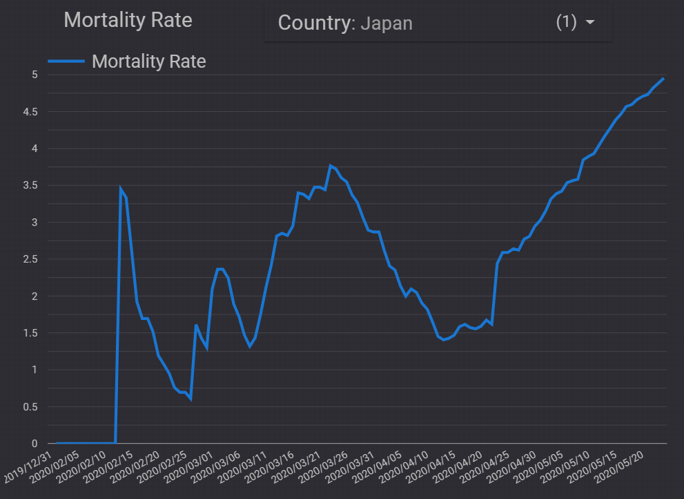
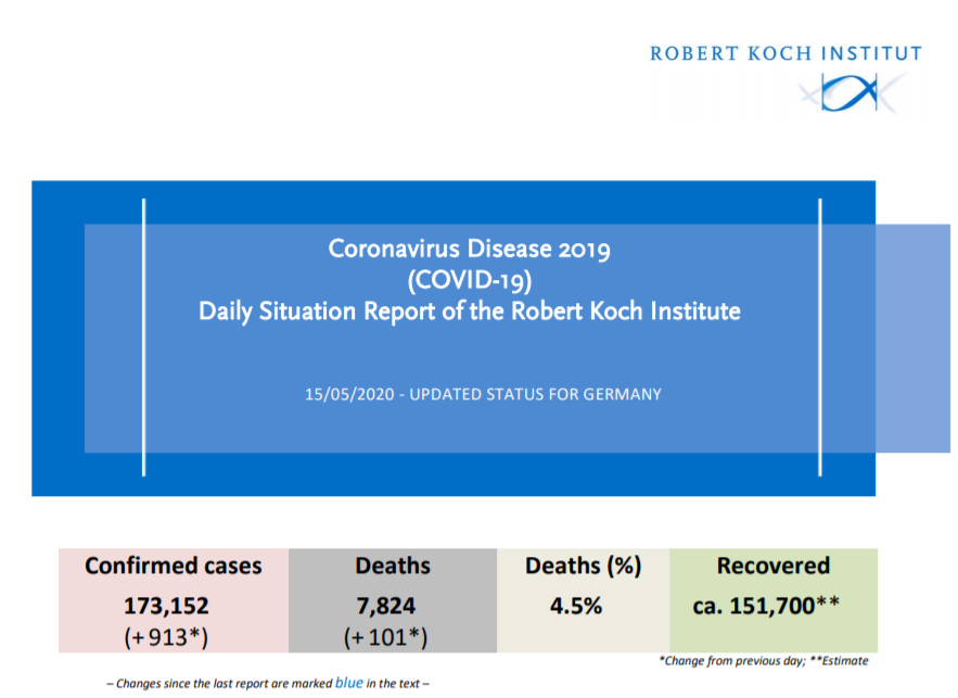
◆【新型コロナ】実は、それほど低くはない日本の新型コロナによる死亡率:分母の感染確認者数が少ないだけかもしれませんが
死亡者数を感染確認者数で割った「死亡率」は、日本の場合それほど低くはありません。下のグラフにあるように、多くの場合、死亡は感染確認の後で生じるので、死亡者数を感染確認者数で割った死亡率は、感染確認者数が増加している局面では、過小な値になっていることがわかります。現在は、感染確認者数の増加が鈍り、死亡が発生している状況なので、死亡率は上昇中です。その値は約5%で、100人の感染確認者のうち5人が死亡している、ということになっています。まだ、この値は上昇中のようです。人口の年齢構成の違いなどもあるので、一概には言えませんが、この値は、ドイツをやや上回り、アメリカの約6%よりはやや小さい水準です。イタリアやスペイン、フランスは10%を超えているので、それらに比べると小さい値ですが、韓国の2.4%よりは、かなり大きな値のようです。一つの可能性として、日本の場合は、感染確認者数が過小なのかもしれません。検査体制の貧弱さから、データが少ないのかもしれません。緊急事態宣言が解除されましたが、緊急事態宣言開始のタイミングは遅く、また、その解除のタイミングも遅かったのではないでしょうか。緊急事態宣言が出された時には、減少傾向が始まっていたようなので、そもそも、緊急事態宣言は必要だったのかどうか、検証してもらいたいと思います。結局、爆発的な感染拡大は生じませんでしたが、医療機関がひっ迫したということは、新型コロナ用の医療機関のキャパシティの拡大こそが課題だということがはっきりしました。データが不足していては、政策決定も誤ることになります。十分な検査体制を構築してほしいと思います。↓ECDCの5/24付データでは、日本の死亡者数は820人、感染確認者数は16,550人です。---------------------------------------------------------------------------------------------------------------------------------------↓実効再生産数を計算できるWebアプリがあります。↓倍加時間についてです。---------------------------------------------------------------------------------------------------------------------------------------------------【ダッシュボード「COVID-19 Transition Graphs」を試作】中国本土以外の地域への感染が拡大しているため、国別、地域別の感染者数の推移を簡単に確認できるダッシュボードを試作しています。随時、ページを追加しています。グラフのデータは、右上部分の操作でダウンロードすることができます。アメリカの「地域別の変数」を前処理して、「州別」での推移をグラフ化できるようにしました。また、州コードのフィールドを作成してコロプレス地図も作成しています。楽天ブログでは「iframe」タグが使えないので、Bloggerのページから利用できるようにしています。無料で利用できる、グーグルの「データポータル」のダッシュボードです。データさえあれば、簡単に作成できます。「国」別、「地域」別に日ごとの感染者数の推移を見ることができます。↓ダッシュボードの試作です。下記リンクのページから利用できます。ジョンズ・ホプキンス大学の「JHU CSSE」の「Covid19 Daily Reports」のデータを利用しています。 EdgeブラウザやIEブラウザなど、Chromeブラウザ以外での利用の場合はうまく表示されないことがあるようです。↓上記のダッシュボードのデータの出所のサイトです。マップがメインのダッシュボードです-----------------------------------------------------------------------------------------↓WHOのサイトでも、感染者数、地域などの「Situation Report」が日々更新されています。関心がある場合は、一日に一度見るといいのではないかと思います。↓日本のインフルエンザの「定点当たり報告数」をグラフ化できるダッシュボードを試作。都道府県別にグラフ化可能です。------------------------------------------------------ 新型コロナウイルス(2019-novel coronavirus)対策もインフルエンザ対策と同じで、手洗い、うがい、マスク着用(咳エチケット)、免疫力アップなどが対策になるようです。【3/6再入荷】【お一人様3個まで】LEC レック 除菌の【激落ちくん】320ml 除菌 激落ち キッチン アルカリ電解水 配合 アルコールスプレー 除菌スプレー【RCP】【S-659】【キャッシュレス 還元 対象店】価格:260円(税別、送料別)(2020/3/7時点)楽天で購入----------------------------------------------------------------------------★おすすめの記事 ◆How Windows Sonic looks like.:Windows Sonic for Headphonesの音声と2chステレオ音声の比較:7.1.2chテストトーンの比較で明らかになった違い:一目で違いがわかりました----------------------------------------------------------------------------------------------------------
2020.05.25
コメント(0)
-
◆Windowsパソコンの空き容量の少なくなったCドライブのSSDを交換しようとしましたが、「回復パーティション」を削除して、しばらく使い続けることにしました
空き容量が1GBくらいしかなくなってきた、Windows8.1のデスクトップパソコンの起動ディスクのSSDを交換しようと思い、使っていなかったSSDにクローンを作成しました。128GBのSSDをCドライブとして使ってきましたが、空き容量が1GB台となってきました。使っていなかった180GBのSSDを利用してクローンを作成して交換しようと考えたわけです。まず、2台同時に接続できるHDDスタンドでクローンを作成しました。15分くらいで完了しました。SSD同士のハードウェアでのコピーは速いようです。128GBのSSDがそのままクローンになるので、180GBのSSDには未割当領域ができていました。このままでは、交換する意味がないので、起動パーティションを拡張する必要があります。ディスク管理メニューで、180GBSSDの起動パーティションの拡張をしようとしましたが、起動パーティションの右側にあった10GBの「回復パーティション」は管理メニューでは削除できませんでした。コマンドを使えば削除できるようですが。回復パーティションは、工場出荷状態に戻すための領域なので、システムイメージのバックアップを別のディスクに取っておけば不要だと思います。別のパソコンにインストールしてあった、無料版の「AOMEI Partition Assistant」を使えば「回復パーティション」を簡単に削除できることがわかり、削除しようとしましたが、元のSSDの回復パーティションを削除すれば10GBが空くので、結局、元のSSDの「回復パーティション」を削除し、10GBの空き容量を確保して、しばらく使い続けることにしました。Windows 10にアップグレードするまで、しばらく使い続けます。クローンコピーを作成してから、ディスク構成を確認したので時間と手間がかかってしまいました。空き容量不足でドライブを交換する前には、「回復パーティション」の削除によって容量を増やせないかどうかを最初に確認するのがよさそうです。現在は、128GBの元のSSDのクローンの内容になっている180GBのSSDは、Windows10に変更する時に利用することにしました。システムイメージのバックアップや回復ディスクを作成していれば、「回復パーティション」を使うことはまずありません。おそらく、「回復パーティション」が必要な時にはそのSSD自体が使用不能な状態になっている可能性も高そうです。回復ディスクを作成しておき、定期的にシステムイメージのバックアップを別のディスクに作成しておけば、「回復パーティション」は不要だと思います。---------------------------------------------------------------------------------------------------------------------------------------↓実効再生産数を計算できるWebアプリがあります。↓倍加時間についてです。---------------------------------------------------------------------------------------------------------------------------------------------------【ダッシュボード「COVID-19 Transition Graphs」を試作】中国本土以外の地域への感染が拡大しているため、国別、地域別の感染者数の推移を簡単に確認できるダッシュボードを試作しています。随時、ページを追加しています。グラフのデータは、右上部分の操作でダウンロードすることができます。アメリカの「地域別の変数」を前処理して、「州別」での推移をグラフ化できるようにしました。また、州コードのフィールドを作成してコロプレス地図も作成しています。楽天ブログでは「iframe」タグが使えないので、Bloggerのページから利用できるようにしています。無料で利用できる、グーグルの「データポータル」のダッシュボードです。データさえあれば、簡単に作成できます。「国」別、「地域」別に日ごとの感染者数の推移を見ることができます。↓ダッシュボードの試作です。下記リンクのページから利用できます。ジョンズ・ホプキンス大学の「JHU CSSE」の「Covid19 Daily Reports」のデータを利用しています。 EdgeブラウザやIEブラウザなど、Chromeブラウザ以外での利用の場合はうまく表示されないことがあるようです。↓上記のダッシュボードのデータの出所のサイトです。マップがメインのダッシュボードです-----------------------------------------------------------------------------------------↓WHOのサイトでも、感染者数、地域などの「Situation Report」が日々更新されています。関心がある場合は、一日に一度見るといいのではないかと思います。↓日本のインフルエンザの「定点当たり報告数」をグラフ化できるダッシュボードを試作。都道府県別にグラフ化可能です。------------------------------------------------------ 新型コロナウイルス(2019-novel coronavirus)対策もインフルエンザ対策と同じで、手洗い、うがい、マスク着用(咳エチケット)、免疫力アップなどが対策になるようです。【3/6再入荷】【お一人様3個まで】LEC レック 除菌の【激落ちくん】320ml 除菌 激落ち キッチン アルカリ電解水 配合 アルコールスプレー 除菌スプレー【RCP】【S-659】【キャッシュレス 還元 対象店】価格:260円(税別、送料別)(2020/3/7時点)楽天で購入----------------------------------------------------------------------------★おすすめの記事 ◆How Windows Sonic looks like.:Windows Sonic for Headphonesの音声と2chステレオ音声の比較:7.1.2chテストトーンの比較で明らかになった違い:一目で違いがわかりました----------------------------------------------------------------------------------------------------------
2020.05.25
コメント(0)
-
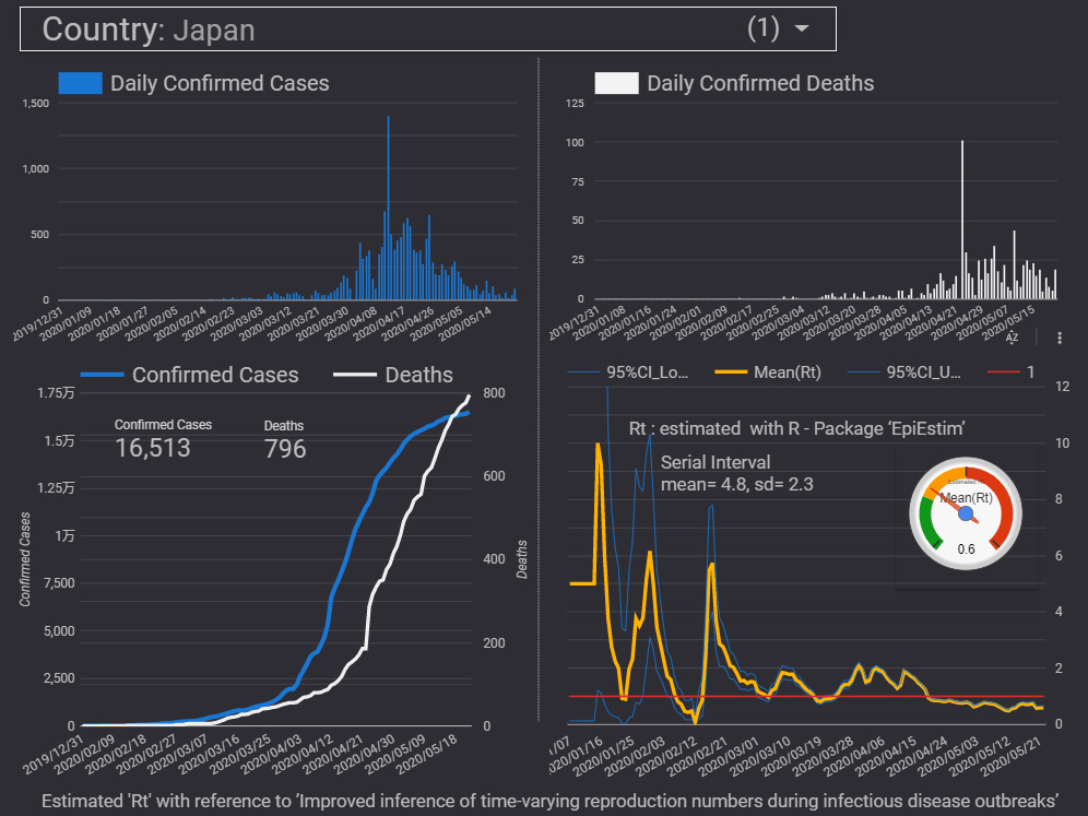
◆【新型コロナ】ダッシュボードらしいページを、ECDCデータ版のダッシュボードに追加しました:国単位で感染確認者数、死亡者数、実効再生産数などがわかるページです
ECDCデータ版のダッシュボードに、ダッシュボードらしいページを追加しました。これまでは、グラフ集のようなページばかりでしたが、やはり一目でわかるページは便利なので、追加してみました。日々の新規の感染確認者数、死亡者数のグラフ、累積の感染確認者数、死亡者数のグラフ、実効再生産数のグラフを1ページに並べているので、一目で状況がわかると思います。実効再生産数Rtのゲージグラフは、ちょっとデザイン的に浮いていますが、一目でわかりやすいので入れています。「コミュニティビジュアル」から追加しています。ダッシュボードは、データを更新するだけで、すべてのグラフが更新され、メニューで表示を簡単に切り替えることができたりするので、便利です。ダッシュボードを利用すると、インタラクティブなレポートを手軽に作成できます。↓プルダウンメニューで、表示させる国を切り替えることができます。↓感染確認者数のデータが70日分以上ある国について実効再生産数を計算している関係で、このページの対象外の国もあります。---------------------------------------------------------------------------------------------------------------------------------------↓実効再生産数を計算できるWebアプリがあります。↓倍加時間についてです。---------------------------------------------------------------------------------------------------------------------------------------------------【ダッシュボード「COVID-19 Transition Graphs」を試作】中国本土以外の地域への感染が拡大しているため、国別、地域別の感染者数の推移を簡単に確認できるダッシュボードを試作しています。随時、ページを追加しています。グラフのデータは、右上部分の操作でダウンロードすることができます。アメリカの「地域別の変数」を前処理して、「州別」での推移をグラフ化できるようにしました。また、州コードのフィールドを作成してコロプレス地図も作成しています。楽天ブログでは「iframe」タグが使えないので、Bloggerのページから利用できるようにしています。無料で利用できる、グーグルの「データポータル」のダッシュボードです。データさえあれば、簡単に作成できます。「国」別、「地域」別に日ごとの感染者数の推移を見ることができます。↓ダッシュボードの試作です。下記リンクのページから利用できます。ジョンズ・ホプキンス大学の「JHU CSSE」の「Covid19 Daily Reports」のデータを利用しています。 EdgeブラウザやIEブラウザなど、Chromeブラウザ以外での利用の場合はうまく表示されないことがあるようです。↓上記のダッシュボードのデータの出所のサイトです。マップがメインのダッシュボードです-----------------------------------------------------------------------------------------↓WHOのサイトでも、感染者数、地域などの「Situation Report」が日々更新されています。関心がある場合は、一日に一度見るといいのではないかと思います。↓日本のインフルエンザの「定点当たり報告数」をグラフ化できるダッシュボードを試作。都道府県別にグラフ化可能です。------------------------------------------------------ 新型コロナウイルス(2019-novel coronavirus)対策もインフルエンザ対策と同じで、手洗い、うがい、マスク着用(咳エチケット)、免疫力アップなどが対策になるようです。【3/6再入荷】【お一人様3個まで】LEC レック 除菌の【激落ちくん】320ml 除菌 激落ち キッチン アルカリ電解水 配合 アルコールスプレー 除菌スプレー【RCP】【S-659】【キャッシュレス 還元 対象店】価格:260円(税別、送料別)(2020/3/7時点)楽天で購入----------------------------------------------------------------------------★おすすめの記事 ◆How Windows Sonic looks like.:Windows Sonic for Headphonesの音声と2chステレオ音声の比較:7.1.2chテストトーンの比較で明らかになった違い:一目で違いがわかりました----------------------------------------------------------------------------------------------------------
2020.05.23
コメント(0)
-

◆【アマゾン・プライム・ビデオ】「ホームカミング」シーズン2の配信が始まりました:ステイホームの週末におすすめです
ジュリア・ロバーツさん主演での「ホームカミング」のシーズン1は、サスペンスものとして、とてもおもしろかったのですが、さて、シーズン2はどうでしょうか。なお、「ホームカミング」は、中東からの兵士の「帰還」という意味で、「ステイホーム」とは関係がありません。シーズン1で好演したジュリア・ロバーツさんはシーズン2には出演していないようです。シーズン2が本日5月22日から配信が始まりました。1話30分前後で全7話なので、ステイホームの週末にすぐ観終えてしまいそうです。これから観始めるところですが、ストーリーとしては、シーズン1からのつながりはあるようです。トレーラーやシーズン2の各話の写真を見ると、ジュリア・ロバーツさん以外の見覚えのある顔があります。ホームカミング (字幕版)シーズン2 2020 全2シーズン 16+新たな謎が生まれる。助けようとする気持ち。人を振り回す上司。妄想にとらわれる兵士。手に負えない予期せぬ結果。主演 ジャネール・モネイ, クリス・クーパー, ステファン・ジェームズ----------------------------------------------------【シーズン2、第1話を観ました】シーズン1と同じく「ガイスト社」のクスリの話です。シーズン1と同じで、クスリで失った記憶をたどっていくというパターンのようです。あの「農場」が初登場です。----------------------------------------------------【シーズン2、観終えました】短尺なので、すぐに観終えてしまいました。面白かったですが、シーズン1の方が厚みというか、深みがあった感じです。ちょっと、シーズン2のストーリー展開は無理やりな感じもありましたが、シーズン1での謎が解明されました。----------------------------------------------------4KUHD画質の作品ですが、EdgeブラウザでHD1080P画質で観ています。液晶パネルを交換したばかりのノートパソコンの15.6インチ画面では、HD1080Pでもきれいです。ミドルサイズの4K画面は、ベゼルを考えなければ、15.6インチのフルHD画面が4枚あれば実現できるようなものなので、フルHD画面は4K画面の一部を観ているようなものなので、きれいな画面であるのは確かだと思います。でも、4K大画面は魅力です。巨大画面の場合は、特別定額給付金では無理ですが、テレビよりもプロジェクターの方が低価格で入手できそうです。---------------------------------------------------------------------------------------------------------------------------------------↓実効再生産数を計算できるWebアプリがあります。↓倍加時間についてです。---------------------------------------------------------------------------------------------------------------------------------------------------【ダッシュボード「COVID-19 Transition Graphs」を試作】中国本土以外の地域への感染が拡大しているため、国別、地域別の感染者数の推移を簡単に確認できるダッシュボードを試作しています。随時、ページを追加しています。グラフのデータは、右上部分の操作でダウンロードすることができます。アメリカの「地域別の変数」を前処理して、「州別」での推移をグラフ化できるようにしました。また、州コードのフィールドを作成してコロプレス地図も作成しています。楽天ブログでは「iframe」タグが使えないので、Bloggerのページから利用できるようにしています。無料で利用できる、グーグルの「データポータル」のダッシュボードです。データさえあれば、簡単に作成できます。「国」別、「地域」別に日ごとの感染者数の推移を見ることができます。↓ダッシュボードの試作です。下記リンクのページから利用できます。ジョンズ・ホプキンス大学の「JHU CSSE」の「Covid19 Daily Reports」のデータを利用しています。 EdgeブラウザやIEブラウザなど、Chromeブラウザ以外での利用の場合はうまく表示されないことがあるようです。↓上記のダッシュボードのデータの出所のサイトです。マップがメインのダッシュボードです-----------------------------------------------------------------------------------------↓WHOのサイトでも、感染者数、地域などの「Situation Report」が日々更新されています。関心がある場合は、一日に一度見るといいのではないかと思います。↓日本のインフルエンザの「定点当たり報告数」をグラフ化できるダッシュボードを試作。都道府県別にグラフ化可能です。------------------------------------------------------ 新型コロナウイルス(2019-novel coronavirus)対策もインフルエンザ対策と同じで、手洗い、うがい、マスク着用(咳エチケット)、免疫力アップなどが対策になるようです。【3/6再入荷】【お一人様3個まで】LEC レック 除菌の【激落ちくん】320ml 除菌 激落ち キッチン アルカリ電解水 配合 アルコールスプレー 除菌スプレー【RCP】【S-659】【キャッシュレス 還元 対象店】価格:260円(税別、送料別)(2020/3/7時点)楽天で購入----------------------------------------------------------------------------★おすすめの記事 ◆How Windows Sonic looks like.:Windows Sonic for Headphonesの音声と2chステレオ音声の比較:7.1.2chテストトーンの比較で明らかになった違い:一目で違いがわかりました----------------------------------------------------------------------------------------------------------
2020.05.22
コメント(0)
-
◆【新型コロナ】日本政府、南米9カ国に270万ドルを寄付:称賛される行為でしょうが、自国内の検査・医療体制対策や補償にも取り組んでほしいと思います
WHOのレポートに「日本政府、アメリカ大陸の9か国でCOVID-19への対応を拡大するために270万ドルを寄付」という情報がありました。日本政府は、緊急事態宣言下で、寄付を決定しているようです。日本政府にはまだまだ余裕があるようです。南米では感染が急拡大していて、日本の寄付は、世界的に称賛される行為だと思います。ただ、日本国内の検査体制や医療体制も不十分な状態です。休業補償なども十分ではありません。自国内の対策にも積極的に取り組んでもらいたいと思います。WHOにも日本政府は資金を拠出していますが、WHOは、毎日、日本語のレポートくらい出してほしいと思います。↓世界的には、落ち着いているのはオセアニア地域くらいで、感染拡大は進行中です。---------------------------------------------------------------------------------------------------------------------------------------↓実効再生産数を計算できるWebアプリがあります。↓倍加時間についてです。---------------------------------------------------------------------------------------------------------------------------------------------------【ダッシュボード「COVID-19 Transition Graphs」を試作】中国本土以外の地域への感染が拡大しているため、国別、地域別の感染者数の推移を簡単に確認できるダッシュボードを試作しています。随時、ページを追加しています。グラフのデータは、右上部分の操作でダウンロードすることができます。アメリカの「地域別の変数」を前処理して、「州別」での推移をグラフ化できるようにしました。また、州コードのフィールドを作成してコロプレス地図も作成しています。楽天ブログでは「iframe」タグが使えないので、Bloggerのページから利用できるようにしています。無料で利用できる、グーグルの「データポータル」のダッシュボードです。データさえあれば、簡単に作成できます。「国」別、「地域」別に日ごとの感染者数の推移を見ることができます。↓ダッシュボードの試作です。下記リンクのページから利用できます。ジョンズ・ホプキンス大学の「JHU CSSE」の「Covid19 Daily Reports」のデータを利用しています。 EdgeブラウザやIEブラウザなど、Chromeブラウザ以外での利用の場合はうまく表示されないことがあるようです。↓上記のダッシュボードのデータの出所のサイトです。マップがメインのダッシュボードです-----------------------------------------------------------------------------------------↓WHOのサイトでも、感染者数、地域などの「Situation Report」が日々更新されています。関心がある場合は、一日に一度見るといいのではないかと思います。↓日本のインフルエンザの「定点当たり報告数」をグラフ化できるダッシュボードを試作。都道府県別にグラフ化可能です。------------------------------------------------------ 新型コロナウイルス(2019-novel coronavirus)対策もインフルエンザ対策と同じで、手洗い、うがい、マスク着用(咳エチケット)、免疫力アップなどが対策になるようです。【3/6再入荷】【お一人様3個まで】LEC レック 除菌の【激落ちくん】320ml 除菌 激落ち キッチン アルカリ電解水 配合 アルコールスプレー 除菌スプレー【RCP】【S-659】【キャッシュレス 還元 対象店】価格:260円(税別、送料別)(2020/3/7時点)楽天で購入----------------------------------------------------------------------------★おすすめの記事 ◆How Windows Sonic looks like.:Windows Sonic for Headphonesの音声と2chステレオ音声の比較:7.1.2chテストトーンの比較で明らかになった違い:一目で違いがわかりました----------------------------------------------------------------------------------------------------------
2020.05.22
コメント(0)
-
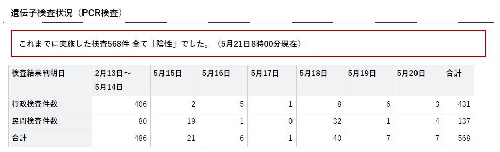
◆【新型コロナ】PCR検査の特異度はどれくらいなのでしょうか:検査拡大に懐疑的な人は、99%とか95%を仮定していたと思うのですが
岩手県では、今までのところ、新型コロナウイルスの陽性者がゼロです。568件検査が行われていて、陽性者はゼロです。特異度99%(偽陽性が1%の確率の場合で起きる)場合、岩手県で、数人の陽性者が出ていてもおかしくはないはずです。特異度95%であれば、20人以上の陽性者がいても不思議ではありません。検査数の拡大に懐疑的な主張の理論的な背景の一つに、「偽陽性者」がたくさん出てきて、医療機関が混乱する、という考えがありましたが、岩手県の状況はどのように解釈すればいいのでしょうか。「大数の法則」があてはまるほど検査数が多くないので、たまたま陽性者ゼロが続いている、ということなのでしょうか。いずれにせよ、偽陽性が0%ということもないでしょうから、そろそろ岩手県で陽性者が出てくるころだと思いますが。---------------------------------------------------------------------------------------------------------------------------------------↓実効再生産数を計算できるWebアプリがあります。↓倍加時間についてです。---------------------------------------------------------------------------------------------------------------------------------------------------【ダッシュボード「COVID-19 Transition Graphs」を試作】中国本土以外の地域への感染が拡大しているため、国別、地域別の感染者数の推移を簡単に確認できるダッシュボードを試作しています。随時、ページを追加しています。グラフのデータは、右上部分の操作でダウンロードすることができます。アメリカの「地域別の変数」を前処理して、「州別」での推移をグラフ化できるようにしました。また、州コードのフィールドを作成してコロプレス地図も作成しています。楽天ブログでは「iframe」タグが使えないので、Bloggerのページから利用できるようにしています。無料で利用できる、グーグルの「データポータル」のダッシュボードです。データさえあれば、簡単に作成できます。「国」別、「地域」別に日ごとの感染者数の推移を見ることができます。↓ダッシュボードの試作です。下記リンクのページから利用できます。ジョンズ・ホプキンス大学の「JHU CSSE」の「Covid19 Daily Reports」のデータを利用しています。 EdgeブラウザやIEブラウザなど、Chromeブラウザ以外での利用の場合はうまく表示されないことがあるようです。↓上記のダッシュボードのデータの出所のサイトです。マップがメインのダッシュボードです-----------------------------------------------------------------------------------------↓WHOのサイトでも、感染者数、地域などの「Situation Report」が日々更新されています。関心がある場合は、一日に一度見るといいのではないかと思います。↓日本のインフルエンザの「定点当たり報告数」をグラフ化できるダッシュボードを試作。都道府県別にグラフ化可能です。------------------------------------------------------ 新型コロナウイルス(2019-novel coronavirus)対策もインフルエンザ対策と同じで、手洗い、うがい、マスク着用(咳エチケット)、免疫力アップなどが対策になるようです。【3/6再入荷】【お一人様3個まで】LEC レック 除菌の【激落ちくん】320ml 除菌 激落ち キッチン アルカリ電解水 配合 アルコールスプレー 除菌スプレー【RCP】【S-659】【キャッシュレス 還元 対象店】価格:260円(税別、送料別)(2020/3/7時点)楽天で購入----------------------------------------------------------------------------★おすすめの記事 ◆How Windows Sonic looks like.:Windows Sonic for Headphonesの音声と2chステレオ音声の比較:7.1.2chテストトーンの比較で明らかになった違い:一目で違いがわかりました----------------------------------------------------------------------------------------------------------
2020.05.21
コメント(0)
-

◆【新型コロナ】首都圏などの緊急事態宣言はなぜ解除されないのでしょうか:需要蒸発によって、政府がコロナショックを拡大しているのかもしれません
日本では、新型コロナウイルスの感染確認者数が減少傾向にあるのは明らかです。このような局面で緊急事態宣言が解除されないようでは、今後、少し感染拡大が起きると、緊急事態宣言がすぐに出されるようなことになるのでしょうか。緊急事態宣言の開始の際には存在していなかった、わかりにくい「解除基準」を後付けで作成していて、不透明なやり方であることは間違いありません。宣言を解除しても、感染防止対策などの「新しい生活様式」を続けるしかないので、宣言の有無はもはやあまり意味がないのではないでしょうか。必要な政策は、休業要請や外出自粛などではなく、検査体制、医療体制の拡充なのではないかと思います。簡単な対策に流れがちなのではないかと思います。「ステイホーム」と言うだけの政策であれば、誰がリーダーであってもいいということになります。累計の感染確認者数は増加する一方ですが、回復する人もいるので、「アクティブケース」は減少してきています。緊急事態宣言は、医療崩壊を防ぐためだと思いますが、医療体制のキャパシティが低すぎる現状を早急になんとかしてもらいたいと思います。4月中旬ごろまで、無症状者、軽症者を無条件で入院させていて、病院を疲弊させてきた政府や自治体の責任は何も問われないのでしょうか。とにかく、政府には、コロナウイルスのリスクと、経済的な補償なしに経済社会活動を長期間停止させている政策のリスクについて詳細に比較検証してもらいたいと思います。インフルエンザ対策では、「緊急事態宣言」も「人との接触機会80%削減」などもありませんが、仮にある程度のリスクを許容するとした場合、新型コロナウイルスに対しては、どれくらいの制限が適正なのか、冷静にリスク評価をしてもらいたいと思います。世界的には、感染拡大が続いていて、ワクチンはないので今後も感染拡大は続くと考えられます。経済社会活動の制限で封じ込める戦略では、長期戦は無理だと思います。経済社会活動と感染抑制策のバランスを探索するのが課題です。「誰が感染しているのかわからない」から、感染期間の2週間以上、全員が家にいて、他人と接触しなければ、少なくとも他人同士の感染はなくなる、という100年前と同じ対策である「ステイホーム」戦略ですが、経済社会活動への影響は大きいものがあります。観光、飲食、小売り、イベント、交通関連などの需要が蒸発してしまっています。テレビCMには、「AC」のものが増加しており、企業活動も縮小していることがうかがえます。もはや、感染力が強い新型コロナウイルスとは共存していくしかないようですが、経済社会活動を厳しく制限する方法では、長期戦を戦うことはできないと思います。↓回復者も増えているので、「アクティブケース」の動向こそが重要です。↓世界的には、感染拡大は続いています。これからも続きそうです。---------------------------------------------------------------------------------------------------------------------------------------↓実効再生産数を計算できるWebアプリがあります。↓倍加時間についてです。---------------------------------------------------------------------------------------------------------------------------------------------------【ダッシュボード「COVID-19 Transition Graphs」を試作】中国本土以外の地域への感染が拡大しているため、国別、地域別の感染者数の推移を簡単に確認できるダッシュボードを試作しています。随時、ページを追加しています。グラフのデータは、右上部分の操作でダウンロードすることができます。アメリカの「地域別の変数」を前処理して、「州別」での推移をグラフ化できるようにしました。また、州コードのフィールドを作成してコロプレス地図も作成しています。楽天ブログでは「iframe」タグが使えないので、Bloggerのページから利用できるようにしています。無料で利用できる、グーグルの「データポータル」のダッシュボードです。データさえあれば、簡単に作成できます。「国」別、「地域」別に日ごとの感染者数の推移を見ることができます。↓ダッシュボードの試作です。下記リンクのページから利用できます。ジョンズ・ホプキンス大学の「JHU CSSE」の「Covid19 Daily Reports」のデータを利用しています。 EdgeブラウザやIEブラウザなど、Chromeブラウザ以外での利用の場合はうまく表示されないことがあるようです。↓上記のダッシュボードのデータの出所のサイトです。マップがメインのダッシュボードです-----------------------------------------------------------------------------------------↓WHOのサイトでも、感染者数、地域などの「Situation Report」が日々更新されています。関心がある場合は、一日に一度見るといいのではないかと思います。↓日本のインフルエンザの「定点当たり報告数」をグラフ化できるダッシュボードを試作。都道府県別にグラフ化可能です。------------------------------------------------------ 新型コロナウイルス(2019-novel coronavirus)対策もインフルエンザ対策と同じで、手洗い、うがい、マスク着用(咳エチケット)、免疫力アップなどが対策になるようです。【3/6再入荷】【お一人様3個まで】LEC レック 除菌の【激落ちくん】320ml 除菌 激落ち キッチン アルカリ電解水 配合 アルコールスプレー 除菌スプレー【RCP】【S-659】【キャッシュレス 還元 対象店】価格:260円(税別、送料別)(2020/3/7時点)楽天で購入----------------------------------------------------------------------------★おすすめの記事 ◆How Windows Sonic looks like.:Windows Sonic for Headphonesの音声と2chステレオ音声の比較:7.1.2chテストトーンの比較で明らかになった違い:一目で違いがわかりました----------------------------------------------------------------------------------------------------------
2020.05.21
コメント(0)
-
◆【新型コロナ】5月2日にオンライン申請した特別定額給付金はまだ振り込まれていません:自治体によって異なるでしょうが、私の場合は5月末頃の振り込みになるようです
「郵送申請の方が給付は早いかもしれない」という、驚くべき特別定額給付金の「オンライン申請」ですが、政府、自治体のIT化は絶望的な状況にあることが明るみに出た、ということだと思います。私の場合は、5月2日にオンライン申請をしていて、5月5日に自治体に届いたという通知がありました。自治体のサイトを見ると、5月初めにオンライン申請した場合は、5月末頃の振り込みになるようです。オンライン申請をした際、控えのPDFがメールで届いた時に、これは、PDFを印刷して、手作業で処理するのかもしれないといった、嫌な予感がしていました。結局、申請書をメールで送るのとあまり変わらない、ということのようですが、世帯内の給付対象者があらかじめ印字されている分、郵送の方が速く処理されるようです。テレビのニュースを見ていると、PDFを印刷しているわけではなく、パソコンの画面上で確認しているようです。いずれにせよ、オンラインでデジタルデータを送っている意味が全くないようです。マイナンバーカードのパスワードリセットや電子証明書の期限切れのために自治体の窓口が混雑するとか、「オンライン申請」は、いろいろと話題を提供しています。それほど利用することがないせいか、電子証明書の期限が5年というのは短く感じます。所得税の確定申告はオンラインでできますが、自治体の住民税の申告は紙ベースでしかできません。小規模の自治体では、コンビニのコピー機で、マイナンバーカードを利用して住民票を取得することができない自治体もあります。自治体のIT化は、国よりも遅れているので、自治体が給付窓口となる特別定額給付金で、オンライン処理がうまくできないのも当然のようです。でも、このような状況で、総務大臣は「ぜひ、オンラインで申請してください」と言っていたのですから、総務大臣はIT化の状況について何もわかっていない、ということが明らかになったようです。オンライン申請の受付をやめる自治体も出てきましたが、総務省は何か見解を出さないのでしょうか。総務省と自治体の関係は、厚生労働省と自治体の関係とよく似ているようです。「先進国」だと思っていた日本ですが、「後進国化」が進行しているのでしょうか。新型コロナウイルスに揺さぶられて、日本の社会のいろいろな問題点、課題が明るみになってきているようです。---------------------------------------------------------------------------------------------------------------------------------------↓実効再生産数を計算できるWebアプリがあります。↓倍加時間についてです。---------------------------------------------------------------------------------------------------------------------------------------------------【ダッシュボード「COVID-19 Transition Graphs」を試作】中国本土以外の地域への感染が拡大しているため、国別、地域別の感染者数の推移を簡単に確認できるダッシュボードを試作しています。随時、ページを追加しています。グラフのデータは、右上部分の操作でダウンロードすることができます。アメリカの「地域別の変数」を前処理して、「州別」での推移をグラフ化できるようにしました。また、州コードのフィールドを作成してコロプレス地図も作成しています。楽天ブログでは「iframe」タグが使えないので、Bloggerのページから利用できるようにしています。無料で利用できる、グーグルの「データポータル」のダッシュボードです。データさえあれば、簡単に作成できます。「国」別、「地域」別に日ごとの感染者数の推移を見ることができます。↓ダッシュボードの試作です。下記リンクのページから利用できます。ジョンズ・ホプキンス大学の「JHU CSSE」の「Covid19 Daily Reports」のデータを利用しています。 EdgeブラウザやIEブラウザなど、Chromeブラウザ以外での利用の場合はうまく表示されないことがあるようです。↓上記のダッシュボードのデータの出所のサイトです。マップがメインのダッシュボードです-----------------------------------------------------------------------------------------↓WHOのサイトでも、感染者数、地域などの「Situation Report」が日々更新されています。関心がある場合は、一日に一度見るといいのではないかと思います。↓日本のインフルエンザの「定点当たり報告数」をグラフ化できるダッシュボードを試作。都道府県別にグラフ化可能です。------------------------------------------------------ 新型コロナウイルス(2019-novel coronavirus)対策もインフルエンザ対策と同じで、手洗い、うがい、マスク着用(咳エチケット)、免疫力アップなどが対策になるようです。【3/6再入荷】【お一人様3個まで】LEC レック 除菌の【激落ちくん】320ml 除菌 激落ち キッチン アルカリ電解水 配合 アルコールスプレー 除菌スプレー【RCP】【S-659】【キャッシュレス 還元 対象店】価格:260円(税別、送料別)(2020/3/7時点)楽天で購入----------------------------------------------------------------------------★おすすめの記事 ◆How Windows Sonic looks like.:Windows Sonic for Headphonesの音声と2chステレオ音声の比較:7.1.2chテストトーンの比較で明らかになった違い:一目で違いがわかりました----------------------------------------------------------------------------------------------------------
2020.05.20
コメント(0)
-

◆季節性インフルエンザの流行状況から見た「新型コロナウイルス対策」の効果:医療機関の受診を控えた影響もあったのかもしれませんが
新型コロナウイルスへの対策は、季節性インフルエンザに対しても効果があったと考えられます。下記のグラフの横軸は、「週」ですが、学校の休校要請期間が始まったのが第10週(3月2日~3月8日)で、緊急事態宣言があったのが第15週(4月6日~4月12日)です。第15週(4月6日~4月12日)以前から、すでにインフルエンザの流行は収束していたことがグラフからわかります。第10週以降の自粛などの対策が季節性インフルエンザの流行に対しても効果をあげていたので、全国に対する緊急事態宣言は不要だったのかもしれません。岩手県での数字が他の地域よりも高いことから、医療機関の受診の自粛も一部あった可能性はありますが、人と人の接触の削減の効果は大きかったようです。インフルエンザの2019年シーズンは、早期に流行が始まりましたが、流行規模は小さいものでした。暖冬が影響していたのかもしれません。インフルエンザの2020年シーズンはどのようになるのでしょうか。2019年シーズンの規模が小さかった分、抗体を持つ人が少なく、流行規模は大きくなるのでしょうか。あるいは、「新しい生活様式」によって、インフルエンザの流行も抑制されるのでしょうか。---------------------------------------------------------------------------------------------------------------------------------------↓実効再生産数を計算できるWebアプリがあります。↓倍加時間についてです。---------------------------------------------------------------------------------------------------------------------------------------------------【ダッシュボード「COVID-19 Transition Graphs」を試作】中国本土以外の地域への感染が拡大しているため、国別、地域別の感染者数の推移を簡単に確認できるダッシュボードを試作しています。随時、ページを追加しています。グラフのデータは、右上部分の操作でダウンロードすることができます。アメリカの「地域別の変数」を前処理して、「州別」での推移をグラフ化できるようにしました。また、州コードのフィールドを作成してコロプレス地図も作成しています。楽天ブログでは「iframe」タグが使えないので、Bloggerのページから利用できるようにしています。無料で利用できる、グーグルの「データポータル」のダッシュボードです。データさえあれば、簡単に作成できます。「国」別、「地域」別に日ごとの感染者数の推移を見ることができます。↓ダッシュボードの試作です。下記リンクのページから利用できます。ジョンズ・ホプキンス大学の「JHU CSSE」の「Covid19 Daily Reports」のデータを利用しています。 EdgeブラウザやIEブラウザなど、Chromeブラウザ以外での利用の場合はうまく表示されないことがあるようです。↓上記のダッシュボードのデータの出所のサイトです。マップがメインのダッシュボードです-----------------------------------------------------------------------------------------↓WHOのサイトでも、感染者数、地域などの「Situation Report」が日々更新されています。関心がある場合は、一日に一度見るといいのではないかと思います。↓日本のインフルエンザの「定点当たり報告数」をグラフ化できるダッシュボードを試作。都道府県別にグラフ化可能です。------------------------------------------------------ 新型コロナウイルス(2019-novel coronavirus)対策もインフルエンザ対策と同じで、手洗い、うがい、マスク着用(咳エチケット)、免疫力アップなどが対策になるようです。【3/6再入荷】【お一人様3個まで】LEC レック 除菌の【激落ちくん】320ml 除菌 激落ち キッチン アルカリ電解水 配合 アルコールスプレー 除菌スプレー【RCP】【S-659】【キャッシュレス 還元 対象店】価格:260円(税別、送料別)(2020/3/7時点)楽天で購入----------------------------------------------------------------------------★おすすめの記事 ◆How Windows Sonic looks like.:Windows Sonic for Headphonesの音声と2chステレオ音声の比較:7.1.2chテストトーンの比較で明らかになった違い:一目で違いがわかりました----------------------------------------------------------------------------------------------------------
2020.05.20
コメント(0)
-

◆【新型コロナ】米・モデルナ社のワクチン「mRNA-1273」の開発に期待:NYダウの大幅高の理由はこれでしょうか
ニューヨークダウが久しぶりに1000ドル以上上げる局面があり、大幅高になっていますが、米国のバイオベンチャー、モデルナ社のワクチン開発に進捗が見られたからのようです。モデルナの「mRNA-1273」は、メッセンジャーRNAのワクチンで、体の中に抗原のタンパク質を発現させて、免疫反応を得る仕組みです。The investigational vaccine was developed using a genetic platform called mRNA (messenger RNA). The investigational vaccine directs the body’s cells to express a virus protein that it is hoped will elicit a robust immune response. The mRNA-1273 vaccine has shown promise in animal models, and this is the first trial to examine it in humans. 有効なワクチンがあれば、ロックダウンなどなしで、実効再生産数を1未満に抑制することが可能になるので、収束させることができ、経済社会活動が元通りになり得ます。まだフェーズ1の段階ですが、完成すれば新型コロナウイルスとの戦いでの大きな前進になります。7月に第3相(フェーズ3)臨床試験が始まるそうです。あくまでもワクチンは開発の途中段階なので、ニューヨークダウは今日大幅に上げた分、明日は大幅に下がるかもしれません。経過観察期間もあるので、ワクチンの完成は早くて来年中でしょう。安全性に問題がなければ、年内にも限定された範囲で接種が始まるかもしれません。当然、米国での使用が優先されるので、日本で使えるようになるには米国で利用されるようになってから1年以上かかるかもしれません。ということは、日本で幅広く利用できるようになるのは、早くて2022年~2023年頃なのかもしれません。日本のバイオベンチャーのアンジェスなども、同様の仕組みで免疫を得ようとするDNAタイプのワクチンを開発していますが、第1相臨床試験はこれからで、開発の進捗が待たれます。日本の場合と大きな違いがあるのは、米国の国の機関である「National Institute of Allergy and Infectious Diseases (NIAID), part of the National Institutes of Health (NIH)」がワクチンの臨床試験の資金を出して、臨床試験を主導している点です。日本政府は、すべて民間まかせで、「開発されて申請されたら、早めに承認してあげますよ」という、口先だけの関与です。アメリカの場合は、政府の機関が臨床試験を実施しています。口先だけの日本政府とは大きな隔たりがあることがわかります。モデルナのワクチンは、米国政府のワープ・スピード作戦の一環のようです。対応の大きな違いから、「国とは何か」「政府とは何か」といったことを考えさせられる気がします。少なくとも、厚生労働省は、民間に要請したり、都道府県に通達を出したりするだけの「指令塔」のような機関であって、実務的オペレーションを担う機関ではないようですが、このような非常時には、臨床試験を主導するくらいのことを実行してほしいと思います。国立感染症研究所が、ワクチン開発に関与しているようですが、具体的な動きが外部からはよくわかりません。日経電子版からモデルナは新型コロナの有力なワクチン候補「mRNA-1273」を開発している。今回の治験では、異なるワクチン量を2回に分けて18~55歳の男女45人に投与した。その結果、新型コロナに感染し、回復した患者に見られるのと同程度かそれ以上のレベルの抗体が全員に確認できた。一部の参加者には、ウイルスの感染を予防する働きをする「中和抗体」も確認された。これまでのところ、重篤な副作用も見られないという国立アレルギー感染症研究所(NIAID)が主導して臨床試験を実施しています。---------------------------------------------------------------------------------------------------------------------------------------↓実効再生産数を計算できるWebアプリがあります。↓倍加時間についてです。---------------------------------------------------------------------------------------------------------------------------------------------------【ダッシュボード「COVID-19 Transition Graphs」を試作】中国本土以外の地域への感染が拡大しているため、国別、地域別の感染者数の推移を簡単に確認できるダッシュボードを試作しています。随時、ページを追加しています。グラフのデータは、右上部分の操作でダウンロードすることができます。アメリカの「地域別の変数」を前処理して、「州別」での推移をグラフ化できるようにしました。また、州コードのフィールドを作成してコロプレス地図も作成しています。楽天ブログでは「iframe」タグが使えないので、Bloggerのページから利用できるようにしています。無料で利用できる、グーグルの「データポータル」のダッシュボードです。データさえあれば、簡単に作成できます。「国」別、「地域」別に日ごとの感染者数の推移を見ることができます。↓ダッシュボードの試作です。下記リンクのページから利用できます。ジョンズ・ホプキンス大学の「JHU CSSE」の「Covid19 Daily Reports」のデータを利用しています。 EdgeブラウザやIEブラウザなど、Chromeブラウザ以外での利用の場合はうまく表示されないことがあるようです。↓上記のダッシュボードのデータの出所のサイトです。マップがメインのダッシュボードです-----------------------------------------------------------------------------------------↓WHOのサイトでも、感染者数、地域などの「Situation Report」が日々更新されています。関心がある場合は、一日に一度見るといいのではないかと思います。↓日本のインフルエンザの「定点当たり報告数」をグラフ化できるダッシュボードを試作。都道府県別にグラフ化可能です。------------------------------------------------------ 新型コロナウイルス(2019-novel coronavirus)対策もインフルエンザ対策と同じで、手洗い、うがい、マスク着用(咳エチケット)、免疫力アップなどが対策になるようです。【3/6再入荷】【お一人様3個まで】LEC レック 除菌の【激落ちくん】320ml 除菌 激落ち キッチン アルカリ電解水 配合 アルコールスプレー 除菌スプレー【RCP】【S-659】【キャッシュレス 還元 対象店】価格:260円(税別、送料別)(2020/3/7時点)楽天で購入----------------------------------------------------------------------------★おすすめの記事 ◆How Windows Sonic looks like.:Windows Sonic for Headphonesの音声と2chステレオ音声の比較:7.1.2chテストトーンの比較で明らかになった違い:一目で違いがわかりました----------------------------------------------------------------------------------------------------------
2020.05.19
コメント(0)
-
◆【新型コロナ】日本の死亡者数の減少ペースが緩やかなのは何故でしょうか:検査数不足で確認できなかった感染者がもっといた可能性があるかもしれません
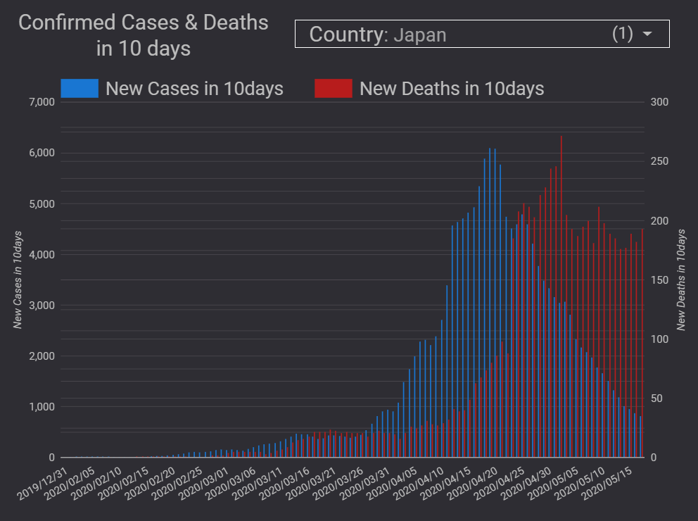
下図は、ECDCデータ版のダッシュボードでの、10日間の感染確認者数と死亡者数の推移のグラフです。1日ごとの感染確認者数や死亡者数では、バラツキが大きいので、10日間ごとの推移にしています。感染確認者数が増加してから、しばらくすると死亡者数が増加してきます。感染確認者数が減少すると、しばらくしてから死亡者数も減少してきます。日本のグラフでは、死亡者数の減少ペースがやや遅いように見えます。これは、もしかすると、感染確認者数が増加する局面で、検査できなかった感染者がもっといたということなのかもしれません。つまり、重症化率や死亡率があまり変動しないとすると、死亡者数から感染者数を逆算で推定できるはずですが、死亡者数に対して感染確認者数が少ないということになれば、感染確認者数が足りていなかったということなのかもしれません。日本の検査数の少なさがこのような形で表れているのでしょうか。4月頃に「感染確認」が不十分だった時期があったと考えられるので、4月、5月あたりは、「超過死亡」の数もいくらか見られるかもしれません。↓日本の場合、死亡者数の減少ペースが感染確認者数の減少ペースと合っていないようです。↓ドイツの場合は、感染確認者数の減少と死亡者数の減少が連動しているように見えます。↓イタリアの場合も、感染確認者数の減少と死亡者数の減少が連動しているように見えます。---------------------------------------------------------------------------------------------------------------------------------------↓実効再生産数を計算できるWebアプリがあります。↓倍加時間についてです。---------------------------------------------------------------------------------------------------------------------------------------------------【ダッシュボード「COVID-19 Transition Graphs」を試作】中国本土以外の地域への感染が拡大しているため、国別、地域別の感染者数の推移を簡単に確認できるダッシュボードを試作しています。随時、ページを追加しています。グラフのデータは、右上部分の操作でダウンロードすることができます。アメリカの「地域別の変数」を前処理して、「州別」での推移をグラフ化できるようにしました。また、州コードのフィールドを作成してコロプレス地図も作成しています。楽天ブログでは「iframe」タグが使えないので、Bloggerのページから利用できるようにしています。無料で利用できる、グーグルの「データポータル」のダッシュボードです。データさえあれば、簡単に作成できます。「国」別、「地域」別に日ごとの感染者数の推移を見ることができます。↓ダッシュボードの試作です。下記リンクのページから利用できます。ジョンズ・ホプキンス大学の「JHU CSSE」の「Covid19 Daily Reports」のデータを利用しています。 EdgeブラウザやIEブラウザなど、Chromeブラウザ以外での利用の場合はうまく表示されないことがあるようです。↓上記のダッシュボードのデータの出所のサイトです。マップがメインのダッシュボードです-----------------------------------------------------------------------------------------↓WHOのサイトでも、感染者数、地域などの「Situation Report」が日々更新されています。関心がある場合は、一日に一度見るといいのではないかと思います。↓日本のインフルエンザの「定点当たり報告数」をグラフ化できるダッシュボードを試作。都道府県別にグラフ化可能です。------------------------------------------------------ 新型コロナウイルス(2019-novel coronavirus)対策もインフルエンザ対策と同じで、手洗い、うがい、マスク着用(咳エチケット)、免疫力アップなどが対策になるようです。【3/6再入荷】【お一人様3個まで】LEC レック 除菌の【激落ちくん】320ml 除菌 激落ち キッチン アルカリ電解水 配合 アルコールスプレー 除菌スプレー【RCP】【S-659】【キャッシュレス 還元 対象店】価格:260円(税別、送料別)(2020/3/7時点)楽天で購入----------------------------------------------------------------------------★おすすめの記事 ◆How Windows Sonic looks like.:Windows Sonic for Headphonesの音声と2chステレオ音声の比較:7.1.2chテストトーンの比較で明らかになった違い:一目で違いがわかりました----------------------------------------------------------------------------------------------------------
2020.05.18
コメント(0)
-

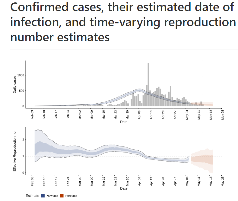
◆【新型コロナ】やっとわかった、専門家会議の実効再生産数の概念と西浦先生らの計算方法:日本科学技術ジャーナリスト会議のニコニコ動画で解説されています
西浦先生らが計算している、実効再生産数・Rtの概念や計算方法について、日本科学技術ジャーナリスト会議(5月12日開催)のニコニコ動画で、西浦先生が解説をされていました。テレビ会議システムのZOOMを使ったオンライン会議です。西浦先生のZOOMの背景画像は北海道の雪山のような画像でした。動画では、西浦先生が、一人の研究者の立場で解説をされています。【8割おじさん西浦教授に聞く】新型コロナの実効再生産数のすべて オンライン講演会生中継/主催:日本科学技術ジャーナリスト会議公式 2020/05/12(火) 20:00開始 (2時間21分)説明資料や、計算のためのR言語のコードは、GitHubにアップされています。https://github.com/contactmodel/COVID19-Japan-Reff動画では、実効再生産数の概念(概念は複数あり)と計算式の考え方、実効再生産数の計算の元データの整備として「感染確認の報告日」を「感染日」に変換処理していることなどの説明がありました。動画のほとんどが、実効再生産数の計算式の考え方についてでした。数式にはよくわからない部分がありましたが、「実効再生産数」の「概念」や「計算方法」には、複数のものが存在していることがよくわかりました。計算方法・手法は、いろんなものがあるようです。実効再生産数の定義や概念は一つではないようです。計算によって出てくる「実効再生産数・Rt」は、日々の感染確認者数と感染間隔のデータから「推定」されているので、結局は、日々の感染確認者数の増減の傾向を反映している指標ということになります。「実効再生産数が1を上回ると感染者が増加し、下回ると減少します」とかいうのは、「感染確認者数が増加すると1を上回り、減少すると1を下回る」ということでもあるようです。いずれにしても、実効再生産数をデータから推定する方法には、まずデータの整備が重要なようです。西浦先生らの推定方法では、感染日ベースにデータを変換するところに注力しているようです。Rtの推定は、「感染状況」の推定なので、「感染状況」を推定するところが一番重要なようです。感染確認の報告データから、いかに「感染日」を推定できるのかが大事なようです。R言語による具体的な計算方法については、ほとんど言及がありませんでしたが、RStanでMCMCを実行していたりするようです。GitHubには最尤推定のコードと、RStanによる推定のコードの2種類がアップされています。データを「感染日」ベースに推定して変換するコードとRtの推定のコードが一体化しているため、ECDCのデータに西浦先生らの推定用コードを適用するのはちょっと難しそうです。実効再生産数の推定よりも、データを「感染日」ベースに推定して変換するところにデータ処理の工夫が凝らされています。動画からは、現状の日本の国内データの整備の遅れの問題などが垣間見えました。驚くことに、西村先生らの研究チームも、都道府県別の報道ベースのデータを収集する作業をしていたりするそうです。どうやら、厚生労働省が集約しているデータは、そのまま使えない状況のようです。日本の「データ収集・集約」のプロセスには大きな問題があるようです。なお、実効再生産数の計算に用いている発病間隔(発症間隔)のパラメータは、やはり西浦先生らの論文のものが使われていました。論文には複数の数字がありましたが、今回の解説で特定することができました。発病間隔の平均は4.8日、標準偏差は2.3という数字を使っているようです。これまで、ECDCデータ版のダッシュボードでは、平均4.7、標準偏差2.9にしていたので、5月18日のデータ更新からパラメータを変更します。なお、今後、西浦先生らの監修の実効再生産数が、民間のダッシュボードで日々報告されることが検討されているようです。感染拡大の指標として、倍加時間についての話もありましたが、「リセット」というような話がありました。確かに、感染確認者数の累計が大きくなり、一方で日々の感染確認者数は減少しているので、累計の倍加時間は過去最長の水準になってきています。累計をいったんリセットしないと、倍加時間は、新たに感染が拡大する局面の指標として使えないようです。-------------------------------------------------------↓西浦先生が、日本科学技術ジャーナリスト会議(5月12日開催)での質問に回答しています。---------------------------------------------------------------------------------------------------------------------------------------↓実効再生産数を計算できるWebアプリがあります。↓倍加時間についてです。---------------------------------------------------------------------------------------------------------------------------------------------------【ダッシュボード「COVID-19 Transition Graphs」を試作】中国本土以外の地域への感染が拡大しているため、国別、地域別の感染者数の推移を簡単に確認できるダッシュボードを試作しています。随時、ページを追加しています。グラフのデータは、右上部分の操作でダウンロードすることができます。アメリカの「地域別の変数」を前処理して、「州別」での推移をグラフ化できるようにしました。また、州コードのフィールドを作成してコロプレス地図も作成しています。楽天ブログでは「iframe」タグが使えないので、Bloggerのページから利用できるようにしています。無料で利用できる、グーグルの「データポータル」のダッシュボードです。データさえあれば、簡単に作成できます。「国」別、「地域」別に日ごとの感染者数の推移を見ることができます。↓ダッシュボードの試作です。下記リンクのページから利用できます。ジョンズ・ホプキンス大学の「JHU CSSE」の「Covid19 Daily Reports」のデータを利用しています。 EdgeブラウザやIEブラウザなど、Chromeブラウザ以外での利用の場合はうまく表示されないことがあるようです。↓上記のダッシュボードのデータの出所のサイトです。マップがメインのダッシュボードです-----------------------------------------------------------------------------------------↓WHOのサイトでも、感染者数、地域などの「Situation Report」が日々更新されています。関心がある場合は、一日に一度見るといいのではないかと思います。↓日本のインフルエンザの「定点当たり報告数」をグラフ化できるダッシュボードを試作。都道府県別にグラフ化可能です。------------------------------------------------------ 新型コロナウイルス(2019-novel coronavirus)対策もインフルエンザ対策と同じで、手洗い、うがい、マスク着用(咳エチケット)、免疫力アップなどが対策になるようです。【3/6再入荷】【お一人様3個まで】LEC レック 除菌の【激落ちくん】320ml 除菌 激落ち キッチン アルカリ電解水 配合 アルコールスプレー 除菌スプレー【RCP】【S-659】【キャッシュレス 還元 対象店】価格:260円(税別、送料別)(2020/3/7時点)楽天で購入----------------------------------------------------------------------------★おすすめの記事 ◆How Windows Sonic looks like.:Windows Sonic for Headphonesの音声と2chステレオ音声の比較:7.1.2chテストトーンの比較で明らかになった違い:一目で違いがわかりました----------------------------------------------------------------------------------------------------------
2020.05.18
コメント(0)
-
◆【新型コロナ】ドイツのRKIのデイリーレポート:確かに実効再生産数がデイリーレポートに記載されています
「ドイツでは、実効再生産数・Rが毎日公表されている。日本はなぜ毎日公表しないのか」という声があったりします。確かに、ドイツのRKI(Robert Koch Institut)のデイリーレポートには、実効再生産数・Rが記載されています。ただし、レポートの1ページ目にはなく、6ページ目にありました。なお、4月7日付けのレポートから、実効再生産数の報告が始まったようです。4日間の移動平均データによるRと、7日間の移動平均データによるRの2種類が記載されていました。ドイツの5月15日のレポートに記載されていた、4日間の移動平均データによる実効再生産数・Rは0.80で、7日間の移動平均データによるRは、0.90です。The current estimate is R= 0.80 (95% prediction interval: 0.67 – 0.97) and is based on electronically notified cases as of 15/05/2020, 12:00 AM. The 7-day R-value is estimated at 0.90 (95% predictation interval: 0.83 - 0.98) and is based on electronically notified cases as of 15/05/2020, 12:00 AM. 感染確認者数などのデータから推定される「実効再生産数・R」は、簡単に自動計算できるので、日本でも毎日公表することは簡単なはずです。実効再生産数の公表の有無の以前に、ドイツのRKIのデイリーレポートのような、わかりやすくまとまっているデイリーレポートを日本政府も出してほしいと思います。---------------------------------------------------------------------------------------------------------------------------------------↓実効再生産数を計算できるWebアプリがあります。↓倍加時間についてです。---------------------------------------------------------------------------------------------------------------------------------------------------【ダッシュボード「COVID-19 Transition Graphs」を試作】中国本土以外の地域への感染が拡大しているため、国別、地域別の感染者数の推移を簡単に確認できるダッシュボードを試作しています。随時、ページを追加しています。グラフのデータは、右上部分の操作でダウンロードすることができます。アメリカの「地域別の変数」を前処理して、「州別」での推移をグラフ化できるようにしました。また、州コードのフィールドを作成してコロプレス地図も作成しています。楽天ブログでは「iframe」タグが使えないので、Bloggerのページから利用できるようにしています。無料で利用できる、グーグルの「データポータル」のダッシュボードです。データさえあれば、簡単に作成できます。「国」別、「地域」別に日ごとの感染者数の推移を見ることができます。↓ダッシュボードの試作です。下記リンクのページから利用できます。ジョンズ・ホプキンス大学の「JHU CSSE」の「Covid19 Daily Reports」のデータを利用しています。 EdgeブラウザやIEブラウザなど、Chromeブラウザ以外での利用の場合はうまく表示されないことがあるようです。↓上記のダッシュボードのデータの出所のサイトです。マップがメインのダッシュボードです-----------------------------------------------------------------------------------------↓WHOのサイトでも、感染者数、地域などの「Situation Report」が日々更新されています。関心がある場合は、一日に一度見るといいのではないかと思います。↓日本のインフルエンザの「定点当たり報告数」をグラフ化できるダッシュボードを試作。都道府県別にグラフ化可能です。------------------------------------------------------ 新型コロナウイルス(2019-novel coronavirus)対策もインフルエンザ対策と同じで、手洗い、うがい、マスク着用(咳エチケット)、免疫力アップなどが対策になるようです。【3/6再入荷】【お一人様3個まで】LEC レック 除菌の【激落ちくん】320ml 除菌 激落ち キッチン アルカリ電解水 配合 アルコールスプレー 除菌スプレー【RCP】【S-659】【キャッシュレス 還元 対象店】価格:260円(税別、送料別)(2020/3/7時点)楽天で購入----------------------------------------------------------------------------★おすすめの記事 ◆How Windows Sonic looks like.:Windows Sonic for Headphonesの音声と2chステレオ音声の比較:7.1.2chテストトーンの比較で明らかになった違い:一目で違いがわかりました----------------------------------------------------------------------------------------------------------
2020.05.16
コメント(0)
-
◆特別定額給付金で買いたいガジェット「Home Theater Solutions XP-EXT1」:スピーカーから聴こえてくるように聴こえるというヘッドホンシステム:「頭外定位」で深夜の映画鑑賞に最適だと思います
日本では未発売のJVCの「EXOFIELD」テクノロジーを利用した「Home Theater Solutions XP-EXT1」の立体音響ヘッドホンシステムが気になります。特に、テクノロジーとかソリューションズとかが気になります。価格は、「$999.95」なので、もしも日本で発売される場合は、恐らく、13~14万円くらいのプライシングになるのではないかと思います。1人分の特別定額給付金では買えませんが、2人分であればお釣りがくると思います。【追記:8月に国内販売開始予定になりました:ほぼ1人分の特別定額給付金で買える価格になりそうです:X BOX ONE Sとかをつなげると配信とディスクの両方が使えるので良さそうです】ちなみに、5月2日にオンライン申請した特別定額給付金はまだ給付されていません。どうやら、オンライン申請だから早く給付されるものでもないようです。申請時期によっては、郵送申請の方が処理が速いこともあり得るらしく、政府のIT化は絶望的な状況であることがわかります。ヘッドホンでは、「頭内定位」という、頭の中の音を聴いているような感じがどうしてもありますが、JVCのEXOFIELDのシステムでは、外部スピーカーからの音のように聴こえるという「頭外定位」になるそうです。頭部伝達関数を利用した、バーチャルサラウンドの音声処理ですが、耳の形から個人向けに処理のカスタマイズができるようです。マルチチャンネルの音源にも対応したということで、Dolby Atmosの映画も立体的に、頭外定位で楽しめそうです。深夜の映画鑑賞での利用に最適なのではないかと思います。でも、日本では未発売です。特徴1:個人に関するさまざまな音響特性の測定により、頭外定位のための最適な音場処理を実現。特徴2:「耳内音響マイクシステム」を用いた測定により、オープン型/ 密閉型を問わずヘッドホンで自然な音場を実現。特徴3:新開発の「個人特性生成アルゴリズム」により、最適な音響特性を短時間で測定・自動生成が可能。特徴4:測定データと「EXOFIELD」処理をスマートフォンアプリケーション等への実装が可能。特徴5:マルチチャンネルの再生にも対応し、ホームシアターやVR をはじめとする立体音場もヘッドホンで再現。特徴6:個人特性抽出生成 ~測定はヘッドホン特性だけで、スピーカー特性はDB から抽出。---------------------------------------------------------------------------------------------------------------------------------------↓実効再生産数を計算できるWebアプリがあります。↓倍加時間についてです。---------------------------------------------------------------------------------------------------------------------------------------------------【ダッシュボード「COVID-19 Transition Graphs」を試作】中国本土以外の地域への感染が拡大しているため、国別、地域別の感染者数の推移を簡単に確認できるダッシュボードを試作しています。随時、ページを追加しています。グラフのデータは、右上部分の操作でダウンロードすることができます。アメリカの「地域別の変数」を前処理して、「州別」での推移をグラフ化できるようにしました。また、州コードのフィールドを作成してコロプレス地図も作成しています。楽天ブログでは「iframe」タグが使えないので、Bloggerのページから利用できるようにしています。無料で利用できる、グーグルの「データポータル」のダッシュボードです。データさえあれば、簡単に作成できます。「国」別、「地域」別に日ごとの感染者数の推移を見ることができます。↓ダッシュボードの試作です。下記リンクのページから利用できます。ジョンズ・ホプキンス大学の「JHU CSSE」の「Covid19 Daily Reports」のデータを利用しています。 EdgeブラウザやIEブラウザなど、Chromeブラウザ以外での利用の場合はうまく表示されないことがあるようです。↓上記のダッシュボードのデータの出所のサイトです。マップがメインのダッシュボードです-----------------------------------------------------------------------------------------↓WHOのサイトでも、感染者数、地域などの「Situation Report」が日々更新されています。関心がある場合は、一日に一度見るといいのではないかと思います。↓日本のインフルエンザの「定点当たり報告数」をグラフ化できるダッシュボードを試作。都道府県別にグラフ化可能です。------------------------------------------------------ 新型コロナウイルス(2019-novel coronavirus)対策もインフルエンザ対策と同じで、手洗い、うがい、マスク着用(咳エチケット)、免疫力アップなどが対策になるようです。【3/6再入荷】【お一人様3個まで】LEC レック 除菌の【激落ちくん】320ml 除菌 激落ち キッチン アルカリ電解水 配合 アルコールスプレー 除菌スプレー【RCP】【S-659】【キャッシュレス 還元 対象店】価格:260円(税別、送料別)(2020/3/7時点)楽天で購入----------------------------------------------------------------------------★おすすめの記事 ◆How Windows Sonic looks like.:Windows Sonic for Headphonesの音声と2chステレオ音声の比較:7.1.2chテストトーンの比較で明らかになった違い:一目で違いがわかりました----------------------------------------------------------------------------------------------------------
2020.05.16
コメント(0)
-
◆【新型コロナ】今後の実効再生産数の短期予測を国別にできるサイトがありました:シンプルですっきりしたデザインのサイトです
実効再生産数・Rtの計算方法などについて調べていて、実効再生産数の短期的な予測ができるサイトを発見しました。「London School of Hygiene&Tropical Medicineにある感染症の数学的モデリングセンター(CMMID」のサイトです。London School of Hygiene&Tropical Medicineにある感染症の数学的モデリングセンター(CMMID)は、LSHTMの全3学部の疫学者、数学者、経済学者、統計学者、臨床医の学際的なグループです。「Real time report」の表示のページは、一言で言うと、「更新される論文の図表」といった雰囲気のサイトです。個人的には、もうちょっと、はっきりとした色遣いにした方がいいと思いますが、シンプルで見やすい図表です。ダッシュボードの参考にしたいと思います。ECDCのデータを基に、各種計算をしていて、計算結果をシンプルデザインのグラフで表示しています。このサイトのように、加工度を高めたデータによる図表を私のECDC版のダッシュボードに追加していきたいものです。最初は、静的なページだと思っていましたが、画面上部の帯がメニューになっていて、表示する地域などを選択すると、各種グラフが表示されます。このサイトでの実効再生産数の計算ですが、時点t1と時点t2があった場合に、t1からt2にかけての感染確認者数の増減のデータから、時点t1の実効再生産数を算出するタイプのようです。また、感染確認日から発症日を推定していますが、国別に遅延のパラメータを変えていないようなので、日本の検査の実情からすると、少し発症日を後ろ倒しして考えた方がいいのかもしれません。↓世界の国々についてデータが計算されていますが、下図のように、「感染確認者が今後多そうな6カ国」として表示するなどの要約もされています。ブラジル、インド、ロシア、イギリス、アメリカなどで感染拡大が続いています。別のページは、「致命率」の推定の情報があります。死亡率を、ある時点の感染確認者数と死亡者数で計算すると、過小な数字になってしまうので、このページでは、感染確認と死亡の間のタイムラグを考慮に入れて推計しています。確かに、感染確認者数が増えてから、遅れて死亡者数が増えるので、感染確認者数が増えている局面では、単純に計算した死亡率が低下するということになります。そして、日本の場合は、日々の感染確認者数が減る局面にありますが、日々の死亡者数はまだそれほど減ってきていないので、死亡率は高まってきています。---------------------------------------------------------------------------------------------------------------------------------------↓実効再生産数を計算できるWebアプリがあります。↓倍加時間についてです。---------------------------------------------------------------------------------------------------------------------------------------------------【ダッシュボード「COVID-19 Transition Graphs」を試作】中国本土以外の地域への感染が拡大しているため、国別、地域別の感染者数の推移を簡単に確認できるダッシュボードを試作しています。随時、ページを追加しています。グラフのデータは、右上部分の操作でダウンロードすることができます。アメリカの「地域別の変数」を前処理して、「州別」での推移をグラフ化できるようにしました。また、州コードのフィールドを作成してコロプレス地図も作成しています。楽天ブログでは「iframe」タグが使えないので、Bloggerのページから利用できるようにしています。無料で利用できる、グーグルの「データポータル」のダッシュボードです。データさえあれば、簡単に作成できます。「国」別、「地域」別に日ごとの感染者数の推移を見ることができます。↓ダッシュボードの試作です。下記リンクのページから利用できます。ジョンズ・ホプキンス大学の「JHU CSSE」の「Covid19 Daily Reports」のデータを利用しています。 EdgeブラウザやIEブラウザなど、Chromeブラウザ以外での利用の場合はうまく表示されないことがあるようです。↓上記のダッシュボードのデータの出所のサイトです。マップがメインのダッシュボードです-----------------------------------------------------------------------------------------↓WHOのサイトでも、感染者数、地域などの「Situation Report」が日々更新されています。関心がある場合は、一日に一度見るといいのではないかと思います。↓日本のインフルエンザの「定点当たり報告数」をグラフ化できるダッシュボードを試作。都道府県別にグラフ化可能です。------------------------------------------------------ 新型コロナウイルス(2019-novel coronavirus)対策もインフルエンザ対策と同じで、手洗い、うがい、マスク着用(咳エチケット)、免疫力アップなどが対策になるようです。【3/6再入荷】【お一人様3個まで】LEC レック 除菌の【激落ちくん】320ml 除菌 激落ち キッチン アルカリ電解水 配合 アルコールスプレー 除菌スプレー【RCP】【S-659】【キャッシュレス 還元 対象店】価格:260円(税別、送料別)(2020/3/7時点)楽天で購入----------------------------------------------------------------------------★おすすめの記事 ◆How Windows Sonic looks like.:Windows Sonic for Headphonesの音声と2chステレオ音声の比較:7.1.2chテストトーンの比較で明らかになった違い:一目で違いがわかりました----------------------------------------------------------------------------------------------------------
2020.05.16
コメント(0)
-
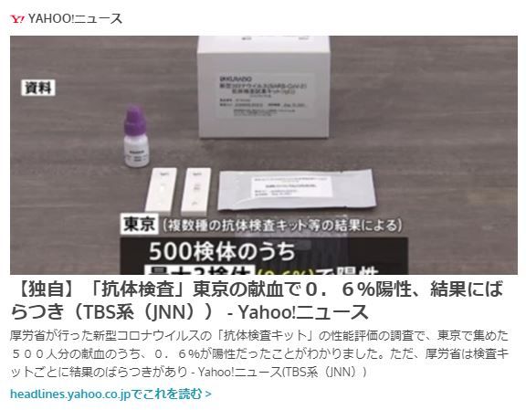
◆【新型コロナ】献血の血液による抗体検査の結果:東京は最大0.6%陽性、東北は最大0.4%陽性:検査キット間にバラツキも
日本赤十字社の献血の血液を使って、東京で500件、東北で500件の抗体検査が試行されたようですが、陽性は、東京で「最大0.6%」、東北で「0.4%」という結果だそうです。検査キットの性能調査が目的のようですが、複数の検査キットの間で結果が異なる場合があったとのことです。やはり、検査に偽陽性、偽陰性は付き物のようです。スペインの抗体検査で、5%の陽性という話もありましたから、そもそも、日本では感染者数自体が少なかった可能性もあり得るようです。抗体を持っている人が少ないということは、集団免疫獲得までの時間はまだまだかかるということになるので、感染者が少ないということは、今後にとってはいいことではなさそうです。また、PCR検査での偽陽性もかなり多いのかもしれません。ただし、検査対象が「献血の血液」なので、かなりバイアスがある可能性は高いと思います。献血する人には、健康な方が多いと推測されます。検査対象に大きな偏りがあるのではないかと思います。つまり、スープをかき混ぜないで味見をしているようなものなのではないかと思います。6月から、東京、大阪、宮城で1万人規模での調査が行われるようですので、その結果に注目したいと思います。---------------------------------------------------------------------------------------------------------------------------------------↓実効再生産数を計算できるWebアプリがあります。↓倍加時間についてです。---------------------------------------------------------------------------------------------------------------------------------------------------【ダッシュボード「COVID-19 Transition Graphs」を試作】中国本土以外の地域への感染が拡大しているため、国別、地域別の感染者数の推移を簡単に確認できるダッシュボードを試作しています。随時、ページを追加しています。グラフのデータは、右上部分の操作でダウンロードすることができます。アメリカの「地域別の変数」を前処理して、「州別」での推移をグラフ化できるようにしました。また、州コードのフィールドを作成してコロプレス地図も作成しています。楽天ブログでは「iframe」タグが使えないので、Bloggerのページから利用できるようにしています。無料で利用できる、グーグルの「データポータル」のダッシュボードです。データさえあれば、簡単に作成できます。「国」別、「地域」別に日ごとの感染者数の推移を見ることができます。↓ダッシュボードの試作です。下記リンクのページから利用できます。ジョンズ・ホプキンス大学の「JHU CSSE」の「Covid19 Daily Reports」のデータを利用しています。 EdgeブラウザやIEブラウザなど、Chromeブラウザ以外での利用の場合はうまく表示されないことがあるようです。↓上記のダッシュボードのデータの出所のサイトです。マップがメインのダッシュボードです-----------------------------------------------------------------------------------------↓WHOのサイトでも、感染者数、地域などの「Situation Report」が日々更新されています。関心がある場合は、一日に一度見るといいのではないかと思います。↓日本のインフルエンザの「定点当たり報告数」をグラフ化できるダッシュボードを試作。都道府県別にグラフ化可能です。------------------------------------------------------ 新型コロナウイルス(2019-novel coronavirus)対策もインフルエンザ対策と同じで、手洗い、うがい、マスク着用(咳エチケット)、免疫力アップなどが対策になるようです。【3/6再入荷】【お一人様3個まで】LEC レック 除菌の【激落ちくん】320ml 除菌 激落ち キッチン アルカリ電解水 配合 アルコールスプレー 除菌スプレー【RCP】【S-659】【キャッシュレス 還元 対象店】価格:260円(税別、送料別)(2020/3/7時点)楽天で購入----------------------------------------------------------------------------★おすすめの記事 ◆How Windows Sonic looks like.:Windows Sonic for Headphonesの音声と2chステレオ音声の比較:7.1.2chテストトーンの比較で明らかになった違い:一目で違いがわかりました----------------------------------------------------------------------------------------------------------
2020.05.15
コメント(0)
-
◆【新型コロナ】専門家会議の実効再生産数の算出手法はベイズ統計であるようです:実効再生産数の「95%信用区間」(Credible Interval)という用語からわかります
新型コロナウイルス感染症対策専門家会議の「新型コロナウイルス感染症対策の状況分析・提言」(令和 2 年 5 月 14 日) の中に、「実効再生産数」が紹介されています。その実効再生産数の計算式などの詳細は、明らかにされていませんが、一つ確実にわかることがあります。資料のなかで、「95%信頼区間」ではなく、「95%信用区間」という表現になっていることから、この実効再生産数が、ベイズ統計の手法によって推定されていることがわかります。それから、グラフは英語表記になっていて、英語の論文用に使えるように作成されている図表であることがわかります。この機会を利用して、論文を量産しているようです。早く論文を公開して、計算方法やパラメータを明らかにしてほしいと思います。さて、ベイズ統計では、「唯一の真の実効再生産数の値」というものを仮定しないで、「実効再生産数」の値は確率分布として推定される、という考え方のようです。真の値は、一つではなく、確率分布(事後確率分布)として表現されます。ベイジアンの場合は、「95%の確率で『95%信用区間(Credible Interval)』の中に真の値がある」ということになります。一方、従来型の統計学の考え方は、「真の実効再生産数」というものが存在していて、得られたデータから推定される「95%信頼区間」にその「真の値」が95%の確率で含まれる、という考え方になります。100回標本データをとった場合に、95回は真の値がその範囲に含まれるようにとった幅が「95%信頼区間」です。ややこしいですが、「真の値が100回中95回は含まれるように配慮して設定した幅である」ということになります。標本データによって「95%信頼区間の幅」自体が変動するので、ある特定の標本データで推定された一つの「95%信頼区間」に、真の値が100回中95回含まれるということではありません。つまり、100回分のデータがあれば、「95%信頼区間」は100通りあり(同じ区間である場合もあると思いますが)、その100通りの区間のうちの95通りの区間に真の値が含まれるように推定した幅、ということになります。「これくらいの幅をとっておけば、100回中95回はこの幅の中に入るだろう」という「幅の取り方」の話ということになります。ベイジアンの場合は、従来型の統計学に比べて、解釈がシンプルです。実効再生産数は、「95%の確率で95%信用区間に含まれている」という明快な解釈になります。下記の例で言うと、4 月 28 日時点の全国の実効再生産数の推定値は、95%の確率で、0.4から0.7の間にある、ということになります。一方、仮にその区間が従来型の「信頼区間」だとすると、100回データをとって、信頼区間を推定した場合、100回中95回は真の値がその中に含まれるようにとった幅が「0.4~0.7」である、というわかりにくいことになります。ECDCのデータを利用したダッシュボードで、実効再生産数・Rtを国別に表示できるページを作成していますが、その計算ではR言語の「EpiEstim」というパッケージを利用しています。「EpiEstim」パッケージはベイジアンの手法を用いているので、専門家会議の計算アルゴリズムと似ているのではないかと思います。②実効再生産数の推移〇 5 月 13 日までの全国の実効再生産数は、4 月 29 日までの感染時刻に関する推定が可能であり、概ね 4 月上旬以降から1を下回り続けている。発症日データのみを用いた推定による 4 月 28 日時点の全国の推定値は、0.6(95%信用区間:0.4、0.7)であった。---------------------------------------------------------------------------------------------------------------------------------------↓実効再生産数を計算できるWebアプリがあります。↓倍加時間についてです。---------------------------------------------------------------------------------------------------------------------------------------------------【ダッシュボード「COVID-19 Transition Graphs」を試作】中国本土以外の地域への感染が拡大しているため、国別、地域別の感染者数の推移を簡単に確認できるダッシュボードを試作しています。随時、ページを追加しています。グラフのデータは、右上部分の操作でダウンロードすることができます。アメリカの「地域別の変数」を前処理して、「州別」での推移をグラフ化できるようにしました。また、州コードのフィールドを作成してコロプレス地図も作成しています。楽天ブログでは「iframe」タグが使えないので、Bloggerのページから利用できるようにしています。無料で利用できる、グーグルの「データポータル」のダッシュボードです。データさえあれば、簡単に作成できます。「国」別、「地域」別に日ごとの感染者数の推移を見ることができます。↓ダッシュボードの試作です。下記リンクのページから利用できます。ジョンズ・ホプキンス大学の「JHU CSSE」の「Covid19 Daily Reports」のデータを利用しています。 EdgeブラウザやIEブラウザなど、Chromeブラウザ以外での利用の場合はうまく表示されないことがあるようです。↓上記のダッシュボードのデータの出所のサイトです。マップがメインのダッシュボードです-----------------------------------------------------------------------------------------↓WHOのサイトでも、感染者数、地域などの「Situation Report」が日々更新されています。関心がある場合は、一日に一度見るといいのではないかと思います。↓日本のインフルエンザの「定点当たり報告数」をグラフ化できるダッシュボードを試作。都道府県別にグラフ化可能です。------------------------------------------------------ 新型コロナウイルス(2019-novel coronavirus)対策もインフルエンザ対策と同じで、手洗い、うがい、マスク着用(咳エチケット)、免疫力アップなどが対策になるようです。【3/6再入荷】【お一人様3個まで】LEC レック 除菌の【激落ちくん】320ml 除菌 激落ち キッチン アルカリ電解水 配合 アルコールスプレー 除菌スプレー【RCP】【S-659】【キャッシュレス 還元 対象店】価格:260円(税別、送料別)(2020/3/7時点)楽天で購入----------------------------------------------------------------------------★おすすめの記事 ◆How Windows Sonic looks like.:Windows Sonic for Headphonesの音声と2chステレオ音声の比較:7.1.2chテストトーンの比較で明らかになった違い:一目で違いがわかりました----------------------------------------------------------------------------------------------------------
2020.05.15
コメント(0)
-
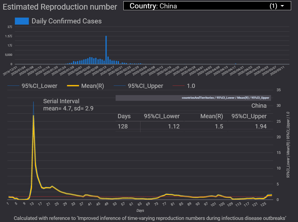
◆【新型コロナ】「麦わら帽子は冬に買え」ではないですが、「マスクは夏に買え」ということになるのかもしれません:マスクは市況商品になったようです
しばらく、「在庫なし」あるいは「高価格」だった不織布マスクですが、楽天市場でも「在庫あり」「適正価格」の状態に近づいてきているようです。楽天市場で「マスク」の検索結果を見る昨年、ダイソーで不織布のマスクを30枚108円(増税前)で購入した記憶がありますから、1枚3円前後が基準価格の一つのようです。そのような価格とはまだまだ開きがあるようですが、一時期と比べて価格が低下してきたのは確かなようです。中国での新型コロナ感染者数の一旦の収束、生産活動の再開などによって、マスクの供給量が増加しているようで、不織布マスクの在庫が復活し、価格が低下してきているようです。↓ECDCのデータを利用したダッシュボードで、日々の感染確認者数の推移や実効再生産数を国ごとに表示できるページを作成しています。中国では、日々の新規の感染確認者数は少なくなっています。ただし、直近では、実効再生産数が1.5(95%信用区間:1.12~1.94)と、1を超えているので、今後、感染確認者数が急増するとマスク価格が再び高騰するかもしれません。まさに、マスクは、原油や銅、仮想通貨のような市況商品化してきているようです。原油の先物のようなマイナスの価格になることはあり得ないでしょうが、供給が戻ってきているようなので、マスクの価格はしばらく沈静化しそうです。しかし、新型コロナウイルスの大規模な第2波が、この秋冬にやってくる可能性があるので、また秋冬にマスクの供給が減少して、在庫不足、価格高騰といったことが起きる可能性があるかもしれません。これから、秋冬に向けて、「ドル・コスト平均法(定額購入法)」によって、少しずつ家庭内のマスクの備蓄を増やしていくといいのではないかと思います。それにしても政府のマスクは、遅くとも4月上旬ごろまでに届けてもらいたかったと思います。まだ届いていません。やはり、政府の施策にはスピード感なし、的外れなところがありますが、「税金」だと思うと、やり切れない気持ちになります。---------------------------------------------------------------------------------------------------------------------------------------↓実効再生産数を計算できるWebアプリがあります。↓倍加時間についてです。---------------------------------------------------------------------------------------------------------------------------------------------------【ダッシュボード「COVID-19 Transition Graphs」を試作】中国本土以外の地域への感染が拡大しているため、国別、地域別の感染者数の推移を簡単に確認できるダッシュボードを試作しています。随時、ページを追加しています。グラフのデータは、右上部分の操作でダウンロードすることができます。アメリカの「地域別の変数」を前処理して、「州別」での推移をグラフ化できるようにしました。また、州コードのフィールドを作成してコロプレス地図も作成しています。楽天ブログでは「iframe」タグが使えないので、Bloggerのページから利用できるようにしています。無料で利用できる、グーグルの「データポータル」のダッシュボードです。データさえあれば、簡単に作成できます。「国」別、「地域」別に日ごとの感染者数の推移を見ることができます。↓ダッシュボードの試作です。下記リンクのページから利用できます。ジョンズ・ホプキンス大学の「JHU CSSE」の「Covid19 Daily Reports」のデータを利用しています。 EdgeブラウザやIEブラウザなど、Chromeブラウザ以外での利用の場合はうまく表示されないことがあるようです。↓上記のダッシュボードのデータの出所のサイトです。マップがメインのダッシュボードです-----------------------------------------------------------------------------------------↓WHOのサイトでも、感染者数、地域などの「Situation Report」が日々更新されています。関心がある場合は、一日に一度見るといいのではないかと思います。↓日本のインフルエンザの「定点当たり報告数」をグラフ化できるダッシュボードを試作。都道府県別にグラフ化可能です。------------------------------------------------------ 新型コロナウイルス(2019-novel coronavirus)対策もインフルエンザ対策と同じで、手洗い、うがい、マスク着用(咳エチケット)、免疫力アップなどが対策になるようです。【3/6再入荷】【お一人様3個まで】LEC レック 除菌の【激落ちくん】320ml 除菌 激落ち キッチン アルカリ電解水 配合 アルコールスプレー 除菌スプレー【RCP】【S-659】【キャッシュレス 還元 対象店】価格:260円(税別、送料別)(2020/3/7時点)楽天で購入----------------------------------------------------------------------------★おすすめの記事 ◆How Windows Sonic looks like.:Windows Sonic for Headphonesの音声と2chステレオ音声の比較:7.1.2chテストトーンの比較で明らかになった違い:一目で違いがわかりました----------------------------------------------------------------------------------------------------------
2020.05.15
コメント(0)
-
◆【新型コロナ:誤りの部分を訂正しました】来年の大学入試に出そうな「偽陽性者」と「真の陽性者」の確率の問題:検査拡大への懐疑論の一つの論拠は「偽陽性者」の問題のようです:多くの偽陽性者が医療崩壊を招きかねないという考え方があるようです:確かに検査の仕方によっては「偽陽性者」が大量に発生します
小田垣教授の考察を紹介したブログに対して、「ベイズ統計(事前確率→事後確率)を学んでください」とのコメントをいただきました。「早期収束を図るために検査を拡大する方法がある」という主張に対して、「検査の拡大」には問題点もある、という的確なご指摘です。この指摘の背景には、ベイズ統計で言うところの「事前確率の低い人(症状のない人・感染していない人)」に対して検査を行った場合、仮に精度の高い検査であっても、事前確率が低い人が多い場合には、多数の偽陽性者(感染していないのに感染しているとされる人)が出てしまい、検査の意味がなくなってしまうどころか、多数の偽陽性者の対応に追われて医療崩壊が起きるという考え方があるのかもしれません。「本当に感染している確率」については、ベイズの定理を使わなくても、「条件付き確率」で解ける問題のようです。いかにも、来年の大学入試で出そうな問題です。私は、「ベイズ統計」については、概説書レベルの知識しかありません。確かに、病気の診断についての例題が、ベイズ統計の概説書に載っていました。ベイズの定理を書き表すには、数式エディターを使う必要があるので、ベイズの定理についてはまたの機会にまとめてみようと思います。さて、例えば、スペインの抗体検査の結果では、5%程度が「感染した可能性がある」ということだったので、95%の人は「感染していなかった」ということになり、集団免疫獲得までは、まだまだ時間がかかりそうです。この「感染していない人が多い状態」が、多数の偽陽性者の問題を起こすようです。【下記の計算の誤った部分を訂正しました:太字の部分が誤りでした:お詫びして訂正します】仮に、検査の精度について、「感染者を感染者として正しく検出できる確率が70%」「感染していない人を誤って感染していると判定する確率が1%」とします。スペインの抗体検査の例にならって、全人口のうち、「感染者が5%」「感染していない人が95%」の割合だとします。10万人の集団について考えると、前提として「感染者は5千人」「感染していない人は9万5千人」ということになります。この場合、「感染していて、感染していると判定される人数」は、5000人の70%の3500人です。「感染していないのに感染していると判定される人数」は、95000人の1%の950人です。「感染していると判定される人数」は、3500+950=4450人です。10万人の集団から1人を無作為で選んで検査を実施して「感染していると判定された」ときに、「本当に感染している」確率は、3500÷4450=78.7%ということになります。「感染者」が少ないと、集団の全体を検査した場合、「感染している」という判定であっても、「実際に感染している」確率は78.7%と高くはない、ということになるようです。このような場合に重要なのは、「感染している可能性が高い人(症状がある人)」を検査するようにスクリーニングすれば、「感染している」という判定が正しい確率を上げることができるということのようです。「全人口」に対する検査には意味がない、という主張は、上記の例のように、多数の偽陽性者を生んでしまうという意味で正しいと思いますが、日本の現状は「症状がある人(事前確率が高い人)」への検査が十分できていないのが問題なので、「検査を拡大すべきだ」という主張も正しいと思います。単純化すると、検査拡大への反対論の趣旨は、「無症状者を多く検査すると多数の偽陽性者が生じて医療崩壊が起きる」ということのようです。それに対して、検査拡大論には「症状のある人の検査ができていないのは問題なので、検査を拡大すべきだ」というものと「とにかく全員を検査すべきだ」というものがあると思いますが、少なくとも前者の「症状のある人は検査できるようにすべきだ」というのは妥当なものだと思います。「とにかく全員検査すべきだ」という主張の場合でも、「偽陽性なのに重篤な症状」ということはまれでしょうから、感染していると判定されても無症状の人は病院ではなく、軽症者・無症状者用の隔離施設に隔離するということであれば医療崩壊を起こすことはないと思います。真の陽性であっても、偽陽性であっても、軽症者や無症状者は病院以外の隔離施設に隔離すればいいのだと思います。そもそも、重篤な症状があれば、「偽陰性」であっても入院は必要です。まあ、「全員のPCR検査」は極論で、今のところ現実的ではないと思いますが。どうやら、「検査拡大」と「軽症者・無症状者用の隔離施設」は必ずセットにすべきもののようです。それから、医療機関が大量の検査を実施することになると、医療機関の大きな負担になるので、検査専門の「検査センター」もセットに加える必要があります。つまり、「検査拡大」「検査専門の検査センター」「大規模な隔離施設」の3点セットが必要だということだと思います。これは、「韓国方式」そのもののようです。なお、偽陽性の誤判定率1%(特異度99%)とした場合でも、検査数が多くなると、偽陽性は少なからずあるようなので、隔離施設内で偽陽性者が真の陽性者にならないように、隔離施設は「個室」にして、隔離施設内での感染を抑制する必要があると思います。でも、岩手県では400人以上検査していて、陽性者ゼロということは、偽陽性はかなり少ない可能性もあります。特異度99%という仮定は、一見高そうに見えますが、それでも低いのかもしれません。特異度が99%であれば、岩手県で1人くらいは陽性者がいてもいいのではないかと思います。特異度を95%と仮定して、「偽陽性者が多いはずだ」という主張もあったりしますが、その95%の場合であれば岩手県で20人前後陽性者がいてもいいはずです。まだ、試行数が少なくて収束していないだけで、40000人検査すれば、2000人偽陽性がでるということなのでしょうか。特異度が95%とかであれば、400件検査して、1人も陽性者がいない事態というのは、ほぼあり得ない状況なのではないでしょうか。400件では、特異度の検証をするための数が足りていないということでしょうか。岩手県の検査が1000件くらいになった時に陽性者がどれくらいになるのか注目されます。そもそも、「陽性者を必ず入院させる」という対応が間違いなのであって、「陽性者のうち、入院の必要がある人を入院させる」という当たり前の対応をするのであれば、検査の精度は問題ではないと思います。もちろん、陰性であっても入院の必要があれば入院させる必要があります。入院が必要な症状があれば、陽性判定の有無にかかわらず、入院の必要はあるわけで、「検査拡大が医療崩壊を起こす」という説には論理の飛躍があるように思います。結局、「無症状者を入院させる」という対応が間違っている、ということなのではないでしょうか。新型コロナのように、軽症や無症状者が多い場合は、病院とは別の大規模な隔離施設が必要だということなのだと思います。2月の段階では、病態がよくわからなかったので、仕方がなかったと思いますが、3月には「軽症者・無症状者の隔離施設」の対応ができたのではないかと思います。偽陽性が問題になるのは、「陽性者を無条件に入院させる」という間違った対応を前提にしているからだと思います。「無症状者を多く検査すると多数の偽陽性者が生じて医療崩壊が起きる」という主張の前提は、「トリアージをまったく行わない」ということのようです。適切なトリアージが行われるのであれば、検査を拡大する方向が正しいのではないかと思います。検査拡大を主張する人と、検査拡大に懐疑的な人では、「トリアージの有無」という、議論の前提条件が異なっているので、議論がかみ合わないのではないでしょうか。また、検査拡大に懐疑的な人は、「病院の病床数は増やすことは不可能」「軽症者・無症状者隔離施設は存在しない」といった前提に基づいて考えている場合が多いのではないかと思います。確かに、短期的にはその前提は正しいと思います。しかし、長期戦を想定した場合には、その前提自体を変える必要があると思います。2009年の豚インフルエンザ(新型インフルエンザ)が流行した時、初期の患者は軽症者であっても強制的に入院、隔離され、「インフルエンザなのに、公費で3食昼寝付きか」という感想を持ったことを思い出しました。私の場合は、秋に罹患したので、私費でタミフルを購入し、自宅療養でした。しかも、大流行時なのに、抗原検査のために、鼻腔に長い綿棒を挿入されて、非常に痛い思いをしたという、いやな記憶があります。大流行時に発熱があるという、事前確率が高い状態だったので、検査なしでタミフルを処方するという診断も妥当だったのではないかと思います。新型コロナの場合は、「無症状の感染者」が特徴のようなので、症状のある人はもちろん検査し、陽性者の周囲の人も幅広く検査する必要があるとすると、やはり、検査は拡大した方がいいのだと思います。検査拡大反対論の中でも、「検査能力拡大賛成、検査慎重実施」というのはわかりますが、「検査能力拡大不要」という考え方は何か違うと個人的に思います。---------------------------------------------------------------------------------------------------------------------------------------↓実効再生産数を計算できるWebアプリがあります。↓倍加時間についてです。----------------------------------------------------------------------------------------------------------------------------------------------------長さ調節可フィルターも入る2重構造!洗濯可立体仕様のケアマスク●先行受注●【メール便で送料無料】【メール便A】マスク 布マスク 男女兼用 日本製 国内生産 二重構造 フィルター効果 ユニセックス 洗える 洗濯可能 清潔 花粉症 保湿 コットン 綿価格:1380円(税込、送料無料) (2020/3/27時点)楽天で購入洗って、繰り返し使える布マスクです。-------------------------------------------------------------------------【ダッシュボード「COVID-19 Transition Graphs」を試作】中国本土以外の地域への感染が拡大しているため、国別、地域別の感染者数の推移を簡単に確認できるダッシュボードを試作しています。随時、ページを追加しています。グラフのデータは、右上部分の操作でダウンロードすることができます。アメリカの「地域別の変数」を前処理して、「州別」での推移をグラフ化できるようにしました。また、州コードのフィールドを作成してコロプレス地図も作成しています。楽天ブログでは「iframe」タグが使えないので、Bloggerのページから利用できるようにしています。無料で利用できる、グーグルの「データポータル」のダッシュボードです。データさえあれば、簡単に作成できます。「国」別、「地域」別に日ごとの感染者数の推移を見ることができます。↓ダッシュボードの試作です。下記リンクのページから利用できます。ジョンズ・ホプキンス大学の「JHU CSSE」の「Covid19 Daily Reports」のデータを利用しています。直近のアメリカのデータは地域分類が細かくなっていて、1日当たり2千行くらいになっています。 EdgeブラウザやIEブラウザなど、Chromeブラウザ以外での利用の場合はうまく表示されないことがあるようです。↓上記のダッシュボードのデータの出所のサイトです。マップがメインのダッシュボードです-----------------------------------------------------------------------------------------↓WHOのサイトでも、感染者数、地域などの「Situation Report」が日々更新されています。関心がある場合は、一日に一度見るといいのではないかと思います。↓日本のインフルエンザの「定点当たり報告数」をグラフ化できるダッシュボードを試作。都道府県別にグラフ化可能です。------------------------------------------------------ 新型コロナウイルス(2019-novel coronavirus)対策もインフルエンザ対策と同じで、手洗い、うがい、マスク着用(咳エチケット)、免疫力アップなどが対策になるようです。【3/6再入荷】【お一人様3個まで】LEC レック 除菌の【激落ちくん】320ml 除菌 激落ち キッチン アルカリ電解水 配合 アルコールスプレー 除菌スプレー【RCP】【S-659】【キャッシュレス 還元 対象店】価格:260円(税別、送料別)(2020/3/7時点)楽天で購入----------------------------------------------------------------------------★おすすめの記事 ◆How Windows Sonic looks like.:Windows Sonic for Headphonesの音声と2chステレオ音声の比較:7.1.2chテストトーンの比較で明らかになった違い:一目で違いがわかりました----------------------------------------------------------------------------------------------------------
2020.05.15
コメント(0)
-

◆【新型コロナ】スペインの抗体検査の結果から、人口の約5%が感染した可能性があるようです:リスクに見合った制限のあり方を検討する必要があると思います
スペインで、36000世帯の9万人を対象として行われた抗体調査の結果によると、人口の約5%が新型コロナウイルスに感染した可能性がある、ということだそうです。ということは、スペインの人口の95%はまだ感染していないということになります。今後は、いかに緩やかなペースでまだ感染していない人が感染していくのか、ということがスペインの課題になると思います。日本の感染者の割合はどれくらいなのでしょうか。スペインよりも小さい割合だとすると、夏の時期に感染者がある程度増えて、抗体を持つ人が増えることが望ましいのかもしれません。未感染者が多いまま秋、冬を迎えると、より大きな感染の波になって、大惨事を招きかねないと思います。ECDCのデータによると、5月11日時点のスペインの感染確認者は227,436人で米国に次ぎ2番目の多さです。死亡者数は26,744人となっていて、米国、イタリア、イギリスに次ぐ4番目です。このデータでのスペインでの死亡率(死亡者数/感染確認者数)は、11.8%という高い水準になります。ECDCのデータに付記されているスペインの人口は、46,723,749人です。この人口の5%は、2,336,187人です。抗体検査の結果から推定される感染者数2,336,187人を分母とすると死亡率は約1.1%で、一桁小さい値になります。死亡率が高いのは、高齢者と基礎疾患のある人なので、健康な中年以下での死亡率はさらに低い値になります。日本の場合の死亡率は、既存のデータで約4%です。日本での抗体検査の結果に基づく死亡率はまだわかりませんが、スペインのように一桁小さくなる可能性は高いと思います。その死亡率を前提として、社会経済活動にどれくらい厳しい制限をかけるのが妥当なのか、リスクと経済活動のバランスを考える必要があると思います。「医療崩壊を防ぐ」ためと言いながら、軽症者・無症状者の隔離施設の整備に取り組むのが遅く、医療体制の拡充もほとんど手付かずのまま、社会経済活動の制限をいつまで続けるのでしょうか。感染予防の重点対象者は、高齢者と基礎疾患のある人です。特に行動変容が必要なのは、高齢者と基礎疾患のある人なのに、社会全体に制限をかけて、経済損失を膨大なものにしている状態は長期間続けられないと思います。長期戦であるなら、社会が長期間耐えられる施策である必要があります。詳細なリスク評価をしようともせずに、疫学の専門家の案をそのまま実行するというのは、政府の怠慢以外の何ものでもないと思います。大規模標本による抗体調査の結果から、新型コロナウイルスの致死率のリスクを算出し、リスクに見合った制限のあり方を検討する必要があると思います。全世帯に機能性の低い布マスク2枚を配布するといった施策をしている政府に、長期グランドデザインを望むべくもないのかもしれません。少なくとも、この2枚の布マスク配布を提案した方は、コロナ対策の仕事には向いていないのかもしれません。現状の専門家会議のメンバー構成だけで、長期戦を戦った場合、日本の経済社会活動の崩壊をどのように防ぐのでしょうか。そもそも、専門家会議があたかも最高意思決定機関のようになっているのは問題なのではないかと思います。---------------------------------------------------------------------------------------------------------------------------------------↓実効再生産数を計算できるWebアプリがあります。↓倍加時間についてです。----------------------------------------------------------------------------------------------------------------------------------------------------長さ調節可フィルターも入る2重構造!洗濯可立体仕様のケアマスク●先行受注●【メール便で送料無料】【メール便A】マスク 布マスク 男女兼用 日本製 国内生産 二重構造 フィルター効果 ユニセックス 洗える 洗濯可能 清潔 花粉症 保湿 コットン 綿価格:1380円(税込、送料無料) (2020/3/27時点)楽天で購入洗って、繰り返し使える布マスクです。-------------------------------------------------------------------------【ダッシュボード「COVID-19 Transition Graphs」を試作】中国本土以外の地域への感染が拡大しているため、国別、地域別の感染者数の推移を簡単に確認できるダッシュボードを試作しています。随時、ページを追加しています。グラフのデータは、右上部分の操作でダウンロードすることができます。アメリカの「地域別の変数」を前処理して、「州別」での推移をグラフ化できるようにしました。また、州コードのフィールドを作成してコロプレス地図も作成しています。楽天ブログでは「iframe」タグが使えないので、Bloggerのページから利用できるようにしています。無料で利用できる、グーグルの「データポータル」のダッシュボードです。データさえあれば、簡単に作成できます。「国」別、「地域」別に日ごとの感染者数の推移を見ることができます。↓ダッシュボードの試作です。下記リンクのページから利用できます。ジョンズ・ホプキンス大学の「JHU CSSE」の「Covid19 Daily Reports」のデータを利用しています。直近のアメリカのデータは地域分類が細かくなっていて、1日当たり2千行くらいになっています。 EdgeブラウザやIEブラウザなど、Chromeブラウザ以外での利用の場合はうまく表示されないことがあるようです。↓上記のダッシュボードのデータの出所のサイトです。マップがメインのダッシュボードです-----------------------------------------------------------------------------------------↓WHOのサイトでも、感染者数、地域などの「Situation Report」が日々更新されています。関心がある場合は、一日に一度見るといいのではないかと思います。↓日本のインフルエンザの「定点当たり報告数」をグラフ化できるダッシュボードを試作。都道府県別にグラフ化可能です。------------------------------------------------------ 新型コロナウイルス(2019-novel coronavirus)対策もインフルエンザ対策と同じで、手洗い、うがい、マスク着用(咳エチケット)、免疫力アップなどが対策になるようです。【3/6再入荷】【お一人様3個まで】LEC レック 除菌の【激落ちくん】320ml 除菌 激落ち キッチン アルカリ電解水 配合 アルコールスプレー 除菌スプレー【RCP】【S-659】【キャッシュレス 還元 対象店】価格:260円(税別、送料別)(2020/3/7時点)楽天で購入----------------------------------------------------------------------------★おすすめの記事 ◆How Windows Sonic looks like.:Windows Sonic for Headphonesの音声と2chステレオ音声の比較:7.1.2chテストトーンの比較で明らかになった違い:一目で違いがわかりました----------------------------------------------------------------------------------------------------------
2020.05.14
コメント(0)
-
◆【新型コロナ】人口10万人あたりの感染確認者数は制限解除の指標として適切でしょうか
政府の制限解除のための指標として、「1週間計の、人口10万人あたりの新規感染確認者数」が候補となっているようですが、この値は、検査数の大小によって変動するので、果たして適切な指標と言えるのでしょうか。検査能力向上によって、3月よりも4月の検査数は増加しています。感染確認者数の基準だけでは、あまり適切ではないと思います。感染確認者数については、検査数と関係する陽性率のような指標もあった方がいいのではないかと思います。「人口100万人あたり」ではなく、「人口10万人あたり」なのは、都道府県単位での運用を考えているからでしょう。明日、制限解除に向けた基準の詳細が公表されるようですが、基準値を厳しい数字とした場合、制限解除は当面不可能ということにもなりかねないと思います。感染者の分母が大きくなった現状で、分母が小さかった頃の「感染確認者数」を望んでも、「ないものねだり」になりかねないと思います。また、夏の時期に厳しく制限するということは、秋、冬の時期にはさらに厳しく制限しなければならないのではないかと思います。夏の時期に感染者をある程度増やして、抗体を持つ人を増やすことも考えないと、未感染者が多いまま秋、冬を迎えると、より大きな感染の波になって、大惨事を招きかねないと思います。制限解除基準を厳しくするよりも、検査数拡大、軽症者・無症状者隔離施設の拡充、医療体制の強化などに取り組む方が先なのではないかと思います。いずれにしても、政府は、感染拡大の抑制の見通しと同時に、経済社会活動の制限を政府が続けた場合の経済の先行き予測を明らかにする責任があるのではないでしょうか。制限によって、売上が蒸発してしまった業界もあります。経済社会の崩壊を防ぐことをまったく考えていないように思えます。実際、専門家会議には経済の専門家が含まれていないので、「経済のことを考えていない」のは当然の成り行きかもしれませんが。欧米諸国ほど深刻な事態になっていないのに、なぜ8都道府県は「緊急事態宣言」の継続なのでしょうか。欧米諸国をはるかに下回る感染状況なのに、厳しい制限が必要な「医療体制」の拡充こそが急務なのではないでしょうか。「医療体制」の拡充については、ゆるやかな右肩上がりのグラフの直線の絵しかなく、具体的な対策、プランなどの話がないというのはなぜなのでしょうか。専門家には、病院運営の実務者や臨床医は含まれていないようですが、メンバーの偏りを指摘する人は政府内にはいないのでしょうか。---------------------------------------------------------------------------------------------------------------------------------------↓実効再生産数を計算できるWebアプリがあります。↓倍加時間についてです。----------------------------------------------------------------------------------------------------------------------------------------------------長さ調節可フィルターも入る2重構造!洗濯可立体仕様のケアマスク●先行受注●【メール便で送料無料】【メール便A】マスク 布マスク 男女兼用 日本製 国内生産 二重構造 フィルター効果 ユニセックス 洗える 洗濯可能 清潔 花粉症 保湿 コットン 綿価格:1380円(税込、送料無料) (2020/3/27時点)楽天で購入洗って、繰り返し使える布マスクです。-------------------------------------------------------------------------【ダッシュボード「COVID-19 Transition Graphs」を試作】中国本土以外の地域への感染が拡大しているため、国別、地域別の感染者数の推移を簡単に確認できるダッシュボードを試作しています。随時、ページを追加しています。グラフのデータは、右上部分の操作でダウンロードすることができます。アメリカの「地域別の変数」を前処理して、「州別」での推移をグラフ化できるようにしました。また、州コードのフィールドを作成してコロプレス地図も作成しています。楽天ブログでは「iframe」タグが使えないので、Bloggerのページから利用できるようにしています。無料で利用できる、グーグルの「データポータル」のダッシュボードです。データさえあれば、簡単に作成できます。「国」別、「地域」別に日ごとの感染者数の推移を見ることができます。↓ダッシュボードの試作です。下記リンクのページから利用できます。ジョンズ・ホプキンス大学の「JHU CSSE」の「Covid19 Daily Reports」のデータを利用しています。直近のアメリカのデータは地域分類が細かくなっていて、1日当たり2千行くらいになっています。 EdgeブラウザやIEブラウザなど、Chromeブラウザ以外での利用の場合はうまく表示されないことがあるようです。↓上記のダッシュボードのデータの出所のサイトです。マップがメインのダッシュボードです-----------------------------------------------------------------------------------------↓WHOのサイトでも、感染者数、地域などの「Situation Report」が日々更新されています。関心がある場合は、一日に一度見るといいのではないかと思います。↓日本のインフルエンザの「定点当たり報告数」をグラフ化できるダッシュボードを試作。都道府県別にグラフ化可能です。------------------------------------------------------ 新型コロナウイルス(2019-novel coronavirus)対策もインフルエンザ対策と同じで、手洗い、うがい、マスク着用(咳エチケット)、免疫力アップなどが対策になるようです。【3/6再入荷】【お一人様3個まで】LEC レック 除菌の【激落ちくん】320ml 除菌 激落ち キッチン アルカリ電解水 配合 アルコールスプレー 除菌スプレー【RCP】【S-659】【キャッシュレス 還元 対象店】価格:260円(税別、送料別)(2020/3/7時点)楽天で購入----------------------------------------------------------------------------★おすすめの記事 ◆How Windows Sonic looks like.:Windows Sonic for Headphonesの音声と2chステレオ音声の比較:7.1.2chテストトーンの比較で明らかになった違い:一目で違いがわかりました----------------------------------------------------------------------------------------------------------
2020.05.13
コメント(0)
-
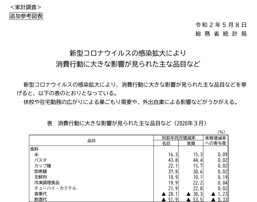
◆【新型コロナ】3月の家計調査でわかった、「コロナ」による消費の大きな変化
学校の休校、外出の自粛、テレワークなどが始まっていた3月の家計の消費状況は、前年と比べて大きく変化していることが、総務省の3月の「家計調査」の結果からわかります。3月の「家計調査」の結果によって、「巣ごもり消費」の実態が明らかになっています。学校給食や外食が「おうちごはん」に移行したようで、お米、パスタ、カップ麺、冷凍食品、チューハイ・カクテルなどの購入金額が前年同月比で増えています。特に、パスタは4割増と多くなっています。トイレットペーパーが増えているのは、外での消費分がシフトしたというよりも、品不足の不安意識によるものでしょうか。交通費は大幅に減少しています。通販の利用が増えているようで、運送料が増加しています。増加率が大きいのは、「ゲーム機」「ゲームソフト」で、名目値でそれぞれ約1.7倍、約1.6倍と大幅な増加になっています。外食などが大幅に減少し、内食が増えている訳ですが、外食産業など、「コロナ」によって大幅に売り上げが減少している業種が大きなダメージを受けていることがはっきりとわかる結果です。社会経済活動の制限をいつまで続けるのでしょうか。感染拡大の抑制を「ステイホーム」以外の方法で実現する方法を模索する必要があります。昨年の10月の消費増税以降、家計消費は前年同月比がマイナスになっています。「消費増税不況」に「コロナ不況」が重なってきていて、経済活動は大打撃を受けています。「感染拡大抑制」と「経済活動の活性化」の両方を追求する必要があり、「感染拡大抑制」だけを追求する施策だけでは、医療崩壊を防げても、確実に経済社会の崩壊を招くことになります。休業要請をしても、補償がない、あるいは不十分な補償の状態をいつまでも続けることはできないと思います。「超過死亡」の統計を、チェックしていく必要はあるでしょうが、今のところ、日本は死亡者数では、欧米諸国のようなことにはなっていません。検査数のキャパがもっとあったら、死亡者数もより少なくできた可能性もあります。「検査→感染確認者の隔離」という「攻め」の対策を大規模に実施していくしかないのではないかと思います。---------------------------------------------------------------------------------------------------------------------------------------↓実効再生産数を計算できるWebアプリがあります。↓倍加時間についてです。----------------------------------------------------------------------------------------------------------------------------------------------------長さ調節可フィルターも入る2重構造!洗濯可立体仕様のケアマスク●先行受注●【メール便で送料無料】【メール便A】マスク 布マスク 男女兼用 日本製 国内生産 二重構造 フィルター効果 ユニセックス 洗える 洗濯可能 清潔 花粉症 保湿 コットン 綿価格:1380円(税込、送料無料) (2020/3/27時点)楽天で購入洗って、繰り返し使える布マスクです。-------------------------------------------------------------------------【ダッシュボード「COVID-19 Transition Graphs」を試作】中国本土以外の地域への感染が拡大しているため、国別、地域別の感染者数の推移を簡単に確認できるダッシュボードを試作しています。随時、ページを追加しています。グラフのデータは、右上部分の操作でダウンロードすることができます。アメリカの「地域別の変数」を前処理して、「州別」での推移をグラフ化できるようにしました。また、州コードのフィールドを作成してコロプレス地図も作成しています。楽天ブログでは「iframe」タグが使えないので、Bloggerのページから利用できるようにしています。無料で利用できる、グーグルの「データポータル」のダッシュボードです。データさえあれば、簡単に作成できます。「国」別、「地域」別に日ごとの感染者数の推移を見ることができます。↓ダッシュボードの試作です。下記リンクのページから利用できます。ジョンズ・ホプキンス大学の「JHU CSSE」の「Covid19 Daily Reports」のデータを利用しています。直近のアメリカのデータは地域分類が細かくなっていて、1日当たり2千行くらいになっています。 EdgeブラウザやIEブラウザなど、Chromeブラウザ以外での利用の場合はうまく表示されないことがあるようです。↓上記のダッシュボードのデータの出所のサイトです。マップがメインのダッシュボードです-----------------------------------------------------------------------------------------↓WHOのサイトでも、感染者数、地域などの「Situation Report」が日々更新されています。関心がある場合は、一日に一度見るといいのではないかと思います。↓日本のインフルエンザの「定点当たり報告数」をグラフ化できるダッシュボードを試作。都道府県別にグラフ化可能です。------------------------------------------------------ 新型コロナウイルス(2019-novel coronavirus)対策もインフルエンザ対策と同じで、手洗い、うがい、マスク着用(咳エチケット)、免疫力アップなどが対策になるようです。【3/6再入荷】【お一人様3個まで】LEC レック 除菌の【激落ちくん】320ml 除菌 激落ち キッチン アルカリ電解水 配合 アルコールスプレー 除菌スプレー【RCP】【S-659】【キャッシュレス 還元 対象店】価格:260円(税別、送料別)(2020/3/7時点)楽天で購入----------------------------------------------------------------------------★おすすめの記事 ◆How Windows Sonic looks like.:Windows Sonic for Headphonesの音声と2chステレオ音声の比較:7.1.2chテストトーンの比較で明らかになった違い:一目で違いがわかりました----------------------------------------------------------------------------------------------------------
2020.05.13
コメント(0)
-
◆【新型コロナ】ひとまず、ピークアウトしているようです:ただし、検査数が不十分だった時期があるので、ピークがいつだったのかは定かではありませんが・・・
新型コロナウイルスの感染確認者数は、潜伏期間などもあることから、2週間くらい前の感染状況を示しているようです。最近の日々の感染確認者数は減少傾向にあるようなので、2週間くらい前の感染状況iは落ち着いていたということがわかります。ECDCのデータを基に計算した実効再生産数・Rtも、0.52と低い値になってきています。感染確認者数の推移のグラフを2週間ほどずらして、振り返ってみると、緊急事態宣言が出された4月の上旬頃までが特に厳しい局面だったようです。日本での、感染確認者数の時系列推移と死亡者数の時系列推移の相互相関の分析結果では、タイムラグの日数が、最近は11日間へと長期化しています。3月末までのデータで計算した場合、日本のタイムラグは、下図のように「0日」でした。これは、検査数が足りていなくて、感染確認のタイミングが遅い場合が多かったからかもしれません。↓4月末日までのデータで算出した場合、日本のタイムラグは11日になっています。4月上旬ごろまでは、検査能力が感染者数に対して不十分であった可能性があり、感染確認のタイミングが遅くなり、感染確認から死亡までの日数が短くなっていた可能性があります。疑わしい症状があっても、PCR検査をすぐに受けられない場合もあるとされていますが、4月の検査数の水準は、3月の水準を明らかに上回ってきています。ただし、感染確認者数も多くなっているので、4月の陽性率は高くなっているようです。4月中旬頃からは、検査数が増えてきたことによって、より早いタイミングで感染確認ができるようになり、最近は、感染確認と死亡までの日数が長くなっているようです。↓折れ線グラフが、日々の検査数の推移です。日本では、4月は3月よりも検査数の水準が高まっています。↓最近のデータでのドイツの場合です。感染確認者数の時系列推移と死亡者数の時系列推移の相互相関の分析で得られる、タイムラグは12日くらいです。日本でタイムラグが「11日」に長期化してきたということは、検査能力の拡大によって、検査のタイミングが以前よりも早期化してきた結果なのかもしれません。もちろん、新型肺炎の病状についての理解度が高まり、医療ケアの内容が向上してきている結果である可能性もあるので、断定はできません。いずれにしても、早期確認、早期ケア開始のためには、検査能力に余裕があることが必要だと思います。検査能力が不足していると、「感染者数」のピークがいつだったのか、ということも正確にはわからなくなります。陽性率が高い場合は、検査数が足りていないということにもなるでしょうから、検査能力のキャパに余裕がないと、感染者数の増減の傾向把握は難しくなります。感染者の指数関数的な増加が始まってからでは、検査能力の拡充は追い付かなくなります。感染確認者数が減少してきているので、今後、検査能力の拡充は後回しになっていくのでしょうか。あるいは、第2波に備えて、検査能力を拡充していくのでしょうか。インフルエンザのように、抗原検査キットが利用できるようになれば、それはそれでいいですが、PCR検査のキャパは他の先進国レベル並みに整備されるのでしょうか。ロシアでは、最近、一日に20万件の検査をしているようです。最近は、感染確認者は、1日に1万人以上だったりしますが、制限緩和の方向のようです。ロシアは、社会経済活動に比重をおいた独自の方向に進もうとしているようです。要注目だと思います。日本で、実際に今すぐ20万件の検査をする必要はないのかもしれませんが、日本もそれくらいの検査のキャパを整備しておく必要はないのでしょうか。その答えは、1年後くらいには出るのではないかと思います。---------------------------------------------------------------------------------------------------------------------------------------↓実効再生産数を計算できるWebアプリがあります。↓倍加時間についてです。----------------------------------------------------------------------------------------------------------------------------------------------------長さ調節可フィルターも入る2重構造!洗濯可立体仕様のケアマスク●先行受注●【メール便で送料無料】【メール便A】マスク 布マスク 男女兼用 日本製 国内生産 二重構造 フィルター効果 ユニセックス 洗える 洗濯可能 清潔 花粉症 保湿 コットン 綿価格:1380円(税込、送料無料) (2020/3/27時点)楽天で購入洗って、繰り返し使える布マスクです。-------------------------------------------------------------------------【ダッシュボード「COVID-19 Transition Graphs」を試作】中国本土以外の地域への感染が拡大しているため、国別、地域別の感染者数の推移を簡単に確認できるダッシュボードを試作しています。随時、ページを追加しています。グラフのデータは、右上部分の操作でダウンロードすることができます。アメリカの「地域別の変数」を前処理して、「州別」での推移をグラフ化できるようにしました。また、州コードのフィールドを作成してコロプレス地図も作成しています。楽天ブログでは「iframe」タグが使えないので、Bloggerのページから利用できるようにしています。無料で利用できる、グーグルの「データポータル」のダッシュボードです。データさえあれば、簡単に作成できます。「国」別、「地域」別に日ごとの感染者数の推移を見ることができます。↓ダッシュボードの試作です。下記リンクのページから利用できます。ジョンズ・ホプキンス大学の「JHU CSSE」の「Covid19 Daily Reports」のデータを利用しています。直近のアメリカのデータは地域分類が細かくなっていて、1日当たり2千行くらいになっています。 EdgeブラウザやIEブラウザなど、Chromeブラウザ以外での利用の場合はうまく表示されないことがあるようです。↓上記のダッシュボードのデータの出所のサイトです。マップがメインのダッシュボードです-----------------------------------------------------------------------------------------↓WHOのサイトでも、感染者数、地域などの「Situation Report」が日々更新されています。関心がある場合は、一日に一度見るといいのではないかと思います。↓日本のインフルエンザの「定点当たり報告数」をグラフ化できるダッシュボードを試作。都道府県別にグラフ化可能です。------------------------------------------------------ 新型コロナウイルス(2019-novel coronavirus)対策もインフルエンザ対策と同じで、手洗い、うがい、マスク着用(咳エチケット)、免疫力アップなどが対策になるようです。【3/6再入荷】【お一人様3個まで】LEC レック 除菌の【激落ちくん】320ml 除菌 激落ち キッチン アルカリ電解水 配合 アルコールスプレー 除菌スプレー【RCP】【S-659】【キャッシュレス 還元 対象店】価格:260円(税別、送料別)(2020/3/7時点)楽天で購入----------------------------------------------------------------------------★おすすめの記事 ◆How Windows Sonic looks like.:Windows Sonic for Headphonesの音声と2chステレオ音声の比較:7.1.2chテストトーンの比較で明らかになった違い:一目で違いがわかりました----------------------------------------------------------------------------------------------------------
2020.05.12
コメント(0)
-
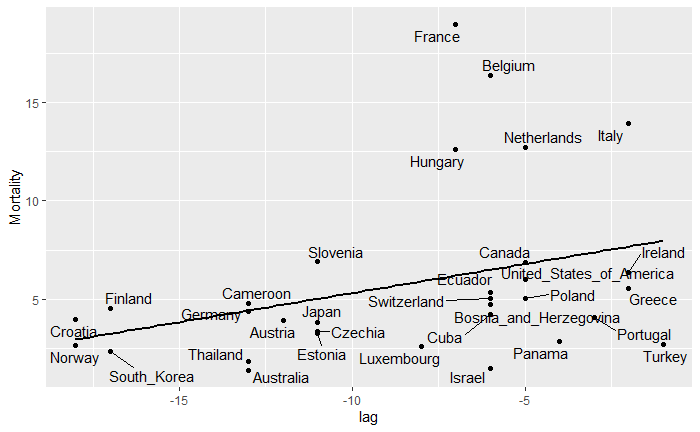
◆【新型コロナ】「陽性率7%未満の国で死亡率が低い」という話の本当の意味:誤解されていることが多いようです
「陽性率が7%未満」が大阪府の出口戦略の基準になったようですが、この説の基になっている千葉大の論文の趣旨は、「陽性率が低く、検査数が十分に足りている状態→感染者を早期に確認できている→早期に医療ケア開始ができている→死亡者を減らすことができている」ということだと思います。「陽性率が7%以下あるいは未満」だと陽性者が少ないので安心できる、という話ではありません。そもそも、「7%の陽性者数」というのは検査数の分母次第で変わります。絶対数が多い状況の場合には、出口の基準になりにくく、KPIとしてはわかりにくい指標かもしれません。あと、ベッドの空き率とかいう大阪府の基準ですが、分母のベッド数を増やしていく必要があるのではないかと思います。実は、「陽性率が7%」ということ自体には明確な意味があるわけではなく、「早期ケアの開始ができるための検査数が足りているかどうか」という目安に過ぎないと思います。「7%」という値は、例えば解析に利用したデータの期間などによっても上下に振れるはずで、厳密な意味があるわけではないと思います。検査体制が崩壊していないかどうか、検査数が十分足りているかどうかの大まかな目安として考えるべきものです。千葉大の論文では、感染確認者数のデータと死亡者数のデータのタイムラグについて言及しています。個人的には、「7%」の話よりも、感染確認と死亡の「タイムラグ」の話の方が本筋なのではないかと思ったりします。でも、「タイムラグ」よりも「7%」の方が「キャッチー」なので、「7%」を前面に出したのではないかと思います。千葉大の論文に対しては、辛辣なコメントが投稿されています。英語の論文は、やっぱり読みにくいので、できれば日本語版を出してほしいと思います。↓ECDCのデータを利用して、感染確認者数の時系列推移と死亡者数の時系列推移の相互相関から「タイムラグ」を推定し、死亡率との関係を見ました。感染確認のタイミングが早い方が、ケアを早期に始められるので、死亡率低下につながる、ということなのではないかと思います。横軸が「タイムラグ」、縦軸が死亡率です。左の方にある国は、感染確認と死亡までの時間が長いと思われます。↓5月10日に計算した、日本の感染確認者数の時系列と死亡者の時系列の相互相関。横軸が日数の差です。棒は相関係数の大きさを示しています。この場合、感染確認の時系列推移と死亡の時系列推移の間のタイムラグは11日だと推定されます。最近は「タイムラグ」が長期化していて、医療ケアに時間をかけられるようになっているのではないかと思います。↓4月17日に計算した、日本の感染確認者数の時系列と死亡者の時系列の相互相関。感染確認の時系列推移と死亡の時系列推移の間のタイムラグは4日と推定され、タイムラグの日数が短かったと推定されます。4月の上旬ごろまでは、検査数が不十分で、感染確認のタイミングが遅かったのではないかと思います。---------------------------------------------------------------------------------------------------------------------------------------↓実効再生産数を計算できるWebアプリがあります。↓倍加時間についてです。----------------------------------------------------------------------------------------------------------------------------------------------------長さ調節可フィルターも入る2重構造!洗濯可立体仕様のケアマスク●先行受注●【メール便で送料無料】【メール便A】マスク 布マスク 男女兼用 日本製 国内生産 二重構造 フィルター効果 ユニセックス 洗える 洗濯可能 清潔 花粉症 保湿 コットン 綿価格:1380円(税込、送料無料) (2020/3/27時点)楽天で購入洗って、繰り返し使える布マスクです。-------------------------------------------------------------------------【ダッシュボード「COVID-19 Transition Graphs」を試作】中国本土以外の地域への感染が拡大しているため、国別、地域別の感染者数の推移を簡単に確認できるダッシュボードを試作しています。随時、ページを追加しています。グラフのデータは、右上部分の操作でダウンロードすることができます。アメリカの「地域別の変数」を前処理して、「州別」での推移をグラフ化できるようにしました。また、州コードのフィールドを作成してコロプレス地図も作成しています。楽天ブログでは「iframe」タグが使えないので、Bloggerのページから利用できるようにしています。無料で利用できる、グーグルの「データポータル」のダッシュボードです。データさえあれば、簡単に作成できます。「国」別、「地域」別に日ごとの感染者数の推移を見ることができます。↓ダッシュボードの試作です。下記リンクのページから利用できます。ジョンズ・ホプキンス大学の「JHU CSSE」の「Covid19 Daily Reports」のデータを利用しています。直近のアメリカのデータは地域分類が細かくなっていて、1日当たり2千行くらいになっています。 EdgeブラウザやIEブラウザなど、Chromeブラウザ以外での利用の場合はうまく表示されないことがあるようです。↓上記のダッシュボードのデータの出所のサイトです。マップがメインのダッシュボードです-----------------------------------------------------------------------------------------↓WHOのサイトでも、感染者数、地域などの「Situation Report」が日々更新されています。関心がある場合は、一日に一度見るといいのではないかと思います。↓日本のインフルエンザの「定点当たり報告数」をグラフ化できるダッシュボードを試作。都道府県別にグラフ化可能です。------------------------------------------------------ 新型コロナウイルス(2019-novel coronavirus)対策もインフルエンザ対策と同じで、手洗い、うがい、マスク着用(咳エチケット)、免疫力アップなどが対策になるようです。【3/6再入荷】【お一人様3個まで】LEC レック 除菌の【激落ちくん】320ml 除菌 激落ち キッチン アルカリ電解水 配合 アルコールスプレー 除菌スプレー【RCP】【S-659】【キャッシュレス 還元 対象店】価格:260円(税別、送料別)(2020/3/7時点)楽天で購入----------------------------------------------------------------------------★おすすめの記事 ◆How Windows Sonic looks like.:Windows Sonic for Headphonesの音声と2chステレオ音声の比較:7.1.2chテストトーンの比較で明らかになった違い:一目で違いがわかりました----------------------------------------------------------------------------------------------------------
2020.05.11
コメント(0)
-
◆【新型コロナ】感染者情報の処理のシステム化への取り組み開始:国はやっと「長期戦」に備え始めたようです:このことから政府の感染症への準備不足についていろいろとわかります
これまで紙やFAXベースで処理していた、新型コロナウイルスの感染者情報をシステムでの処理にしていくそうです。ようやく国は、「長期戦」を覚悟し始めたということでしょうか。このことから、いろいろなことがわかります。アビガンは「新型インフルエンザ」への備えとして、備蓄されていたということですが、感染状況を把握するための「情報システムの備え」は何一つなかったということがわかります。システム化は、遅くとも休校要請があった2月末頃から取り組んでいてもよかったと思うのですが、そうしていなかったのは、政府は、「短期収束」を希望していて、「短期決戦の意気込み」で臨んでいたからではないでしょうか。新しい感染症への備えのことを考えると、あらかじめそのような情報処理システムが存在していてもおかしくはないと思います。ただ、普段使わないものをあらかじめ作成しておくのは無駄なので、既存の業務の処理システムの拡張機能として用意しておけばよかったのではないかと思います。国立感染症研究所では、週次で感染症について「定点当たり報告数」の情報をとりまとめています。そのような仕組みをシステム化し、さらにシステム拡張ができるようにしておいて、新規感染症への対応をする、という発想はなかったようです。発想はあっても、予算がつかなかったのかもしれませんが。いずれにしても、他にも、政府の有事への備えというものには準備不足のものが数多くあるのではないかと思います。自衛隊には、防疫部隊は存在していても、生物兵器への備えはほとんどできていないようです。今回、検疫所への応援に自衛官が行ったりしているようですが、自衛隊の防疫部隊は、組織として目立った動きはしていません。自然現象の病気としての感染であっても、生物兵器によるウイルス攻撃であっても、生じる事象は同じはずなのですが、防疫部隊が何の活躍もしていないことから、国民を守る備えが皆無であったことがわかります。やはり、自衛隊には、生物兵器で国が攻撃されても、国民を救うという備えはないのは確かなようです。今からでも、防疫部隊によるPCR検査センターを開設するとか、目に見える活動をしてほしいと思います。--------------------------------------------------------------------------↓実効再生産数を計算できるWebアプリがあります。↓倍加時間についてです。----------------------------------------------------------------------------------------------------------------------------------------------------長さ調節可フィルターも入る2重構造!洗濯可立体仕様のケアマスク●先行受注●【メール便で送料無料】【メール便A】マスク 布マスク 男女兼用 日本製 国内生産 二重構造 フィルター効果 ユニセックス 洗える 洗濯可能 清潔 花粉症 保湿 コットン 綿価格:1380円(税込、送料無料) (2020/3/27時点)楽天で購入洗って、繰り返し使える布マスクです。-------------------------------------------------------------------------【ダッシュボード「COVID-19 Transition Graphs」を試作】中国本土以外の地域への感染が拡大しているため、国別、地域別の感染者数の推移を簡単に確認できるダッシュボードを試作しています。随時、ページを追加しています。グラフのデータは、右上部分の操作でダウンロードすることができます。アメリカの「地域別の変数」を前処理して、「州別」での推移をグラフ化できるようにしました。また、州コードのフィールドを作成してコロプレス地図も作成しています。楽天ブログでは「iframe」タグが使えないので、Bloggerのページから利用できるようにしています。無料で利用できる、グーグルの「データポータル」のダッシュボードです。データさえあれば、簡単に作成できます。「国」別、「地域」別に日ごとの感染者数の推移を見ることができます。↓ダッシュボードの試作です。下記リンクのページから利用できます。ジョンズ・ホプキンス大学の「JHU CSSE」の「Covid19 Daily Reports」のデータを利用しています。直近のアメリカのデータは地域分類が細かくなっていて、1日当たり2千行くらいになっています。 EdgeブラウザやIEブラウザなど、Chromeブラウザ以外での利用の場合はうまく表示されないことがあるようです。↓上記のダッシュボードのデータの出所のサイトです。マップがメインのダッシュボードです-----------------------------------------------------------------------------------------↓WHOのサイトでも、感染者数、地域などの「Situation Report」が日々更新されています。関心がある場合は、一日に一度見るといいのではないかと思います。↓日本のインフルエンザの「定点当たり報告数」をグラフ化できるダッシュボードを試作。都道府県別にグラフ化可能です。------------------------------------------------------ 新型コロナウイルス(2019-novel coronavirus)対策もインフルエンザ対策と同じで、手洗い、うがい、マスク着用(咳エチケット)、免疫力アップなどが対策になるようです。【3/6再入荷】【お一人様3個まで】LEC レック 除菌の【激落ちくん】320ml 除菌 激落ち キッチン アルカリ電解水 配合 アルコールスプレー 除菌スプレー【RCP】【S-659】【キャッシュレス 還元 対象店】価格:260円(税別、送料別)(2020/3/7時点)楽天で購入----------------------------------------------------------------------------★おすすめの記事 ◆How Windows Sonic looks like.:Windows Sonic for Headphonesの音声と2chステレオ音声の比較:7.1.2chテストトーンの比較で明らかになった違い:一目で違いがわかりました----------------------------------------------------------------------------------------------------------
2020.05.11
コメント(0)
-
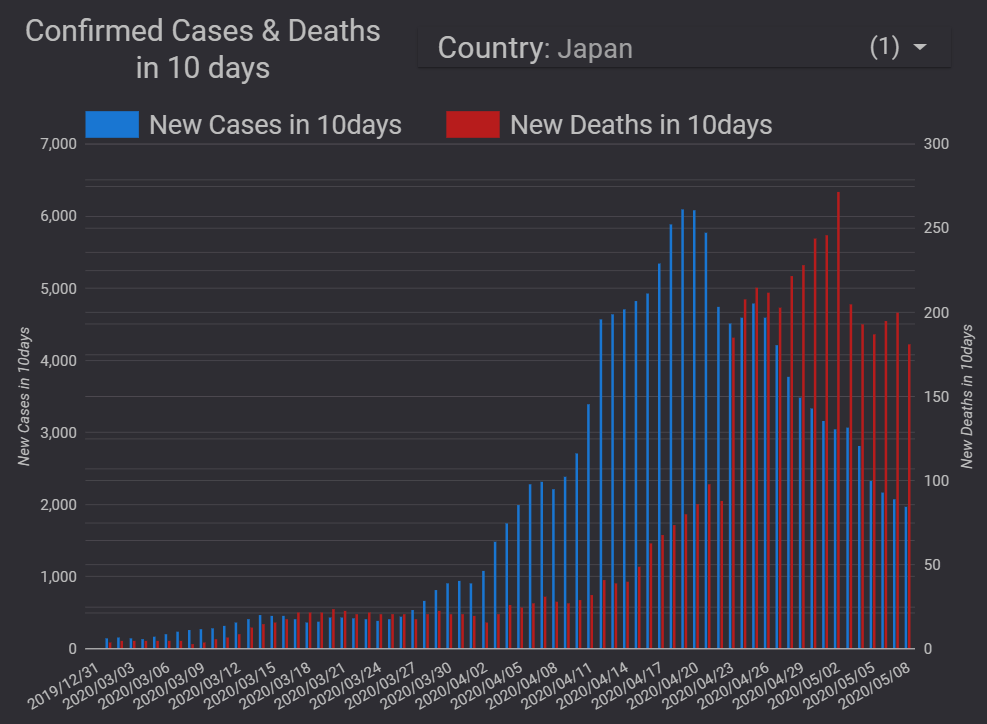
◆【新型コロナ】「陽性率7%」以下に保つために検査拡大が必要なシンプルな理由:早期発見、早期ケア開始のために検査能力の拡充が必要です:検査が不十分だと死亡率が高まる可能性が高いと思います
新型コロナウイルス対策のために検査能力を高める必要があるという理由は、いくつかありますが、最もシンプルな理由は、「早期発見、早期ケア開始のため」ということなのではないかと思います。「陽性率7%以下」になるように検査数を拡大すべき理由は、感染者を早期に発見できるようにすることなのではないかと思います。ダッシュボードで、いろいろとグラフを作成していますが、下図は感染確認者数と死亡者数の関係をわかりやすく表していると思います。以下の内容の一部は、すでに4月17日のブログでも記していますが、散布図のデータを追加して、新たにまとめ直しました。新型コロナウイルスによって、死亡に至るまでは、「感染→発症→感染確認→入院」といったプロセスを経ている場合が多いと思います。感染確認者数の山から、遅れて死亡者数の山が見られるのは、上記のような死亡に至るプロセスがあるからです。重症化してから入院する場合と、ある程度軽症のうちに入院する場合とでは、その後の経過は異なる可能性が高いと思います。ある程度重症化してからしか検査が受けられないような状況では、死亡のリスクが高くなるはずです。検査のタイミングが遅いと死亡率を高めるのではないかと思います。特に、高齢者や疾患のあるハイリスクの人は、早期に検査を受けられるようにする必要があると思います。ECDCのデータを利用したダッシュボードで、感染確認者数の時系列推移と死亡者数の時系列推移のグラフを作成すると、感染確認者数の山の後に死亡者数の山が見られることがはっきりとわかります。ただし、このような二つの山がはっきりとしているかどうかは、国によって、あるいは感染拡大のフェーズによって異なっているようです。感染確認者数の時系列推移と死亡者数の時系列推移のタイムラグは、検査が適切なタイミングでできているのかどうかをうかがい知る一つの指標になるのではないかと考え、R言語のccf関数を使って、国別に相互相関を計算してみました。どれくらいの日数のタイムラグの場合に相互相関が最大になるのかを計算した結果では、ドイツは、比較的長い日数のタイムラグが見られます。つまり、ドイツでは感染確認から死亡までの日数が長いようです。感染確認者に対する治療の時間が確保されているのではないでしょうか。一方、タイムラグが短い国の場合は、感染確認から死亡までの日数が短いと考えられ、「検査のタイミングが遅い」「医療崩壊によってケアができていない」といったことがあるのではないでしょうか。日本の場合は、以前はタイムラグが短かったのですが、最近は長くなっています。日本のグラフを見ると、検査のタイミングが4月上旬頃から改善されてきているように思います。ということは、4月上旬までに発症した人の中には検査体制の制約の影響で、検査のタイミングが遅れて、十分なケアを受けられずに死亡した人が少なからずいた可能性があると思います。もしかすると、有名な俳優の方もその中に含まれていた、ということなのかもしれません。少なくとも、4月上旬までは、検査のタイミングが遅い場合が直近よりも多かったことがうかがえます。感染確認者数が減少傾向になった日本では、最近、検査のタイミングが早くなってきているのではないかと思います。4月初め頃までは、検査のキャパがひっ迫していたようです。諸外国と比べて、少なかった検査数は、死亡者数の増加につながった可能性があるのかもしれません。検査数に余裕がないと、ケアの開始が遅くなることによって、死亡率の上昇につながりかねないので、今後も検査能力の拡充が望まれます。↓ECDCデータ版のダッシュボードで、国別に感染確認者数の時系列と死亡者数(右目盛り)の時系列を並べて見ることができます。↓下図は直近の相互相関の計算結果ですが、日本の「感染確認者数の時系列と死亡者の時系列」は、11日間のタイムラグの場合に相関が最大になっています。4月17日に計算した結果では、4日間でした。↓4月17日のブログで紹介したグラフです。4日間のタイムラグの場合に相関が最大になっています。↓感染確認者数の時系列推移と死亡者数の時系列推移の相互相関を国別に計算しました。相関が最大になる「lag(タイムラグ)」(横軸)と死亡率(縦軸)をプロットしています。累積死亡者数が50人以上で、タイムラグが0未満の国についてプロットしています。タイムラグの日数が長い国の方が死亡率がやや低い傾向が見られます。【散布図を作成するためのRのコード例】実効再生産数・Rtの計算で用いたループの手法で、国別にccf()関数の計算をしてみました。リストに対してループ処理ができるので便利です。-----------------------------------------------------------------df_ECDC <- read.csv("https://opendata.ecdc.europa.eu/covid19/casedistribution/csv", na.strings = "", fileEncoding = "UTF-8-BOM",stringsAsFactors = FALSE)geo_list <- unique(df_ECDC$countriesAndTerritories)df_ECDCtemp1 <- NULLdf_ECDCtemp <- df_ECDCdf_CC <- NULLcc_temp <- NULLcc_tempmr <- NULLdfcc_tempmr <- NULLdfcc_tempmrmax <- NULLfor (i in seq_along(geo_list)) { df_ECDCtemp1 <- subset(df_ECDCtemp,df_ECDCtemp$countriesAndTerritories==geo_list[i]) cc_temp <- ccf(df_ECDCtemp1$cases, df_ECDCtemp1$deaths,plot=FALSE) cc_tempmr <- matrix(c(cc_temp$lag,cc_temp$acf),ncol=2) dfcc_tempmr <- as.data.frame(cc_tempmr) colnames(dfcc_tempmr) <- c("lag","acf") dfcc_tempmrmax <- dfcc_tempmr %>% slice(which.max(acf)) dfcc_tempmrmax <- mutate(dfcc_tempmrmax,countriesAndTerritories=geo_list[i]) Confirmed_M <- max(df_ECDCtemp1$Confirmed) Deaths_M <- max(df_ECDCtemp1$C_Deaths) Mortality <- Deaths_M/Confirmed_M*100 dfcc_tempmrmax <- mutate(dfcc_tempmrmax,Confirmed=Confirmed_M) dfcc_tempmrmax <- mutate(dfcc_tempmrmax,Deaths=Deaths_M) dfcc_tempmrmax <- mutate(dfcc_tempmrmax,Mortality=Mortality) df_CC <- rbind(df_CC,dfcc_tempmrmax)}df_CCd1 <- subset(df_CC,df_CC$Deaths >= 50)df_CCd2 <- subset(df_CCd1,df_CCd1$lag < 0)ggplot(df_CCd2,aes(x=lag,y=Mortality,label = countriesAndTerritories)) + geom_point()+stat_smooth(method = "lm", se = FALSE, colour = "black", size = 1) + geom_text_repel()---------------------------------------------------------------------------------------------------------------------------------------↓実効再生産数を計算できるWebアプリがあります。↓倍加時間についてです。----------------------------------------------------------------------------------------------------------------------------------------------------長さ調節可フィルターも入る2重構造!洗濯可立体仕様のケアマスク●先行受注●【メール便で送料無料】【メール便A】マスク 布マスク 男女兼用 日本製 国内生産 二重構造 フィルター効果 ユニセックス 洗える 洗濯可能 清潔 花粉症 保湿 コットン 綿価格:1380円(税込、送料無料) (2020/3/27時点)楽天で購入洗って、繰り返し使える布マスクです。-------------------------------------------------------------------------【ダッシュボード「COVID-19 Transition Graphs」を試作】中国本土以外の地域への感染が拡大しているため、国別、地域別の感染者数の推移を簡単に確認できるダッシュボードを試作しています。随時、ページを追加しています。グラフのデータは、右上部分の操作でダウンロードすることができます。アメリカの「地域別の変数」を前処理して、「州別」での推移をグラフ化できるようにしました。また、州コードのフィールドを作成してコロプレス地図も作成しています。楽天ブログでは「iframe」タグが使えないので、Bloggerのページから利用できるようにしています。無料で利用できる、グーグルの「データポータル」のダッシュボードです。データさえあれば、簡単に作成できます。「国」別、「地域」別に日ごとの感染者数の推移を見ることができます。↓ダッシュボードの試作です。下記リンクのページから利用できます。ジョンズ・ホプキンス大学の「JHU CSSE」の「Covid19 Daily Reports」のデータを利用しています。直近のアメリカのデータは地域分類が細かくなっていて、1日当たり2千行くらいになっています。 EdgeブラウザやIEブラウザなど、Chromeブラウザ以外での利用の場合はうまく表示されないことがあるようです。↓上記のダッシュボードのデータの出所のサイトです。マップがメインのダッシュボードです-----------------------------------------------------------------------------------------↓WHOのサイトでも、感染者数、地域などの「Situation Report」が日々更新されています。関心がある場合は、一日に一度見るといいのではないかと思います。↓日本のインフルエンザの「定点当たり報告数」をグラフ化できるダッシュボードを試作。都道府県別にグラフ化可能です。------------------------------------------------------ 新型コロナウイルス(2019-novel coronavirus)対策もインフルエンザ対策と同じで、手洗い、うがい、マスク着用(咳エチケット)、免疫力アップなどが対策になるようです。【3/6再入荷】【お一人様3個まで】LEC レック 除菌の【激落ちくん】320ml 除菌 激落ち キッチン アルカリ電解水 配合 アルコールスプレー 除菌スプレー【RCP】【S-659】【キャッシュレス 還元 対象店】価格:260円(税別、送料別)(2020/3/7時点)楽天で購入----------------------------------------------------------------------------★おすすめの記事 ◆How Windows Sonic looks like.:Windows Sonic for Headphonesの音声と2chステレオ音声の比較:7.1.2chテストトーンの比較で明らかになった違い:一目で違いがわかりました----------------------------------------------------------------------------------------------------------
2020.05.10
コメント(3)
-

◆【新型コロナ】とりあえず知りたい「感染症数理モデル」の仕組み:数式なしで、あるいは数式をスキップしてでも仕組みを理解することが重要なようです:わかりやすい解説があるサイトのまとめです
新型コロナウイルスとの戦い、あるいは共存関係は長期化することは間違いありません。今後、緊急事態宣言が解除された後も、行動制限がすべてなくなることはなく、第2波がくれば、何度も緊急事態宣言が出されるかもしれません。長期戦ということになると、外出自粛などの行動制限がなぜ必要なのかについて、しっかりと理解しておいた方がよさそうです。基本再生産数・R0や実効再生産数・Re(あるいはRt)の意味を理解するためには、「SIR」のような数理モデルについて、少なくとも、どのような仕組みなのかを知っておく必要があるようです。「人と人との接触8割削減」の要請も数理モデルから導き出されたものです。数理モデルなので、本格的に理解するには、微分方程式の理解も必要になるのでしょうが、とりあえず、数式に含まれているパラメータは何か、何が増えるとどうなるのか、何が減るとどうなるのか、といったモデルの仕組みを知っておくだけで、再生産数への理解度は格段に違ってくると思います。微分方程式は、時間経過による変化を表現している、ということのようですが、私の理解を超えている部分が大きかったりするので、できるだけ数式の出てこない解説を探して読んでいます。下記のようなページの解説、説明を読むだけで、何となく数理モデルの仕組みについてイメージすることができます。↓とりあえず、この記事を何度も読むとイメージがつかみやすいです。わかりやすい内容です。↓数式なしで、仕組みがイメージでき、わかりやすいです。↓基本再生産数や実効再生産数についての理解が深まります。↓大学の先生が書かれているので、当然数式も出てきますが、数式をかなりスキップしてもわかりやすい内容だと思います。基本的なところから、わかりやすく説明されています。↓指数関数的な増加については、「対数」についても復習しておいた方がよさそうです。そういえば、音声・オーディオで使われている「db(デシベル)」も対数スケールです。↓これは、秀逸な内容です。電卓で実効再生産数を計算できます。親子で学ぼうという趣旨がいいです。↓数式がないと分かりにくいという方向けです。↓数式がないと分かりにくいという方向けです。でも、理系の大学生の1年生向けの内容のようです。↓「R言語」でシミュレーションができるようです。数式も、プログラムのコードの形になっていると、イメージがしやすいような気もします。----------------------------------------------------------------------------------------------------------------------------------------------------↓実効再生産数を計算できるWebアプリがあります。↓倍加時間についてです。----------------------------------------------------------------------------------------------------------------------------------------------------長さ調節可フィルターも入る2重構造!洗濯可立体仕様のケアマスク●先行受注●【メール便で送料無料】【メール便A】マスク 布マスク 男女兼用 日本製 国内生産 二重構造 フィルター効果 ユニセックス 洗える 洗濯可能 清潔 花粉症 保湿 コットン 綿価格:1380円(税込、送料無料) (2020/3/27時点)楽天で購入洗って、繰り返し使える布マスクです。-------------------------------------------------------------------------【ダッシュボード「COVID-19 Transition Graphs」を試作】中国本土以外の地域への感染が拡大しているため、国別、地域別の感染者数の推移を簡単に確認できるダッシュボードを試作しています。随時、ページを追加しています。グラフのデータは、右上部分の操作でダウンロードすることができます。アメリカの「地域別の変数」を前処理して、「州別」での推移をグラフ化できるようにしました。また、州コードのフィールドを作成してコロプレス地図も作成しています。楽天ブログでは「iframe」タグが使えないので、Bloggerのページから利用できるようにしています。無料で利用できる、グーグルの「データポータル」のダッシュボードです。データさえあれば、簡単に作成できます。「国」別、「地域」別に日ごとの感染者数の推移を見ることができます。↓ダッシュボードの試作です。下記リンクのページから利用できます。ジョンズ・ホプキンス大学の「JHU CSSE」の「Covid19 Daily Reports」のデータを利用しています。直近のアメリカのデータは地域分類が細かくなっていて、1日当たり2千行くらいになっています。 EdgeブラウザやIEブラウザなど、Chromeブラウザ以外での利用の場合はうまく表示されないことがあるようです。↓上記のダッシュボードのデータの出所のサイトです。マップがメインのダッシュボードです-----------------------------------------------------------------------------------------↓WHOのサイトでも、感染者数、地域などの「Situation Report」が日々更新されています。関心がある場合は、一日に一度見るといいのではないかと思います。↓日本のインフルエンザの「定点当たり報告数」をグラフ化できるダッシュボードを試作。都道府県別にグラフ化可能です。------------------------------------------------------ 新型コロナウイルス(2019-novel coronavirus)対策もインフルエンザ対策と同じで、手洗い、うがい、マスク着用(咳エチケット)、免疫力アップなどが対策になるようです。【3/6再入荷】【お一人様3個まで】LEC レック 除菌の【激落ちくん】320ml 除菌 激落ち キッチン アルカリ電解水 配合 アルコールスプレー 除菌スプレー【RCP】【S-659】【キャッシュレス 還元 対象店】価格:260円(税別、送料別)(2020/3/7時点)楽天で購入----------------------------------------------------------------------------★おすすめの記事 ◆How Windows Sonic looks like.:Windows Sonic for Headphonesの音声と2chステレオ音声の比較:7.1.2chテストトーンの比較で明らかになった違い:一目で違いがわかりました----------------------------------------------------------------------------------------------------------
2020.05.09
コメント(0)
-

◆【新型コロナ】九州大の小田垣名誉教授が提言:「検査数拡大と隔離」で早期収束の可能性
新型コロナウイルスの感染拡大を抑制するため、医療崩壊防止のために、外出自粛や休業要請など、「人と人との接触8割削減」のための「自粛」が求められていますが、いつまでも続けられるものでもないと思います。「人と人との接触8割削減」とか、「新しい生活様式」とか言うばかりで、日本政府の対策の選択肢には、100年前のスペイン風邪の対策と同じ方法しかないのでしょうか。このままでは、日本政府は、100年間何の進化もしていないということになります。韓国の例のように、多数のPCR検査を行って、感染確認者をどんどん隔離していく施策もあるのではないかと思います。米国でも、検査数をさらに増やしていく方向にあります。九州大学の小田垣先生の論考で、「PCR検査数拡大→感染確認者の隔離」の施策によって、接触機会の削減を緩和しても、収束が可能だというシミュレーションが紹介されています。↓小田垣先生のホームページはこちら感染症モデルでは、「感染率を下げる」施策をとれば、実効再生産数が低下し、収束に向かうことになります。「感染率を下げる」方法としては、ワクチンがない状況では、手洗い、マスク、人との接触機会削減など、多くのことは、国民の努力に依存するものばかりです。実効再生産数を低下させるには、ウイルスに再生産させないようにすればいいはずです。つまり、感染者を隔離すれば済む話です。実にシンプルな話です。だから法定伝染病の場合は、公費で病院に隔離されるわけですが、それを大規模に行えば、早期に収束するはずです。軽症者、無症状者用の大規模な隔離施設を用意すれば済む話です。社会経済活動を制限していることで失われるGDPの額に比べれば、隔離施設などに必要な金額は微々たるものだと思います。政府には、「感染率を下げる」施策として、「PCR検査数拡大→感染確認者の隔離」を検討してほしいと思います。「新しい生活様式」を取り入れていく必要はありますが、政府は国民に自粛を要請するだけでなく、「攻め」の対策も展開してほしいと思います。小田垣先生が言われているように、「人と人の接触機会の8割減少」と言うだけの政府の対応は、無為無策ということになると思います。対策本部の専門家も、疫学関連のアカデミアの人ばかりで、かなり視野が狭く、専門外のことについては、非常に幼稚なところもあるように思います。専門家の方々も一生懸命に取り組まれていて、大変なご苦労もあると思いますが、自説に固執することなく、柔軟に客観的に正しいと思われる方向に進んでいってもらいたいと思います。対策本部の専門家の方が、「PCR検査のキャパシティはどこの国にも限界があり、その限界に近づいた時に病院や検査センターに多くの人が密集し、さらに一部の人は興奮して大声をあげるような状況になるのは容易に想像できる。」とかいう資料を作成していたりしますが、一般市民のことをどう思っているのかがうかがえます。いずれ、この資料は非公開になるのではないかと思いますので、今のうちにぜひ一読されることをお勧めします。何か、B級映画で見かける、政府高官が「そんなことをしたら国民はパニックになる」といったセリフを言っているシーンが思い浮かんできます。「PCR検査のキャパシティはどこの国にも限界があり、・・・」→確かにその通りですが、日本の「キャパの限界」が諸外国と比べて低すぎるのが問題なのに、論点の幼稚なすり替えだと思います。また、なぜ、PCR検査のキャパの限界に近づいたら、病院や検査センターに人が密集することになるのでしょうか。感染者が急激に増加した場合に、そのようなことがあり得るかもしれませんが、密集する理由は検査のキャパが限界に近づいたからではないと思います。インフルエンザの定点当たり報告数が極端に低水準になっているのは、インフルエンザの収束以外に、風邪症状があっても「病院受診を自粛している」といった要因もあるのではないかと思います。いずれにせよ、諸外国と比べて低すぎる検査のキャパシティを拡大させようという考えがなかったのは明らかです。この「PCR検査のキャパシティはどこの国にも限界があり、・・・」という部分は、専門家が記したものなのか、厚労省の官僚が記したものなのか、あるいは厚労省に忖度した専門家が記したものなのかがよくわかりません。アカデミアの人が、あるいは厚労省の人が「PCR検査を増やしても無駄だ」と本気で思っているのであれば、その理由の詳細を明確に説明してもらいたいと思います。偽陽性を理由に検査拡大に懐疑的な人もいるようですが、岩手県で400件以上検査して陽性者ゼロということからすると、偽陽性はそれほど多くないのかもしれません。どのような病気でも、早期発見、早期のケア開始の方がいいと思いますが、症状があっても検査を迅速に受けられないような状況があると、死亡者を増やすことになります。ある論文では、「発症から入院までの期間の長さ」が、「年齢」の次に「死亡率」と相関が高い要因である、としています。早期に検査が行われて、早期にケアが開始されていれば、亡くならずに済んだ人もいるのではないかと思います。A Machine Learning Model Reveals Older Age and Delayed Hospitalization as Predictors of Mortality in Patients with COVID-19Age was the most important variable in predicting mortality followed by the time gap between symptom onset and hospitalization. Conclusions: Patients aged beyond 62 years are at higher risk of fatality whereas hospitalization within 2 days of the onset of symptoms could reduce mortality in COVID-19 patients.現状の検査体制や医療体制を所与のものとしてしか考えていないように見受けられます。検査と医療キャパシティの制約を変えられないと考えるから、「8割削減」という策しか出てこないのではないかと思います。長期戦といいながら、グランドデザインがなく、検査体制や医療体制の拡充は口先だけ、というのでは困ります。今後の第2波、第3波の方が大規模になる可能性もあるので、検査能力や隔離施設のキャパ、医療キャパの拡充が最重要課題だと思います。対策本部の専門家の人選は、厚生労働省の責任ではないかと思いますが、諸々の問題の根源は厚生労働省の能力レベルにある、ということなのでしょうか。↓小田垣先生の論考です。---------------------------------------------------------------------------------------------------------------------------------------↓「R言語」のパッケージで、60カ国以上について計算した、実効再生産数・Rtのグラフをダッシュボードで見られるようにしました。↓実効再生産数を計算できるWebアプリがありました。↓倍加時間についてです。----------------------------------------------------------------------------------------------------------------------------------------------------長さ調節可フィルターも入る2重構造!洗濯可立体仕様のケアマスク●先行受注●【メール便で送料無料】【メール便A】マスク 布マスク 男女兼用 日本製 国内生産 二重構造 フィルター効果 ユニセックス 洗える 洗濯可能 清潔 花粉症 保湿 コットン 綿価格:1380円(税込、送料無料) (2020/3/27時点)楽天で購入洗って、繰り返し使える布マスクです。-------------------------------------------------------------------------【ダッシュボード「COVID-19 Transition Graphs」を試作】中国本土以外の地域への感染が拡大しているため、国別、地域別の感染者数の推移を簡単に確認できるダッシュボードを試作しています。随時、ページを追加しています。グラフのデータは、右上部分の操作でダウンロードすることができます。アメリカの「地域別の変数」を前処理して、「州別」での推移をグラフ化できるようにしました。また、州コードのフィールドを作成してコロプレス地図も作成しています。楽天ブログでは「iframe」タグが使えないので、Bloggerのページから利用できるようにしています。無料で利用できる、グーグルの「データポータル」のダッシュボードです。データさえあれば、簡単に作成できます。「国」別、「地域」別に日ごとの感染者数の推移を見ることができます。↓ダッシュボードの試作です。下記リンクのページから利用できます。ジョンズ・ホプキンス大学の「JHU CSSE」の「Covid19 Daily Reports」のデータを利用しています。直近のアメリカのデータは地域分類が細かくなっていて、1日当たり2千行くらいになっています。 EdgeブラウザやIEブラウザなど、Chromeブラウザ以外での利用の場合はうまく表示されないことがあるようです。↓上記のダッシュボードのデータの出所のサイトです。マップがメインのダッシュボードです-----------------------------------------------------------------------------------------[イタリア お土産]バッチ チョコレート 12粒入り (イタリア お土産 イタリア 土産 イタリア おみやげ イタリア みやげ)価格:1448円(税別、送料別)(2020/3/12時点)楽天で購入がんばれ、イタリア。↓WHOのサイトでも、感染者数、地域などの「Situation Report」が日々更新されています。関心がある場合は、一日に一度見るといいのではないかと思います。↓日本のインフルエンザの「定点当たり報告数」をグラフ化できるダッシュボードを試作。都道府県別にグラフ化可能です。------------------------------------------------------ 新型コロナウイルス(2019-novel coronavirus)対策もインフルエンザ対策と同じで、手洗い、うがい、マスク着用(咳エチケット)、免疫力アップなどが対策になるようです。【3/6再入荷】【お一人様3個まで】LEC レック 除菌の【激落ちくん】320ml 除菌 激落ち キッチン アルカリ電解水 配合 アルコールスプレー 除菌スプレー【RCP】【S-659】【キャッシュレス 還元 対象店】価格:260円(税別、送料別)(2020/3/7時点)楽天で購入----------------------------------------------------------------------------★おすすめの記事 ◆How Windows Sonic looks like.:Windows Sonic for Headphonesの音声と2chステレオ音声の比較:7.1.2chテストトーンの比較で明らかになった違い:一目で違いがわかりました----------------------------------------------------------------------------------------------------------
2020.05.08
コメント(2)
-
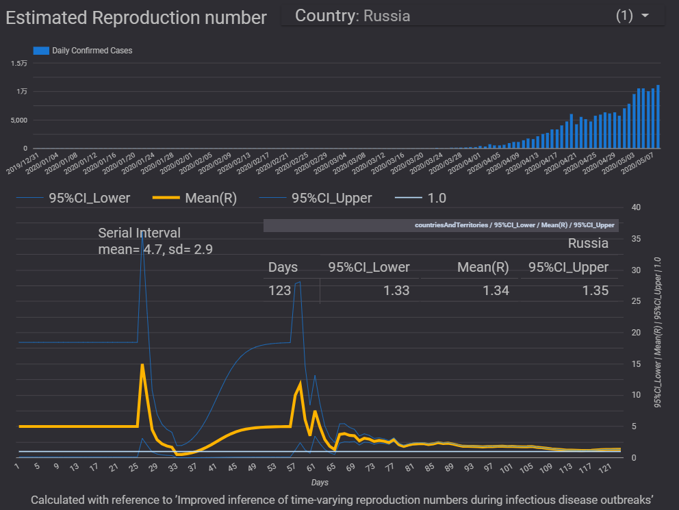
◆【新型コロナ】目標指標としての「実効再生産数・Rt」:ECDCデータ版のダッシュボードのページを更新しました:コードも改訂しています
新型コロナの実効再生産数・Rtの計算のためのR言語のコードを改訂しました。今朝の「おはよう日本」で、山中先生が、「実効再生産数」は、努力目標のための指標として利用できるのではないか、というような趣旨のことを言われていました。基本再生産数R0は、何もしない場合の感染初期段階の新型コロナの感染力を示しますが、実効再生産数は、感染済みの人の増加や介入策などによって変化するはずのものなので、「実効再生産数・Rt」をどのようにして抑制するのか、という観点から、この指標を見るのがよさそうです。ただし、下記の「EpiEstim」のように、過去の感染確認者数の推移のデータから計算される実効再生産数・Rtは、「バックミラー」で過去を見ている指標に過ぎません。「EpiEstim」で計算されるような実効再生産数・Rtが1を大きく超えてくるのは、感染確認者数が増加した後になるようです。「EpiEstim」のパッケージで計算する国・地域を、データのある日数が「90日以上」にしていますが、下記のようなエラーメッセージが出ます。つまり、過去の事例の研究用、検証用としての計算が想定されているのかもしれません。You're estimating R too early in the epidemic to get the desired posterior CV.恐らく、計算方法としては、発症間隔のパラメータ(発症間隔のデータ分布)を利用して、時点Aの感染確認者数と、「発症間隔後(データ分布後)」の時点Bの感染確認者数との関係から、時点Aの感染確認者が時点Bにおいてどれだけ「再生産」されたのか、を推定しているようです。時点Bの感染確認者数が時点Aよりも増えていれば、時点Aにおける時点Bにおける実効再生産数・Rtは1よりも大きくなります。時点Bで減っていれば、1を下回ることになります。計算のための入力パラメータは、発症間隔の平均値と標準偏差なので、「発症間隔のデータ分布」を利用しているはずです。ということは、厳密には、時点Aから「発症間隔のデータ分布」の分の日数が経過した時点(複数時点)の感染確認者数が評価されて、時点Aでの値 時点Bでの値が計算されているのではないかと思います。つまり、過去の「増加、減少」が、計算されるRtに反映されています。ということは、今が時点Bだとすると、時点Bの頃の実効再生産数・Rtは、将来の時点Cからさかのぼって計算されることになります。時点Bの感染確認者数が、時点Cの感染確認者数にどのように反映されているのか、が計算されるのだと思います。→混乱してしまいましたが、そのように計算された値が、時点Bではなく、時点Cでの実効再生産数ということになっているようです。つまり、「時点Bから時点Cにかけて、どれだけ再生産したのか」という値です。「reproducted number」とでも言った方がいいのかもしれません。「EpiEstim」のパッケージのデフォルトでの計算結果では、実効再生産数・Rtのデータ件数は、感染確認者数のデータ件数よりも7件(7日分)少なくなっていました。ということは、実効再生産数・Rtの最初の7日分のデータにNAを入れて、日々の感染確認者数のデータと件数をそろえても問題はなさそうです。グラフ化する場合の実用上では「ゼロ」を代入することも考えられますが、「ゼロ」は適切ではないのでやめておきます。感染確認者数のデータ自体も「過去の感染状況」のデータなので、そのデータを利用した計算で推定される実効再生産数も「過去の再生産状況」を示しています。「今日のRtは・・・です」といった伝え方では、誤解が生じると思われるので、利用の仕方、解釈の仕方に注意を要する指標なのだと思います。そもそも、「感染確認者数」自体が過去の感染状況を示すデータなので、「タイムラグ」について留意する必要があります。緊急事態宣言が出された頃の実効再生産数が1を下回っていたというのも、緊急事態宣言が出されてから20日ほど経過して初めてわかることのようです。なお、日本の最新の実効再生産数・Rtは、0.73です。これは、20日ほど前の再生産状況を示しているのだと思われます。ダッシュボードでは、プルダウンメニューによって、グラフで表示させる国・地域を選べます。ダッシュボードでは、60以上の国・地域の実効再生産数・Rt(95%信頼区間も)と日々の感染確認者数の推移を表示できます。ノートパソコンの液晶画面を交換して、画面が見やすくなったので、ダッシュボードのデザインも変更しました。目に優しい反転画面に変更しています。反転画面は合理的で、LEDライトを浴びる量を劇的に減らすことができます。計算した実効再生産数・RtをECDCのデータを利用したダッシュボードでグラフ化しています。プルダウンメニューで国を選んで、グラフを表示させることができます。下記のRコードで用いている「EpiEstim」のパッケージは、「Improved inference of time-varying reproduction numbers during infectious disease outbreaks」という論文に基づいています。このパッケージでは、実効再生産数・Rtを日々の感染確認者数のデータと発症間隔のパラメータから計算しています。なお、このパッケージのデフォルトでは、実効再生産数は、7日間の移動平均のデータで計算されているようで、最初の7日間の実効再生産数の値はありません。感染確認者数のデータ件数と合わせるために、実効再生産数・Rtの最初の7日分には「ゼロ」を入れています。→日々の感染確認者数と実効再生産数のデータの日数をそろえてグラフ化しているダッシュボードは不適切ということになるかもしれませんので、修正しました。確かに「EpiEstim」でのプロットではグラフが分けられています。↓「EpiEstim」パッケージでは、発症間隔の分布の情報と日々の感染者のデータから実効再生産数・Rtを計算する仕組みになっています。ベイジアンの手法が用いられています。【改訂版:Rコードの例】改訂版では、日数と日々の感染確認者数の列を追加しているほか、データの日数が100日未満の国・地域の一覧表も作成しています。「90日以上」にしてみましたが、下記のコードで、件数を確認すると、90日の場合も、100日の場合も66件が対象でした。50~60件以下のデータ件数の国が多いようです。geo_list <- unique(df_Rt$countriesAndTerritories)length(geo_list)【5月17日:発病間隔のパラメータを平均4.8、標準偏差2.3に変更します。18日のデータ更新から反映させます。日本科学技術ジャーナリスト会議のニコニコ動画で、利用されているパラメータがわかりました。これまで、同じ論文中の別のパラメータを使用していました】--------------------------------------------------------library(EpiEstim)df_ECDC <- read.csv("https://opendata.ecdc.europa.eu/covid19/casedistribution/csv", na.strings = "", fileEncoding = "UTF-8-BOM")geo_list <- unique(df_ECDC$countriesAndTerritories)df_ECDCtemp <- df_ECDC temp_R <- NULL temp_Rt <- NULL temp_Date <- NULL temp_Case <- NULL temp_DC <- NULL df_DC <- NULL df_Rt <- NULL temp_notcal <- NULL df_notcal <- NULLfor (i in seq_along(geo_list)) { df_ECDCtemp1 <- subset(df_ECDCtemp,df_ECDCtemp$countriesAndTerritories==geo_list[i]) df_ECDCtemp2 <- subset(df_ECDCtemp1,df_ECDCtemp1$cases >= 0) if (length(df_ECDCtemp2$cases) >= 90) {rt_parametric_si <- estimate_R(df_ECDCtemp2$cases,method = "parametric_si",config = make_config(list(mean_si = 4.8, std_si = 2.3))) temp_R <- rt_parametric_si$R temp_Rt <- mutate(temp_R,countriesAndTerritories=geo_list[i]) temp_Rt <- mutate(temp_Rt,Days=seq(from=1, to=nrow(rt_parametric_si$R), by=1)) temp_Date <- matrix(rt_parametric_si$dates,ncol=1) colnames(temp_Date) <- "Days" temp_Case <- matrix(rt_parametric_si$I,ncol=1) colnames(temp_Case) <- "Cases" temp_DC <- cbind(temp_Date,temp_Case) temp_DC <- as.data.frame(temp_DC) temp_DC <- mutate(temp_DC,countriesAndTerritories=geo_list[i]) df_DC <- rbind(df_DC,temp_DC) df_Rt <- rbind(df_Rt,temp_Rt)}else {temp_notcal <- as.data.frame(geo_list[i]) temp_notcal <- mutate(temp_notcal,Under100days=nrow(df_ECDCtemp1)) colnames(temp_notcal) <- c("countriesAndTerritories","Under100days") df_notcal <- rbind(df_notcal,temp_notcal) }}----------------------------------------------------------------------------------------------------------------------------------------------------↓実効再生産数を計算できるWebアプリがあります。↓倍加時間についてです。----------------------------------------------------------------------------------------------------------------------------------------------------長さ調節可フィルターも入る2重構造!洗濯可立体仕様のケアマスク●先行受注●【メール便で送料無料】【メール便A】マスク 布マスク 男女兼用 日本製 国内生産 二重構造 フィルター効果 ユニセックス 洗える 洗濯可能 清潔 花粉症 保湿 コットン 綿価格:1380円(税込、送料無料) (2020/3/27時点)楽天で購入洗って、繰り返し使える布マスクです。-------------------------------------------------------------------------【ダッシュボード「COVID-19 Transition Graphs」を試作】中国本土以外の地域への感染が拡大しているため、国別、地域別の感染者数の推移を簡単に確認できるダッシュボードを試作しています。随時、ページを追加しています。グラフのデータは、右上部分の操作でダウンロードすることができます。アメリカの「地域別の変数」を前処理して、「州別」での推移をグラフ化できるようにしました。また、州コードのフィールドを作成してコロプレス地図も作成しています。楽天ブログでは「iframe」タグが使えないので、Bloggerのページから利用できるようにしています。無料で利用できる、グーグルの「データポータル」のダッシュボードです。データさえあれば、簡単に作成できます。「国」別、「地域」別に日ごとの感染者数の推移を見ることができます。↓ダッシュボードの試作です。下記リンクのページから利用できます。ジョンズ・ホプキンス大学の「JHU CSSE」の「Covid19 Daily Reports」のデータを利用しています。直近のアメリカのデータは地域分類が細かくなっていて、1日当たり2千行くらいになっています。 EdgeブラウザやIEブラウザなど、Chromeブラウザ以外での利用の場合はうまく表示されないことがあるようです。↓上記のダッシュボードのデータの出所のサイトです。マップがメインのダッシュボードです-----------------------------------------------------------------------------------------↓WHOのサイトでも、感染者数、地域などの「Situation Report」が日々更新されています。関心がある場合は、一日に一度見るといいのではないかと思います。↓日本のインフルエンザの「定点当たり報告数」をグラフ化できるダッシュボードを試作。都道府県別にグラフ化可能です。------------------------------------------------------ 新型コロナウイルス(2019-novel coronavirus)対策もインフルエンザ対策と同じで、手洗い、うがい、マスク着用(咳エチケット)、免疫力アップなどが対策になるようです。【3/6再入荷】【お一人様3個まで】LEC レック 除菌の【激落ちくん】320ml 除菌 激落ち キッチン アルカリ電解水 配合 アルコールスプレー 除菌スプレー【RCP】【S-659】【キャッシュレス 還元 対象店】価格:260円(税別、送料別)(2020/3/7時点)楽天で購入----------------------------------------------------------------------------★おすすめの記事 ◆How Windows Sonic looks like.:Windows Sonic for Headphonesの音声と2chステレオ音声の比較:7.1.2chテストトーンの比較で明らかになった違い:一目で違いがわかりました----------------------------------------------------------------------------------------------------------
2020.05.08
コメント(0)
-
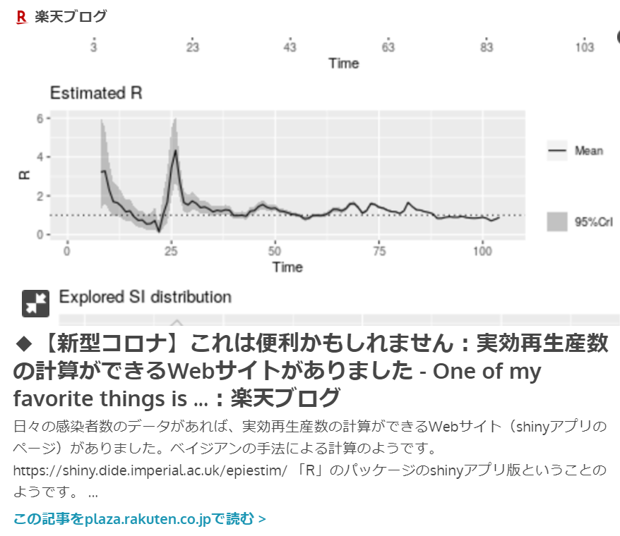
◆【新型コロナ】北里大学がイベルメクチンの治験を実施するそうです
新型コロナウイルス感染症の治療薬として期待されている、駆虫薬のイベルメクチンの医師主導の治験が行われるようです。副作用が少ない薬だそうですので、早期に抗新型コロナウイルス薬として活用されるようになってほしいと思います。免疫活性化の効果があるということなのか、抗ウイルス効果があるのか、よくわかりませんが、これまでに投与された人間や動物は非常に多いので、有効性が推定されるのであれば、すぐ投与してもいいのではないかと思います。有効性が確認されれば、途上国でも多く利用されるようになると思われます。延期された東京五輪を救う薬になる可能性もあると思います。イベルメクチンは、投与例の少ないレムデシビルよりもずっと安心で、供給量も格段に多いのではないでしょうか。ギリアド・サイエンシズは、5月4日、新型コロナウイルス感染症についてレムデシビルを国内で承認申請したそうですが、今日、5月7日に承認されるようなので、「超スピード承認」です。審査などないに等しいと言えそうです。--------------------------------------------------------------------------↓実効再生産数を計算できるWebアプリがあります。↓倍加時間についてです。----------------------------------------------------------------------------------------------------------------------------------------------------長さ調節可フィルターも入る2重構造!洗濯可立体仕様のケアマスク●先行受注●【メール便で送料無料】【メール便A】マスク 布マスク 男女兼用 日本製 国内生産 二重構造 フィルター効果 ユニセックス 洗える 洗濯可能 清潔 花粉症 保湿 コットン 綿価格:1380円(税込、送料無料) (2020/3/27時点)楽天で購入洗って、繰り返し使える布マスクです。-------------------------------------------------------------------------【ダッシュボード「COVID-19 Transition Graphs」を試作】中国本土以外の地域への感染が拡大しているため、国別、地域別の感染者数の推移を簡単に確認できるダッシュボードを試作しています。随時、ページを追加しています。グラフのデータは、右上部分の操作でダウンロードすることができます。アメリカの「地域別の変数」を前処理して、「州別」での推移をグラフ化できるようにしました。また、州コードのフィールドを作成してコロプレス地図も作成しています。楽天ブログでは「iframe」タグが使えないので、Bloggerのページから利用できるようにしています。無料で利用できる、グーグルの「データポータル」のダッシュボードです。データさえあれば、簡単に作成できます。「国」別、「地域」別に日ごとの感染者数の推移を見ることができます。↓ダッシュボードの試作です。下記リンクのページから利用できます。ジョンズ・ホプキンス大学の「JHU CSSE」の「Covid19 Daily Reports」のデータを利用しています。直近のアメリカのデータは地域分類が細かくなっていて、1日当たり2千行くらいになっています。 EdgeブラウザやIEブラウザなど、Chromeブラウザ以外での利用の場合はうまく表示されないことがあるようです。↓上記のダッシュボードのデータの出所のサイトです。マップがメインのダッシュボードです-----------------------------------------------------------------------------------------[イタリア お土産]バッチ チョコレート 12粒入り (イタリア お土産 イタリア 土産 イタリア おみやげ イタリア みやげ)価格:1448円(税別、送料別)(2020/3/12時点)楽天で購入がんばれ、イタリア。↓WHOのサイトでも、感染者数、地域などの「Situation Report」が日々更新されています。関心がある場合は、一日に一度見るといいのではないかと思います。↓日本のインフルエンザの「定点当たり報告数」をグラフ化できるダッシュボードを試作。都道府県別にグラフ化可能です。------------------------------------------------------ 新型コロナウイルス(2019-novel coronavirus)対策もインフルエンザ対策と同じで、手洗い、うがい、マスク着用(咳エチケット)、免疫力アップなどが対策になるようです。【3/6再入荷】【お一人様3個まで】LEC レック 除菌の【激落ちくん】320ml 除菌 激落ち キッチン アルカリ電解水 配合 アルコールスプレー 除菌スプレー【RCP】【S-659】【キャッシュレス 還元 対象店】価格:260円(税別、送料別)(2020/3/7時点)楽天で購入----------------------------------------------------------------------------★おすすめの記事 ◆How Windows Sonic looks like.:Windows Sonic for Headphonesの音声と2chステレオ音声の比較:7.1.2chテストトーンの比較で明らかになった違い:一目で違いがわかりました----------------------------------------------------------------------------------------------------------
2020.05.07
コメント(0)
-

◆【新型コロナ】実効再生産数・Rtを国別に計算する「R言語」のコード例です:ECDCのデータを利用したダッシュボードでグラフ化しています:感染間隔(Serial interval)のパラメータは西浦先生らの論文の数字を利用しています
新型コロナウイルスの実効再生産数・Rtを、R言語の「EpiEstim」パッケージを利用して、国別に計算できるようにしました。60カ国以上について、一度に計算しています。データは、ECDCの日々の感染確認者数のデータを利用しています。なお、計算の結果では、日本の最新の実効再生産数・Rtは、0.76となっています。この値は、20日ほど前の感染状況を示しているようです。下記のコードのようなループ処理は、都道府県別や州別のロング型データにも同様に適用でき、一度に多くの計算をすることができます。国・地域のリストのループ処理によって多くの国・地域の値を一度に計算していますが、日々の感染確認者数のデータが100日分以上ある国について、実効再生産数・Rtを計算しています。今日の処理では、100日分以上のデータがある66か国が計算対象になっていました。なお、感染間隔(Serial interval)のパラメータは、西浦先生らによる論文「Serial interval of novel coronavirus (COVID-19) infections」で示された、平均値4.7と標準偏差2.9を利用しています。計算した実効再生産数・RtをECDCのデータを利用したダッシュボードでグラフ化しています。プルダウンメニューで国を選んで、グラフを表示させることができます。下記のRコードで用いている「EpiEstim」のパッケージは、「Improved inference of time-varying reproduction numbers during infectious disease outbreaks」という論文に基づいています。↓「EpiEstim」パッケージでは、感染間隔の分布の情報と日々の感染者のデータから実効再生産数・Rtを計算する仕組みになっています。ベイジアンの手法が用いられています。下記のコードの太字の部分が、「EpiEstim」パッケージに関するコードです。【↓Rのコード例です:いろいろと必要なパッケージがありますが省略しています。というよりも、普段からたくさんのパッケージを読み込んでいるので、必要最小限のパッケージが特定できません】【5月17日:発病間隔のパラメータを平均4.8、標準偏差2.3に変更します。18日のデータ更新から反映させます。日本科学技術ジャーナリスト会議のニコニコ動画で、利用されているパラメータがわかりました。これまで、同じ論文中の別のパラメータを使用していました】library(EpiEstim)df_ECDC <- read.csv("https://opendata.ecdc.europa.eu/covid19/casedistribution/csv", na.strings = "", fileEncoding = "UTF-8-BOM")#ダッシュボード用データでは、スペインのデータが1日分(1行分)欠損しているのを補う処理をしています。geo_list <- unique(df_ECDC$countriesAndTerritories)df_ECDCtemp <- df_ECDCdf_Rt <- NULLtemp_Rt <- NULLfor (i in seq_along(geo_list)) { df_ECDCtemp1 <- subset(df_ECDCtemp,df_ECDCtemp$countriesAndTerritories==geo_list[i]) df_ECDCtemp2 <- subset(df_ECDCtemp1,df_ECDCtemp1$cases >= 0) if (length(df_ECDCtemp2$cases) >=100) {rt_parametric_si <- estimate_R(df_ECDCtemp2$cases,method = "parametric_si",config = make_config(list(mean_si = 4.8, std_si = 2.3))) temp_Rt <- rt_parametric_si$R temp_Rt <- mutate(temp_Rt,countriesAndTerritories=geo_list[i]) df_Rt <- rbind(df_Rt, temp_Rt)} else {print(geo_list[i])}}df_Rt <- df_Rt[,c(1,3,12)]#ECDCのデータの国・地域の列から、国・地域のリスト(重複のないリスト)を作成します。そのリストを使って、国別・地域別のデータを抽出し、計算処理を行います。計算結果に国・地域の情報を足して、保存します。この一連の結果の追記を繰り返します。中にはデータ件数が少ない国・地域があって、計算のエラーが生じたので、分岐処理を加えています。--------------------------------------------------------------------------↓実効再生産数を計算できるWebアプリがあります。↓倍加時間についてです。----------------------------------------------------------------------------------------------------------------------------------------------------長さ調節可フィルターも入る2重構造!洗濯可立体仕様のケアマスク●先行受注●【メール便で送料無料】【メール便A】マスク 布マスク 男女兼用 日本製 国内生産 二重構造 フィルター効果 ユニセックス 洗える 洗濯可能 清潔 花粉症 保湿 コットン 綿価格:1380円(税込、送料無料) (2020/3/27時点)楽天で購入洗って、繰り返し使える布マスクです。-------------------------------------------------------------------------【ダッシュボード「COVID-19 Transition Graphs」を試作】中国本土以外の地域への感染が拡大しているため、国別、地域別の感染者数の推移を簡単に確認できるダッシュボードを試作しています。随時、ページを追加しています。グラフのデータは、右上部分の操作でダウンロードすることができます。アメリカの「地域別の変数」を前処理して、「州別」での推移をグラフ化できるようにしました。また、州コードのフィールドを作成してコロプレス地図も作成しています。楽天ブログでは「iframe」タグが使えないので、Bloggerのページから利用できるようにしています。無料で利用できる、グーグルの「データポータル」のダッシュボードです。データさえあれば、簡単に作成できます。「国」別、「地域」別に日ごとの感染者数の推移を見ることができます。↓ダッシュボードの試作です。下記リンクのページから利用できます。ジョンズ・ホプキンス大学の「JHU CSSE」の「Covid19 Daily Reports」のデータを利用しています。直近のアメリカのデータは地域分類が細かくなっていて、1日当たり2千行くらいになっています。 EdgeブラウザやIEブラウザなど、Chromeブラウザ以外での利用の場合はうまく表示されないことがあるようです。↓上記のダッシュボードのデータの出所のサイトです。マップがメインのダッシュボードです-----------------------------------------------------------------------------------------[イタリア お土産]バッチ チョコレート 12粒入り (イタリア お土産 イタリア 土産 イタリア おみやげ イタリア みやげ)価格:1448円(税別、送料別)(2020/3/12時点)楽天で購入がんばれ、イタリア。↓WHOのサイトでも、感染者数、地域などの「Situation Report」が日々更新されています。関心がある場合は、一日に一度見るといいのではないかと思います。↓日本のインフルエンザの「定点当たり報告数」をグラフ化できるダッシュボードを試作。都道府県別にグラフ化可能です。------------------------------------------------------ 新型コロナウイルス(2019-novel coronavirus)対策もインフルエンザ対策と同じで、手洗い、うがい、マスク着用(咳エチケット)、免疫力アップなどが対策になるようです。【3/6再入荷】【お一人様3個まで】LEC レック 除菌の【激落ちくん】320ml 除菌 激落ち キッチン アルカリ電解水 配合 アルコールスプレー 除菌スプレー【RCP】【S-659】【キャッシュレス 還元 対象店】価格:260円(税別、送料別)(2020/3/7時点)楽天で購入----------------------------------------------------------------------------★おすすめの記事 ◆How Windows Sonic looks like.:Windows Sonic for Headphonesの音声と2chステレオ音声の比較:7.1.2chテストトーンの比較で明らかになった違い:一目で違いがわかりました----------------------------------------------------------------------------------------------------------
2020.05.07
コメント(0)
-
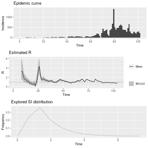
◆【新型コロナ】これは便利かもしれません:実効再生産数の計算ができるWebサイトがありました
日々の感染者数のデータがあれば、実効再生産数・Rtの計算ができるWebサイト(shinyアプリのページ)がありました。ベイジアンの手法による計算のようです。https://shiny.dide.imperial.ac.uk/epiestim/「R」のパッケージのshinyアプリ版ということのようです。なお、このアプリは、「Improved inference of time-varying reproduction numbers during infectious disease outbreaks」という論文に基づいています。日々の感染確認者数のデータは、例えば、後述の試作のダッシュボードのグラフの右上のメニューからダウンロードできます。累積のデータではなく、日々の新規数のデータ(Daily New Cases)を利用します。ダウンロードしたデータの日々のケースのデータの列の部分だけを残して保存し、上記のアプリのサイトにアップロードすれば計算結果とグラフが得られます。データの列のヘッダーはなしでもありでもどちらでも構いません。読み込む際に指定できるようになっています。別途、発生間隔(Serial interval:英文しかないので、日本語の用語がわかりません)の平均値、標準偏差などのパラメータが必要だったりしますが、過去の伝染病での感染間隔のデータ(例えば2009年の新型インフルエンザの値)を適用することで、とりあえず計算はできます。→ その後、いろいろと調べて、西浦先生らの論文の発症間隔(Serial interval)のパラメータを入力して計算できました。発症間隔は、1次感染の発症から、2次感染の発症までの期間のようです。つまり、ある人が発症した時点から、その発症した人経由で感染した別の人が発症する時点までの期間のことのようです。アプリには、発症間隔の平均値の標準偏差だけでなく、標準偏差の平均値や標準偏差などの入力欄があるところはベイズ統計的ですが、今のところ、各入力欄にどのような値を入力すればいいのかよくわかりませんが、95%信頼区間(信用区間?)の値を入力するといいのかもしれません。→ その後、いろいろと調べて、西浦先生らの論文の発症間隔のパラメータを入力して計算できました。このアプリでの計算では、原則として発症間隔についての調査データが必要とされるようです。対策本部の利用しているデータが公開されると、このアプリでより適切な計算ができるようになるのではないでしょうか。山中先生が別の計算方法で計算されていますが、ある研究論文にあった発症間隔の平均値6.3、標準偏差4.2という値を利用しているようです。西浦先生らによる論文「Serial interval of novel coronavirus (COVID-19) infections」というのがあったので、この論文中で言及されている発症間隔の値を用いるのもよさそうです。この論文では、発症間隔の中央値が4.0ですが、平均値と標準偏差は「4.7 days (95% CrI: 3.7, 6.0)and 2.9 days (95% CrI: 1.9, 4.9)」ということなので、この平均値と標準偏差の値と、それぞれの95%信頼区間の値をアプリに入力すればよさそうです。でも、「標準偏差の標準偏差」の値のデータがありません。標準偏差の信頼区間から標準偏差の標準偏差を逆算できるのかもしれませんが、ポアソン分布での計算のようなので単純ではなさどうです。とりあえず1としておきます。→ その後、いろいろと調べて、西浦先生らの論文の発症間隔のパラメータを入力して計算できました。→アプリの途中のメニューで「Parametric without uncertainty (offset gamma)」を選んで、「uncertaintyなし」の設定にすれば、発症間隔の平均値と標準偏差の二つの値を入力するだけで計算できました。平均を4.74.8、標準偏差を2.92.3としました。【5月17日:発病間隔のパラメータを平均4.8、標準偏差2.3に変更します。18日のデータ更新から反映させます。日本科学技術ジャーナリスト会議のニコニコ動画で、利用されているパラメータがわかりました。これまで、同じ論文中の別のパラメータを使用していました】新規コロナウイルス(COVID-19)感染の連続間隔。西浦H 1、リントンNM 2、アフメチャノフAR 2。概要目的:28の感染者と感染者のペアに関する情報から、新規コロナウイルス(COVID-19)のシリアル間隔を推定します。方法:公開された研究記事とケース調査レポートから、一次症例(感染者)と二次症例(感染者)の発症日を収集しました。データの信頼性を主観的にランク付けし、完全なデータセット(n = 28)とレポートで最も確実性の高いペアのサブセット(n = 18)の両方で分析を行いました。さらに、流行がまだ成長段階にあるため、データの正しい切り捨てを調整します。結果:正しい切り捨てを考慮してすべてのペアを分析し、シリアル間隔の中央値を4.0日と推定しました(95%信頼できる間隔[CrI]:3.1、4.9)。データを最も特定のペアのみに制限すると、シリアル間隔の中央値は4.6日と推定されました(95%CrI:3.5、5.9)。結論:COVID-19のシリアル間隔は、その潜伏期間の中央値に近いか、それよりも短いです。これは、二次感染のかなりの部分が発症前に発生する可能性があることを示唆しています。COVID-19のシリアルインターバルは、重症急性呼吸器症候群(SARS)のシリアルインターバルよりも短く、SARSシリアルインターバルを使用して行われた計算でバイアスが生じる可能性があることを示しています。ResultsWe were able to obtain data on 28 infector-infectee pairs(see Supplementary Table). Of these, 12 pairs were familyclusters. Accounting for right truncation and analyzing allpairs, the model using the lognormal distribution was selectedas the best-fit model (WAIC = 224.0), while no significantdifferences from other models were identified. The medianserial interval was estimated at 4.0 days (95% credible interval[CrI]: 3.1, 4.9) while the mean and standard deviation (SD) ofthe serial interval were estimated at 4.7 days (95% CrI: 3.7, 6.0)and 2.9 days (95% CrI: 1.9, 4.9), respectively. Withouttruncation, the model using the lognormal distribution wasalso the best-fit model (WAIC = 128.0) with the median serialinterval estimated at 3.9 days (95% CrI: 3.1, 4.8).政府の対策本部の実効再生産数の計算には、この論文中の発生間隔のパラメータが利用されている可能性が高いのではないかと思います。この西浦先生らの論文には、「潜伏期間よりも感染の間隔が短い場合がある」という内容があり、発症前から感染力がある、という話はこの論文に基づいているようです。下図は、日本の日々の感染確認者数のデータを、ECDCデータのダッシュボードからダウンロードし、2月以降のデータで計算したものです。Webアプリによって、下記のグラフとRtの計算結果のデータ表を得ることができます。データ表はcsvファイルでダウンロードできます。発症間隔を変えて、どのような結果になるのかのシミュレーションにも利用できそうではあります。↓2009年のインフルエンザの発症間隔のパラメーターを用いた場合↓「uncertaintyあり」に設定し、西浦先生らの論文の発症間隔のパラメータを用いた場合。発症間隔の分布がMCMCで推定されているようです。↓「uncertaintyなし」に設定して、西浦先生らの論文の発症間隔のパラメータの、平均4.7、標準偏差2.9を利用した場合。最新のRtは、0.74です。【Rのパッケージによる計算】Webアプリは、Rのパッケージを基にしているので、当然、Rのパッケージでも計算できるはずです。というか、RのパッケージからWebアプリは派生したもののはずです。しかし、コードの記法がよくわかりませんでした。「EpiEstim package for R」のコードの記載のあるブログを参考にして、何とかできました。https://timchurches.github.io/blog/posts/2020-02-18-analysing-covid-19-2019-ncov-outbreak-data-with-r-part-1/#estimating-changes-in-the-effective-reproduction-number【5月17日:発病間隔のパラメータを平均4.8、標準偏差2.3に変更します。18日のデータ更新から反映させます。日本科学技術ジャーナリスト会議のニコニコ動画で、利用されているパラメータがわかりました。これまで、同じ論文中の別のパラメータを使用していました】下記は、コードの例です。データとしては、ECDCのデータを読み込んで、日本のデータを抽出したものを利用しています。1月以前のデータも含んでいます。コードで計算できるようになったので、入力データを入れ替えるだけで多くの国や地域での計算が簡単にできるようになりました。計算結果をダッシュボードでグラフ化できるようにしていきたいと考えています。【コード例:ECDCのサイトからのデータ読み込みとRtの計算ができます】df_ECDC <- read.csv("https://opendata.ecdc.europa.eu/covid19/casedistribution/csv", na.strings = "", fileEncoding = "UTF-8-BOM")df_ECDCJapan <- dplyr::filter(df_ECDC,geoId == "JP")install.packages("EpiEstim")library(EpiEstim)plot_Ri <- function(estimate_R_obj) { p_I <- plot(estimate_R_obj, "incid", add_imported_cases = TRUE) # plots the incidence p_SI <- plot(estimate_R_obj, "SI") # plots the serial interval distribution p_Ri <- plot(estimate_R_obj, "R") return(gridExtra::grid.arrange(p_I, p_SI, p_Ri, ncol = 1))}japan_parametric_si <- estimate_R(df_ECDCJapan$cases, method = "parametric_si", config = make_config(list(mean_si = 4.8, std_si = 2.3)))plot_Ri(japan_parametric_si)options(max.print=10000)japan_parametric_si結局、一般的な「実効再生産数・Rt」の計算で使われているデータは、「日々の感染確認者数のデータ」と、「発症間隔(1次感染者の発症から2次感染者の発症までの日数)のパラメータ」のみということなので、日々の感染確認者数の増加や減少を反映している指標に過ぎない、という見方ができるようです。何か、賢そうな名前の指標ですが、それほど役立つものでもなさそうです。実効再生産数・Rtには、わかりやすい概念という側面と、計算で推定される指標という側面があり、概念の方から見ると、「実効再生産数」ってすごいと思ってしまいますが、計算による推定方法の仕組みを知ると、期待外れになるかもしれません。「概念」と「推定される数値の指標」は別物として考えるのがいいのかもしれません。------------------------------------------------------------------------------------------------------------------------------------------------------------------------------------------------------------------------------長さ調節可フィルターも入る2重構造!洗濯可立体仕様のケアマスク●先行受注●【メール便で送料無料】【メール便A】マスク 布マスク 男女兼用 日本製 国内生産 二重構造 フィルター効果 ユニセックス 洗える 洗濯可能 清潔 花粉症 保湿 コットン 綿価格:1380円(税込、送料無料) (2020/3/27時点)楽天で購入洗って、繰り返し使える布マスクです。-------------------------------------------------------------------------【ダッシュボード「COVID-19 Transition Graphs」を試作】中国本土以外の地域への感染が拡大しているため、国別、地域別の感染者数の推移を簡単に確認できるダッシュボードを試作しています。随時、ページを追加しています。グラフのデータは、右上部分の操作でダウンロードすることができます。アメリカの「地域別の変数」を前処理して、「州別」での推移をグラフ化できるようにしました。また、州コードのフィールドを作成してコロプレス地図も作成しています。楽天ブログでは「iframe」タグが使えないので、Bloggerのページから利用できるようにしています。無料で利用できる、グーグルの「データポータル」のダッシュボードです。データさえあれば、簡単に作成できます。「国」別、「地域」別に日ごとの感染者数の推移を見ることができます。↓ダッシュボードの試作です。下記リンクのページから利用できます。ジョンズ・ホプキンス大学の「JHU CSSE」の「Covid19 Daily Reports」のデータを利用しています。直近のアメリカのデータは地域分類が細かくなっていて、1日当たり2千行くらいになっています。 EdgeブラウザやIEブラウザなど、Chromeブラウザ以外での利用の場合はうまく表示されないことがあるようです。↓上記のダッシュボードのデータの出所のサイトです。マップがメインのダッシュボードです-----------------------------------------------------------------------------------------[イタリア お土産]バッチ チョコレート 12粒入り (イタリア お土産 イタリア 土産 イタリア おみやげ イタリア みやげ)価格:1448円(税別、送料別)(2020/3/12時点)楽天で購入がんばれ、イタリア。↓WHOのサイトでも、感染者数、地域などの「Situation Report」が日々更新されています。関心がある場合は、一日に一度見るといいのではないかと思います。----------------------------------------------------------------------------------------------------------------------------------------------------↓日本のインフルエンザの「定点当たり報告数」をグラフ化できるダッシュボードを試作。都道府県別にグラフ化可能です。------------------------------------------------------ 新型コロナウイルス(2019-novel coronavirus)対策もインフルエンザ対策と同じで、手洗い、うがい、マスク着用(咳エチケット)、免疫力アップなどが対策になるようです。【3/6再入荷】【お一人様3個まで】LEC レック 除菌の【激落ちくん】320ml 除菌 激落ち キッチン アルカリ電解水 配合 アルコールスプレー 除菌スプレー【RCP】【S-659】【キャッシュレス 還元 対象店】価格:260円(税別、送料別)(2020/3/7時点)楽天で購入----------------------------------------------------------------------------★おすすめの記事 ◆How Windows Sonic looks like.:Windows Sonic for Headphonesの音声と2chステレオ音声の比較:7.1.2chテストトーンの比較で明らかになった違い:一目で違いがわかりました----------------------------------------------------------------------------------------------------------
2020.05.05
コメント(0)
-
◆HPのノートパソコンの液晶画面を交換しました:画面だけは新品同様になりました。
オンライン申請を済ませた特別定額給付金をあて込んで、以前から液晶の表示がおかしくなっていたHPのノートパソコンの15.6インチフルHDの液晶パネルを交換しました。液晶パネルは、約4年間の使用で壊れました。症状としては、画面の色表示がおかしくなって、赤色がうまく表示されなくなり、さらには残像現象が生じたりして、テキスト入力くらいにしか使えない状態になっていました。レノボのノートPC用の交換部品が多く販売されているようなので、今度ノートPCを購入する場合は、部品交換修理が簡単なレノボのパソコンを選ぶのがいいのではないかと思うようになりました。あるいは、中古のレノボを購入して、不具合がでてきたら、即、部品交換する、というのがいいのかもしれません。HPのパソコン用というパネルが、なかなか見つからず、レノボ用でしたが、30ピン端子で、ねじ止め位置が同じパネルを見つけて、多分大丈夫だろうと思い、注文しました。30ピン端子を外すのが難しかった以外は、非常に簡単に交換できました。パネルの交換では、30ピン端子のケーブルの脱着が最も難しかったです。それ以外は、基板にアクセスする必要もなかったので、とても簡単でした。ケーブルと端子の上からびっちりとテープが貼られていて、端子はテープで固定されていました。端子周辺のテープを慎重に剥がして、端子をそっと斜め上に引き抜く必要がありました。端子をはめる場合も、斜め上から押し込む形ですが、はまったという感触がとぼしいのは、なんとかならないものかと思います。端子の上からテープを貼って固定しています。交換後の画面は非常にきれいで、画面だけは新品同様になりました。日本のサイトで購入しましたが、アメリカの通販サイトでの価格の倍以上の価格でした。日本の円は購買力が乏しいということなのでしょうか。日本はデフレとかいう話もありますが、パソコン関連やガジェットなどの物価は非常に高いという印象があります。日本の「HD解像度のパネル」の価格よりも、米国の「フルHD解像度のパネル」が安かったりします。米国のメジャーな通販サイトのドルでの価格を見ていると、「何でこんなに違うの?????」と思ってしまいます。「日本円」の購買力のスペックは低いと思います。----------------------------------------------------------------------------------------------------------------------------------------------------長さ調節可フィルターも入る2重構造!洗濯可立体仕様のケアマスク●先行受注●【メール便で送料無料】【メール便A】マスク 布マスク 男女兼用 日本製 国内生産 二重構造 フィルター効果 ユニセックス 洗える 洗濯可能 清潔 花粉症 保湿 コットン 綿価格:1380円(税込、送料無料) (2020/3/27時点)楽天で購入洗って、繰り返し使える布マスクです。-------------------------------------------------------------------------【ダッシュボード「COVID-19 Transition Graphs」を試作】中国本土以外の地域への感染が拡大しているため、国別、地域別の感染者数の推移を簡単に確認できるダッシュボードを試作しています。随時、ページを追加しています。グラフのデータは、右上部分の操作でダウンロードすることができます。アメリカの「地域別の変数」を前処理して、「州別」での推移をグラフ化できるようにしました。また、州コードのフィールドを作成してコロプレス地図も作成しています。楽天ブログでは「iframe」タグが使えないので、Bloggerのページから利用できるようにしています。無料で利用できる、グーグルの「データポータル」のダッシュボードです。データさえあれば、簡単に作成できます。「国」別、「地域」別に日ごとの感染者数の推移を見ることができます。↓ダッシュボードの試作です。下記リンクのページから利用できます。ジョンズ・ホプキンス大学の「JHU CSSE」の「Covid19 Daily Reports」のデータを利用しています。直近のアメリカのデータは地域分類が細かくなっていて、1日当たり2千行くらいになっています。 EdgeブラウザやIEブラウザなど、Chromeブラウザ以外での利用の場合はうまく表示されないことがあるようです。↓上記のダッシュボードのデータの出所のサイトです。マップがメインのダッシュボードです-----------------------------------------------------------------------------------------[イタリア お土産]バッチ チョコレート 12粒入り (イタリア お土産 イタリア 土産 イタリア おみやげ イタリア みやげ)価格:1448円(税別、送料別)(2020/3/12時点)楽天で購入がんばれ、イタリア。↓WHOのサイトでも、感染者数、地域などの「Situation Report」が日々更新されています。関心がある場合は、一日に一度見るといいのではないかと思います。↓日本のインフルエンザの「定点当たり報告数」をグラフ化できるダッシュボードを試作。都道府県別にグラフ化可能です。------------------------------------------------------ 新型コロナウイルス(2019-novel coronavirus)対策もインフルエンザ対策と同じで、手洗い、うがい、マスク着用(咳エチケット)、免疫力アップなどが対策になるようです。【3/6再入荷】【お一人様3個まで】LEC レック 除菌の【激落ちくん】320ml 除菌 激落ち キッチン アルカリ電解水 配合 アルコールスプレー 除菌スプレー【RCP】【S-659】【キャッシュレス 還元 対象店】価格:260円(税別、送料別)(2020/3/7時点)楽天で購入----------------------------------------------------------------------------★おすすめの記事 ◆How Windows Sonic looks like.:Windows Sonic for Headphonesの音声と2chステレオ音声の比較:7.1.2chテストトーンの比較で明らかになった違い:一目で違いがわかりました----------------------------------------------------------------------------------------------------------
2020.05.05
コメント(0)
-
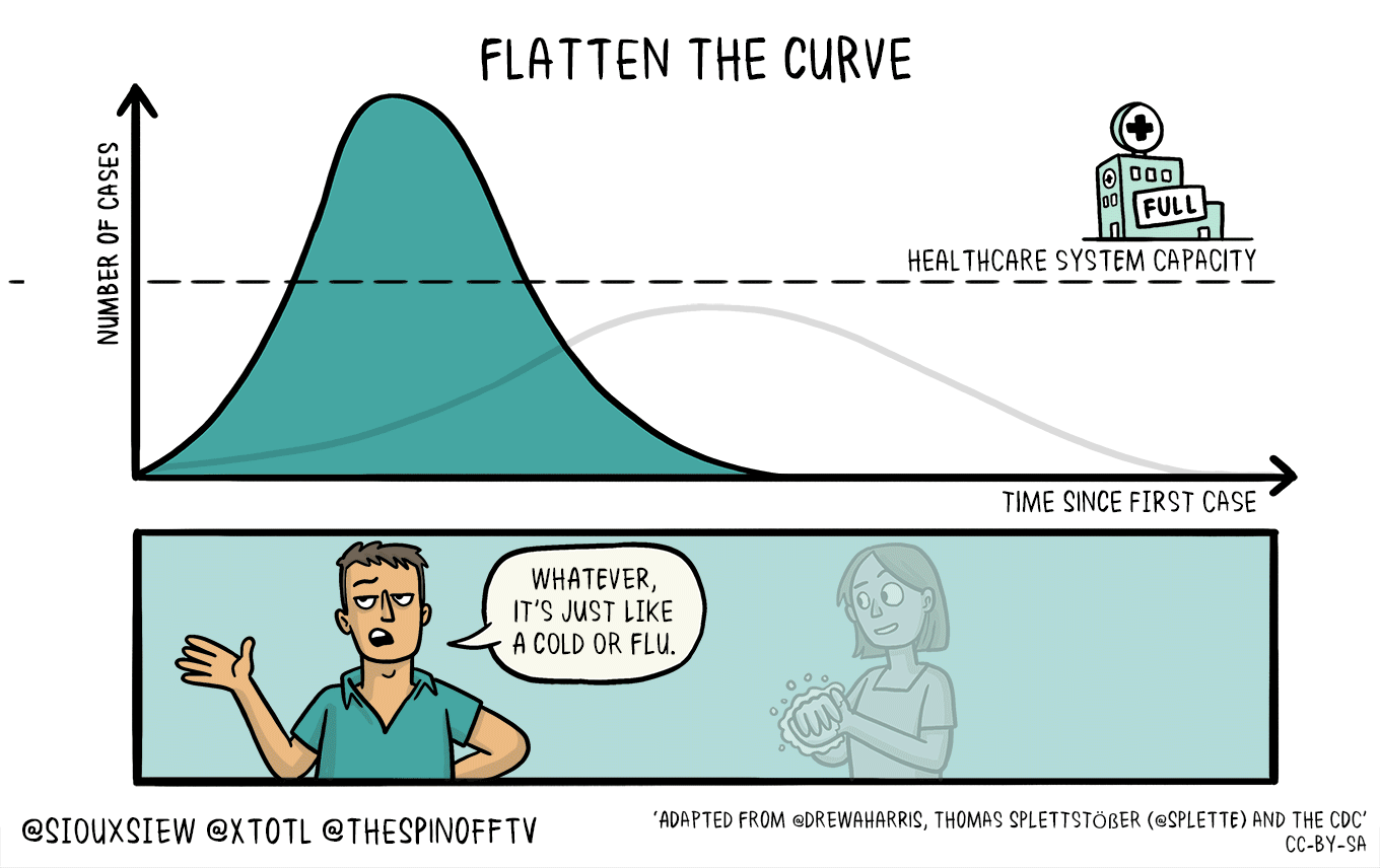
◆【新型コロナ】やっぱり、歴史は繰り返しているのでしょうか:先の大戦の失敗についての検証が不十分だったということでしょうか
1940年の東京五輪は、日中戦争などの影響によって中止になりましたが、2020年東京五輪は、ウイルスとの戦争によって、今のところ延期になっています。歴史の奇妙な一致を、多くの人が感じているのではないでしょうか。今回の日本政府の戦略、対応などについて、「新型ウイルスとの戦争」という観点から考えてみると、日本は先の大戦から何も学んでいないのではないかと思います。確かに、「戦争」を放棄したので、第二次世界大戦での戦略の失敗などについての検証、反省、改善策の検討などは本格的になされなかったと思います。戦争の失敗が戦後政治に生かされたのは、「非常事態」以外の「平時」の局面についてのみだと思います。今風に言えば、「PDCA」の「C:Check」なしに新たな「Action」に取り組んでいるようなものです。「次の戦争のための敗戦の検証」はなされなかったので、今の日本に、戦争のような非常事態への備え、危機対応の能力が不足していても、当然のことなのかもしれません。先の大戦との類似点については、下記のようなことがすぐに思い浮かびます。【類似点:資源の制約の下での戦い】先の大戦は、石油、鉄鋼などの戦略資源の制約の中での戦いでしたが、今回は、PCR検査能力や医療施設の収容力といった制約の中で戦っているようです。問題は、その制約を所与のものとして受け入れていて、その制約の下で、短期的、戦術的に戦うという発想しか持てないでいるということなのではないでしょうか。2月以来、クラスター対策という白兵戦での「短期決戦」しか考えてこなかったのではないでしょうか。東京五輪のこともあり、「短期で収束させたい」という主観的な願望から、長期的なグランドデザインがないまま、短期決戦しか考えられなくなっているように見えます。むしろ、長期的グランドデザインを検討するなどもってのほか、といった風潮があったのではないかと思います。もしかすると、政府内では、延期した五輪前に収束するシナリオしか許されていないのかもしれません。新型コロナウイルスにとっては、五輪の都合など関係ないので、2~3年後以降に収束するようなシナリオの想定も必要なのではないかと思います。政府の対策にも、今のところ、PCR検査能力や医療のキャパシティといった「制約」の解消に取り組むといった、中長期的な視点での戦略構想が見えていません。【類似点:ロジスティクス・兵站の軽視】先の大戦では、日本は「補給戦」で完敗していたので、局所で戦術的な勝利があったとしても、戦略的に負けるのは必然だったということのようです。PCR検査能力の増強や、軽症者隔離施設の確保、病床の増床などが対策本部では軽視されているのではないかと思います。いずれも、都道府県のすべき事項だとして、中央政府は他人事のように考えているようにも見えます。よく言われますが、日本にはCDCやECDCのような組織がありません。対策本部の専門家は、疫学関係のアカデミアの人たちばかりですが、経営学系の『失敗の本質 日本軍の組織論的研究』といった本は読んでいなさそうです。そのような中では、対策として、疫学の教科書通りに、「新しい生活様式」といった教科書丸写しのような「人々の接触機会の抑制策」しか出てこないのも当然でしょう。対策本部のアカデミア系の方々にとっては、PCR検査能力の拡充や、ホテルを隔離施設にするとかいったことは、まさに他人事でしょう。対策本部のメンバーには、疫学関係の専門家以外の方にももっと入ってもらう必要があると思います。【類似点:情報の軽視】PCR検査能力の問題とも重なりますが、信頼できるデータなしに、物事を進めようとしています。また、中国由来のウイルスは封じ込めたとか言っていますが、ではなぜヨーロッパ由来のウイルスを水際で止めることができなかったのでしょうか。入国制限措置などが遅れたからだと思いますが、諸外国の状況についての情報収集・分析能力が欠如しているから、制限措置の発動が遅れたのではないかと思います。【類似点:知らしむべからず】対策本部のデータ分析の内容などが明らかではありません。政策の基になっているデータ、分析手法、分析内容は開示されてもいいのではないでしょうか。専門家会議は、2006年以来の「新型インフルエンザ対策専門家会議」の流れをくんでいることは間違いありませんが、まさに、厚労省ファミリーということなのでしょうか。一世帯に布マスク2枚配布とか、「竹槍」で戦えと言っているようなものではないでしょうか。ほかにも、先の大戦の日本と重なるようなことが多くあると思います。歴史は繰り返しているようです。しかし、歴史に学んでいないので、同じような失敗を繰り返すことになるのでしょうか。制限が緩和されなかった最大の理由は、明らかです。患者の数が、医療体制のキャパシティを超えないようにするためです。しかし、爆発的な感染拡大は起きなかったけれども、医療がひっ迫しているということからすると、そもそも医療体制の拡充が第一に必要なことなのではないでしょうか。政策の優先順位はどうなっているのでしょうか。政府の無為無策の犠牲になるのは、常に一般市民です。政治家も官僚も「コロナ対策なんかやりたくて、政治家や官僚になったわけではない」と思っているかのように、後手後手の対策ばかりです。今度の秋冬に、爆発的な感染が起きて、死亡者が多数出ても、すべて国民の責任にされてしまいそうです。夏にかけて、感染拡大が抑制されているうちに、秋冬に備えることを忘れないようにしてほしいと思います。9月、10月頃から大きな波がやってくるかもしれません。まさに、「欲しがりません、勝つまでは」のようなスローガンが、妙にマッチする風潮ですが、「検査拡大→感染確認者の隔離・重症者の入院」といった攻めの政策もないと、社会経済の崩壊を招く可能性が高いのではないかと思います。------------------------------------------------------------------------------------------------------------------------------------------------------------------------------------------------------------------------------長さ調節可フィルターも入る2重構造!洗濯可立体仕様のケアマスク●先行受注●【メール便で送料無料】【メール便A】マスク 布マスク 男女兼用 日本製 国内生産 二重構造 フィルター効果 ユニセックス 洗える 洗濯可能 清潔 花粉症 保湿 コットン 綿価格:1380円(税込、送料無料) (2020/3/27時点)楽天で購入洗って、繰り返し使える布マスクです。-------------------------------------------------------------------------【ダッシュボード「COVID-19 Transition Graphs」を試作】中国本土以外の地域への感染が拡大しているため、国別、地域別の感染者数の推移を簡単に確認できるダッシュボードを試作しています。随時、ページを追加しています。グラフのデータは、右上部分の操作でダウンロードすることができます。アメリカの「地域別の変数」を前処理して、「州別」での推移をグラフ化できるようにしました。また、州コードのフィールドを作成してコロプレス地図も作成しています。楽天ブログでは「iframe」タグが使えないので、Bloggerのページから利用できるようにしています。無料で利用できる、グーグルの「データポータル」のダッシュボードです。データさえあれば、簡単に作成できます。「国」別、「地域」別に日ごとの感染者数の推移を見ることができます。↓ダッシュボードの試作です。下記リンクのページから利用できます。ジョンズ・ホプキンス大学の「JHU CSSE」の「Covid19 Daily Reports」のデータを利用しています。直近のアメリカのデータは地域分類が細かくなっていて、1日当たり2千行くらいになっています。 EdgeブラウザやIEブラウザなど、Chromeブラウザ以外での利用の場合はうまく表示されないことがあるようです。↓上記のダッシュボードのデータの出所のサイトです。マップがメインのダッシュボードです-----------------------------------------------------------------------------------------[イタリア お土産]バッチ チョコレート 12粒入り (イタリア お土産 イタリア 土産 イタリア おみやげ イタリア みやげ)価格:1448円(税別、送料別)(2020/3/12時点)楽天で購入がんばれ、イタリア。↓WHOのサイトでも、感染者数、地域などの「Situation Report」が日々更新されています。関心がある場合は、一日に一度見るといいのではないかと思います。↓日本のインフルエンザの「定点当たり報告数」をグラフ化できるダッシュボードを試作。都道府県別にグラフ化可能です。------------------------------------------------------ 新型コロナウイルス(2019-novel coronavirus)対策もインフルエンザ対策と同じで、手洗い、うがい、マスク着用(咳エチケット)、免疫力アップなどが対策になるようです。【3/6再入荷】【お一人様3個まで】LEC レック 除菌の【激落ちくん】320ml 除菌 激落ち キッチン アルカリ電解水 配合 アルコールスプレー 除菌スプレー【RCP】【S-659】【キャッシュレス 還元 対象店】価格:260円(税別、送料別)(2020/3/7時点)楽天で購入----------------------------------------------------------------------------★おすすめの記事 ◆How Windows Sonic looks like.:Windows Sonic for Headphonesの音声と2chステレオ音声の比較:7.1.2chテストトーンの比較で明らかになった違い:一目で違いがわかりました----------------------------------------------------------------------------------------------------------
2020.05.05
コメント(0)
-
◆【新型コロナ】レムデシビル:まだ申請されていないのに「承認の方向」?
レムデシビルが、日本で、新型コロナウイルスの治療薬として、世界に先駆けて承認されるのでしょうか。レムデシビルは、あの「タミフル」を創ったギリアド・サイエンシズ社が開発中の抗ウイルス薬です。有効な治療薬ということであれば、利用しやすくなるのはいいことですが、まだ、ギリアド社からの申請もされていないのに、厚労大臣が「承認の方針」を表明するのには、ものすごく違和感を感じます。また、国内での投与例がレムデシビルよりも多いアビガンが後回しなのも謎です。対米関係の文脈の中で、ステルス戦闘機などに加えて、レムデシビルも買わされる、というようなことなのでしょうか。驚くようなスピード感ですが、驚くような薬価になるのかもしれません。供給量もあまり期待できないかもしれません、国内での治療にどれだけ活用されるのでしょうか。アビガンの承認は急がなくていいのでしょうか。【追記】ギリアド・サイエンシズは、5月4日、新型コロナウイルス感染症についてレムデシビルを国内で承認申請したそうです。------------------------------------------------------------------------------------------------------------------------------------------------------------------------------------------------------------------------------長さ調節可フィルターも入る2重構造!洗濯可立体仕様のケアマスク●先行受注●【メール便で送料無料】【メール便A】マスク 布マスク 男女兼用 日本製 国内生産 二重構造 フィルター効果 ユニセックス 洗える 洗濯可能 清潔 花粉症 保湿 コットン 綿価格:1380円(税込、送料無料) (2020/3/27時点)楽天で購入洗って、繰り返し使える布マスクです。-------------------------------------------------------------------------【ダッシュボード「COVID-19 Transition Graphs」を試作】中国本土以外の地域への感染が拡大しているため、国別、地域別の感染者数の推移を簡単に確認できるダッシュボードを試作しています。随時、ページを追加しています。グラフのデータは、右上部分の操作でダウンロードすることができます。アメリカの「地域別の変数」を前処理して、「州別」での推移をグラフ化できるようにしました。また、州コードのフィールドを作成してコロプレス地図も作成しています。楽天ブログでは「iframe」タグが使えないので、Bloggerのページから利用できるようにしています。無料で利用できる、グーグルの「データポータル」のダッシュボードです。データさえあれば、簡単に作成できます。「国」別、「地域」別に日ごとの感染者数の推移を見ることができます。↓ダッシュボードの試作です。下記リンクのページから利用できます。ジョンズ・ホプキンス大学の「JHU CSSE」の「Covid19 Daily Reports」のデータを利用しています。直近のアメリカのデータは地域分類が細かくなっていて、1日当たり2千行くらいになっています。 EdgeブラウザやIEブラウザなど、Chromeブラウザ以外での利用の場合はうまく表示されないことがあるようです。↓上記のダッシュボードのデータの出所のサイトです。マップがメインのダッシュボードです-----------------------------------------------------------------------------------------[イタリア お土産]バッチ チョコレート 12粒入り (イタリア お土産 イタリア 土産 イタリア おみやげ イタリア みやげ)価格:1448円(税別、送料別)(2020/3/12時点)楽天で購入がんばれ、イタリア。↓WHOのサイトでも、感染者数、地域などの「Situation Report」が日々更新されています。関心がある場合は、一日に一度見るといいのではないかと思います。↓日本のインフルエンザの「定点当たり報告数」をグラフ化できるダッシュボードを試作。都道府県別にグラフ化可能です。------------------------------------------------------ 新型コロナウイルス(2019-novel coronavirus)対策もインフルエンザ対策と同じで、手洗い、うがい、マスク着用(咳エチケット)、免疫力アップなどが対策になるようです。【3/6再入荷】【お一人様3個まで】LEC レック 除菌の【激落ちくん】320ml 除菌 激落ち キッチン アルカリ電解水 配合 アルコールスプレー 除菌スプレー【RCP】【S-659】【キャッシュレス 還元 対象店】価格:260円(税別、送料別)(2020/3/7時点)楽天で購入----------------------------------------------------------------------------★おすすめの記事 ◆How Windows Sonic looks like.:Windows Sonic for Headphonesの音声と2chステレオ音声の比較:7.1.2chテストトーンの比較で明らかになった違い:一目で違いがわかりました----------------------------------------------------------------------------------------------------------
2020.05.03
コメント(0)
-
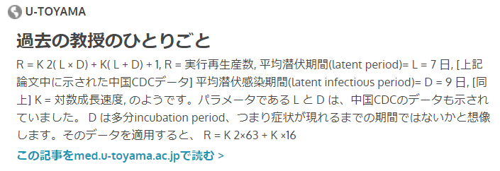
◆【新型コロナ】なるほど、実効再生産数「Rt」は、日々の感染確認者数の増加局面で1を超え、減少局面で1を下回ります:増加率、減少率から推定できる指標のようです
基本再生産数R0とか、実効再生産数(effective reproduction number) Rtとか、普段聞きなれない言葉が、ニュースや情報番組に頻繁に登場するようになっています。なお、基本再生産数はまだ感染者がいない集団での数字で、実効再生産数はすでに感染した人も含まれる集団での数字のようです。では、実効再生産数はどのように計算されるのでしょうか。下記のサイトにわかりやすい計算式がありました。実効再生産数の計算は下記のような数式でできるようです。ただし、何種類もある計算方式の中の一つということのようです。中には、ベイズ統計で推定する方法もあるようです。R = K2(L × D) + K(L + D) + 1Kが対数成長速度で、LとDの係数に中国のデータに基づく数字を入れると、R = K2×63 + K ×16 + 1という式になります。意外と単純な数式でも計算することができるようです。倍加時間の計算に用いているデータからも算出できるようなので、この中国のLとDを用いて、ECDCのデータを利用しているダッシュボードに、国別にRtを見ることができるページを作成しました。→「R言語」のEpiEstimパッケージを用いて計算する方法に変えています。Kは、(LOG(過去5日間の感染確認者数計)ー LOG(さらにその前の5日間の感染確認者数計))/5日間 という式で計算しています。日ごとの数字を用いるとブレが大きくなるので、5日分のデータを用いています。→「R言語」のEpiEstimパッケージを用いて計算する方法に変えています。この式では、日本のRtは変動が大きくなっています。検査数の少なさが数字の安定性に影響しているのでしょうか。欧米諸国では、日本よりもブレは少なくなっています。対策本部が公表した実効再生産数の95%信頼区間は非常に小さいというか、もはや区間ではない形ですが、日本のデータから信頼性の高い実効再生産数が算出できるのかどうかという疑問もあります。計算式の種類やLとDの値、Kの算出方法によって、Rtの値も当然変わってきます。ダッシュボードで計算したものは、おおまかな傾向を把握する目的にしか利用できなさそうです。日本の対策本部の計算式やパラメータの値を公表してもらいたいと思います。Rt(実効再生産数)は、1より大きいと感染者数は増加し、1を下回ると感染者数は減少していく、というコンセプトのものだと理解していたのですが、計算の仕方としては、感染者が増加しているとRt(実効再生産数)は1より大きくなり、感染者が減少していると、1を下回るということになります。つまり、Rt(実効再生産数)は増加率、減少率から推定される指標という側面があるということになります。感染と感染確認の間には、潜伏期間、発症から検査までの期間などがあるので、感染確認者数のデータから推計される実効再生産数は、14日くらい以前の感染状況を示していることになるようです。ということは、「感染状況」は、感染確認者数のデータの日付からさかのぼった、「推定感染時刻」の日付を当てはめて推定する必要があります。対策本部の実効再生産数の資料では、「感染者」数のピークが3月末です。一方、ECDCのデータを利用したダッシュボードの過去10日間の感染確認者数のグラフのピークは、4月19日前後なので、20日ほどさかのぼった日付を想定するといいのかもしれません。概念としては、Rtによって感染者の増加、減少が決まってくるはずのものですが、実際の計算としては増加、減少といった観測データからRtが推定される、ということのようです。観測データから、その観測データが得られる原因の事象(再生産数)を推定している、という仕組みのようです。ベイジアンの手法が用いられているのは、このような考え方と親和性が高いからでしょう。利用方法によっては、増加率や減少率を見ているのとあまり変わらないのかもしれません。もしかすると、感染確認者の聞き取り調査の結果なども利用した、まったく別の実効再生産数の算出方法もあるのかもしれませんが、少なくとも上記のような式からは、概念と計算方法の間に何か飛躍がある印象を受けます。「Rt>1」だから、感染者が増加する、ということを裏返すと、感染者が増加している場合に「Rt>1」と推定される、ということになっていて、「Rt>1」は感染者が増加していることの現れに過ぎず、その大きさは増加ペースの速さということになります。実効再生産数とか、難しそうな感じですが、計算の上では、増加率や減少率に依存する指標であるとすると、一般市民にとっては、増加しているのか減少しているのかを難しく表現しているのに過ぎないと思います。結局、実際に重要なのは、感染確認者数の規模、入院が必要な人数の規模、重症化した人の規模といった絶対値のようです。↓こちらのサイトに、計算式のわかりやすい説明があります。↓計算式です。↓上記の計算式は、この論文にあります。↓山中先生が紹介している論文です。論文中のリンクから、Excelの計算シートをダウンロードすることができます。Excelシートにデータを貼りつけると、マクロによってグラフまで自動作成されます。この論文の方式でRを計算できる「R」のコードPackage ‘EpiEstim’もあるようです。MCMCによって事後分布が推定されているようなので、ベイジアンの手法が用いられているようです。【5月17日追記:5月12日の日本科学技術ジャーナリスト会議のニコニコ動画で、西浦先生が実効再生産数の計算方法を解説されていました。】【8割おじさん西浦教授に聞く】新型コロナの実効再生産数のすべて オンライン講演会生中継/主催:日本科学技術ジャーナリスト会議公式 2020/05/12(火) 20:00開始 (2時間21分)説明資料や、計算のためのR言語のコードは、GitHubにアップされています。https://github.com/contactmodel/COVID19-Japan-Reff-------------------------------------------------------------↓「R言語」のパッケージで、60カ国以上について計算した、実効再生産数・Rtのグラフをダッシュボードで見られるようにしました。↓実効再生産数を計算できるWebアプリがありました。↓倍加時間についてです。----------------------------------------------------------------------------------------------------------------------------------------------------長さ調節可フィルターも入る2重構造!洗濯可立体仕様のケアマスク●先行受注●【メール便で送料無料】【メール便A】マスク 布マスク 男女兼用 日本製 国内生産 二重構造 フィルター効果 ユニセックス 洗える 洗濯可能 清潔 花粉症 保湿 コットン 綿価格:1380円(税込、送料無料) (2020/3/27時点)楽天で購入洗って、繰り返し使える布マスクです。-------------------------------------------------------------------------【ダッシュボード「COVID-19 Transition Graphs」を試作】中国本土以外の地域への感染が拡大しているため、国別、地域別の感染者数の推移を簡単に確認できるダッシュボードを試作しています。随時、ページを追加しています。グラフのデータは、右上部分の操作でダウンロードすることができます。アメリカの「地域別の変数」を前処理して、「州別」での推移をグラフ化できるようにしました。また、州コードのフィールドを作成してコロプレス地図も作成しています。楽天ブログでは「iframe」タグが使えないので、Bloggerのページから利用できるようにしています。無料で利用できる、グーグルの「データポータル」のダッシュボードです。データさえあれば、簡単に作成できます。「国」別、「地域」別に日ごとの感染者数の推移を見ることができます。↓ダッシュボードの試作です。下記リンクのページから利用できます。ジョンズ・ホプキンス大学の「JHU CSSE」の「Covid19 Daily Reports」のデータを利用しています。直近のアメリカのデータは地域分類が細かくなっていて、1日当たり2千行くらいになっています。 EdgeブラウザやIEブラウザなど、Chromeブラウザ以外での利用の場合はうまく表示されないことがあるようです。↓上記のダッシュボードのデータの出所のサイトです。マップがメインのダッシュボードです-----------------------------------------------------------------------------------------[イタリア お土産]バッチ チョコレート 12粒入り (イタリア お土産 イタリア 土産 イタリア おみやげ イタリア みやげ)価格:1448円(税別、送料別)(2020/3/12時点)楽天で購入がんばれ、イタリア。↓WHOのサイトでも、感染者数、地域などの「Situation Report」が日々更新されています。関心がある場合は、一日に一度見るといいのではないかと思います。↓日本のインフルエンザの「定点当たり報告数」をグラフ化できるダッシュボードを試作。都道府県別にグラフ化可能です。------------------------------------------------------ 新型コロナウイルス(2019-novel coronavirus)対策もインフルエンザ対策と同じで、手洗い、うがい、マスク着用(咳エチケット)、免疫力アップなどが対策になるようです。【3/6再入荷】【お一人様3個まで】LEC レック 除菌の【激落ちくん】320ml 除菌 激落ち キッチン アルカリ電解水 配合 アルコールスプレー 除菌スプレー【RCP】【S-659】【キャッシュレス 還元 対象店】価格:260円(税別、送料別)(2020/3/7時点)楽天で購入----------------------------------------------------------------------------★おすすめの記事 ◆How Windows Sonic looks like.:Windows Sonic for Headphonesの音声と2chステレオ音声の比較:7.1.2chテストトーンの比較で明らかになった違い:一目で違いがわかりました----------------------------------------------------------------------------------------------------------
2020.05.03
コメント(2)
-
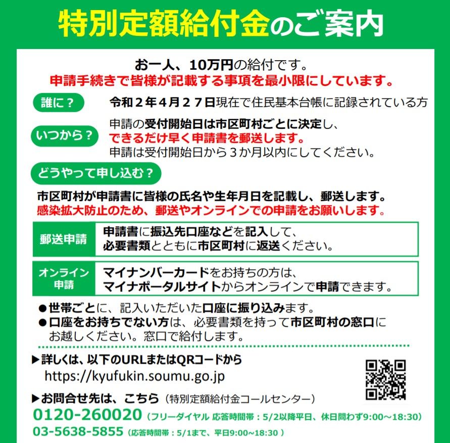
◆【新型コロナ】特別定額給付金の申請が始まりました:オンライン申請は昨日からできるようになっています:今日、オンライン申請をしました:郵送の場合は添付資料印刷が必要なので、プリンターのインクが切れていないか確認する必要があるかもしれません
市区町村によって、受付開始時期に違いがあるようですが、特別定額給付金のオンライン申請が昨日からできるようになっていました。郵送での申請では、申請用紙が届くのを待つ必要があるようですが、電子証明書を登録したマイナンバーカードがあればオンライン申請ができます。電子証明書登録のないマイナンバーカードは使えません。【追記】オンラインで申請しても、結局は市区町村でアナログ処理されるので、世帯内需給対象者の確認がオンライン申請の方が面倒のようで、郵送申請よりも支払いに時間がかかることもあり得るとか。あり得ないことがあり得る「お役所しごと」です。マイナンバーカードの暗証番号を忘れていたり、暗証番号の誤入力で、ロックがかかった状態だったりすると、オンライン申請はできません。電子証明書の期限切れの場合ももちろんオンライン申請はできません。なお、マイナンバーカードを新規に申請する場合は、カードを受け取るまでに1カ月~2カ月くらいかかるので、今回のオンライン申請のためにマイナンバーカードを取得しようというのは現実的ではないと思います。また、パソコンとICカードリーダ、あるいは、カードの読み取りができるスマホが必要です。マイナンバーカードで確定申告をしていれば、何の問題もなくオンライン申請ができそうですが、これが初めてのオンライン申請の場合は、カードリーダのドライバのインストールから始める必要があるので、申請を終えるまでに時間がかかると思います。初のオンライン申請の場合では、1時間で終わればいいほうではないかと思います。オンライン申請では、振込先金融機関の口座の確認書類の画像をアップロードする必要があるようです。チェック用なのでしょうが、確定申告の還付申請では、銀行・支店名と口座番号を入力するだけなので、わざと申請のハードルを高くしているのかもしれません。郵送の場合にも免許証などの本人確認資料や口座確認資料のコピーが必要です。コピー機能付プリンターやコンビニのコピー機が活躍しそうです。コンビニのコピー機の利用者が激増しそうです。コンビニに巨大な特需が生まれるかもしれません。郵送申請する場合は、申請書が届く前に、本人確認書類と、通帳かキャッシュカードの口座番号と口座名義がわかるコピーを用意しておくといいと思います。とりあえず、郵送申請の場合は、プリンターのインクを買っておいた方がいいのかもしれません。早速、今日にでもオンライン申請してみたいと思います。古いスマホしかないので、パソコンで申請します。【オンライン申請をしました】マイナポータルのサイトのぴったりサービスのページから申請できます。マイナポータルの利用者登録はしなくても、特別定額給付金の申請はできます。まず、動作環境チェックから始まりました。マイナポータルAPをインストールしていなかったので、アプリのインストールが必要でした。アプリのインストールは一瞬で終了しました。クロームブラウザを使用して申請しましたが、アプリと言っても、マイナポータルAPはクロームの拡張機能のようです。後は、画面の指示に従って必要事項を入力していくだけでした。氏名、住所、生年月日、性別は、マイナンバーカードから自動入力できますが、後述の理由で、(できたけど)できなかったので、カードの表記と同じ内容を手入力しました。重要なポイントは、世帯内の給付対象者を自分で入力する必要がある点です。恐らく、郵送の申請書ではあらかじめ世帯内の給付対象者が記入されているのではないかと思いますが、オンライン申請の場合は自分で入力する必要があります。マイナンバーカードには世帯の情報がないので仕方がないようです。それから、預金通帳あるいはキャッシュカードなどの、口座番号と口座名義の確認用の画像をアップロードする必要があります。スマホで写真撮影して、OneDriveにアップロード保存し、パソコンでその画像をアップロードしました。なお、スマホがアンドロイドの場合には、Windows 10の「スマホ同期」機能を利用できるように設定していれば、スマホで撮影した写真を簡単にパソコンで利用できるようです。私のスマホは、iPhoneなのでその「スマホ同期」機能では写真の同期はできません。スキャナー機能の備わったプリンターがあれば、スキャンした画像をパソコンに取り込んで、アップロードできます。Windowsパソコンであれば、標準の「ペイント」のソフトで取り込めます。スキャナー(スキャナー機能付プリンター)をパソコンにつないで、「ペイント」のファイルメニューから「カメラまたはスキャナーから取り込む」を選べば、スキャンできます。最後の電子署名付与のところで、問題発生。画面から反応がありませんでした。実は、私は、2画面のマルチディスプレイにしているのですが、片方の画面をオフにしていました。そのオフにしていた画面の方に、電子署名付与の際の暗証番号入力のポップアップ画面が表示されているのに気づくのに時間がかかりました。タスクバーにウサギのアイコンが出ていたので気づきました。よく、ポップアップ画面やファイル保存、読み込みの別画面がオフにした方の画面に出ていることが多いので、何となくそんな気はしていましたが。氏名・住所などの情報の自動入力の際も、マイナンバーカードの情報を読み取るための暗証番号入力画面が、オフにしていた画面に表示されていたのに気づかなかったということのようです。アプリのインストールや確認資料の画像アップロード、暗証番号入力のポップアップ画面に気づくまでの時間などがかかりましたので、30分以上かかりました。スムーズに行けば、20分以内で申請できるのではないでしょうか。カードの読み取り処理の際のページに「暗証番号入力のポップアップ画面が現れます」とかの表示があると、よりわかりやすいのではないかと思いました。ページ全体や入力欄も色合いがはっきりしていなくて、見やすい、わかりやすいとは言い難い感じです。とりあえず、オンライン申請を終えましたが、いつ振り込まれるのか、といった情報は表示されませんでした。申請を終えると、作成された申請書のPDFを控えとしてダウンロードできましたが、まさか自治体はこれを紙に印刷して処理するのでしょうか。口座番号とかをそこから手入力したりするのでしょうか。よく考えると、特別給付なので、恒久的な処理ではなく、一時的な処理なので、オンライン申請した情報を自治体は紙に印刷して、口座番号も手入力しそうです。オンライン申請といっても、実際のところは、申請書をメールやFAXで送るのと大差ないのかもしれません。マイナンバーカードを使って、コンビニで住民票を取得するということでさえも、できる自治体とできない自治体があります。住民税のオンライン申告も不可能です。今のところ「電子政府」の整備は、絶望的に遅れているのかもしれません。「マイナンバーカードが普及しない」のは、住民税のオンライン申請といったベーシックなこともできないからだと思います。各種の助成金や融資の申請もオンラインで申請できるようにすればいいのにと思いますが、助成金などのためにシステムを構築するという発想は皆無なのでしょう。話題がそれましたが、今回の特別定額給付金の予算の10分の1くらいでも、医療体制の拡充(病床数の増加・軽症者隔離施設拡大)、検査数の拡大などにあてて、検査で確認した感染者を隔離施設と病院に振り分けていけば、制限解除はもっと早期にできるのではないかと思います。医療体制のキャパシティの拡大、拡充に予算を向けた方が、全国の社会経済活動に制限をかけるよりも合理的なのではないかと思います。----------------------------------------------------------------------------------------------------------------------------------------------------長さ調節可フィルターも入る2重構造!洗濯可立体仕様のケアマスク●先行受注●【メール便で送料無料】【メール便A】マスク 布マスク 男女兼用 日本製 国内生産 二重構造 フィルター効果 ユニセックス 洗える 洗濯可能 清潔 花粉症 保湿 コットン 綿価格:1380円(税込、送料無料) (2020/3/27時点)楽天で購入洗って、繰り返し使える布マスクです。-------------------------------------------------------------------------【ダッシュボード「COVID-19 Transition Graphs」を試作】中国本土以外の地域への感染が拡大しているため、国別、地域別の感染者数の推移を簡単に確認できるダッシュボードを試作しています。随時、ページを追加しています。グラフのデータは、右上部分の操作でダウンロードすることができます。アメリカの「地域別の変数」を前処理して、「州別」での推移をグラフ化できるようにしました。また、州コードのフィールドを作成してコロプレス地図も作成しています。楽天ブログでは「iframe」タグが使えないので、Bloggerのページから利用できるようにしています。無料で利用できる、グーグルの「データポータル」のダッシュボードです。データさえあれば、簡単に作成できます。「国」別、「地域」別に日ごとの感染者数の推移を見ることができます。↓ダッシュボードの試作です。下記リンクのページから利用できます。ジョンズ・ホプキンス大学の「JHU CSSE」の「Covid19 Daily Reports」のデータを利用しています。直近のアメリカのデータは地域分類が細かくなっていて、1日当たり2千行くらいになっています。 EdgeブラウザやIEブラウザなど、Chromeブラウザ以外での利用の場合はうまく表示されないことがあるようです。↓上記のダッシュボードのデータの出所のサイトです。マップがメインのダッシュボードです-----------------------------------------------------------------------------------------[イタリア お土産]バッチ チョコレート 12粒入り (イタリア お土産 イタリア 土産 イタリア おみやげ イタリア みやげ)価格:1448円(税別、送料別)(2020/3/12時点)楽天で購入がんばれ、イタリア。↓WHOのサイトでも、感染者数、地域などの「Situation Report」が日々更新されています。関心がある場合は、一日に一度見るといいのではないかと思います。↓日本のインフルエンザの「定点当たり報告数」をグラフ化できるダッシュボードを試作。都道府県別にグラフ化可能です。------------------------------------------------------ 新型コロナウイルス(2019-novel coronavirus)対策もインフルエンザ対策と同じで、手洗い、うがい、マスク着用(咳エチケット)、免疫力アップなどが対策になるようです。【3/6再入荷】【お一人様3個まで】LEC レック 除菌の【激落ちくん】320ml 除菌 激落ち キッチン アルカリ電解水 配合 アルコールスプレー 除菌スプレー【RCP】【S-659】【キャッシュレス 還元 対象店】価格:260円(税別、送料別)(2020/3/7時点)楽天で購入----------------------------------------------------------------------------★おすすめの記事 ◆How Windows Sonic looks like.:Windows Sonic for Headphonesの音声と2chステレオ音声の比較:7.1.2chテストトーンの比較で明らかになった違い:一目で違いがわかりました----------------------------------------------------------------------------------------------------------
2020.05.02
コメント(0)
-
◆【新型コロナ】過去最高の長さになっている日本の感染確認者数の倍加時間
緊急事態宣言が始まる時に参考にされていたと見られる、感染確認者数の「倍加時間」ですが、直近では、過去最高の長さにまでなってきています。「倍加時間」が長くなっていることは、増加率が鈍化していることを示していますが、「倍加時間」は緊急事態宣言解除の参考にはされていないようです。感染確認者数の累計の規模の大きさと、現状の検査数が不釣り合いになってきている可能性があり、「倍加時間」や増加率などは、日本では役に立たない指標になっているのかもしれません。検査数の少なさは、救命率だけでなく、制限緩和のためのデータの収集にも影響しているのではないでしょうか。↓折れ線グラフが感染確認者数の累計、棒グラフが倍加時間。------------------------------------------------------------------------------------------------------------------------------------------------------------------------------------------------------------------------------長さ調節可フィルターも入る2重構造!洗濯可立体仕様のケアマスク●先行受注●【メール便で送料無料】【メール便A】マスク 布マスク 男女兼用 日本製 国内生産 二重構造 フィルター効果 ユニセックス 洗える 洗濯可能 清潔 花粉症 保湿 コットン 綿価格:1380円(税込、送料無料) (2020/3/27時点)楽天で購入洗って、繰り返し使える布マスクです。-------------------------------------------------------------------------【ダッシュボード「COVID-19 Transition Graphs」を試作】中国本土以外の地域への感染が拡大しているため、国別、地域別の感染者数の推移を簡単に確認できるダッシュボードを試作しています。随時、ページを追加しています。グラフのデータは、右上部分の操作でダウンロードすることができます。アメリカの「地域別の変数」を前処理して、「州別」での推移をグラフ化できるようにしました。また、州コードのフィールドを作成してコロプレス地図も作成しています。楽天ブログでは「iframe」タグが使えないので、Bloggerのページから利用できるようにしています。無料で利用できる、グーグルの「データポータル」のダッシュボードです。データさえあれば、簡単に作成できます。「国」別、「地域」別に日ごとの感染者数の推移を見ることができます。↓ダッシュボードの試作です。下記リンクのページから利用できます。ジョンズ・ホプキンス大学の「JHU CSSE」の「Covid19 Daily Reports」のデータを利用しています。直近のアメリカのデータは地域分類が細かくなっていて、1日当たり2千行くらいになっています。 EdgeブラウザやIEブラウザなど、Chromeブラウザ以外での利用の場合はうまく表示されないことがあるようです。↓上記のダッシュボードのデータの出所のサイトです。マップがメインのダッシュボードです-----------------------------------------------------------------------------------------[イタリア お土産]バッチ チョコレート 12粒入り (イタリア お土産 イタリア 土産 イタリア おみやげ イタリア みやげ)価格:1448円(税別、送料別)(2020/3/12時点)楽天で購入がんばれ、イタリア。↓WHOのサイトでも、感染者数、地域などの「Situation Report」が日々更新されています。関心がある場合は、一日に一度見るといいのではないかと思います。↓日本のインフルエンザの「定点当たり報告数」をグラフ化できるダッシュボードを試作。都道府県別にグラフ化可能です。------------------------------------------------------ 新型コロナウイルス(2019-novel coronavirus)対策もインフルエンザ対策と同じで、手洗い、うがい、マスク着用(咳エチケット)、免疫力アップなどが対策になるようです。【3/6再入荷】【お一人様3個まで】LEC レック 除菌の【激落ちくん】320ml 除菌 激落ち キッチン アルカリ電解水 配合 アルコールスプレー 除菌スプレー【RCP】【S-659】【キャッシュレス 還元 対象店】価格:260円(税別、送料別)(2020/3/7時点)楽天で購入----------------------------------------------------------------------------★おすすめの記事 ◆How Windows Sonic looks like.:Windows Sonic for Headphonesの音声と2chステレオ音声の比較:7.1.2chテストトーンの比較で明らかになった違い:一目で違いがわかりました----------------------------------------------------------------------------------------------------------
2020.05.01
コメント(0)
-
◆インフルエンザの第16週(4月13日~19日)の定点当たり報告数が最も多いのは岩手県です:受診の自粛の影響でしょうか
インフルエンザの第16週(4月13日~19日)の定点当たり報告数が47都道府県の中で最も多いのは岩手県です。東京都など、第16週の定点当たり報告数が「ゼロ」のところも複数あります。全国の第16週の定点当たり報告数は近年に見られない、0.05という低水準です。手洗い、うがい、外出自粛などがインフルエンザの感染も封じ込めた可能性がありますが、風邪症状があっても、診療機関の受診を自粛している影響もあるのかもしれません。------------------------------------------------------------------------------------------国立感染症研究所から毎週発表される、インフルエンザの「定点当たり報告数」のデータをグラフとして見ることができるダッシュボードを作成しました。毎週の報告数のグラフと、報告数累計のグラフの2種類です。グーグルのデータポータルによるダッシュボードです。都道府県別のページを追加しています。左下のところでページ移行ができます。あるいは、「→キー」で移動できます。※EdgbブラウザやIEブラウザなど、Chromeブラウザ以外ではうまく表示されないようです。★おすすめの記事 ◆インフルエンザの流行が始まったようです:今年は流行の始まりが早いようです◆Netflixの4半期決算報告で紹介されている作品は?:決算報告資料は、Netflixの話題作を探す一つの手段です◆Netflix (NFLX)の第3四半期決算発表で、NFLXの株価上昇:1株利益が予想を上回る:「ストレンジャー・シングス」効果?で有料会員数の増加数は前年同期を上回る◆How Windows Sonic looks like.:Windows Sonic for Headphonesの音声と2chステレオ音声の比較:7.1.2chテストトーンの比較で明らかになった違い:一目で違いがわかりました----------------------------------------------------------------------------------------------------------
2020.05.01
コメント(0)
-
◆【新型コロナ】ECDCのデータを利用したダッシュボードでのスペインのデータの欠損について
ジョンズ・ホプキンス大学のデータを利用したダッシュボードとは別に、ECDCのデータを利用して、新型コロナウイルスの感染確認者数、死亡者数などについてのダッシュボードを作成していますが、先日、スペインのデータで最新の日付のデータが欠損していることに気づきました。4月29日に、4月28日までのデータで、スペインの最新のデータが欠損していることに気づきました。南ヨーロッパの感染確認者数が前日から20万人減少していたので気づきました。ECDCのダッシュボードでも、スペインのデータは前日までになっています。各国の概要紹介で、スペインについては、前日のデータを最新のデータとして紹介しています。地域別などの、時系列の感染確認者数の累計のグラフでは、直近で20万人減少することになってしまうので、現在、応急処置として、下記コードで、スペインの最新の日付の新規数のデータを「0」とした1行を追加しています。----------------------------------------------df_ECDC <- read.csv("https://opendata.ecdc.europa.eu/covid19/casedistribution/csv", na.strings = "", fileEncoding = "UTF-8-BOM")df_Spain <- read.csv("spain.csv")df_ECDC <- rbind(df_ECDC,df_Spain)----------------------------------------------遡って確認すると、4月26日付のデータからスペインの最新日付のデータが欠損しています。スペインについて、データの収集方法が変更になったということなのかもしれません。ECDCに問い合わせたところ、返信がありました。「スペインでの報告の不一致と遅れは、専門家によっても指摘されており、現在、症例数の正確な報告を確実にする過程にあります。」ということで、今後変わる可能性もあるかもしれません。ECDCのデータは、日々の新規の数のデータなので、スペインのデータの収集が1日遅れの場合、「0」とはせずに、最新の日付については欠損にしているのではないかと思われます。スペインのデータだけ、最新データの日付が一日ずれている、ということのようです。スペインのデータを1日ずらして、スペインのデータについては、前日の日付のデータを最新の日付のデータとする、という考え方があるかもしれません。------------------------------------------------------------------------------------------------------------------------------------------------------------------------------------------------------------------------------長さ調節可フィルターも入る2重構造!洗濯可立体仕様のケアマスク●先行受注●【メール便で送料無料】【メール便A】マスク 布マスク 男女兼用 日本製 国内生産 二重構造 フィルター効果 ユニセックス 洗える 洗濯可能 清潔 花粉症 保湿 コットン 綿価格:1380円(税込、送料無料) (2020/3/27時点)楽天で購入洗って、繰り返し使える布マスクです。-------------------------------------------------------------------------【ダッシュボード「COVID-19 Transition Graphs」を試作】中国本土以外の地域への感染が拡大しているため、国別、地域別の感染者数の推移を簡単に確認できるダッシュボードを試作しています。随時、ページを追加しています。グラフのデータは、右上部分の操作でダウンロードすることができます。アメリカの「地域別の変数」を前処理して、「州別」での推移をグラフ化できるようにしました。また、州コードのフィールドを作成してコロプレス地図も作成しています。楽天ブログでは「iframe」タグが使えないので、Bloggerのページから利用できるようにしています。無料で利用できる、グーグルの「データポータル」のダッシュボードです。データさえあれば、簡単に作成できます。「国」別、「地域」別に日ごとの感染者数の推移を見ることができます。↓ダッシュボードの試作です。下記リンクのページから利用できます。ジョンズ・ホプキンス大学の「JHU CSSE」の「Covid19 Daily Reports」のデータを利用しています。直近のアメリカのデータは地域分類が細かくなっていて、1日当たり2千行くらいになっています。 EdgeブラウザやIEブラウザなど、Chromeブラウザ以外での利用の場合はうまく表示されないことがあるようです。↓上記のダッシュボードのデータの出所のサイトです。マップがメインのダッシュボードです-----------------------------------------------------------------------------------------[イタリア お土産]バッチ チョコレート 12粒入り (イタリア お土産 イタリア 土産 イタリア おみやげ イタリア みやげ)価格:1448円(税別、送料別)(2020/3/12時点)楽天で購入がんばれ、イタリア。↓WHOのサイトでも、感染者数、地域などの「Situation Report」が日々更新されています。関心がある場合は、一日に一度見るといいのではないかと思います。↓日本のインフルエンザの「定点当たり報告数」をグラフ化できるダッシュボードを試作。都道府県別にグラフ化可能です。------------------------------------------------------ 新型コロナウイルス(2019-novel coronavirus)対策もインフルエンザ対策と同じで、手洗い、うがい、マスク着用(咳エチケット)、免疫力アップなどが対策になるようです。【3/6再入荷】【お一人様3個まで】LEC レック 除菌の【激落ちくん】320ml 除菌 激落ち キッチン アルカリ電解水 配合 アルコールスプレー 除菌スプレー【RCP】【S-659】【キャッシュレス 還元 対象店】価格:260円(税別、送料別)(2020/3/7時点)楽天で購入----------------------------------------------------------------------------★おすすめの記事 ◆How Windows Sonic looks like.:Windows Sonic for Headphonesの音声と2chステレオ音声の比較:7.1.2chテストトーンの比較で明らかになった違い:一目で違いがわかりました----------------------------------------------------------------------------------------------------------
2020.05.01
コメント(0)
全48件 (48件中 1-48件目)
1
-
-

- ブログ更新しました♪
- 5月23日 記事更新致しました。
- (2026-05-23 19:41:01)
-
-
-

- パソコンを楽しむ♪
- ChatGPTが、いいものを作ってくれま…
- (2026-05-23 20:22:17)
-
-
-
- 楽天ブログいろいろ
- 「見る」を「見るな」!楽天ブログ内…
- (2026-05-19 15:22:29)
-


